
Can You Design a New Inconspicuous Consumption T-Shirt?
If so, then I have a project for you. Plus a new Inconspicuous News Roundup!

Note: This post is not paywalled. Enjoy!
Lately I’ve been thinking a bit about Inconspicuous Consumption’s shorthand abbreviation — IC. If you say it out loud, it sounds like “I see.” That feels right, because Inconspicuous Consumption is often about seeing small details, seeing things that other people miss, the surprise of discovery, and so on. You see? IC!
I’ve been thinking that the resonance between “IC” and “I see” might make the basis for a good logo or T-shirt. For a while I tinkered with a lowercase “i” dotted with an eyeball, like this:
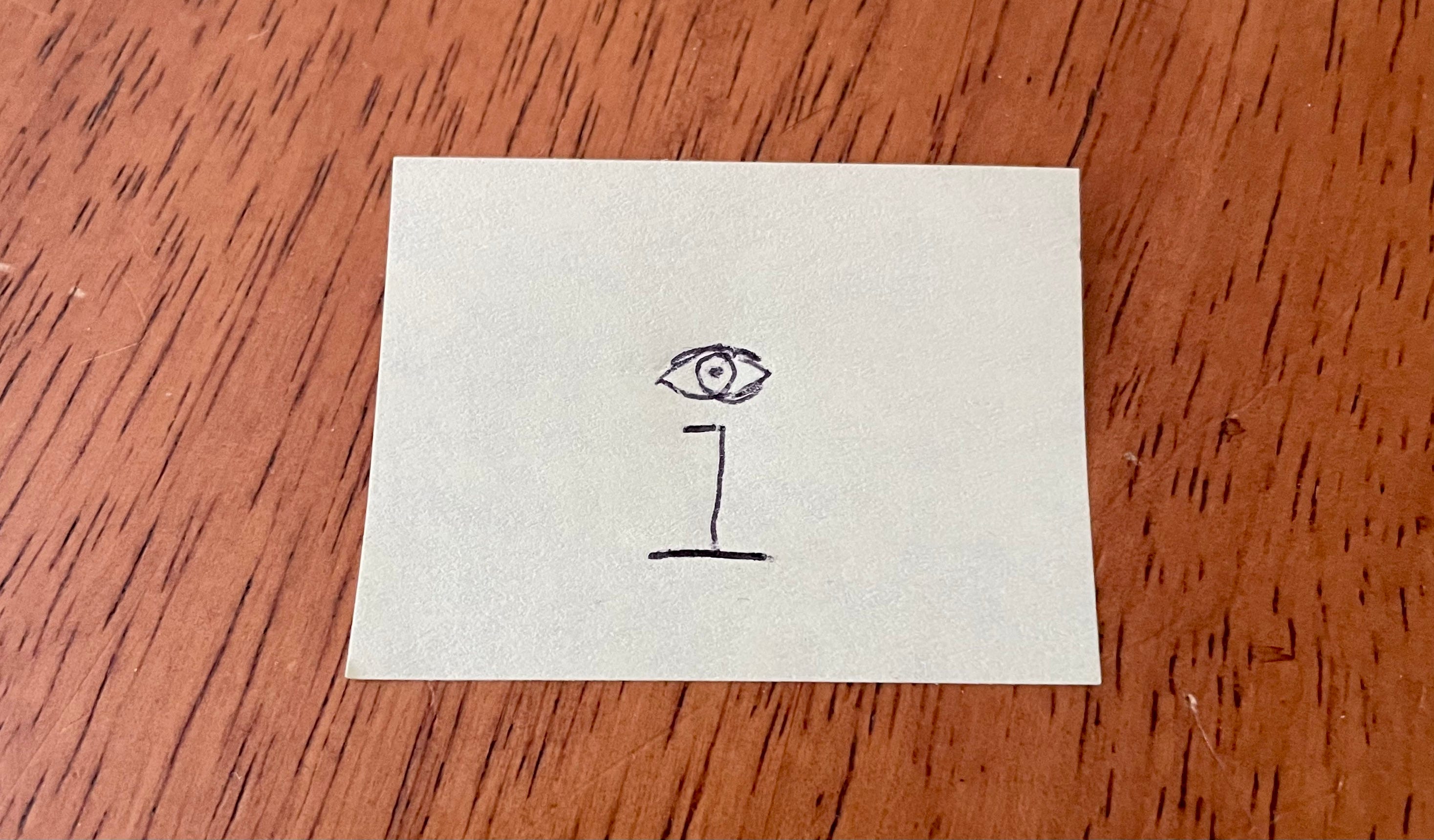
But I couldn’t find a way to integrate that into a larger concept that really communicated the “IC”/“I see” connection. The truth is, I’m not a very good designer.
But maybe some of you folks are. So today I’m issuing a call for entries: Let’s come up with an Inconspicuous Consumption graphic that riffs on the connection between “IC” and “I see.”
A few notes for those who want to take on this challenge:
You’re welcome to run with my eye-dotted “i” idea if you like, but that’s absolutely not required.
Your design can include the words “Inconspicuous Consumption” or not. Up to you.
Similarly, your design can include images of things we’ve talked about here (Brannock Devices, manicules, zebra boards, etc.), or not. Again, up to you.
If you can find a way to use the phrase “I see,” said the blind man, as he picked up his hammer and saw, I’ll be very impressed.
If I particularly like your design, I will put it on a T-shirt that I’ll make available in the IC shop. I’ll split the sales profits with you 50/50, plus you’ll get a free T-shirt with your design.
This is a design challenge, not a contest. I may end choosing multiple designs for the T-shirt treatment, or just one, or none. Depends on how I like the designs.
Please: No AI or AI-assisted designs.
Email your design to me by June 25th (that’s three weeks from today). You can submit as many designs as you like.
I think that covers it, but let me know if you have any additional questions. Thanks, and have fun with your designs!
Inconspicuous News Roundup
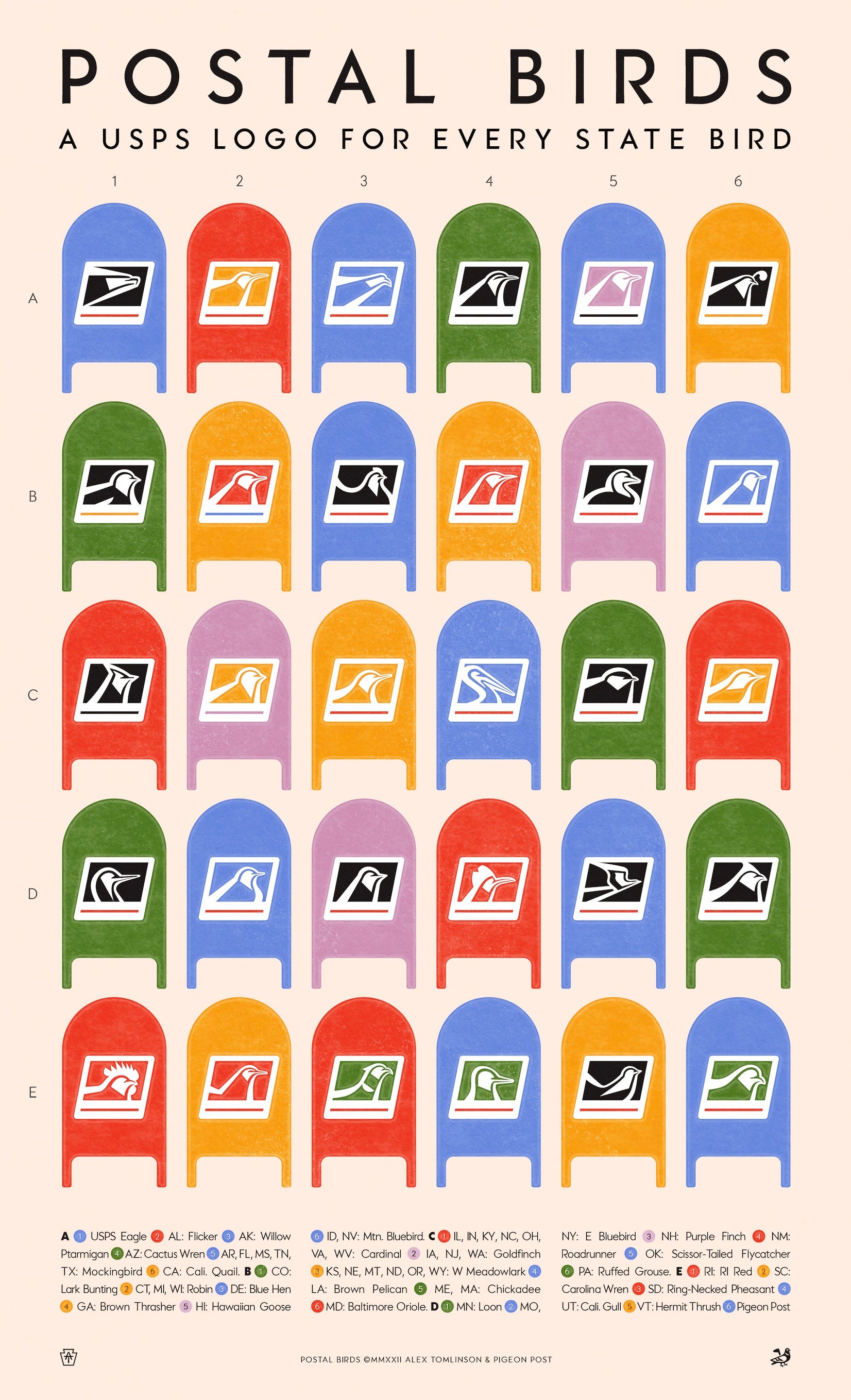
You know how the USPS logo shows a stylized eagle? A bird-centric artist named Alex Tominson has reimagined the logo for all of the country’s official state birds (see above).
Did you know that Nepal has its own time zone, which is 15 minutes off from all the others? It’s true!
Oh man, check out this absolutely sensational pop-up book — so good (from Trish Clark):
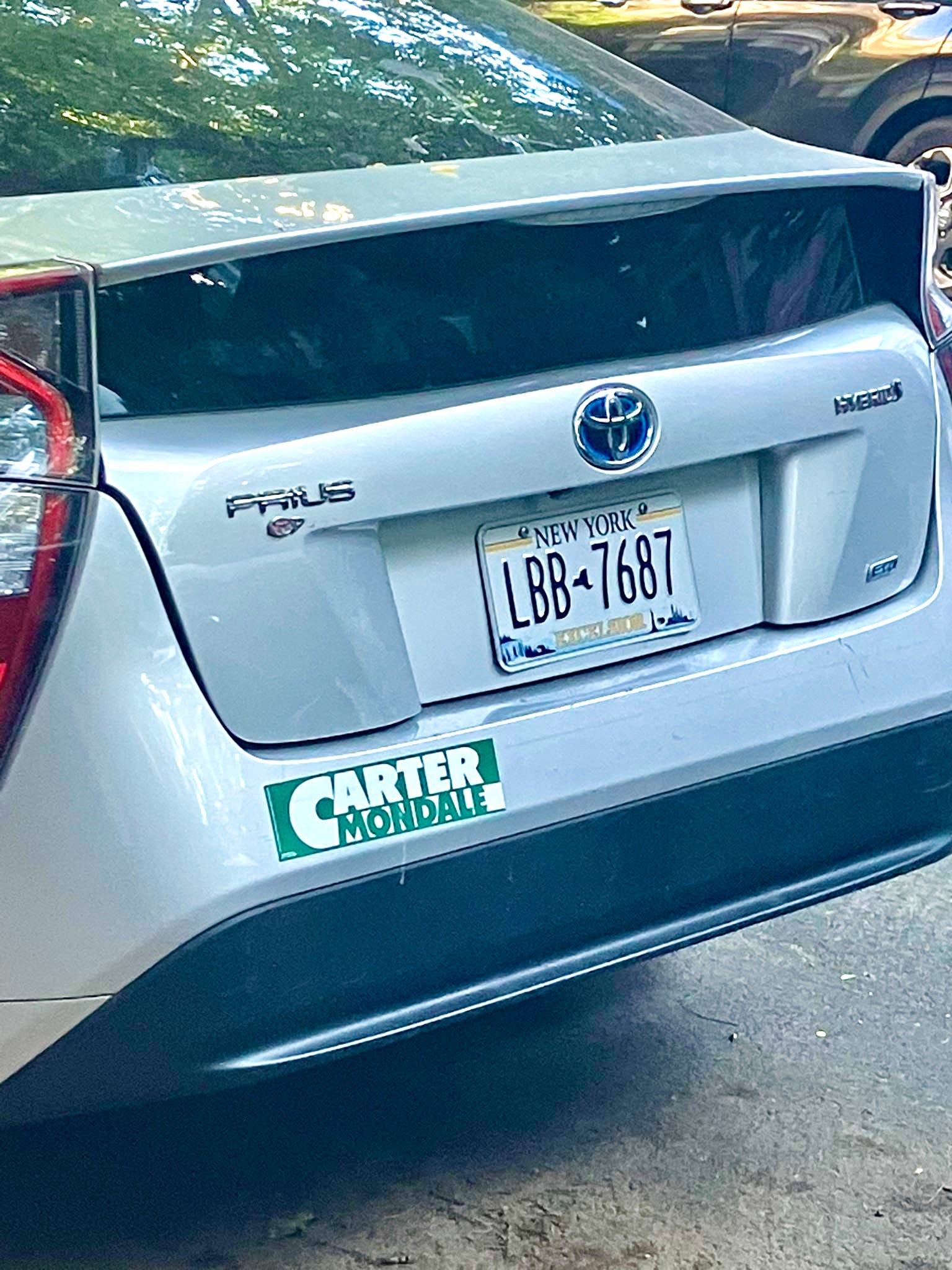
Miriam Sicherman spotted this car with a 1976 Carter/Mondale bumper sticker (see below). Not sure if that’s just an isolated instance or if retro political bumper stickers are a trend. Anyone know more?
Paul Lukas has been obsessing over the inconspicuous for most of his life, and has been writing about those obsessions for more than 30 years. You can contact him here.
Not sure if you’ve covered this before but being postal related I figured it’d be worth sharing. I’ve recently noticed that the bottom right panel of each blue mailbox has the month/year it was made embossed on it. I’ve noticed that most of the mailboxes in my neighborhood were recent replacements done this decade but there is one holdout from 1973.
So down to try a T-Shirt design ~!