

Note: This post is not paywalled. Enjoy! — Paul
Hello! Last month I announced an Inconspicuous Consumption T-shirt challenge. Just to refresh your memory, here’s how I laid it out:
Lately I’ve been thinking a bit about Inconspicuous Consumption’s shorthand abbreviation — IC. If you say it out loud, it sounds like “I see.” That feels right, because Inconspicuous Consumption is often about seeing small details, seeing things that other people miss, the surprise of discovery, and so on. You see? IC!
I’ve been thinking that the resonance between “IC” and “I see” might make the basis for a good logo or T-shirt. For a while I tinkered with a lowercase “i” dotted with an eyeball, like this:
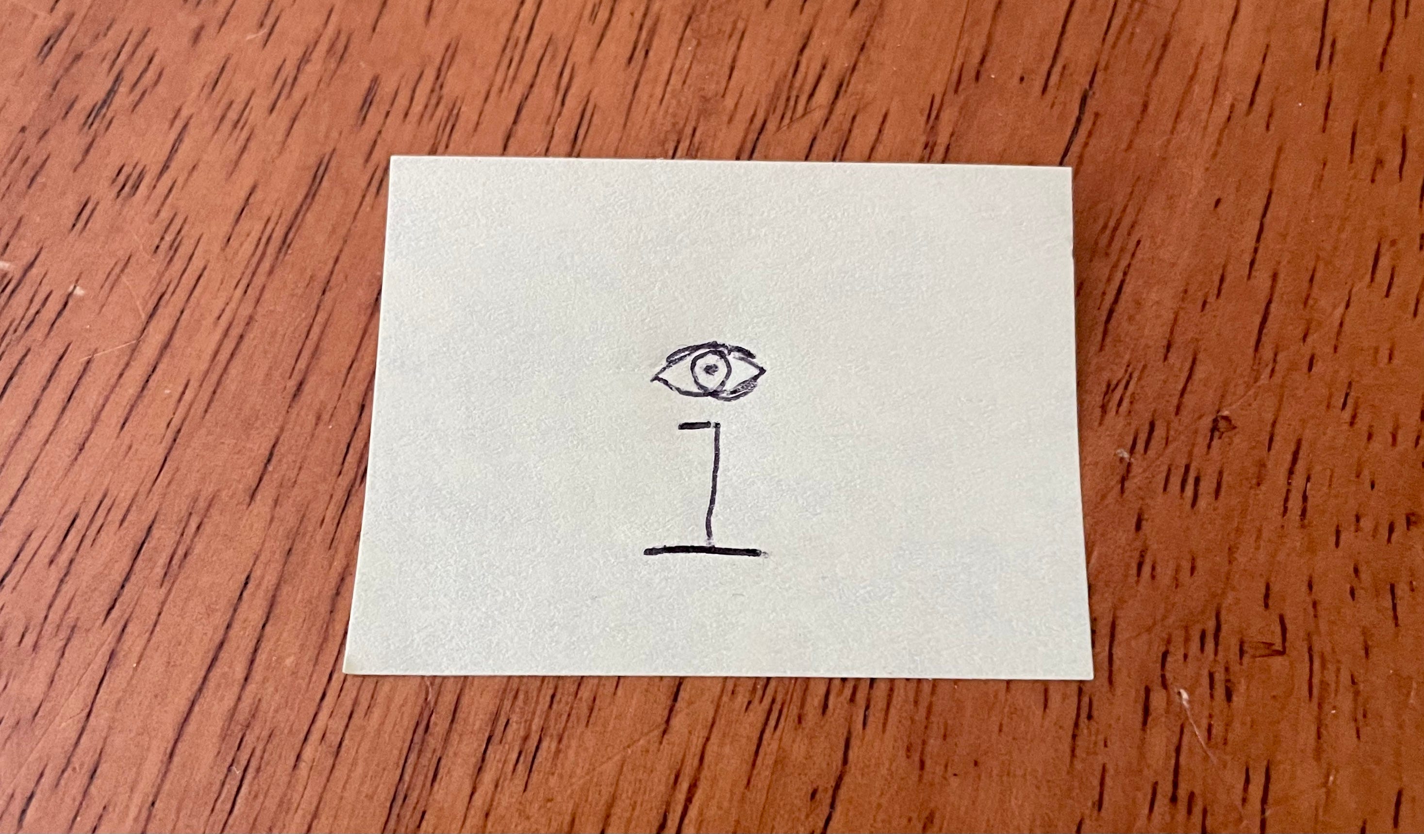
But I couldn’t find a way to integrate that into a larger concept that really communicated the “IC”/“I see” connection. So today I’m issuing a call for entries: Let’s come up with an Inconspicuous Consumption graphic that riffs on the connection between “IC” and “I see.”
I received lots of submissions (thank you!), but one of them immediately stood out as the best. Behold:
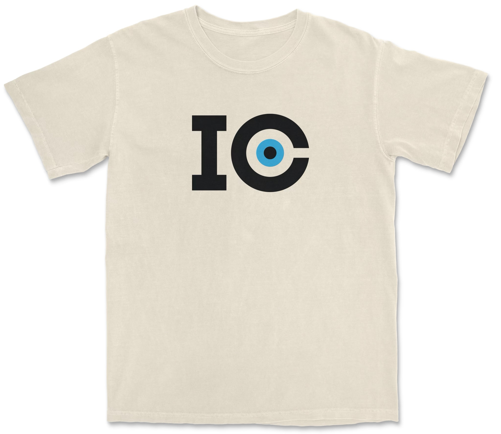
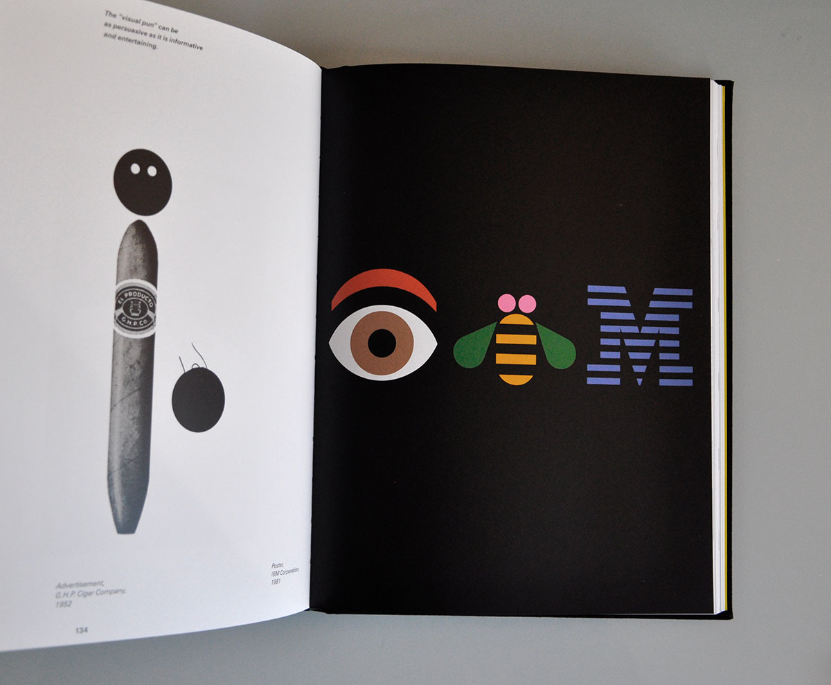
Isn’t that great? It’s from IC reader Jonathan Lawrence, a professional graphic designer based in Atlanta, and I love it — so simple, so playful, and it really gets at the connection between “IC” and “I see.” Plus it feels rooted in classic graphic design history, because reminds me of Paul Rand’s famous IBM rebus and also echoes all the great eyeball-themed Bauhaus posters.
I told Jonathan that I thought it would be fun to have other eye colors available, so he added brown and green to the mix:
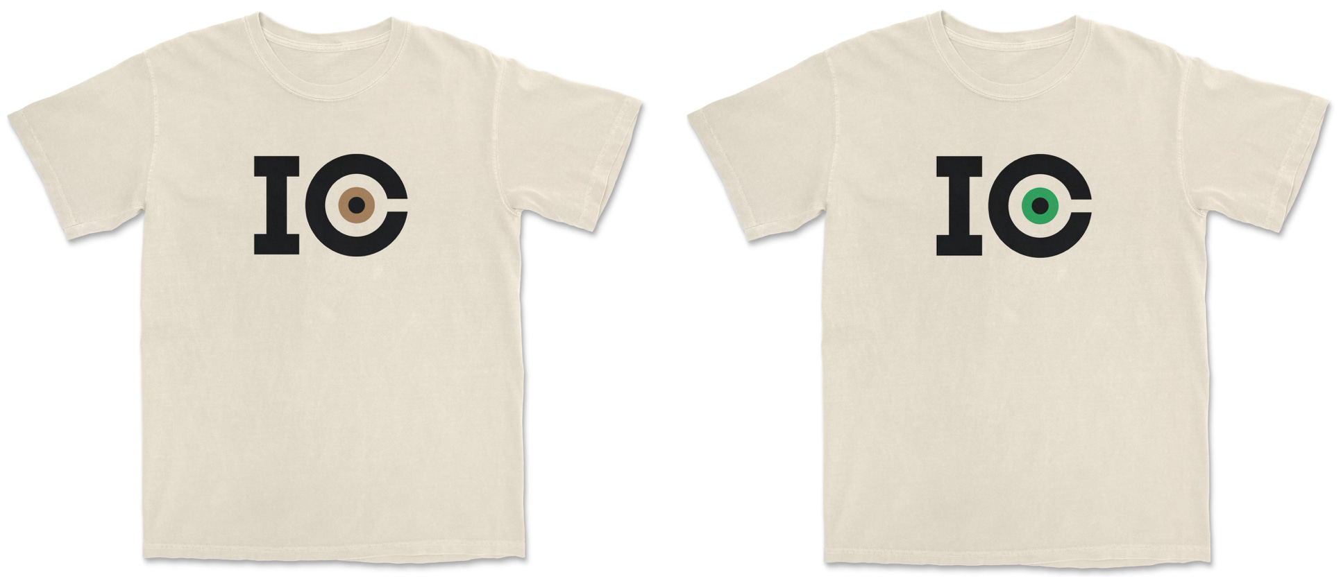
These light-colored shirts, with the black “IC” lettering, are available in a bunch of colors and styles, depending on the eye color. Here’s a sampling:


For darker shirt colors, we have the “IC” lettering in white — again, with all three eye colors available. Here’s a sampling of those designs:


I realize that it can look a bit odd for the “whites” of the eyes to be black, navy, brown, or whatever the shirt color happens to be. Jonathan and I played around with various ways of making that part of the eyeball white, regardless of the shirt color, but we agreed that those solutions all made the eye feel less naturalistic within the “C,” so we ultimately decided to let the shirt color serve as the “whites” of the eyes. (Of course, you can solve this issue by getting white or off-white as your shirt color.)
We also considered putting “Inconspicuous Consumption” on the back of the shirt — sort of an answer key to the inevitable “What does ‘IC’ stand for?” query — but that would have raised the shirt price by at least $4, plus we kinda like the idea of letting the logo speak for itself. If you know, you know; if you don’t know, maybe you’ll ask and find out!
So there are six separate versions of the shirt (each with multiple color and style options). Here are the ordering pages for each of them:
If you’re interested in a combination of lettering color, shirt color, and eye color that you don’t see listed, let me know and I’ll try to set it up for you.
I’ve also used put the new logo on coffee mugs — again, in all three eye colors:

And since coffee mugs are white, the whites of the eyes are also white! Here are the ordering pages for the coffee mugs, broken down by eye color: blue, brown, and green.
I may end up using the “IC” mark in additional contexts — we’ll see.
I’m super-thankful to Jonathan Lawrence for coming up with this great design, and for working with me to refine it. As he explained to me, “I’ve always been a graphic designer but didn’t always know that’s what it was called. Looking back, my fascinations with color, packaging, and letterforms all make so much sense.” You can learn more about him on his website, and fans of vintage typography should definitely check out his fantastic Typehunting site.
Jonathan also tells me he spent a lot of time during his childhood drawing logos for imaginary sports teams, so we may be seeing more of him over on Uni Watch. Stay tuned.

Big Brannock News

The great design podcast 99% Invisible recently launched a project called “A History of the United States in 100 Objects.” Happily, they had the wisdom to include the eternal Brannock Device as one of the 100 objects profiled in the series. As a longtime Brannock evangelist, I was excited and honored to be interviewed at length for this episode, much of which is basically a conversation between myself and 99PI host/founder Roman Mars. The whole process was a blast.
The episode is now available to SiriusXM subscribers, and it will go public for everyone else on Friday. I hope you’ll check it out!

A Special Interaction
I recently posted a link to a bunch of stuff I’m selling on eBay. One of those items —a vintage price sign for horse meat from a French butcher shop — sold a few days after I posted the link, and the buyer sent me a very sweet note after making the purchase:
Hi Paul,
I bought the horse meat sign because I shoplifted your book in 1997 when I was a teenage clerk at Waldenbooks. I’m sorry.
Unfortunately, I went on to study the liberal arts and am thus unable to calculate the appropriate compound interest to make you whole in this case. I hope this purchase provides some small compensation and closure for us both and that we are able to move forward in a spirit of reconciliation.
In all seriousness, thank you for the many inconspicuous marvels you’ve helped me notice these past 30 years. My wife plans to use the sign at dinner parties.
Best,
[name redacted]
Isn’t that great? It’s worth noting that the real victim of the book theft was not me but the bookstore — in this case, Waldenbooks. They went bankrupt in 2011, and now we know why.
Paul Lukas has been obsessing over the inconspicuous for most of his life, and has been writing about those obsessions for more than 30 years. He also writes Uni Watch, which is sort of like Inconspicuous Consumption for sports. You can contact him here.
Love the new IC logo! Well done, Johnathan. And thanks for including a green eye option, Paul. Mine are grayish/greenish/bluish but I identify as green-eyed.
The book "shoplifter" reminded me of how early this year I picked up Kelly Carlin's memoir.
I picked up her book at a used book store that's in an old brake factory in my town that was likely taken and never returned to "Friends of Fernridge Park Little Free Library" of West Hartford, and I am glad to whoever "traded" it in (I really enjoyed the book).
I wrote to her to let her know how I bought the book for but reading it was worth much more.
I was surprised that she wrote me back almost immediately:
"I love the way the book came to you, and so glad you are forwarding it to your sister.
Here’s to bringing humor to our human condition sooner rather than later."
It was the best $2 I spent!!