

Oddly Compelling: The Sire Records Logo on a Spinning LP
My quest to find the story behind a classically inconspicuous detail — and the music-biz legends I met along the way.

Note: An important paragraph was inadvertently omitted from an earlier version of this article. This version has the full text. Thanks to everyone who pointed out the error! — Paul
I’m a big music geek, and I used to have nearly 2,000 vinyl LPs. But these days I’m down to just a few hundred, and I don’t play them very often. Like so many people, I now listen to most of my music via internet streaming.
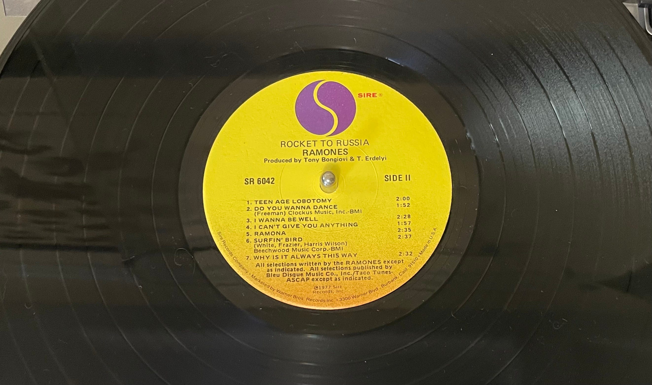
So it was fun to pull a Ramones album off the shelf the other day and rediscover something I’d forgotten about, namely that the Sire Records logo — essentially a simplified yin/yang icon with an “S” formed by the negative space between the yin and yang components — looks absolutely mesmerizing as it spins around on the record label. Look at the “S” in this video (and use the full-screen option to get the full effect):
I can’t stop fixating on how the “S,” via some combination of geometry and physics, looks animated as it spins around on the turntable, almost like a serpent that’s slithering in place. I remember being struck by that visual effect the very first time I played a Sire LP (probably sometime in high school, although I no longer recall the details), and it’s fun to see that its effect on me remains undiminished.
Since rediscovering the animated “S” about two weeks ago, I’ve mentioned it to several friends — all serious music people — and was surprised when they each said they’d never noticed it before. I’m used to being the only person who notices certain things, but am I really the only one who noticed this?
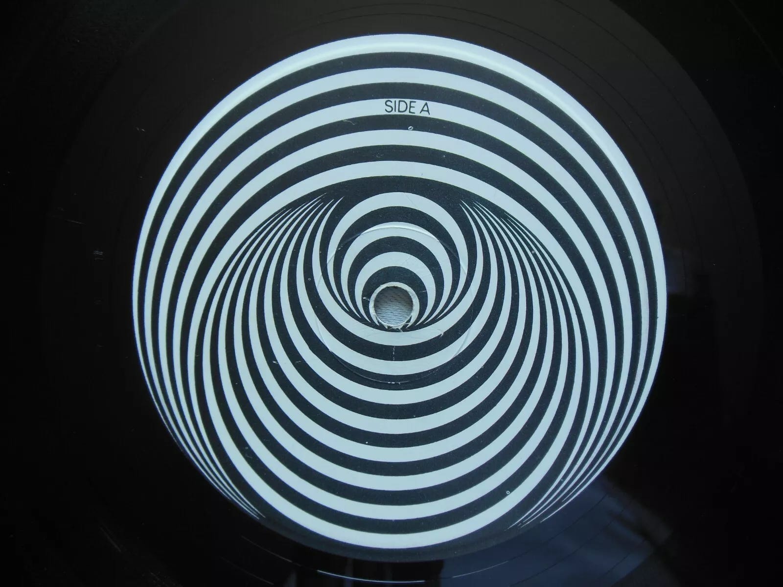
There have been some other record companies over the years whose label designs have looked particularly cool when set in motion. The most prominent example is probably Vertigo, a British prog label founded in 1969, whose label design was, well, vertigo-inducing. Here are two photos and a short video clip:
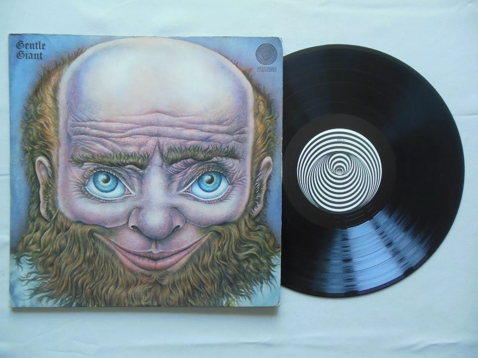
(Fun fact: You can also get the Vertigo label design as a turntable mat.)
The Capitol Records yellow/orange swirl, used on 7″ singles in the 1960s, is another example of a label design that looks good in motion. Again, here’s a photo and a video clip:

But the Vertigo and Capitol labels were obviously intended to look good while in motion. Was that also the case with Sire’s animated “S,” or was it just a happy accident? I decided to find out.
Sire was founded by Seymour Stein and Richard Gottehrer in 1966. The label’s original logo featured gothic lettering and a silhouetted figure that looked a bit like the Lowenbrau beer lion. According to notes written by Stein for a 2006 Sire box set, he and Gottehrer later created the more enduring yin/yang-based logo, which the label still uses today.
Stein died last year, but Gottehrer, who’s now 84, is still active in the music biz, serving as Chief Creative Officer at The Orchard, a music distribution company that he co-founded in 1997, and running his own label, Instant Records (which released a new track by longtime singer-songwriter Richard Barone just a few days ago). Could he shed some light on the animated “S”?
“I never even noticed that before,” said Gottehrer when I recently spoke with him. “You’re the first person to bring that up.”

But here’s the thing: Contrary to what Stein wrote in the notes for that 2006 Sire box set, Gottehrer said he and Stein did not design the Sire logo. “We hired somebody,” Gottehrer told me. “I can't remember his name — I believe it was Craig something. He was like a major, major designer of album covers and he would do logos and things.”
Hmmm — “Craig something.” I wondered if Gottehrer might be referring to Craig Braun, who was a titan of 1960s and ’70s LP cover design.
I eventually tracked down Braun, who, like Gottehrer, is in his mid-80s but still very sharp — and quite a character. He confirmed that he was indeed the designer of the Sire logo. “Yeah, Seymour Stein hired me to do that,” he said. “Probably wanted me to do it for nothing, too. Motherfucker had more money than Carter had liver pills. Anyway, I thought ‘Sire’ was kind of an elegant name — you know, a sire. So I wanted to do something that connoted spirituality. I was probably into gurus and shit at that time.”
So that’s where the yin/yang theme came from. But did Braun also design the label?
“You mean the center-disc label on the vinyl? No, I had nothing to do with that.”
And does that in turn mean that the logo wasn’t specifically designed to create that hypnotic “S” effect on the label?
“No, I never thought about that when I did the logo, and I never even knew about it until you just brought it up.”
And there you have it, people: The animated “S” was just a fortuitous fluke that even the label’s co-founder and the logo’s designer hadn’t been aware of. Classically inconspicuous!
It’s worth mentioning here that my quest to find the story behind the “S” led me to two major figures in pop music history. Gottehrer had a hand in writing and producing the early-1960s hits “Hang on Sloopy,” “My Boyfriend’s Back,” and “I Want Candy,” and later went on to produce albums by Blondie, Richard Hell, the Go-Go’s, Marshall Crenshaw, Link Wray, and literally hundreds more. (There’s an entertaining article about him here.)
As for Braun, he invented the hype sticker and helped execute Andy Warhol’s vision for the Velvet Underground’s “banana” LP cover and the Rolling Stones’ Sticky Fingers cover (he has funny stories to tell about having to procure a few million zippers), plus he designed the “spinner” cover for Led Zeppelin III (technically a volvelle, don’tcha know), the logo for the Carpenters, and lots more, before eventually reinventing himself as a well-regarded TV and movie actor. (There’s a good video interview with him here.)
I will happily admit that it was a kick to interview both of these guys. But I think the bigger takeaway is that our pursuit of the inconspicuous can sometimes lead us in surprising directions, and bring us into contact with fascinating people. Remember that the next time someone rolls their eyes over your supposedly pedantic interest in obscure details.
Before we wrap, three final thoughts:
I still have a hard time believing that nobody else ever noticed the animated “S.” If you’re old enough to have owned and played Sire vinyl LPs, did you ever notice it?
Aside from the examples I already cited, are there any other record label designs that look better in motion than as static art?
And finally, to revisit a recent IC topic, maybe we need a record company to use a lenticular label design. Now that would look cool on the turntable!
(Special thanks to Dan Epstein for helping to connect me with Richard Gottehrer, and to Jeremy Kareken for doing likewise with Craig Braun.)
Quick Inconspicuous Hits
Speaking of music geekery: Once upon a time, I was a rock critic, reviewing records and live shows for various newspapers and magazines. I stopped doing that at least 20 years ago, but the drought is now over, as I’ve just reviewed an excellent indie-rock record for Qobuz (one of the “other” streaming services that compete with Spotify). You can read the review — and listen to the record, which is by a New York band called the Eljin Marbles — here. That link will prompt you to register with Qobuz, but it’s free.
I don’t watch late-night TV, but Jimmy Kimmel conducted a (staged?) Hoarders-style intervention in 2018 with one of his writers, Gary Greenberg, whose office was supposedly filled with huge piles of random stuff — including two Brannock Devices! Here’s the segment (the Brannock sequence begins at the 4:36 mark):
I heard someone on the radio the other day referring to a politician’s “faux populism.” When spoken out loud, that sounds like “faux pas-pulism,” a term that doesn’t exist but probably should.
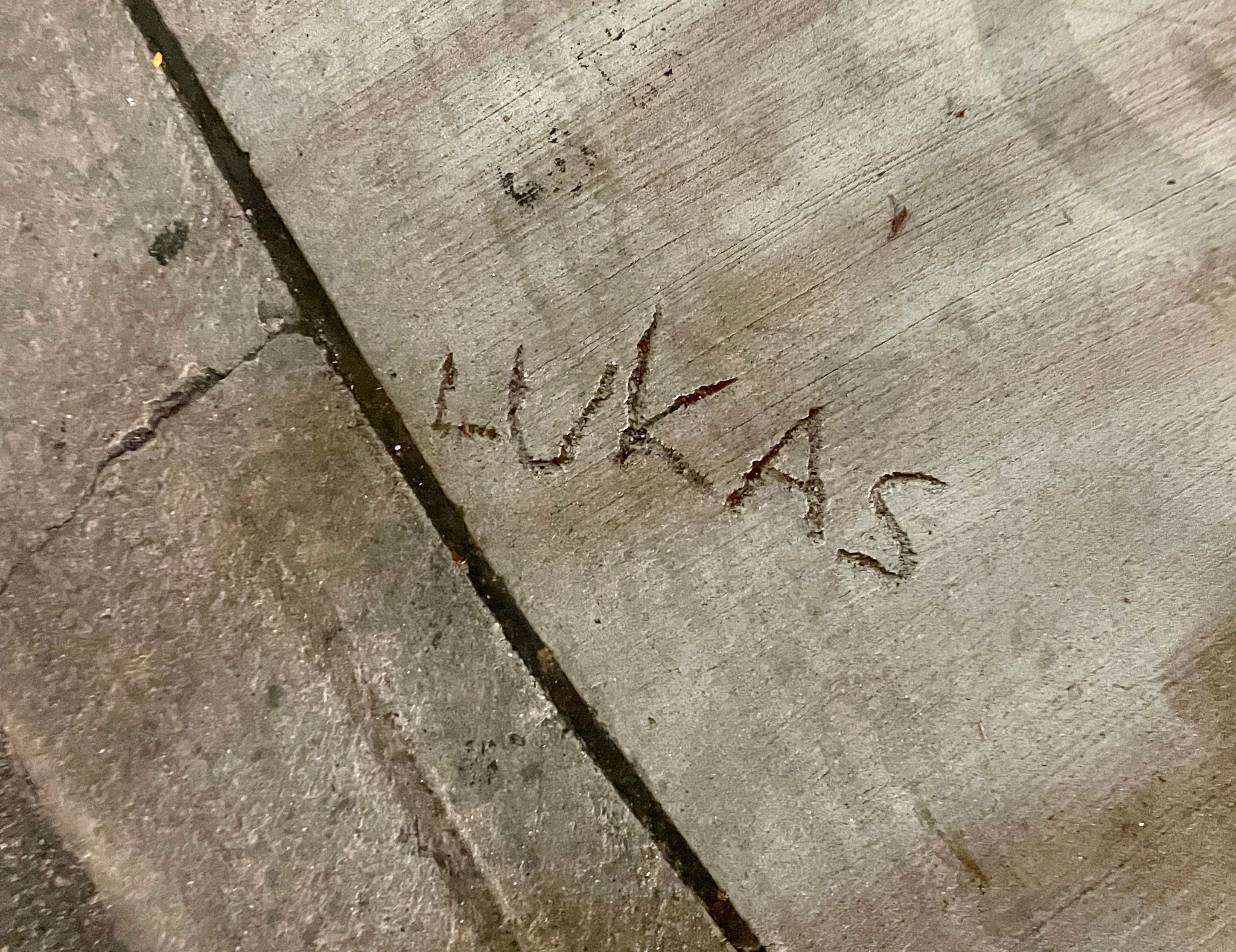
Remember all the “Lukas” graffiti? Reader Mike Chamernik has found a related example at the northeast corner of Belmont and California Avenues in Chicago:

I swear I didn’t do it! Thanks to everyone who responded to my recent call for feedback regarding Inconspicuous Consumption’s publishing schedule. Among those expressing a preference, the overwhelming choice was for me to publish on weekday mornings, so that’s what I’ll do whenever possible.
Paul Lukas has been obsessing over the inconspicuous for most of his life, and has been writing about those obsessions for more than 30 years. You can contact him here.
Love this rabbit hole, Paul, and so appreciative that you did so much detective work on it! Looking forward to combing through my vinyl collection tonight to see if I have any interesting designs to stare at. :-)
Somewhat related, I assume you've seen it because of your converging interests in music and design, but the documentary "Squaring the Circle" is excellent. It's the story of 60s/70s album art design studio Hipgnosis.
I definitely noted the Sire effect because one of the things that led to my lifelong fascination with music was that I was obsessed with watching LPs and 45s spin as a small child. (Questlove mentions in his memoir Mo Meta Blues that he had a similar obsession.)
Speaking of memoirs, Seymour said in his book Siren Song that the label name came from scrambling the first two letters in SEymour and RIchard, and that he liked it because it reminded him of Syd Nathan's King Records, the first label he worked at.
It doesn't have any particular effect when it spins, but I have always loved the post-punk-era Virgin Records labels (approximately 1978-1984, I think), where side one was green with a thin red stripe and side two was red with a thin green stripe.
Cool to see that you reviewed the Eljin Marbles record -- my friend Paula put that out!