

The Pleasures of Decorator Colors
How a recent purchase led to a deep dive on a colorful marketing term.

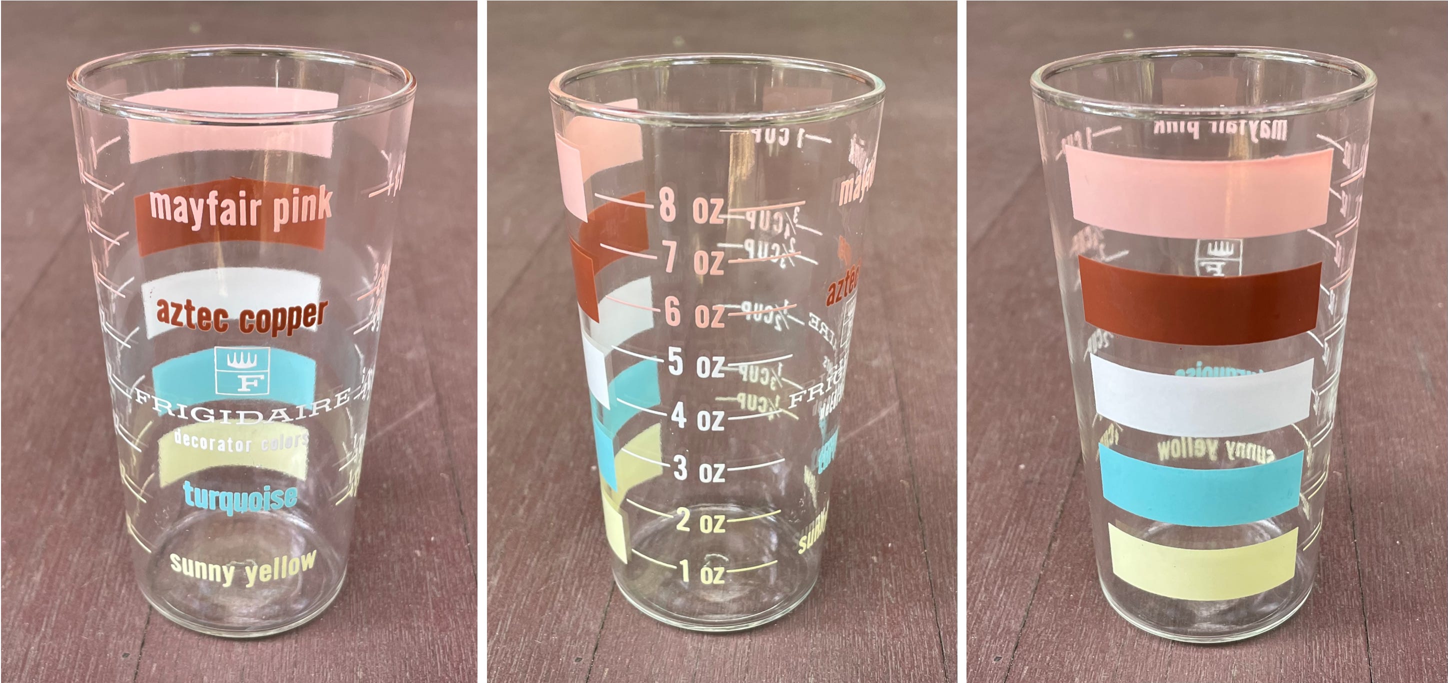
Reader Jo Zwiep recently got in touch to say she’d spotted an online listing for a vintage 1950s advertising piece that she thought I’d like. “Frigidaire was marketing their available colors — not with a brochure or catalog, but a glass!”
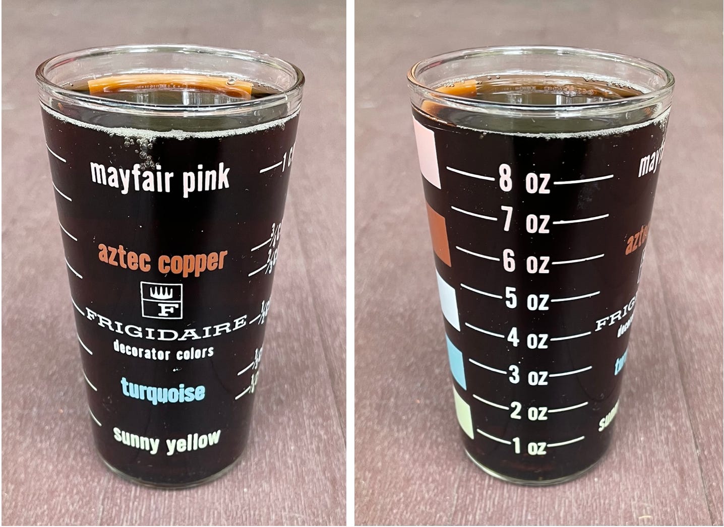
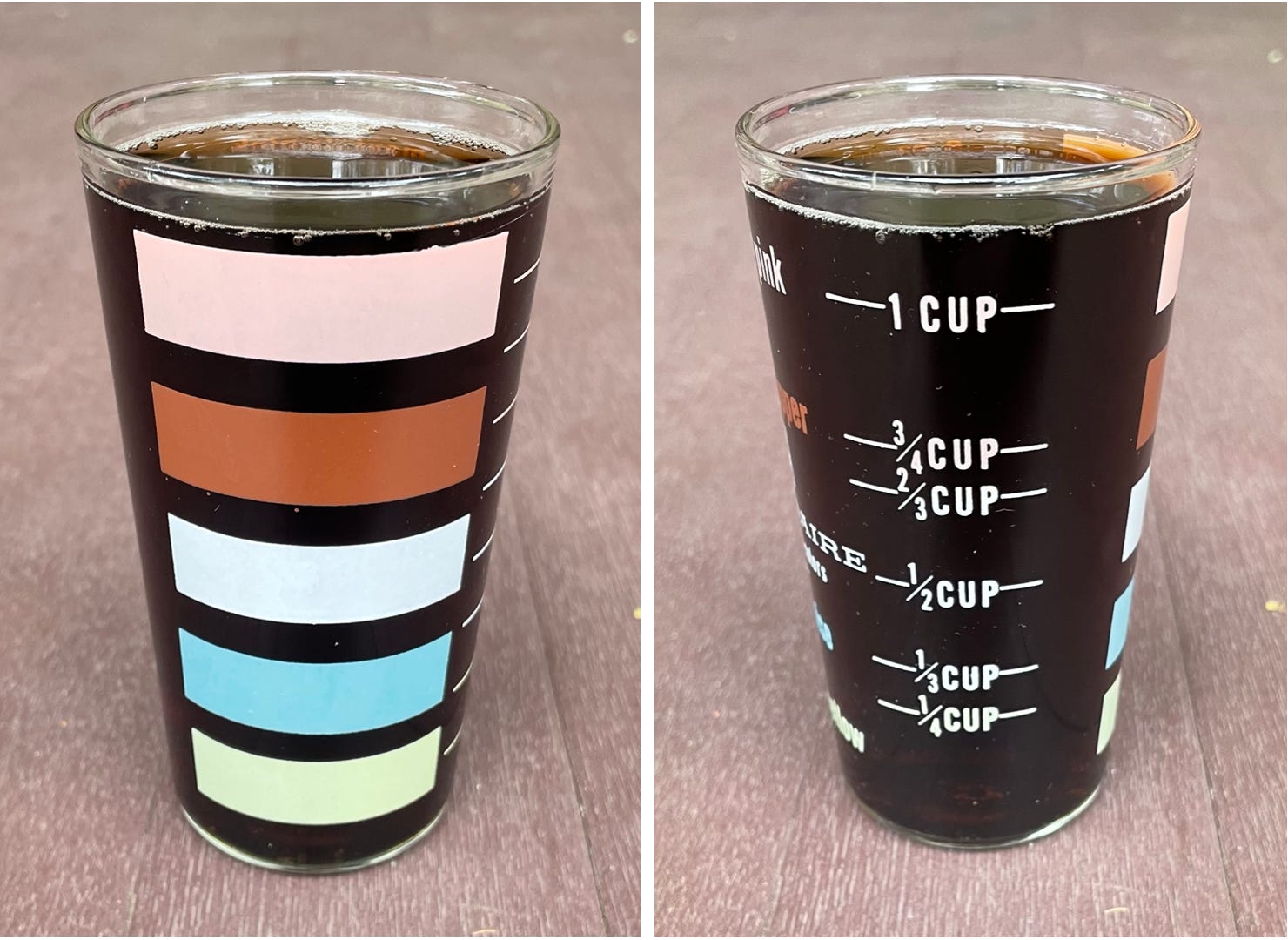
As Jo suspected, this was right up my alley, and the price was reasonable ($15), so I snapped it up . As is often the case with glasses featuring wraparound designs, the graphics are a bit easier to make out against a contrasting background, so here’s how the glass looks when filled with Diet Coke:
I really like this glass, and I knew right away that I’d end up writing about it. But as I began planning and researching, I realized that I was especially enthusiastic about two distinct aspects of the glass, each of which deserved its own showcase. So today I’m going to explore one of those things, and later this week I’ll follow up with the other one.
Let’s start here: The glass is essentially a color sampler, like a swatchbook — the swatches just happen to have been printed onto a glass instead of on pages. I particularly like that the various hues have names like “mayfair pink,” “aztec copper,” and “sunny yellow” (note the all-lowercase format — a classic midcentury trope). But best of all, at least for me, is the descriptor printed below the Frigidaire name: “decorator colors.”
I’ve always loved that term. Maybe it’s because it’s such a charmingly silly bit of marketingspeak, or maybe I’m biased because my parents owned an interior decorating shop. Either way, seeing it on the Frigidaire glass made me realize that while I’ve written a fair amount over the years about colors, I’ve never written about decorator colors. So I’m going to do that today.
It’s not clear exactly who coined the phrase “decorator colors” or exactly when it debuted, but it’s generally associated with home design from the 1940s through the 1960s, when the rise of America’s postwar suburbs helped make “decorator colors” into something of a phenomenon. A 1950 New York Times article, for example, was headlined “Decorator Colors Invade Bathroom” (an evocative notion). And like a lot of aspiration-based ad messaging, “decorator colors” was simultaneously elitist and democratizing: On the one hand, it implied a certain degree of sophistication, taste, modernism, and cultural cachet; on the other hand, the term essentially reassured the hoi polloi by telling them, “Even if you can’t afford a professional decorator, you can still have decorator colors.” Everyone wins.
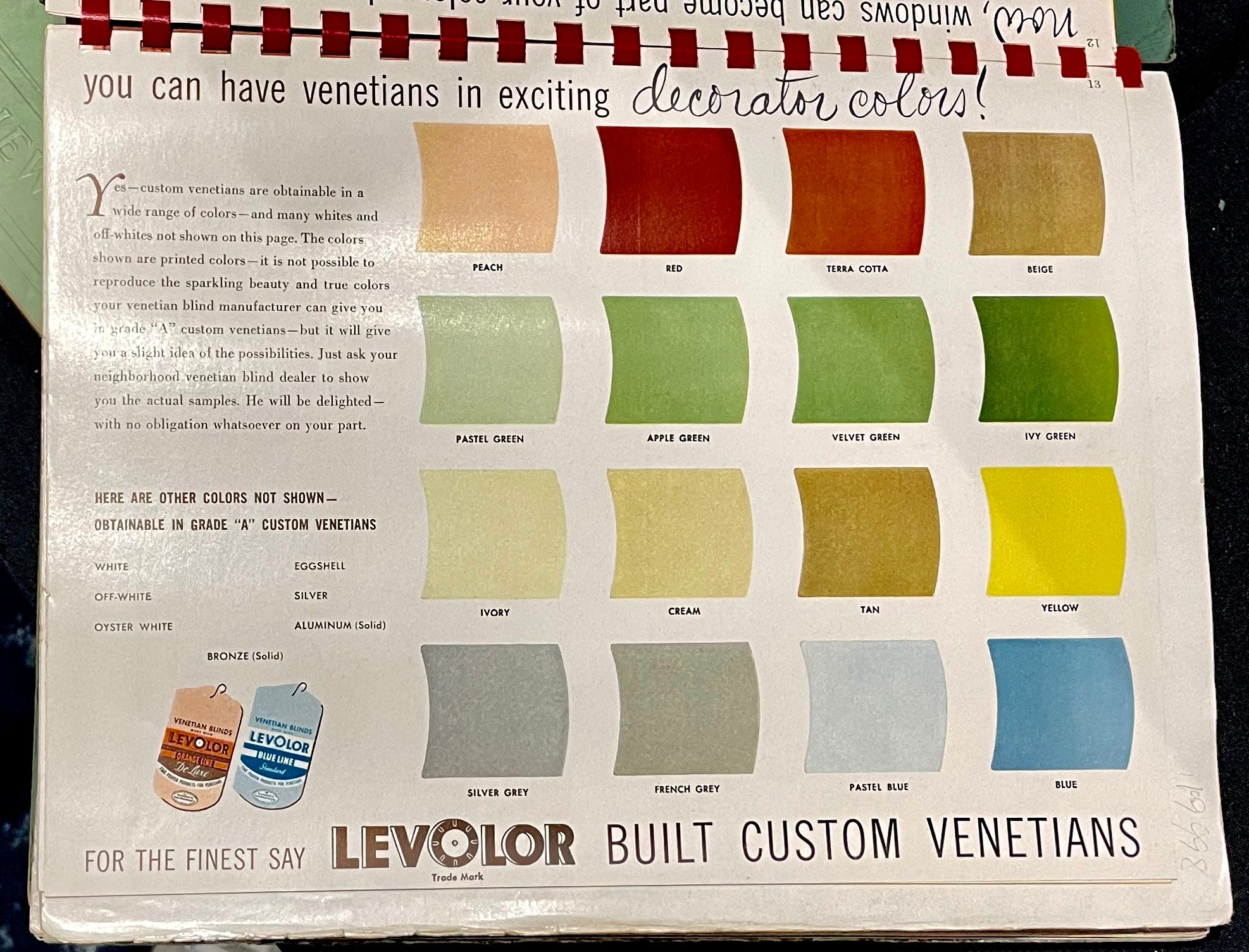
And just what qualifies as a decorator color? There’s no specific definition that I’m aware of, but the tones are usually cool, muted, neutral, and either pastel or pastel-adjacent, like the colors on the Frigidaire glass. Similarly, remember when I attended the Ephemera Fair back in March? One of the items that caught my eye that day was a vintage Venetian blinds catalog that touted the product line’s “exciting decorator colors”:
What other sorts of products have been marketed as having decorator colors? Here are some examples I found, broken down by product category: