

A Visit to the Ephemera Fair
Can you guess which two items I purchased at this fantastic vintage market?

Editor’s Note: I strongly recommend that you read this post on a computer, not on your phone, and also urge you to read the web version of the post, not the emailed version. The web version has enlarged photos and some video content, both of which are best appreciated on a larger screen. Enjoy! — Paul
As you surely know by now, I’m very fond of ephemera. But I’m just an amateur ephemerist compared to some people — like, say, the people who are members of the Ephemera Society of America, which just held its annual conference in Old Greenwich, Connecticut. The conference included various presentations and lectures (typical title: “Better Design Through Chemistry: Graphic Art from the Psychedelic Era”) and also featured the Ephemera Fair, which is basically a big marketplace for ephemera dealers. Although I’m not an ESA member, the Fair is open to the public, so my friend David and I went up to Old Greenwich on Saturday to check out the scene.
There are several definitions of ephemera, but in the collectibles world it usually refers to paper artifacts. That can mean letters, postcards, print ads, books, magazines, catalogs, scrapbooks, diaries, brochures, ticket stubs, photographs, stock certificates, report cards, marriage licenses, greeting cards, business ledgers, passports, matchbook covers, ships’ logs, billheads, birth certificates, wills, and maps, among lots and lots of other things.
All of these things, and many more, were available at the Ephemera Fair. My plan was to treat the Fair as a museum and avoid buying anything, in part because I’d been told that the prices tended to be high and also because I don’t really need more ephemera. But as it turned out, I found two inexpensive items that I really loved and purchased.
Here’s a rundown of some of the most notable things I saw. See if you can guess which two were the ones I bought! I’ll reveal the answer at the end of the post.
Uncut Sheet of Mets Patches
Not paper, but still ephemera. I’m a lifelong Mets fan, but I’d never seen these “World Champions” patches before. Here’s a closer look at the design:
Obviously, this wasn’t team-issued or team-worn. More likely the type of thing that would end up on one of those old youth baseball jackets.
The full sheet was enormous! Check this out:
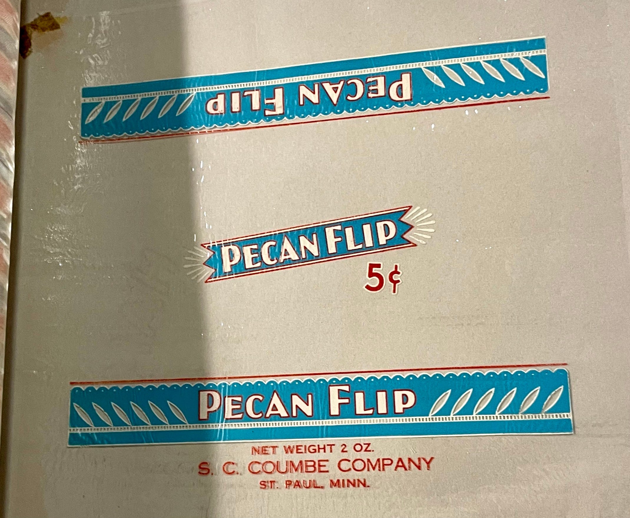
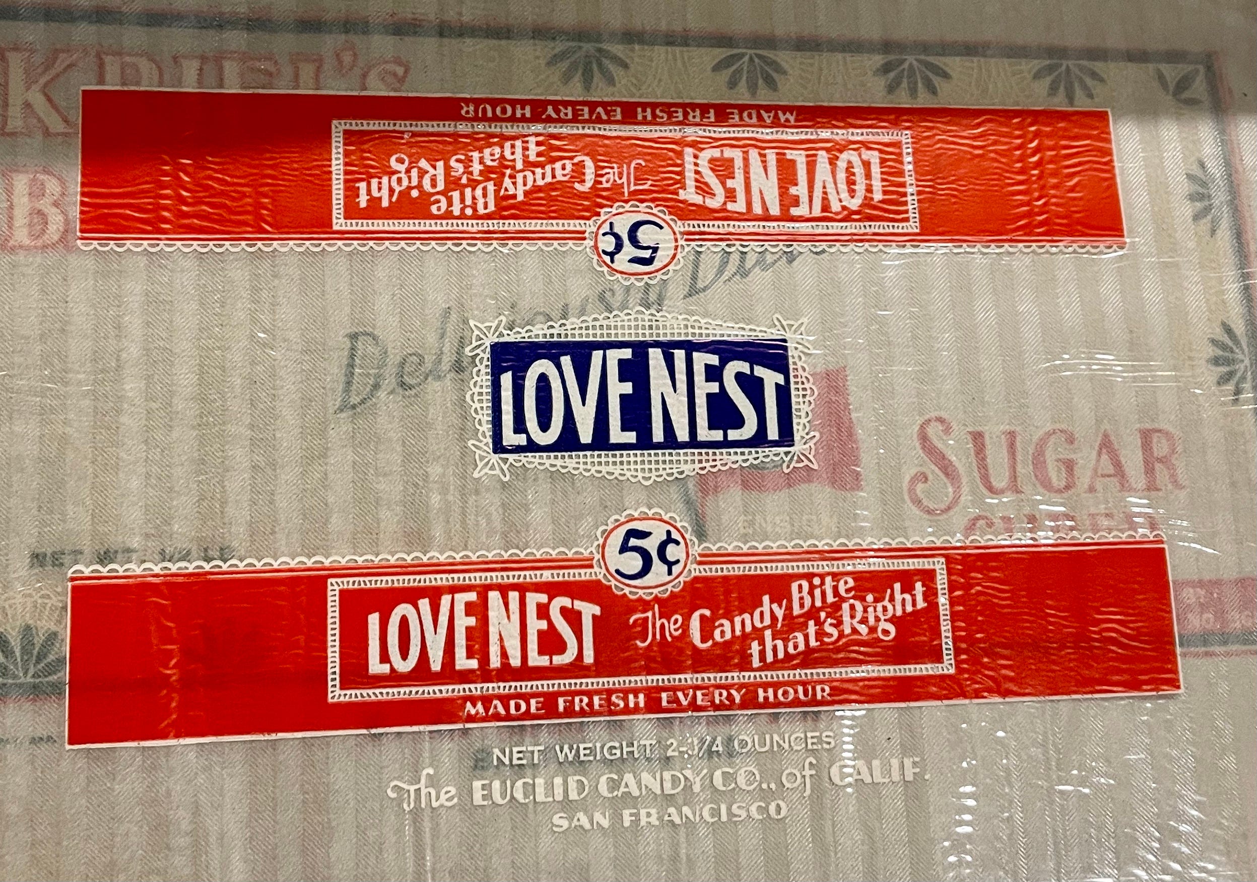
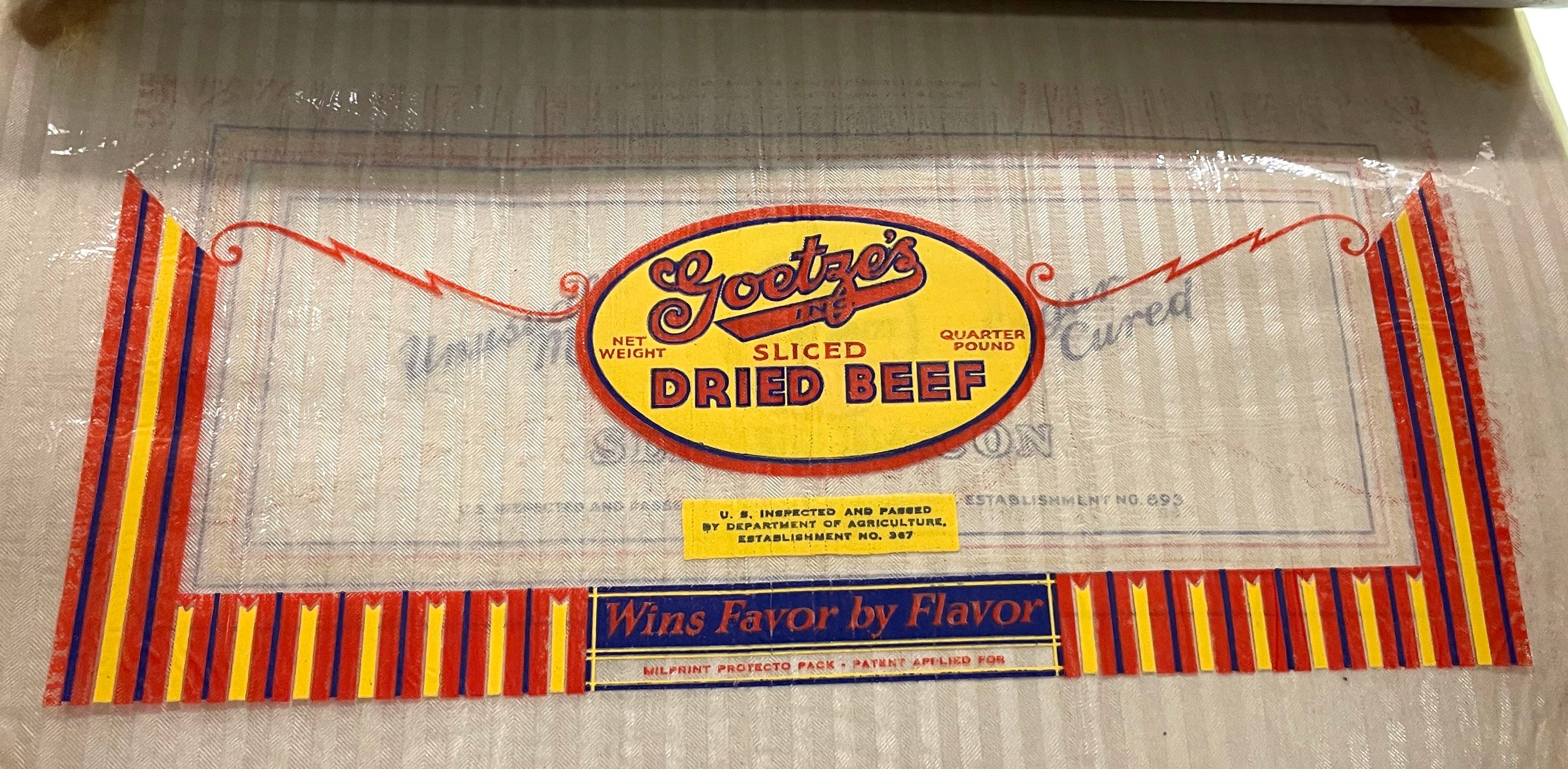
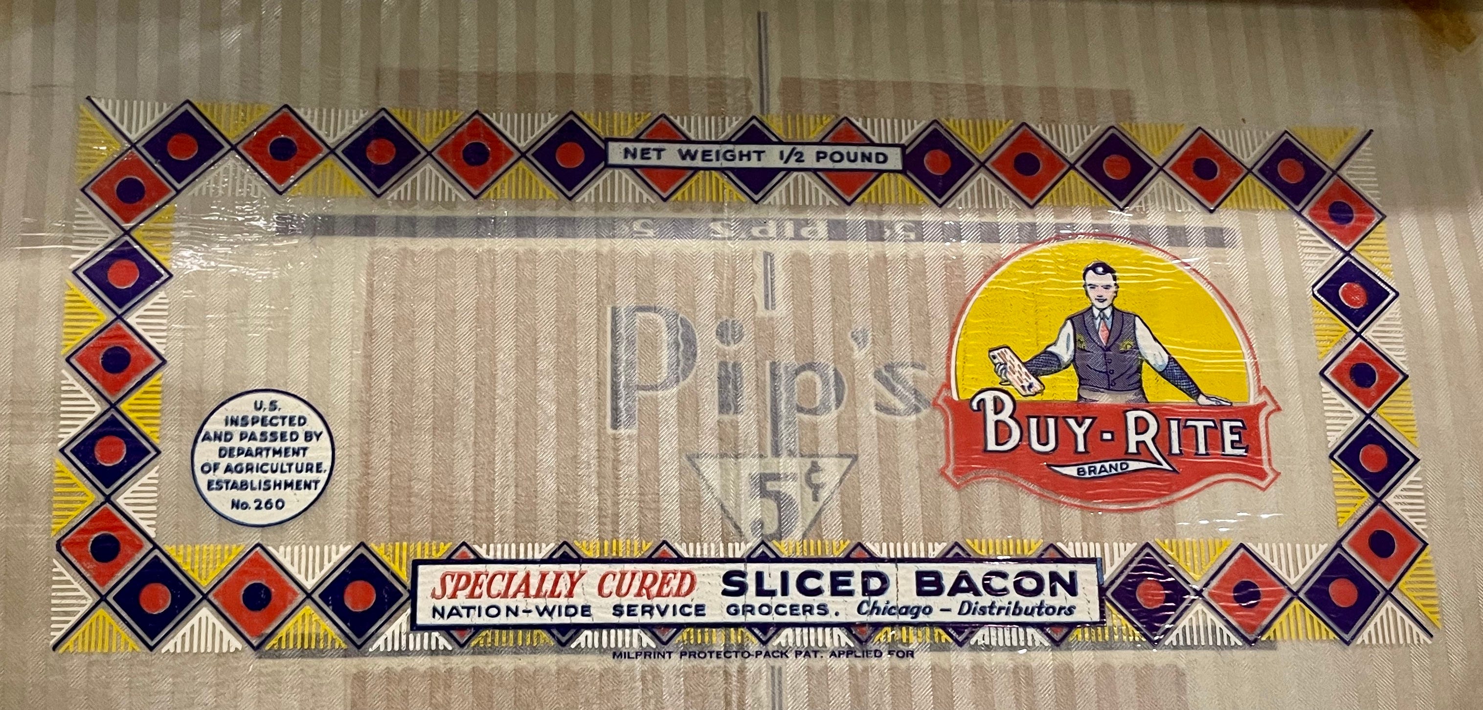
Milprint Sample Catalog
Milprint was a Milwaukee-based printer that was among the first companies to figure out how to print graphics on cellophane, which revolutionized the packaging of meats, candies, and other products. This catalog, which I think is from the 1930s, features dozens of the company’s then-current package designs:
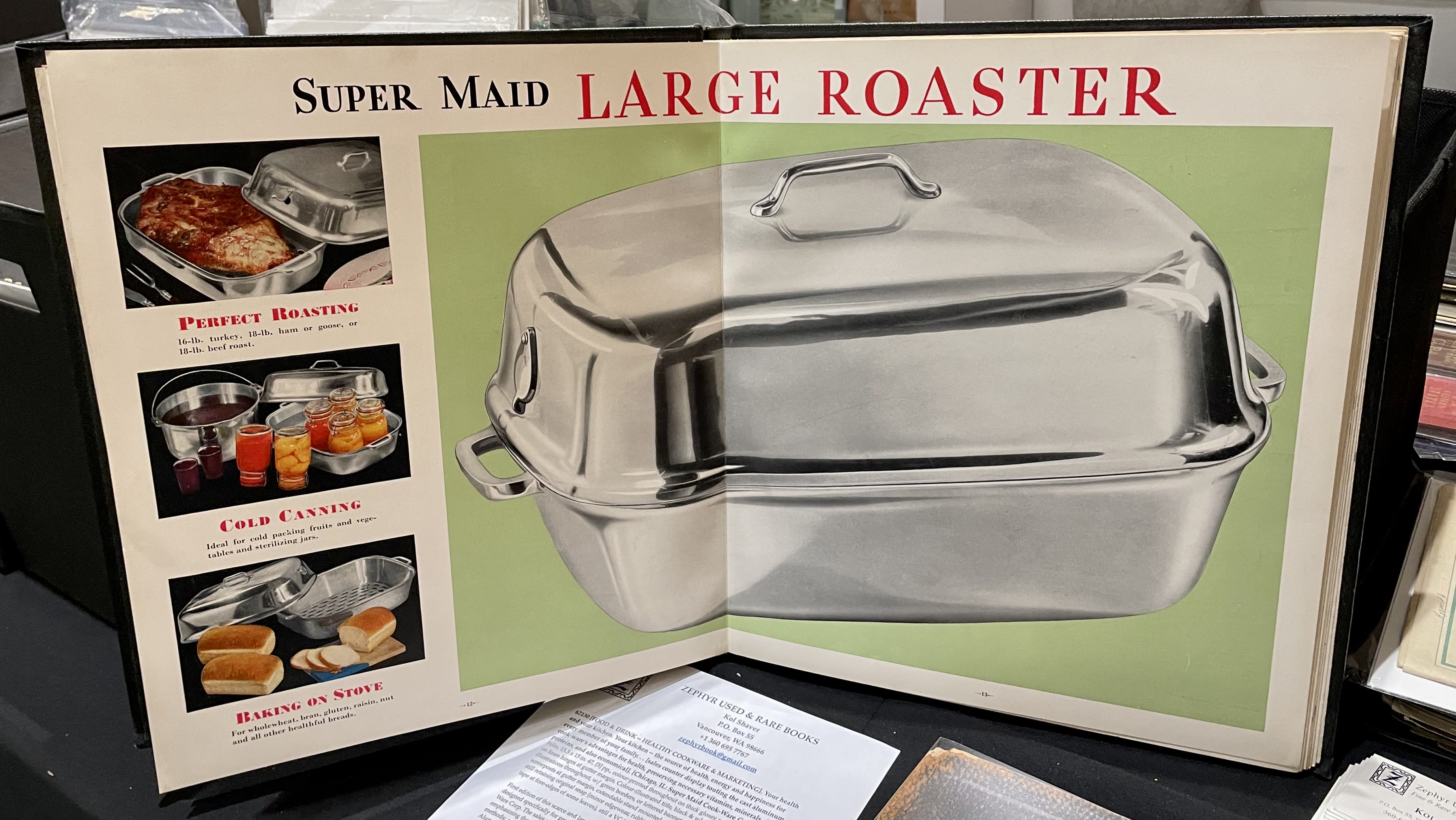
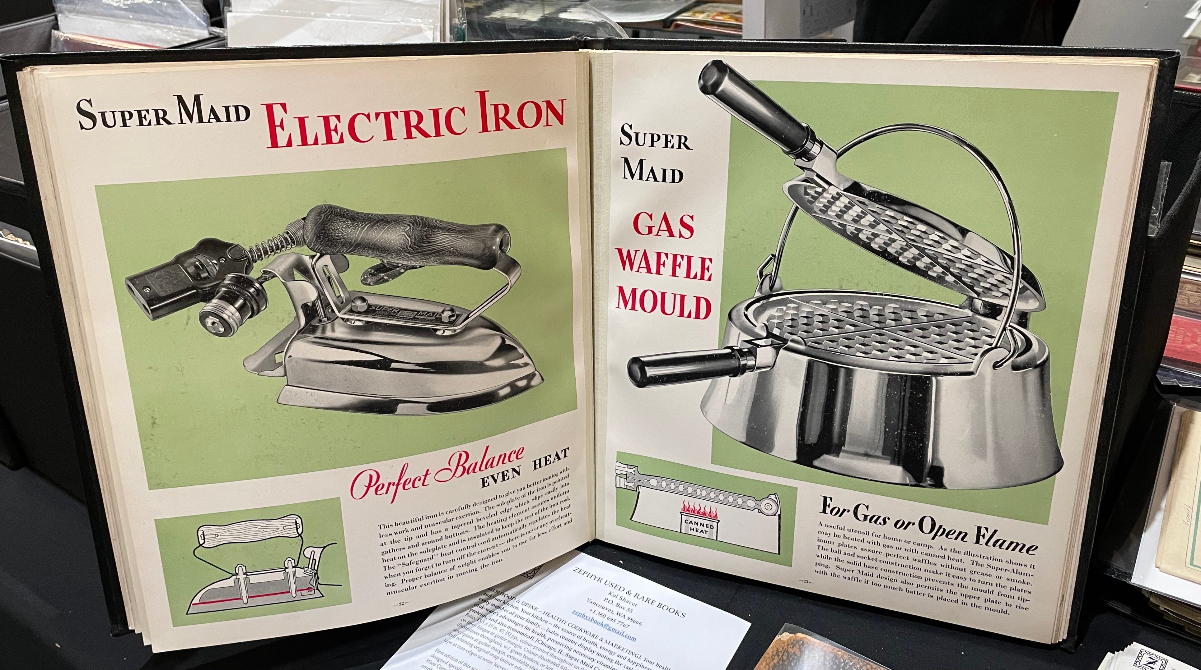
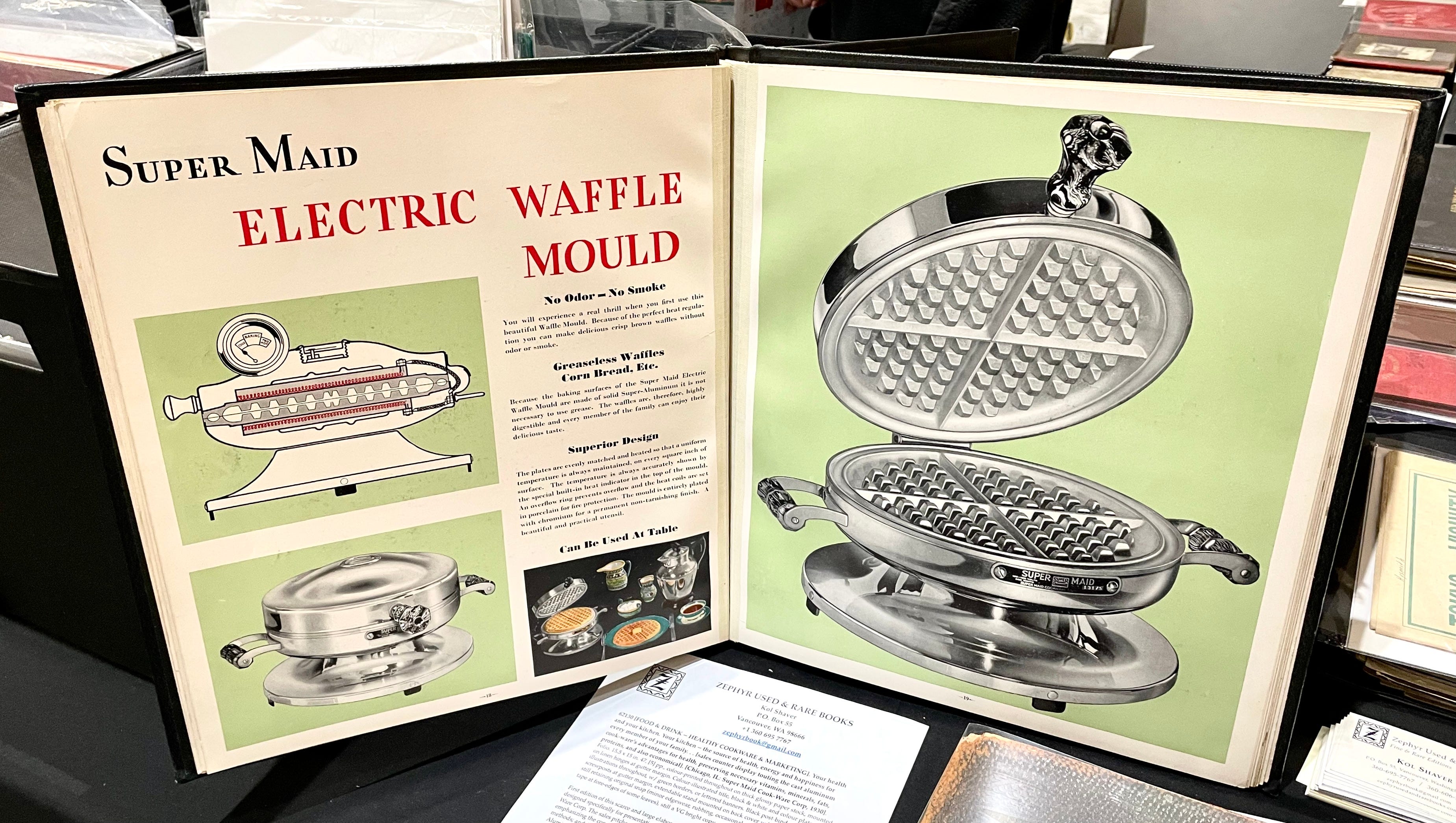
Your Health and Your Kitchen Catalog
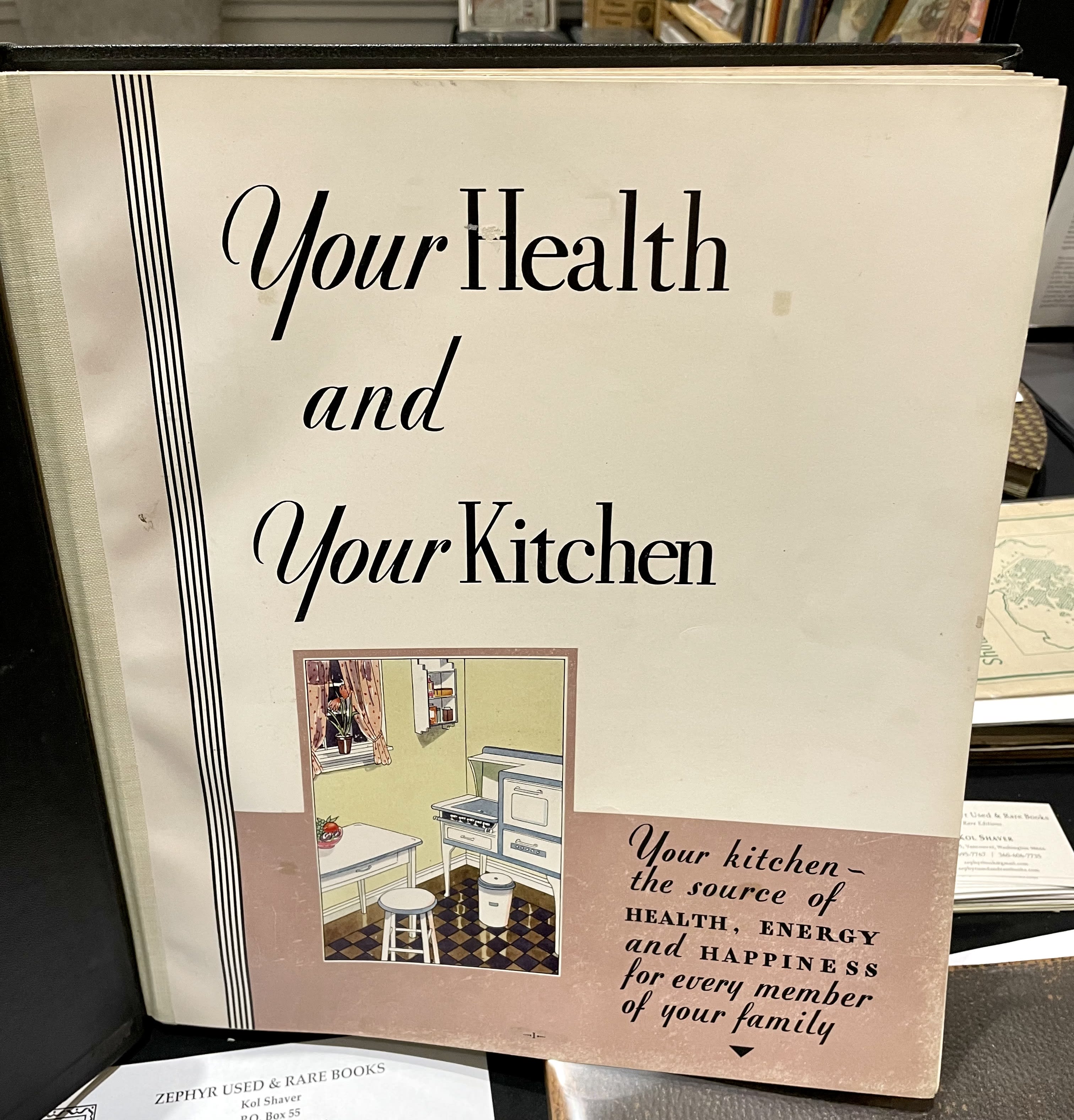
This was a promotional book/catalog produced by the Chicago-based Super Maid Cook-Ware Corporation in 1930. It features magnificent renderings of the company’s product line, including several different waffle irons (which, interestingly, were called waffle moulds):


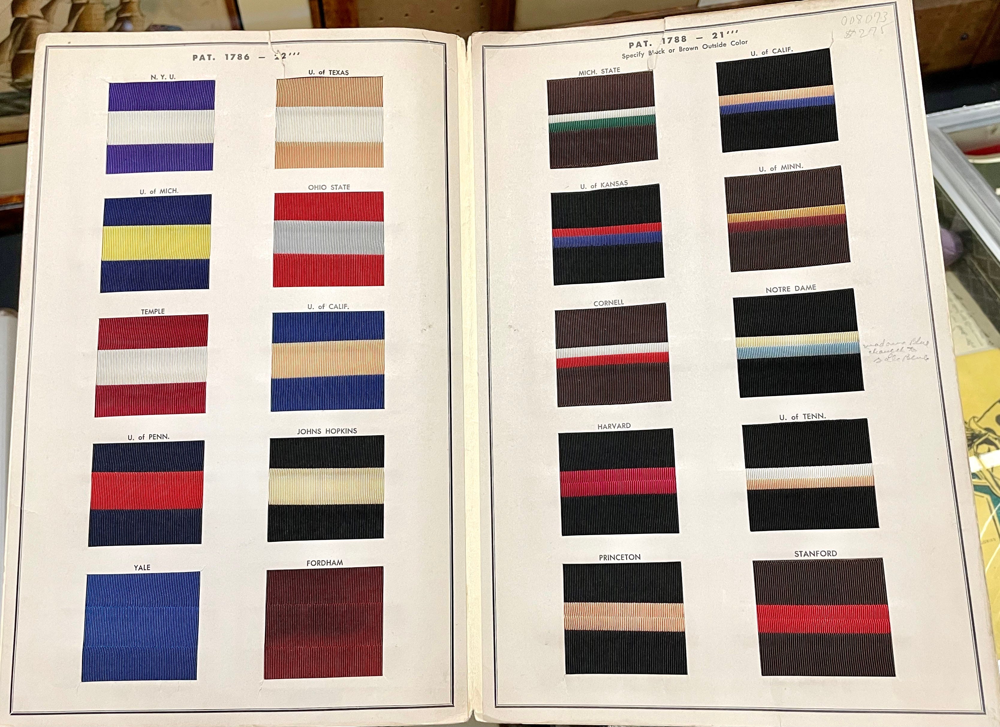
College-Themed Hat Band Sample Brochure
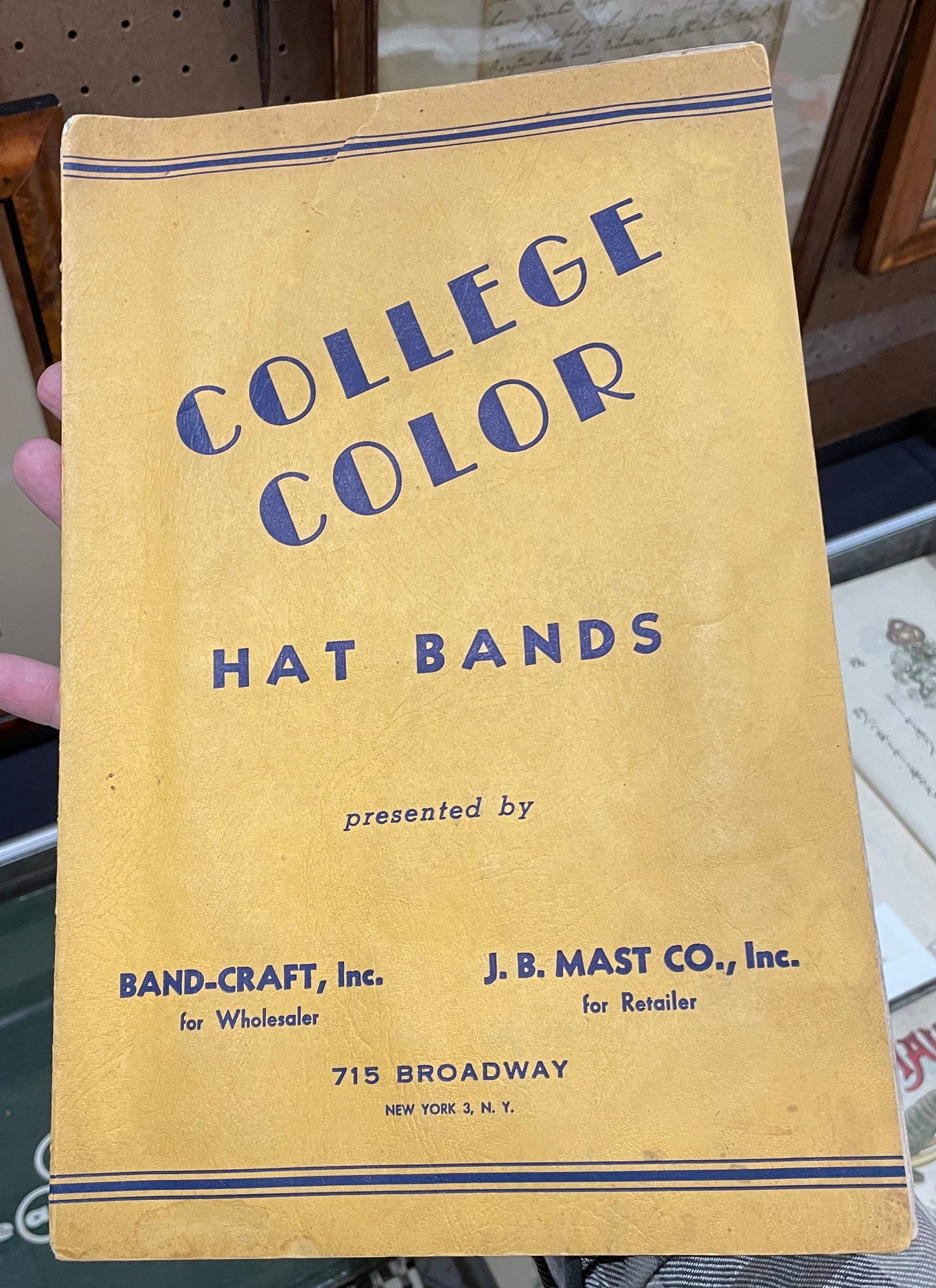
In all my years of writing about sports uniforms, I never came across anything like this 1910 sample brochure featuring hat band swatches rendered in the colors of major colleges. When you open it up, here’s what you see:
Milton Bradley Construction Paper Sample Catalog
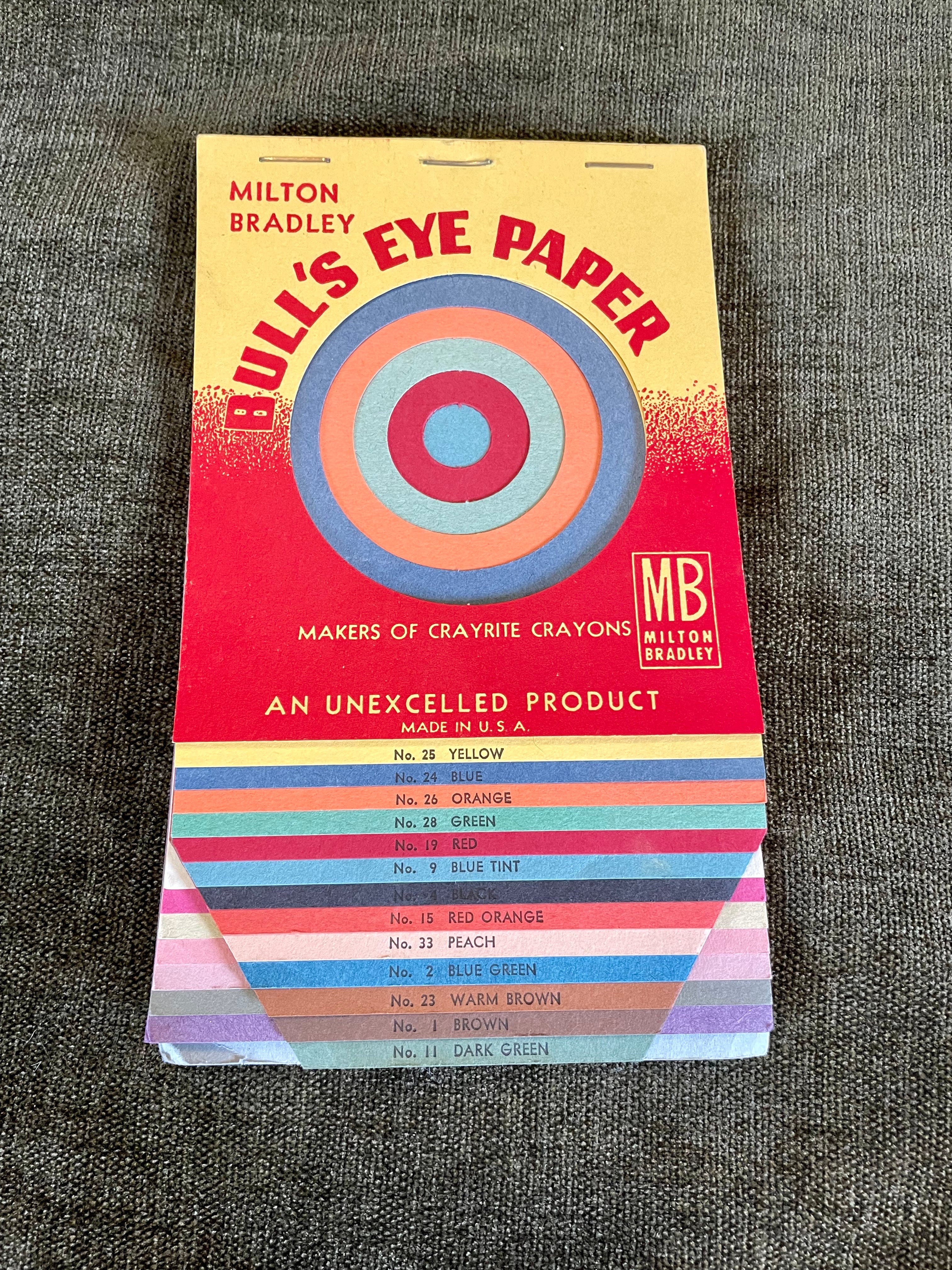
Most of us know Milton Bradley as a board game manufacturer, but the company also used to make school supplies, including construction paper. Paper catalogs are often quite beautiful and appealing, but this one is unusually nice because of all the die cuts. I liked it so much that I even shot a little video of it, which really shows off how special it is:
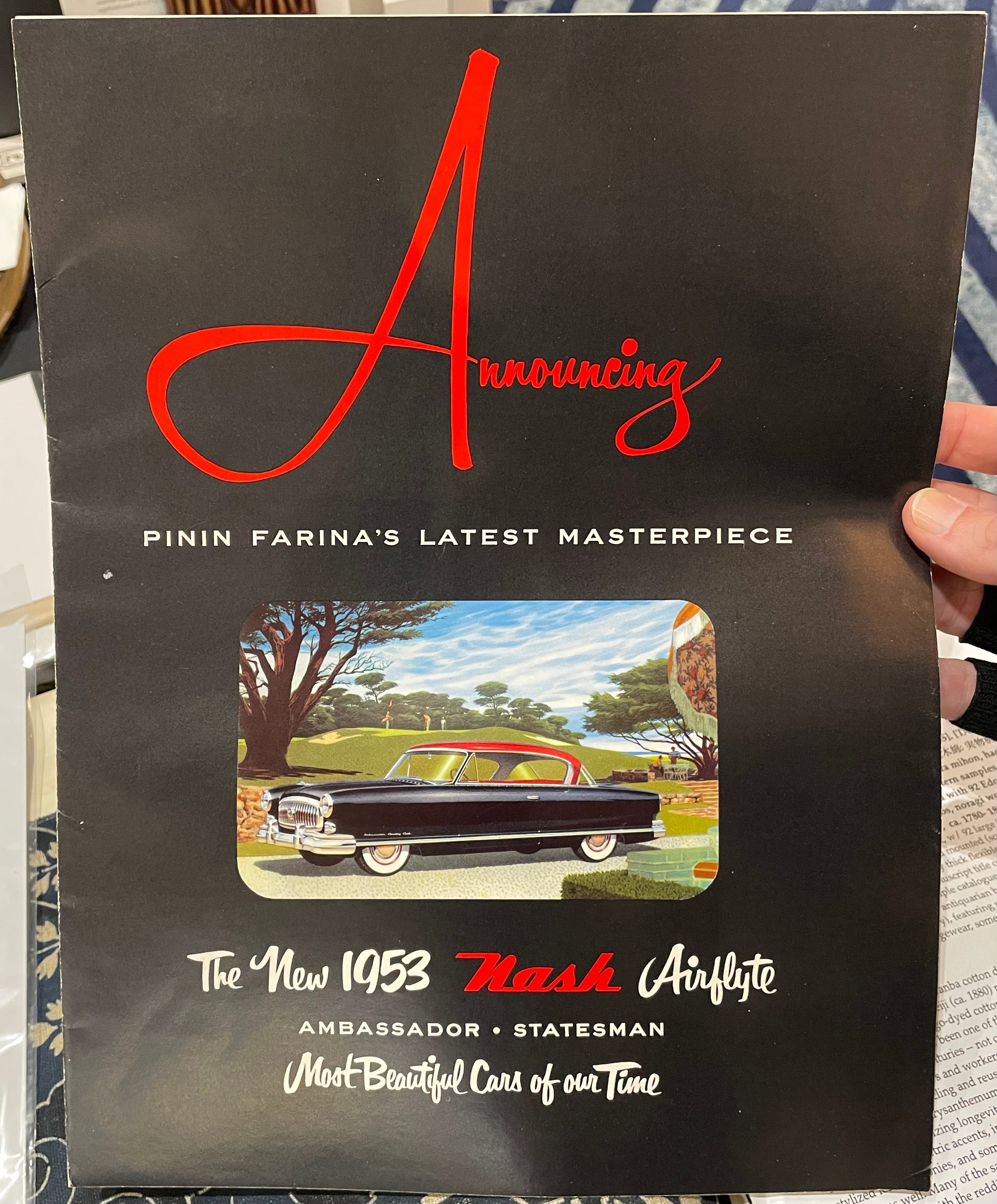
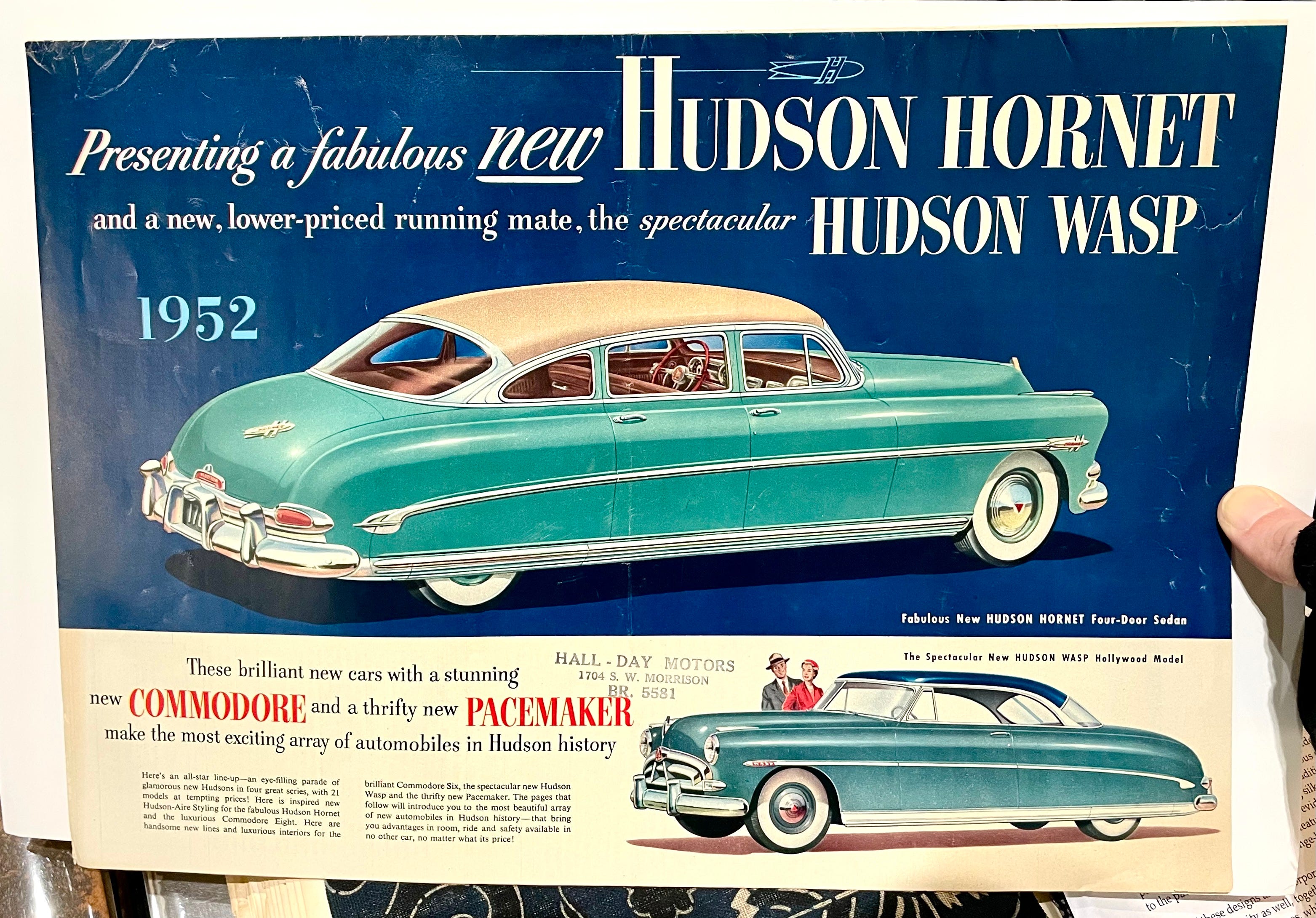
Car Ads
I’m not a big car guy, but this one dealer had lots of very nice vintage promotional brochures and print ads from auto manufacturers. I apparently photographed only two of them (I thought I’d shot more), but they’re both really nice:
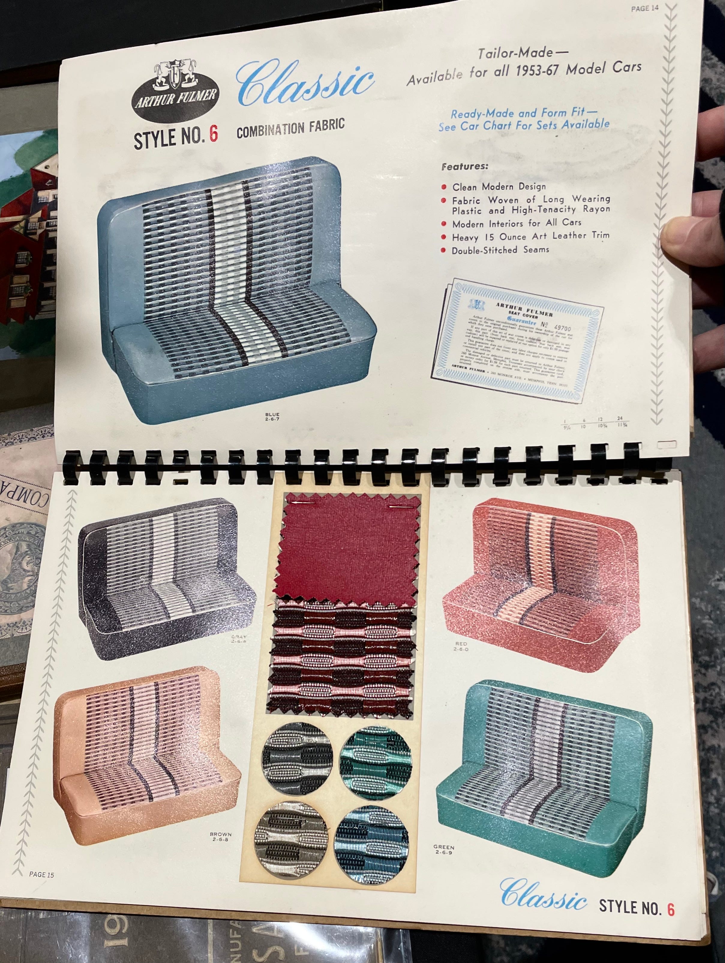
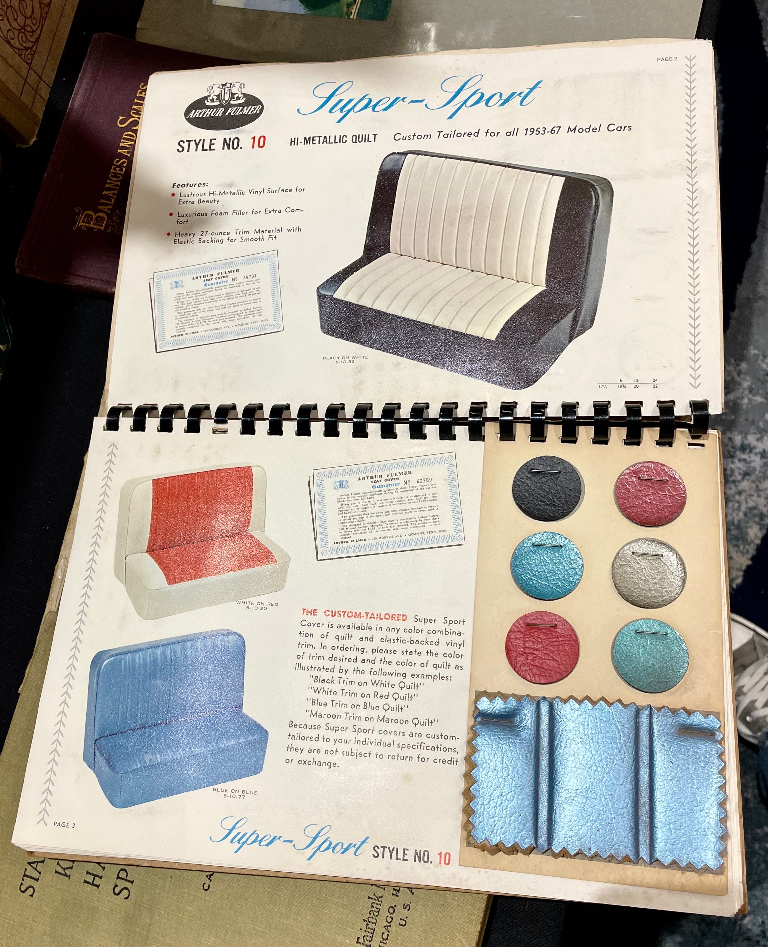
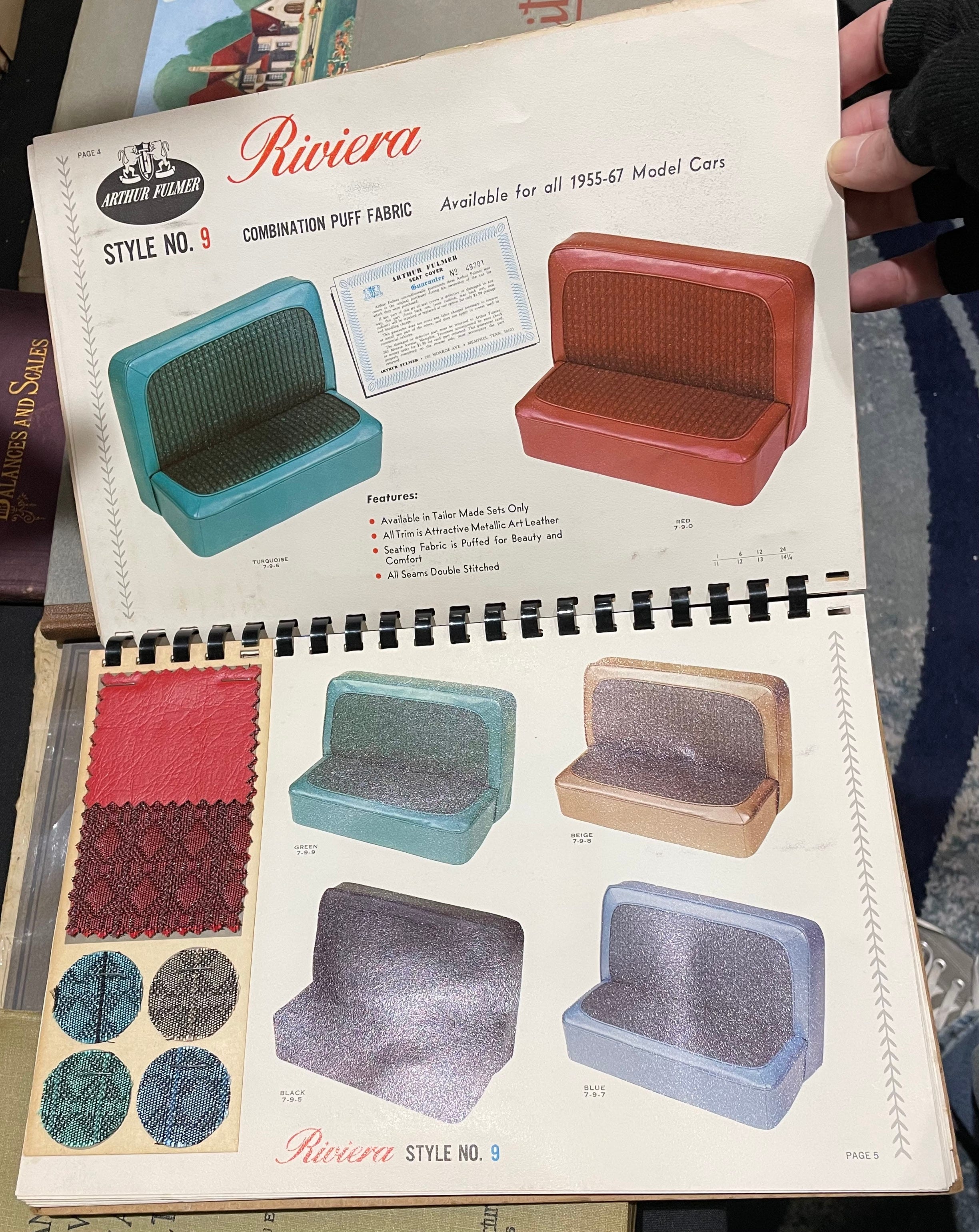
Car Upholstery Sample Catalog
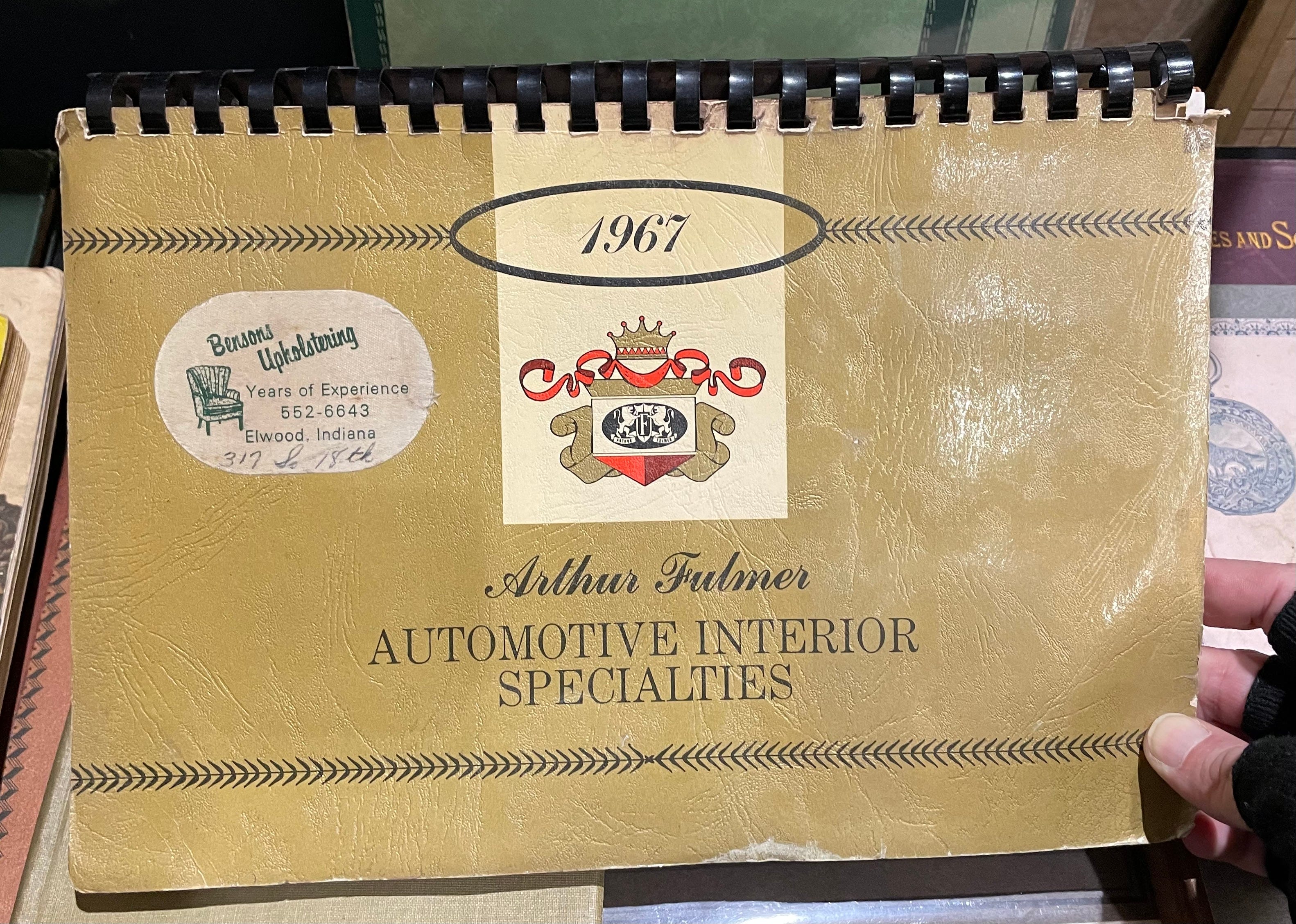
Did I mention that I’m not much of a car guy? But I’m a sucker for a good midcentury sample catalog, and this one definitely delivers:

Preparation H Ad Placard
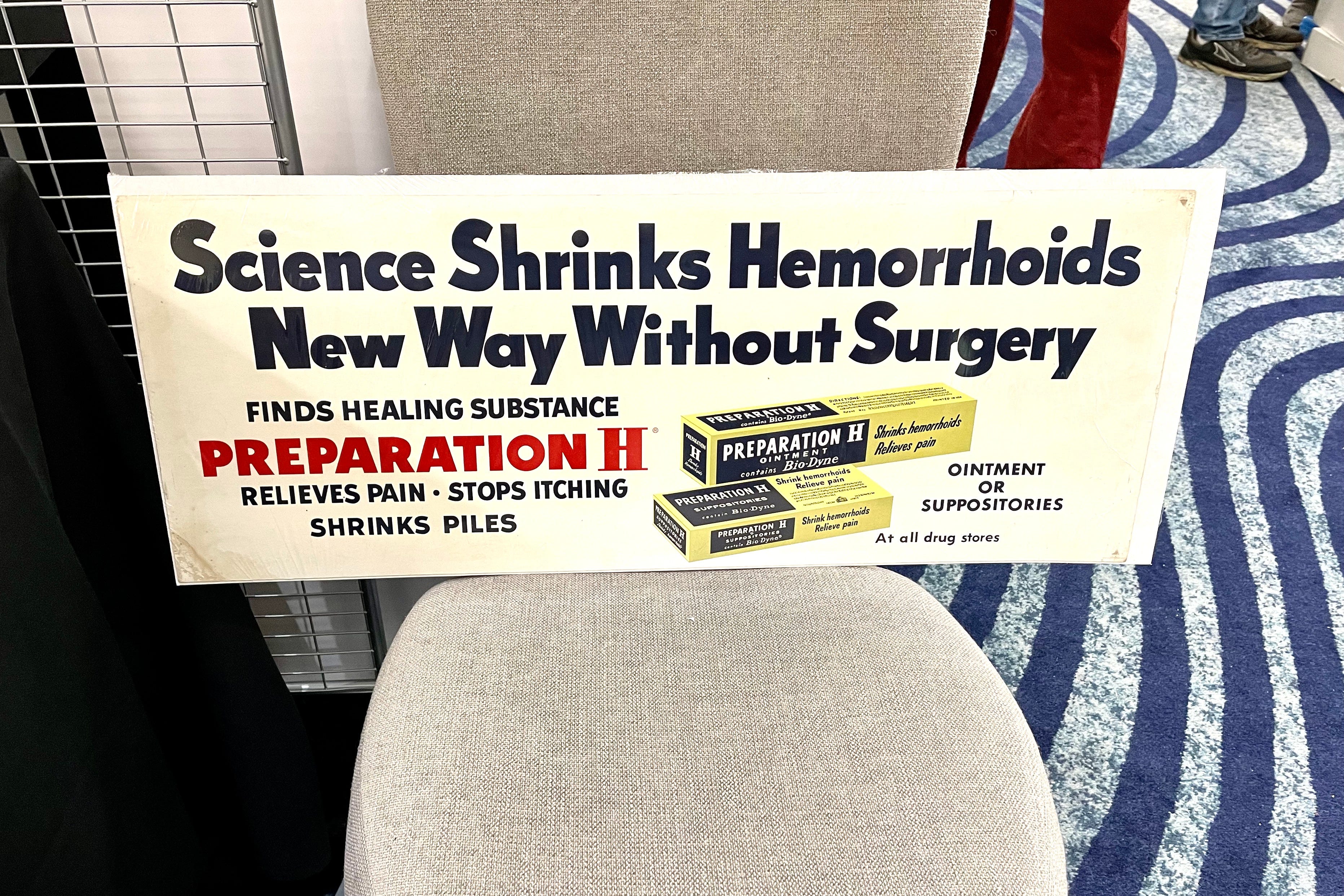
There were surprisingly few display ads available at the Fair. One exception was this magnificent Preparation H ad. I love the phrasing (“Shrinks Piles”) and the overall design. Also, any mention of suppositories always makes me think of this classic scene from The Poseidon Adventure:
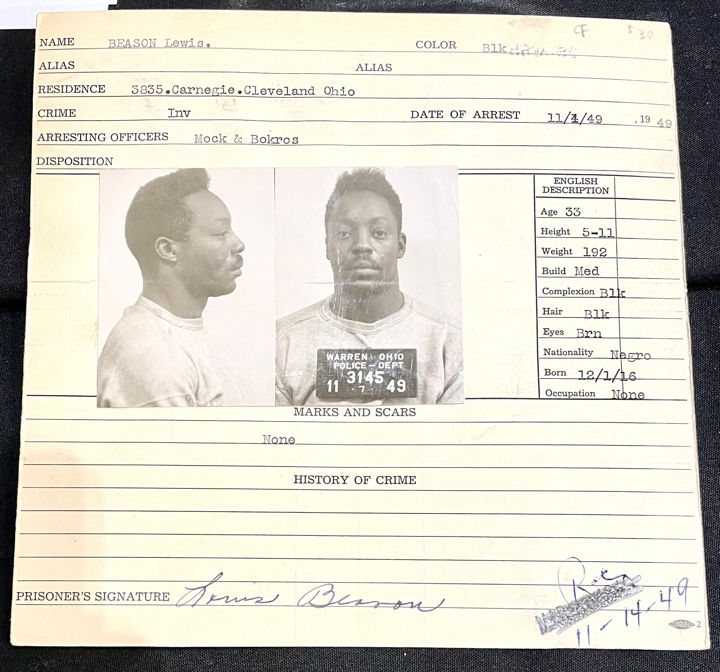
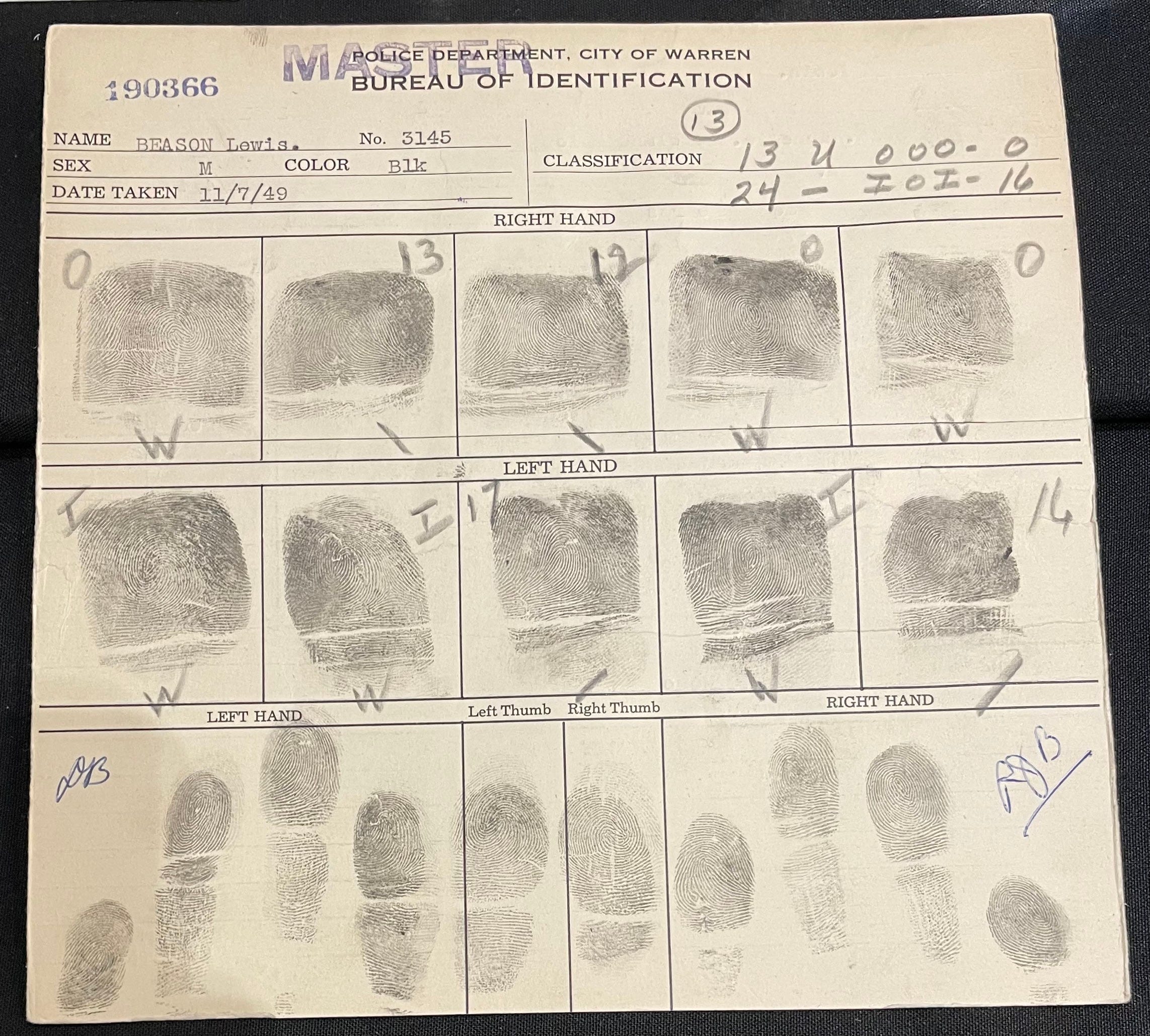
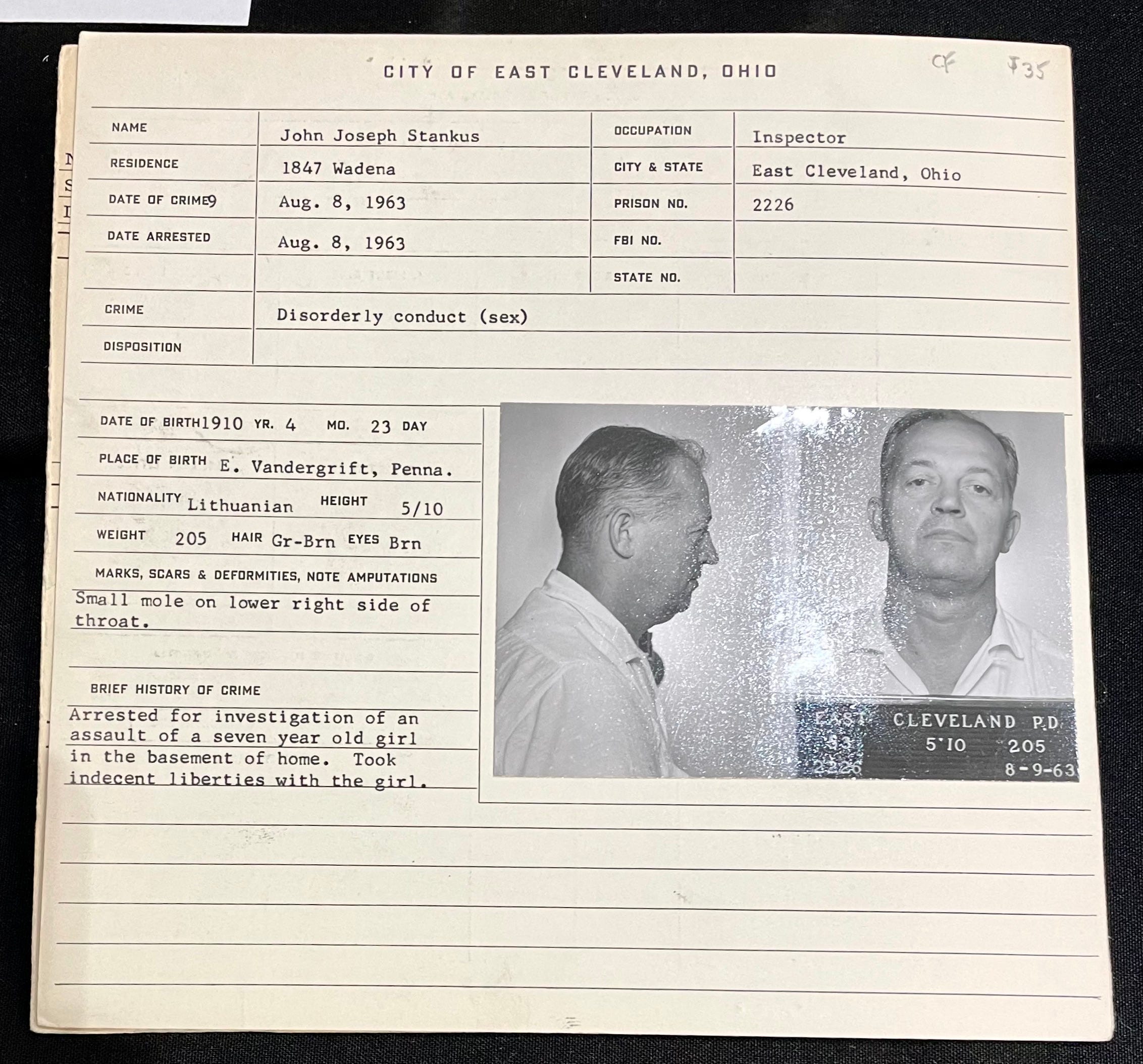
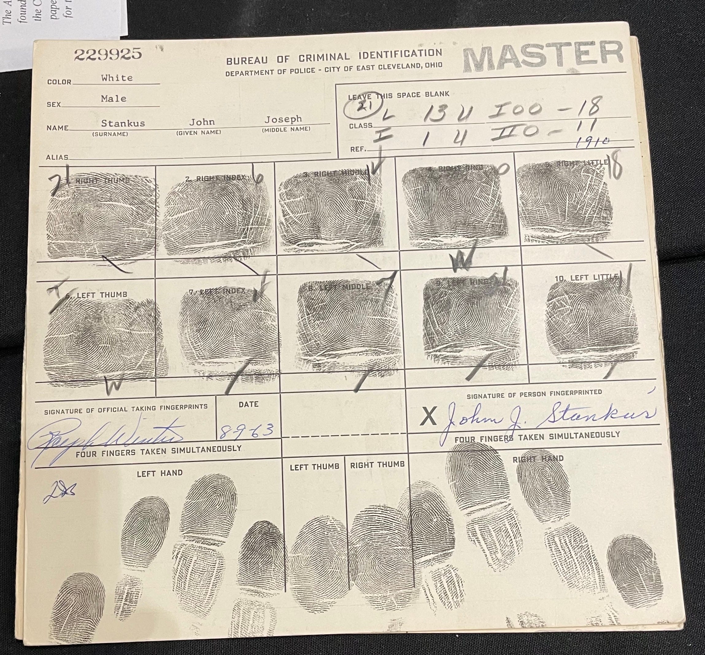
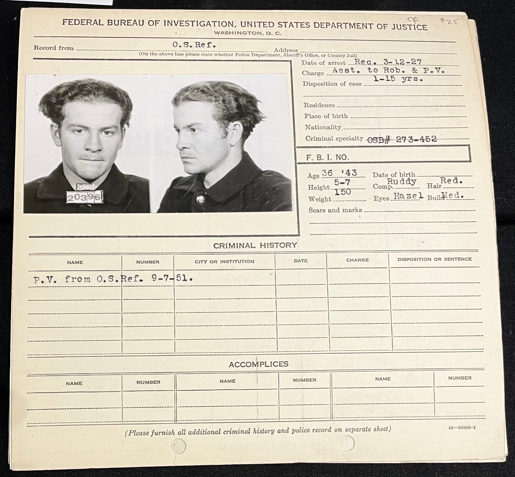
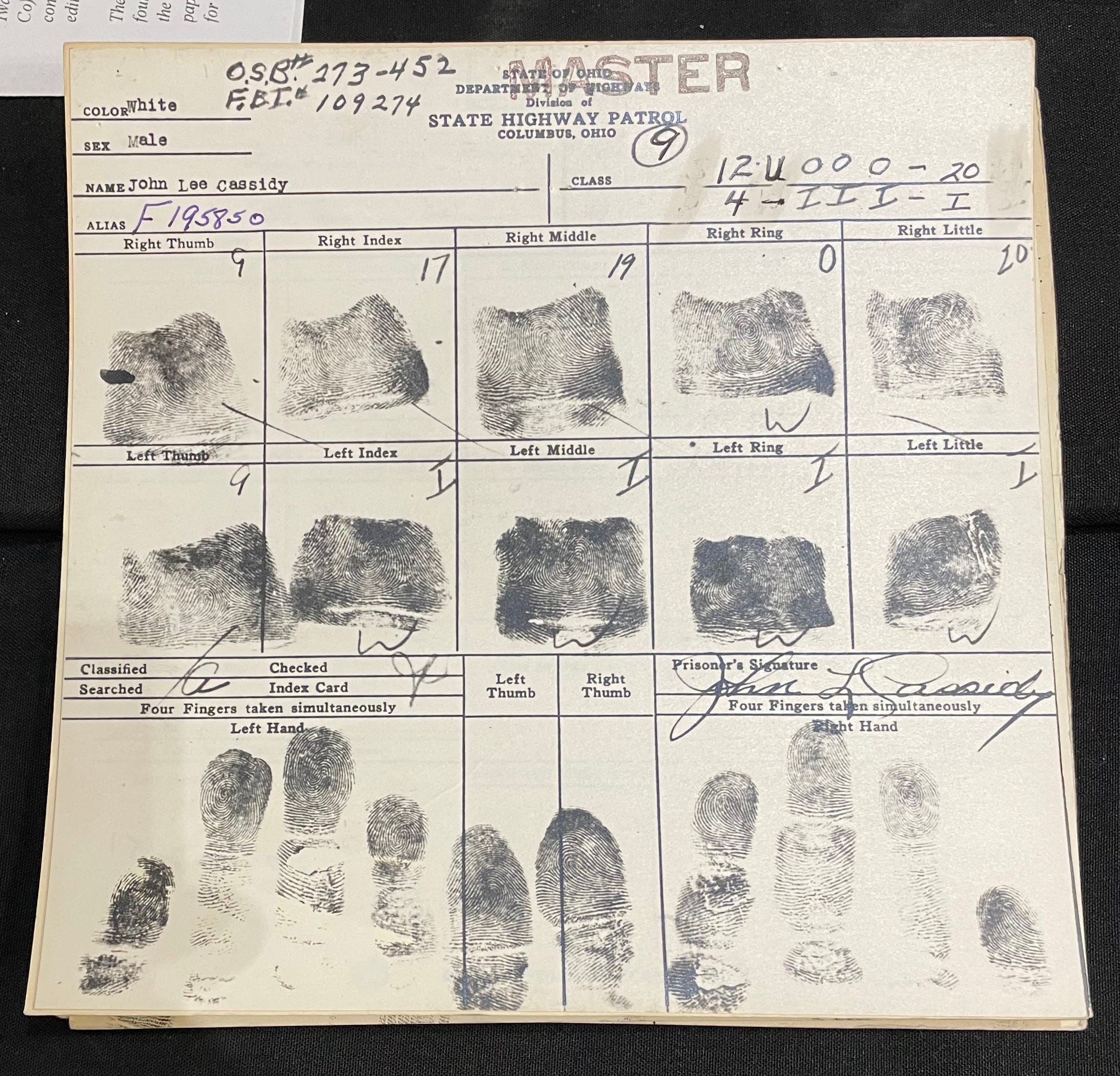
Police Mug Shots
Back in 2019, I wrote an article about a guy who collects old police mug shots. That guy would’ve loved these. In each case, the front of the card is followed by the fingerprints on the back:
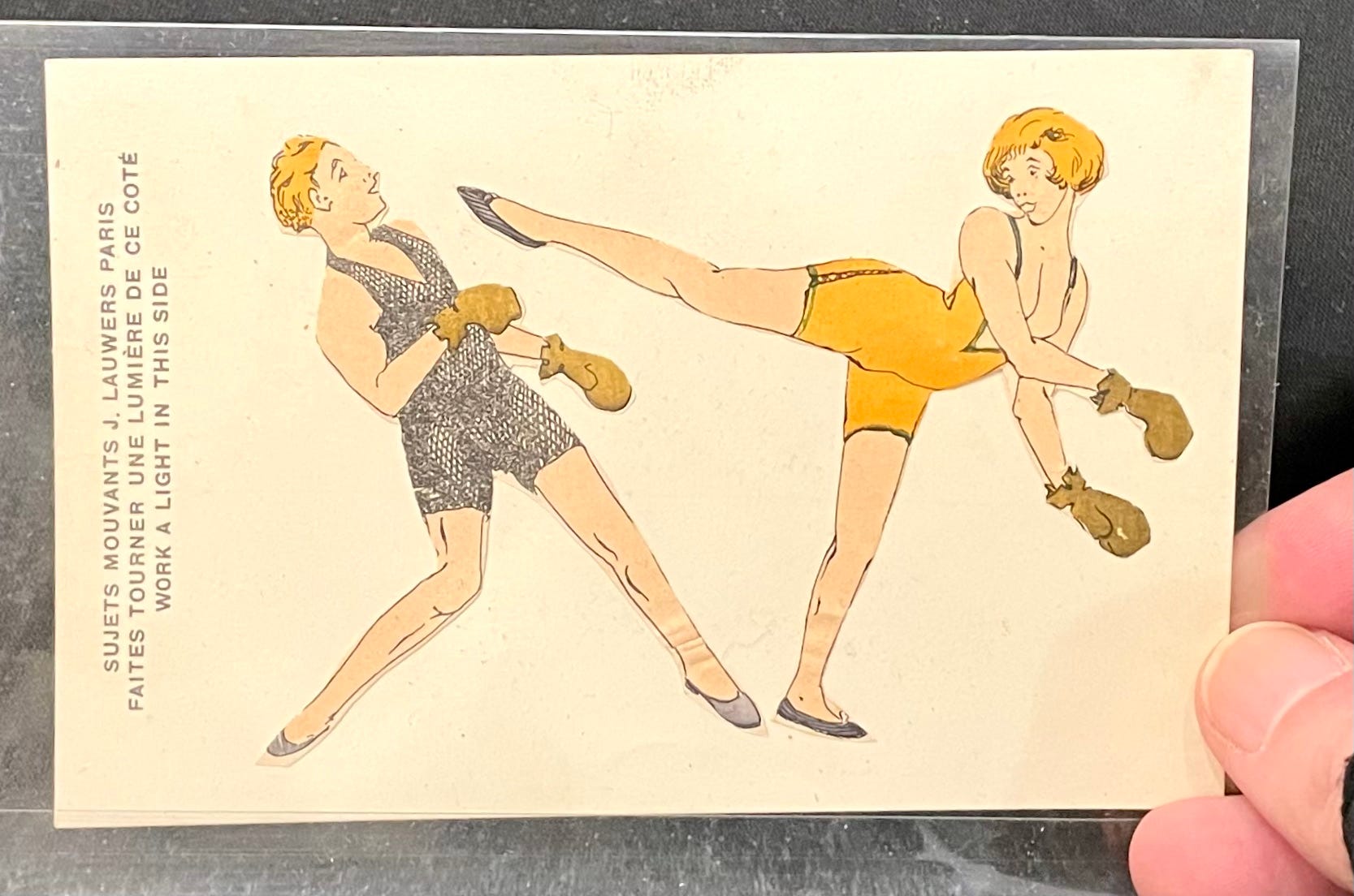
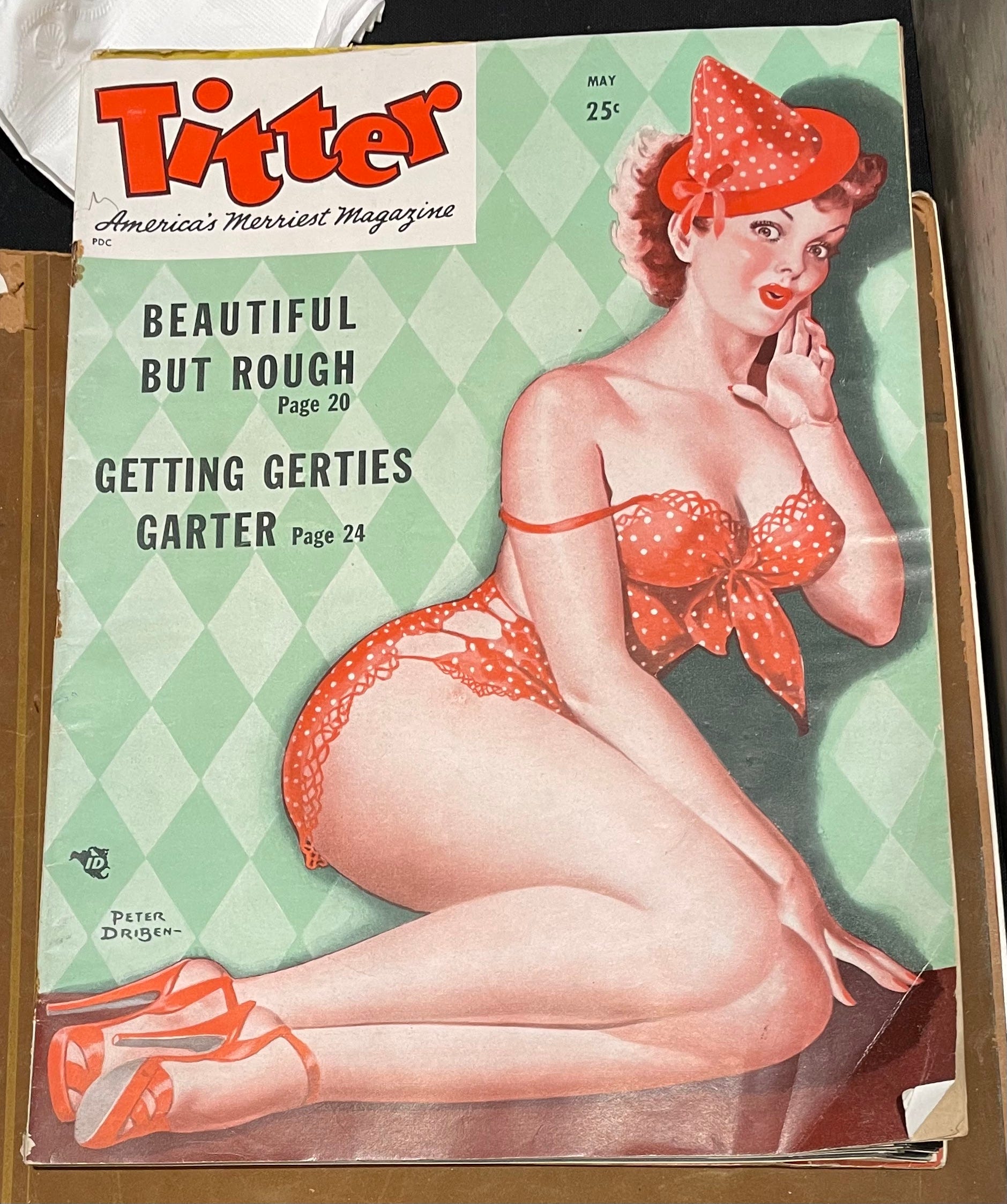
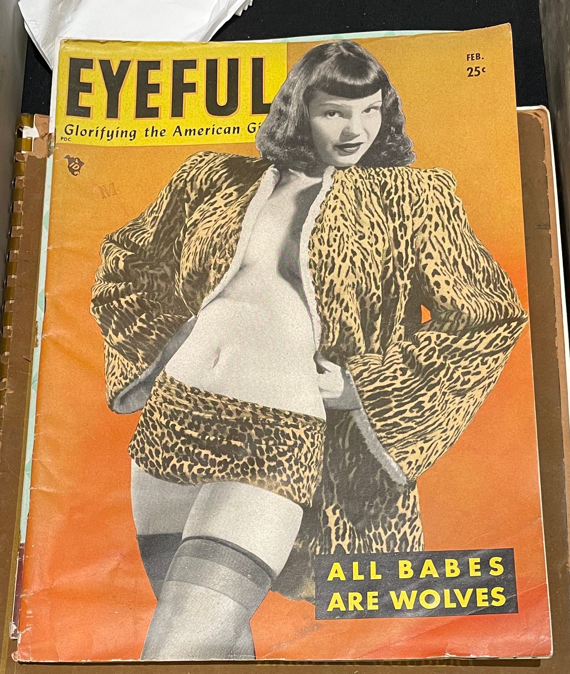
Cheesecake
There was a decent amount of risqué material, although nothing too salacious. Here are a few such items that I photographed:
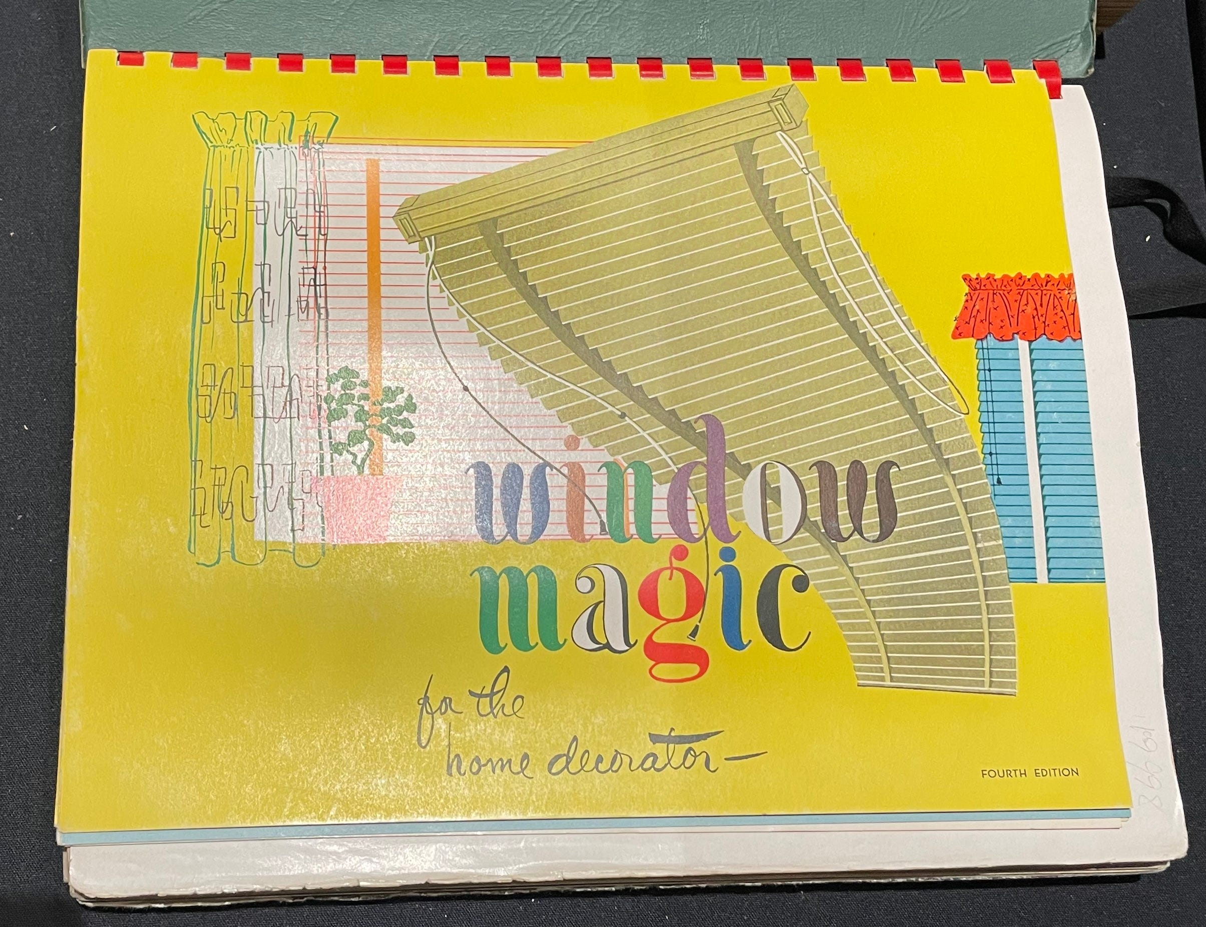
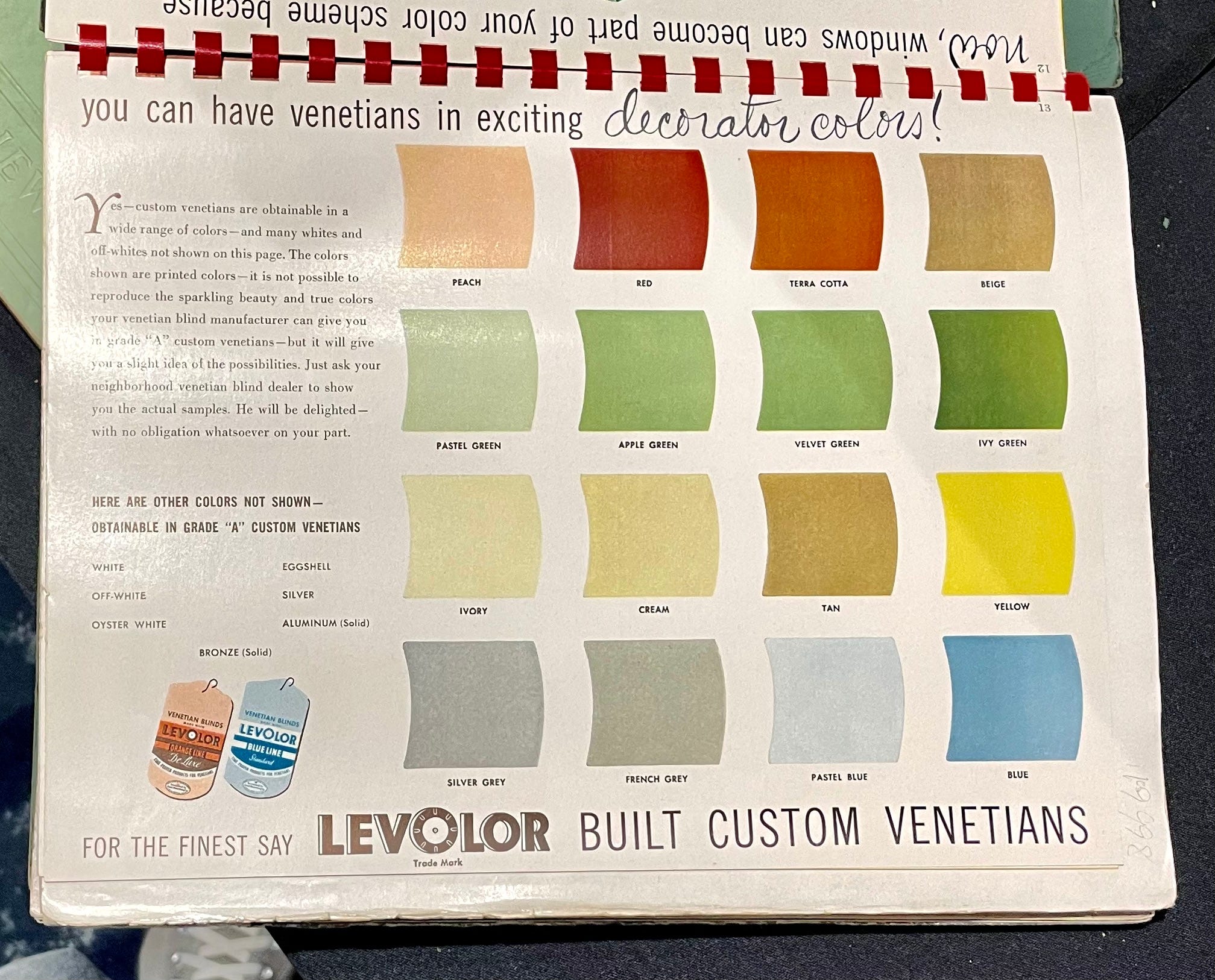
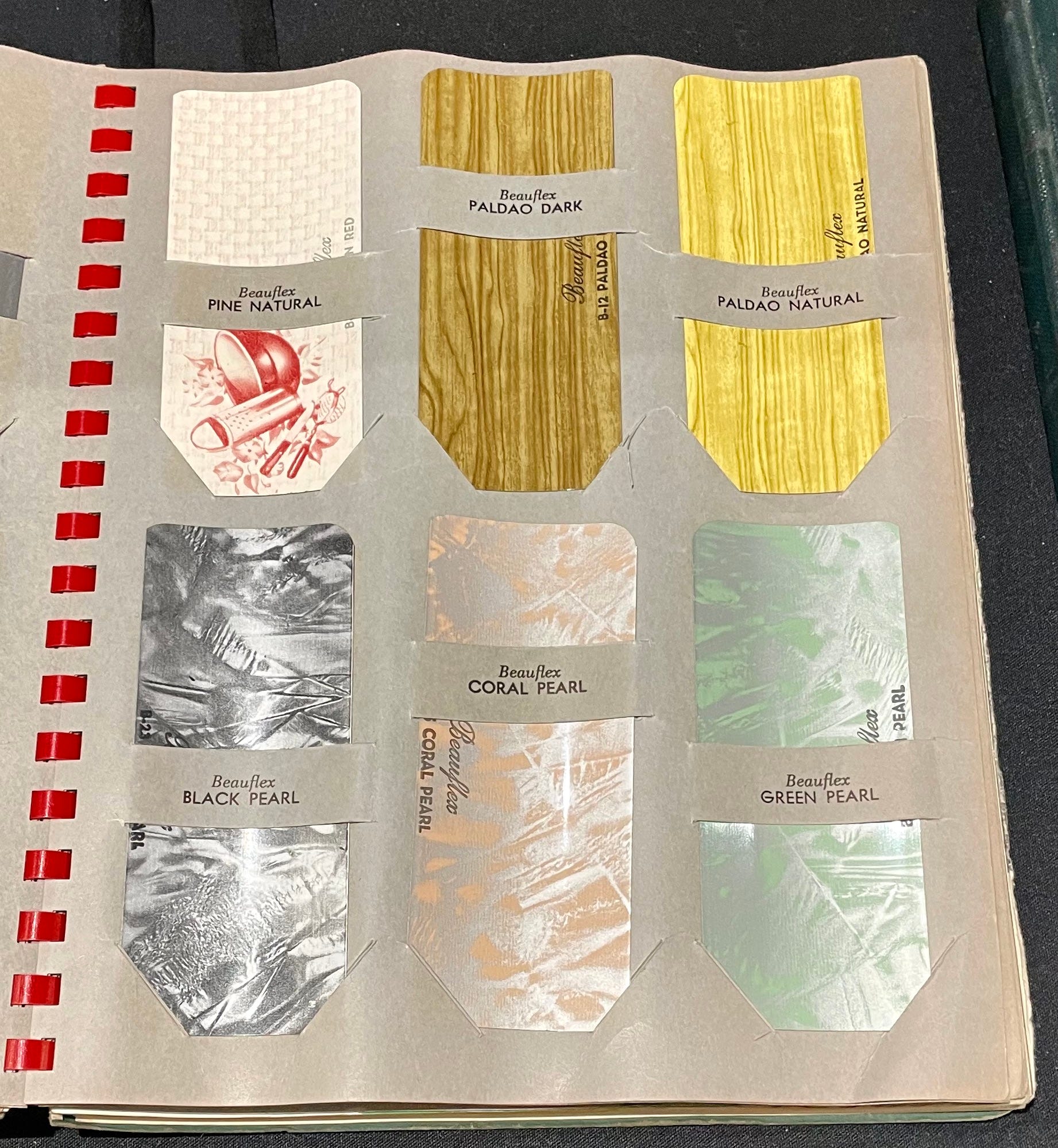
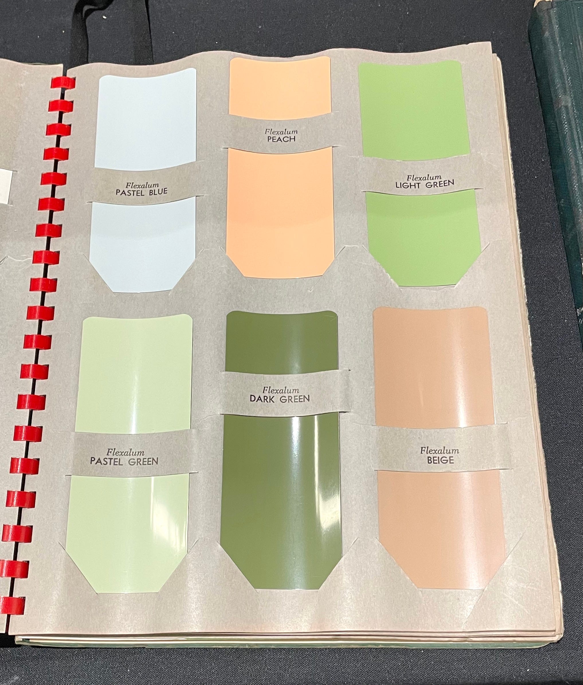
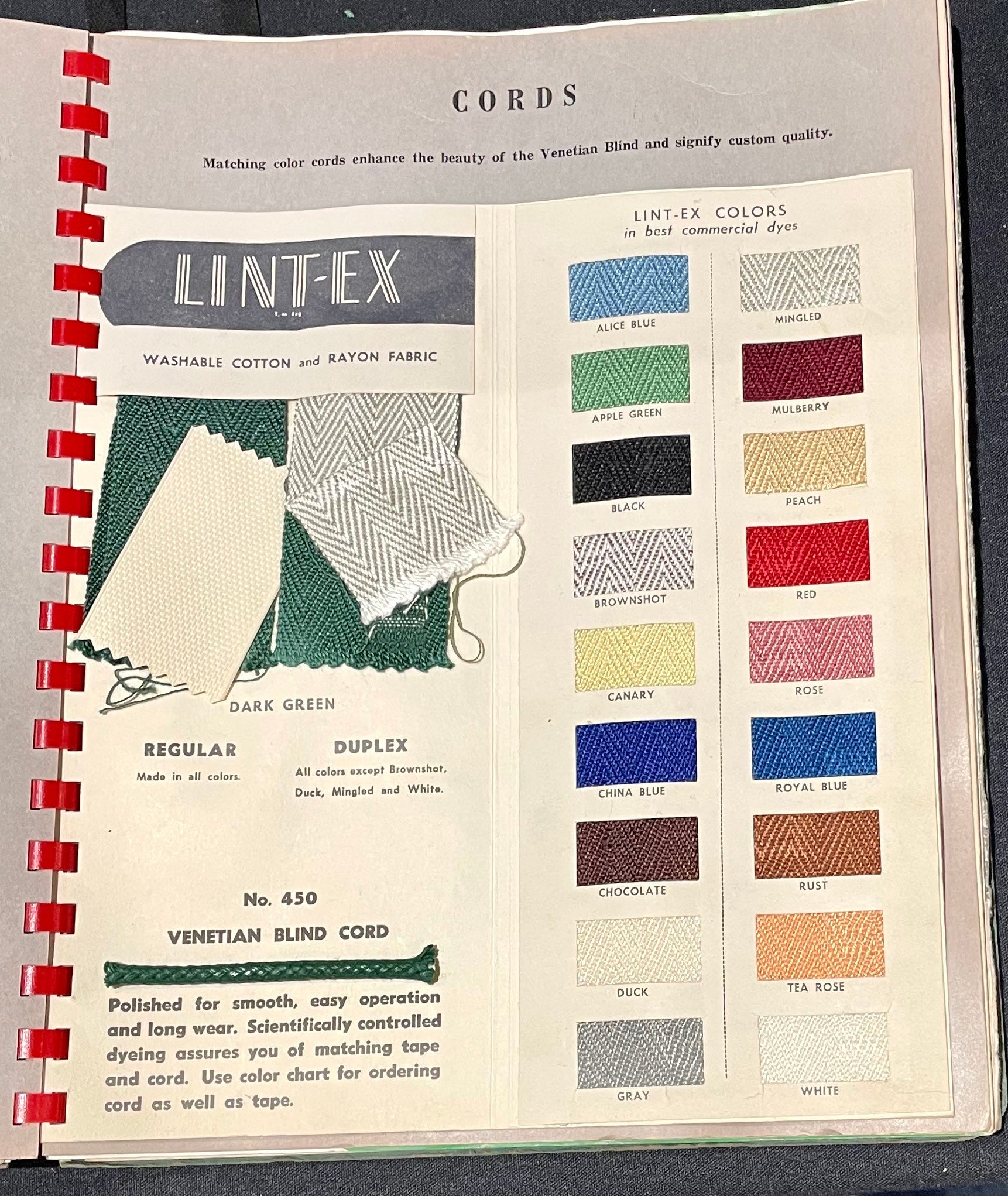
M.C. Weeks Venetian Blinds Sample Catalog
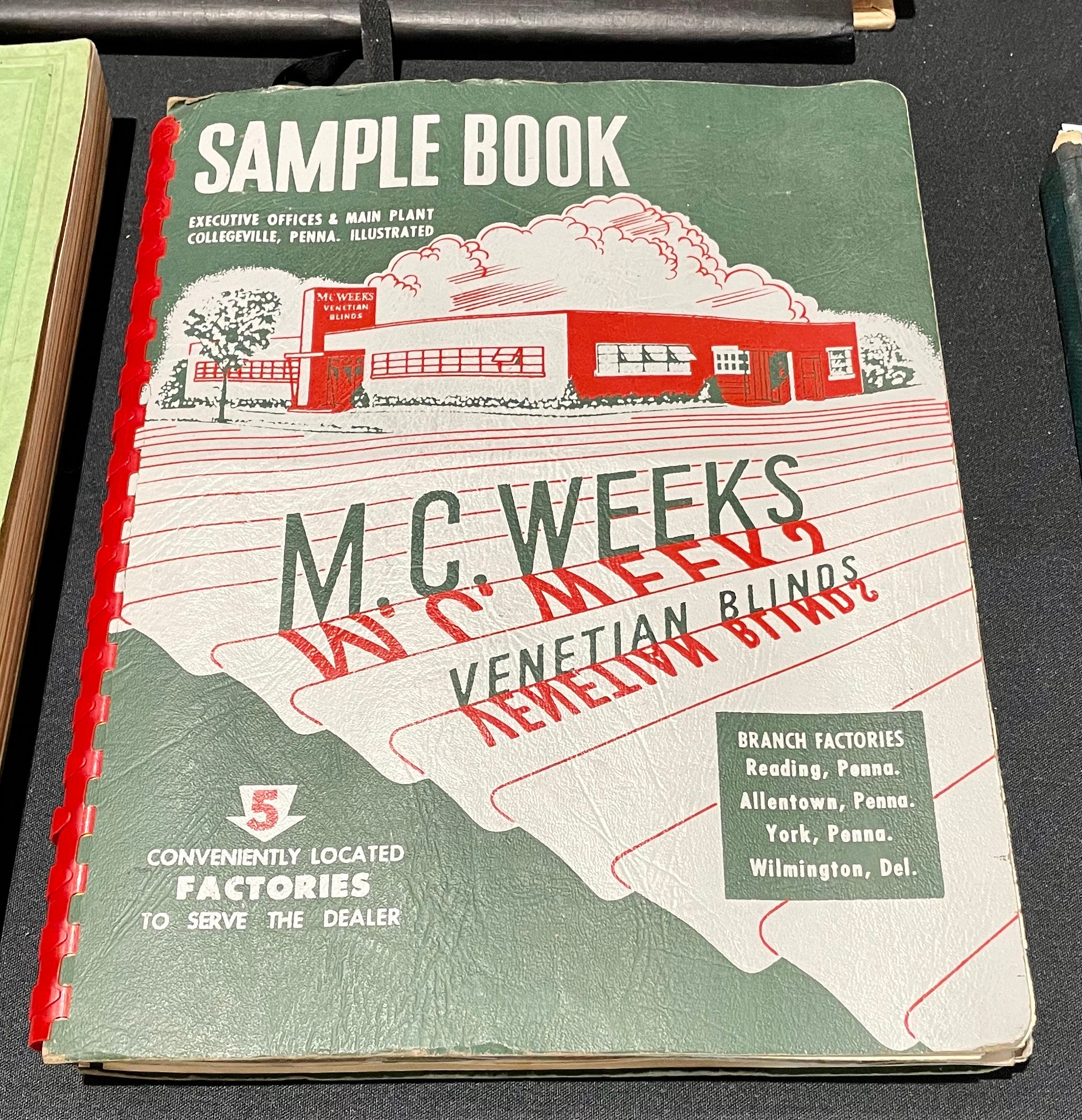
My parents sold venetian blinds, among other home furnishings, but I don’t recall them having any promotional materials as cool as this catalog. It is so up my alley! Here are some of the interior pages:
Cricket Team Photo from Lunatic Asylum
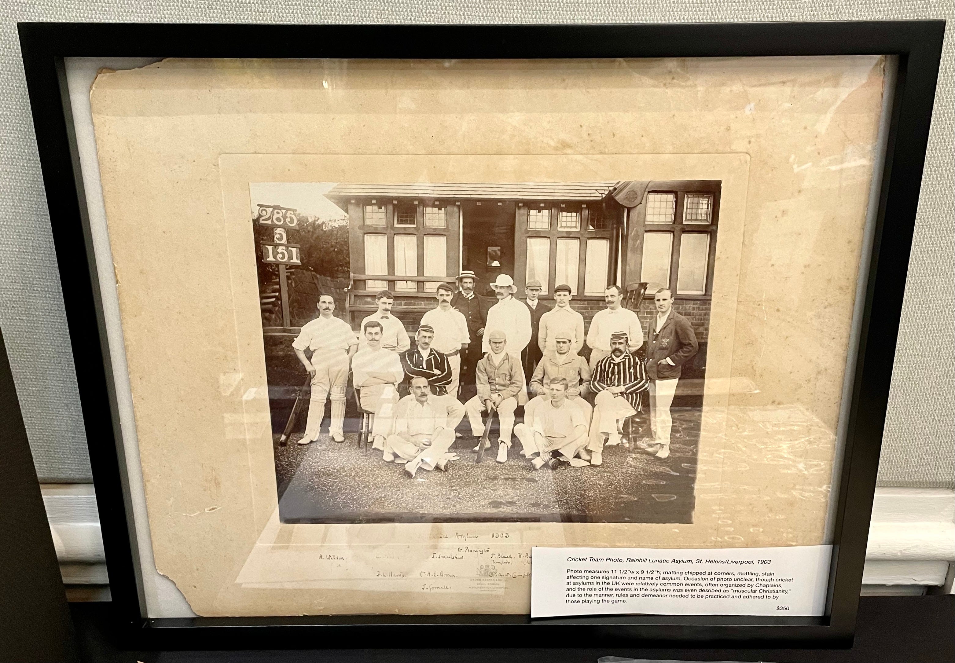
This photo was taken at a British mental health facility in 1903. According to the dealer’s note:
Occasion of photo unclear, though cricket at asylums in the UK [was] relatively common, often organized by Chaplains, and the role of the events at the asylums was even described as “muscular Christianity,” due to the manner, rules, and demeanor needed to be practiced and adhered to by those playing the game.
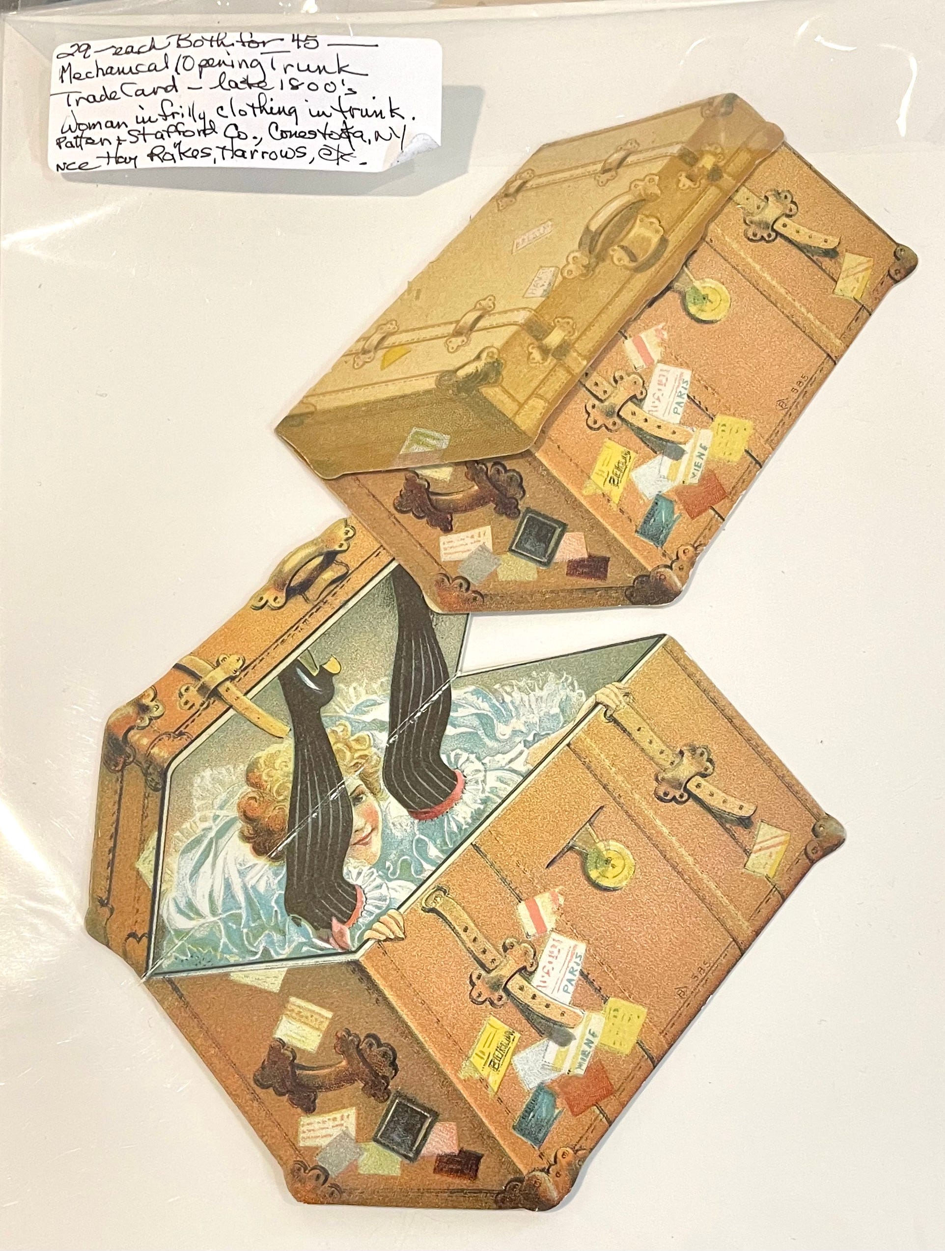
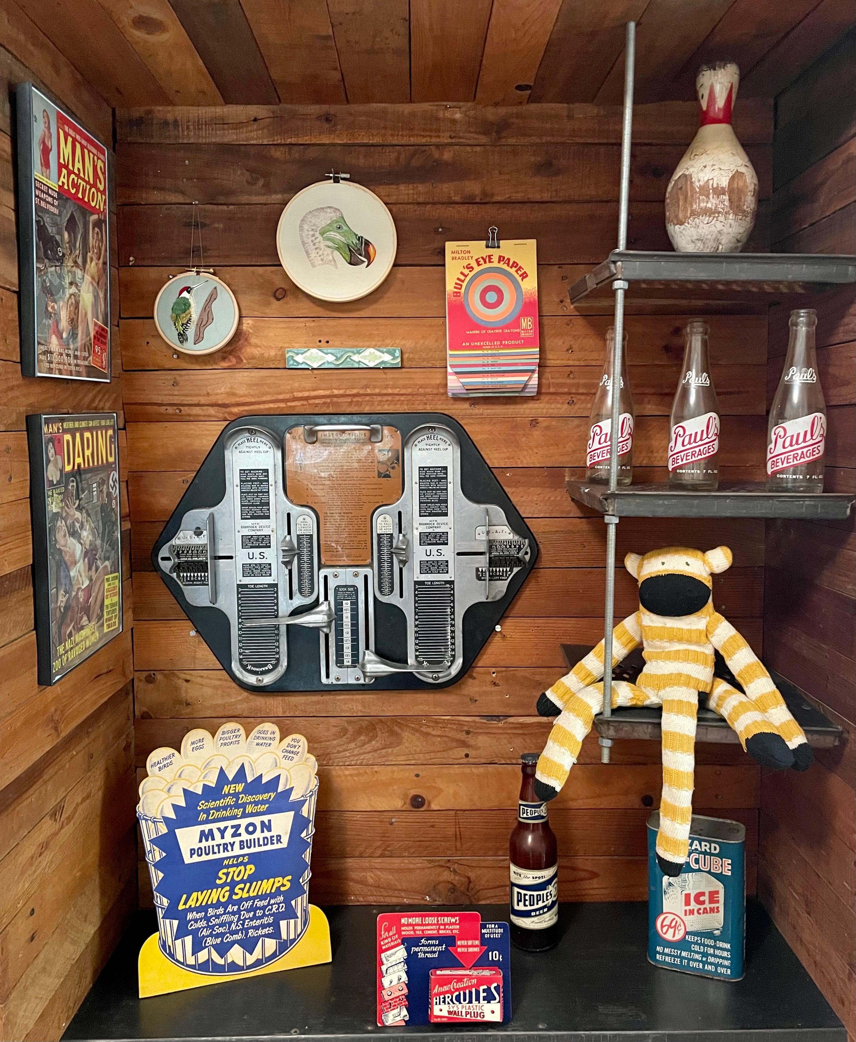
Miscellaneous Items of Interest
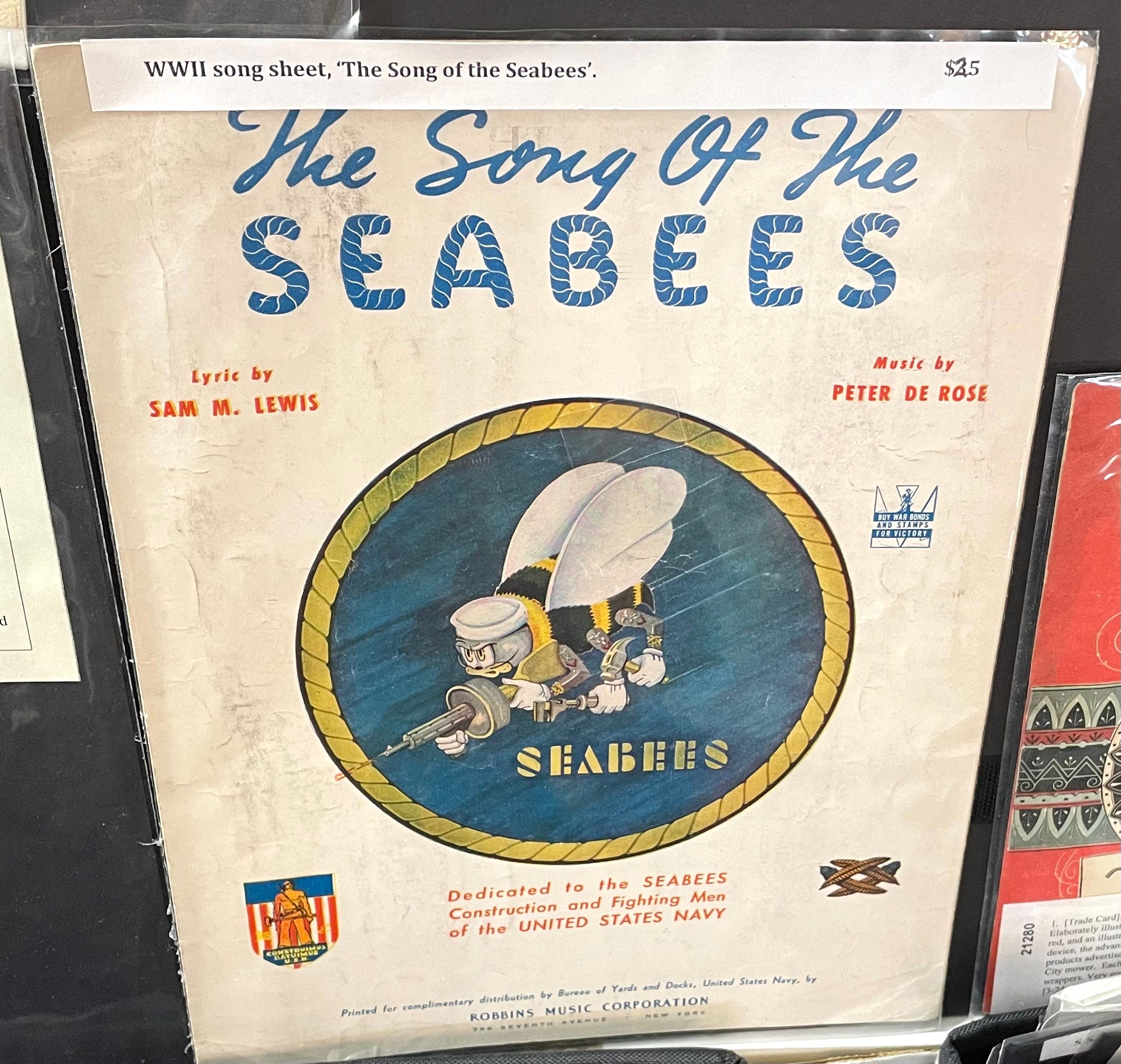
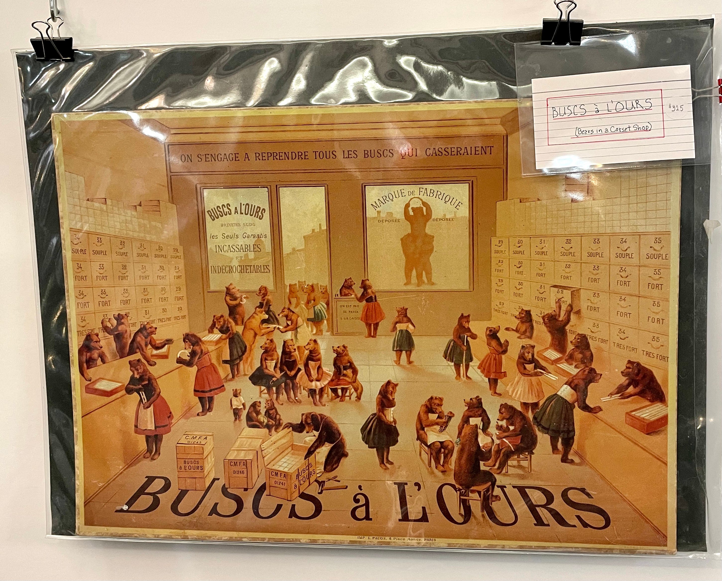
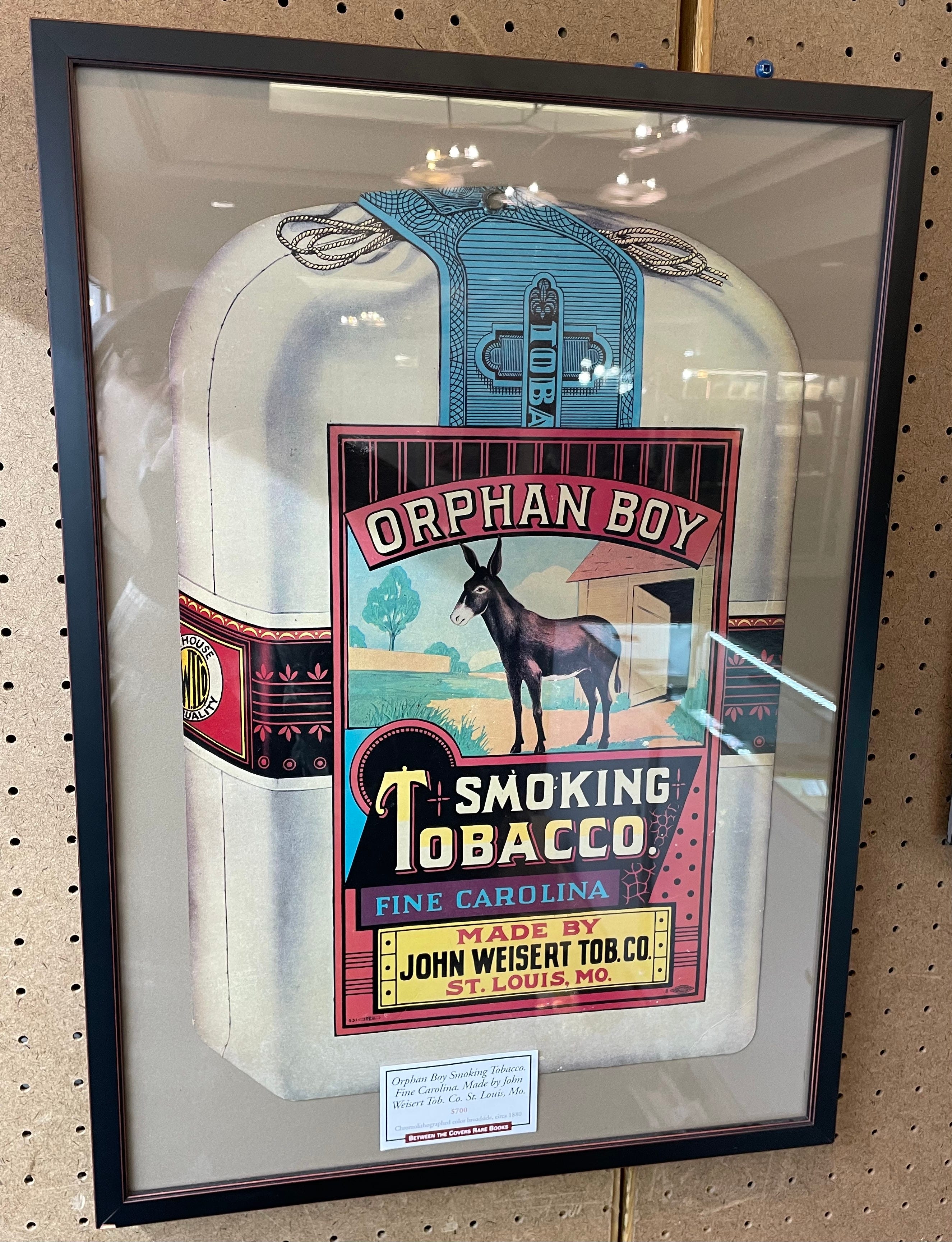
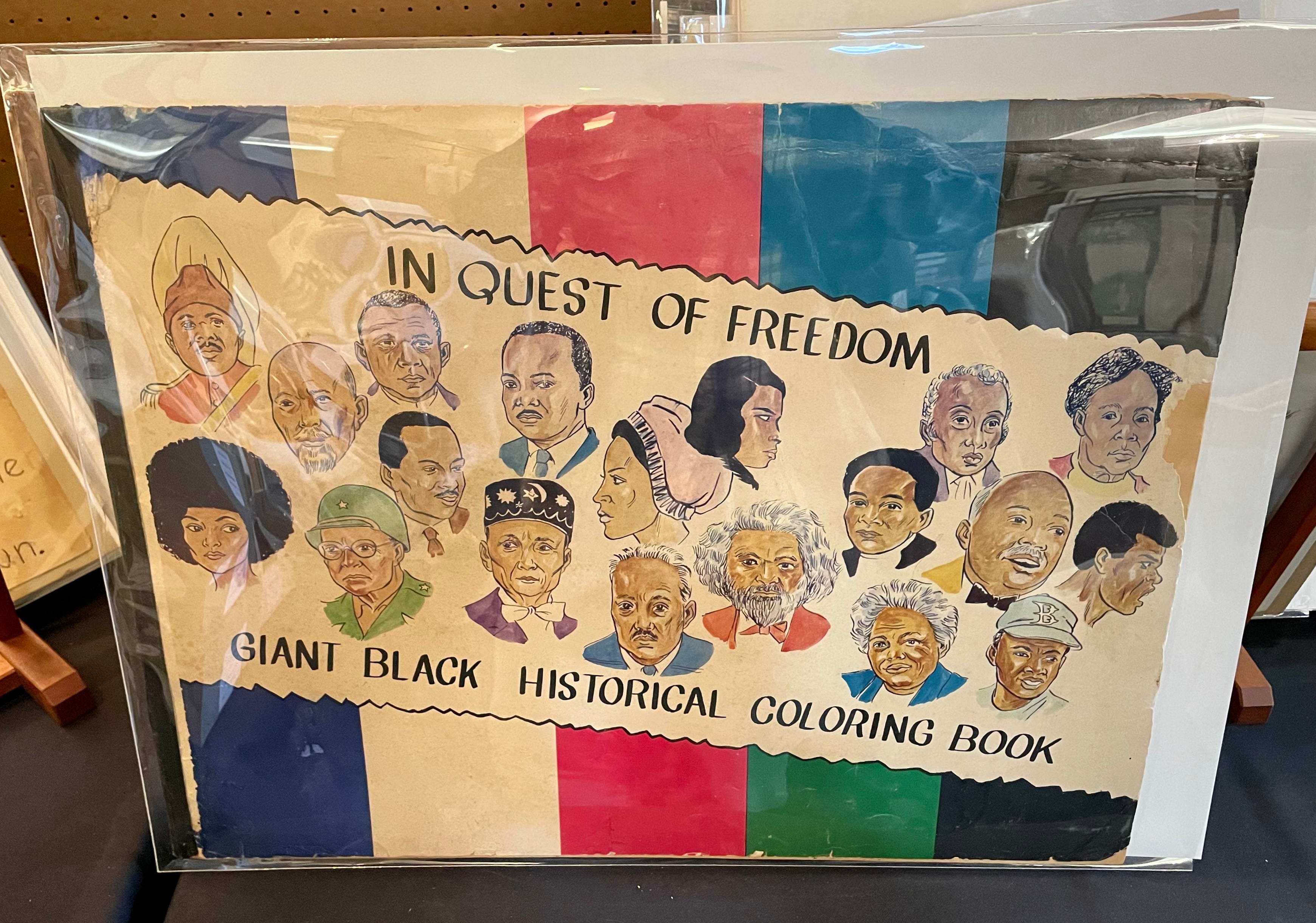
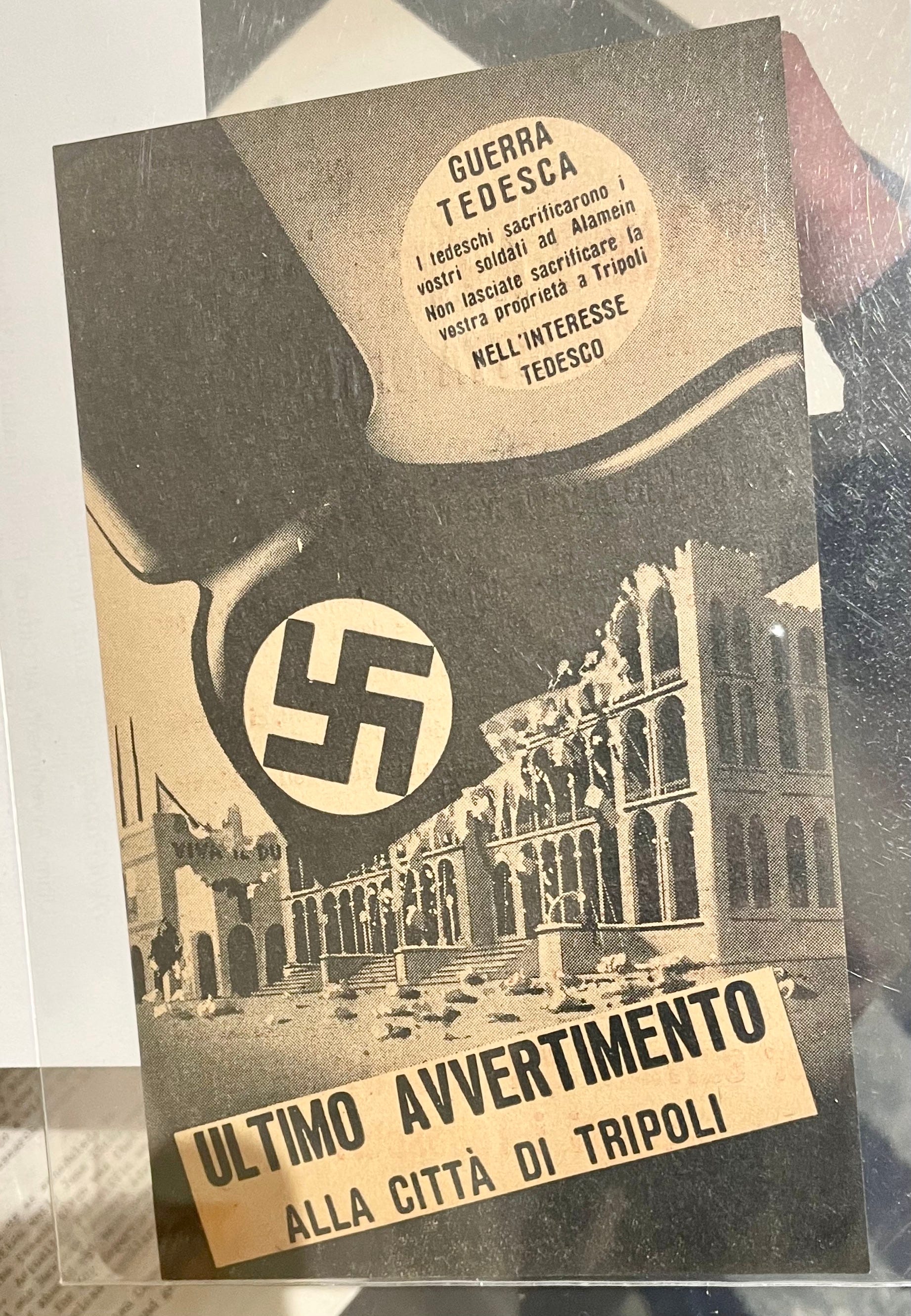
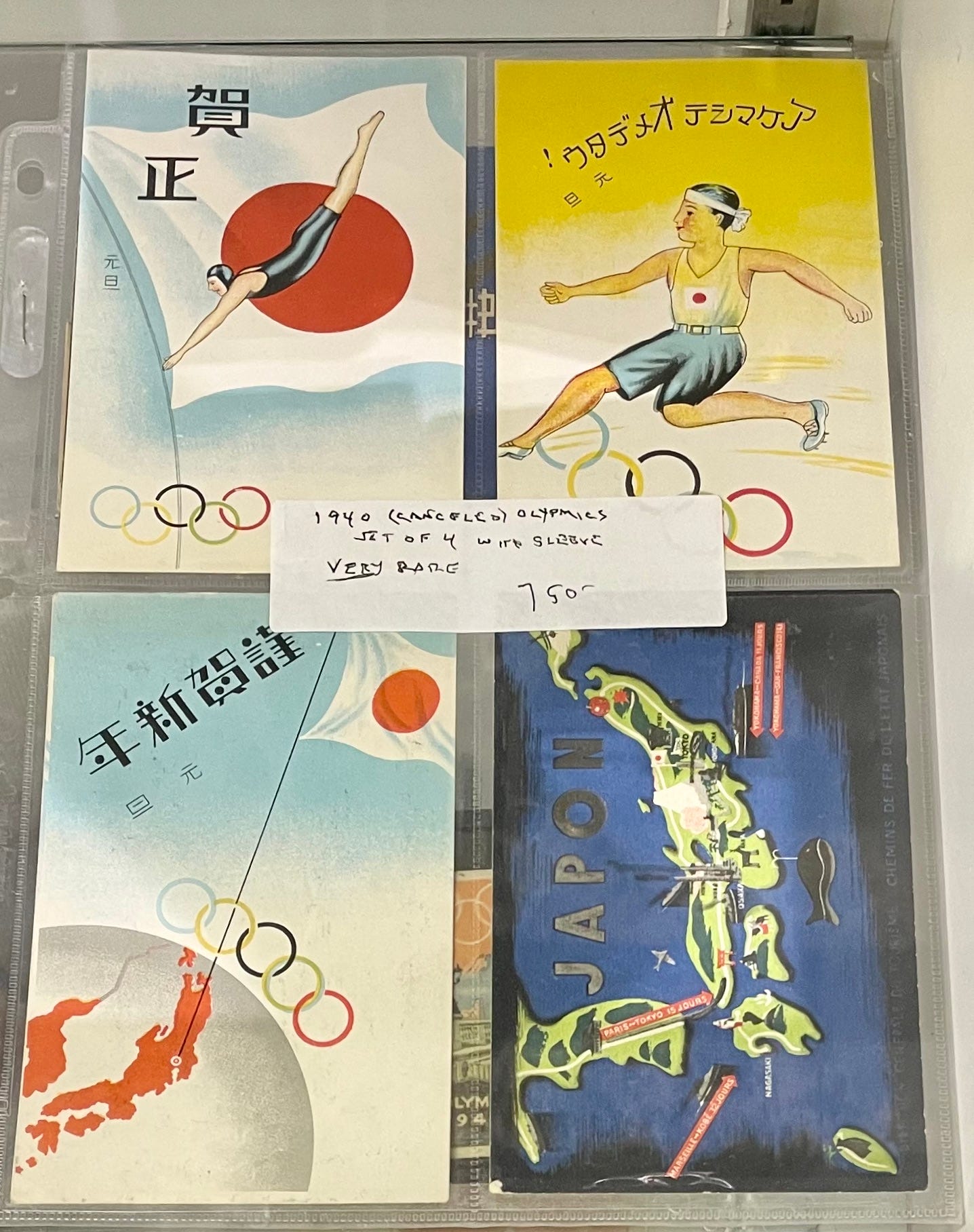
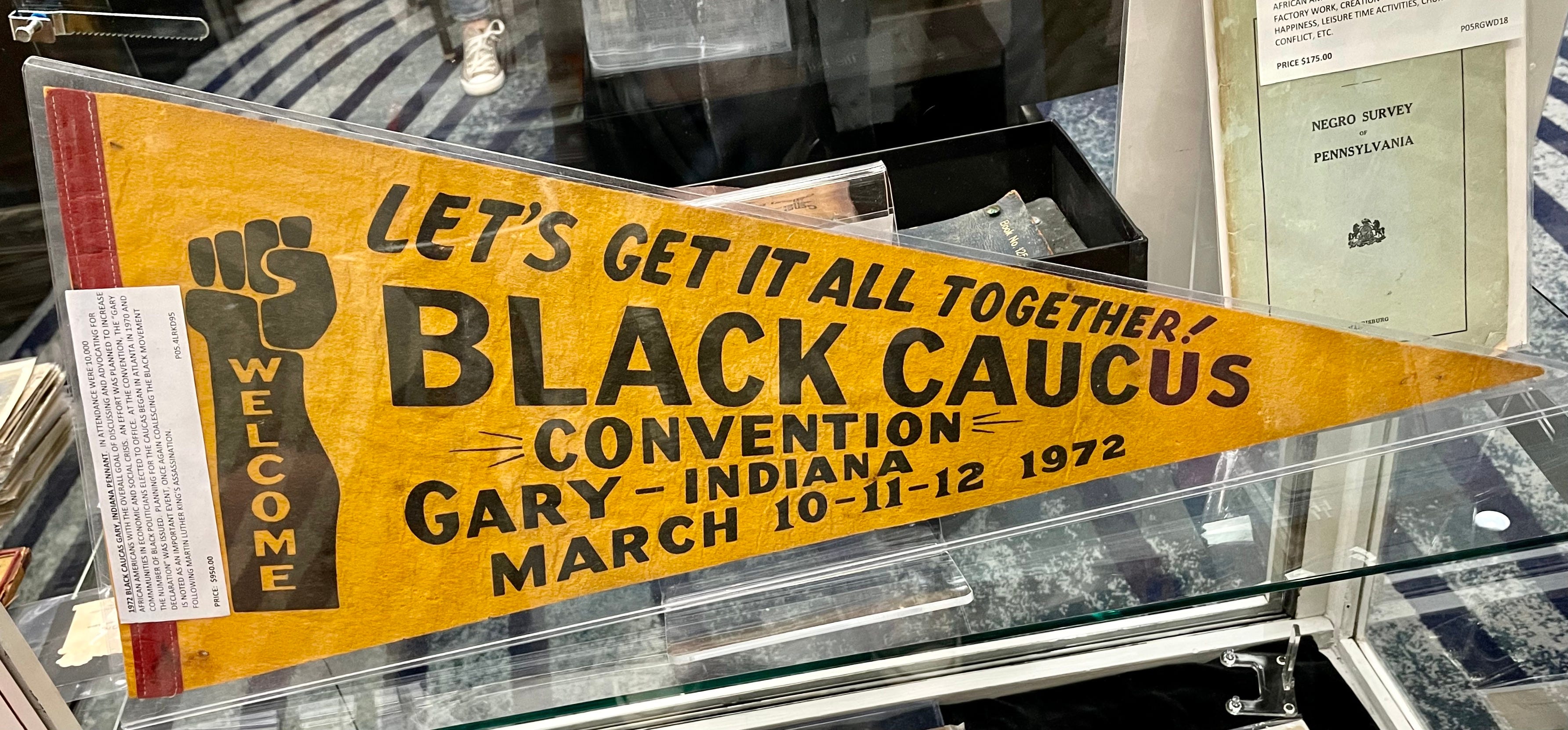
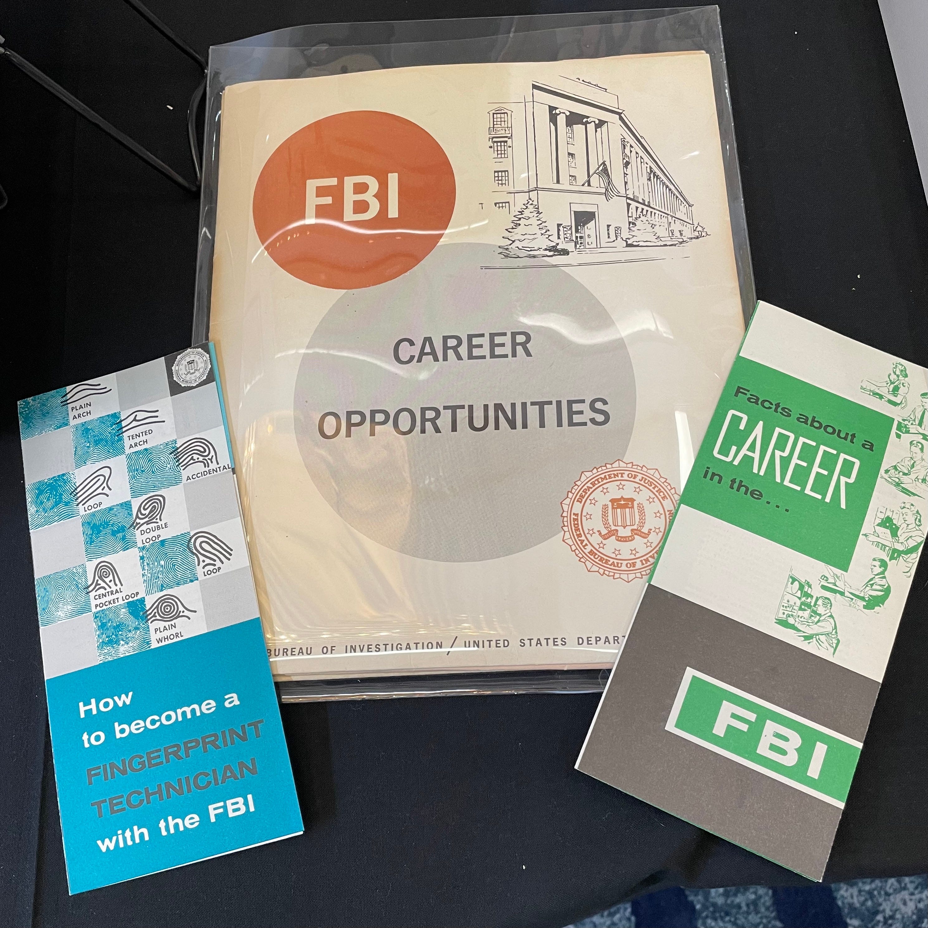
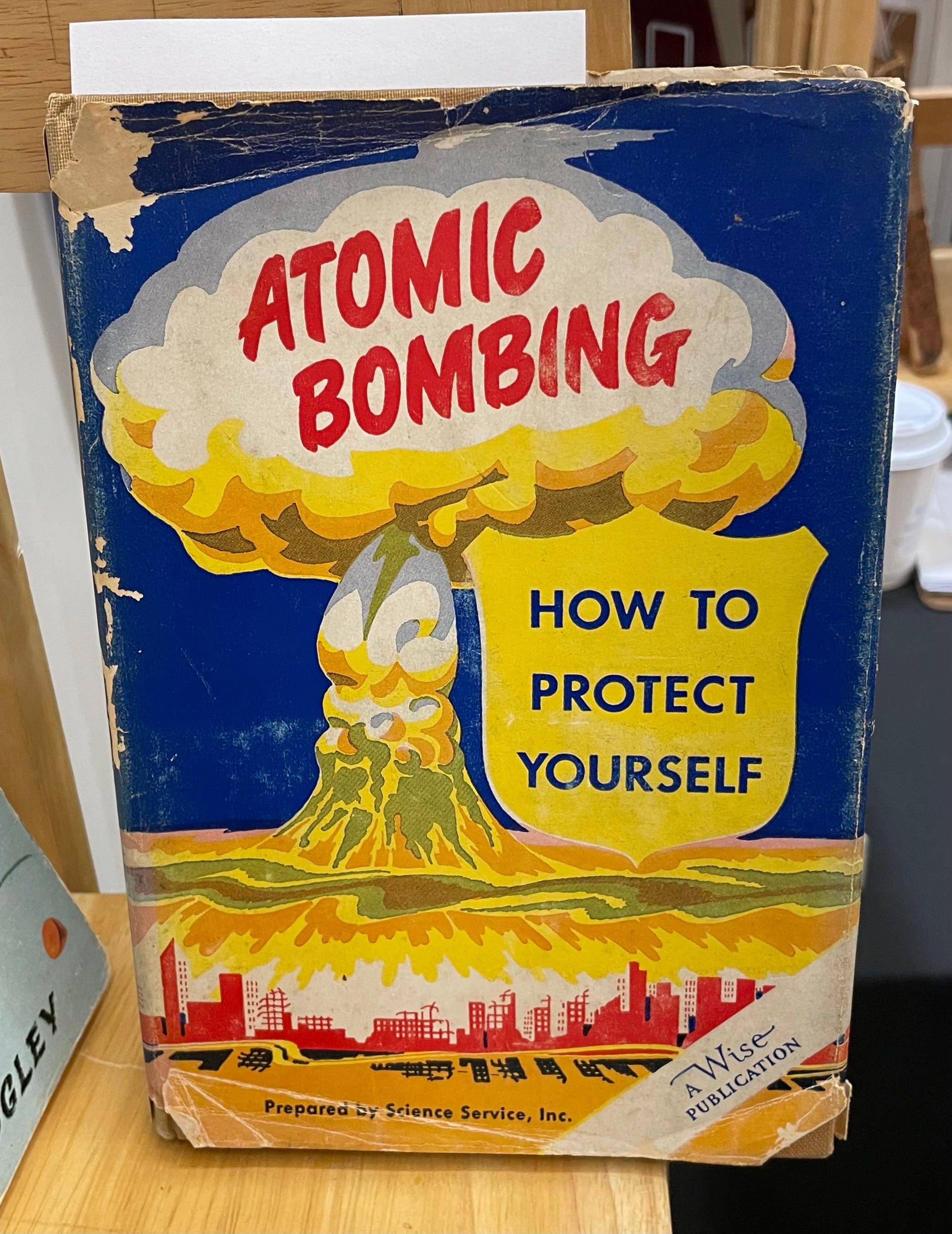
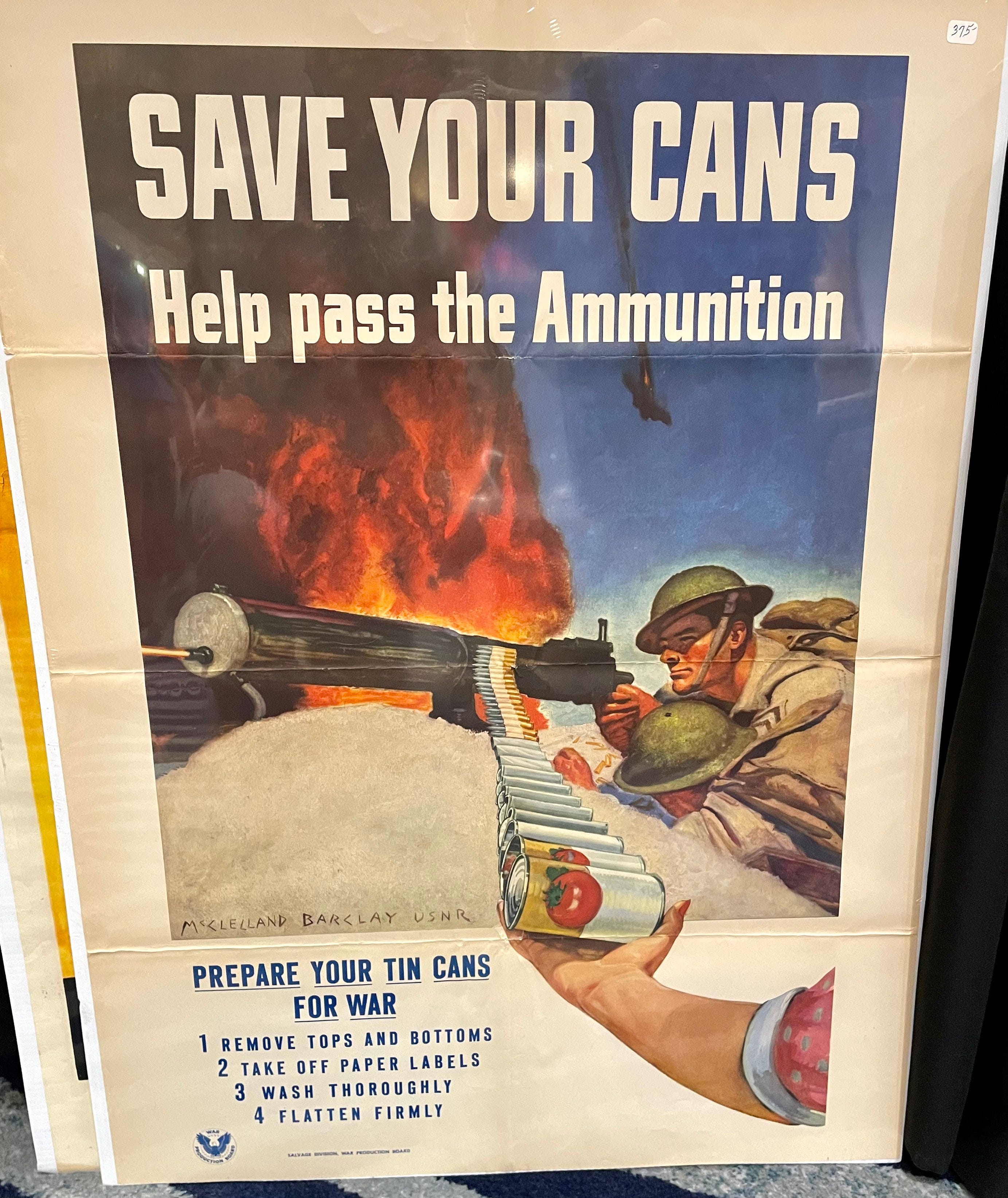
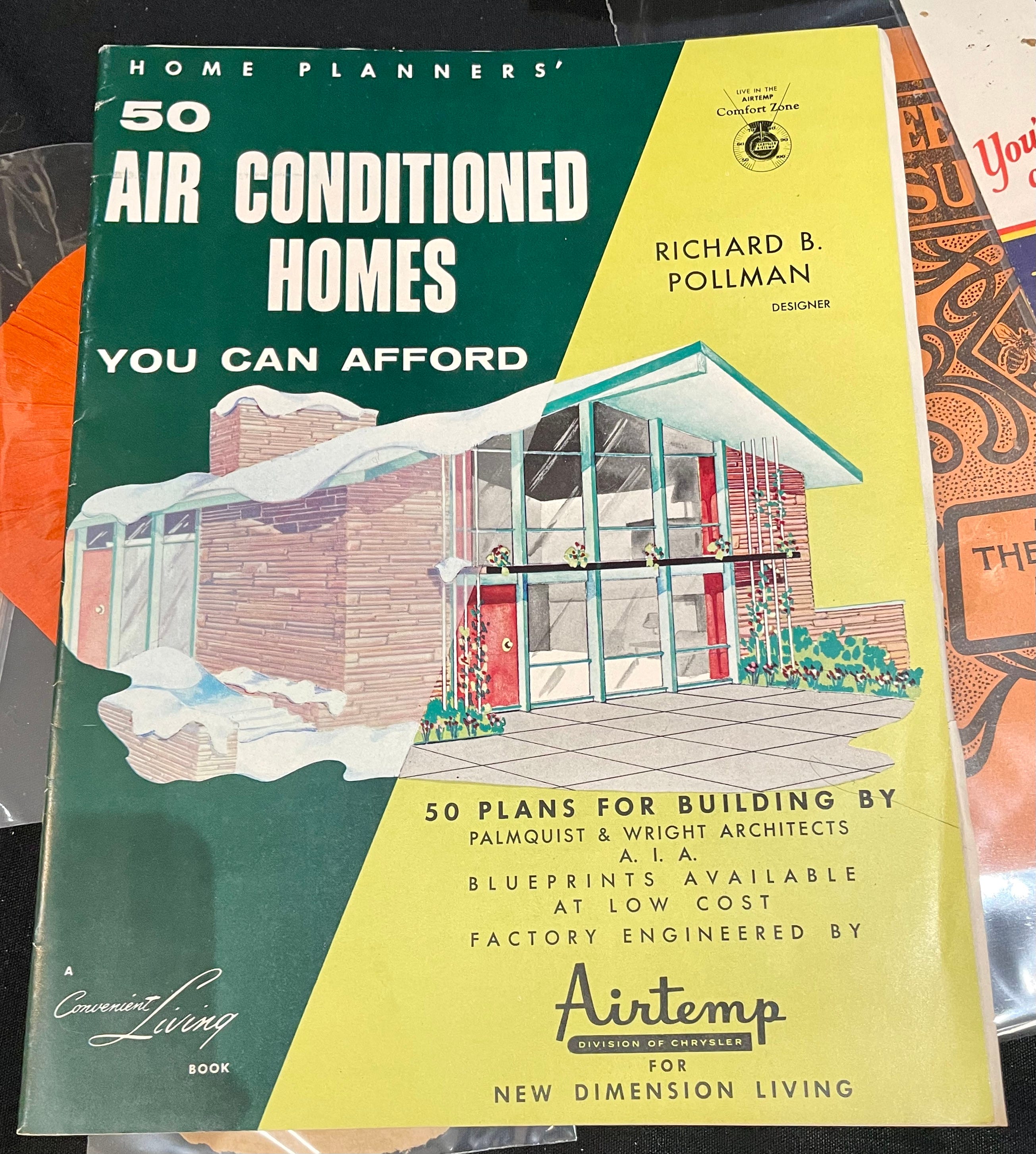
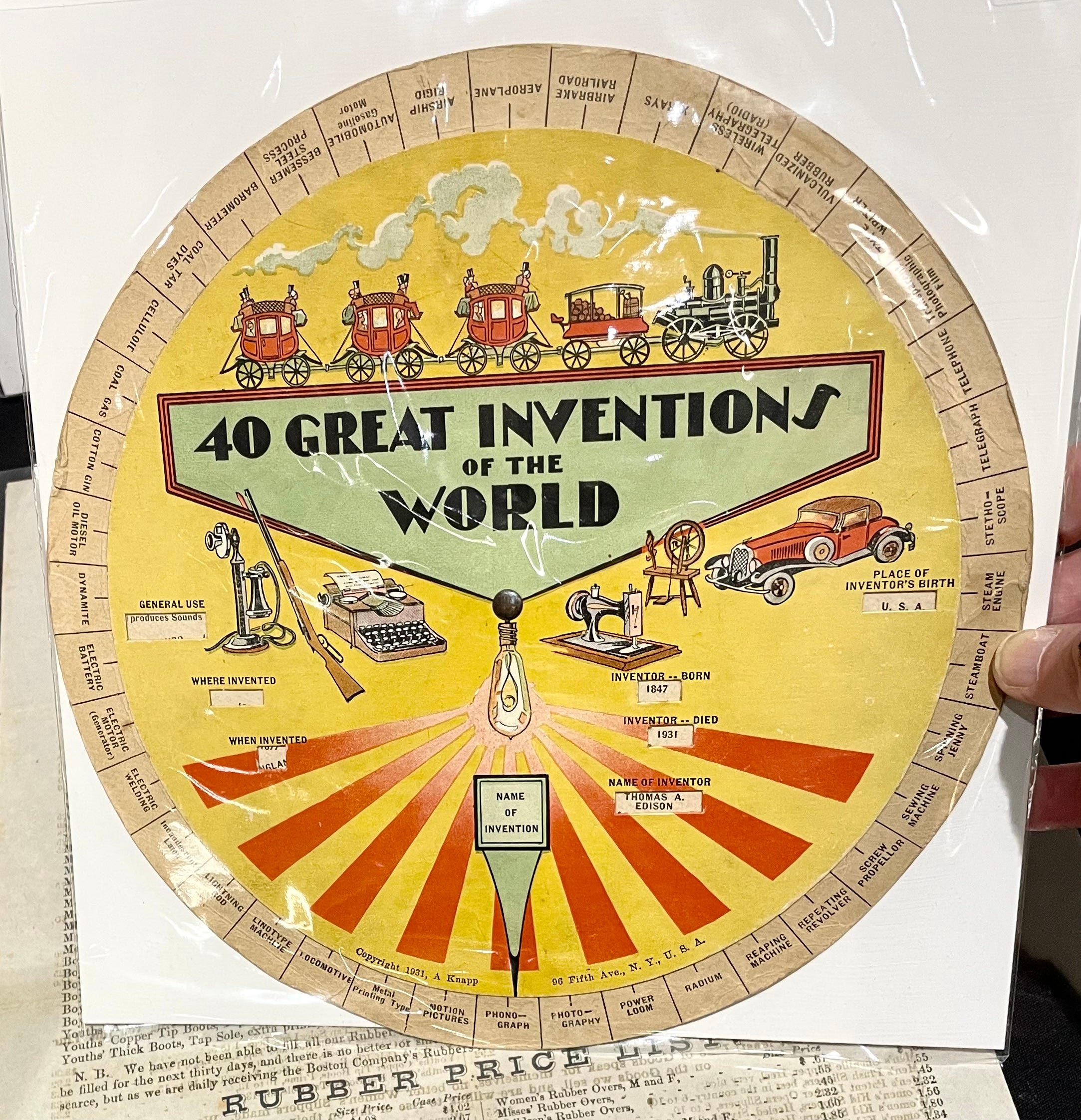
That’s enough for now, although there was a lot more, believe me. A really fun event!
Now then: Have you figured out which two items I ended up purchasing? I’ll give you a hint: One is fairly big, and one is fairly small.
Item No. 1: The Preparation H ad. As soon as I saw it, I knew it would look great in my bathroom, but I figured it would cost way too much. Oddly, there was no price on it, so I asked the dealer, who was surprised that it didn’t have a price tag. His booth mostly featured more antiquarian-type stuff, so I’m not sure why he even had this item to begin with — it didn’t really fit in. Maybe that’s why he said, “Geez, I dunno. I’m in a good mood, so how about 40 bucks?” That was a total deal (I was expecting it to be somewhere in the $150-$200 range), so I snapped it up.
It’s now in my bathroom, where it fits in nicely with a bunch of other midcentury health/grooming displays:
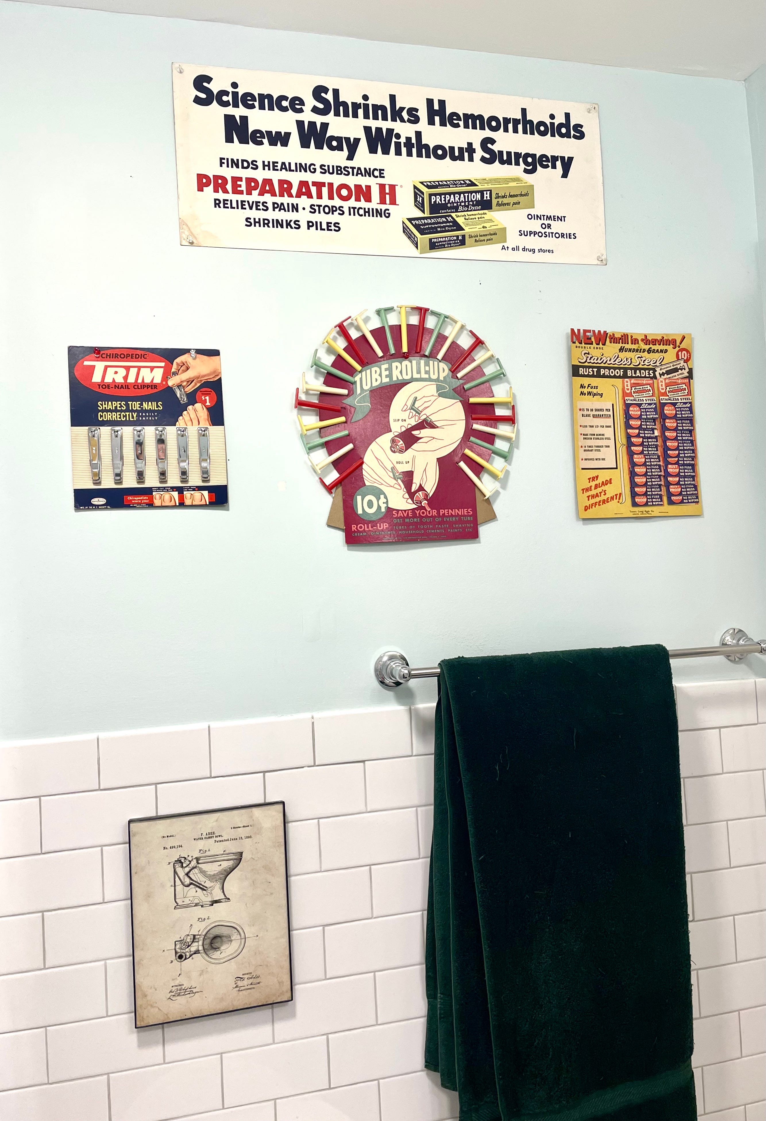
Yes, I know — it’s weird to put a hemorrhoid-relief ad in one’s bathroom. But it works for me! And it’s loaded with interesting little details. Let’s take a closer look:
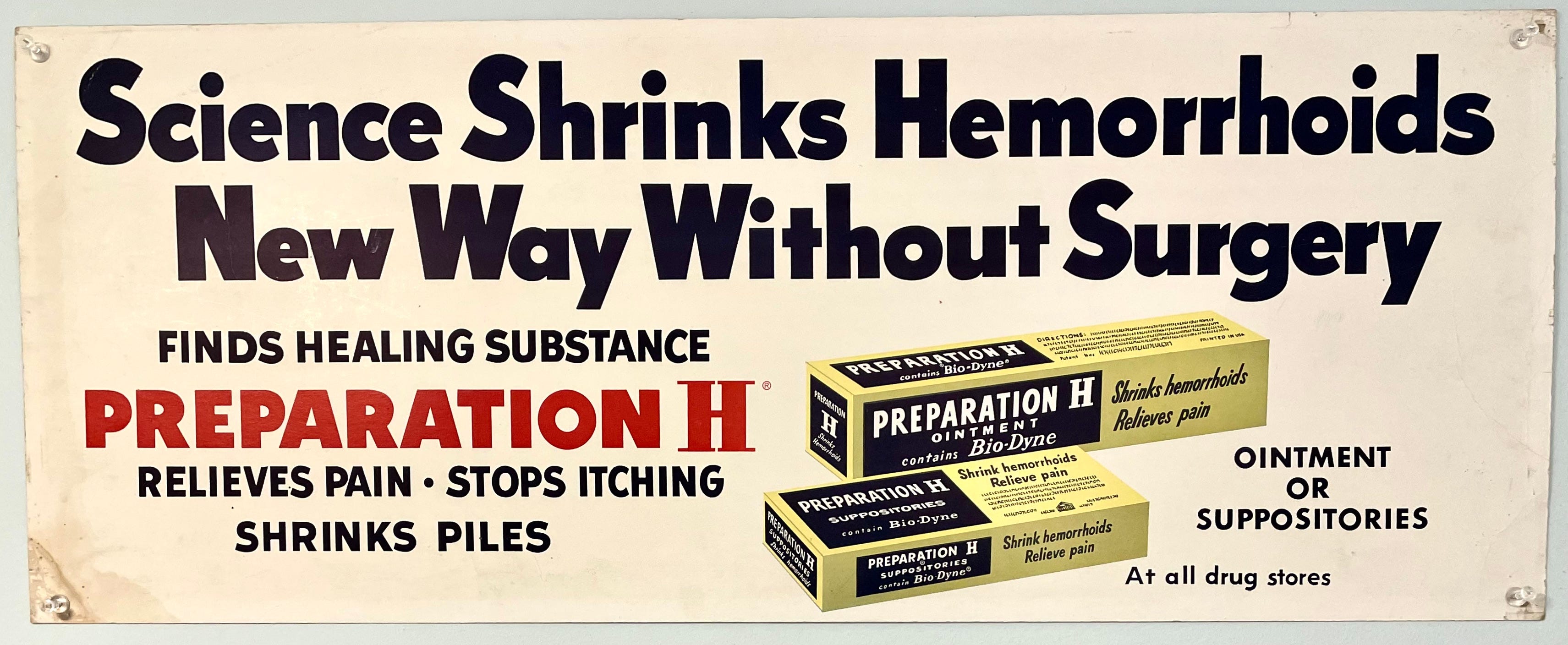
First, note that all of the ad typography is sans serif except for the H in the product name. I like that! (The package design is similar, except “Bio-Dyne” is also serifed.)
Also, in the headline, the treatment of the lowercase e is inconsistent. Look, for example, at how that letter looks in the words “Science” and “Surgery,” and then compare it to the version in “New” and “Hemorrhoids.” I kinda like the stubbier version!
Also-also, look at the wording on the two package designs: The ointment (singular) “Shrinks” and “Relieves,” while the suppositories (plural) “Shrink” and “Relieve.” But they could have stuck with “Shrinks” and “Relieves” for the suppositories, because Preparation H (in whatever format) shrinks and relieves. Interesting that they actually went through the thought process of changing the verbs to match the product format!
Item No. 2: The Milton Bradley paper catalog. As you can tell from the photos I chose to share, I saw a lot of catalogs that I liked, but this one had two advantages over all the others: First, it was reasonably priced ($35). In addition, it’s very suitable for displaying, so I can enjoy looking at it instead of just filing it away on the shelf with all my other vintage catalogs. I’ve added it to this display, at least for now (although I might end up moving it somewhere else):
That completes my report on the Ephemera Fair. Hope you enjoyed these items as much as I did!
Paul Lukas has been obsessing over the inconspicuous for most of his life, and has been writing about those obsessions for more than 30 years. You can contact him here.
Titter magazine sounds like something Elon Musk would buy and change the name to XXX.
*Also, one of those police mugshots has a pretty vague, yet lurid description of the crime...