Of Bumps, Humps, and Lumps
A deep dive on a common but surprisingly nuanced roadway phenomenon.
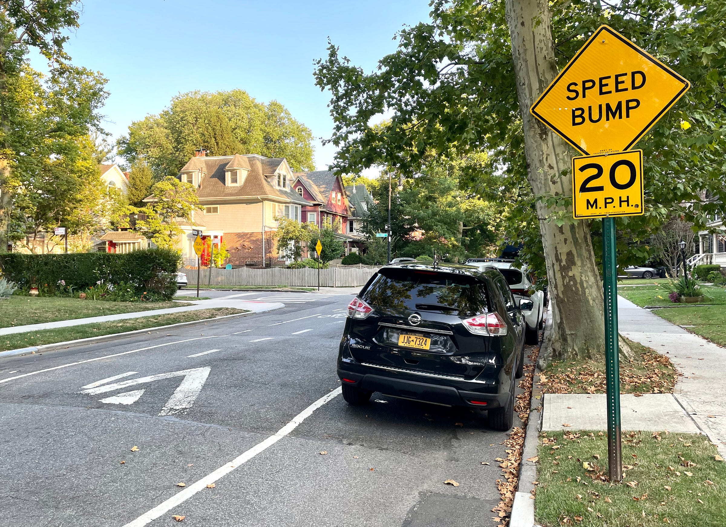
The photo shown above was taken around the corner from my home in Brooklyn. It’s a common sight throughout New York City: the word “Bump” painted on the pavement, followed a few car lengths later by a yellow “Speed Bump” sign and a literal bump in the road. Nothing unusual about it — pretty standard stuff.
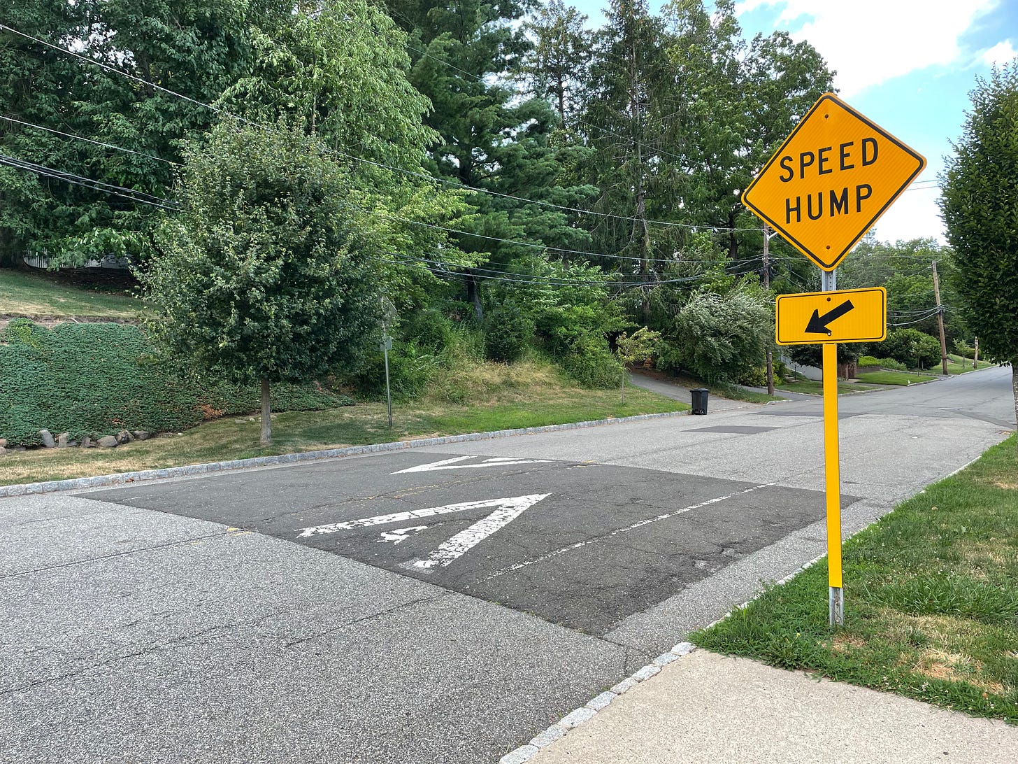
But last year I began dating E, who at the time lived in Montclair, N.J. (she has since moved), and I was intrigued to see that the signs in her neighborhood referred to a speed hump, rather than a bump:
I’d never seen (or at least never noticed) the “hump” descriptor before. My first thought was that bump vs. hump was essentially a potayto/potahto situation. I figured the two terms were synonymous but that different states or municipalities preferred one over the other for various inscrutable reasons. I envisioned a research project in which I’d track bump vs. hump prevalence throughout the country and produce a map showing which term held sway in each state or region (sort of like those maps that show how people refer to carbonated soft drinks). As I thought about that project, I allowed myself to fantasize that there might even be some places that used “Speed Lump,” which would make the map even more interesting.
But after a bit of investigation, I discovered that speed bumps and speed humps are in fact not synonymous. They’re two completely different things — although New York City does its best to blur the distinction between them.
Let’s start with this graphic from the Federal Highway Administration:
Basically, bumps are are short, jarring obstructions designed to slow cars down to 5 to 10 miles per hour, while humps are less aggressive and result in speeds of 15 to 20. (There’s even a page that helps traffic engineers decide which one to install in a given situation.) Here’s how they look in the wild:
Did everyone else know about this distinction? I didn’t until now, even though it seems like exactly the kind of minutiae-driven thing I’d be into.
Anyway: In Montclair, where the signs say, “Hump,” the roadways are indeed adorned with humps. Here’s a typical example:
But here’s the weird thing: In NYC, where the signs say, “Bump,” the streets actually have humps. Remember that photo at the top of this article, showing a speed “bump” around the corner from my house? Let’s take a closer look at that spot:
This same signage/roadway mismatch is found throughout NYC. At first I figured the city’s Department of Transportation didn’t know its bumps from its humps. But after poking around a bit on the DOT website, I came across a bunch of PDFs from 2012 and ’13 (here’s a representative example), each promoting a “Neighborhood Slow Zone” where the DOT planned to lower the speed limit and install speed humps. And buried within each of these PDFs is the following line: “NYC DOT uses the term Bump for what technically is a speed Hump.” Here’s a screen shot of the pertinent section:
So there it is — a forthright acknowledgment of the improper taxonomy. But the PDFs don’t indicate why the DOT chose to go this route. Moreover, I found plenty of other pages on the DOT website that use “hump”; in fact, this DOT map that shows all of the speed humps in the city refers to them as humps — even though each one is accompanied by a roadside sign that says, “Bump”!
I emailed the DOT to ask about all of this and soon heard back from their press secretary, Vincent Barone, who said, “Using ‘Bump’ on our signs better communicates to drivers what to expect.”
In other words, “Humps, shmumps — everyone calls them speed bumps, so that’s what we’re gonna put on our signs.” And on some level, I can appreciate the thinking behind that: Use plain English, not jargon.
But Montclair apparently doesn’t share New York City’s concern about vernacular communication — and neither do lots of other places. A very random survey found “Speed Hump” signs being used in many American cities, including Baltimore, Baton Rouge, Buffalo, Des Moines, Detroit, Milwaukee, Pittsburgh, and Syracuse. The city of Lakeland, Fla., even paints “Hump” on the roadway! I’m not sure if New York is the only city that refers to its humps as bumps, but at the very least it seems to be in the minority. (This may explain why I hadn’t been aware of the bump/hump dichotomy until now, because I’ve lived my entire adult life in NYC.)
Update: Reader JohnMark Fisher, who works for the Federal Highway Administration, posted a comment pointing to this document about highway signage, page 173 of which contains the following passage:
Speed humps generally provide more gradual vertical deflection than speed bumps. Speed bumps limit the speed of traffic more severely than speed humps. Other forms of speed humps include speed tables and raised crosswalks or intersections. However, these differences in engineering terminology are not well known by the public, so for signing purposes these terms are interchangeable. (Emphasis mine.)
So there you go: The federal government officially approves of NYC describing humps as bumps!
Finally, remember how I wondered if some municipality might go with “Speed Lump”? As it turns out, that’s actually a thing! Behold this sign from Lafayette, Louisiana:
Speed lumps, and corresponding signage, can be found here and there around the country. As you can see in the photo above, they are sectioned instead of continuous. That’s so fire trucks can get by without slowing down, like this:

Hope you’ve enjoyed this deep dive on bumps, humps, and lumps. If you have any further info or knowledge to share on this topic (I have a feeling we may have some traffic engineers in the IC readership), feel free to post it in the comments. Thanks!
• • • • •
Little Stories: I Love Lucy
When I was growing up in the early 1970s, reruns of I Love Lucy were constantly being shown on TV. The opening credits always featured the names of the two co-stars, Lucille Ball and Desi Arnaz, who of course played Lucy and Ricky, respectively.
But here’s the thing: As I watched the show, it always seemed obvious to me that the two main characters were Lucy and Ethel, not Lucy and Ricky. Ethel got more screen time and laugh lines than Ricky did, and she also seemed more like Lucy’s natural sidekick. So when I saw that the second-billed star was named Desi Arnaz (which, you have to admit, could easily be mistaken for a woman’s name), I thought that was the actress who played Ethel!
But wait, it gets better (read: worse). After featuring the names of the two primary stars, the credits showed the names of the two secondary stars:
Since Lucille Ball’s name was listed on the left, I figured the actor playing her husband would also be listed on the left. Sure, it seemed a bit odd that a male actor would be named Vivian, but he was Cuban, so eight-year-old me figured it was probably just a cultural difference. For all I knew, lots of guys in Cuba might be named Vivian.
And that’s how I went around for years thinking that Vivian Vance was a male actor who played Ricky Ricardo. I don’t recall how or when I finally realized the truth, but I’m sure I felt like a complete idiot.
(As it turns out, my supposition wasn’t all that far-fetched, because Vivian used to be a common male name, although I didn’t know that at the time.)
Little Stories, focusing on oddball memories from my youth, will be a recurring feature of Inconspicuous Consumption.
• • • • •
Show and Tell
As you may recall, I previously announced that Inconspicuous Consumption would include a recurring project called “Favorite Thing,” about the stories behind people’s treasured possessions. But as I looked through the responses to that announcement, it became apparent to me that people were getting too hung up on the word “favorite.” It made them feel pressured to choose their absolutely tip-top most favorite possession ever, which is a big ask. Many people told me, “I’d love to participate, but I can’t choose just one favorite thing!”
This is my fault. I thought the name “Favorite Thing” had a nice ring to it, but I should have realized that it would be too limiting, too restrictive. Also, it puts all the emphasis on the object and no emphasis on the story.
So I’ve decided to scrap the name “Favorite Thing” and replace it with something simpler and more familiar: “Show and Tell.” The goal now will simply be to present an object of personal significance and share its story. It doesn’t have to be a “favorite” object, or a fancy object, or even an attractive object, as long as it has a good backstory. (Some of you may remember my old Key Ring Chronicles project — that’s basically what I’m looking for here, only without the key rings.)
Here, I’ll go first, with this object:
See that wooden thingie in the photo shown above? My mom brought it home from a junk shop when I was about 10 years old. She explained that it had been the front wall of a five-story chicken coop, which would have looked something like this (the section outlined in green is the show-and-tell object):
The five solid panels are little doors that open up (presumably so the chicken feed could be inserted), like this:
My mom was always finding random objects like this, none of which ever interested me. I was too busy immersing myself in important stuff like comic books, baseball cards, and TV to worry about a stupid piece of an old chicken coop. When she put this new acquisition on display in our living room, it bugged me. Why couldn’t we have pictures on the walls like normal families?
As time went on, though, my mom’s aesthetic strongly influenced my own, and I came to view the chicken coop piece as one of the more beautiful things in our home. I liked its lines, its sense of geometry, its sense of texture. When my parents sold their house and moved to a smaller home in 2004, they had to get rid of a lot of stuff, at which point I claimed the chicken coop piece. It now hangs on a wall in my apartment — a nice piece of home décor, and an even nicer reminder of how my mom taught me to appreciate unconventional things.
If you’d like to be considered as a potential Show and Tell participant, please send an email here. It should include at least one good photo of your significant object and text telling the object’s story (anywhere from 150 to 400 words). Also, please indicate if you’d be willing to do a follow-up Zoom interview about your object. Thanks!
• • • • •
FAQ About This Newly Relaunched Substack
Okay, let’s address some questions you may have about the new format here, beginning with…
What happened to Uni Watch?
The Uni Watch Blog is still covering the world of athletics aesthetics every day, under the direction of Phil Hecken. I still own that site but am no longer involved in its day-to-day editorial operations. This Substack, which used to be devoted to feature-length Uni Watch articles, has been rebranded and is now called Inconspicuous Consumption.
So you’re not writing about uniforms anymore?
Correct. In case you missed that development, here’s why I decided to stop doing Uni Watch.
Is the old Uni Watch content from this Substack still available?
Yes. If you’re a paid subscriber, you can still access all of my archived Substack content here.
Will Inconspicuous Consumption be paywalled?
The first few weeks of content, including this post that you’re reading right now, will be freely available to everyone, so you can get a better sense of what I’ll be doing with the new format. After that, I’ll restore the paywall. For now, I’m expecting to keep the subscription pricing at its current level — $35 for one year, or $5 per month. (For what it’s worth, that’s significantly less than most Substack writers charge.)
What will Inconspicuous Consumption’s publishing schedule be?
My plan is to avoid having a set schedule or a set number of posts per month. I’d rather just write and publish as the mood strikes me, so I might do three posts in one week and no posts the next week. Some posts might be short, others lengthy. Maybe I’ll develop a steady rhythm, or maybe not. We’ll see.
The one thing I’m sure of is that there’ll be plenty of content, so people with paid subscriptions will get their money’s worth — promise! My hope is that the unpredictable schedule will make each post feel like a nice surprise.
This post had several different sections — the speed bumps, Little Stories, Show and Tell. Will every post be like that?
Probably not. I decided to bundle a bunch of different items for this post, just to give you a better sense of the types of things I’ll be writing about, but I don’t expect to maintain that format going forward. I might put two items together in a single post, but I’m more inclined to let each little item stand on its own. We’ll see how things develop, though.
You just took a nearly two-month break from Substack. I don’t begrudge you that, but I have a paid subscription, so was I paying for two months of nothing while you took a breather?
Don’t worry — after my last Substack post, I paused all of the paid subscriptions, so you haven’t been paying for dead air. Now that I’ve started publishing again, I’ve reactivated the paid subscriptions.
What if I have a paid subscription and don’t like the new content?
Substack will send you a reminder about a week before your subscription is set to renew. So if you don’t like the Inconspicuous Consumption content, you can cancel your subscription when it comes up for renewal.
My paid subscription runs through November. If I just cancel when it comes up for renewal, that means I’ll still be paying for several months of non-uni content that I don’t care about. Can’t I get a partial refund for the unused portion?
I’m going to ask all paid subscribers to try the first month or so of Inconspicuous Consumption content, just to give it a chance. After that, you can contact me and ask to cancel with a pro-rated refund, and I’ll arrange that for you. So if your paid subscription still has, say, three months remaining at that point, your refund would be a little less than $9; if you have two months remaining, the refund would be a little less than $6; and so on.
I have a free subscription. How does this all affect me?
Like I said, the first few weeks of new content will not be paywalled, so you’ll recieve those posts by email and be able to read them in their entirety. After I restore the paywall, you’ll still receive an emailed version of each post, but you’ll only be able to read the first paragraph or two before the paywall kicks in.
I think that’s it! For a bit more info, check out the new “About” page. If you have other questions that I haven’t addressed here, feel free to post them in the comments and I’ll do my best to respond.
Paul Lukas has been obsessing over the inconspicuous for most of his life, and has been writing about those obsessions for more than 30 years. You can contact him here.


Welcome back Paul!
Nashville has begun widely installing speed humps across high traffic residential neighborhoods. I have seen signs designating them humps, bumps and cushions. Another less utilized option is the traffic calming device. (Yes, the sign actually says that.) they actually create a curb that pushes into the lane so that cars should slow down as it approaches. Emphasis on should. Fun side note, in Jamaica, speed bumps are noted on signs as sleeping policemen.
Hey Paul! Good to “hear” your “voice” again! Here in Baltimore, we have some speed humps that have crosswalks incorporated in them. I wonder if other cities have them.