
H-Bomb: A Frank Lloyd Wright Typographic Mystery
The famed architect made a surprising error on one of his most notable buildings — or did he? A deep dive to uncover the truth.

Note: This is the first part of a two-article series. Also, it is not paywalled. Enjoy! — Paul
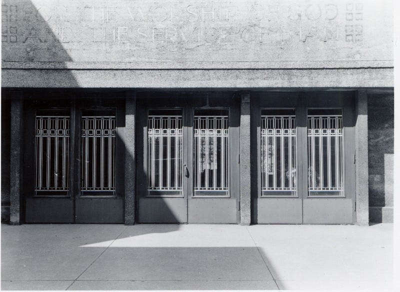
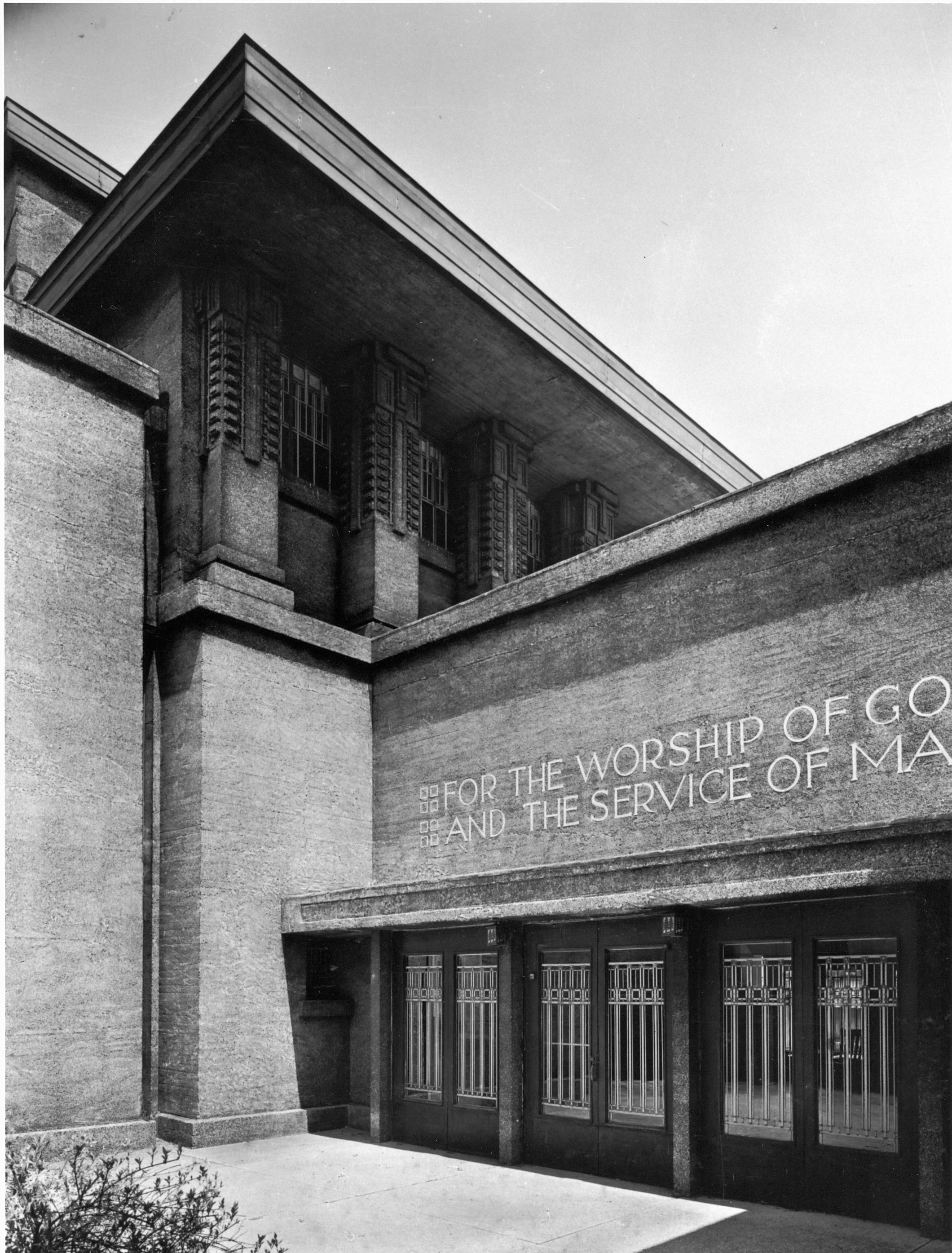
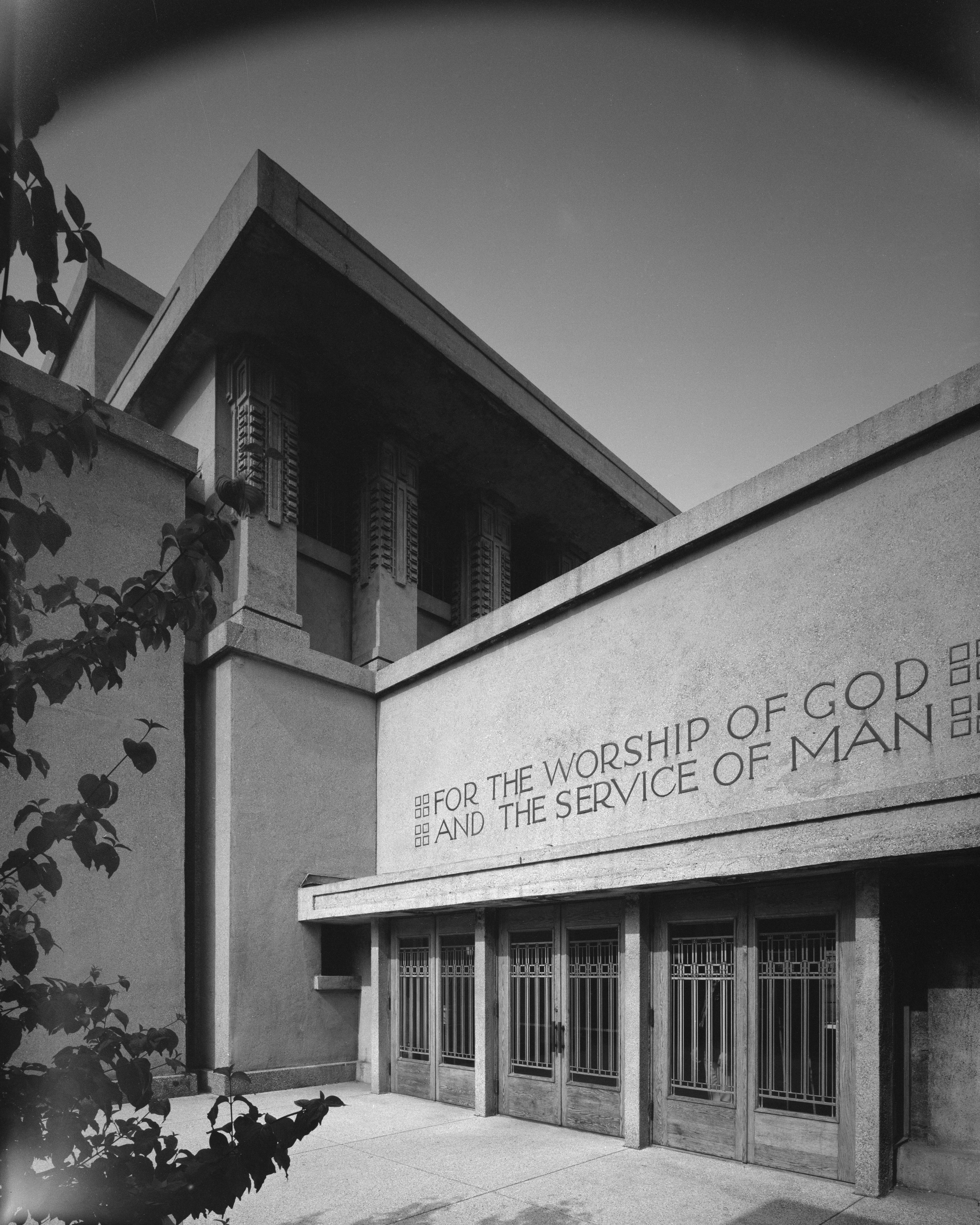
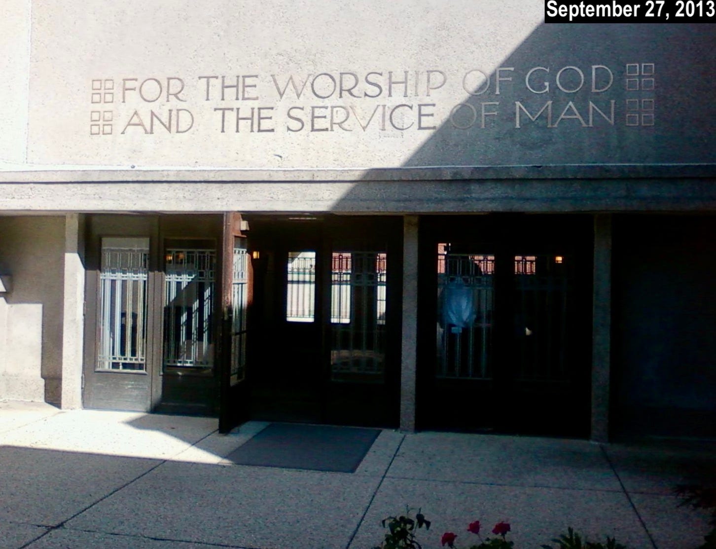
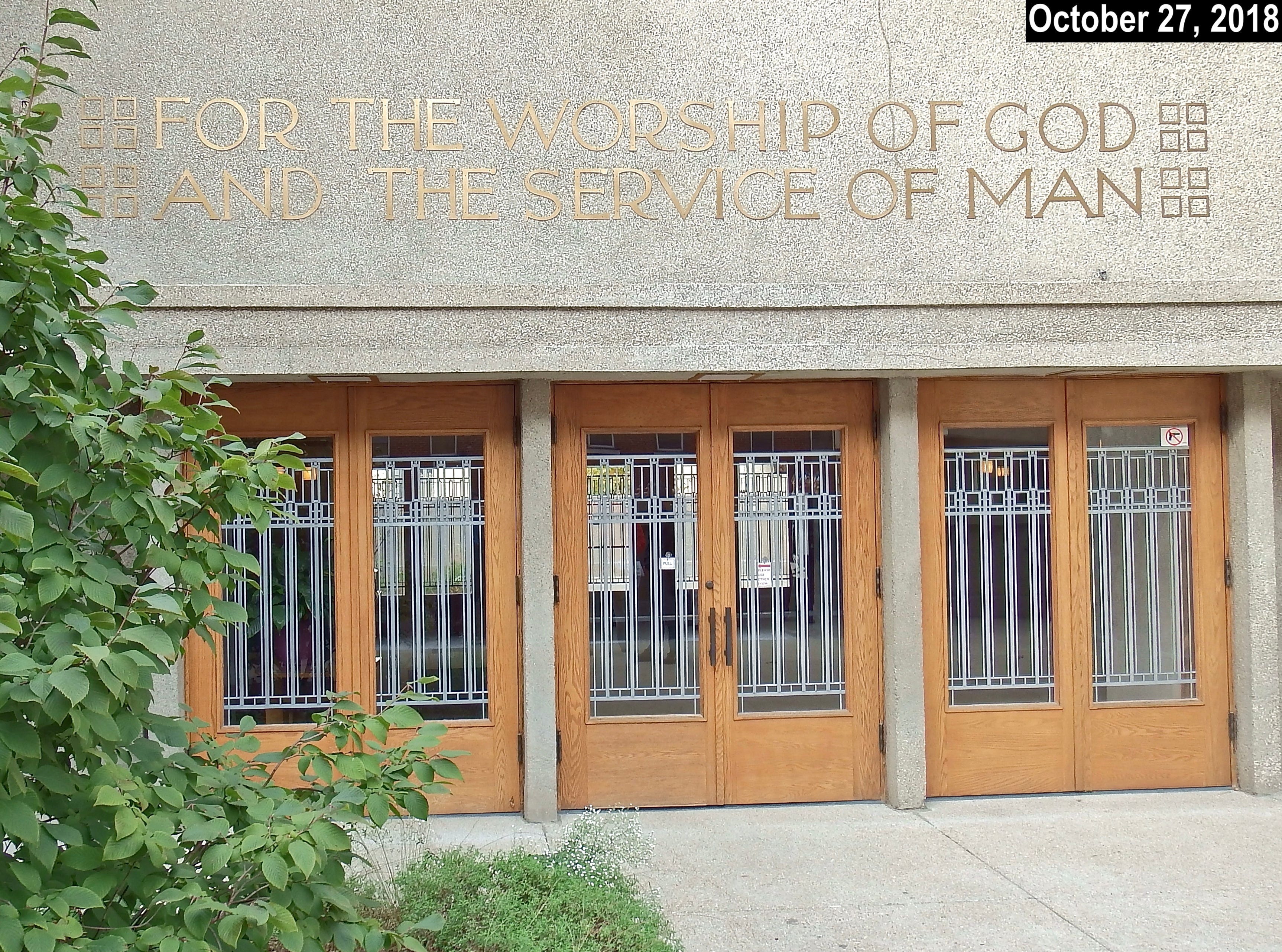
The photo above, taken about two and a half months ago, shows the entrance to Unity Temple, a Unitarian Universalist church in the Chicago suburb of Oak Park, Illinois. Designed by the renowned architect Frank Lloyd Wright (himself a lifelong Unitarian), it opened in 1908 and is sometimes referred to as the world’s first modern building. Wright later said that the Unity Temple project was when he stopped being an “architect of structure” and instead became an “architect of space.”
Despite all of that, Unity Temple includes a surprising flaw. Can you spot it in that header photo?
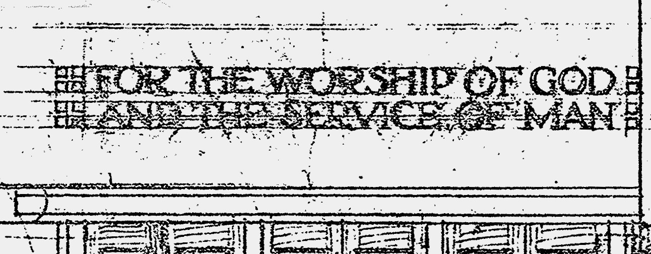
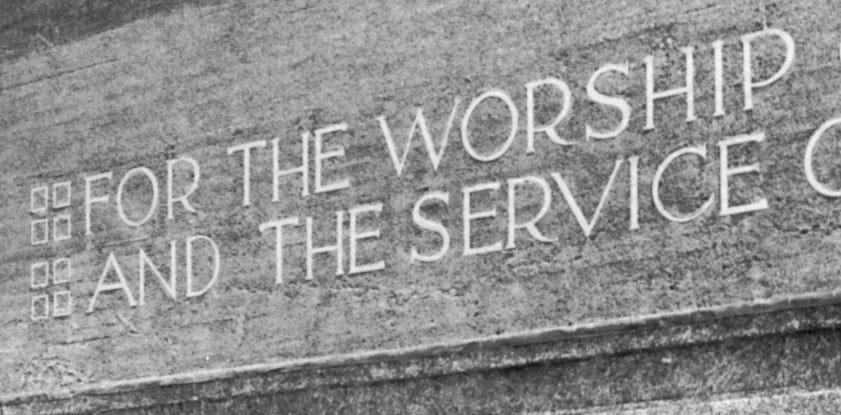
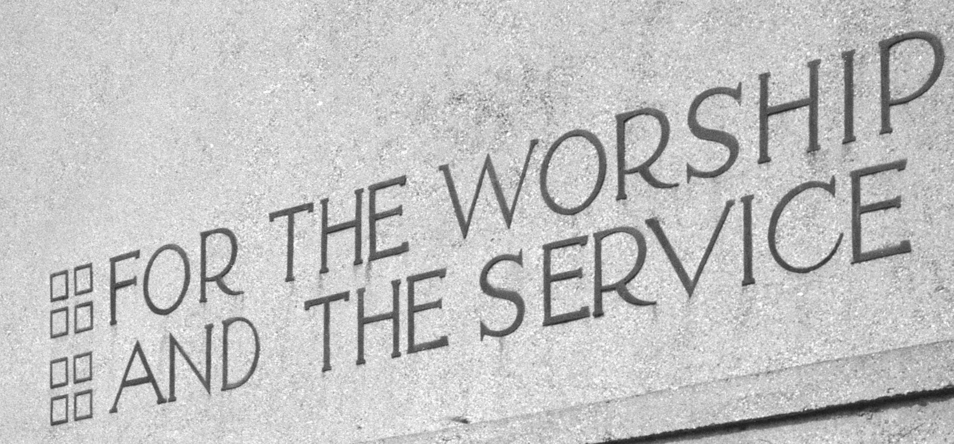
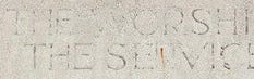
Let’s zoom in on a section of the bronze lettering above the doors:
Now do you see the error? The “H” on the top line is upside-down! It’s particularly apparent because the crossbar of the “H” doesn’t align with the middle arm of the “E.” Compare that to the second line, where those two strokes do align. (If you look back at the header photo, you can see that the sign includes a third “H,” in the word “WORSHIP,” but that one is properly oriented.)
If this mistake sounds familiar, it’s because last summer I wrote about how the familiar blue “H” road signs indicating a nearby hospital are often upside-down. The person who alerted me to that “H”-driven phenomenon is the same one who spotted and photographed Unity Temple’s inverted “H”: my friend Jonathan Hoefler. He’s a famous typographer, so his radar is super-attuned to this stuff (plus his surname starts with an “H,” so he might be particularly sensitive to issues involving that letter). He let me know about the Unity Temple “H” after spotting it during a recent visit to Chicago.
I asked Jonathan if he said anything to the Unity Temple staff about the upside-down letter. “I didn’t have the heart,” he said. “Also, what could be done?”
That might have been the end of the story. I imagined writing a short post that concluded with something like “Hey, even Frank Lloyd Wright made mistakes!”
But then Jonathan added this: “The audio tour at the temple mentioned that the exterior was sprayed with gunite in the 1970s, making me wonder if the original lettering was removed and reinstalled, either introducing the error or preserving it.”
That was an intriguing thought, so I figured I’d try to find out if the letters had been temporarily removed as part of the 1970s gunite treatment. That was the start of what eventually became a lengthy research and reporting process. Along the way, I turned up a bunch of relevant information, including the following:
Unity Temple has two separate entrances, one at the east and one at the west. Each entrance is adorned with identical metal lettering spelling out the same phrase: “For the Worship of God and the Service of Man.” (Jonathan’s photos are of the western entrance, and he didn’t realize there’s an identical sign on the eastern side. If he had known, he would have checked the eastern “H” situation.)
Both signs were indeed removed for the gunite treatment and then reinstalled, just as Jonathan suspected. That was in 1973.
Both signs were badly vandalized in the fall of 2010, when thieves stole 58 of the 72 original letters, apparently intending to sell them for scrap. The remaining 14 letters were removed and new lettering was installed over both entrances about 20 months later, in the spring of 2012.
The new lettering was taken down in 2014, when Unity Temple closed for a $25 million restoration. It reopened, with the lettering back in place, in mid-2017.
This information cast Jonathan’s observation in a different light, because it means Unity Temple’s lettering — which is rendered in a custom typeface that Wright designed — has gone through at least four distinct eras:
Era One runs from the temple’s 1908 opening to the 1973 gunite treatment.
Era Two runs from the 1973 gunite treatment to the 2010 lettering theft.
Era Three runs from the 2012 installation of replacement lettering to the start of the 2014 restoration.
Era Four runs from 2017, when the temple reopened after the restoration, to the present.
Multiply each of the four eras by the three “H”s that appear in the slogan, and then again by the two separate entrances, and you have 24 distinct opportunities for an upside-down “H” to be installed! (And there could be even more eras, and thus more opportunities for inverted “H”s, if the letters were ever taken down and then reinstalled for some other reason that didn’t turn up in my research.)
So had the misoriented “H” that Jonathan recently spotted on the western sign been introduced as part of the recent restoration? Or maybe after the theft? Or maybe that “H” had been upside-down all along, and they just kept it that way with each reinstallation for the sake of consistency? Meanwhile, what about the lettering for the eastern entrance?
And most intriguingly: Had Frank Lloyd Wright himself ever been responsible for an upside-down “H”? Wright died in 1959, so he had nothing to do with the most recent iterations of the lettering, but what about the earlier time periods?
My hope was to answer those questions by creating a comprehensive visual timeline of the lettering over both entrances, so I ended up doing a lot of photo research. Recent-ish photos of the building are fairly easy to find, especially on Flickr (a godsend, because Flickr pics are date-tagged). But older images — basically, anything earlier than 2005 — were surprisingly difficult to source. I ended up having to engage quite a bit with what I’ve come to think of as the Frank Lloyd Wright industrial complex — a dense bureaucracy of foundations, libraries, museums, and research institutions that control access to anything Wright-related.
While I didn’t achieve my original goal of producing a comprehensive visual record of the lettering, I did come up with a fair number of data points. Let’s start here:
Wright’s Original Conception
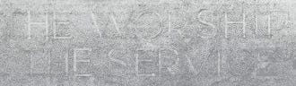
Wright’s original drawings for Unity Temple, shown above, include depictions of the lettering. Let’s zoom in to get a closer look at the key area:
The drawing clearly shows that the crossbar of the “H” should be slightly north of the equator, so to speak, thus aligning with the center arm of the “E.” That’s not surprising, but it’s good to establish this as our baseline of Wright’s intent.
1930s–1940s
Unfortunately, I was not able to find any photos from Unity Temple’s 1908 opening, or even from its first few decades. The earliest archival photo I came up with is this one, which is frustratingly dated by the Oak Park Library as being from “1930s-40s”:
Based on the shadows, that is the eastern entrance. The lettering isn’t easy to make out, so let’s zoom in again:
Although the image quality isn’t great, it’s good enough to confirm that each “H” is oriented correctly. For now, this is the earliest document we have.
May 1956
This is where things get interesting. The photo above, taken in May of 1956, shows the western entrance, and all three of the “H”s are upside-down! Again, let’s zoom in for a closer look:
So were these inverted “H”s at the western entrance always upside-down (which would mean Frank Lloyd Wright installed them that way), or were they originally positioned correctly and then got changed at some point? We can’t yet answer that question, because this 1956 photo is the earliest document we have of that entrance (at least for now).
1956 to 1978
The photo above once again shows the western entrance, and there are two significant changes. The good news is that all of the “H”s are now properly oriented. To see the bad news, look at the “S” in “WORSHIP” — now that is upside-down! (The other “S,” in “SERVICE,” is properly oriented.)
Here’s a closer look:
So when was this photo taken? In another case of frustrating dating, the Chicago History Museum’s archive lists the date as “1956-1978.” Although we can’t know for sure, I’m thinking this image was probably taken after the 1973 gunite treatment, which would explain the letter orientation changes.
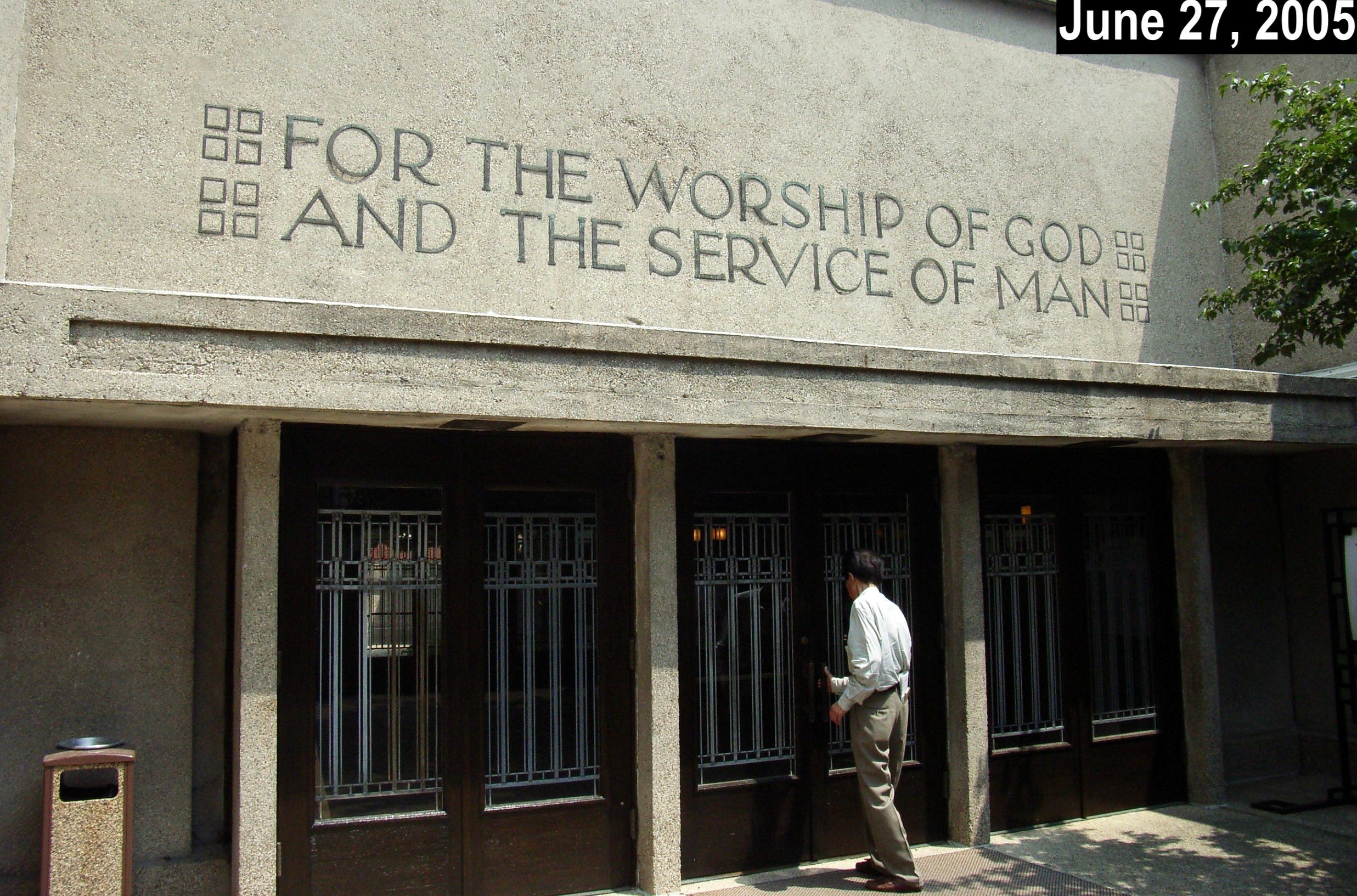
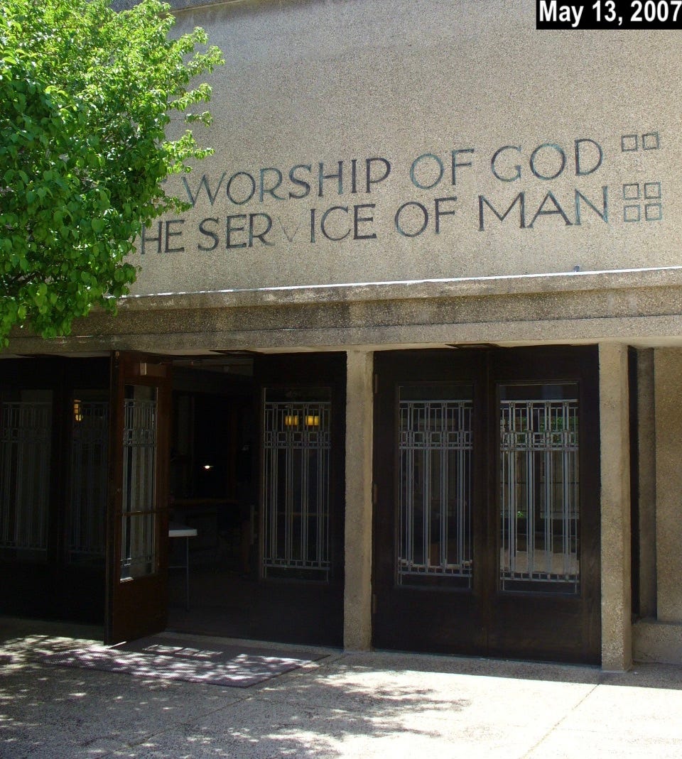
2005 to 2010
Jumping ahead to the 2000s — shortly prior to the 2010 theft — Flickr photos show no changes to the western sign, which was still fully “H”-compliant and still had the upside-down “S.” Here are two representative examples, with the dates noted on each photo:
Photos of the eastern entrance from this period were harder to come by, in part because a tree was obscuring part of the sign. But in this 2007 shot, it appears that the “S” in “WORSHIP” is upside-down, as is the “H” on the second line (plus the “V” in “SERVICE” is missing, but that’s a separate issue):
That last photo doesn’t show the “THE” in the top line. But the full slogan is visible in this 2008 shot:
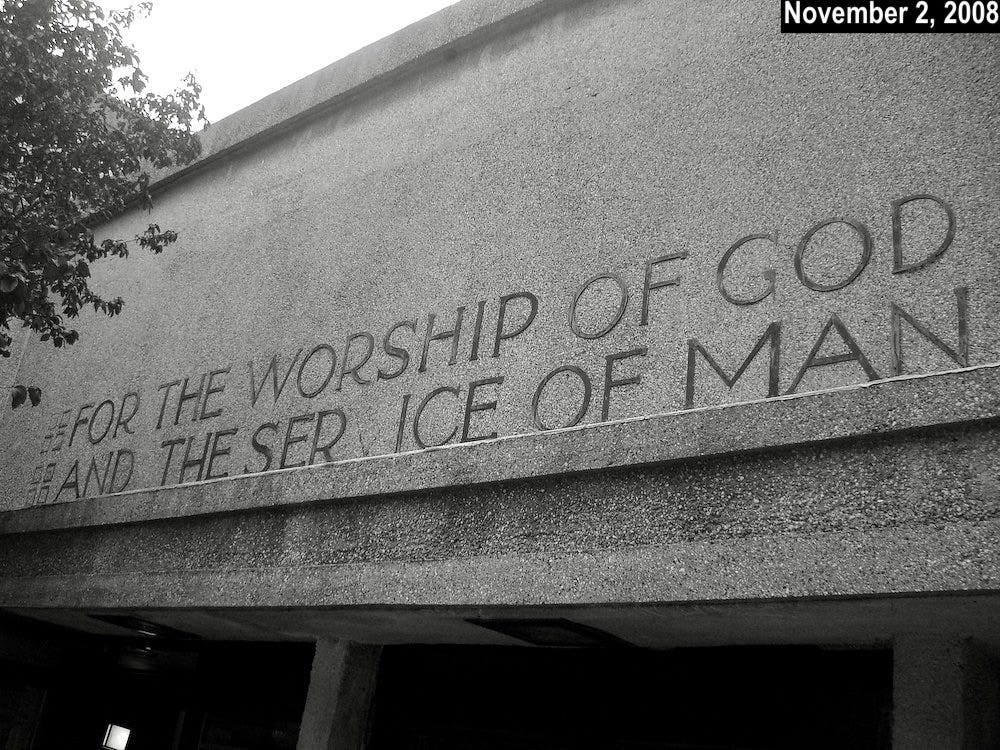
So that confirms it: Shortly prior to the 2010 theft, the eastern sign had two upside-down letters — an “H” and an “S.”
The 2010 Theft
Vandals took most of the letters sometime during the night of September 28th, 2010. Here’s a photo showing how the denuded western entrance looked about nine and a half months later:
If we zoom in, the ghosted letters seem to confirm that each “H” was properly oriented and that the “S” on the top line was not:
I was not able to find a corresponding photo for the eastern sign.
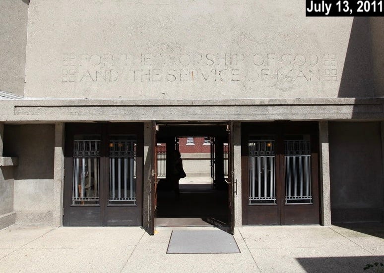
2012 to 2014
Shiny new bronze lettering was unveiled in late May of 2012. How did it look? Let’s start with the western entrance:
Everything looks shipshape there — no glitches.
But what about the eastern entrance, which previously had an inverted “H” and an inverted “S”? Let’s take a look:
They fixed both of the letters! (Looks like they also got rid of the tree, or at least pared it back significantly.)
So during this period — after the 2010 theft, but before the 2014-17 restoration — both signs were A-OK (or, if you prefer, H-OK).
That leads us to…
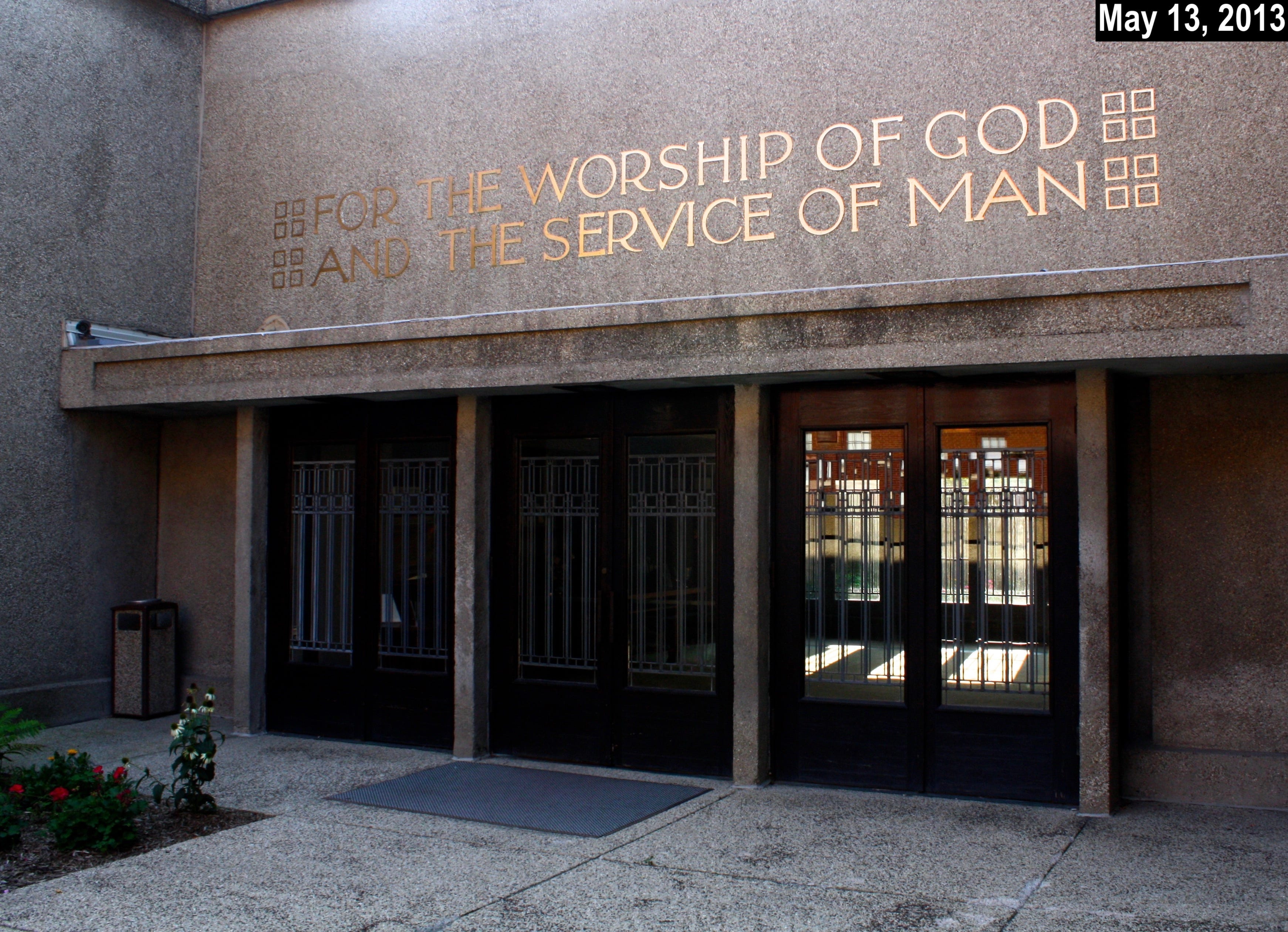
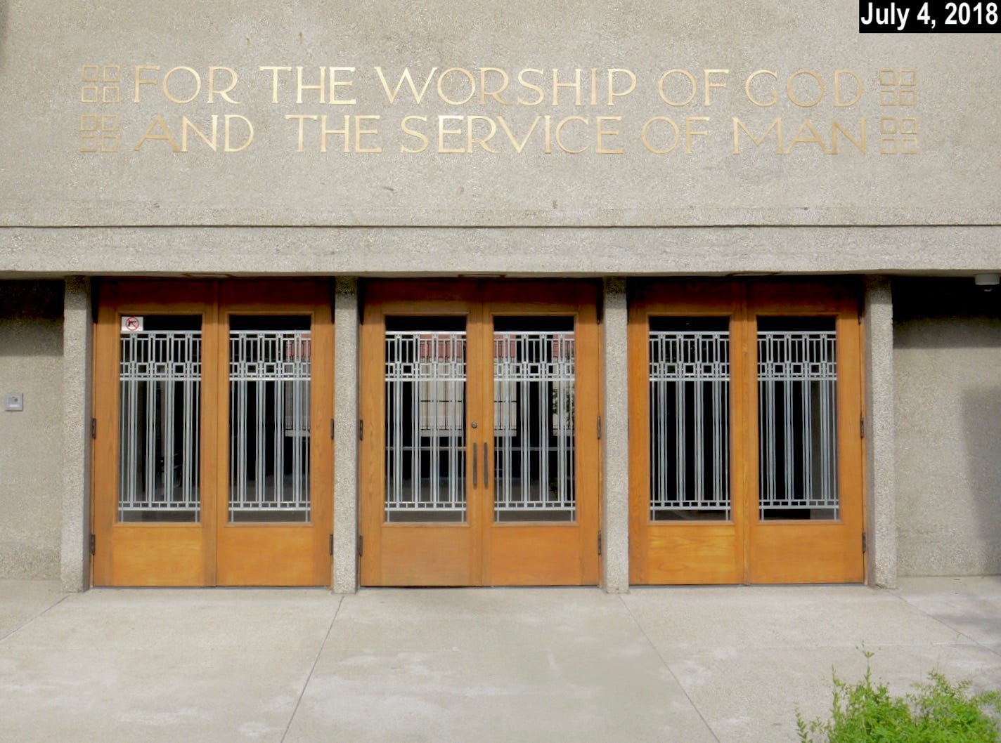
2017 to the Present
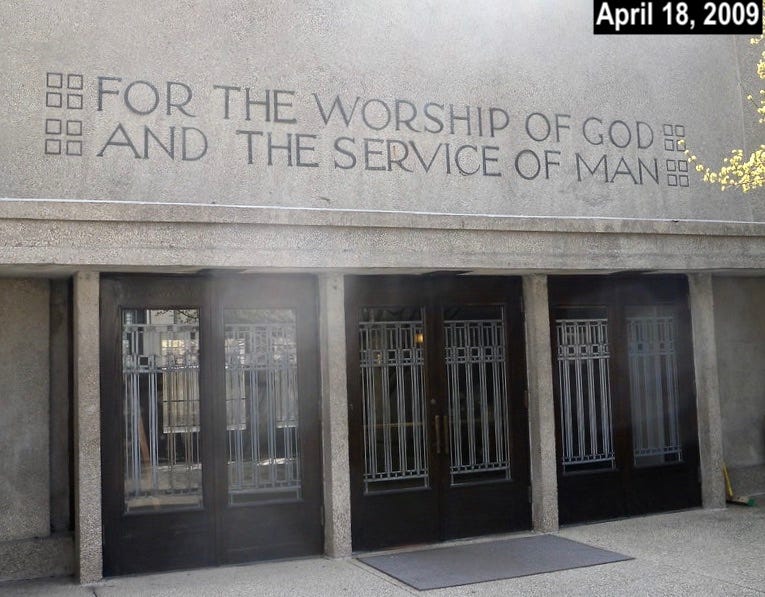
Unity Temple was closed from mid-2014 to mid-2017 for a $25 million restoration that covered, according to one report I read, “every inch” of the facility. Did that include the lettering above the two entrances? Let’s start with the western side:
Oopsie. This error — the upside-down “H” on the first “THE” — is the same glitch that Jonathan Hoefler recently spotted. So now we know when that mistake was introduced: as part of the 2014-17 restoration.
The eastern entrance, however, appears to have escaped unscathed:
Everything there looks good.
Did you follow all of that? Here’s a table summarizing what we have and haven’t learned:
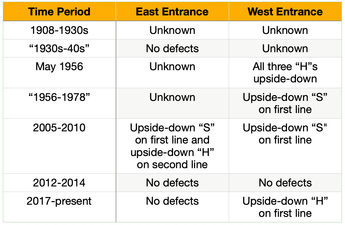
I feel like that’s a good start on this project, although there’s a lot we still don’t know. Most crucially, it’s not clear whether Frank Lloyd Wright himself oversaw the installation of any upside-down letters, although several other architectural professionals clearly did.
As it happens, I spoke to one of those professionals as part of my reporting. I’ll have some thoughts from that person — the man responsible for the current upside-down “H” that started us down this rabbit hole — tomorrow. Stay tuned!
Update: You can read the second part of this story here.
(Right-side-up thanks to Jonathan Hoefler for getting the ball rolling on this one.)
Paul Lukas has been obsessing over the inconspicuous for most of his life, and has been writing about those obsessions for more than 30 years. You can contact him here.
I feel like I don't have the vocabulary to adequately express how thrilling it was to read this post. I know very little about FLW, Unitarians, or architecture but a single upside down letter on a building - I'm so in.
Low-waisted Hs are not unknown in lettering by architects of that vintage (though admittedly especially high-waisted Hs are more common, and in any event the E always follows suit)