

A Common Design Error That’s Been Hiding in Plain Sight
Is an error really an error if nobody notices it? Plus an important nesting bowl update, and more.

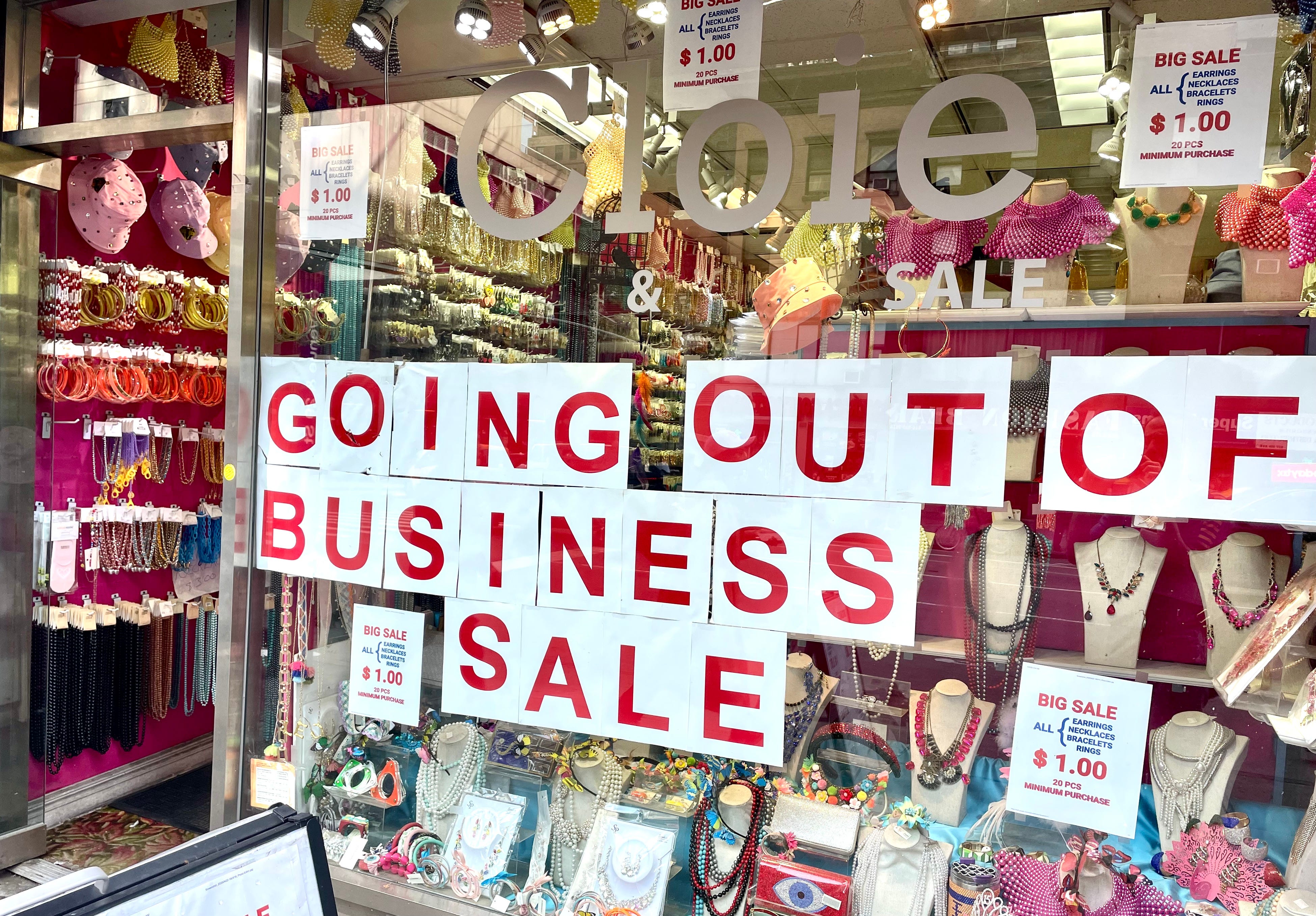
It all started when I was walking up Sixth Avenue in Manhattan last week and noticed a sign for a shop that was going out of business (see above). As my brain processed the sign, the following thought sequence played out in my head, all in the space of a nanosecond:
“Hmmm, the O and I in GOING are raised higher than the other letters. Maybe it’s a vowel thing?”
“ Oh, the O in OUT is also raised. So yes, vowels!”
“Wait, the U in OUT isn’t raised, so it’s not a vowel thing after all.”
“Hmmm, the S in SALE is also raised. Oh, and it’s also upside-down!”
And that’s when I realized that the raised letters were positioned higher than the other letters because those sheets were upside-down. I probably would have figured that out anyway, but the S was the real giveaway. (Of course, if the letters had been vertically centered on the sheets, then the upside-down letters wouldn’t have been raised, but that’s a separate issue.)
A letter or other glyph that looks the same even when it’s oriented upside-down is called an ambigram. Certain capital letters — H, I, N, O, X, and Z — are ambigrams in many fonts, especially sans serif fonts; S also qualifies in some fonts, but not the one used for that sign I saw on Sixth Avenue.
I thought this all constituted an amusing bit of inconspicuousness, so I posted the photo on Facebook. And that’s when my friend Jonathan blew my mind by posting this comment:
I fear you’re about to start noticing how many roadside hospital signs, consisting of a white H on a blue background, have a slightly lower-than-expected crossbar, because they’re upside-down. By my estimate, it’s well over half.
Jonathan happens to be one of the world’s foremost typographers. He’s designed dozens of typefaces, won lots of design awards, been featured on Netflix’s Abstract: The Art of Design series, blah-blah-blah. So it makes sense that he might notice a typographic glitch that the rest of us haven’t picked up on. But his comment still sent me reeling.
I assume we’re all well acquainted with the familiar highway signs that Jonathan’s referring to, right? They usually look something like this:
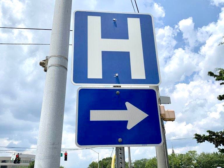
In that photo, the crossbar appears to be slightly north of the equator. But is that how it’s supposed to look? The official version of this sign (and most other highway signs) can be found in the mighty Manual on Uniform Traffic Control Devices, or MUTCD. It lists the hospital H as sign No. D9-2, with this design:
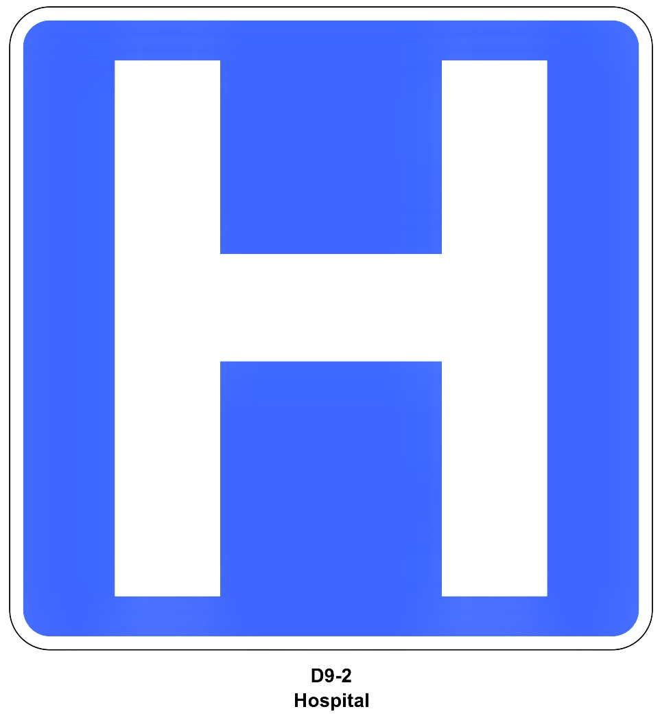
Yup, the crossbar is definitely positioned above the letter’s horizontal center. But how much above? I created a simple measuring tool and applied it to the upper and lower stems of the letter:
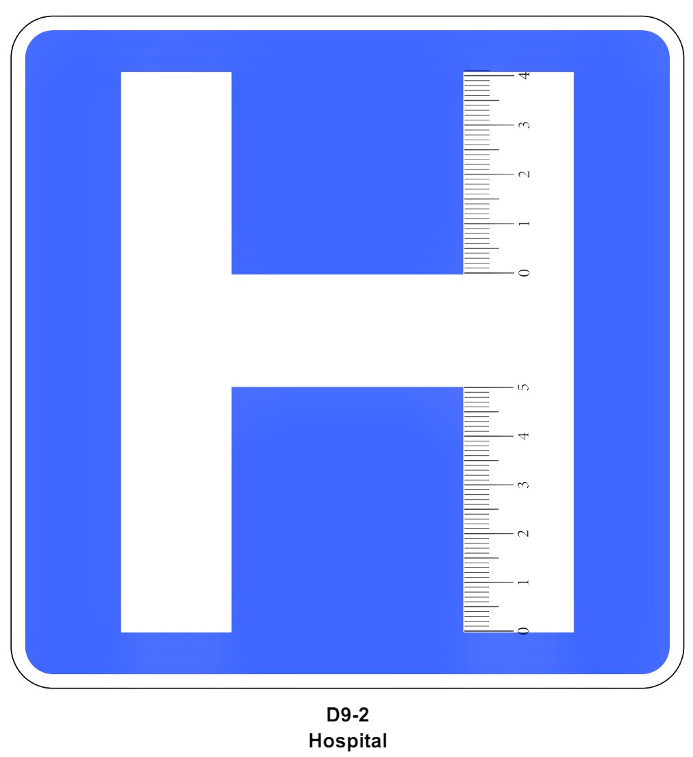
So if the lower stem measures 5 units long, the upper stem is 4.1 units long. Or to put it another way, the upper stem is about 18% shorter than the lower stem. Or to put it yet another way, this letter is definitely not an ambigram.
But it’s close to an ambigram — so close, apparently, that a lot of road crews have been mistakenly installing these signs upside-down, at least according to Jonathan. But is that really true? I immediately thought of the “H” sign pointing the way to Stony Brook University Hospital on Long Island, which I drive past whenever I visit my mom. The most recent shot of that sign on Google Street View is from July 2024, as follows:
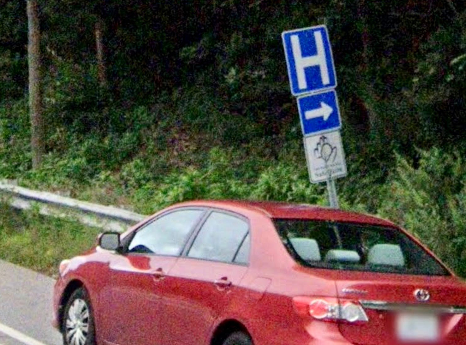
Sure enough, it’s upside-down! Not only that, but archived Street View images indicate that it’s been upside-down like that at least since 2011. I’ve probably driven past that sign hundreds of times during that span, but I never noticed the upside-down letter until now! (For what it’s worth, the sign on the other side of the highway, for cars heading in the opposite direction, is properly oriented.)
Are there other examples out there? I did a bit of Googling and came up with this promotional video from the Georgia Hospital Association. Look at what shows up just three seconds into the clip:
Upside-down! Even better, this is a video about the “H” signs. As the inverted letter appears, the voiceover says, “When you see the ‘H,’ you know a hospital is nearby,” plus the video is actually entitled “A Clear Sign” and is part of a marketing campaign whose website is at aclearsign.org. Yeah — clearly upside-down! (To be fair, the video also includes views of three properly oriented signs, at the 0:17, 0:26, and 0:40 marks.)
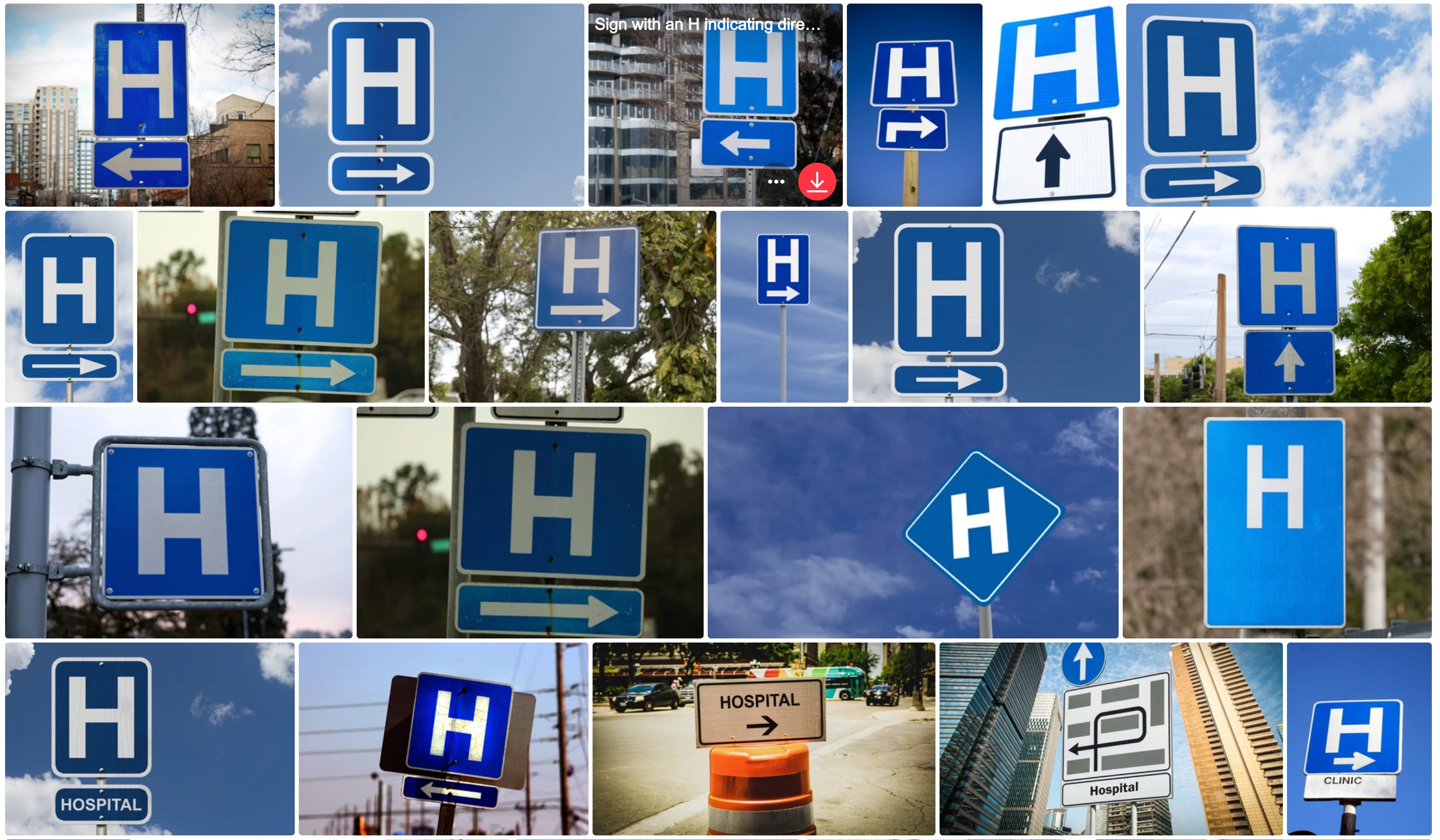
But are these just random examples, or is the situation as widespread as Jonathan indicated? A hint at the answer comes from the stock photo service Shutterstock, which has several dozen photos of “H” signs in the wild — many of which appear to be upside-down.
Okay, it’s official — the inverted hospital sign is definitely a thing. Of course, this problem could have been avoided if the MUTCD simply specified an ambigramic H for this sign. Also, I’ve noticed that more and more traffic signs have various sorts of fine print running along the bottom. If that fine print were included on a hospital sign, that too would solve the problem.
Then again, if a problem has existed for years, or even decades, with almost nobody noticing, is it actually a problem at all, or is it more of a benign idiosyncrasy? Maybe even an Easter egg?
When I asked Jonathan, the famous typographer, why he’d never told me about this phenomenon before, he said, “I wanted to spare you the torment!” I understand what he means — there are certain typographic, grammatical, and stylistic glitches that drive me bonkers when I see them, and I get how it sometimes becomes impossible to un-see a recurring glitch once it’s pointed out to you. But for whatever reason, the upside-down H strikes me as more of an enjoyably quirky variation on the norm, like an albino squirrel or a four-leaf clover. I’m glad to have learned about it, and it’ll be fun to watch for it during road trips. In fact, I suggest that we all start cataloging the “H” signs we encounter, so we can see if Jonathan is right about “well over half” of them being upside-down. If you spot any of them during your travels, you know what to do.
Meanwhile, I’m planning to vist my mom tomorrow. I will definitely check in on a certain sign!

Nesting Bowl Update!
Remember my recent post about the frustration of having an incomplete set of vintage Pyrex nesting bowls? As you may recall, I was missing the red bowl. But not anymore!
An old zine buddy of mine, Mike LaVella, saw that post and recently got in touch to let me know that he had an extra red bowl. He said:
I think I bought a red one on its own years ago and realized how much I was using it, and then someone pointed out that it was part of a set. So I was going to piece a set together like you’re doing, but in 2005 I found a whole set, really cheap — I wanna say I paid $20 for all four bowls, which meant I had two red ones. So when I read your piece, I knew what had to be done!
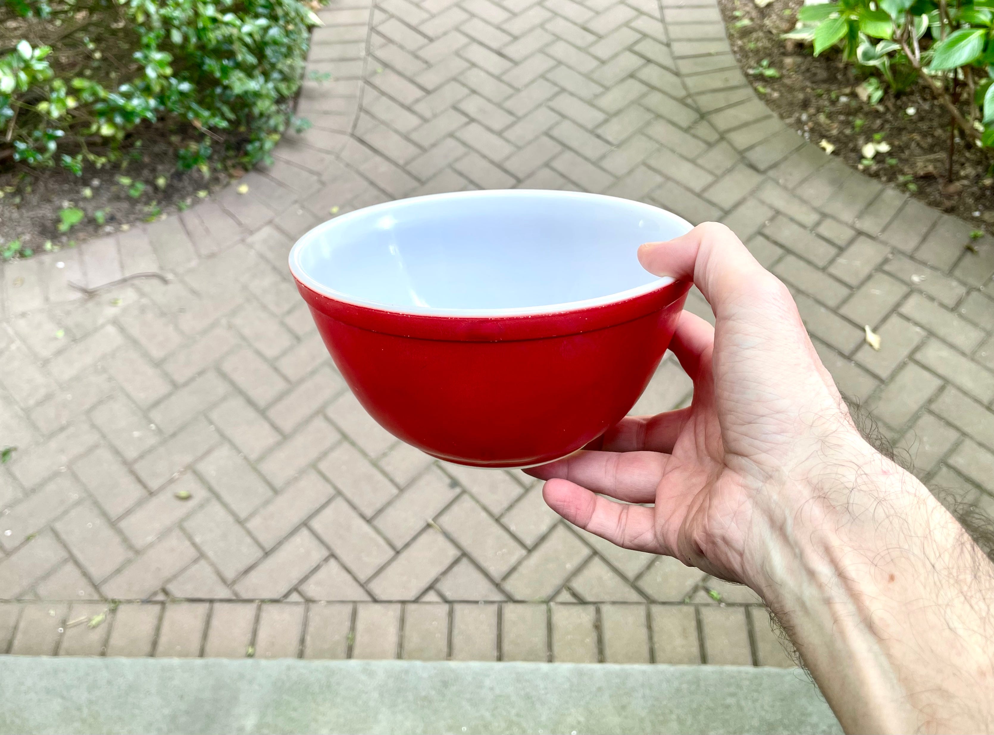
How great is that? Mike offered to give me the red bowl, gratis, as long as I covered the shipping, which of course I was happy to do. So now I have the full set:

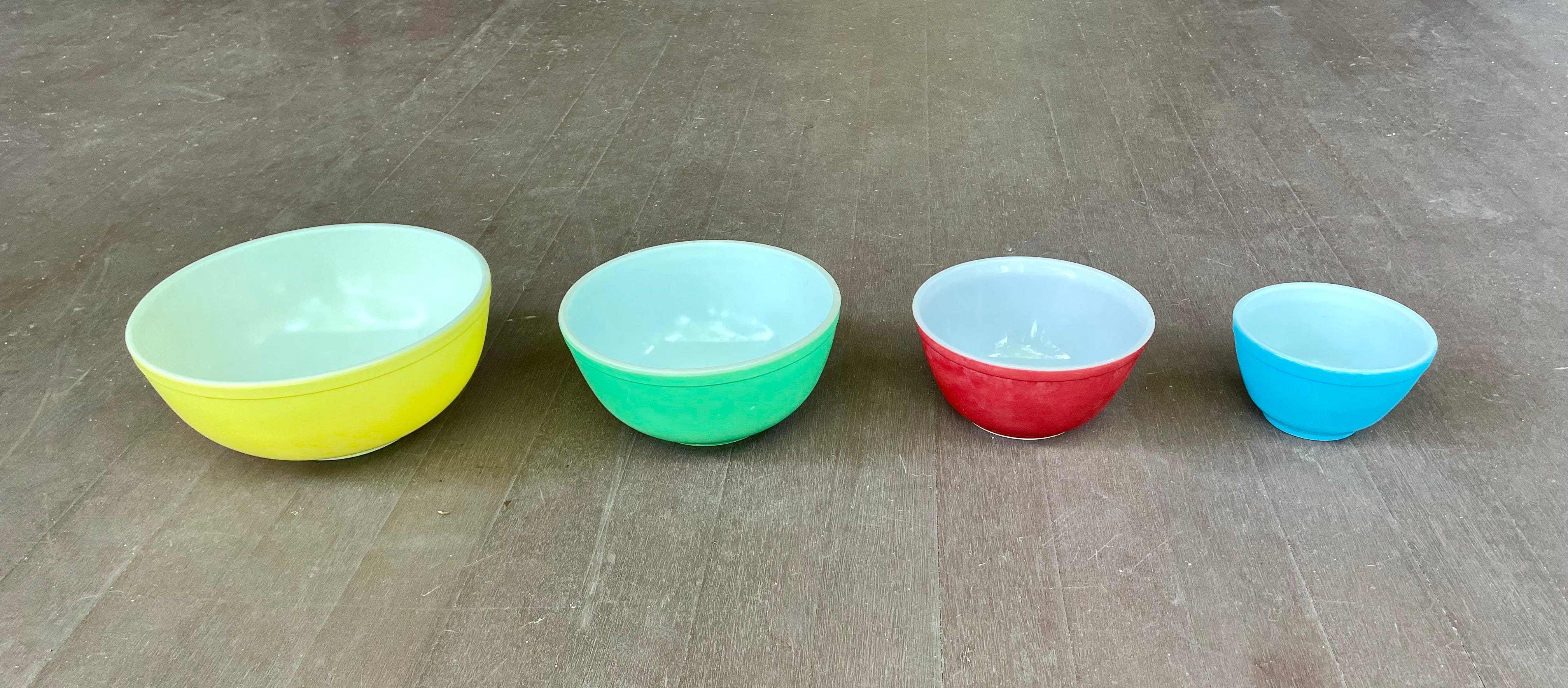
Best of all, my bowl nest, which looked annoyingly incomplete without the red bowl, has now been made whole:

Ah, that’s better.
Interestingly, Mike says he wasn’t happy with his bowl nest either, because the extra red bowl created a bulge that prevented the rims from aligning at the top:
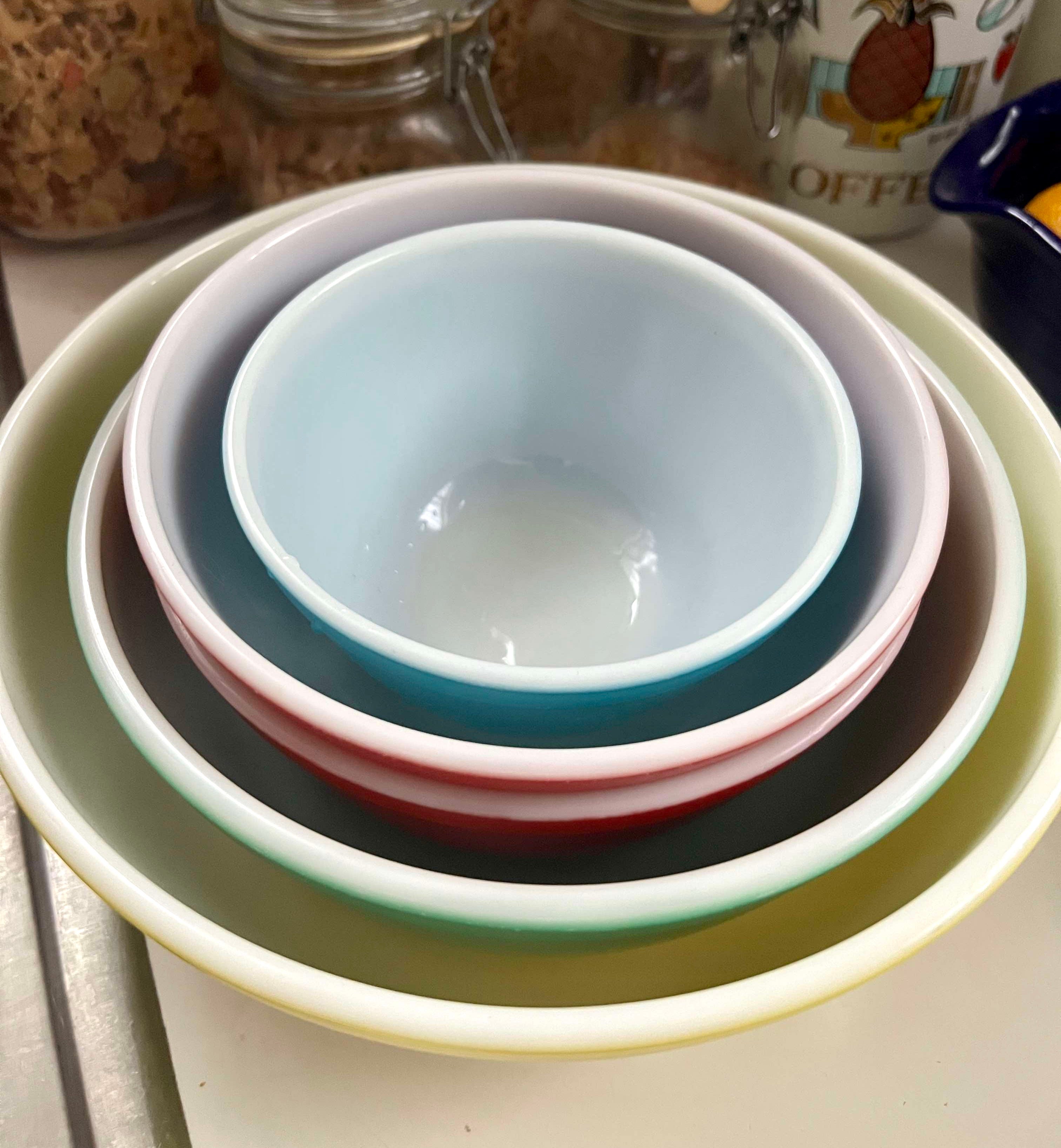
So now our respective kitchen universes have both come into alignment. A win-win!
I should note here that Mike is a serious collector guy (he measures the size of his vinyl record library not by the number of LPs he has but by the collection’s length in linear feet), so I’m super-stoked to have something that was once part of his personal stash. That’s the perfect capper to this story. Thanks, buddy!
BOMP Shirt Update
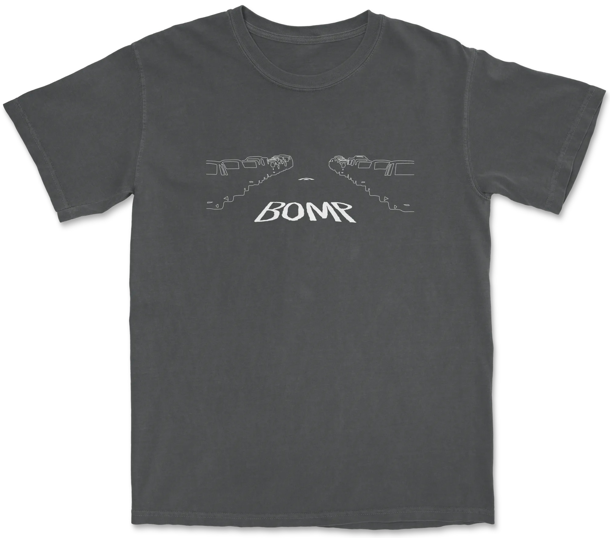
Yesterday I announced that all Inconspicuous Consumption products were available with free shipping this week — except for the BOMP T-shirt. Today I’m happy to report that the BOMP tee is now included in the free shipping promotion! You can find it listed with the rest of our T-shirts (click on the thumbnails to see the full range of colors and style options for each design), and you can also get free shipping on IC caps (again, a wide range of colors and styles), coffee mugs, and drinkware.
You can get free shipping by using the checkout code Happy12. The deal is available only through this Friday, June 20th, so don’t put it off!
Paul Lukas has been obsessing over the inconspicuous for most of his life, and has been writing about those obsessions for more than 30 years. You can contact him here.
One of my favorite things about Paul is the way he just casually drops the names of his famous friends. “I posted on Facebook about typography and my friend commented”, leaving out the fact that the friend in question is probably the world’s foremost living typographer. See also: Ira from Yo La Tengo. This is the kind of thing that probably ought to be a little annoying, but the way Paul does it, it’s actually endearing. If only everybody name-dropped as tactfully as Paul!
You know who will never have this issue? New York City. NYCDOT uses its own unique [Hospital signs](https://maps.app.goo.gl/bsKQrhGkcc4QYgsm6) that have the big white H and then "ospital" in smaller letters with an arrow in one blue rectangular sign. They also do put the "Department of Transportation" lettering at the bottom of every sign they issue so it would also ensure no upside down installs, but you don't need to worry about it at all when there is no ambiguity in which side is up on such a sign.