


Note: This post, which is not paywalled, is being published simultaneously on Inconspicuous Consumption and Uni Watch, so those of you who subscribe to both publications will be receiving it twice (sorry about that!). The post includes a reader poll that I hope you’ll participate in. — Paul
Hello! As most of you know, I have two current media projects: Inconspicuous Consumption, whose symbol is the Brannock Device, and Uni Watch, whose symbol is the winged stirrup. Now graphic designer Bryan Molloy, who’s been collaborating with me on various projects for more than a decade (including the creation of the winged stirrup in 2017), has combined those two ideas by creating the brilliant hybrid mark shown above — the winged Brannock!
Isn’t it great? It perfectly encapsulates how Uni Watch and Inconspicuous Consumption complement each other.
Bryan and I want to put this new icon on a limited-edition T-shirt. It will be available in a small range of colors — white, black, and green, and possibly grey. But before we move ahead, we’d like to have your input on the final design.
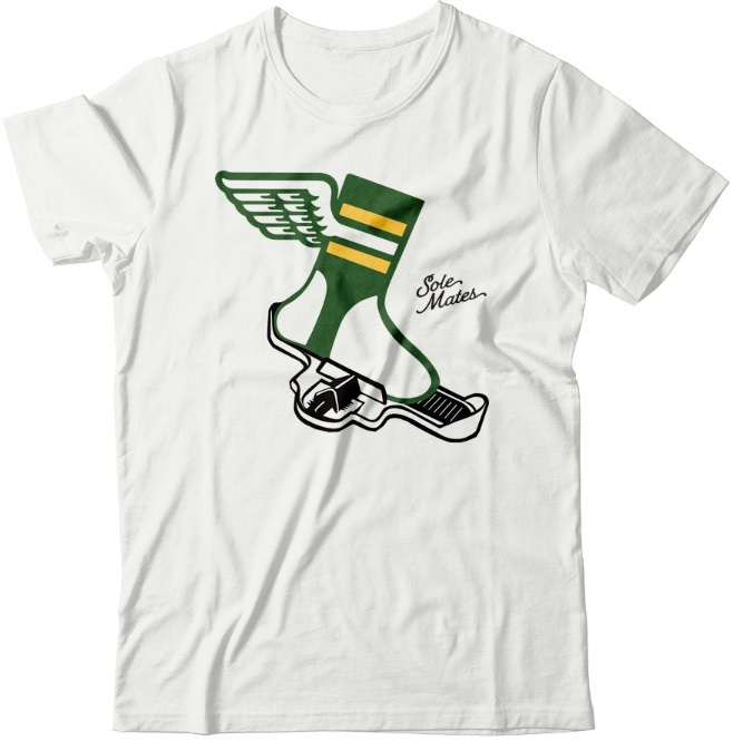
For starters, we came up with a good slogan that captures the hybrid IC/UW logo — “Sole Mates”:
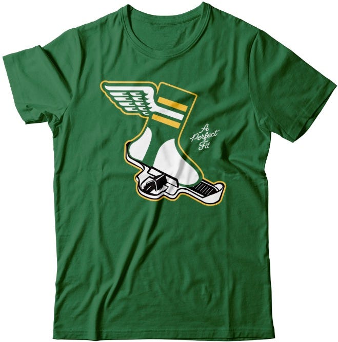
But we also thought of another good slogan — “A Perfect Fit.” Here’s how that would look:
Or we could just skip the slogan and let the winged Brannock speak for itself:
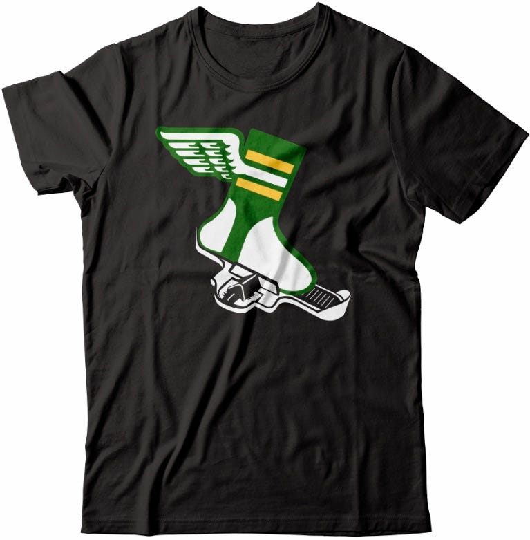
Just to be clear: Whichever version we end up going with, that version will be used for all the shirt colors.
Which version would you like to see? Cast your vote here:
Thanks in advance for your input! I’ll follow up with the poll results and shirt-ordering info shortly.
Slogans degrade t-shirts IMO, even when they are good (and those are both good). The graphic tees I always reach for are ones that have an interesting wordless design that people ask about or comment on. Planet Money squirrel, low battery indicator shirt, etc.
I like ‘A Perfect Fit.” But in my humble opinion, the foot is a bit small. I think it should be a couple of sizes larger to look more balanced.