Ask Me Anything
The latest installment in an occasional Uni Watch series.
Hello! It’s time for the latest quarterly edition of “Ask Me Anything,” where Uni Watch readers submit questions and I do my best to respond to them.
If you want to catch up on previous AMA installments, look here. There are 11 additional editions, dating back several years (when I was calling it “Question Time” instead of AMA), here.
Without further ado, here we go:
Have you ever gotten into professional wrestling? Seems with all the different outfit styles/colors/logos, that could be something right up your alley.
Pro wrestling has never appealed to me. Just not my bag — sorry.
For NFL teams wearing white jerseys, I’ve noticed that I like it better when they pair the white jersey with white pants at home, and the white jersey with the team-color pants on the road. I can't explain why. Have you ever heard anybody else think similarly?
This is definitely the first time I’ve heard someone advocate for that particular protocol. Intriguing! Of course, it wouldn’t work for teams that don’t have white pants, like the Raiders and Steelers (both of which, as it happens, almost never wear white at home anyway).
Is there a city/state/country that you’ve not traveled to and is high on your list? If so, what’s the draw — architecture, music, culture, food?
I’ve been to 49 states and need to get to Hawaii in order to check that final box. Soon, I hope!
Also, I’m very weak on overseas travel and want to explore places like Portugal, Spain, Italy, and France. For food, for culture, for sightseeing — the works. Long overdue!
Do you have a passport?
Yes, of course, although I haven’t used it as much as I’d like. I’ve been to Canada, the UK, Ireland, New Zealand, and Australia — all of which are English-speaking countries. Need to expand my parameters!
Are there any potentially great color combinations not used in any of the Big Four pro sports leagues?
I am a huge proponent of green and orange. Think of the University of Miami Hurricanes — such a great look! I wish a Big Four pro team would go that chromatic route.
You mentioned in this year’s NFL Season Preview that the Jets and Giants, who play in the same stadium, finally have their own midfield logos this season (after previously just using the NFL logo). How is that change accomplished? Do they repaint it each time, or is there a section of carpet that’s swapped out?
My understanding is that they swap out the turf. I’m glad it’s finally happening!
The only other NFL teams to share a stadium — the Rams and Chargers — have both had team-specific midfield logos since their stadium opened in 2020.
I know this is just Nike marketing BS, but am I the only person who rolls their eyes every time they release a new jersey/uniform and claim that it “wicks” 33% more sweat away from the body, therefore improving performance?
I’m sure you’re not the only one.
Generally speaking, I think the incremental performance benefits from one uni edition to another are minimal at best. But I think the cumulative benefits that accrue over time are probably real. Or to put it another way, if you have a game between Team A wearing current uniforms and Team B wearing uniforms from 25 years ago, I think Team A would have some sort of performance advantage.
I don’t necessarily think that it would be a determinative advantage (i.e., Team B could still win that game against Team A). But while a lot of the hype is just, well, hype, I don’t think it’s all just hype.
Why don’t the Pittsburgh Steelers have their logo on both sides of a player’s helmet?
The short version is that when they first added the logo to the helmet in 1962, they viewed it as an experiment and weren’t sure if they’d stick with it, so they put the logo on only one side, in case they decided to scrap the idea. And then the one-side format stuck! Longer version here.
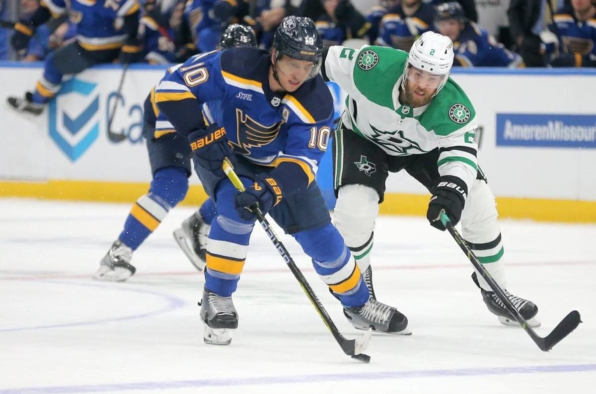
It drives me crazy that NHL teams wear color at home and white on the road. As a Blues fan, every time I watch a home game it’s blue vs. white. Chicago coming in? Blue vs. white. Minnesota? Blue vs. white. I would like to see variety! Are you as frustrated by this as I am?
NHL teams wore white at home from 1970 through 2003, and I much preferred it that way — in part for the reason you cite, but also because I think most NHL teams’ white uniforms (including the Blues’) are much better-looking than their colored uniforms.
So why did the NHL change to color at home in 2003? Like so many other things, it was driven by merchandising: Fans buy more colored jerseys than white jerseys. Sigh.
You sometimes mention that you know and hang out with various people from WFMU. How did you come to be friends with some of the coolest DJs on the best radio station on the planet?
Back in the 1980s and ’90s, I spent some time as a rock critic and also published a fanzine (which wasn’t about music but was sort of music-adjacent and was popular in indie-rock circles). During that time, I connected with lots of bands, DJs, and other people connected to “the scene,” including a bunch of WFMU people. Those connections and friendships continue to form the core of my social world today.
I was just in San Diego, checking off another ballpark off my list. The Friar Frank was pretty darn good, and it got me wondering, what is your favorite ballpark hot dog?
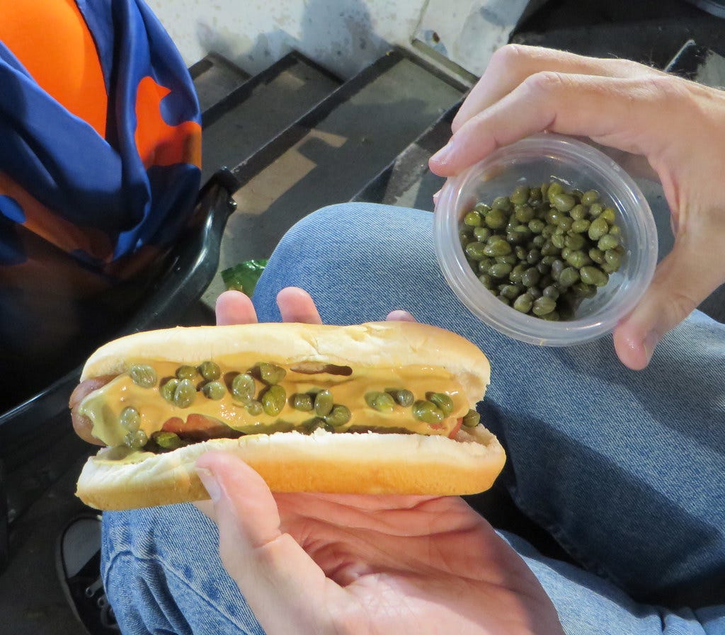
One thing I really like about attending a baseball game is that they still let you bring in your own food (which is particularly handy now that ballpark food has gotten so ridiculously expensive). When I was a kid, our family would get some frozen fried chicken, cook it the night before the game, and then bring it to the ballpark. I still do that today. A Lukas tradition!
All of which is a long way of saying that while I occasionally get a dog at the game (and, as you can see in the photo above, sometimes even bring my own toppings), I more often skip it and just eat my chicken. So I can’t really speak knowledgeably about all the different ballpark franks — sorry!
How many MLB ballparks have you been to?
Not that many in the grand scheme of things. The teams whose home games I’ve attended are Atlanta (not the current stadium), the Brewers, Cardinals, Cubs, Mets (current and previous stadiums), Orioles, Phillies, Pirates, Red Sox, Rockies, Tigers (not the current stadium), and Yankees (not the current stadium). So that’s 13 ballparks for 12 teams in 11 cities.
I know some people like to go to every stadium. I understand that impulse — it’s a form of collecting, which I certainly relate to — but I’ve never felt the urge to do it myself.
You’re a critic and reviewer, so what do you think is the best rating system? A scale of 1 to 10? 1 to 100? Letter grades, thumbs up/down, four (or five) stars? What's your preferred method?
Ha, great question! Honestly, I’m not nuts about shorthand rating systems, because (a) they generally encourage readers to look at the “score” without bothering to read the analysis (I’ve certainly been guilty of this sometimes myself), and (b) they sometimes have wag-the-dog effects on a given industry (it’s kind of nuts how the restaurant biz is driven by Michelin stars, for example). Also, some collective rating scales, like Rotten Tomatoes, can be gamed. All of which is why I’ve mostly avoided rating systems while writing about uniforms. I did sometimes use letter grades when writing for ESPN, mainly because that made my editors happy, but I tried to keep it to a minimum.
That said, some critics have managed to use a grading system as a useful tool. The longtime rock critic Robert Christgau, for example, has been using letter grades for more than 50 years. The grades, whose criteria he spells out, are part of his critical lexicon and provide useful context to track his thoughts on a given artist. Similarly, the music website Pitchfork’s numerical rating system has some value (although its use by hundreds of different writers on the site limits its utility). The key thing about both of those examples is that the rating systems have endured over long periods of time, so they have a certain institutional consistency — or at least that’s the idea.
Personally, though, I think that if the point of criticism is to encourage tasteful cultural output and thoughtful cultural consumption, rating systems mostly work against those goals.
What is your favorite new NFL uniform this season in each category (primary color, primary white, alternate, and throwback)?
Well, the only new primary uniforms this season are for the Cardinals, so I have no choice but to choose them by default, even though I think their new uniforms are pretty bad.
My favorite new throwback is Philly’s Kelly green design. And I guess my favorite new alternate is Cleveland’s new white fauxback helmet, if we can count that as an alternate. You can see my thoughts on all of this year’s new alts and throwbacks here.
How do you foresee the NFL uni landscape unfolding in the near future? Will it become more like the other leagues with multiple uniform sets, or stay with just a throwback?
The NFL is unlikely to end up like the NBA or MLB because there are only 17 games in the regular season. Teams generally like to wear their alternate designs at home, so there’s a limit to how many alternate designs you can wear without watering down your primary design. But I do think we’ll start to see more teams introduce alternate helmets, and that the league will begin to allow teams to mix/match the alternate helmets with their primary jerseys (as the Bengals are doing this year).
What weird or unusual food combinations do you really enjoy?
As noted earlier in this AMA, I like capers on my hot dog. And here’s a weird one: I dunk my buttered toast in my glass of orange juice. Every morning, in fact! I learned this from my father when I was very young, and I realize it makes no sense to anyone else. Just one of those personal quirks.
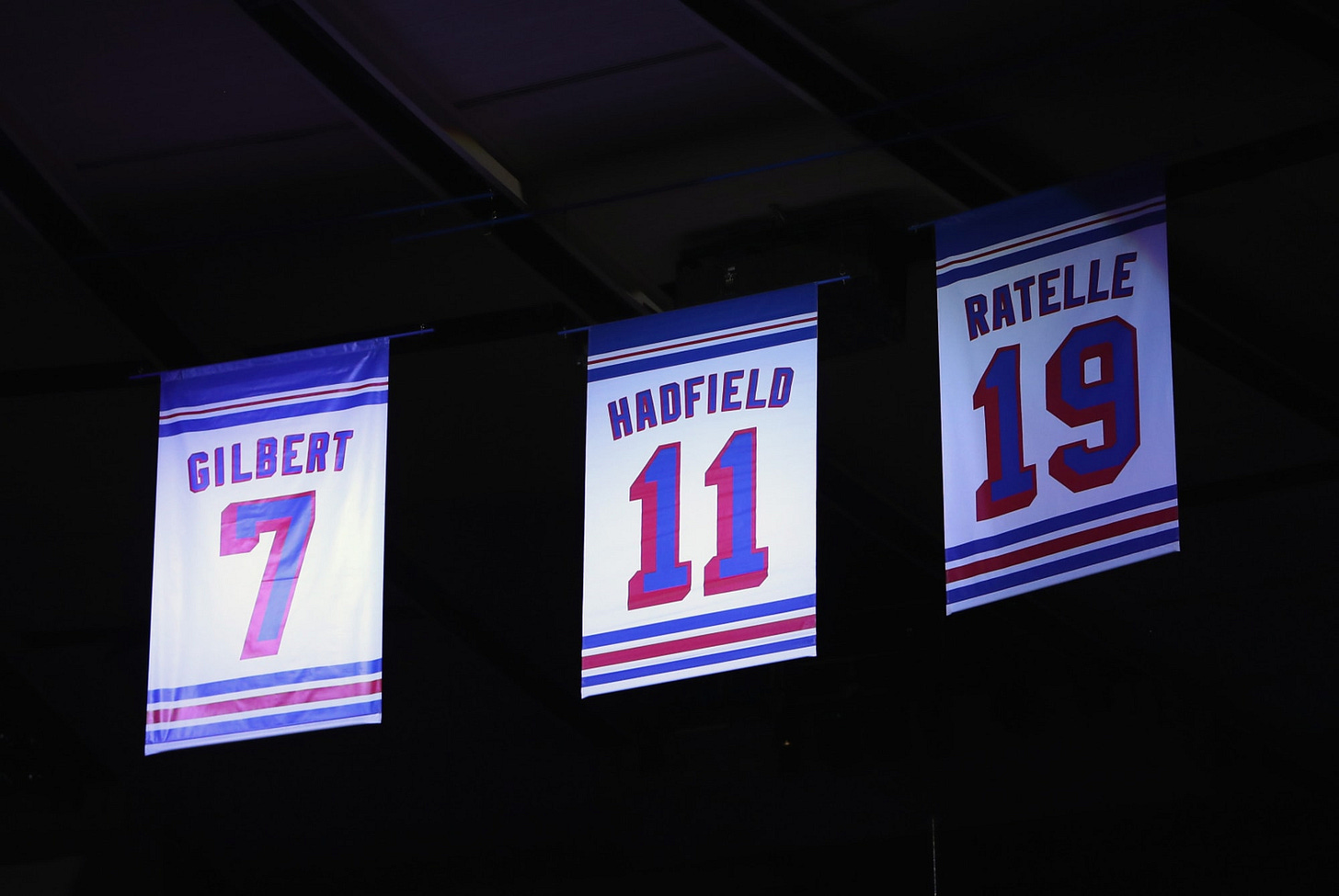
Regarding NHL retired number banners: Teams like the Rangers, Islanders, Red Wings, and Kings mostly replicate the look of the actual jersey, while teams like the Bruins and Caps use different designs. Do you have a preference? I’m partial to the jersey-themed format.
I too prefer the jersey-based treatment (for all sports, not just hockey), but only if each player’s design is era appropriate. The Rangers, for example, use subtle radial arching for the NOBs on their banners (as shown above), which the team has never actually worn on the ice. Grrrr.
I did a fun piece last year about the making of a Sabres banner. You can check it out here.
Earlier this year you did Uni Watch Positivity Week, which I think many readers enjoyed. Now that we’re a few months removed, how do you feel about that week? Any plans to do something similar in the future?
Uni Watch Positivity Week, which I announced back in June, was my attempt to produce a full week’s worth of Uni Watch content without writing anything negative or critical. It was a journalism experiment that doubled as a mental health exercise. Here’s the content I produced that week.
Overall, I’d say it was a success. Readers seemed to enjoy it, and so did I. (Luckily for all of us, the uni-verse didn’t foist any horrible designs or MLB sleeve ads on us that week!) So I’ll probably try it again sometime next year — not necessarily during that same period in mid-June, but at some point in 2024.
In your recent travelogue post, you wrote, “Considering my color preferences, how could I not love a place whose nickname is the Evergreen State?” How far would you say your connection to the color green goes? Favorite color? Part of your identity? What do you think of people who are indifferent to color or have no favorite color? Do you think being partial to a color and Getting It™ are correlated?

I’ve loved the color green since I was very, very young. The sight of it makes me happy. When I was turning five years old, my parents were planning to get me my first bicycle as a birthday present, and I made sure they knew it better be green! (It was.)
I’m typing this on a laptop computer whose desktop background is green, and I’m doing so while sitting on a green sofa. My home also has three green rugs, green towels, a green bathmat, green bedsheets, assorted green tchotchkes, and probably a few other green things that I’m forgetting. I also have lots of green clothing, Uni Watch’s main color is green, and for a while I had a green car! So yes, green is definitely my favorite color and part of my identity. (That said, I also have plenty of non-green clothing, non-green furniture, etc.)
I don’t think any less of someone who doesn’t have a favorite color, nor do I think having a favorite color is a prerequisite for Getting It™. What I find more puzzling is when someone changes their mind about their favorite color. My mom, for example spent a good chunk of her life being partial to orange, but more recently she’s become a big fan of purple (I know, I know). When I ask her what happened to her enthusiasm for orange, she says she just got tired of it. Okay, I guess, but I can’t conceive of an existence in which I get tired of green.
I was wondering why the Unified podcast with you and Chris Creamer stopped, and if there were plans to resume in the future. I really enjoyed listening and learning from both of your perspectives.
Thanks! For those who don’t know, Unified was a weekly uni-themed podcast that SportsLogos.net founder Chris Creamer and I co-hosted for about the first six months of 2021. It was a lot of fun, and a great learning experience, but we ended up pulling the plug on it for two reasons:
It turns out that doing a podcast is a lot more complicated than just sitting down and yakking. It’s a lot of work and takes a substantial amount of time and energy. Planning, scheduling, storyboarding, dealing with advertisers and their scripts, editing, production, website, video, etc.
Unified was exactly what Chris and I both needed during the depths of the pandemic, when we were stuck at home and needed a new project to occupy ourselves. But as the pandemic subsided a bit and we began to reclaim certain aspects of our lives, continuing to do the podcast began to seem unsustainable. We just didn’t have the personal bandwidth for it, and we both admitted that we were sort of relieved when we agreed to stop.
I’m glad you liked Unified. Chris and I liked it too! I’m sorry we couldn’t keep doing it, but it was just too much.
Are you still riding your bike? If so, what kind of bike and what kind of route do you typically take?
I bike almost every day in Prospect Park (Brooklyn’s version of Central Park). The park is about a mile and a half from Uni Watch HQ, so I bike to the park and then do a few laps around the biking/jogging loop. I like to say that it’s my gym and it’s also my shrink — good for my physical and mental health.
I also ride around Brooklyn to run errands, go to movie theaters, go to the doctor, etc. Basically, if I can bike somewhere fairly quickly and easily, I’d rather do that instead of taking the train or driving. (I’ll occasionally bike into Manhattan too, but usually I’ll take the subway.)
Although I bike a lot, I’m not a biker guy — I’m just a guy who bikes. In other words, I don’t own biker shorts, I don’t have the special shoes that snap into the funny little pedals, I don’t have a basement full of bikes and spare parts, etc.
My bike is a Trek 7.5 FX, which I got in 2010. At the time, I think it listed for about $930 (although I got a discounted price from a friend at a dealership). Sadly, it is not green, but aside from that it seems to be doing fine, so I don’t see any need to swap it out for a new ride, at least for now.
Biking has its hazards. I’ve had three major crashes over the years, which resulted in a broken wrist that required surgery (2012), another broken wrist but no surgery (2015), and some facial stitches (2018). Whether due to persistence or just stupidity, I always get right back on the bike as soon as I’m able. (Fortunately, NYC has gotten much better about installing dedicated bike lanes, which makes cycling a less risky endeavor.)
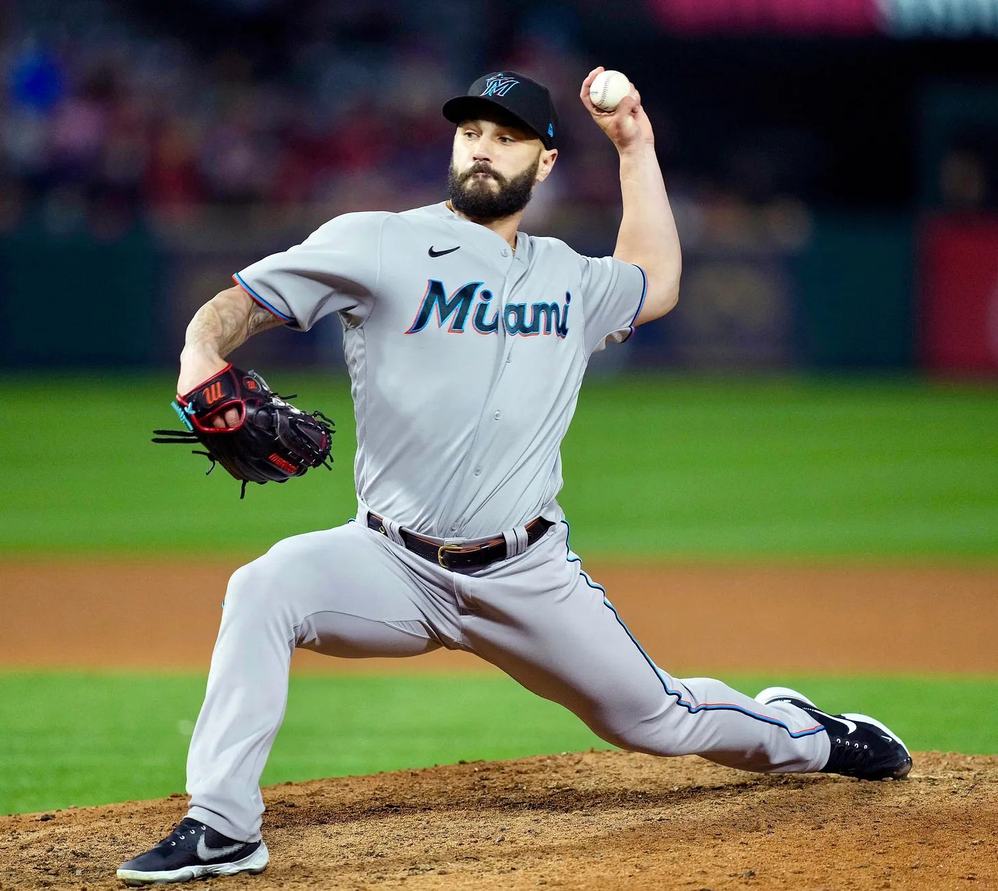
What would you say is the worst or most boring MLB road uni?
“Worst” and “most boring” aren’t necessarily the same thing, but I’ll go with the Marlins, because their (boring) road uni is the same thing as their (boring) home uni, except on grey instead of white.
Of course, a few other teams also duplicate their home scripts on their road jerseys, like the Phillies and Cardinals. But those are much better designs to start with than Miami’s.
I assume at this point in your life you do not plan on having any children. Was there ever a time when you particularly wanted kids or thought you might have them?
Even when I was a kid, I knew I didn’t want to have kids. I’m not sure why — parenthood has just never appealed to me. When I imagine a life that seems interesting, adventurous, fun, romantic, sexy, and so on, I’ve always envisioned having a partner, and also pets, but not children. Parenthood just never pushed my buttons. (This feeling is certainly not a reflection on my own parents, who gave me a great upbringing. I have no gripes or issues with them!)
Obviously, there’s a lot of societal pressure in our culture to have children — more so for women, but also for guys. So at various points I’ve wondered what not wanting kids says about me. Does it mean I’m selfish? Immature? Lazy? Probably yes, yes, and yes, at least to some degree. But at some point you just have to accept who you are (and, just as importantly, who you aren’t), and I long ago accepted my disinterest in parenthood. I no longer worry about what it “means.”
As it happens — and I’m sure this isn’t just a coincidence — most of my friends are also childless. (Maybe they’re selfish, immature, and lazy too!) It’s not that we dislike kids; it’s just that we’ve chosen other priorities for our lives, and we’re happy with those choices.
When I was younger, the “no kids” thing occasionally caused problems in my dating life, scuttling some relationships and precluding others. Thankfully, I’ve now reached the age where that’s no longer an issue!
You present a lot of your life as an open book in a digital space. Is there any chance of you compiling an autobiographical book to preserve a physical record of your life and work?
I suppose it’s possible, but I can’t say that a memoir or anything like that is high on my “to do” list. As you point out, I already share a lot of myself digitally, so the idea of going back and repeating/recapping things I’ve already written about online feels like it would just be covering old ground, which doesn’t seem very interesting to me from a creative standpoint.
Also: While digital journalism (or blogging, or whatever you want to call it) certainly isn’t perfect, I do like how conversational and interactive it is. Look at the conversation you and I are having right here! We couldn’t do that with a book.
I also like the fast pace of digital publishing. Having worked in book publishing back in my 20s, I know that producing a book takes soooooo long. At this point in my life, I doubt whether I have the patience for that kind of project.
Maybe it’s shortsighted of me, but I don’t worry too much about how my work will live on in posterity. I’m more interested in creating new work!
You've mentioned that you occasionally drew uni- and logo-related doodles on your schoolwork when you were growing up. Did you ever save any of those doodles or any of your other drawings from your youth?
I wish! One of my favorite things about Uni Watch is sharing readers’ childhood uni artwork, but I can’t share any of my own because I didn’t save any of it. D’oh! Big mistake.
What is your most prized uni-related item that you’d would want to save in the event of a fire (aside from family heirlooms and the like, of course)?
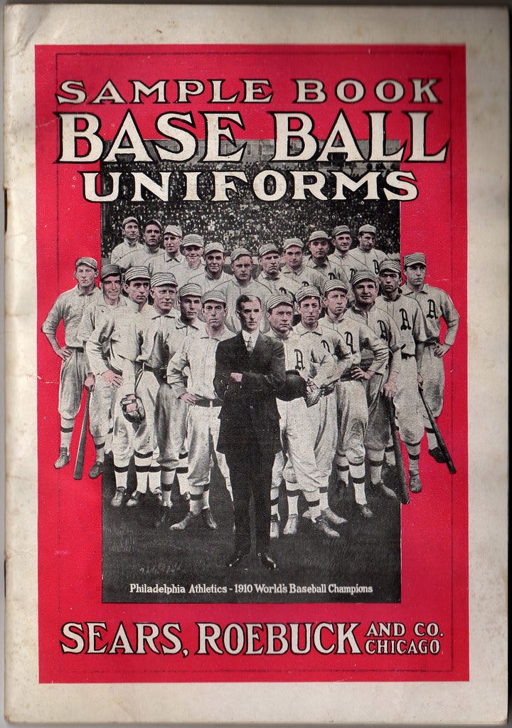
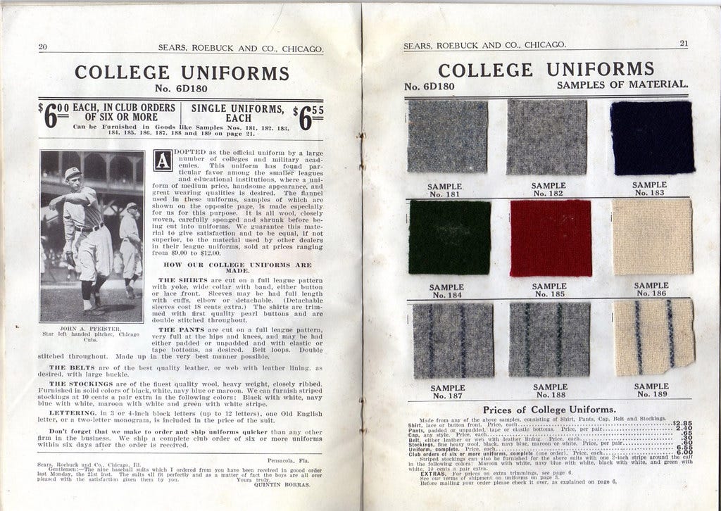
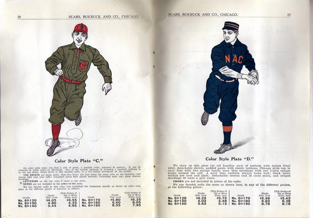
I’d probably want to save the 1911 Sears, Roebuck baseball uniform catalog whose cover is shown above. It’s a real gem — here are a few of the interior pages:
It’s very, very special.
Also, while I’m not a soccer fan, I have a 1935 Umbro soccer kit catalog that’s really amazing. You can check that out here.
I have dozens of additional vintage uni catalogs, along with lots of league style guides, etc., etc. But that 1911 Sears catalog is the cream of the crop.
What’s wrong with people?
The same thing that’s right about them: They (we) are human.
What are your favorite current uni matchups in each of the Big Four pro leagues?
My answers to this could vary depending on the day you ask me. But for today:
MLB: Cardinals (white) vs. Mets (grey).
NFL: Packers (green) vs. 49ers (white).
NHL: Rangers (white) vs. Bruins (black).
NBA: Celtics (white) vs. Spurs (black).
Why do some MLB players not show any sock at all? Couldn’t teams mandate that they go high-cuffed?
As I’m sure you know, I hate the long-pants style. Aesthetic issues aside, however, many players find long pants to be more comfortable and lower-maintenance.
The time to police this was back in the 1980s, when George Hendrick, Ron Darling, and others began wearing their pants down toward their ankles. Unfortunately, it’s now way too late to get the toothpaste back in the tube. High school, college, and minor league teams can (and sometimes do!) mandate that their players go high-cuffed, but doing that on the big league level would require consent from the players’ union, which would never agree to it. Moreover, most teams wouldn’t want to do it to begin with — if you’re paying a guy millions of dollars and he says, “I’m most comfortable with long pants,” then you’re gonna want him to be comfortable!
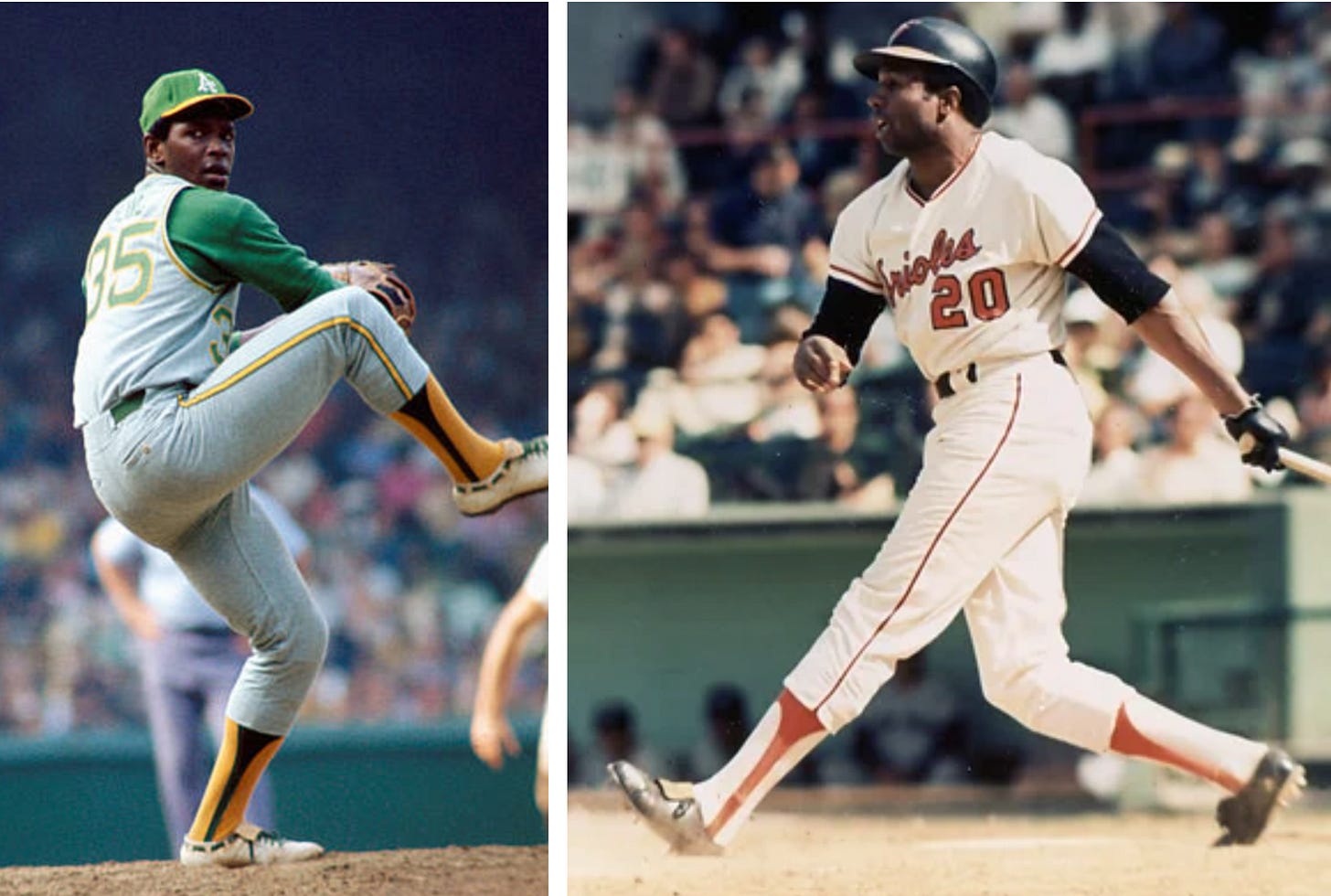
I was a Little Leaguer in the 1970s. I loved the high-cut stirrups of Frank Robinson and Vida Blue, so I had my mother cut my stirrups and add extra material so I could have that look. What about you — did you go with high- or low-cut stirrups?
I got my first Little League uniform in 1973, and I wanted to get the stirrups Just Right. Looking back, I was always a fan of what I’d now call “medium-cut” stirrups. I was always trying to achieve the ideal stirrup-to-white ratio. I don’t recall who my MLB stirrups role model was at the time, but I later came to think that Keith Hernandez was the perfect exemplar of my preferred style:
That’s pretty much what I was aiming for each time I suited up. But I’m sure my stirrups ended up all twisted and uneven after an inning or two, just like every other Little Leaguer’s!
Have you ever bought anything from any of the companies advertising on uniforms or stadiums?
Not that I can think of off the top of my head. Generally speaking, though, these types of ads aren’t necessarily designed to prompt an immediate purchase. They’re designed to raise the brand’s profile, make them seem more like a “big player” in the marketplace, and so on. So if an MLB sleeve ad (or NHL jersey ad, or whatever) doesn’t immediately give you the urge to make a purchase, that doesn’t necessarily mean the ad has failed. The payoff may come months or even years later, when you take the brand more seriously because you’re more familiar with it due to the repeated exposure to the ad. Or maybe the brand raises its prices over time and the existing customers are willing to pay more because they associate the sleeve ad with a “premium” product.
This doesn’t change the fact that uni ads still suck, of course. I’m just saying that you can’t judge their efficacy simply on the basis of short-term consumer behavior.
Do you prefer classic teams that stay true to a classic identity or a team that’s constantly innovating and changing?
First, I want to nitpick at your premise: “Innovating” and “changing” are not necessarily the same thing. Innovation usually involves change, it’s true, but not all change is innovative. One strain of bullshit that we routinely see these days — in modern corporate culture in general and in the uni-verse in particular — is the tendency to claim that anything new is “innovative.” Sometimes these claims are accurate; more often, they’re just a linguistic smokescreen to justify change for change’s sake.
All of that said: As I’ve explained many times, when it comes to uniforms, I’m a classicist, which means that my basic position is, “If it ain’t broke, don’t fix it. But if you can improve it, go for it!”
But even if you improve a team’s look, I don’t think you should keep tinkering with it all the time. The reason we care about a uniform, at least to my way of thinking, is that it’s familiar, it’s instantly recognizable, we root for it no matter who’s wearing it because you have a bond with it. It’s hard to maintain that connection if the design is constantly changing.
I’d make an exception for Oregon’s football team, because constant change (or, if you prefer, “innovation”) is their visual calling card. That approach works for them because they pioneered it, but I don’t think it works for anyone else.
Who actually has final say in the approval of a uniform for a professional sports team? Is it the owner, or is there a committee, or does the manufacturer control the final design?
At the pro level, the team always has the final say. Now, sometimes the manufacturer will push hard to get the team to go in a particular direction (just like any vendor pitching an idea to a client), and sometimes a team will even say to the manufacturer, “We’re putting ourselves in your capable hands — knock yourselves out!” But the client (i.e., the team) always has the final word.
Things are a little different in the NCAA, because schools’ contracts with Nike, Adidas, and Under Armour often give the manufacturers more leeway, especially for “special” uniforms.
Are there any sports you haven't tried and/or haven't watched that you think might try and/or watch in the future?
I don’t think there’s any sport that I want to start watching on TV. As for playing, I haven’t yet tried pickleball, and I’ll admit to being curious about it. I used to play a lot of paddleball, and I’ve played my share of tennis (although it’s been a while), so I think I might be okay at pickleball. Does anyone know anything about the uniforms?
In a fictional universe where you have just been called up from the minors to play for your beloved New York Mets, which number are you choosing and why?
I’d go with No 7 — in part because I like that number (and all prime numbers), and in part as a shout-out to Ed Kranepool, who I grew up rooting for.
What is the biggest “What if?” that didn’t work out or that you turned down so far?
When it comes to regrets or misgivings about the road not taken or things that didn’t pan out, I can honestly say that I don’t have any. I’m not saying my life is perfect or that I’d keep everything exactly the same if I could start over (as noted earlier in this article, for example, I wish I’d done more international travel; perhaps relatedly, I wish I’d paid more attention during high school Spanish class), but there haven’t been any major forks in the road that have left me wondering what would’ve happened if I’d chosen “X” instead of “Y.”
That said, however, there’s this: You know that cliché about how we should all “dance like nobody’s watching”? I can’t do that. In fact, I can’t really dance at all. For whatever reason, I’ve never been comfortable doing it. It’s not that I’m uncoordinated (I’m not) or that I have no sense of rhythm (I do), or that I think dancing is stupid (on the contrary, I think it’s cool and attractive). There’s just something about dancing, or even the prospect of dancing, that reduces me to the level of a pre-adolescent dweeb and makes me really uptight.
In 1986, when I was 22, I read a very positive record review of a James Brown reissue LP. The writer, Byron Coley, heaped praise upon the record and concluded by saying, “It takes a man of my moral fiber not to dance when this shit starts pumpin’.” In other words, Coley was proud to be a non-dancer, and was going out of his way to say so. That made a huge impression on me (obviously, since I’m recalling it nearly 40 years later). I’d never encountered that point of view before, and for a while I tried to adopt it as my own. Like, fuck dancing — it’s stupid!
But I never really believed that. Deep down, I thought dancing was cool and that my inability to do it was some sort of personal failing. That’s still what I think today. Over the years, I’ve occasionally tried to power through my anxiety and dance anyway when the opportunity presented itself, and at one point I even took a lesson (it did not go well), but now I just try to avoid dancing situations as much as possible.
All of which leads to this: I sometimes wonder what my life might have been like if I’d been a good dancer (or at least a comfortable dancer), because I think it would give me a lot more social confidence, maybe some more physical charisma, and less shame and anxiety. When I play out these scenarios in my head, I imagine how dancing like everyone else at friends’ weddings (or wherever) would somehow be so transformative that it would change the arc of my life in all sorts of positive ways. Obviously, that’s pretty silly, but the fact that I invest so much speculative potential in this one activity — dancing — is a measure of how loaded a proposition it is for me.
So that’s my “What if” scenario. It’s not so much about making a different choice, but more about having a different mindset, or maybe even being a different person — a person who can dance.
One thing I’ve always enjoyed about baseball cards is observing the card designs from year to year, especially with Topps, which would seemingly wipe the slate clean and come up with a totally different design each year. Did you ever have any interest in baseball cards? If so, do the designs from any particular year jump out at you as being really good or really bad?
I collected cards from 1972 (when I was eight years old) through 1976 (12 years old). so that was the formative period for me. I particularly liked the 1973 template and even used it as the basis for my own Uni Watch trading card a few years back.
As for a design I didn’t like, I never much cared for the 1975 set. That two-tone background template always seemed cheesy to me.
With the exception of the Twins, there haven’t been a lot of MLB uniform makeovers lately. Do you think MLB’s move to the new Nike template in 2024 will result in a lot of changes/updates/rebrands?
It’s possible, but I wouldn’t count on it. Recent history shows that the move to a new manufacturer or template doesn’t correlate with a lot of design churn. For example:
When the NFL adopted a new template this year, only one team (the Cardinals) got a full makeover.
When the NFL moved from Reebok to Nike in 2012, only one team (the Seahawks) got a full makeover.
When the NHL moved from Reebok to Adidas in 2017, the league actually eliminated alternate uniforms for one season.
Of course, it’s possible that some teams are planning to launch redesigns in conjunction with the new template. But it’s also possible that teams will wait and see how the new template’s rollout goes before committing to anything. We’ll have to wait and see.
Let’s have a list of Paul’s favorites! What are your uniform, sport, shirt, holiday, season, meal, podcast, band?
In order: Cardinals (MLB), baseball, an old Cheap Trick tee that I got in 1988, Thanksgiving, autumn, smoked pork ribs, This American Life, the Rolling Stones.
I’m a lifelong Cowboys fan. Why do you think they won’t standardize their shade of blue?
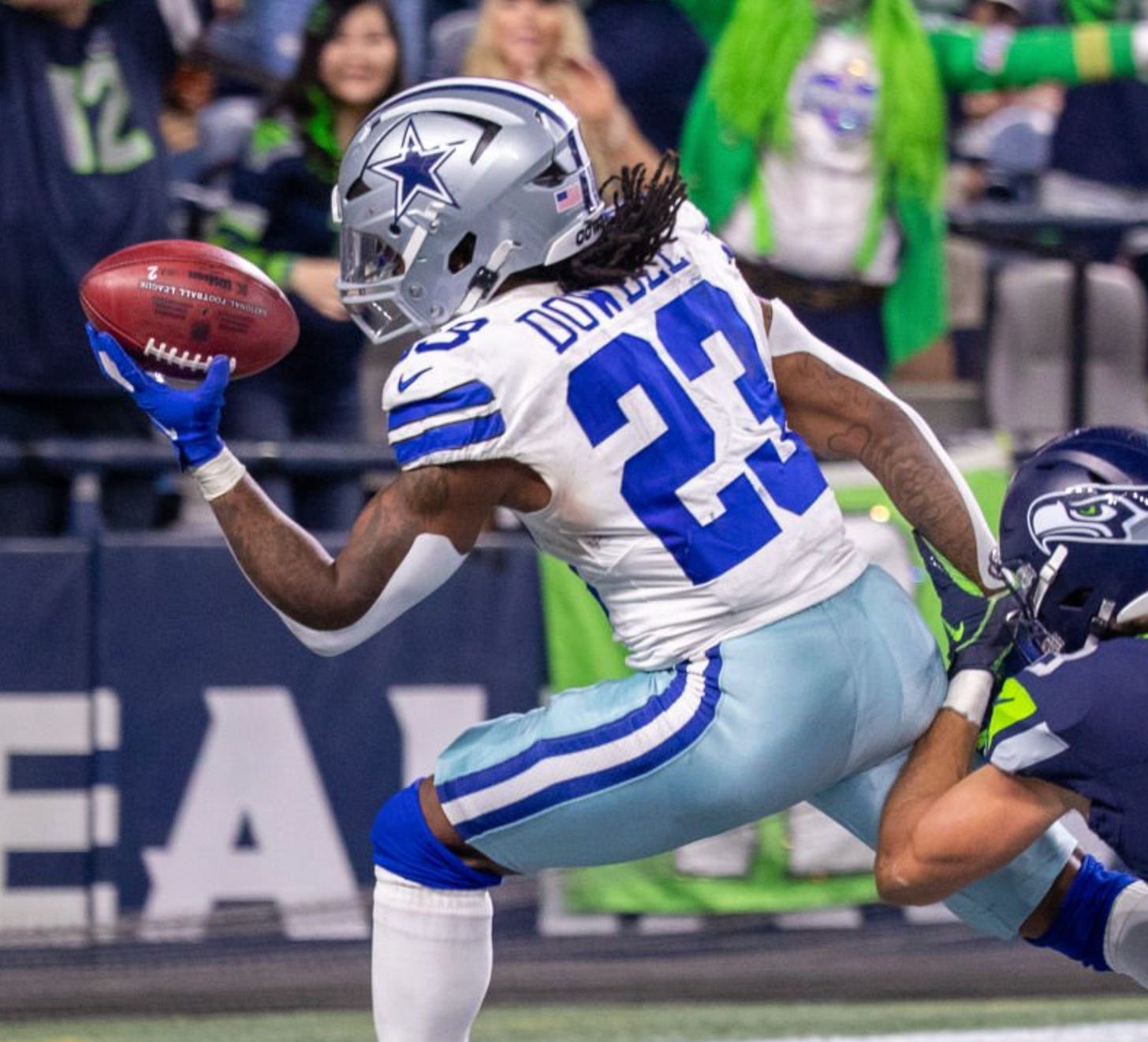
First, I should say that the Cowboys’ inconsistent shades of blue have never bothered me. Not sure why — seems like something that would bug me (and I certainly understand why it bugs you and so many other fans), but I’ve always been okay with it.
As for why they don’t change it, I have a feeling that Jerry Jones doesn’t want to tinker with the team’s longstanding look (but that’s just a hunch). Remember, the Detroit Tigers had inconsistent “D” logos on their cap and home jerseys for decades before they eventually standardized them in 2018, and the New York Yankees still have inconsistent cap and jersey “NY” logos! Personally, I kind of enjoy these little wrinkles in the uni-verse, although I realize they drive other people nuts.
Do you pay for everything you read online (assuming the site has a paywall/subscription), or do you sometimes use the various paywall workarounds?
Supporting journalism that I value is important to me both as a journalist myself and as a citizen, so I pay for quite a bit of it and am generally happy to do so (although sometimes, of course, I have to make hard budgetary decisions about what I’m willing or unwilling to pay for, same as with any other consumer decision).
The only exception is a certain paywalled website that once screwed me over professionally. I prefer not to give them money and occasionally use a simple “hack” to read their articles if they publish something I’m particularly curious about (although I mostly just avoid their content altogether).
What are your thoughts about the changes in the media landscape over the last 30 years, and how that affects culture and society at large? You began your career writing for alt-weeklies, but so many of those have gone extinct. Newspapers are dying and getting bought up by hedge funds, and as a result there is no common shared culture or experience; it is so fragmented and siloed. How has this affected you personally, and what do you think it portends for the next 10 to 20 years?
A proper answer to this question would be the length of a book. A shorter and very incomplete answer would be (a) I feel fortunate to have ridden out the various changes to the media landscape during my career without having gotten kicked off the horse altogether, and (b) I’m concerned by the current state of journalism, especially local news coverage, which has become so atrophied that I fear we’ll see a huge expansion of local political corruption because there will be nobody to hold local officials to account.
I should add, however, that media being “siloed and fragmented,” while generally portrayed as a bad thing, is also what allows projects like Uni Watch to exist. What is our comm-uni-ty if not a siloed group of like-minded enthusiasts? Uni Watch’s longtime slogan, “For People Who Get It™,” is practically a celebration of siloing!
I’m not saying siloed media bubbles (is that a mixed metaphor?) are always a good thing. I’m just saying that in this situation, as in so many others, there are two sides to the coin.
As for the future: Your guess is as good as mine. Like many other people, I’m extremely concerned about what AI and deepfakes will do to journalism, and to society at large. We’ll find out soon enough.
SMU has been in the news a lot with its entry into the ACC. As you know, in recent years they’ve put the Dallas city logo on their helmet and the word “Dallas” on their jersey. As an SMU alumnus, I hate it. Is it Dallas University? No! It’s SMU, and the mustang logo is iconic. What do you think?
A confession: Until SMU added the Dallas elements, I wasn’t aware of the school’s location. I’m not sure where I thought it was, but definitely not Dallas. So I guess you could say that this design approach has been educational (at least for one observer).
That said: I generally agree with you and would prefer to see the uniform reflect either the school name or the team name. But leveraging the Dallas identity fits squarely into the current trend of city-based uniforms, so that’s just the uni-verse we live in now.
Now that it’s been a little more than a year since you introduced the new blog website format, and almost a year since you switched the Premium articles from Bulletin to Substack, what would you say if you had to give a “State of Uni Watch” speech?
I’d say the state of Uni Watch is really, really good. The new blog format, where we often publish multiple posts per day instead of just one, has allowed us to be much more nimble when covering breaking news, and separating the Ticker from the lede has made my mornings more manageable.
In addition, writing for Bulletin presented lots of Facebook-related issues, but those issues vanished when I moved over to Substack. I’m extremely happy with how that’s worked out.
Best of all, the comm-uni-ty of Uni Watch readers seems as robust and engaged as ever. I’m really happy with where things stand as we head toward this project’s 25th uni-versary next year!
———
That’ll do it for this round of Ask Me Anything. Big thanks to everyone who submitted questions, and apologies to people whose queries I wasn’t able to get to.
Our next round of AMA will be in December. If you’d like to submit a question, feel free to email it here. One question per person, please. I look forward to seeing your queries!
Paul Lukas has been writing about uniforms for over 20 years. If you like his Premium articles, you’ll probably like his daily Uni Watch Blog, plus you can follow him on Twitter and Facebook and check out his Uni Watch merchandise. Have a question for Paul? Contact him here.






So many great questions; bravo to everyone who submitted! And thanks Paul for your thoughtful responses.
I don't mean this as a dig, but I've always found it a little funny that the workload for Unified felt so heavy and onerous for you and Chris. Because around that same time, a YouTube channel I follow launched a podcast that was a similar(ish) format and they've raved about how little time and effort it took for them compared to making a living on YouTube. Obviously yall had to do actual journalism before recording the podcast, but I still think the contrast is amusing.