Why Do Some Team Logos Face Right and Others Face Left?
One league’s logos almost all face in one direction, but the others are a mixed bag.
Every NFL season, like clockwork, two things happen. First, some people email me to ask, “Why does the Eagles’ logo face to the left when all other NFL mascot logos face to the right?” (Sometimes they add that the Eagles’ inconsistency is driving them nuts, or “triggering my OCD,” or whatever.) Here's the full set of NFL team logos, so you can see what they mean:
I usually respond with something like this: “Well, our culture reads from left to right, so we’re generally comfortable with rightward-facing graphics, which probably explains why most of the NFL logos are oriented that way. I don’t know why the Eagles chose to have their logo facing leftward (some people say it's because the logo’s feathers form an ‘E,’ although I’ve always found that to be a bit of a reach, plus their previous primary logo also faced left), but they don’t even use that logo very much — or at least it’s not on their helmets — so it doesn’t seem like a big deal either way.”
The second thing that always happens is that some people (maybe the same ones?) email me to ask, “Why does the Cardinals’ head coach wear a logo that faces to the left when the team’s logo faces to the right? He’s wearing it backwards!” If you’re not familiar with this Cards quirk, it’s been going on for many years, spanning multiple coaching regimes:
(From 2012 through 2017, I routinely received similar queries about the Jags’ jersey patch.)
For these people, I usually respond by saying something like, “Well, that’s the way the logo is oriented on the left side of every Arizona player’s helmet, so it’s not like we’ve never seen it facing that way. And since small chest logos on shirts or jackets are usually worn on the left side, I think they prefer to have the cardinal facing inward, instead of ‘sniffing the armpit,’ so to speak.”
The TLDR version: Most NFL logos face to the right, which makes sense, but occasionally you’ll see one facing to the left for whatever reason, and that inconsistency really bugs some people, although it’s never bothered me. And although I never bothered to investigate the matter further, I intuitively assumed that the same was true throughout the uni-verse.
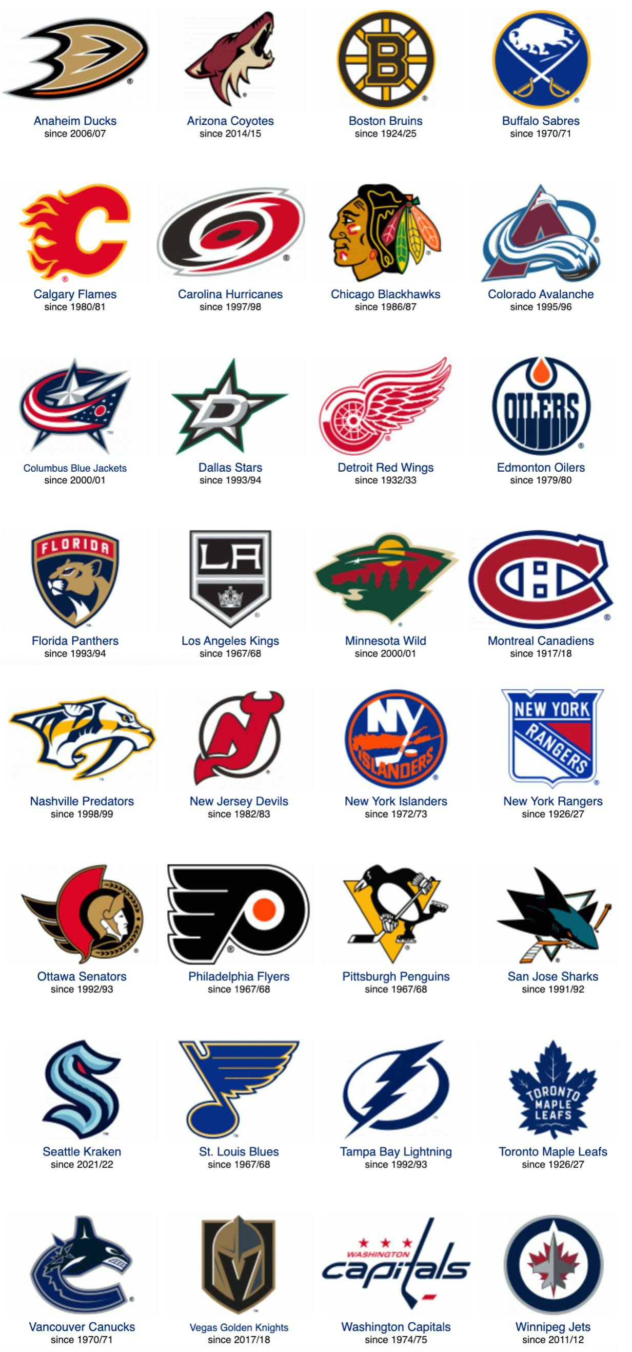
Why am I bringing this up? Because the other day I was looking at NHL team logos while researching another article, and something I'd never noticed before suddenly jumped out at me: Eight NHL team logos face to the left.
Check this out:
As you can see, four NHL teams have logos featuring animals facing to the left (the Sabres, Penguins, Panthers, and Wild) and Chicago has a left-facing human, plus I think we have to count the Blue Jackets’ flag and the Red Wings’ spoked tire as leftward-facing as well, and maybe even the Lightning’s left-striking lightning bolt. None of that qualifies as breaking news, of course — these are familiar designs that we’ve all seen for years — but for some reason it never occurred to me that NHL logo orientations are so radically different from those in the NFL.
To be sure, there are also plenty of rightward-facing NHL logos too (Predators, Senators, Canucks, Sharks, Coyotes, Flyers, etc.), but the left/right split on the ice is fairly balanced, whereas on the gridiron it’s a right-facing rout.
It’s pretty clear now that I was wrong when I told people that we’re all more culturally comfortable with rightward-facing graphics, because the left-facing NHL logos look perfectly fine. I mean, really, can you even imagine the Penguins’ penguin skating in the other direction? The very notion is absurd, or maybe even upsetting!
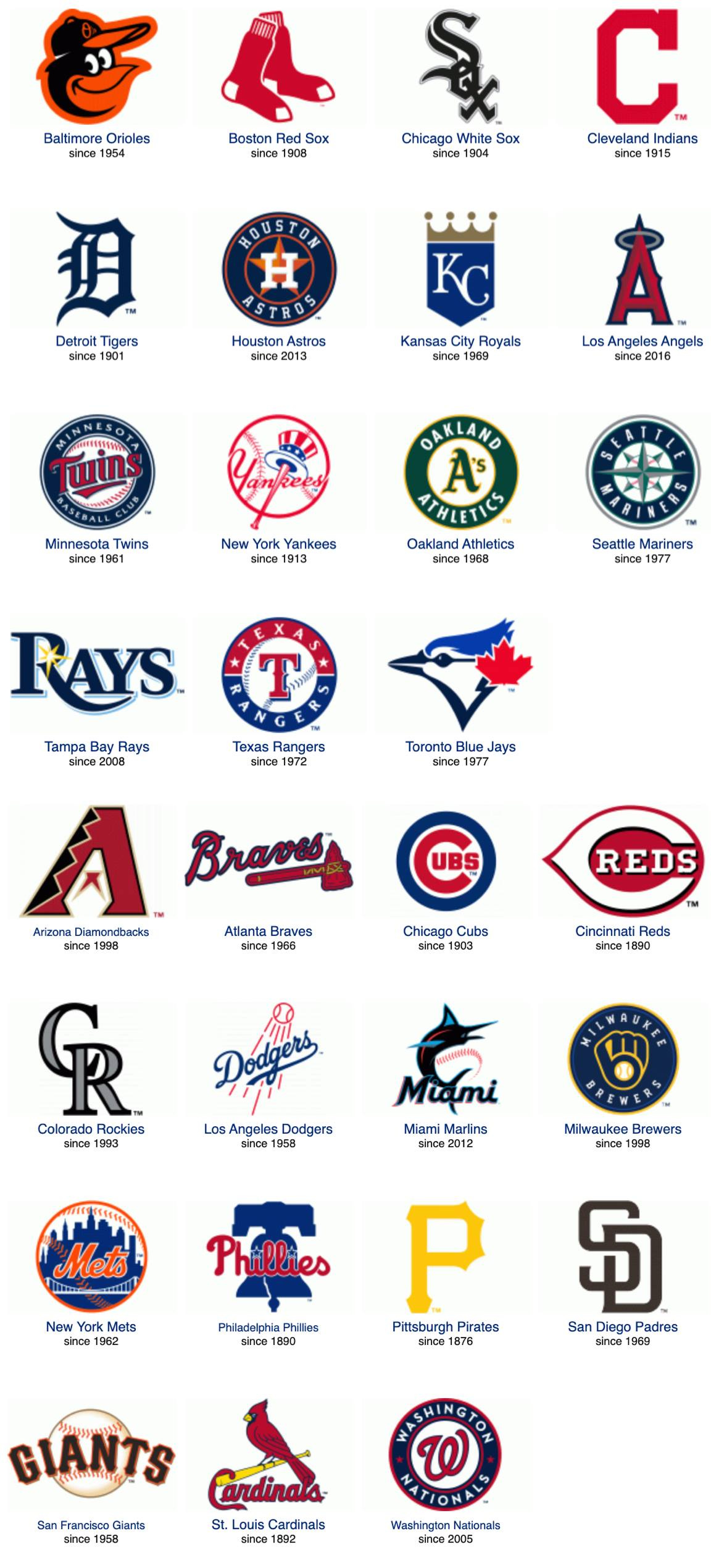
What about the other Big Four leagues? Most MLB logos are letters or wordmarks, so they don’t really face in any direction:
Yeah, there are a few righties (O’s, Red Sox, Marlins) and lefties (Cards, Jays), but most of these don’t really face in either direction.
As for the NBA, their team logos are even less directionally oriented than MLB’s. In another interesting trope that hadn’t fully registered with me until now, most of them just face head-on:
Again, much like in MLB, there are a few lefties (Celtics, Heat) and righties (Hawks, Timberwolves, Magic, Suns). But what really strikes me is how many of the NBA logos feature either mascot characters that are depicted staring right at us (Hornets, Bulls, Grizzlies, Bucks, Pelicans) or static type/image designs that are completely foursquare and symmetrical (Nuggets, Pistons, Rockets, Clippers, Knicks, Wizards). If the NFL is the league of silhouetted profiles, the NBA is the league of bilateral symmetry.
So it turns out that, contrary to my earlier assumption, the NFL is the only major sports league that has mostly right-facing team logos. Why is that? I’m thinking it’s probably because NFL helmet depictions — which are arguably even more visually iconic than the team logos themselves — always show the helmets facing to the right.
That rightward-facing orientation for NFL helmet illustrations has been the standard look for decades, going back to the days of single-bar facemasks. And if you’re routinely going to show your helmets facing to the right, it makes sense that you’d also have your logos facing to the right, since they appear on the helmets.
Ah, but why do the helmets face to the right in the first place? At first I defaulted to my usual thought about our cultural comfort with things that flow from left to right. But then Uni Watch proofreader Jerry Wolper pointed out that they don't have much choice but to show the helmets facing rightward because the Pittsburgh Steelers (Jerry’s favorite team, as it happens) have their logo on only one side of their helmet. If they showed the helmets facing to the left, it would look like the Steelers helmet was blank. (Wondering why the Steelers have the logo on only one side? Look here.)
So is the Steelers' unique mono-logoed helmet the reason so many NFL logos face to the right (and, in turn, the reason so many people email me each NFL season)? Moreover, if the Steelers had chosen to put the logo on the other side of their helmet, would NFL helmet depictions routinely face to the left, and would most NFL logos also face to the left as a result?
We’ll likely never know for sure. But it’s an interesting question to ponder.
(Special thanks to the invaluable SportsLogos.net for the logo groupings.)
• • • • •
Meanwhile: In case you’re not already a regular reader of my daily Uni Watch Blog, we had lots of really great content this week, including a deep dive on a 1971 NFL merchandise catalog; a great story about a 1990 goodwill tour of America by the Soviet Union’s national baseball team; some rare NFL prototype jerseys discovered at a factory sale; and my take on Cleveland’s big uni weekend (which featured the unveiling of the new “Cleveland Guardians” identity and the release of the Cleveland Browns’ new throwback uniforms).
If you haven't already seen these articles, give them a shot. We’re always looking to expand the comm-uni-ty over on the blog.
• • • • •
Finally, it’s come to my attention that in order to post a comment here on Bulletin, you need to be a subscriber. Frankly, that doesn't make much sense to me, since subscribers receive these articles via email, and there’s no way to comment on an email anyway.
I think it would make more sense to make commenting available to anyone with a Facebook account. I’ve passed that feedback along to the Bulletin honchos, who say they’ll consider it. Thanks for your patience while we work out the growing pains with this new platform.
Paul Lukas has been writing about uniforms for over 20 years. If you like his Bulletin articles, you’ll probably like his daily Uni Watch Blog, plus you can follow him on Twitter and Facebook, and check out his podcast. Want to learn about his Uni Watch Membership Program, check out his Uni Watch merchandise, or just ask him a question? Contact him here.


