Where Should the Apostrophe Go on a Vertically Lettered Sign?
A deep dive on an enduring typographic conundrum.

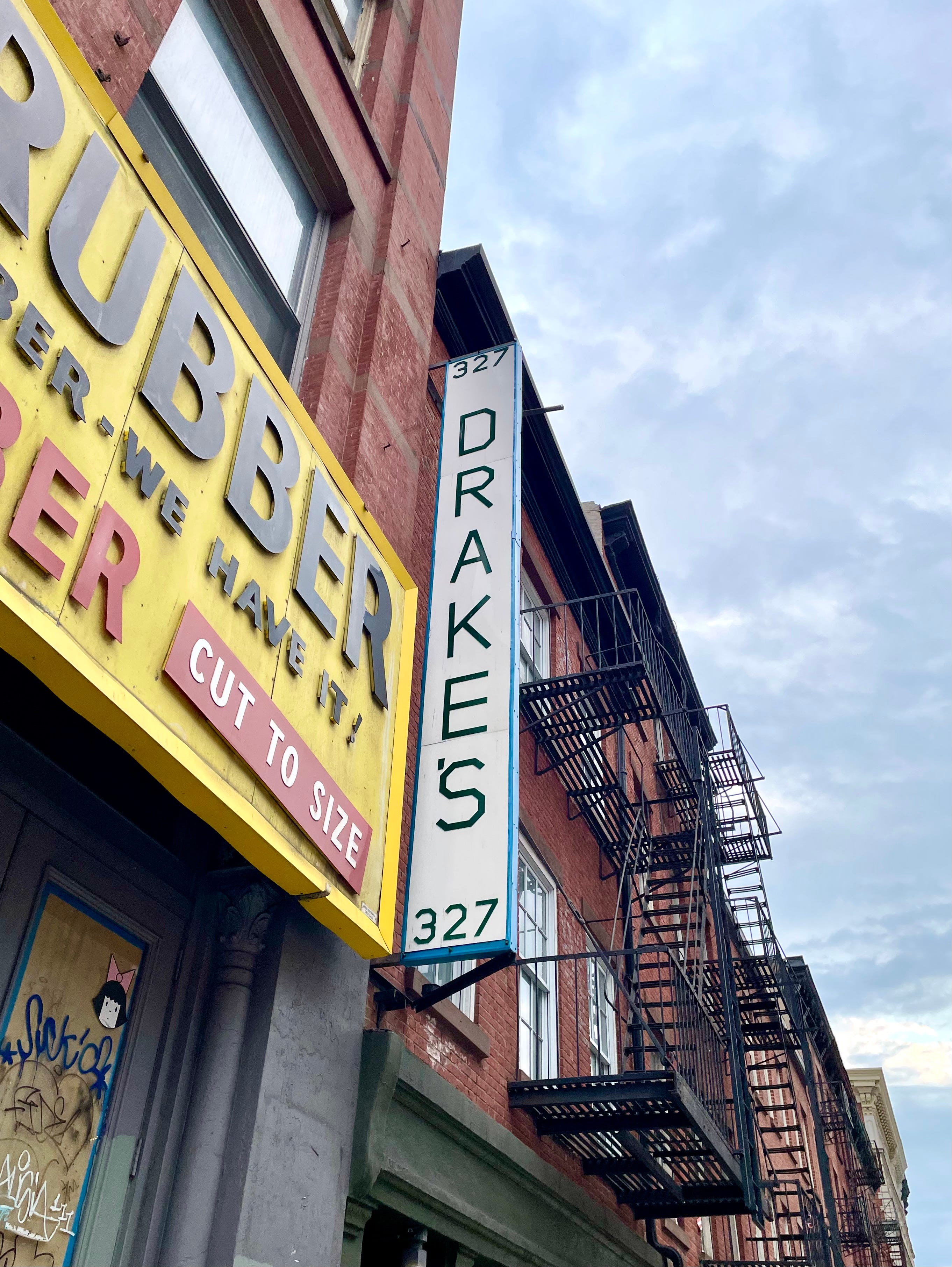
I was walking down Canal Street in Manhattan the other day with my friend (and IC reader!) Adriene Zepka when I noticed the Drake’s sign shown above and stopped to take a photo of it. “Wait, you’re photographing that?” she said. “What’s so special about it?”
The answer, of course, is that the Drake’s sign presents one possible answer to an eternal typographic question: Where should the apostrophe be positioned on a vertically lettered sign for a business with a possessive name?
There’s no straightforward solution to this conundrum, but there are four primary approaches that signmakers have taken over the years, plus a workaround option, each of which feels at least somewhat imperfect. Let’s take a look at each one, beginning with…
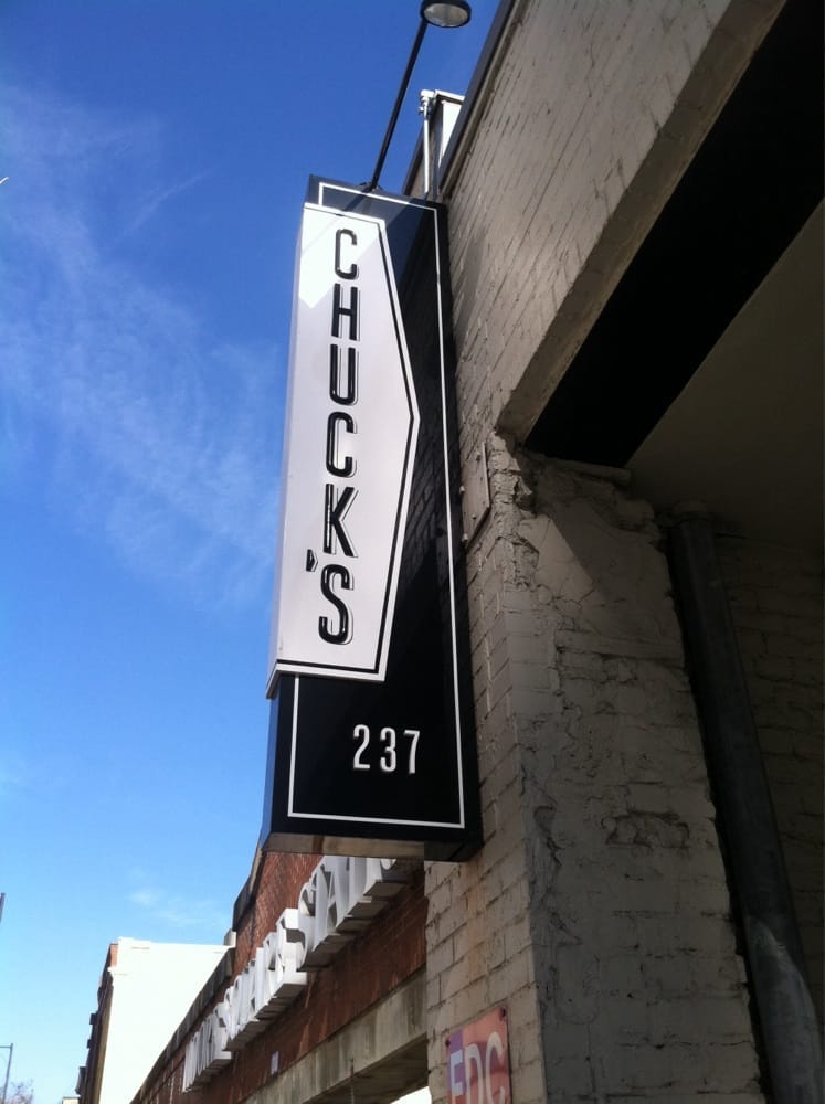
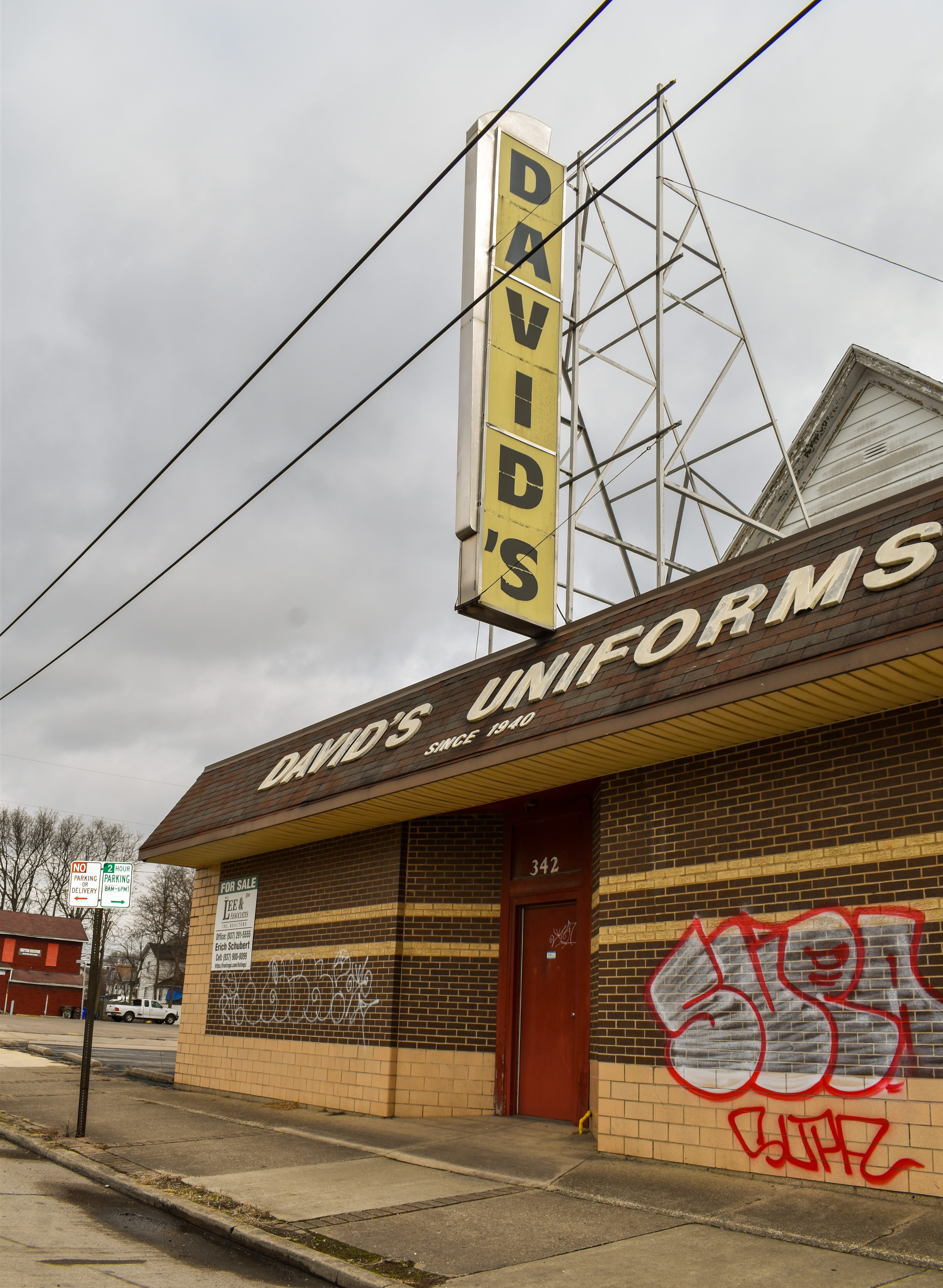
1. Put the Apostrophe in Front of the “S”
The Drake’s sign on falls into this category. Based on my photo research, however, this is a relatively uncommon option, with only a few other examples that I could find: