When “V.F.W.” Stands for “Vibrant, Fantastic, Wonderful”
Sometimes a sign has more going on than immediately meets the eye.
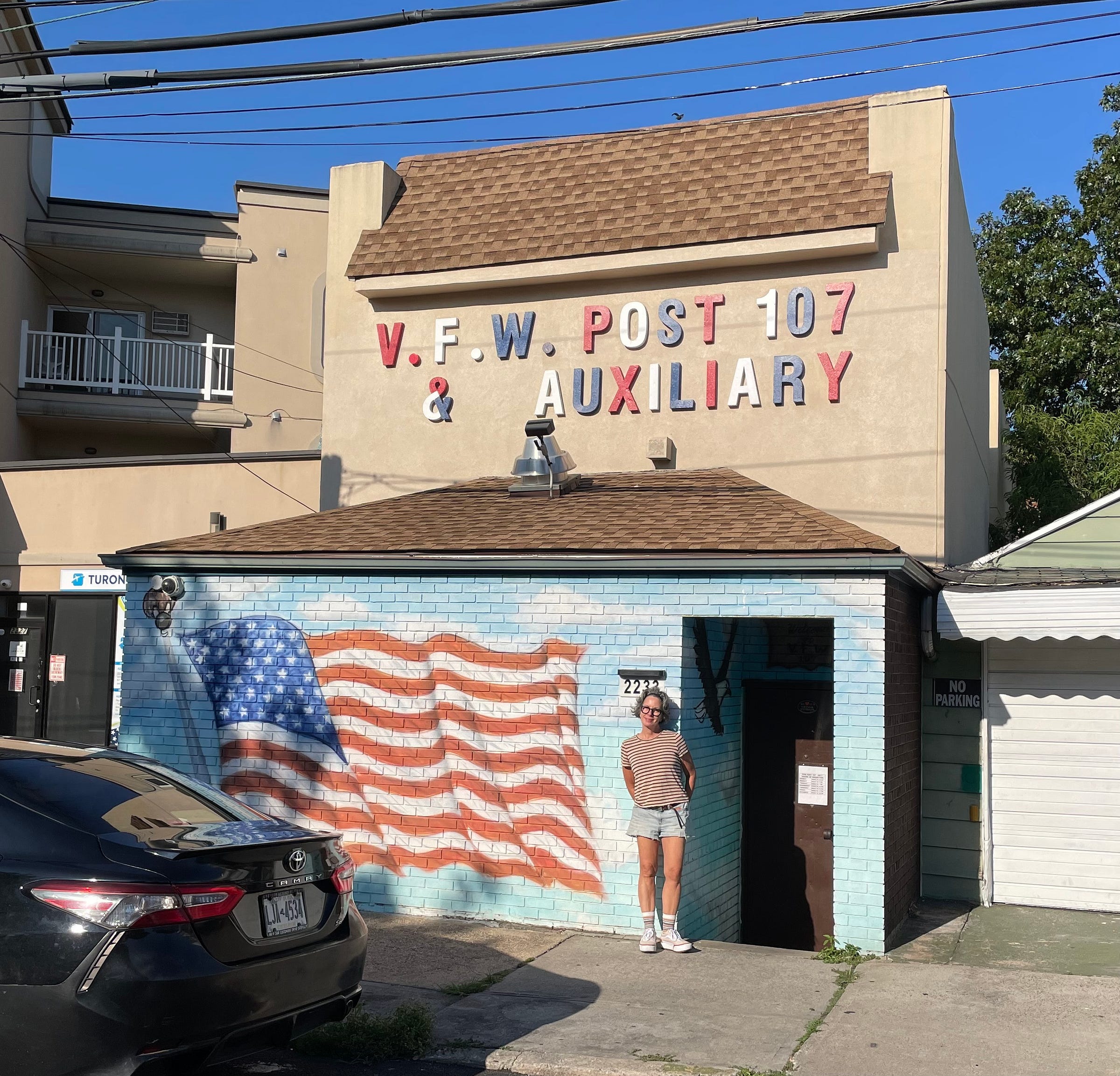
My girlfriend, E, and I were poking around yesterday in Marine Park (a neighborhood in deep-southeast Brooklyn) and came across this VFW post. I loved the multicolored lettering on their sign, so I had E pose for this photo.
I was especially charmed by the tri-colored ampersand. Based on the spacing around it, I suspect they originally had the word “A-N-D” spelled out — presumably in white, blue, and red letters, respectively, based on the rest of the sign’s color sequence. But then for some reason they had to replace the “AND” with the ampersand. If they had rendered the ampersand in just one color, that would have thrown off the sign’s red-white-blue sequence, so they solved that problem by rendering it in all three colors. Funny!
I also found myself wondering this: If I were making this sign, would I make the periods the same colors as their preceding letters (red “V” followed by the red period, white “F” followed by the white period, and so on), or would I do the periods in different colors in order to provide a visual accent? More likely I’d just skip the periods altogether.
Paul Lukas has been obsessing over the inconspicuous for most of his life, and has been writing about those obsessions for more than 30 years. You can contact him here.


I think it might have said "LADIES" instead of "AND". I was googling "VFW Post 107 Marine Park" and found this Facebook post from last fall: https://www.facebook.com/NYPD61PCT/posts/yesterday-we-had-the-honor-to-help-assist-vfw-post-107-on-their-annual-veterans-/743053311182393/
Since the sign and building looked so different, I realized the VFW must extend to the other side of the building. Sure enough, on the opposite side there is that sign: https://maps.app.goo.gl/XWvqoYPBXos2c5qYA . Then if you use Google Streetview's "see more dates" feature, you can go back in time and see that between 2013 and 2017, the sign was changed from "LADIES" to "&": https://maps.app.goo.gl/duzaTkZVw7tRR79w5 (there is no streetview imagery before 2022 on the side with the colorful sign). In that Facebook post, there are some very faint ghosts of where it used to say "LADIES" on the blue sign; the side of the building with the red, white, and blue lettering doesn't show that, but it also looks pretty freshly painted.
The last bit of support for LADIES has to do with the pattern of the red, white, and blue lettering. On the top line, they clearly continue the RWB pattern across words. Since the "7" in "107" is red, we can check how the pattern would fit with LADIES into AUXILIARY. So 107 LADIES AUX... would be WBR WBRWBR WBR...and sure enough, AUX starts as white, blue, red. So I think it works!
Love it! VFW (and American Legion) buildings are odd, too. This one looks like it used to be a Days Inn. An American Legion lodge near me looks like a converted shed for farm equipment.