

Wanna Geek Out Over a 1999 NFL Style Guide?
Of course you do!


Before we get started, a quick note: This article, much like last week’s, includes lots of fairly detailed graphics that you’ll probably want to see at full size. So if possible, I suggest reading it on a laptop or desktop computer, not on your phone. — Paul
Last week’s article about an early-1990s MLB Style Guide was a big hit. So with the NFL draft almost upon us, I’ve decided to follow up this week with a look at another guide from my collection: the 1999 NFL Style Guide.
Just to repeat the basic info from last week: Every major sports league has an annual style guide that shows the official design specs for uniforms, logos, team colors, and so on. Manufacturers and licensees use those specs to create on-field uniforms and retail merchandise. Nowadays, the style guides are all kept on gated websites so the leagues can control access to them, but they used to be printed and shipped to licensees.
Unlike the MLB guide I wrote about last week, which was a new acquisition for me, the NFL guide we’re examining today has been part of my library since 1999 — Uni Watch’s first year of existence. As I recall, I contacted the league with a few uni-related questions for one of my early columns and they responded by sending me their style guide. It’s hard to imagine them doing something like that today, but the whole idea of writing about uniforms was so new and unique at the time, I think their attitude was probably something akin to patting me on the head and saying, “Here, kid — take this. Now run off and have fun writing your little uniform articles.”
As you can see in the photo at the top of this page, the style guide came in a big three-ring binder. Inside is some frontmatter (I’ll get to that later in this article) and then a bunch of tabbed fold-out pages for each of the then-current 31 NFL teams:
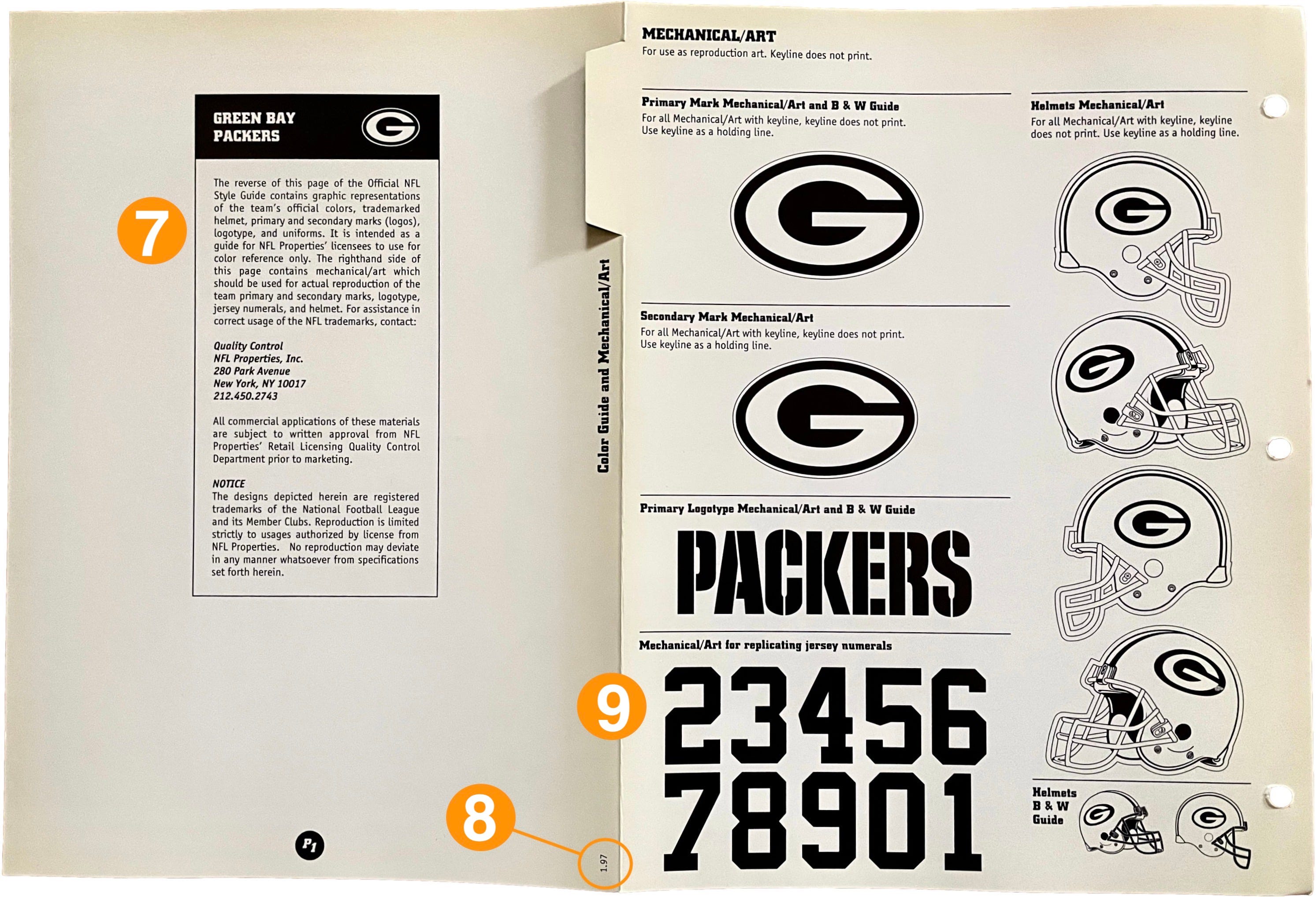
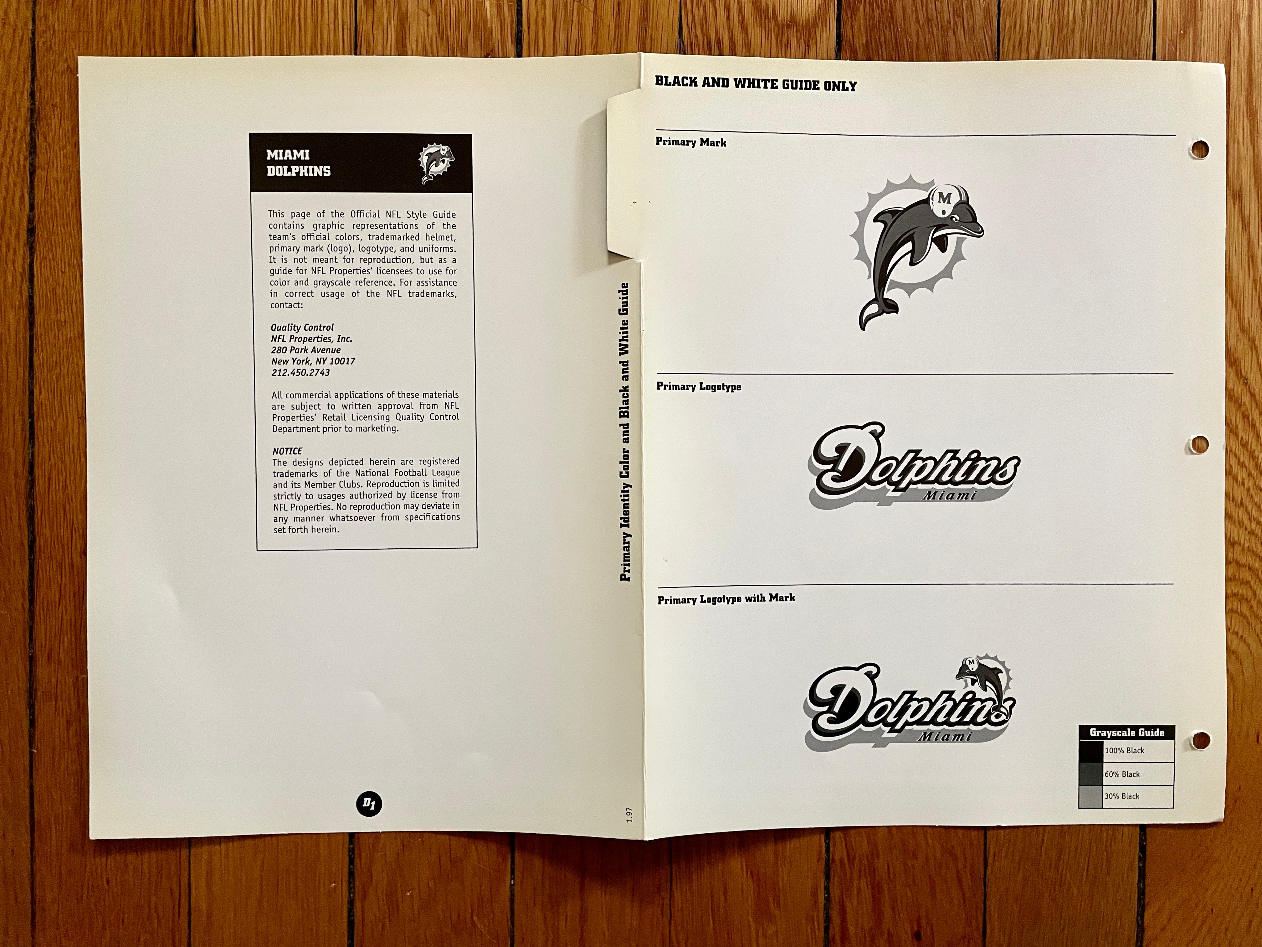
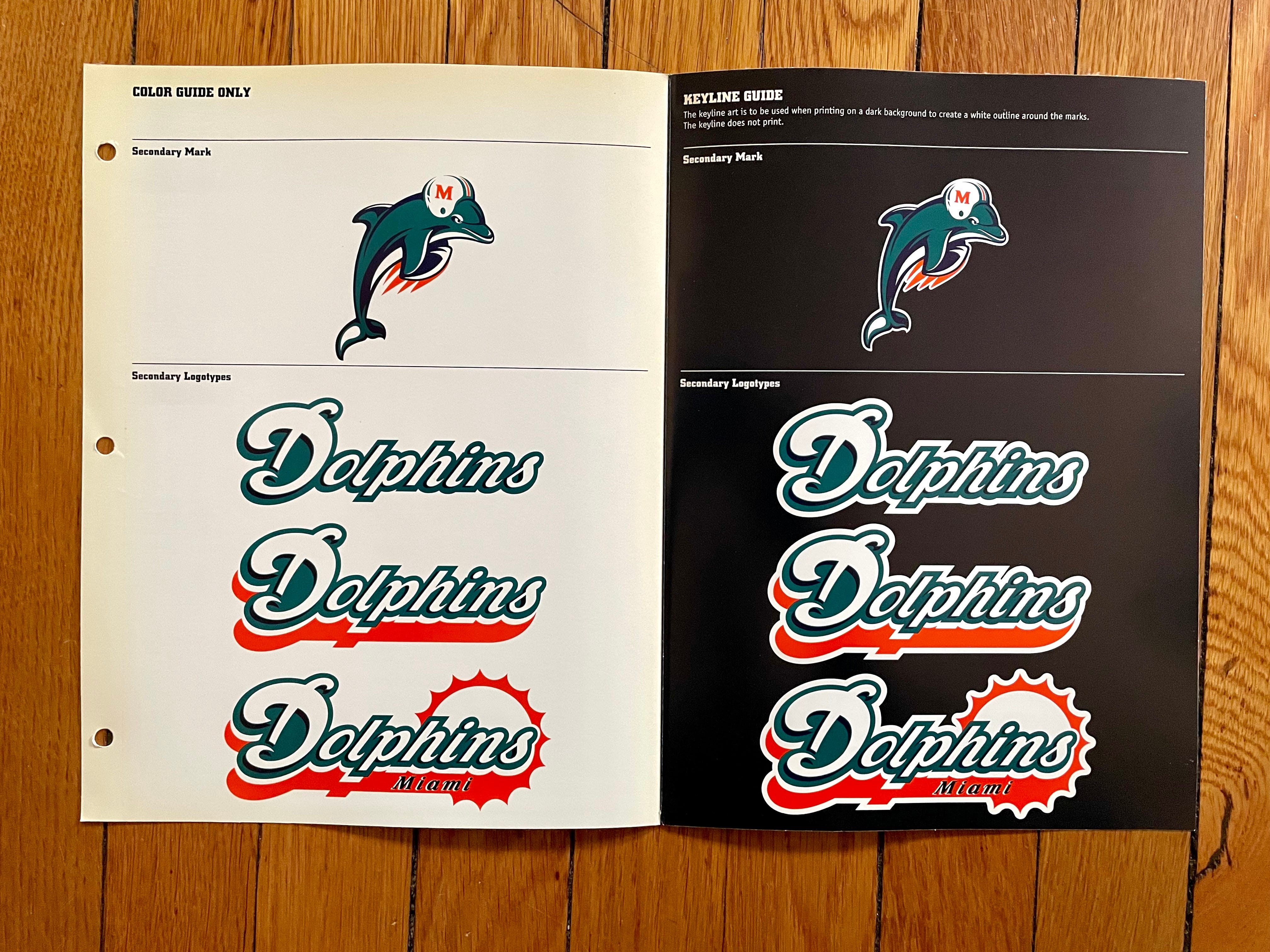
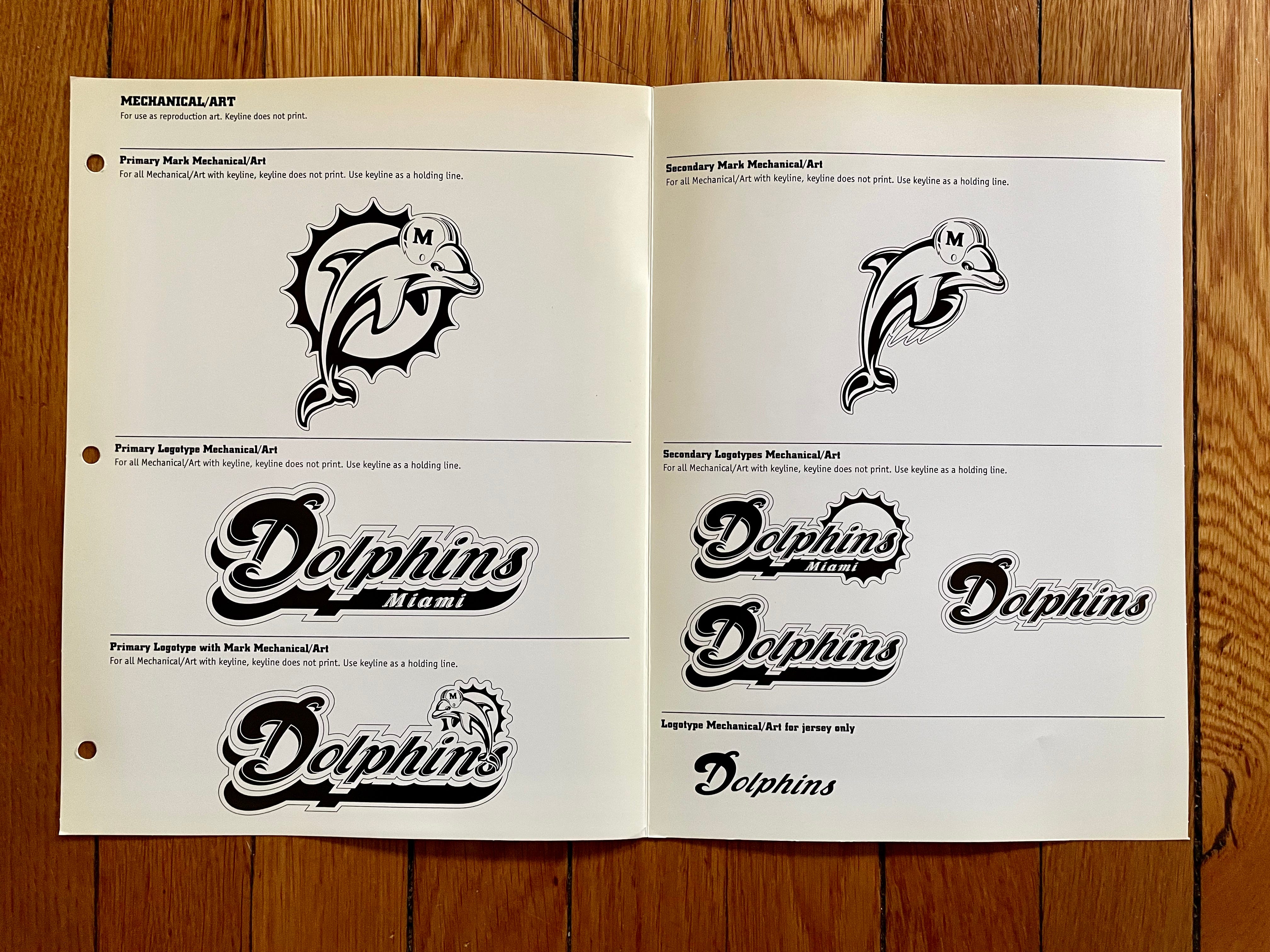
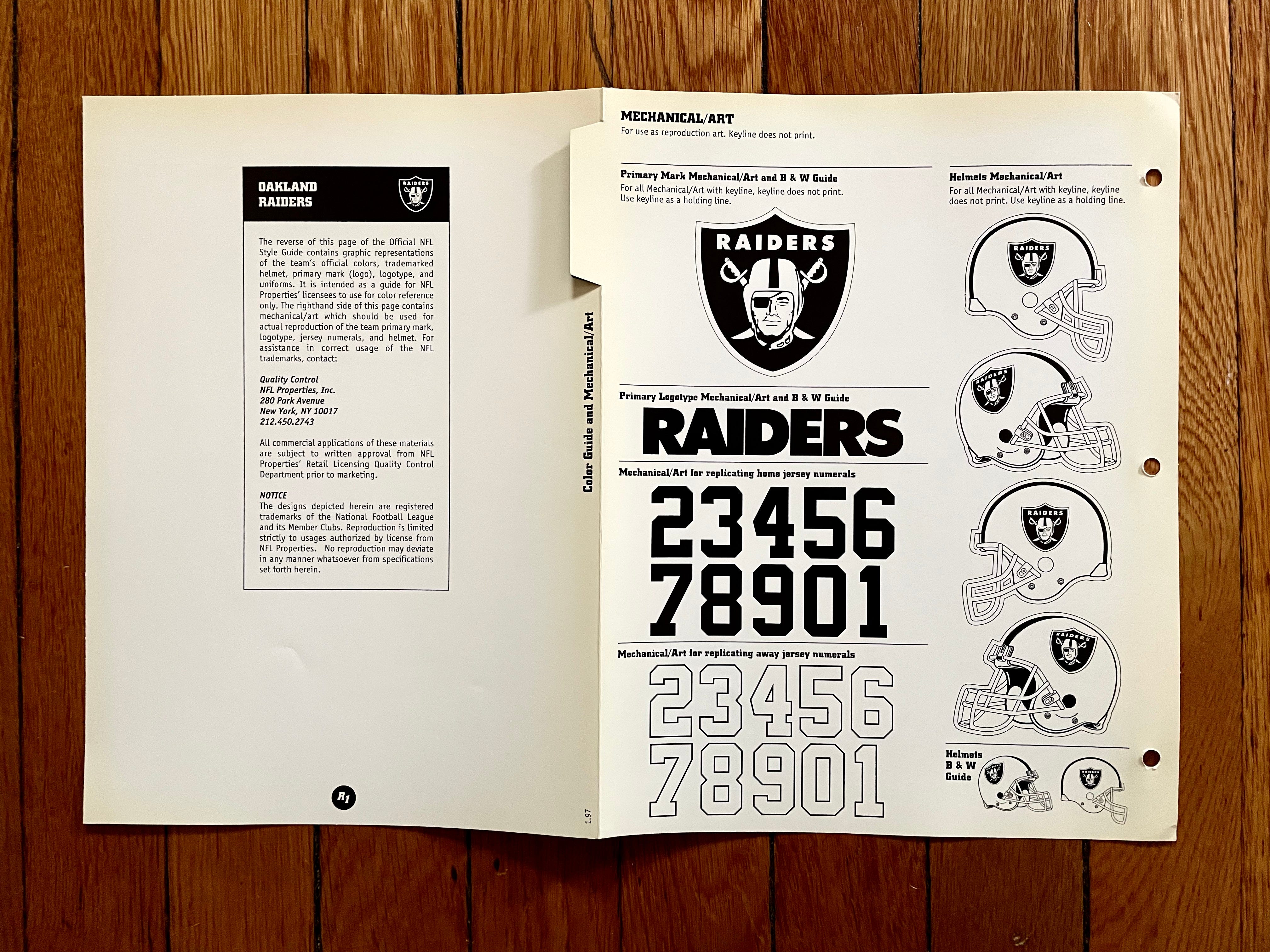
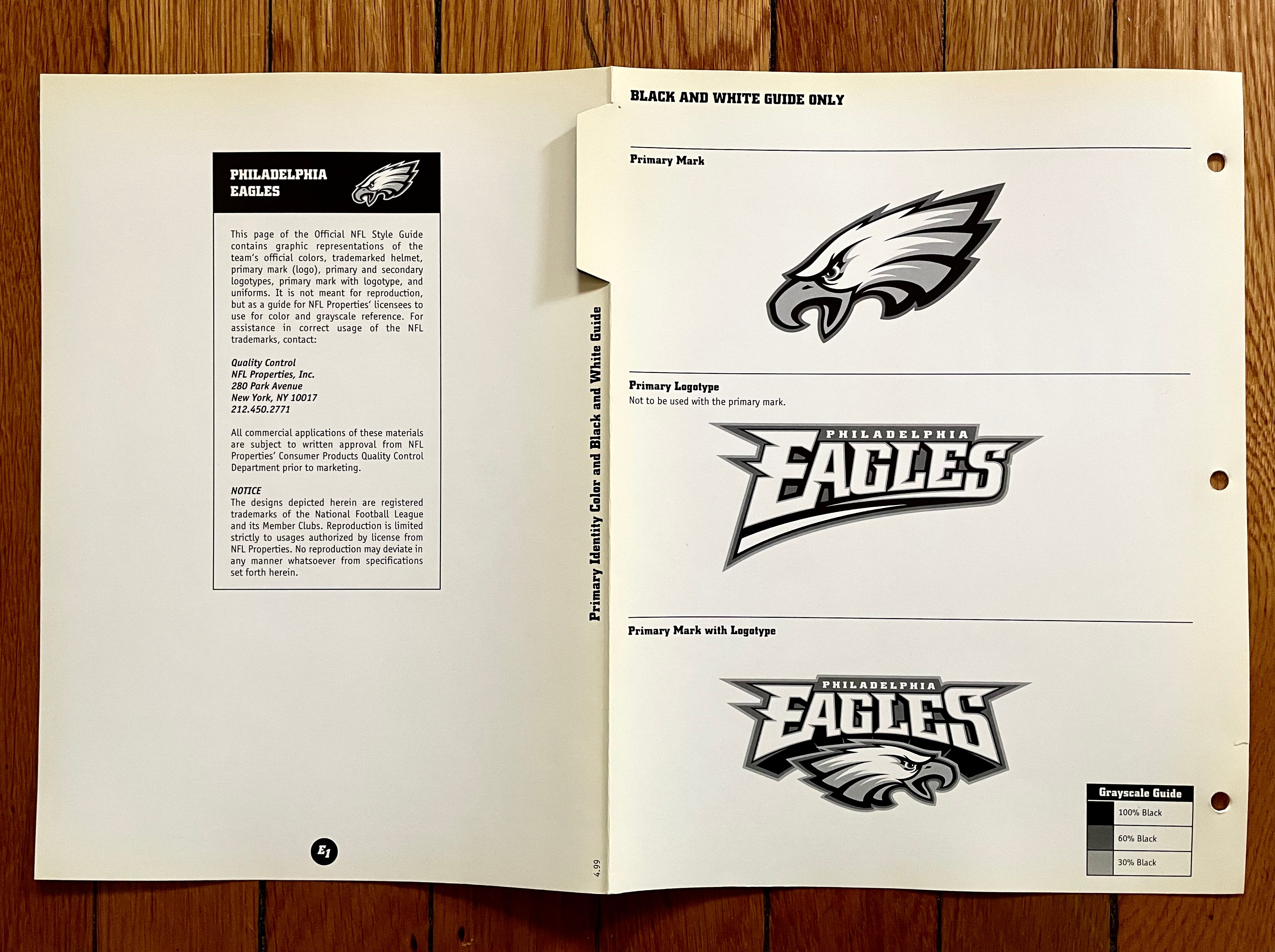
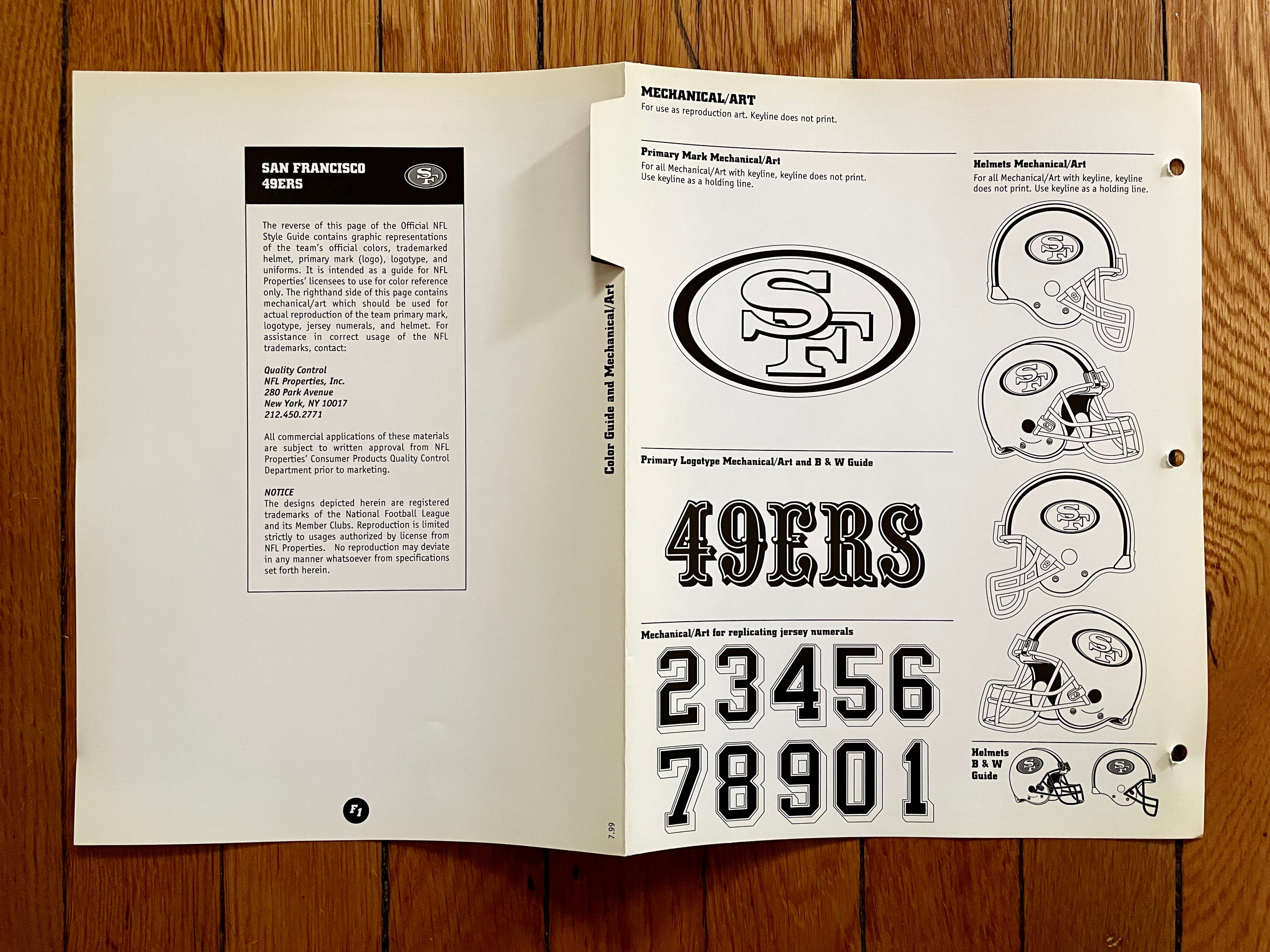
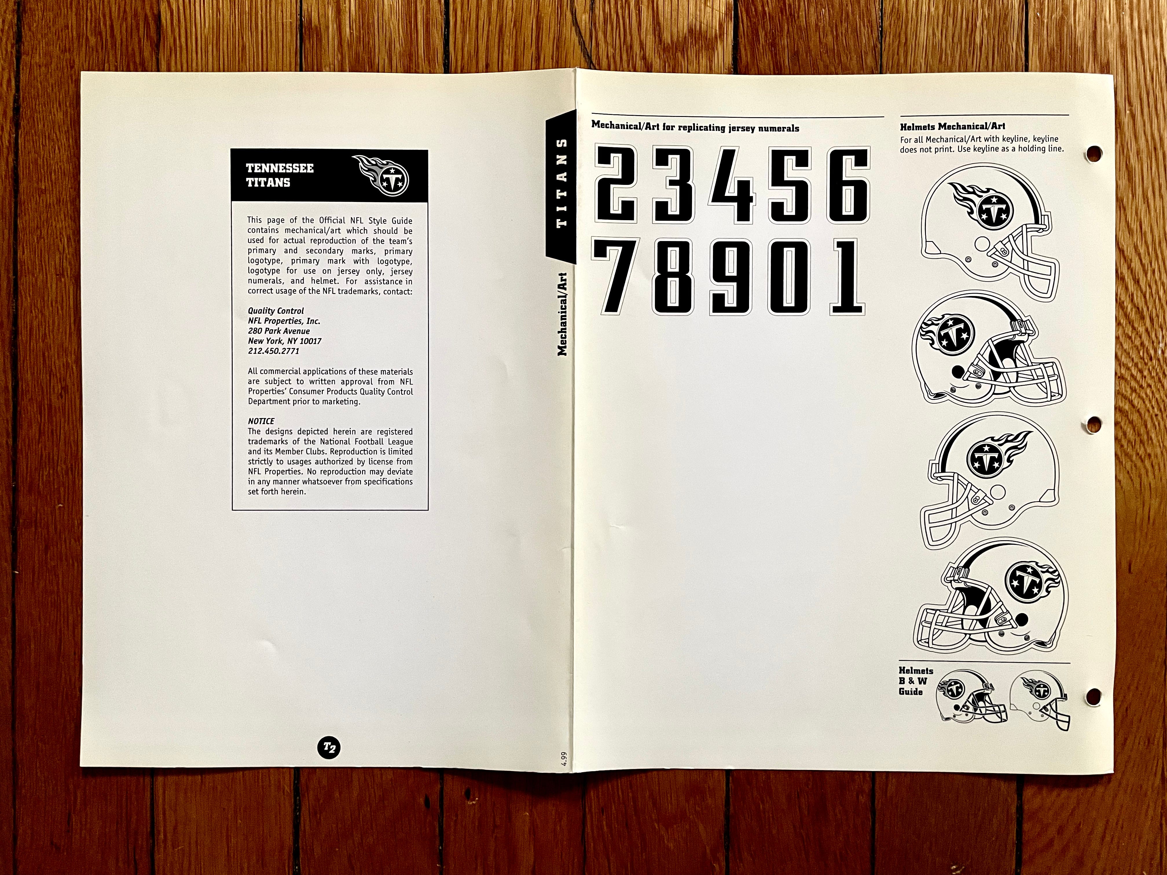
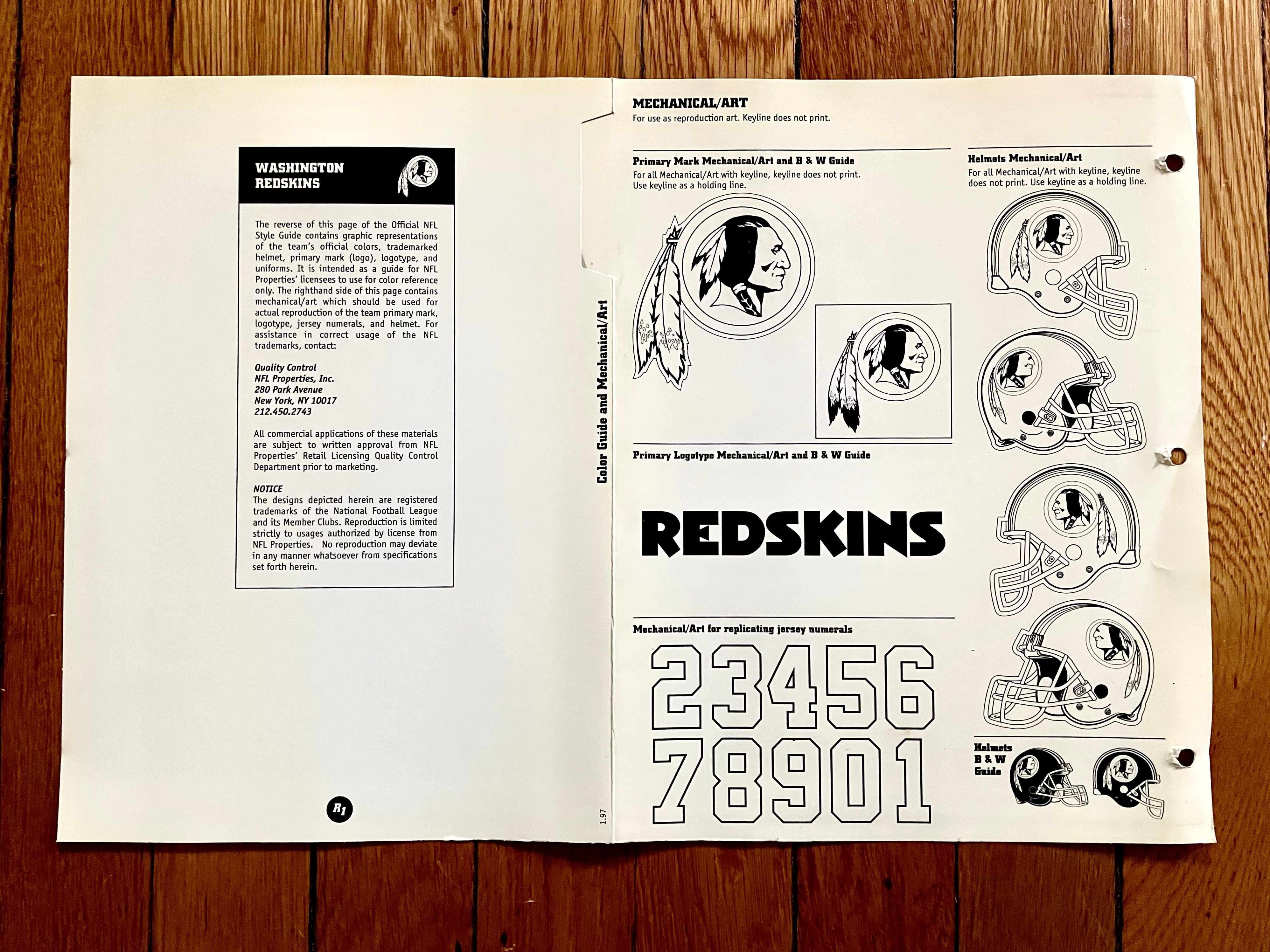
Each team’s fold-out sheet has a color side, which shows the team’s logos, uniforms, and color specs, and a black-and-white side, which has mechanical art intended to be used as camera copy. Let’s take an annotated look at both sides of the sheet for a typical team (the orange-dot numbers correspond to the numbered list that follows the photos):
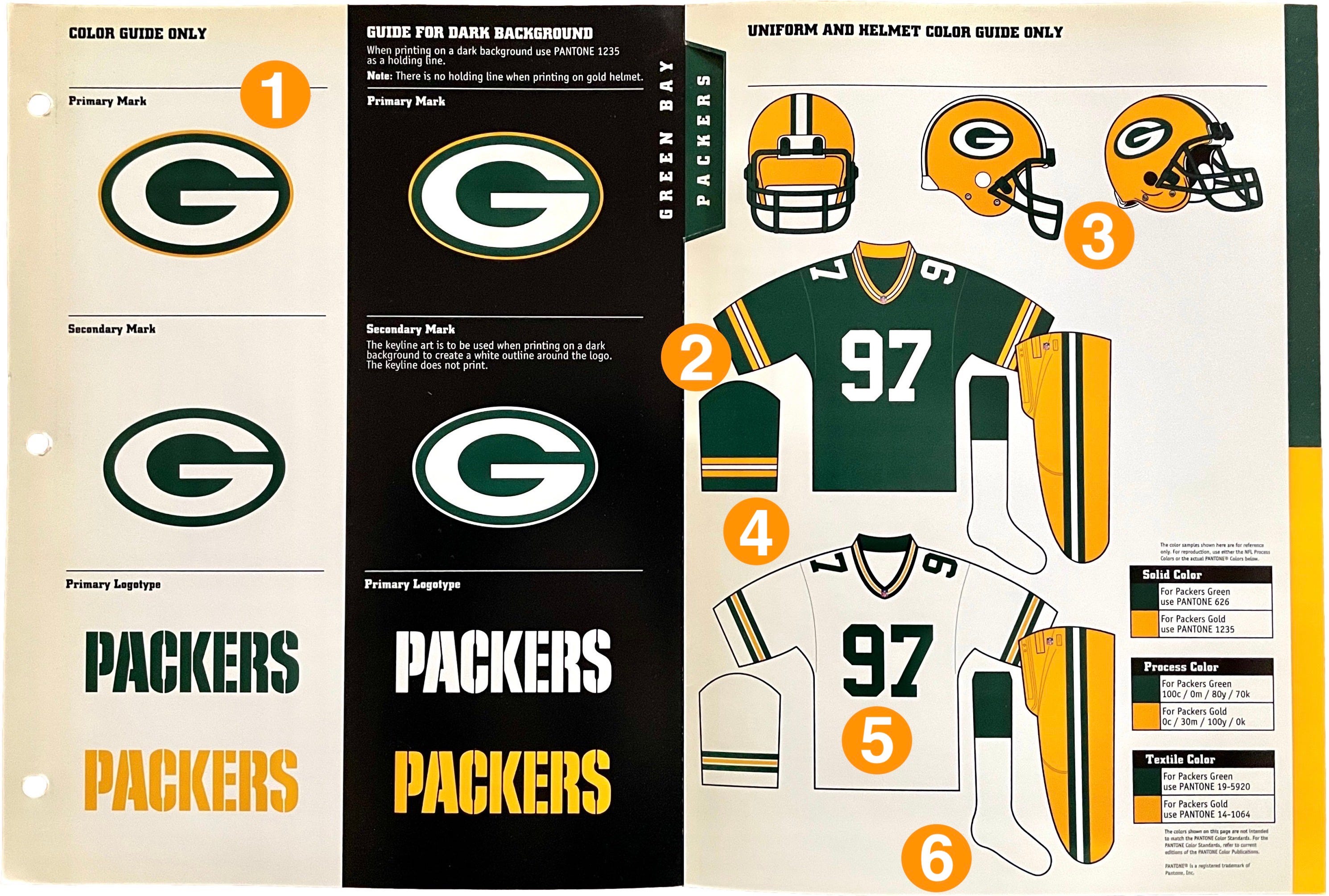
The left side of the color sheet features the team’s primary and secondary logos (which in the Packers’ case are almost identical) and wordmark (or, in the guide’s lingo, “logotype”), all shown on both light and dark backgrounds.
The jersey mock-ups’ sleeves seem comically long by contemporary standards. Even in 1999, nobody in the NFL was wearing their sleeves this long.
Obviously, nobody in the NFL wears this type of helmet or facemask anymore. But the NFL Style Guide was still using this same helmet mock-up template as recently as 2020 (and may still be doing so, for all I know — I no longer have access to it). For that matter, the Browns still use this helmet template as their primary logo! It’s a style that has become the visual shorthand for a football helmet, even though that particular helmet design is obsolete in real life.
For each team, only one colored and one white jersey are shown, with accompanying pants and socks — no alternate jerseys (which didn’t yet exist in the NFL) or throwbacks (which had been used for the league’s 75th-anniversary season in 1994 but were not yet something that teams dabbled with individually). Also, no rear-jersey designs — which, as we’ll see, is an important omission for at least one team.
The uni number used on the jersey mock-ups indicates the most recent year that the team’s style sheet was updated. So for this Packers sheet, everything is current and up-to-date as of 1997. (The entire guide is current as of 1999, but Green Bay didn’t make any changes in 1998 or ’99.)
In the late ’90s, most NFL players still wore their socks pretty much as shown in the guide.
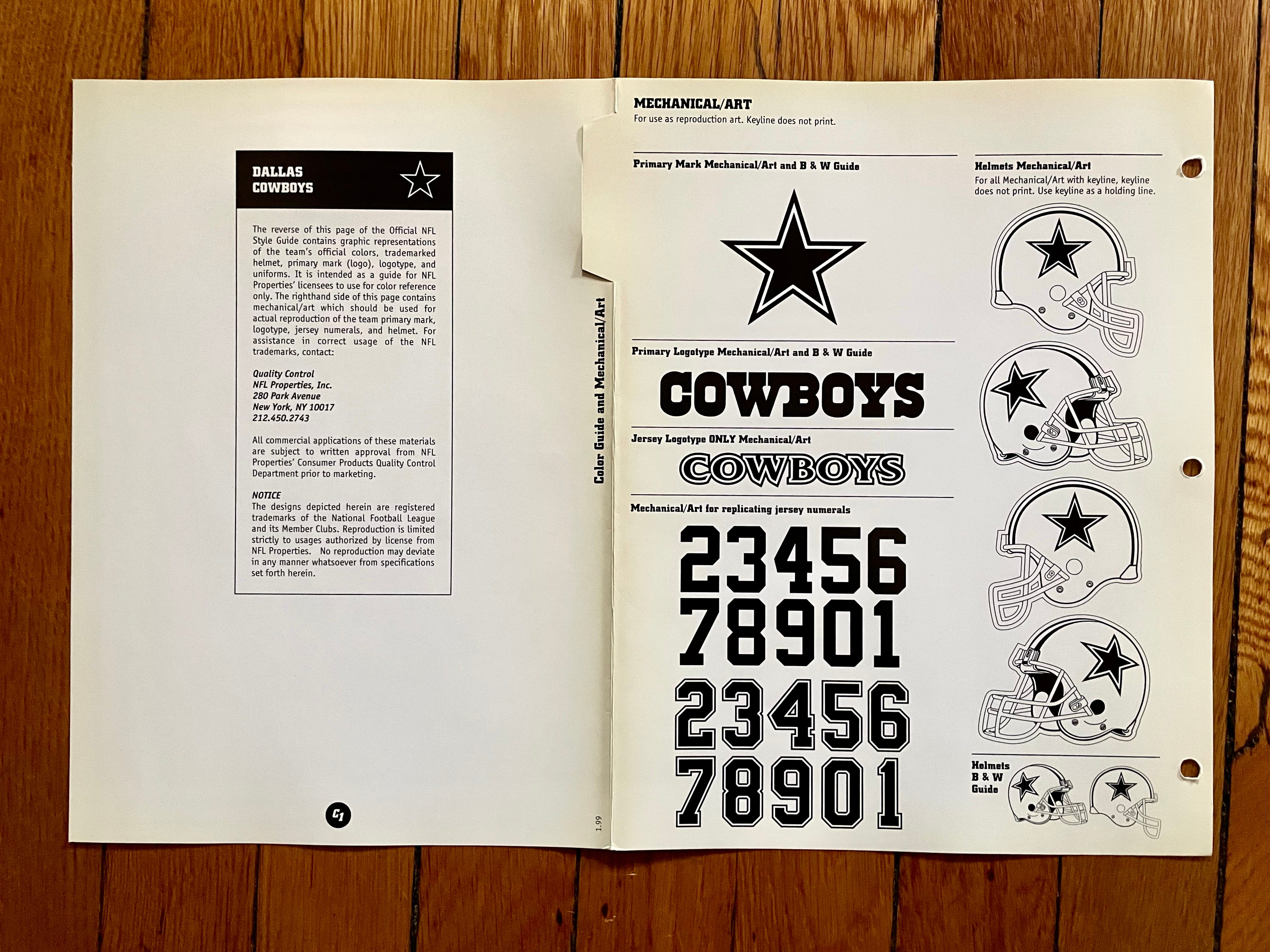
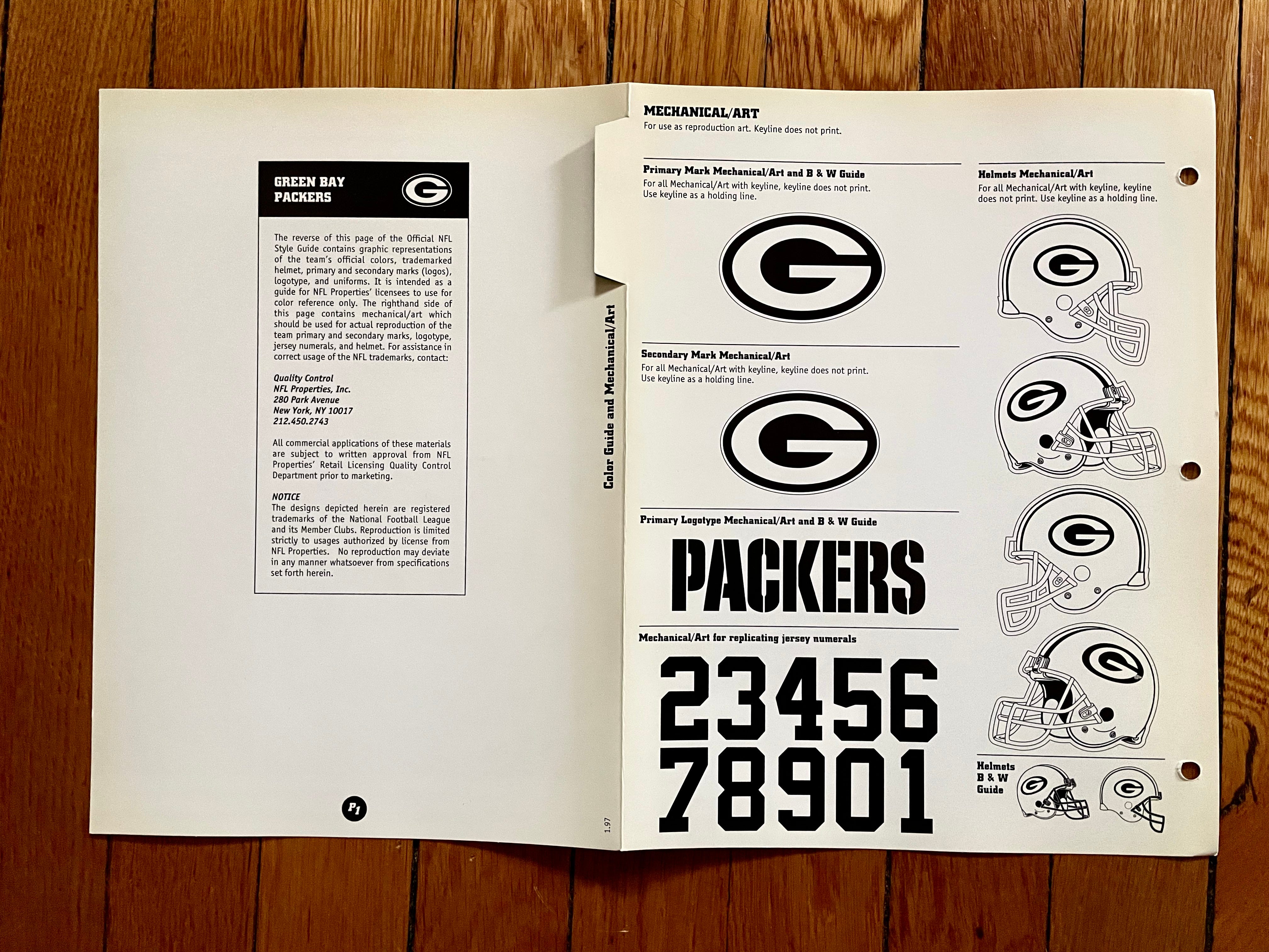
The fine-print text on the left side of the black-and-white sheet is the same for every team.
Right next to the base of the fold, printed sideways, is a date — in this case, “1.97.” Like the number on the jersey mock-up, this indicates the effective date of the sheet, so updated sheets could be swapped in as teams revised their uniforms and specs.
Each team’s jersey number font is displayed in numerical order but — for reasons I’ve never understood — “2” is always shown as the first numeral, with “1” bringing up the rear. Weird!
Those are the basics. As you’ll see, a few teams with deeper logo inventories have additional sheets, but those have pretty much the same format as what I’ve just shown you.
Ready to dive in? Here we go, one team at a time:
Arizona Cardinals
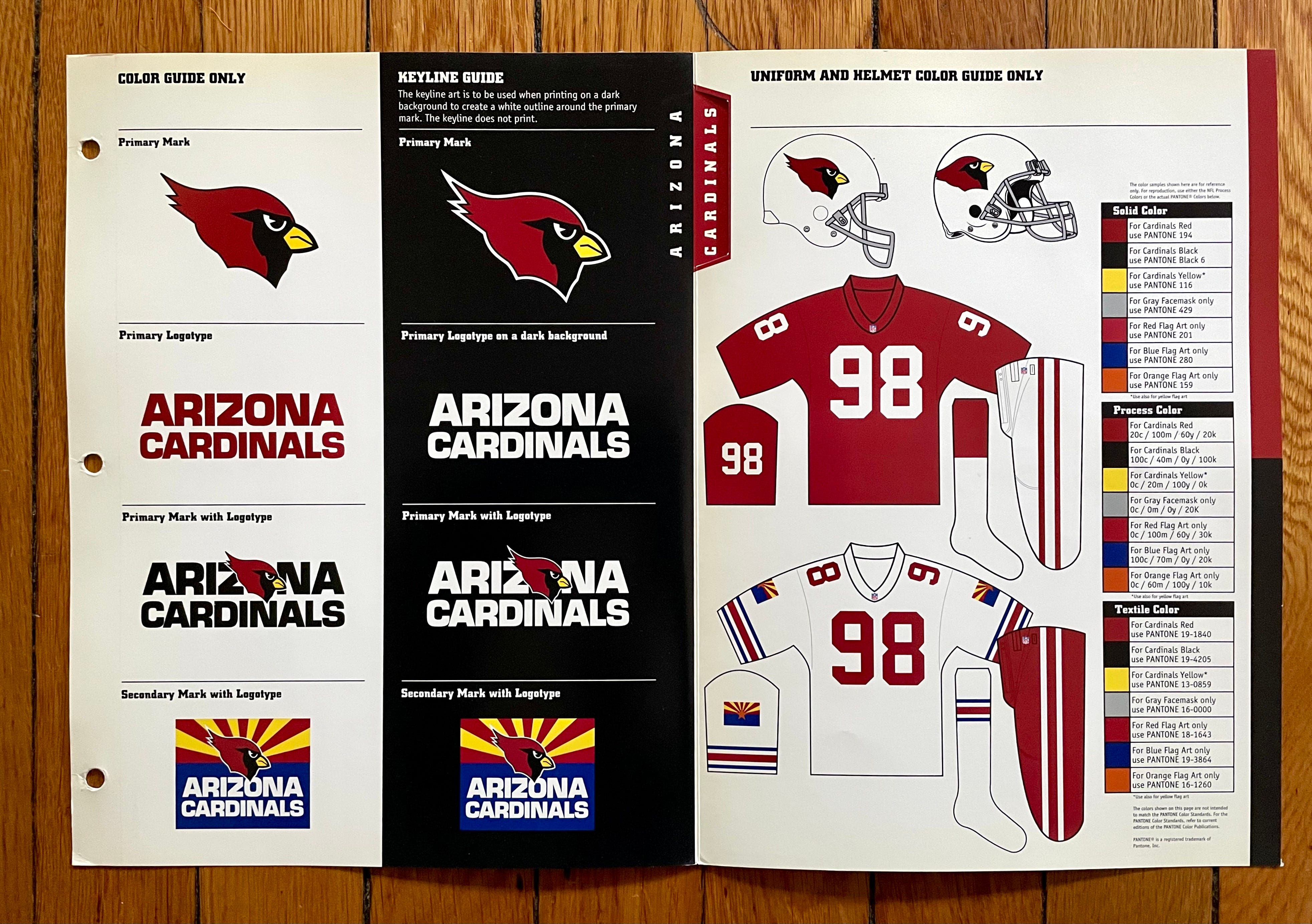
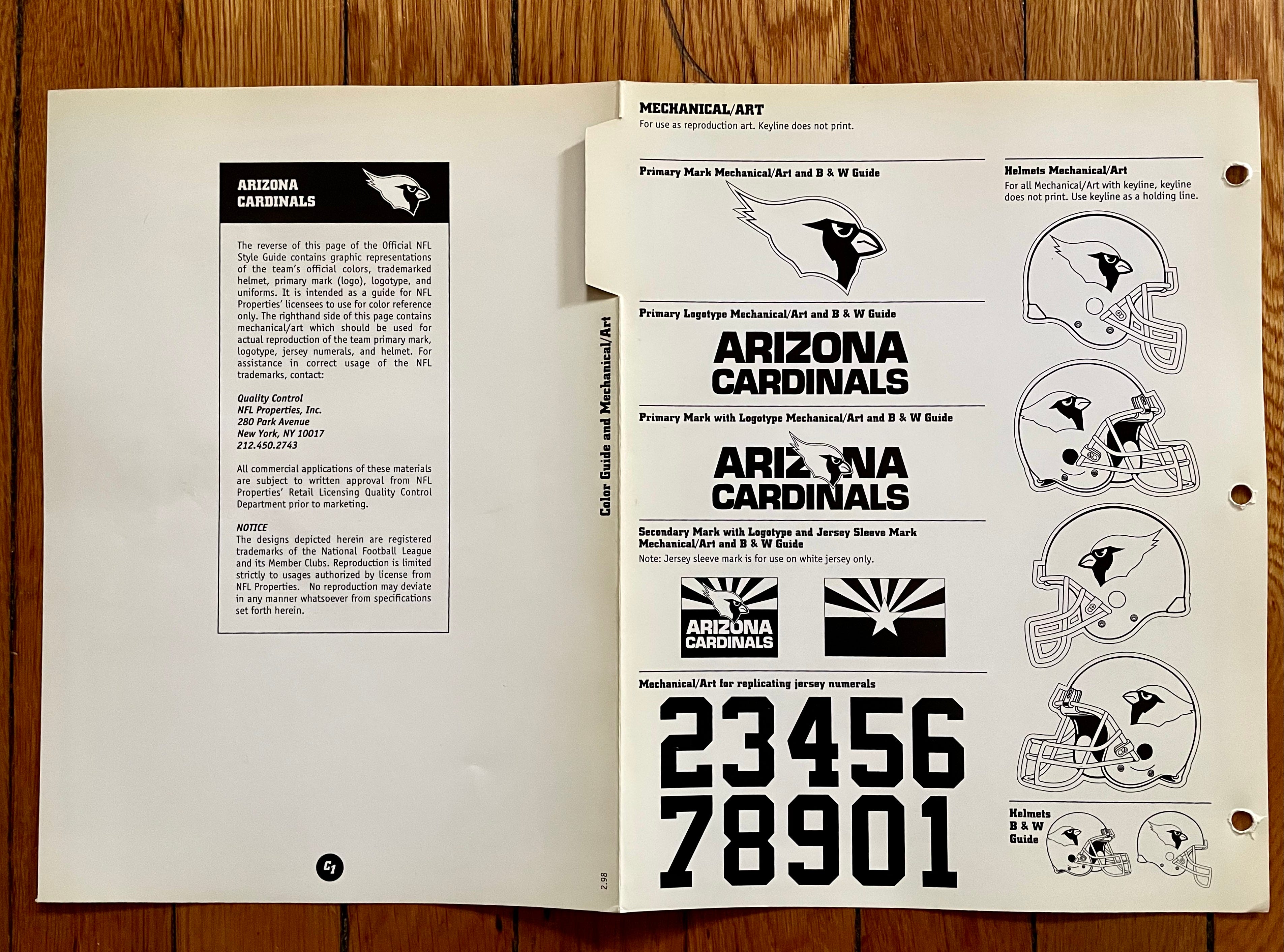
Oh man, this is sooooo much better than anything they’ve worn since. If their recent redesign had simply been a return to this set along with a few concessions to modernity (a red-chrome facemask and an obligatory BFBS design, for example), would anyone — anyone — have been unhappy?
Also: While most teams have specs shown for only two or at most three team colors, the Cardinals had a whopping seven colors, mainly because of their Arizona state flag sleeve patch.
———
Atlanta Falcons
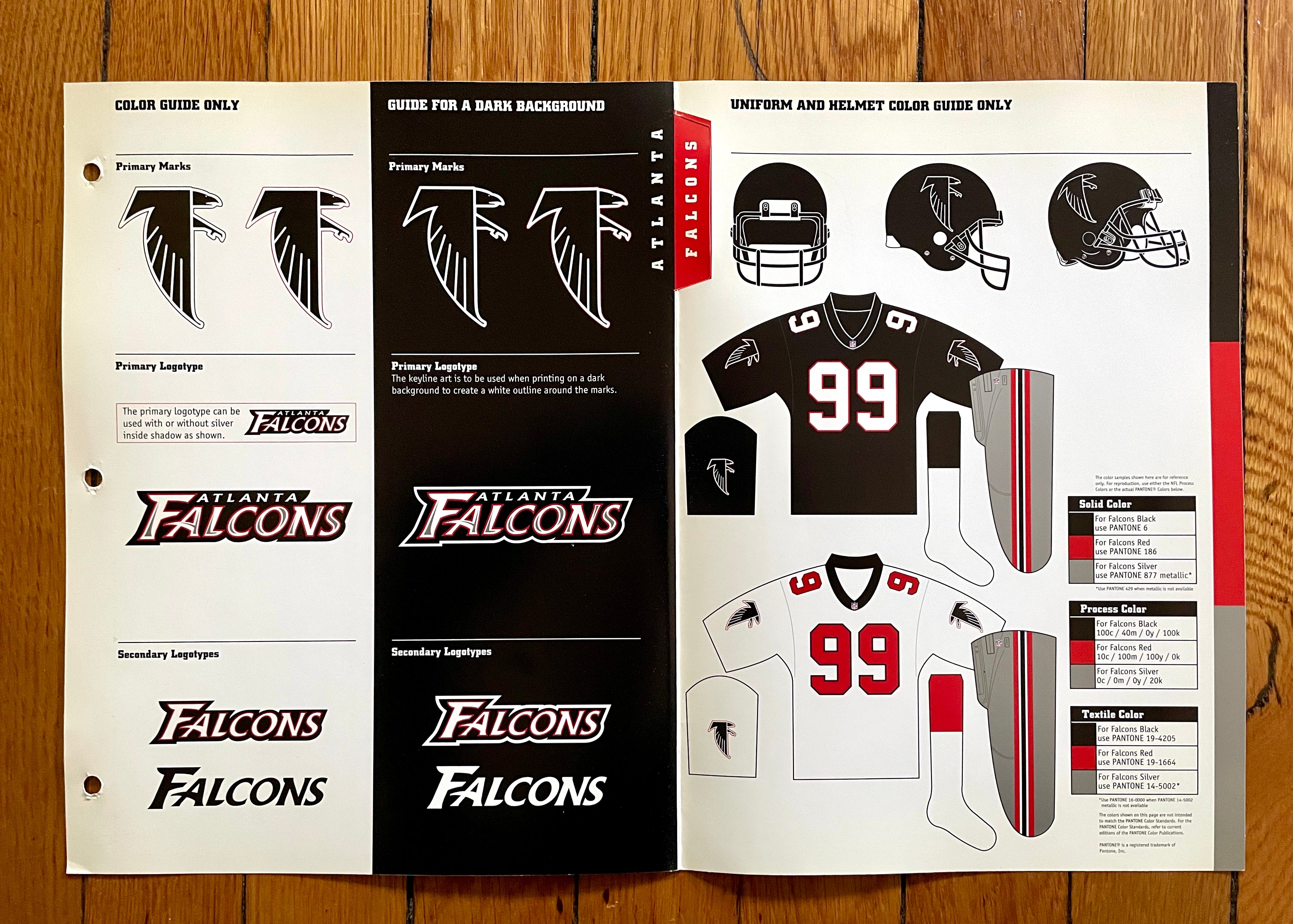
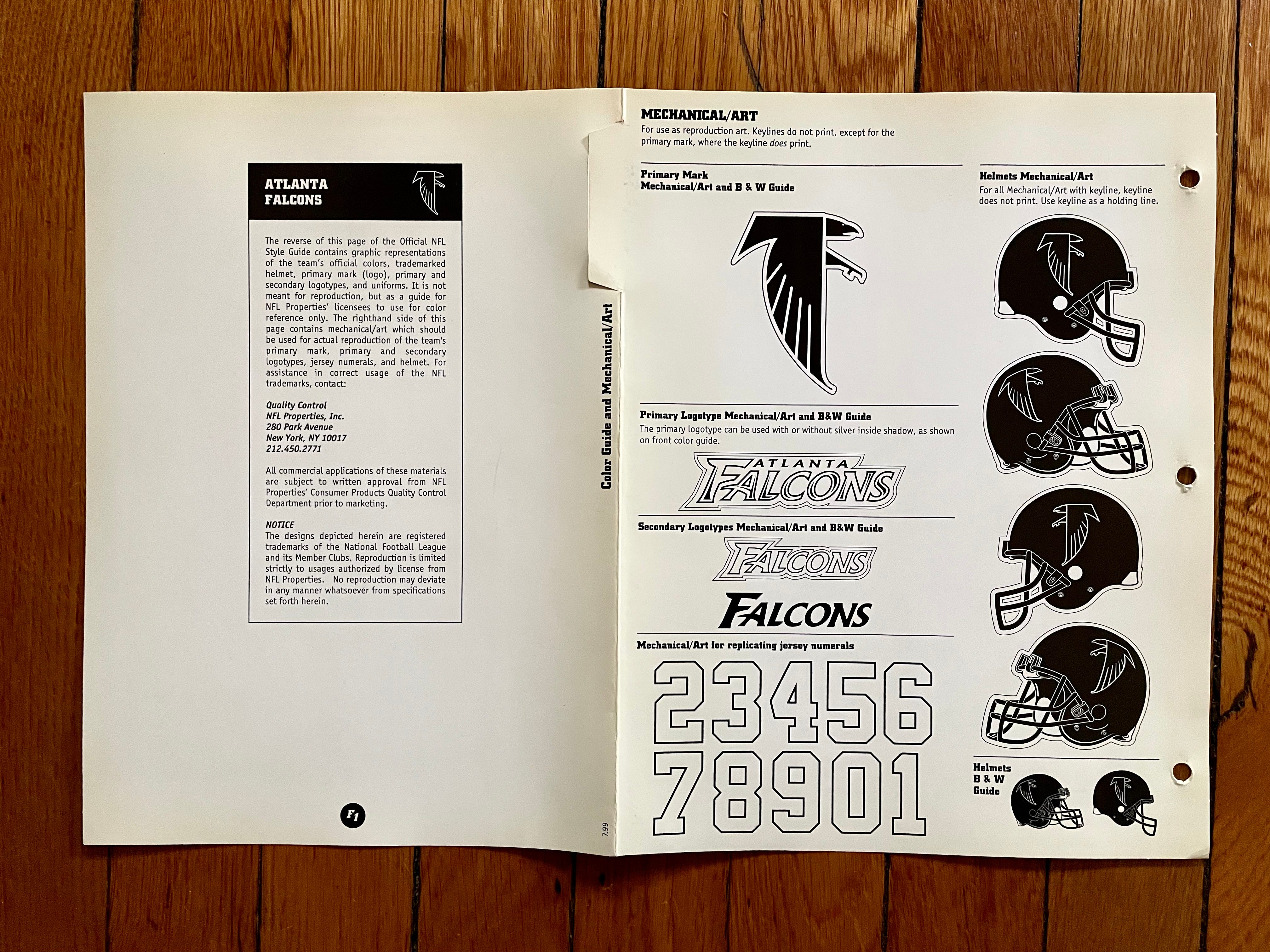
Dirty Birds! Personally, I much prefer the Falcons with red jerseys, or at least red helmets, but this late-’90s look was certainly better than what they wear today.
Also: I have no memory of that wordmark. According to SportsLogos.net, it was used only from 1998 through 2002.
———
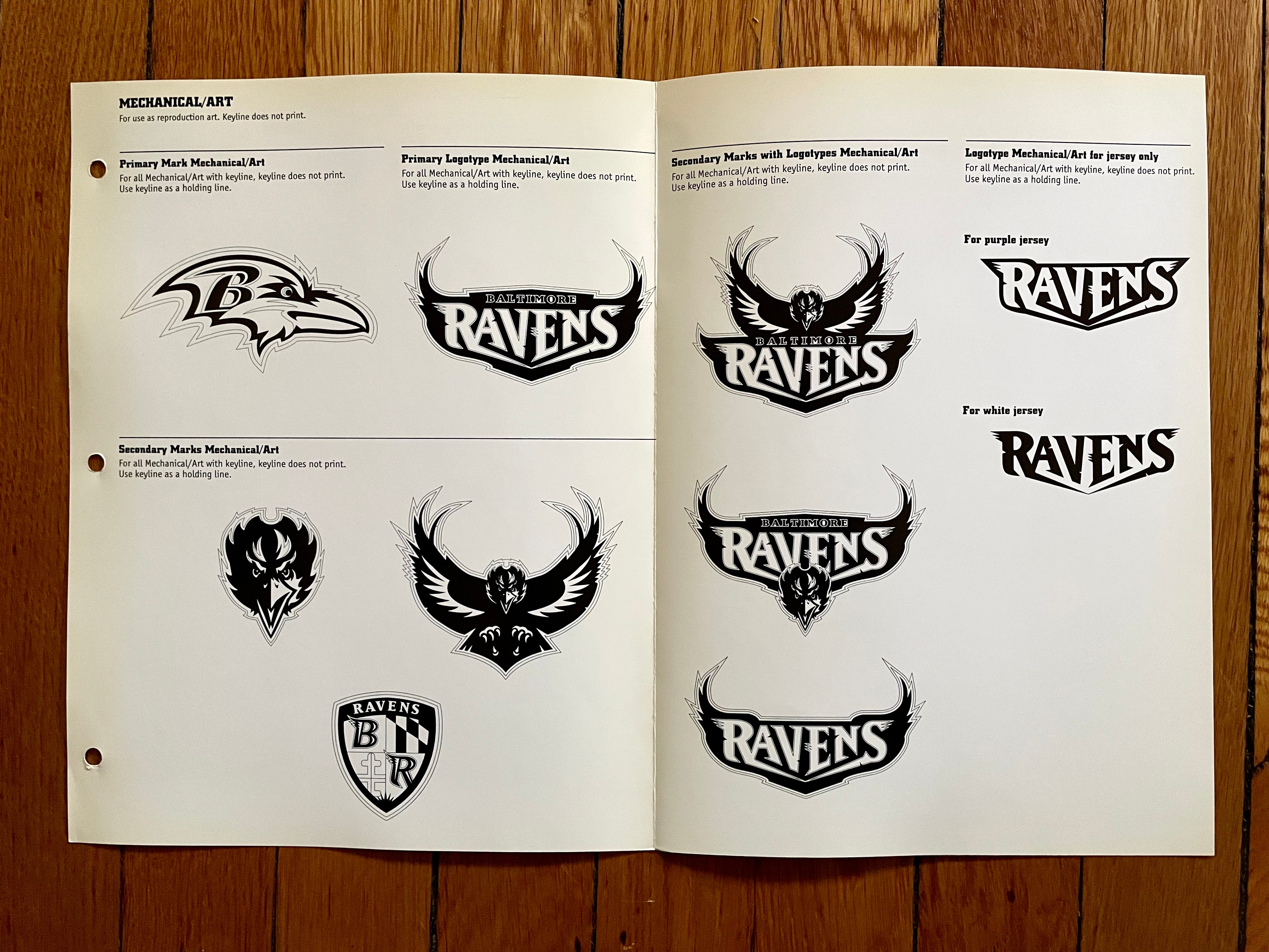
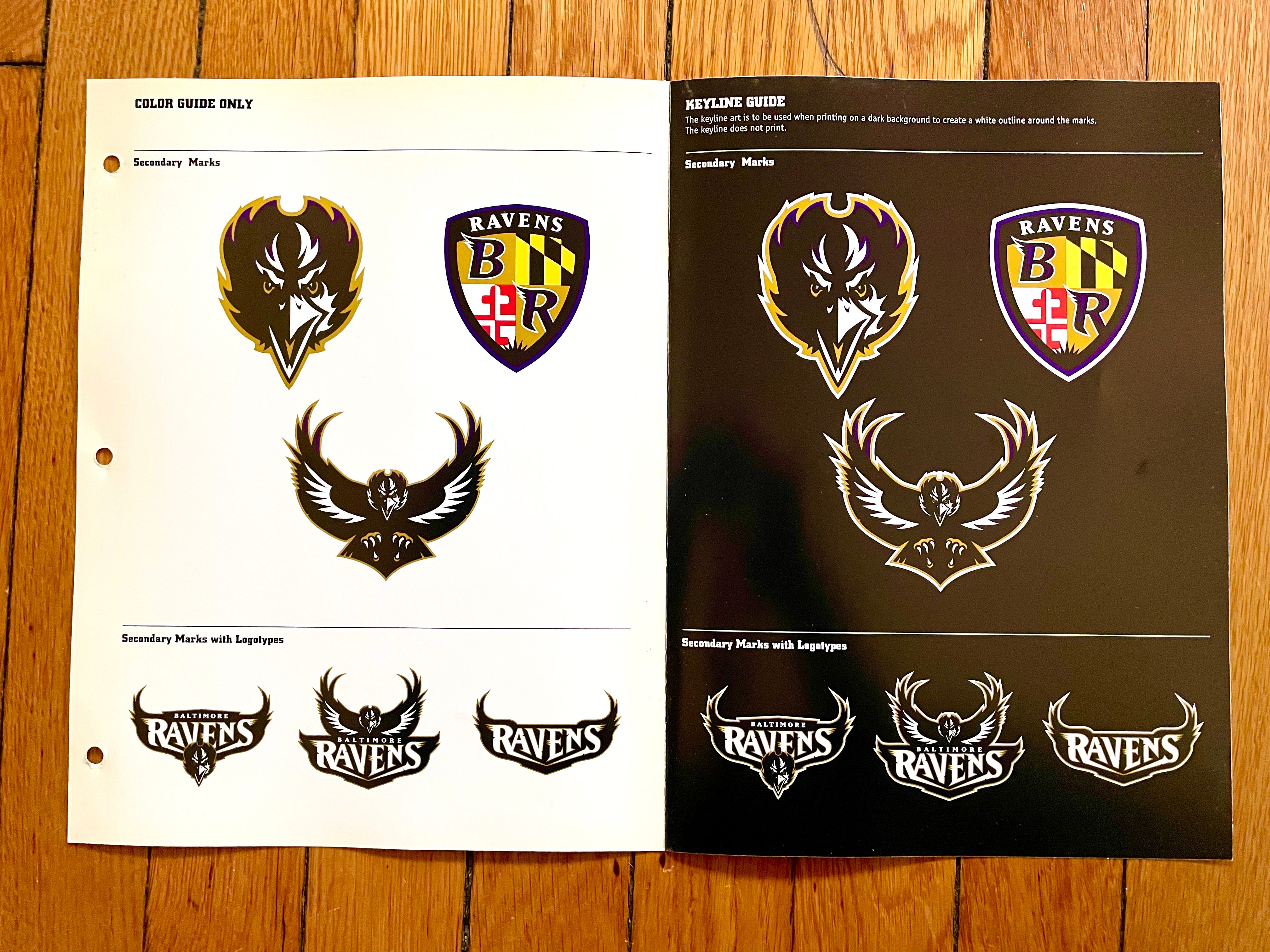
Baltimore Ravens
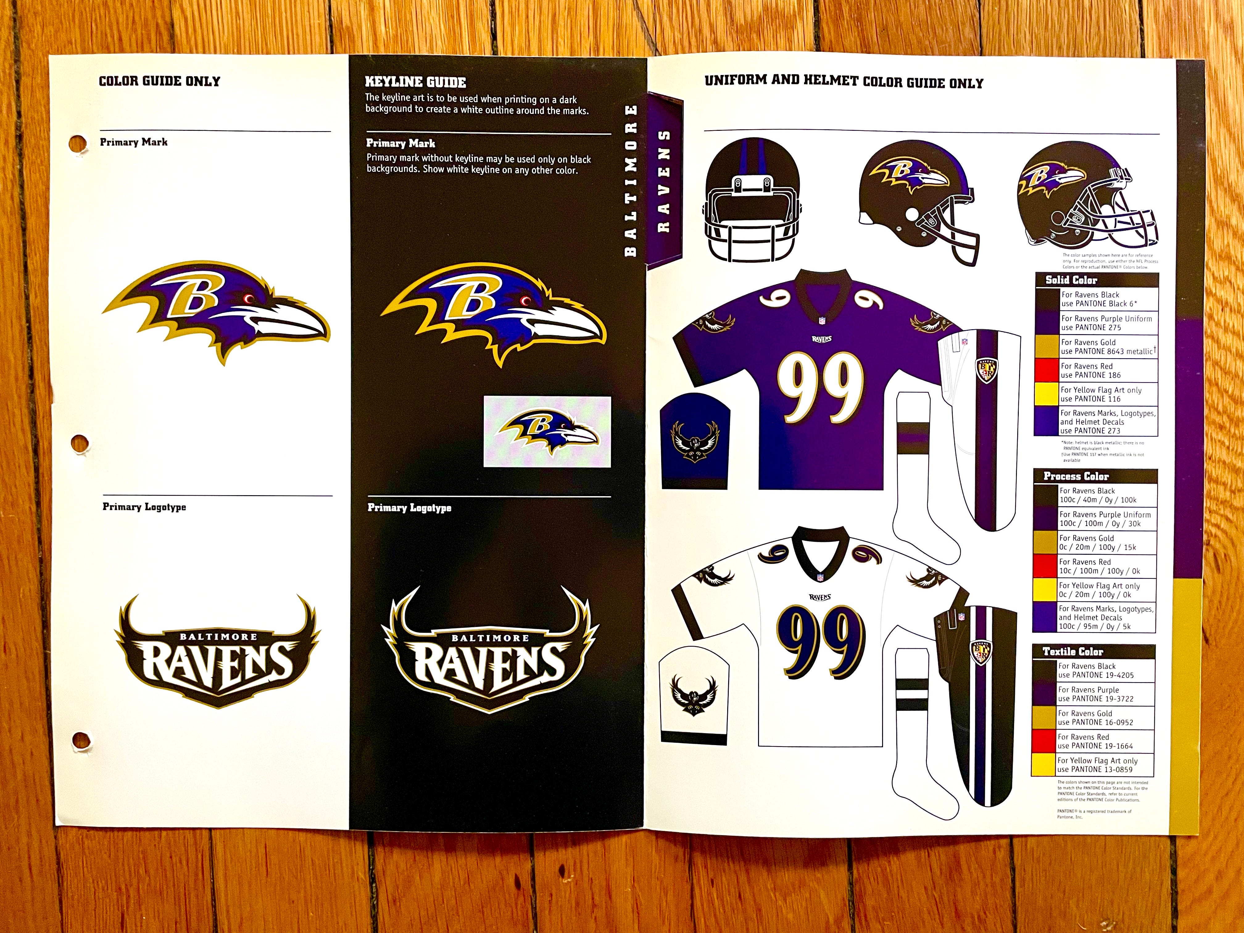
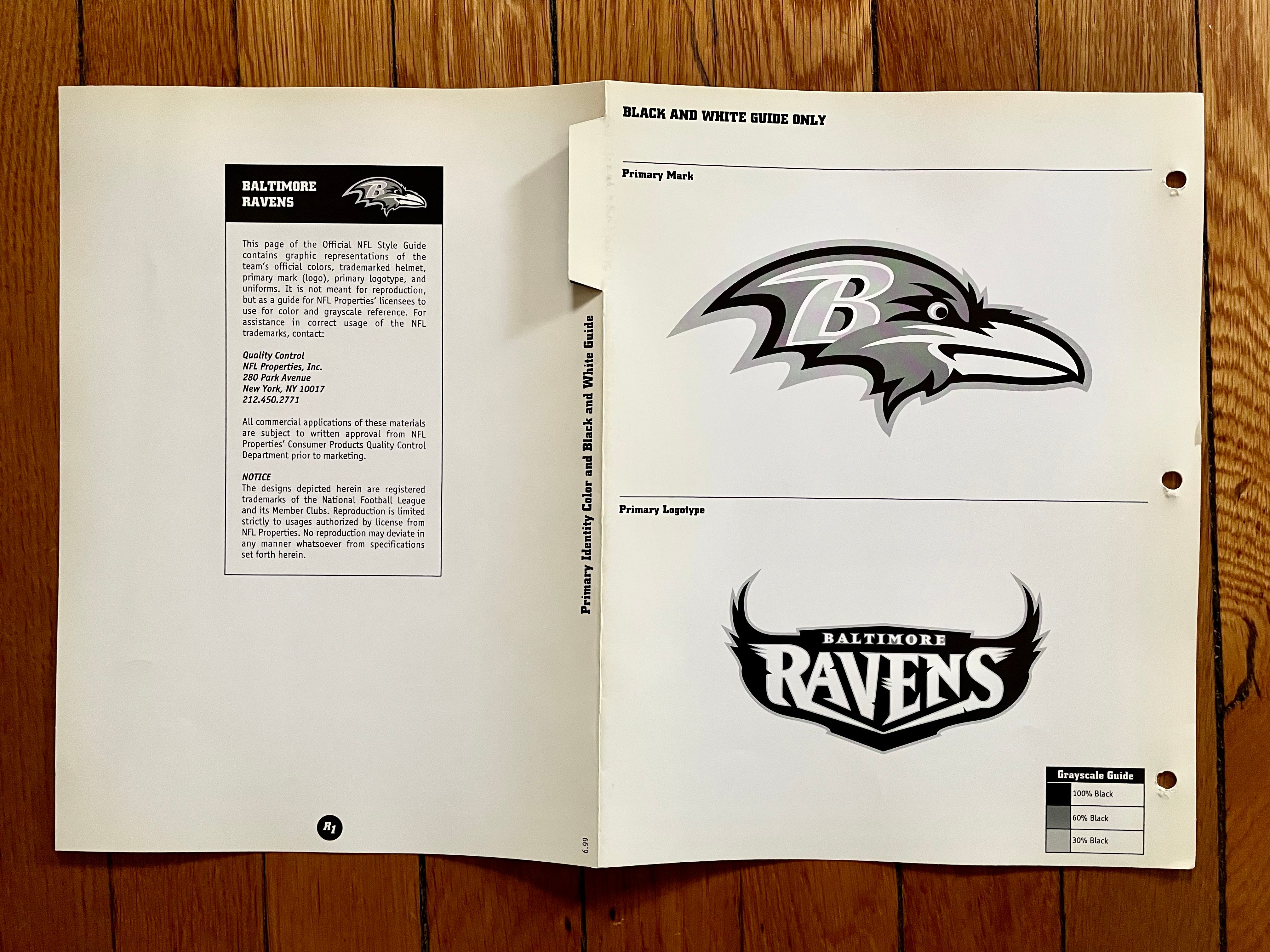

1999 was the year the Ravens replaced their original “flying B” helmet logo (which they had to give up due to a legal dispute) with the logo we’re familiar with today, so these style sheets reflected the team’s new visual identity.
Also: The Ravens, like the Cardinals, had an unusually large number of team colors, mainly because of their Maryland flag-inspired secondary logo.
———
Buffalo Bills
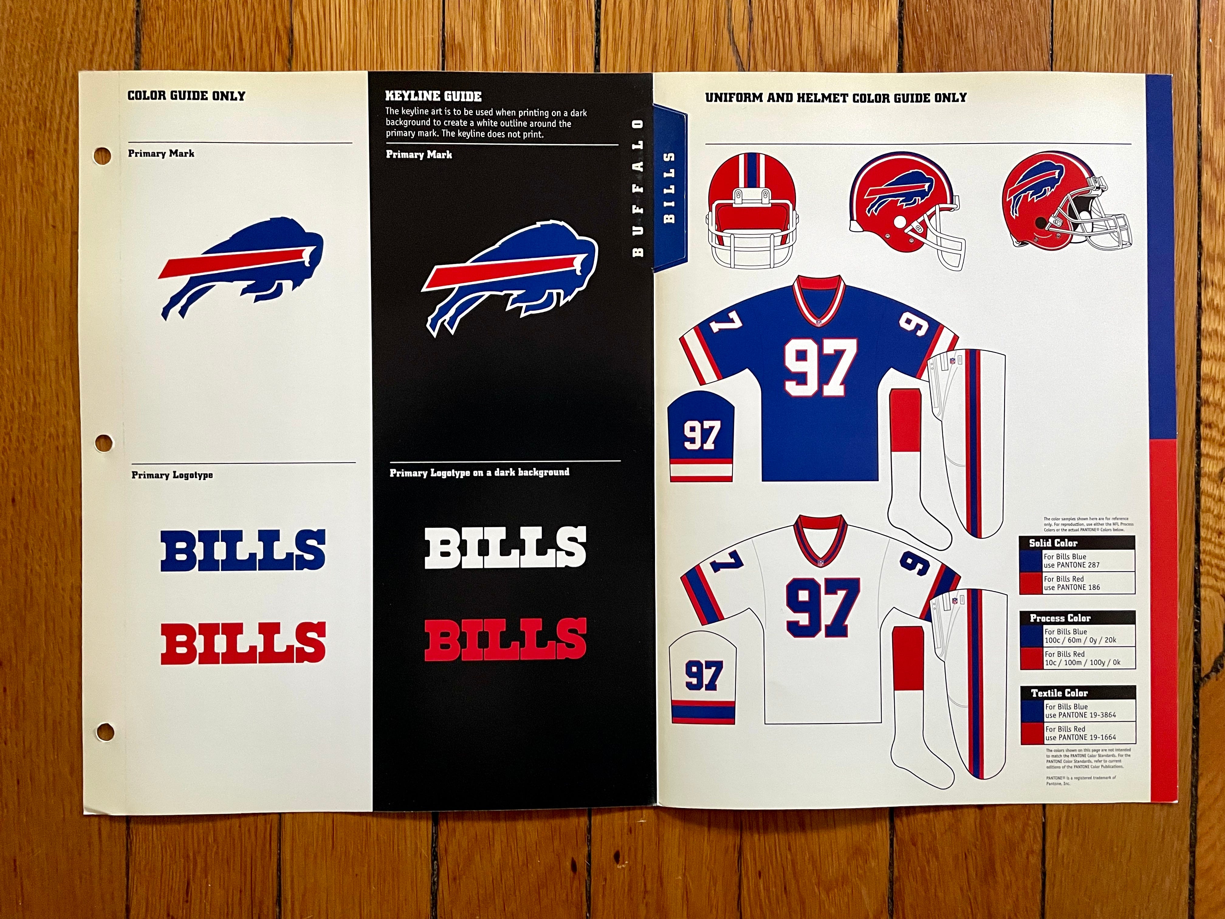
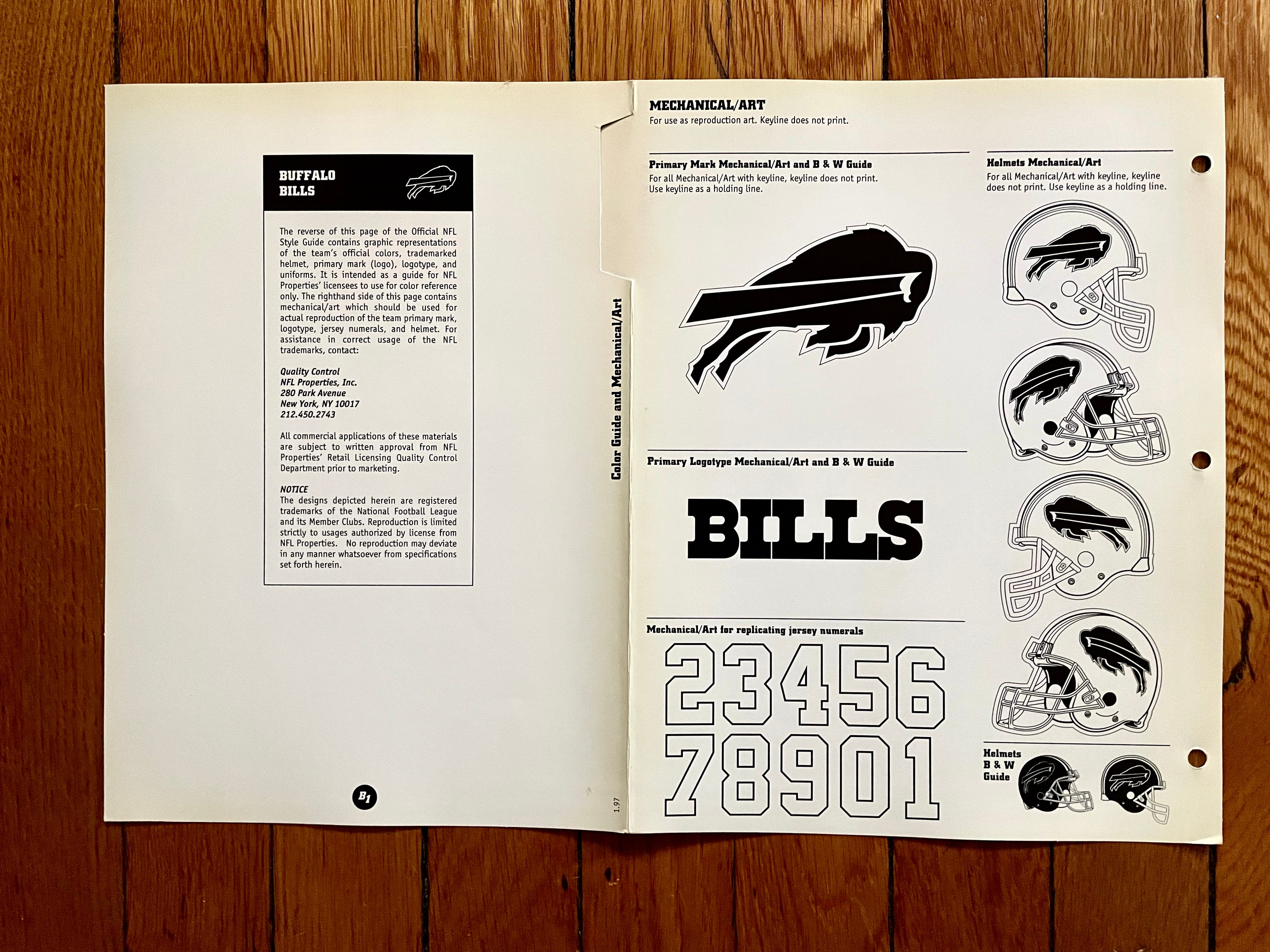
Obviously, the Bills played really well in this uniform set, winning four consecutive AFC championships. But despite the on-field success, I’ve never liked this team in red helmets (or red socks, for that matter). To me, the Bills are a blue team with red trim, so the red helmets never felt right to me, regardless of whether they reduced Joe Ferguson’s interception rate.
———
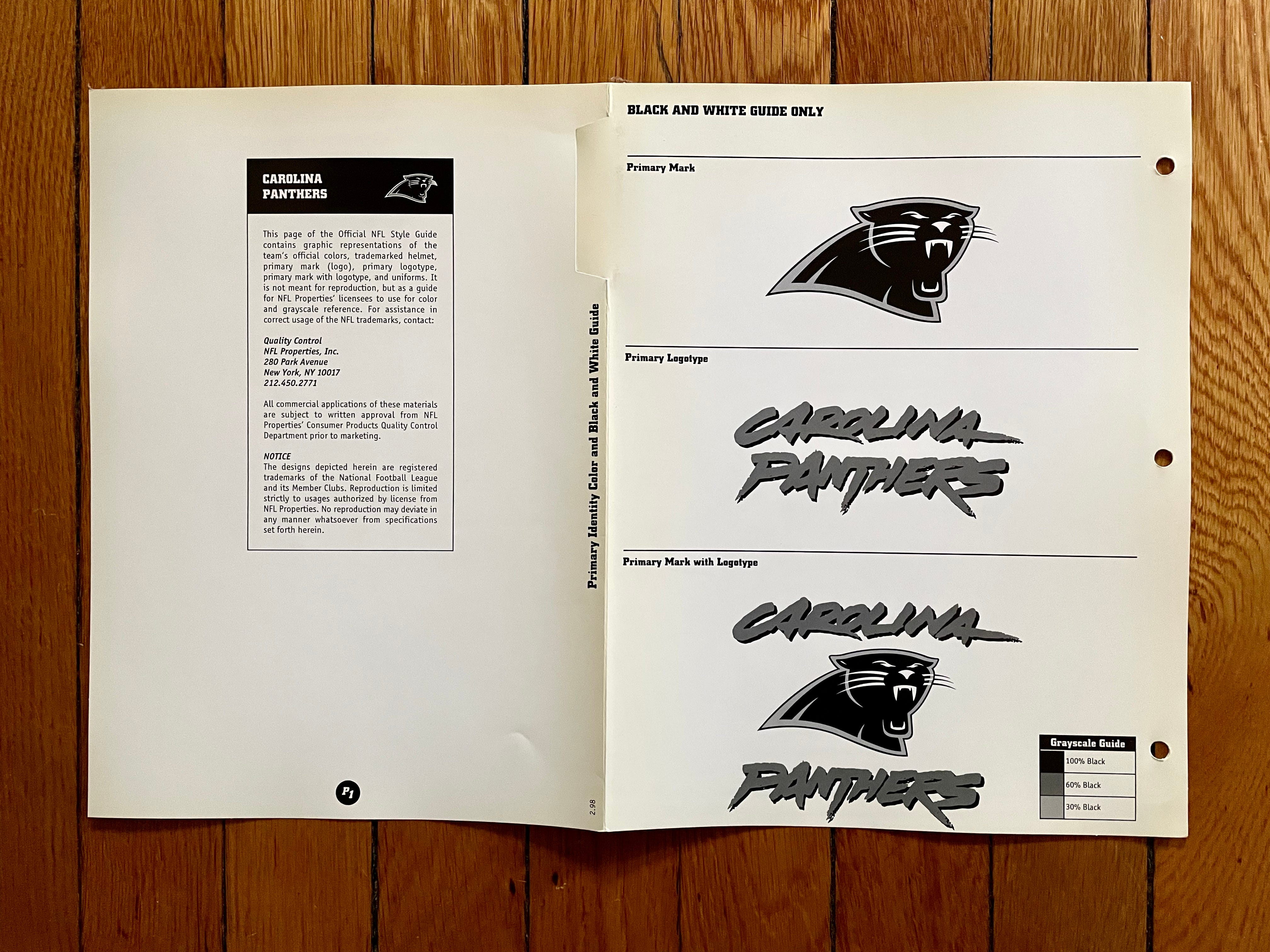
Carolina Panthers
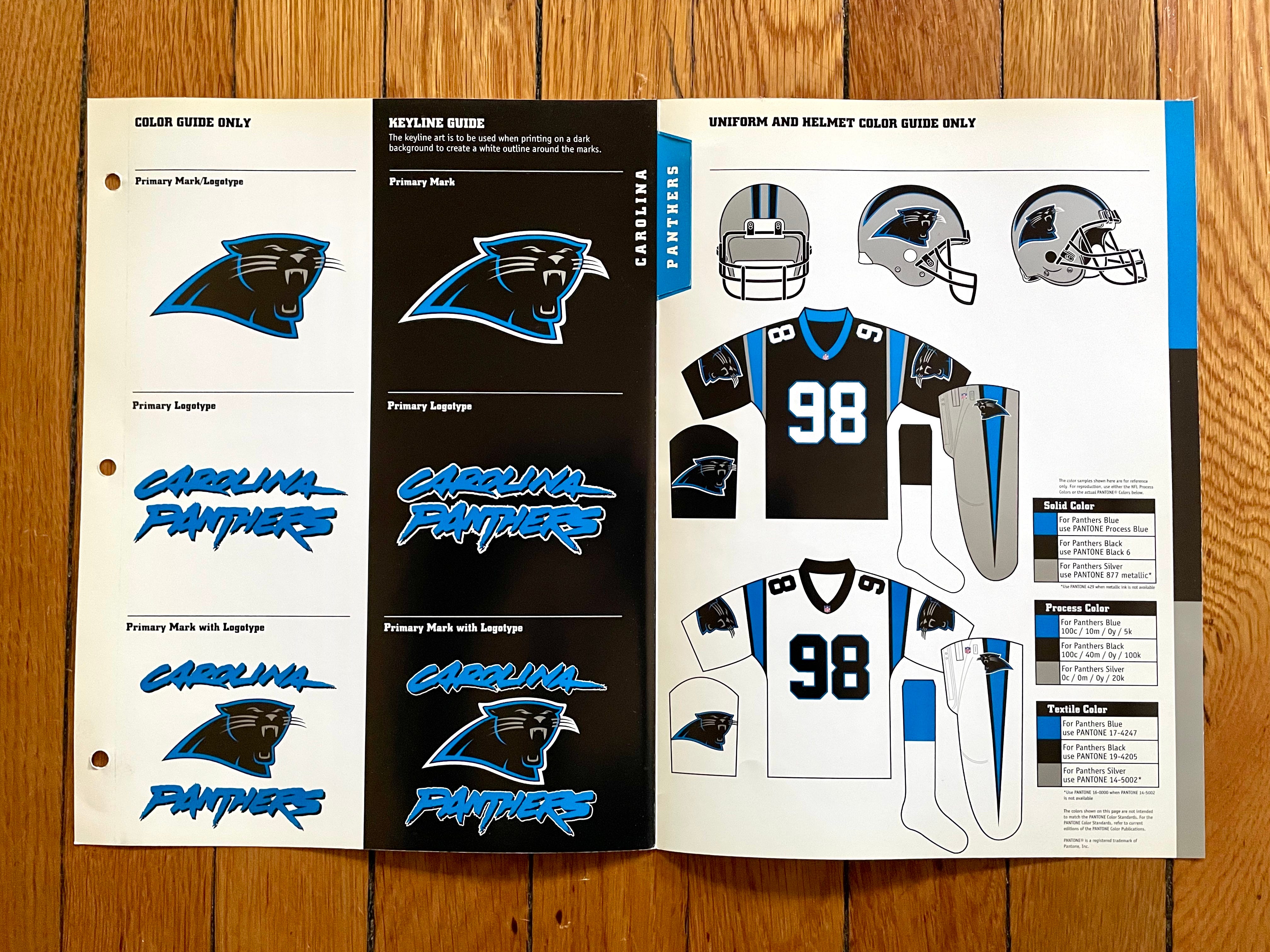
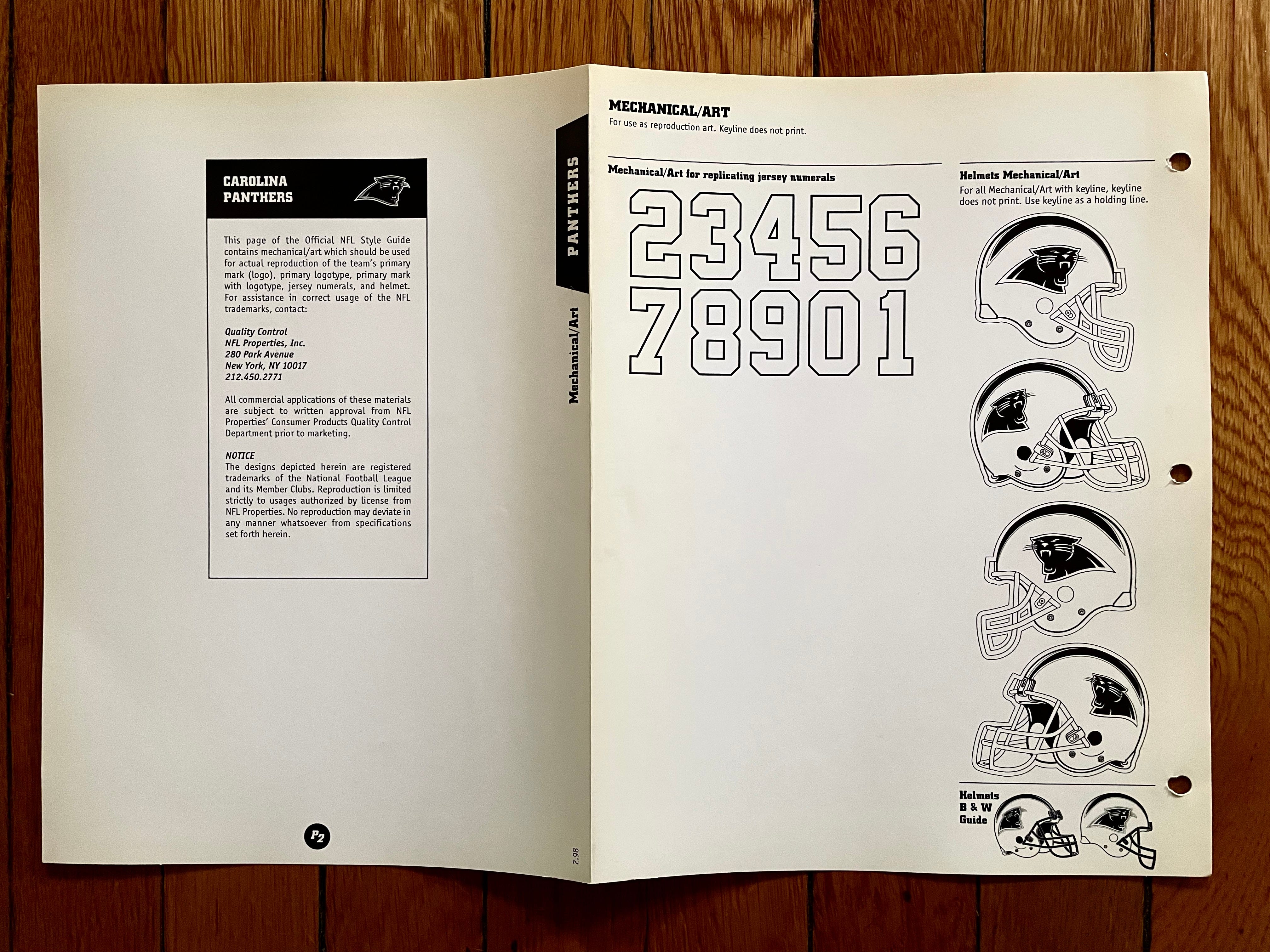
Aside from a few minor tweaks, this is still what the Panthers wear today. One of those tweaks — more of a compromise, really — is that the team’s shade of blue had to change slightly when Nike took over as the NFL’s uniform outfitter in 2012, but they’re going back to the original shade of blue this season.
———
Chicago Bears
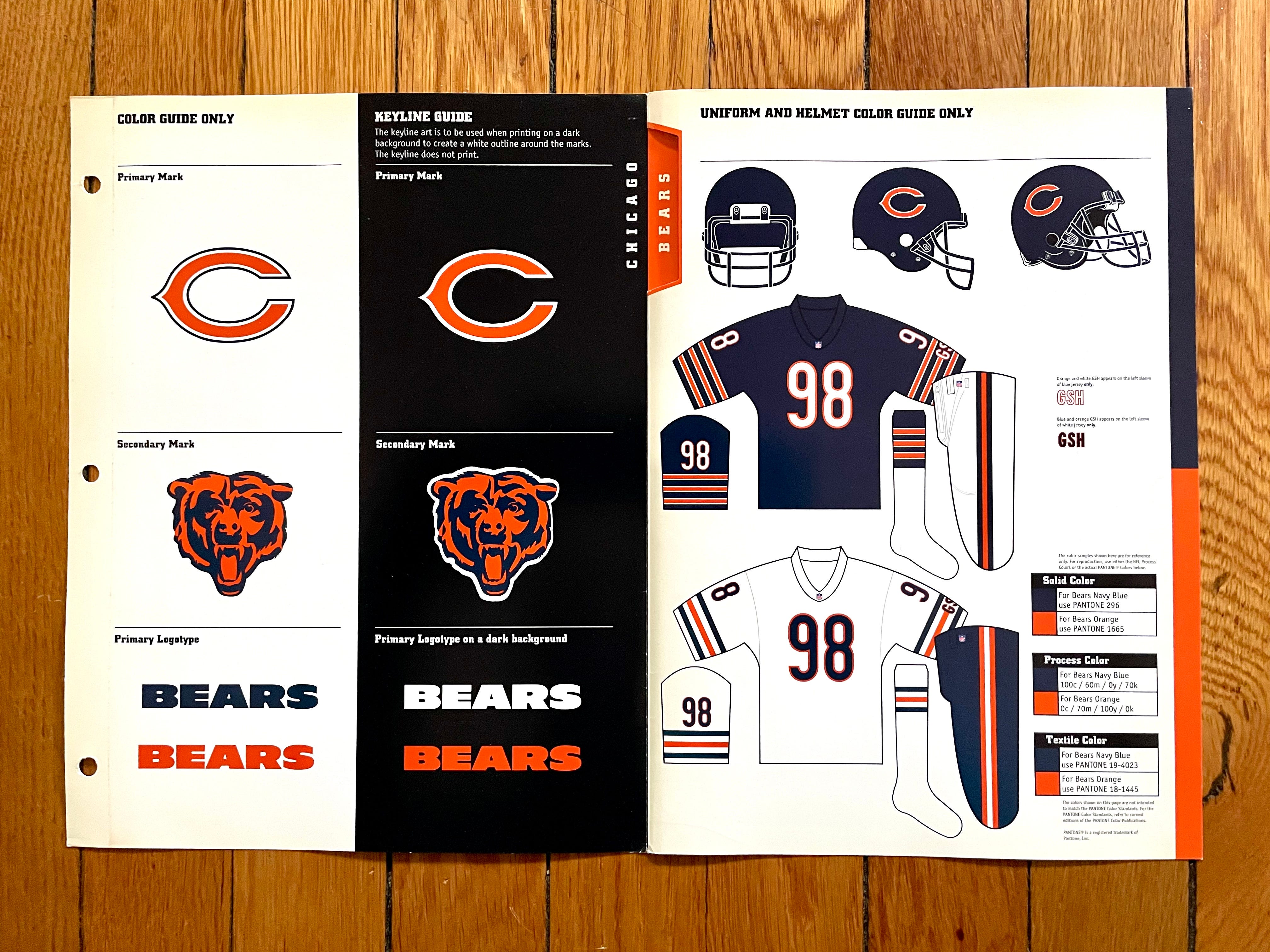
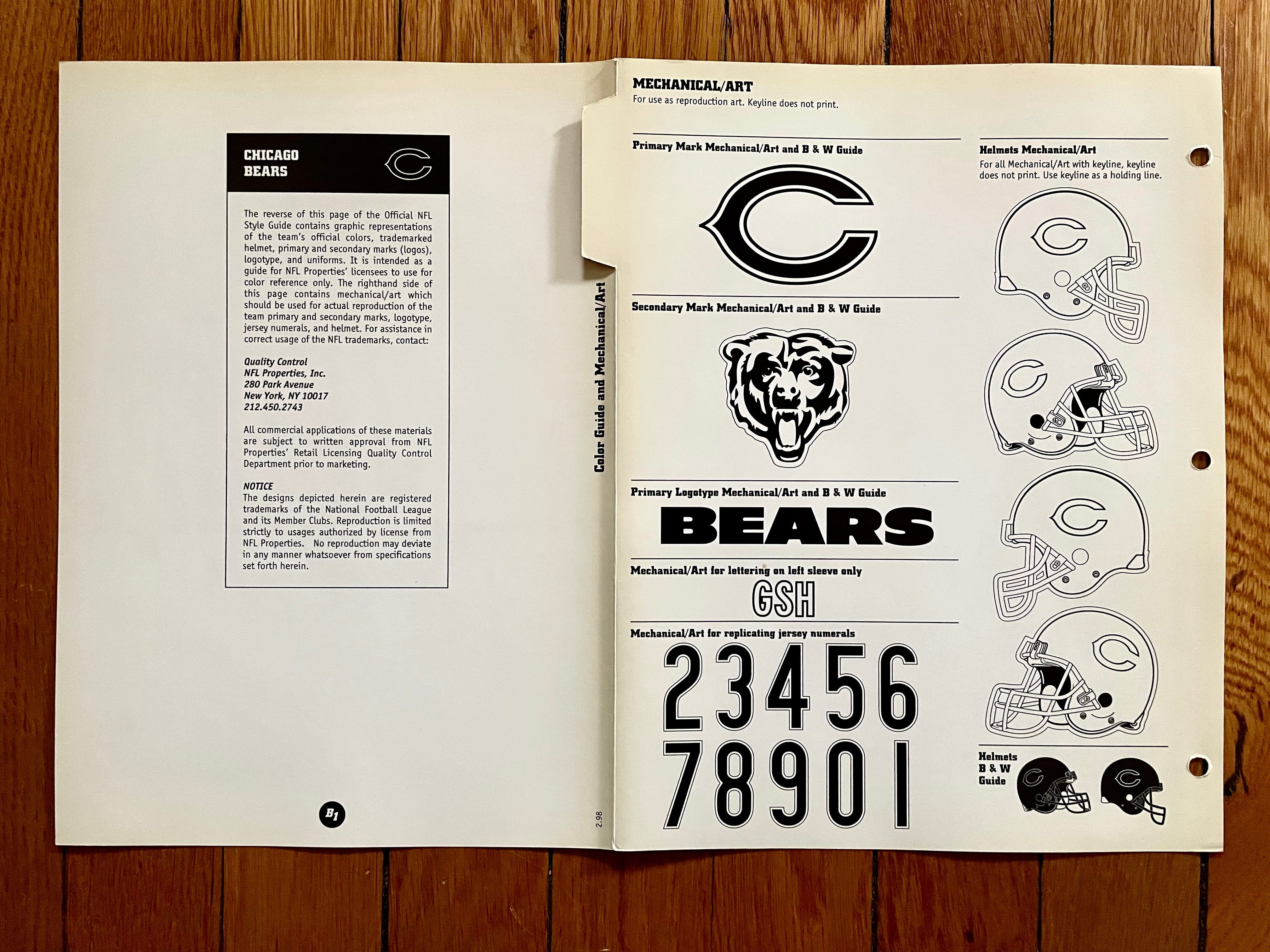
Another team that’s largely unchanged over the past 20-plus years. The only real adjustment is that the TV numbers moved from the sleeves to the shoulders when Nike took over in 2012 — a move that made sense considering the Bears already had three sleeve stripes plus the George Halas perma-memorial:

Speaking of the “GSH” lettering, I like how the style guide included a little notation for that!
———
Cincinnati Bengals
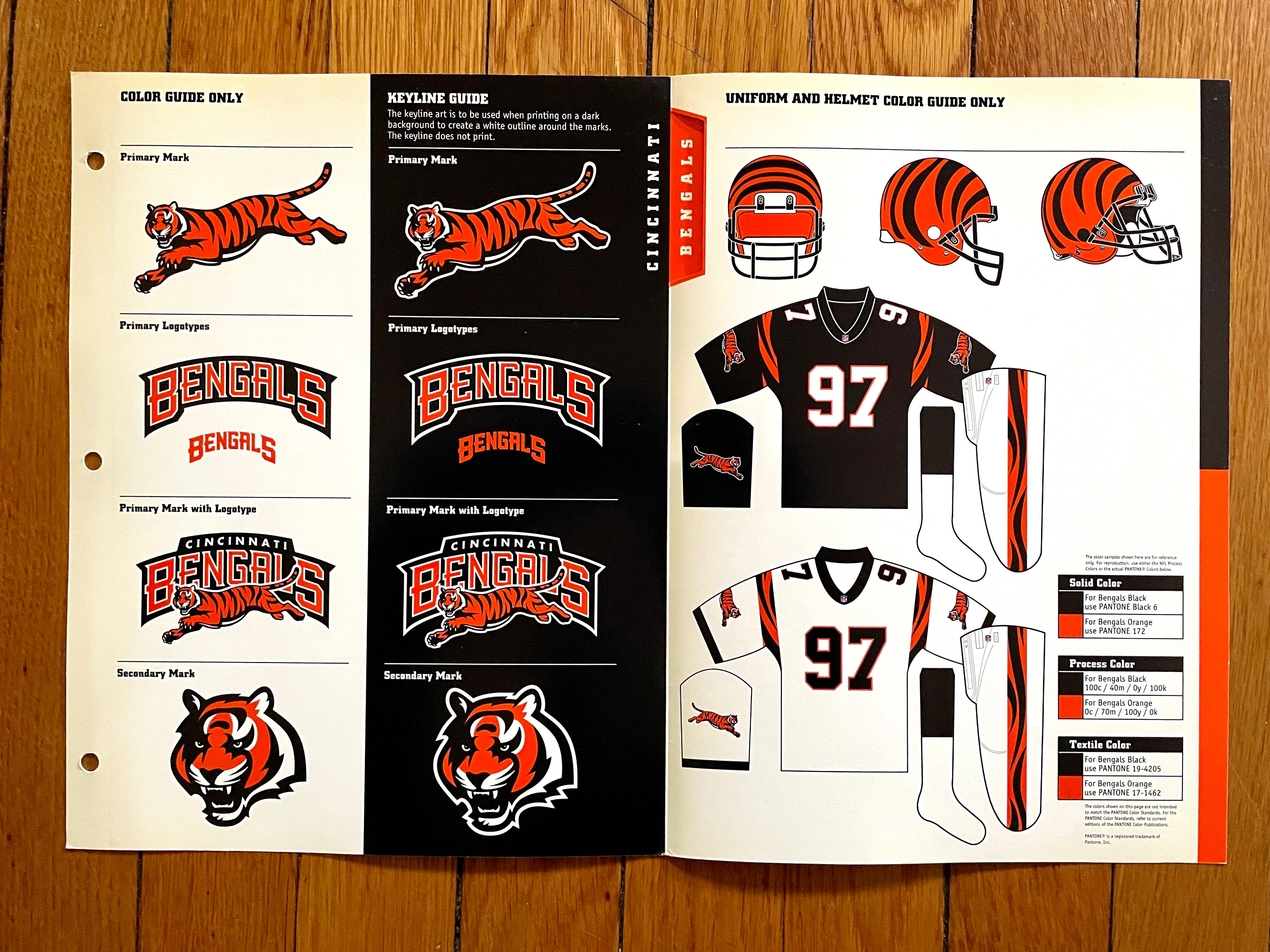
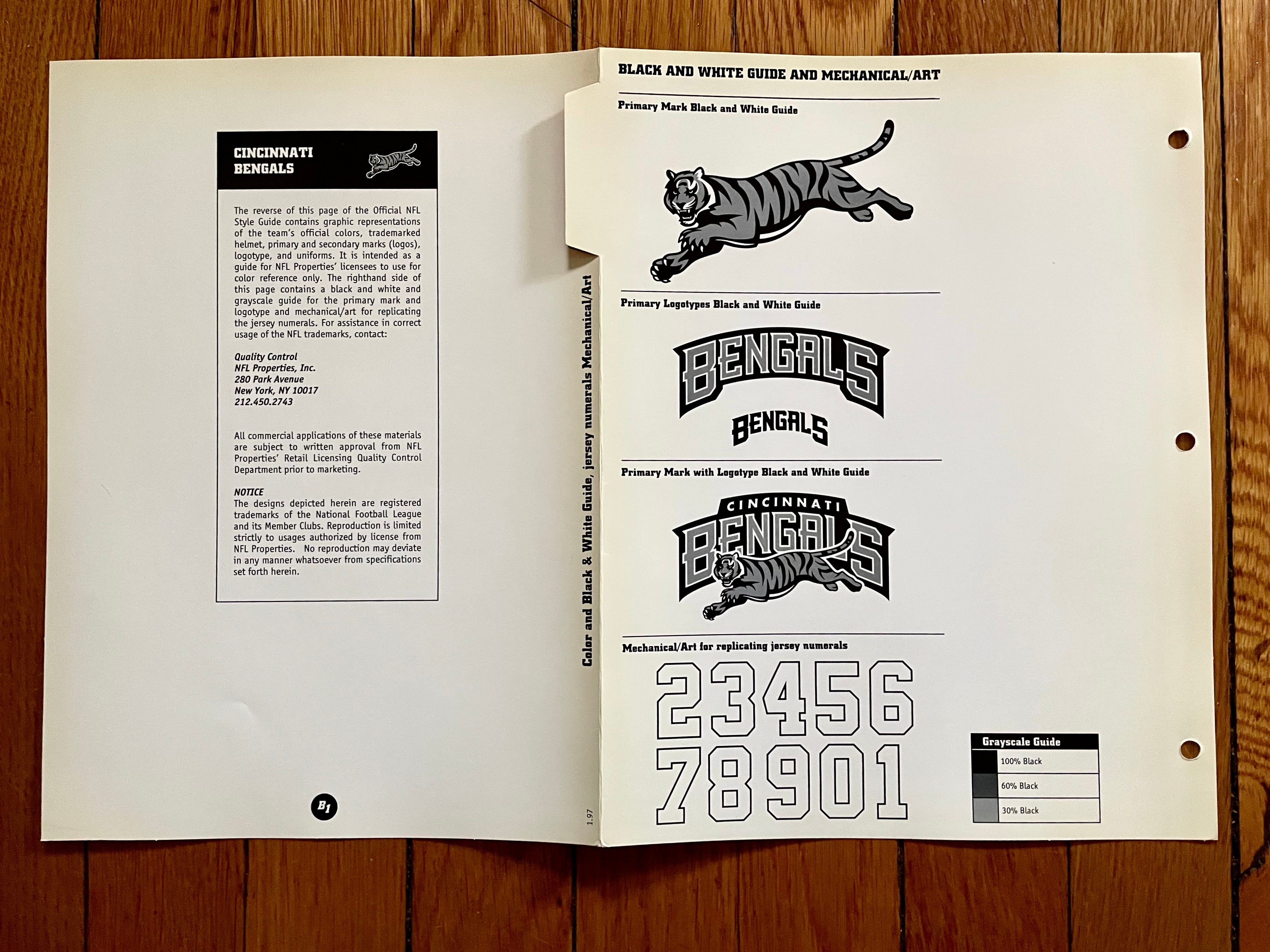
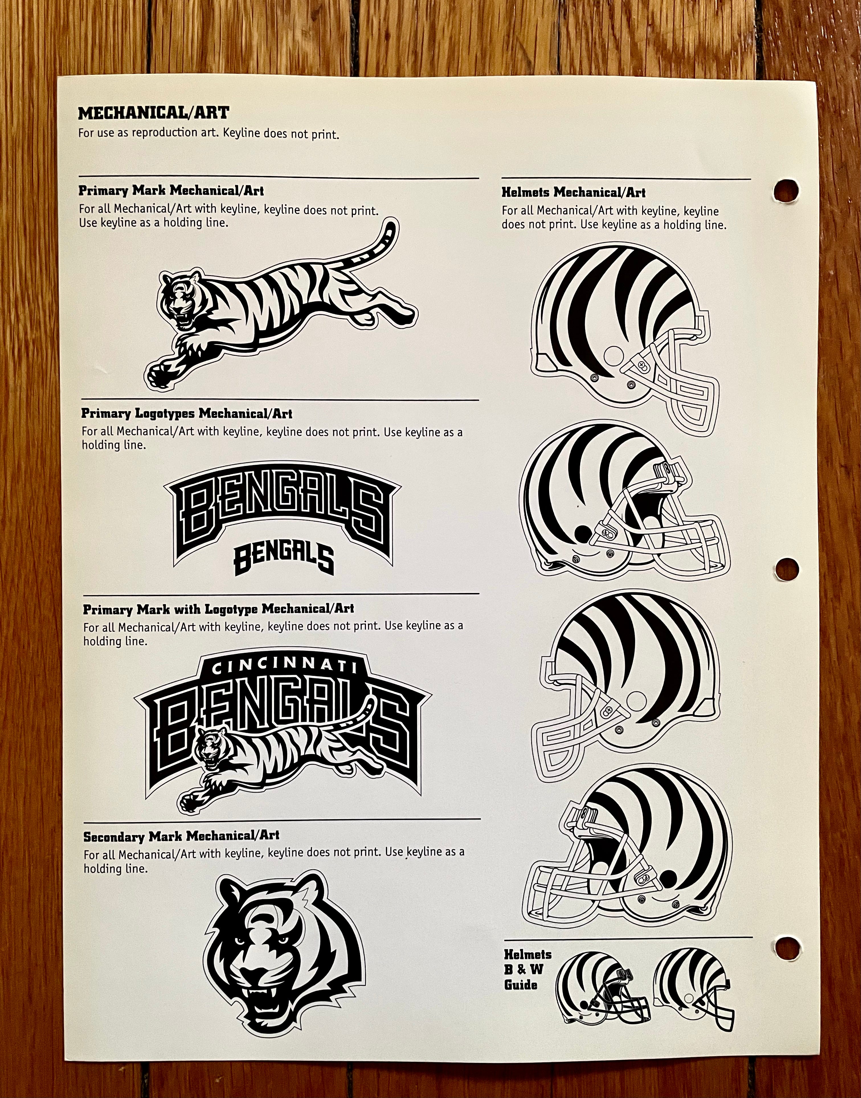
I know a lot of people love this helmet, but you’ll never convince me that they wouldn’t have been better off using that running tiger logo. This, of course, was their original stripe-themed uni set — much better than the godawful set they switched to in 2004.
———
Cleveland Browns
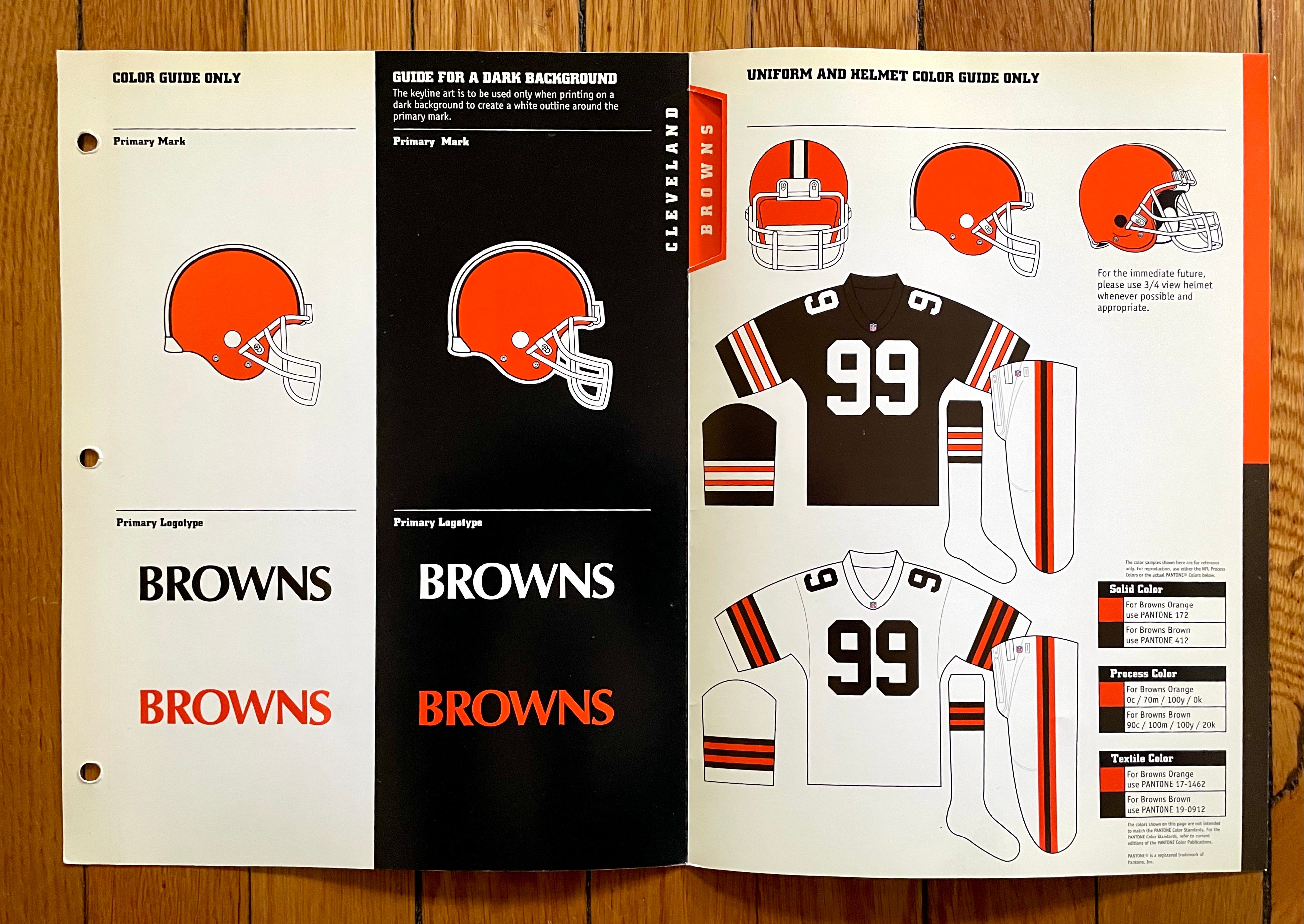
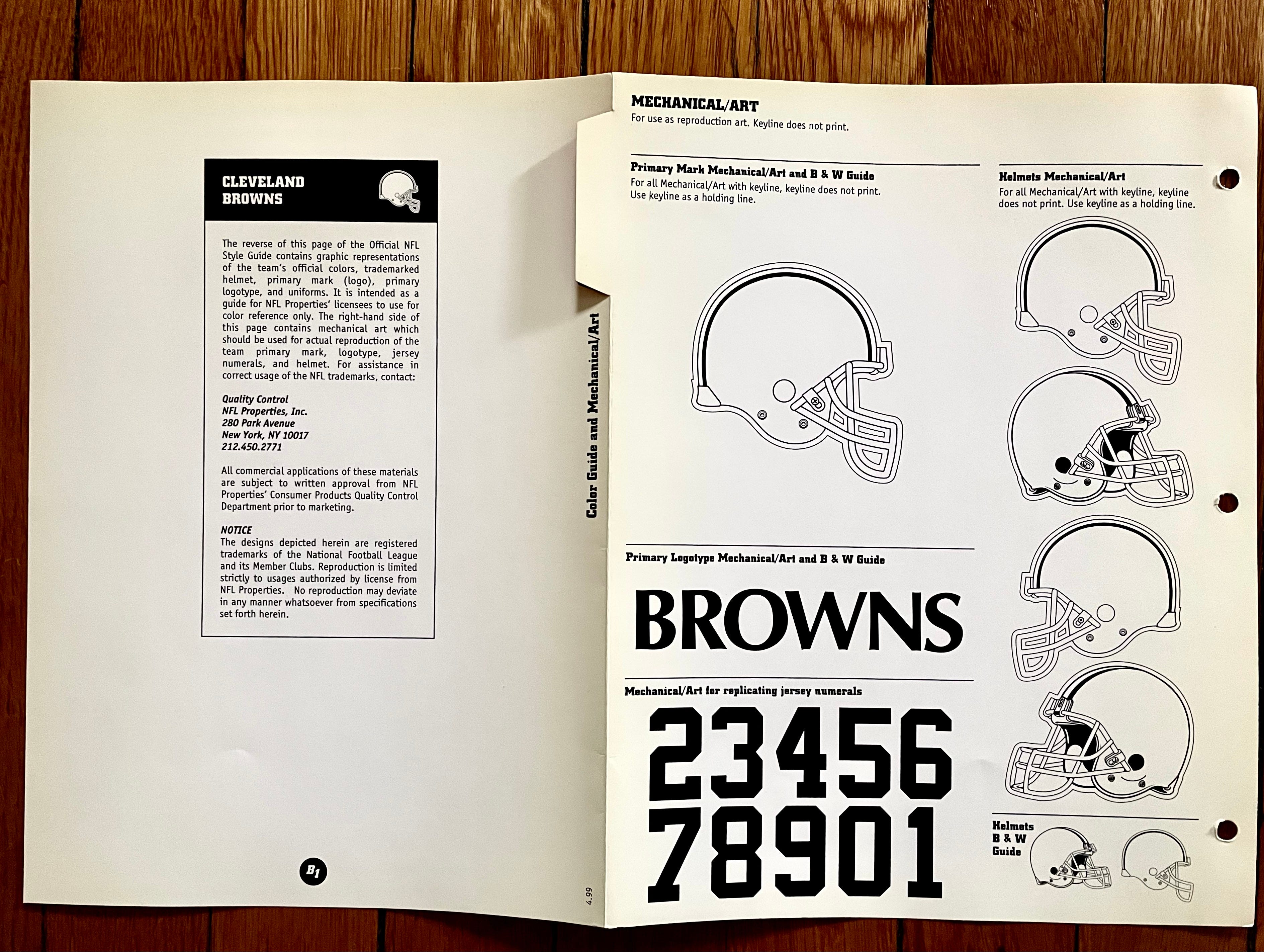
Pretty close to what they currently wear (although there was an unfortunate stylistic detour before normalcy was restored).
What really strikes me when looking at these style sheets is the wordmark. I mean, I know the Browns’ look is famously plain, but that lettering is really plain! The font is Optima Bold — a handsome typeface, for sure, but too staid for a sports insignia.
———
Dallas Cowboys
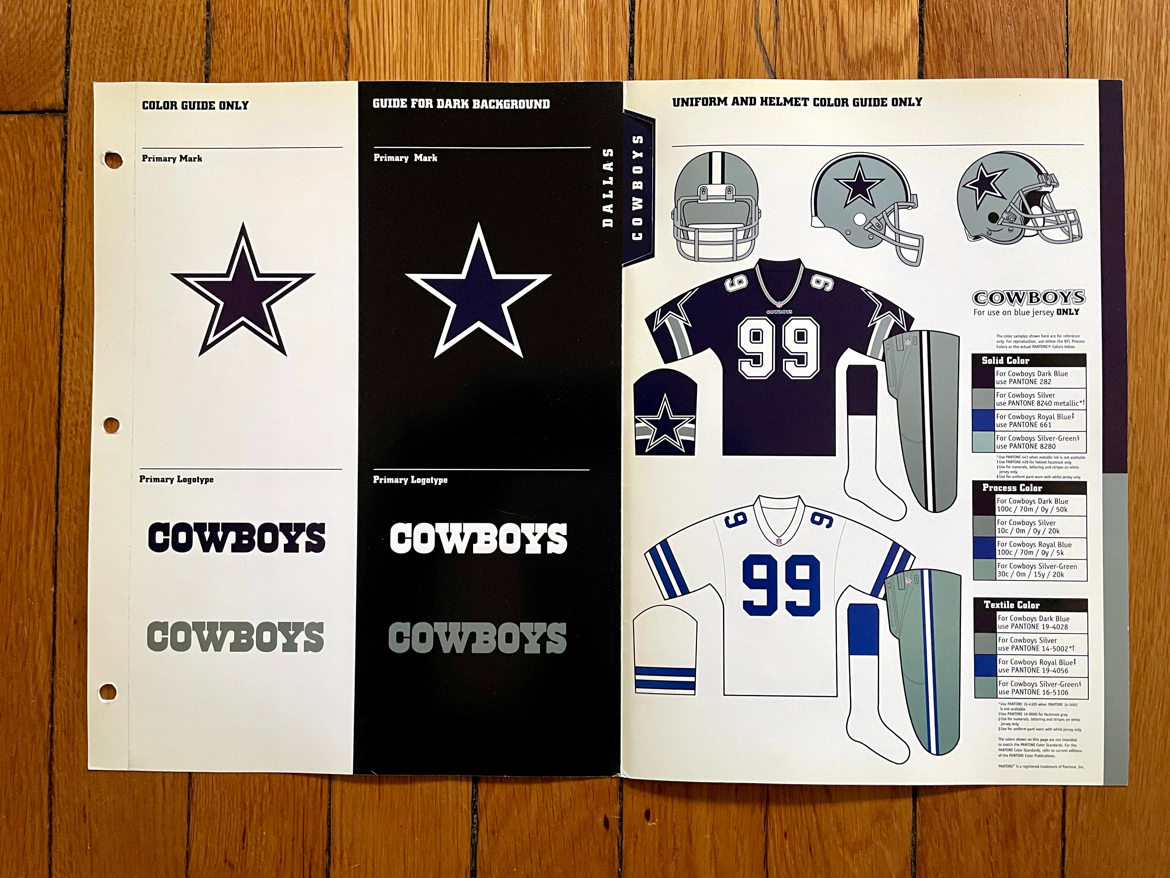
One of the most interesting teams in the guide, if only because it’s fun to see the official color specs for the mismatched silvers and blues.
Also: The Cowboys were among the very few teams in the league whose two primary jerseys weren’t just color-swapped versions of the same design,
Also-also: I like the little note about the “Cowboys” wordmark being “for use on blue jersey ONLY.”
———
Denver Broncos
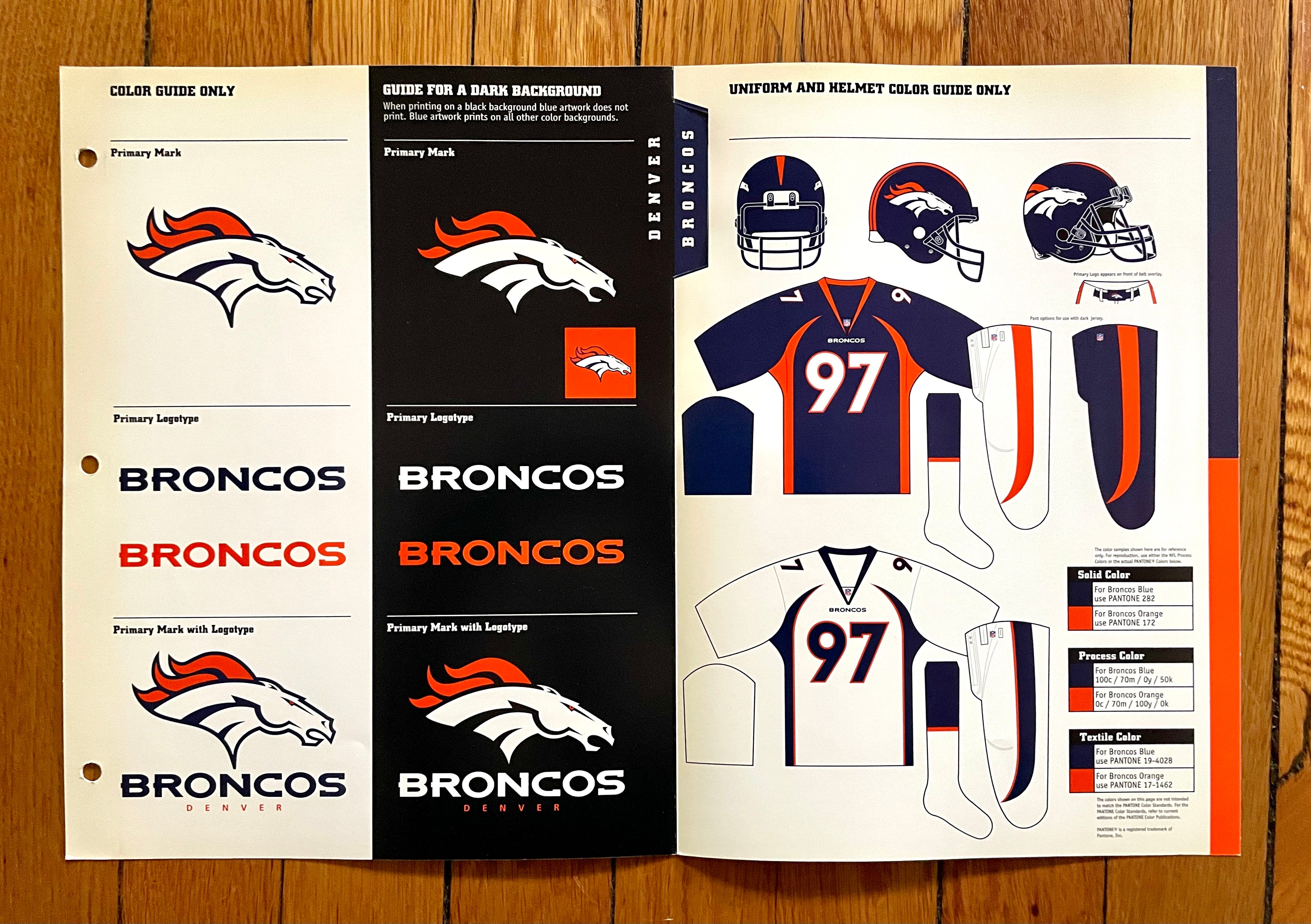
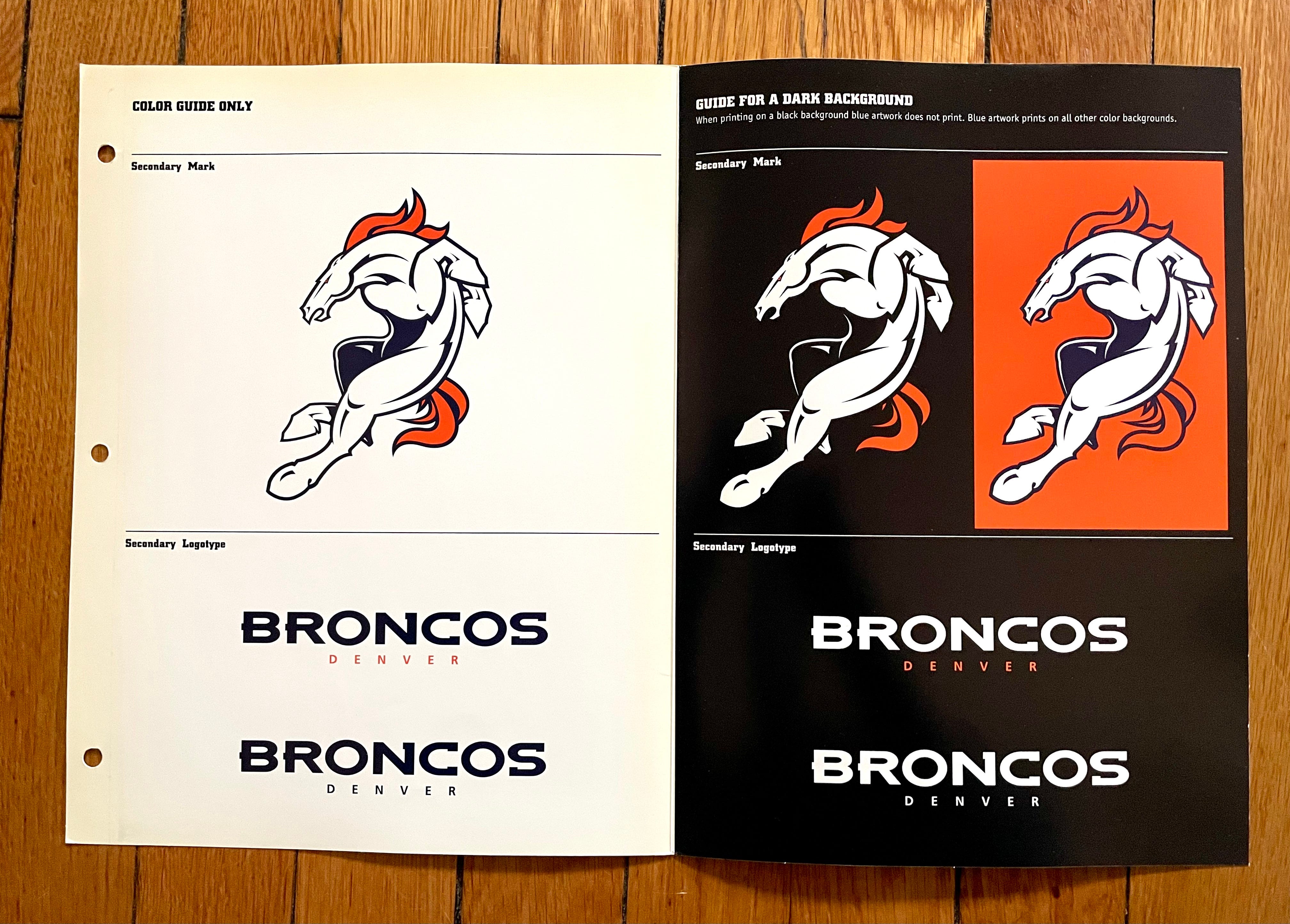
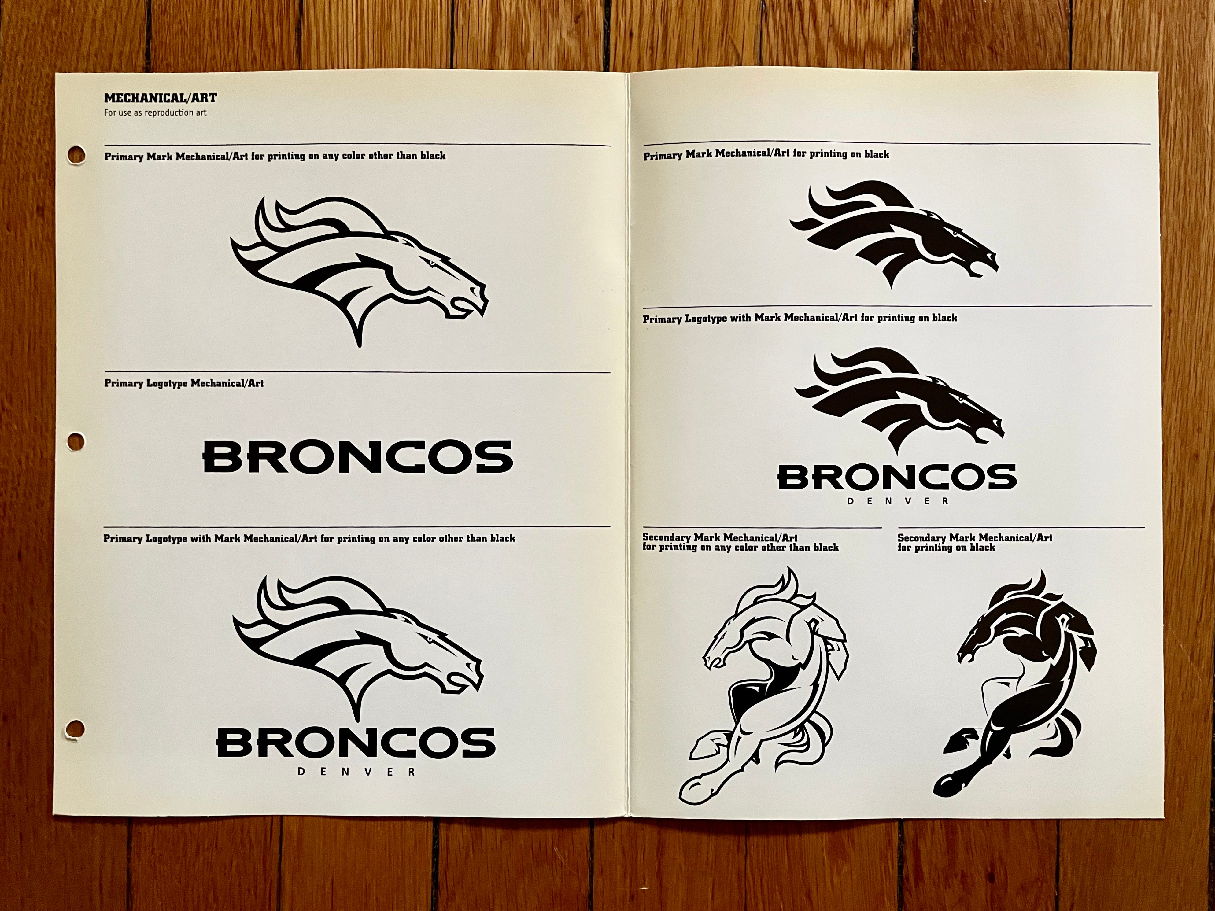
Here we have the design that initially seemed like it would remake the world of NFL aesthetics but ended up being more of an outlier than a trendsetter. It’s more or less what they still wear, except the navy jersey is now an alternate and they wear a color-swapped orange version as the primary. Note that there were two different pairs of white pants — one for use with the navy jersey and one for the white jersey — which seemed absurd and excessive at the time.
Also, this is the only team in the style guide (or, most likely, in NFL history) to have a special note about a little logo-emblazoned sleeve that was supposed to be worn over the belt buckle. Here’s a close-up of that note, along with a photo of how it looked on the field:

That’s very Nike, right? Unfortunately, sometimes the buckle logo was worn askew, or obscured by a towel, or the players just didn’t bother with it. It was quietly abandoned after a few seasons.
Meanwhile: Pretty wild to see all those “full horse” versions of the Broncos’ logo, right?
———
Detroit Lions
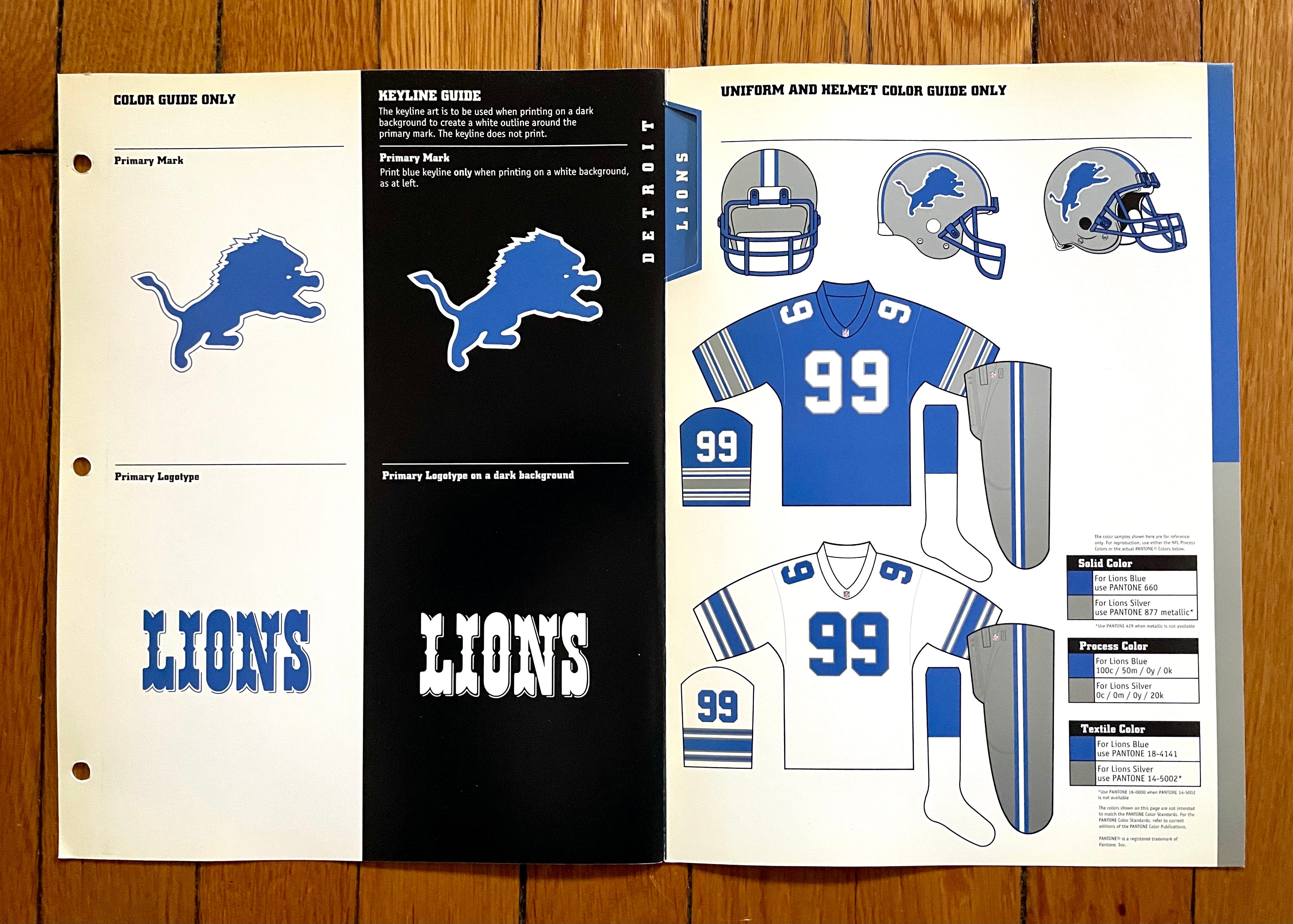
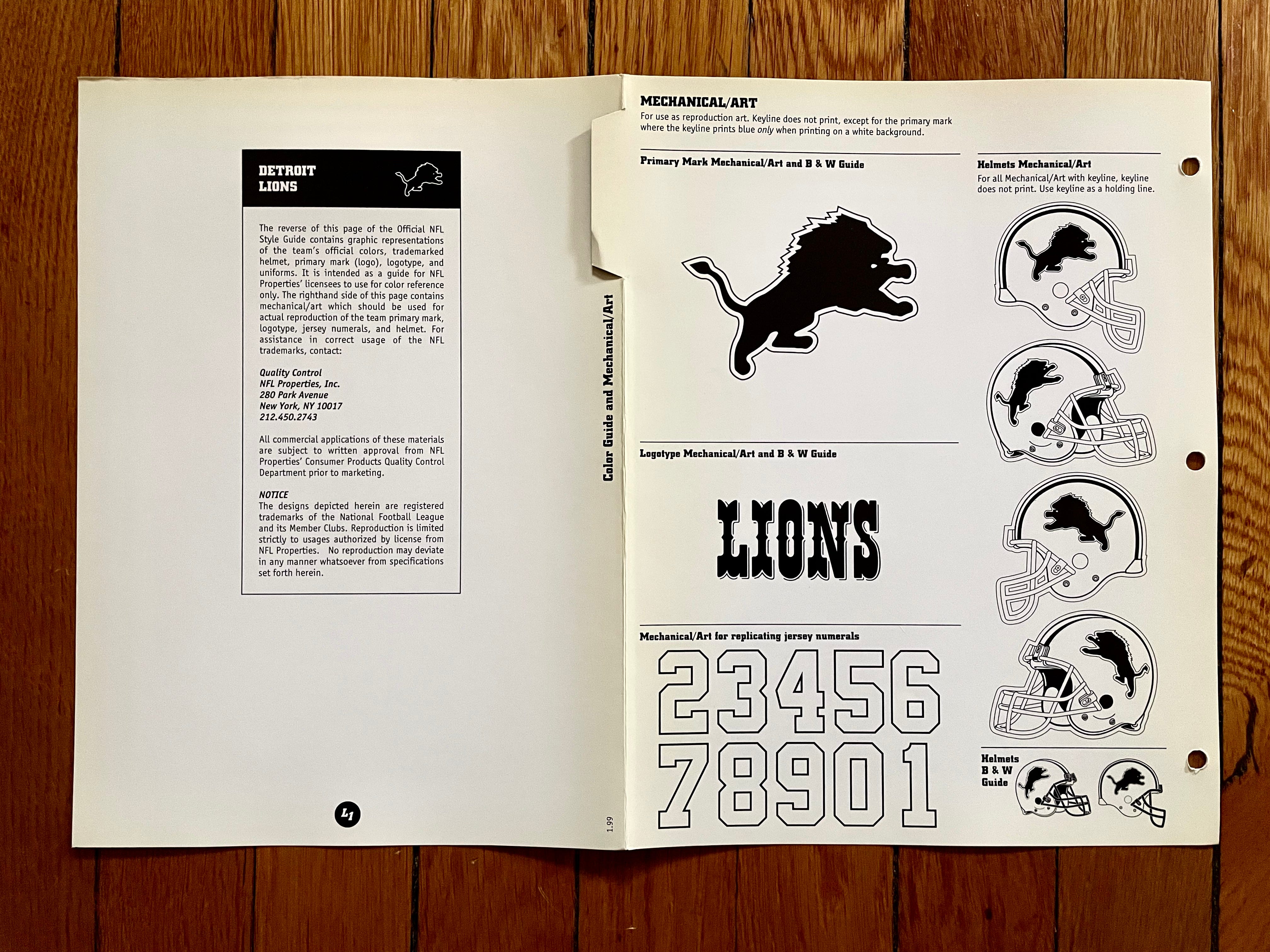
Everyone wishes they’d just go back to this already, myself included. Love the circus-font wordmark, too.
———
Green Bay Packers
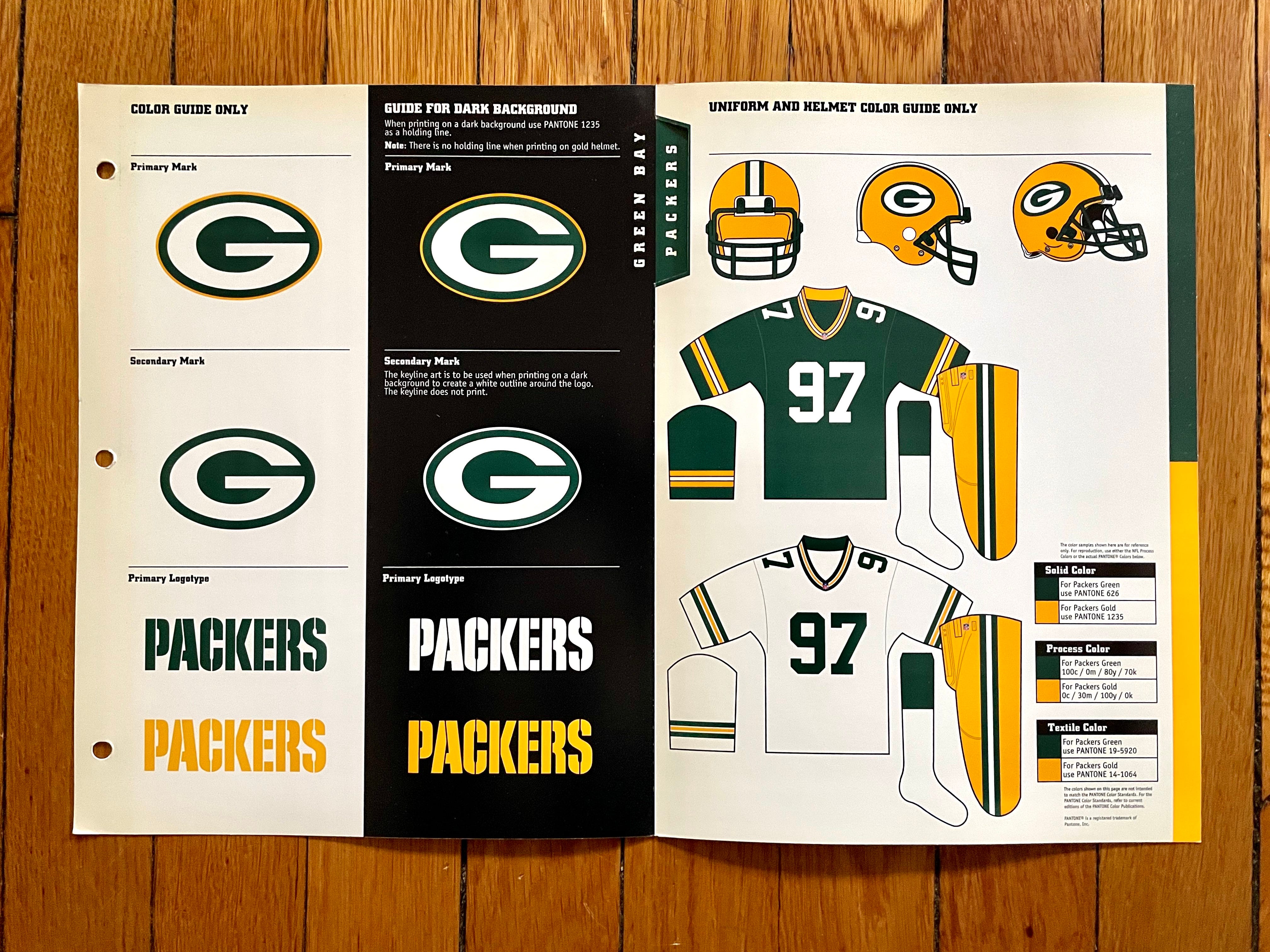
Fun fact: In 1997 (the year this style sheet was printed), the Packers adjusted their sleeve trim from five stripes to three, because NFL sleeves were getting shorter:

They’ve stuck with the three stripes (and pretty much everything else regarding their visual program) since then.
———
Indianapolis Colts
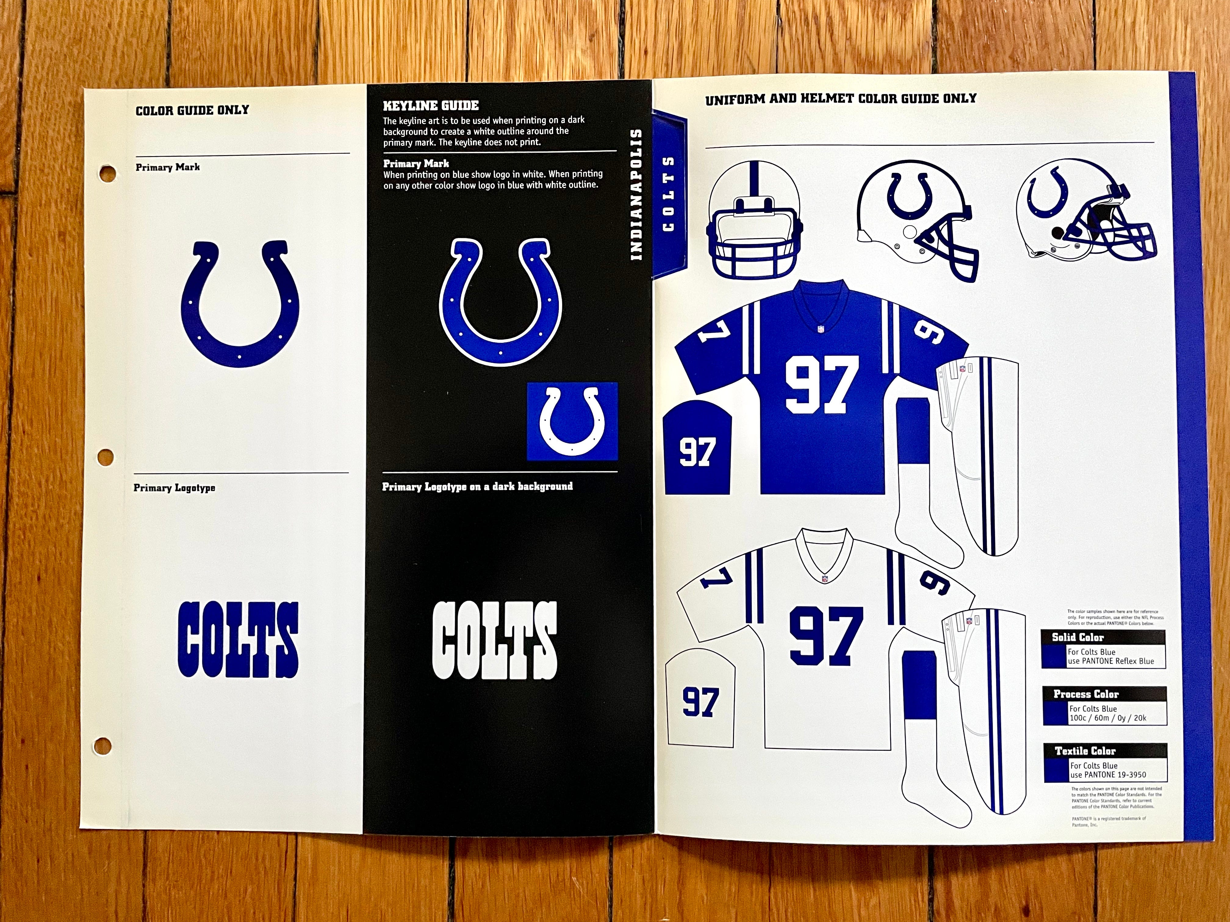
Still pretty much what they wear today, aside from the ever-shrinking shoulder stripes and the move back to a grey facemask.
Also: Since the Colts’ color palette is just blue and white, their color specs are very simple!
———
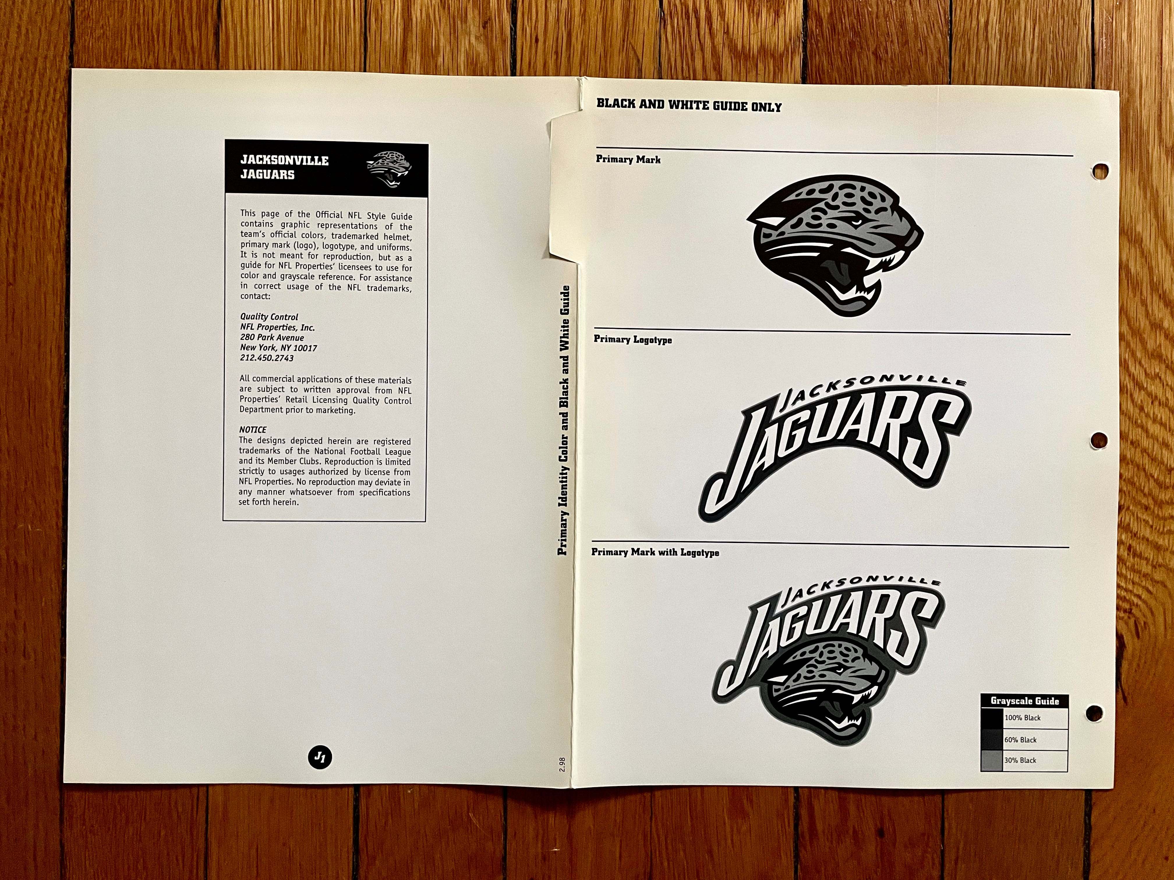
Jacksonville Jaguars
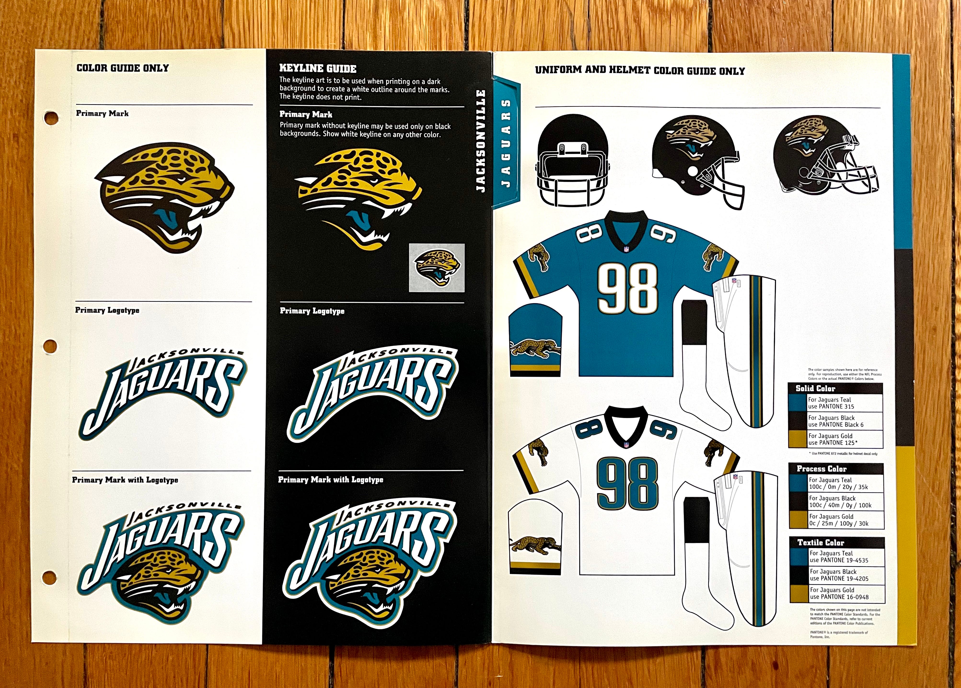
Sigh. I miss this uni set so much — a real modern classic. If only they’d had the brains and patience to stick with it.
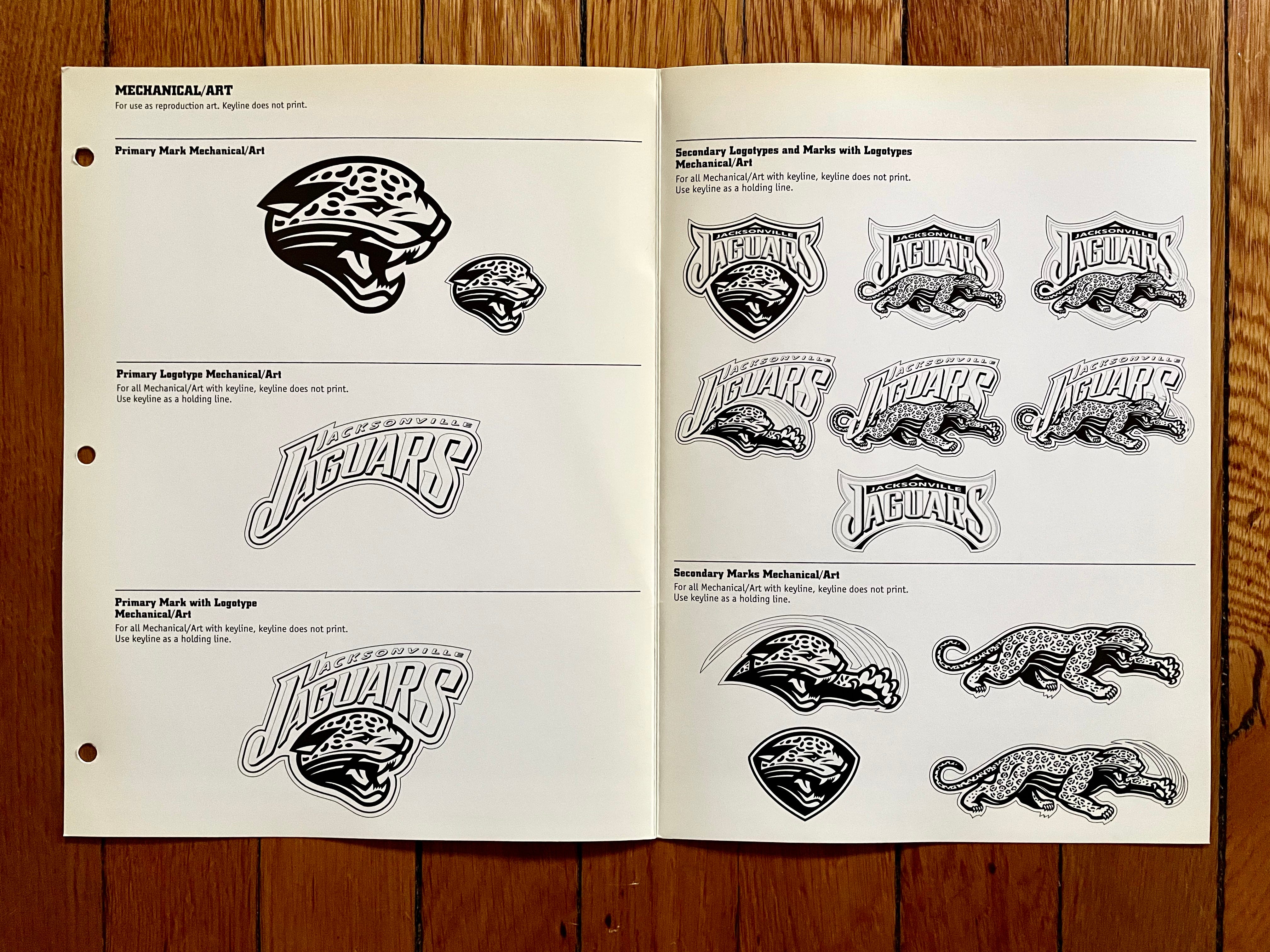
Meanwhile, check out all these variations of the Jags’ logo, most of which weren’t used much, if at all:

———
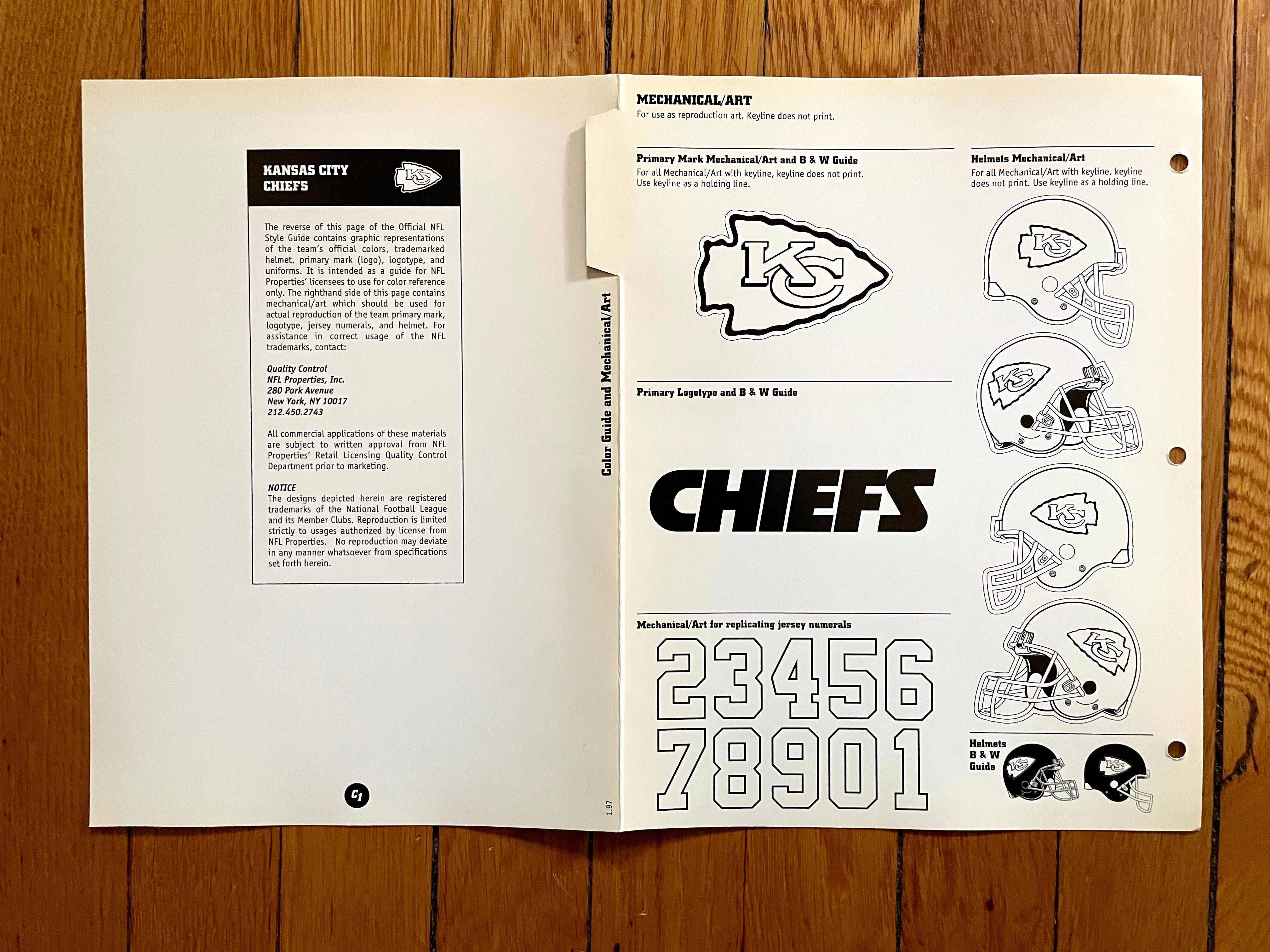
Kansas City Chiefs
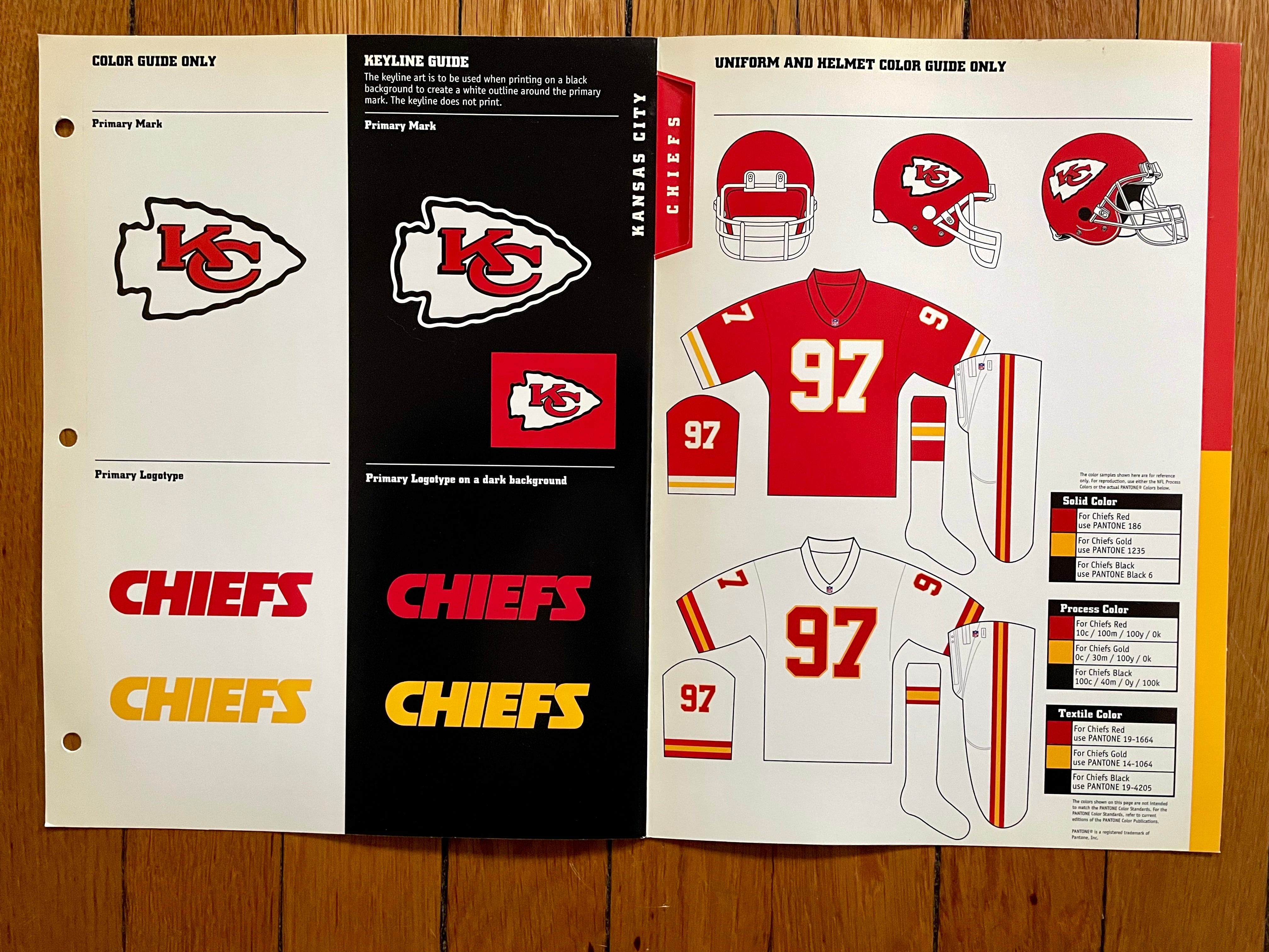
Couple of things here. First, KC, much like the Bears, moved their TV numbers from the sleeves to the shoulders when Nike became the NFL’s outfitter in 2012, with their white/yellow sleeve-cuff trim transformed into a middle-of-the-sleeve stripe pattern:

Also: If you look closely, you’ll see that the style sheets feature two different versions of the team’s arrowhead-themed logo. I refer to them as the “closed C” and the “open C” versions. There seems to be no rhyme or reason regarding which one is used in a given situation, as seen here (look at the lower prong of the “C”):
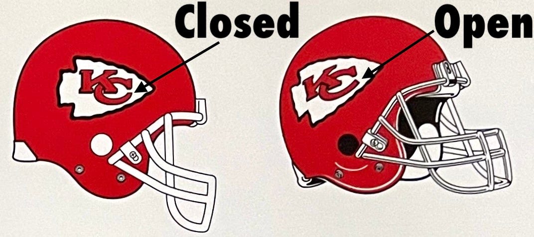
The two logo versions persist to this day — not just in the style guide, but in real life. The team’s helmets, for example, use the “open C” logo. But when quarterback Patrick Mahomes removes his helmet, he reveals a headband emblazoned with the “closed C” version:

Similarly, here’s a photo of KC general manager Brett Veach. Note that the helmet in front of him has the “open C,” while the backdrop behind him and his own polo shirt have the “closed C”:
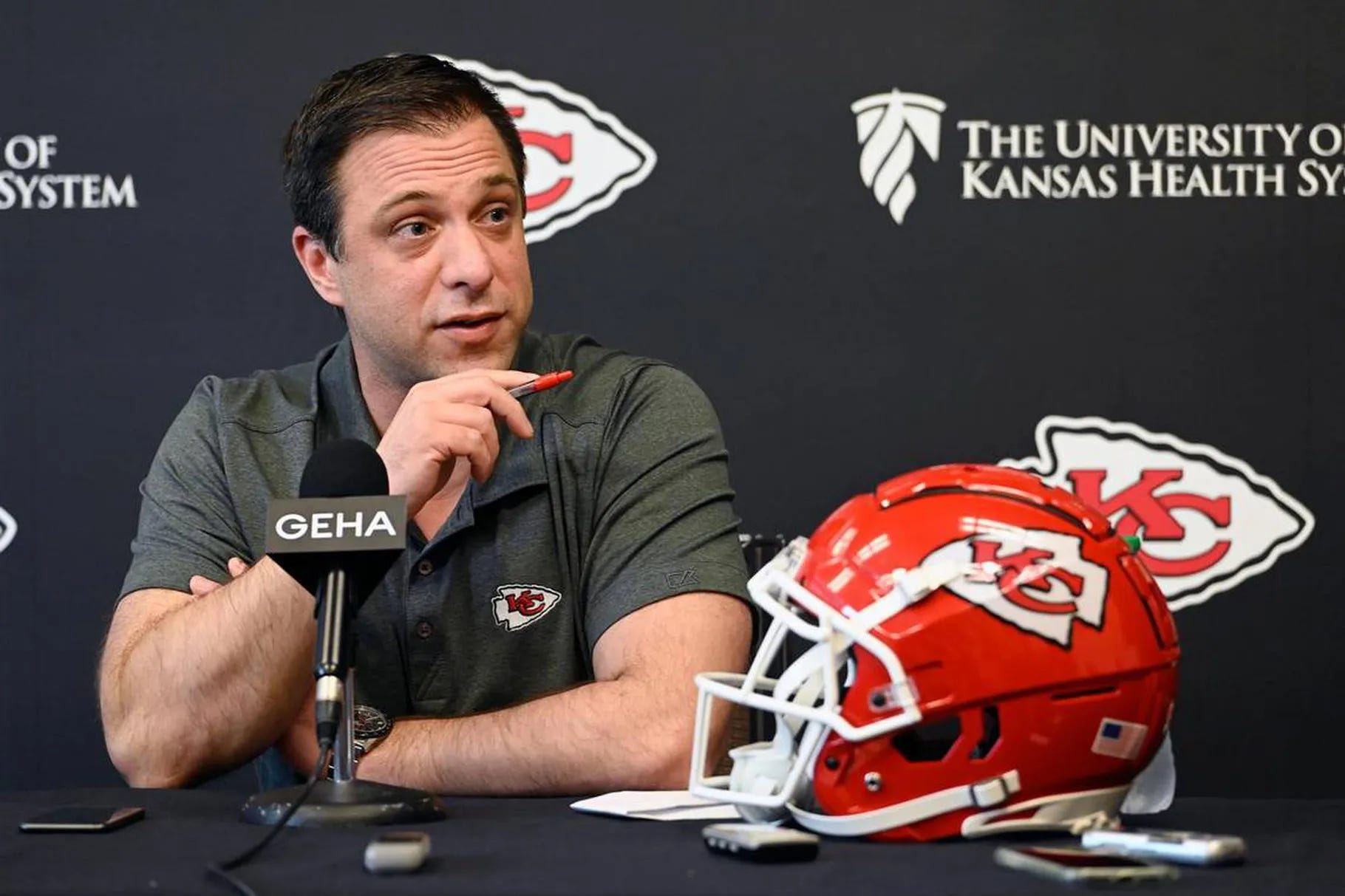
Bizarre, right?
———
Miami Dolphins
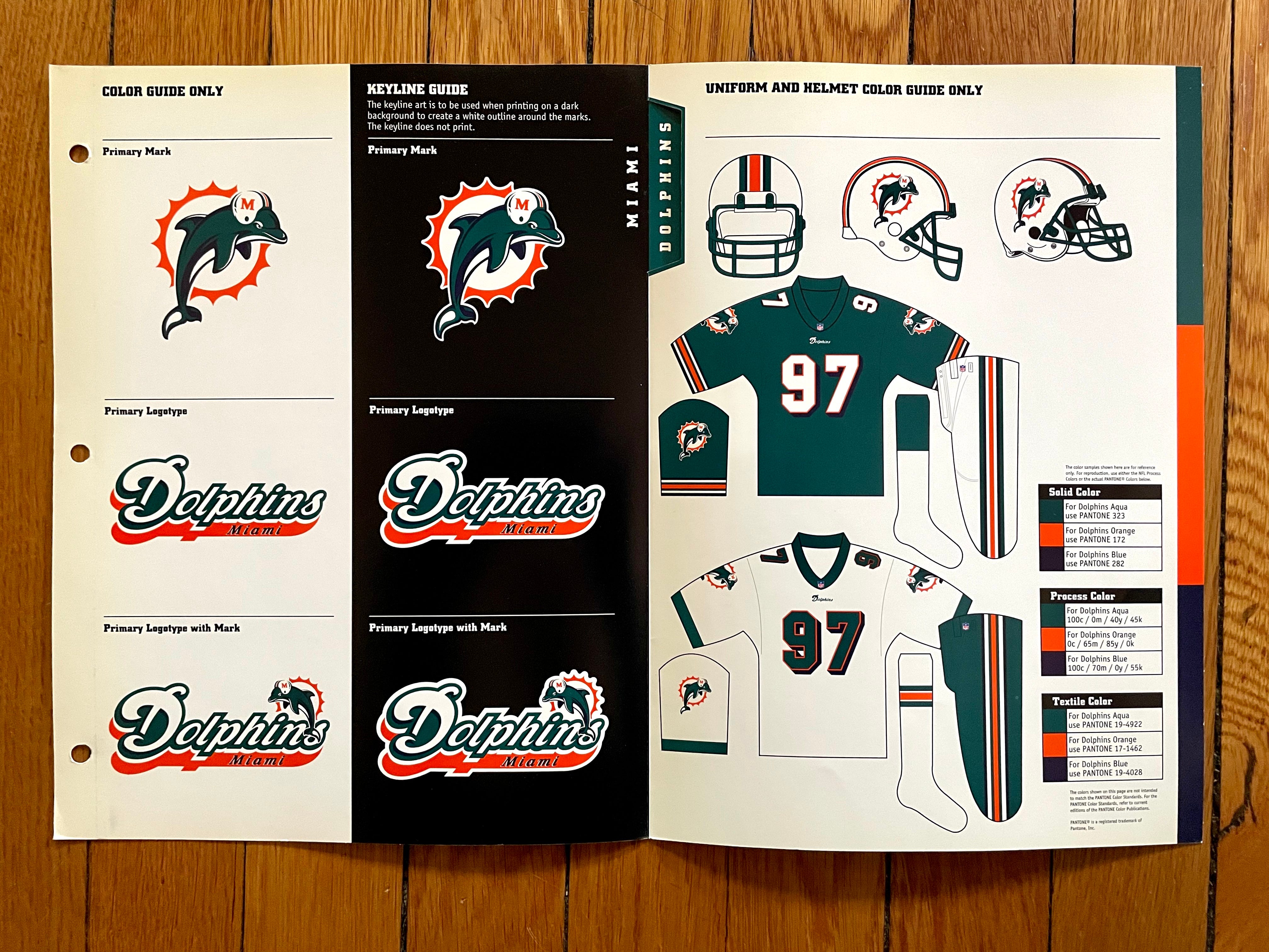
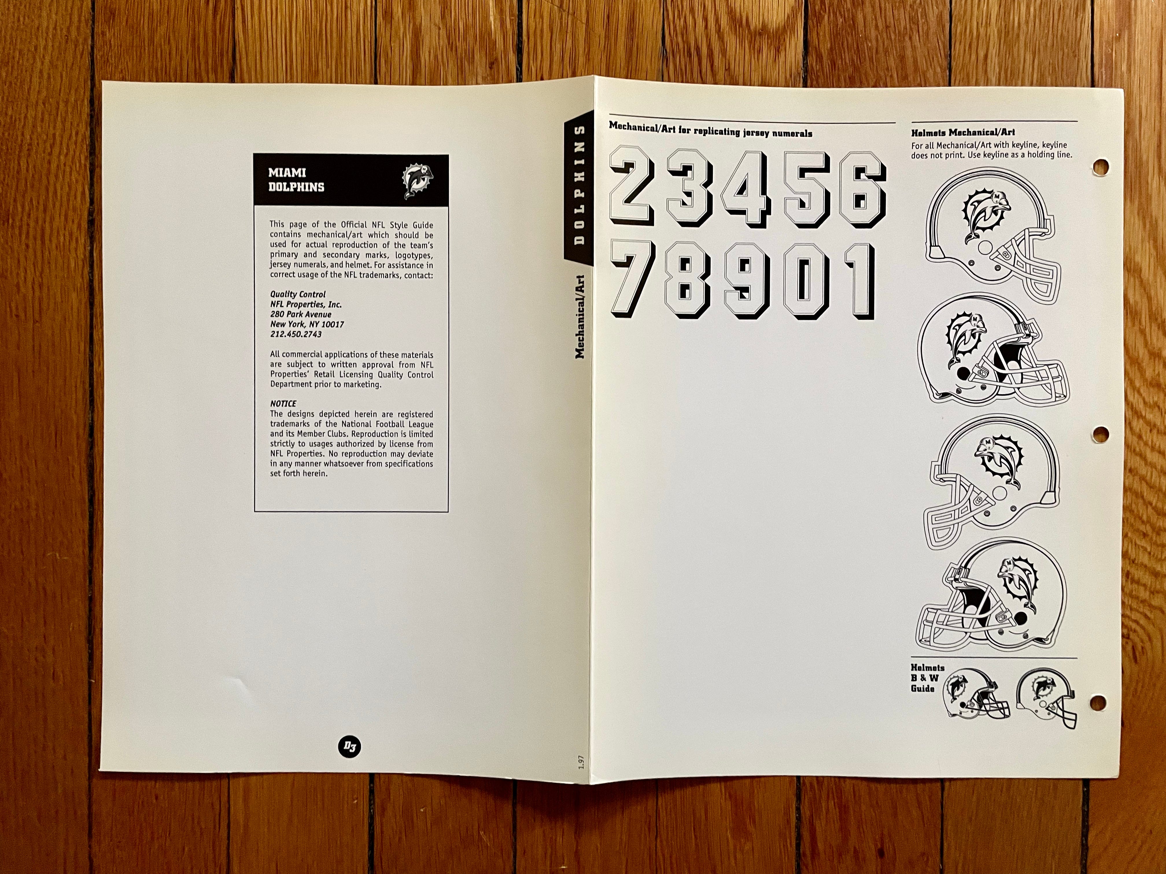
Not my favorite Dolphins era — I could live without the block-shadowed numbers and the navy trim — but definitely better than what they wear nowadays. Bring back the leaping dolphin!
———
Minnesota Vikings
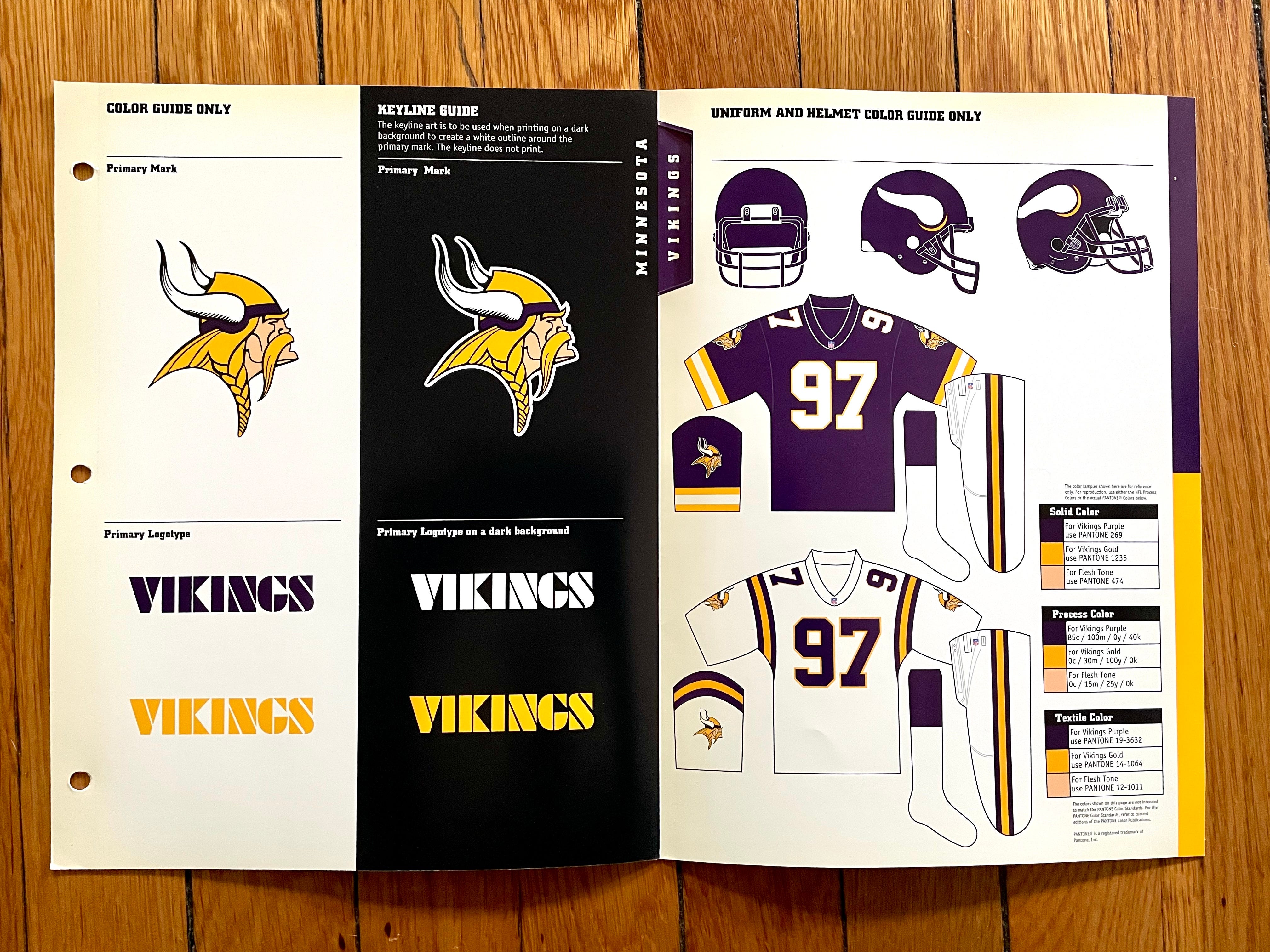
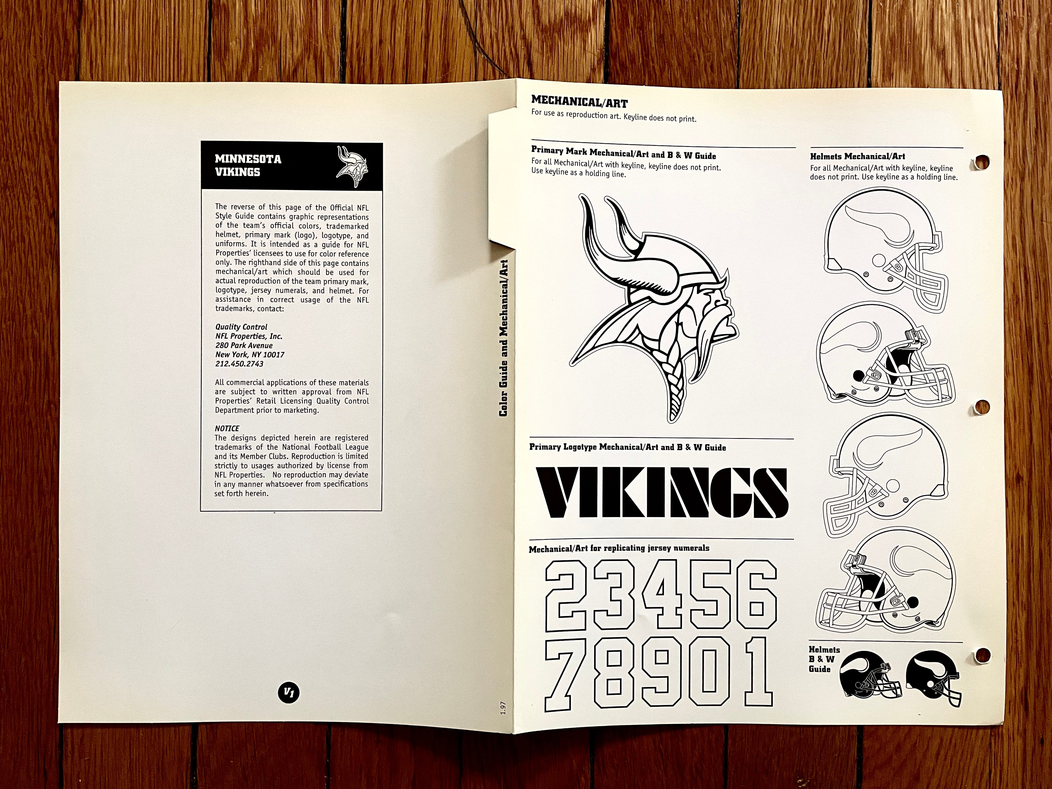
It’s interesting that for years the Vikings had UCLA-style stripes on their white jersey but not on their purple jersey. Cartoonist Karl Hubenthal, who designed the uniforms, originally had more fanciful ideas for the purple jersey, as seen in this sketch, but those ideas apparently never got beyond his drawing board:
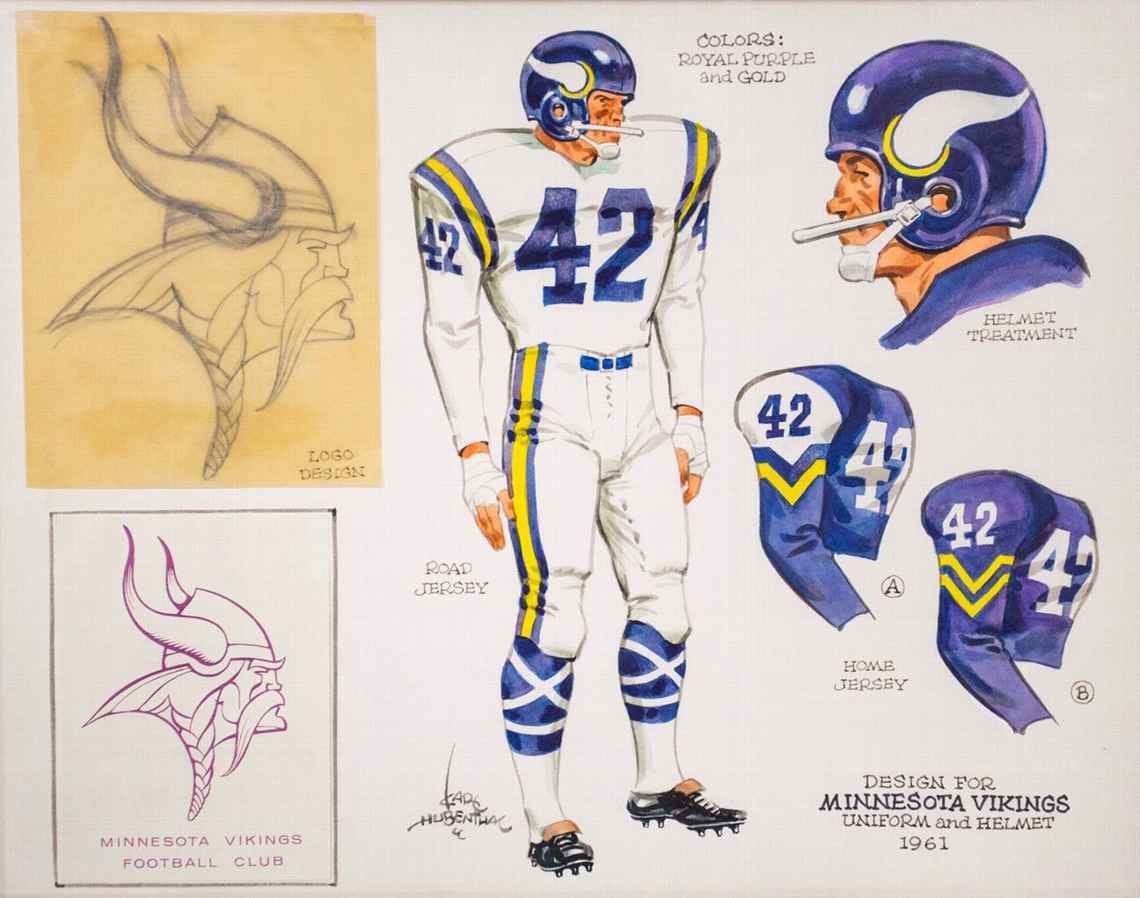
To learn more about Hubenthal and the origins of the Vikings’ uniforms, look here and here.
———
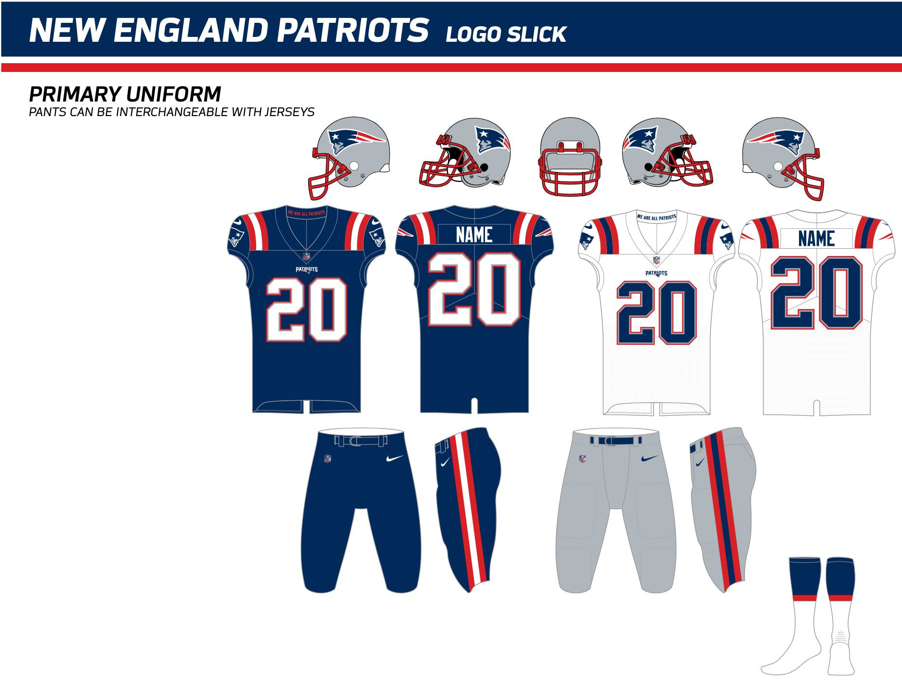
New England Patriots
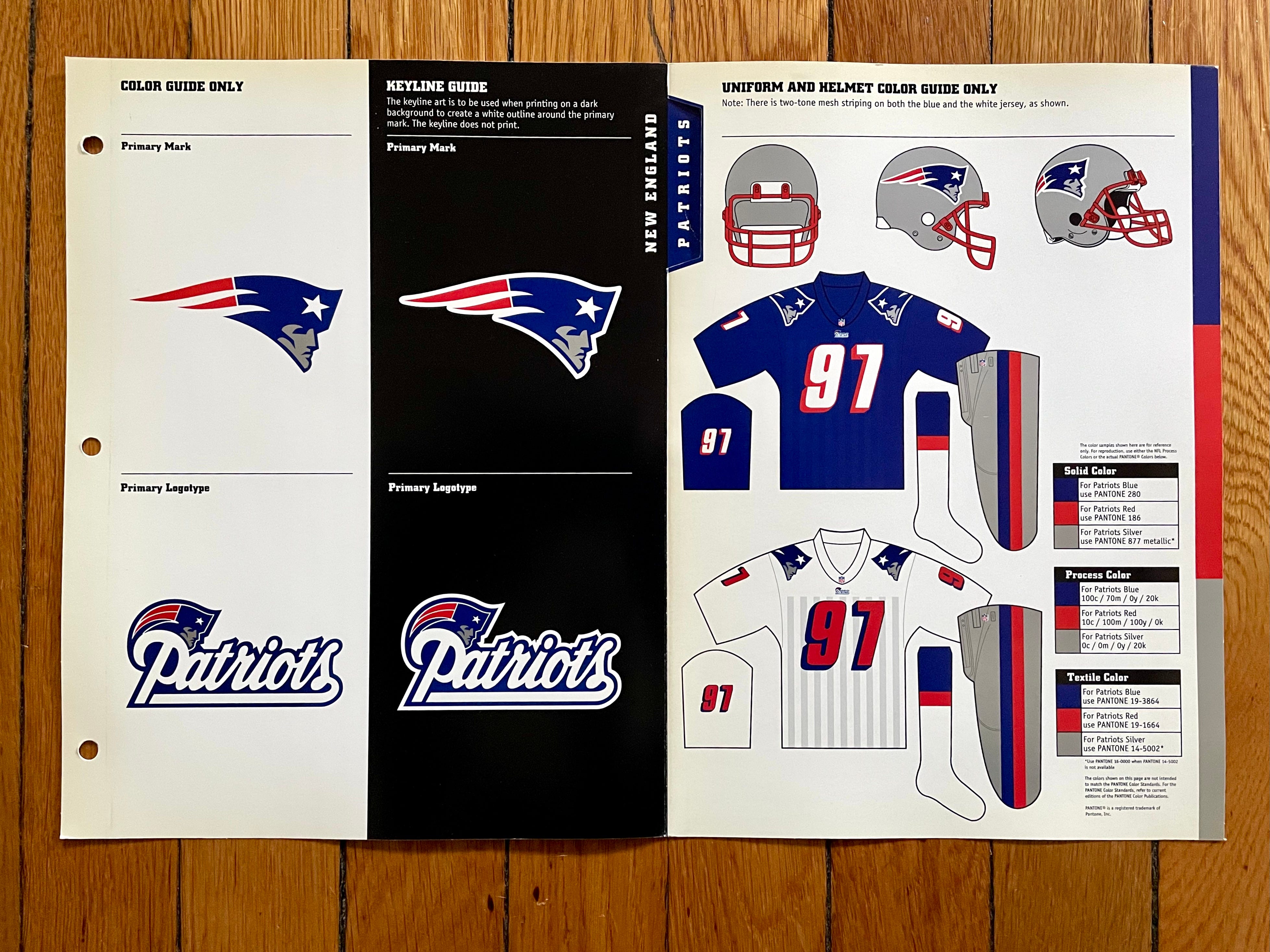
The Pats wore this version of the Flying Elvis uniform from 1995 through 1999. Although it’s barely visible on the style sheet, the blue jersey featured tone-on-tone vertical striping, just like the white jersey. There’s never been anything quite like that on an NFL jersey, before or since. Depending on the lighting, it wasn’t always visible on the field. But when the light hit the jersey just right, the stripes suddenly popped out:

But wait — there’s more! Several NFL teams, including the Pats, redesigned their uniforms for the 2000 season, so the league sent me updated style sheets for those clubs. Here are New England’s:

———
New Orleans Saints
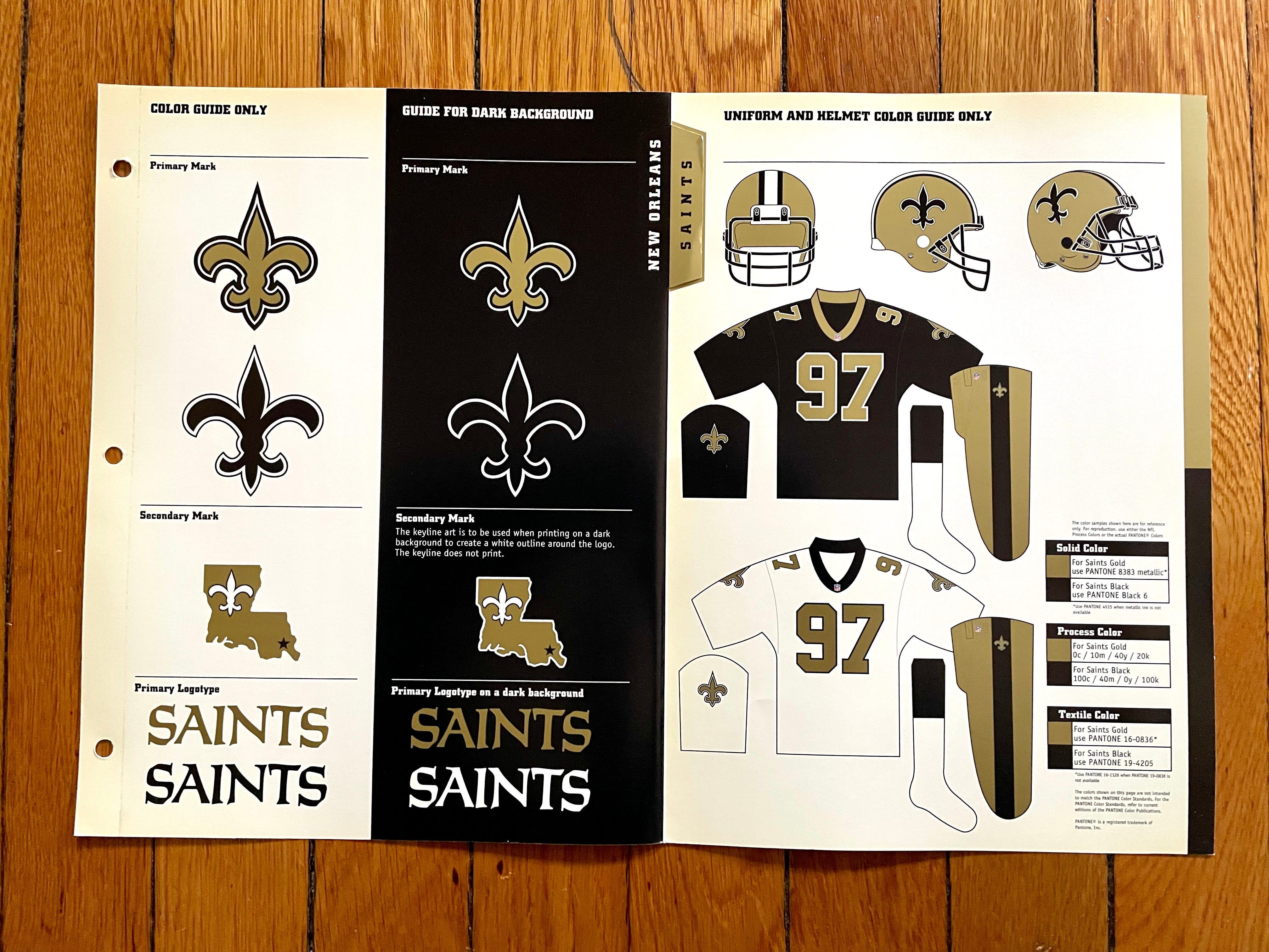
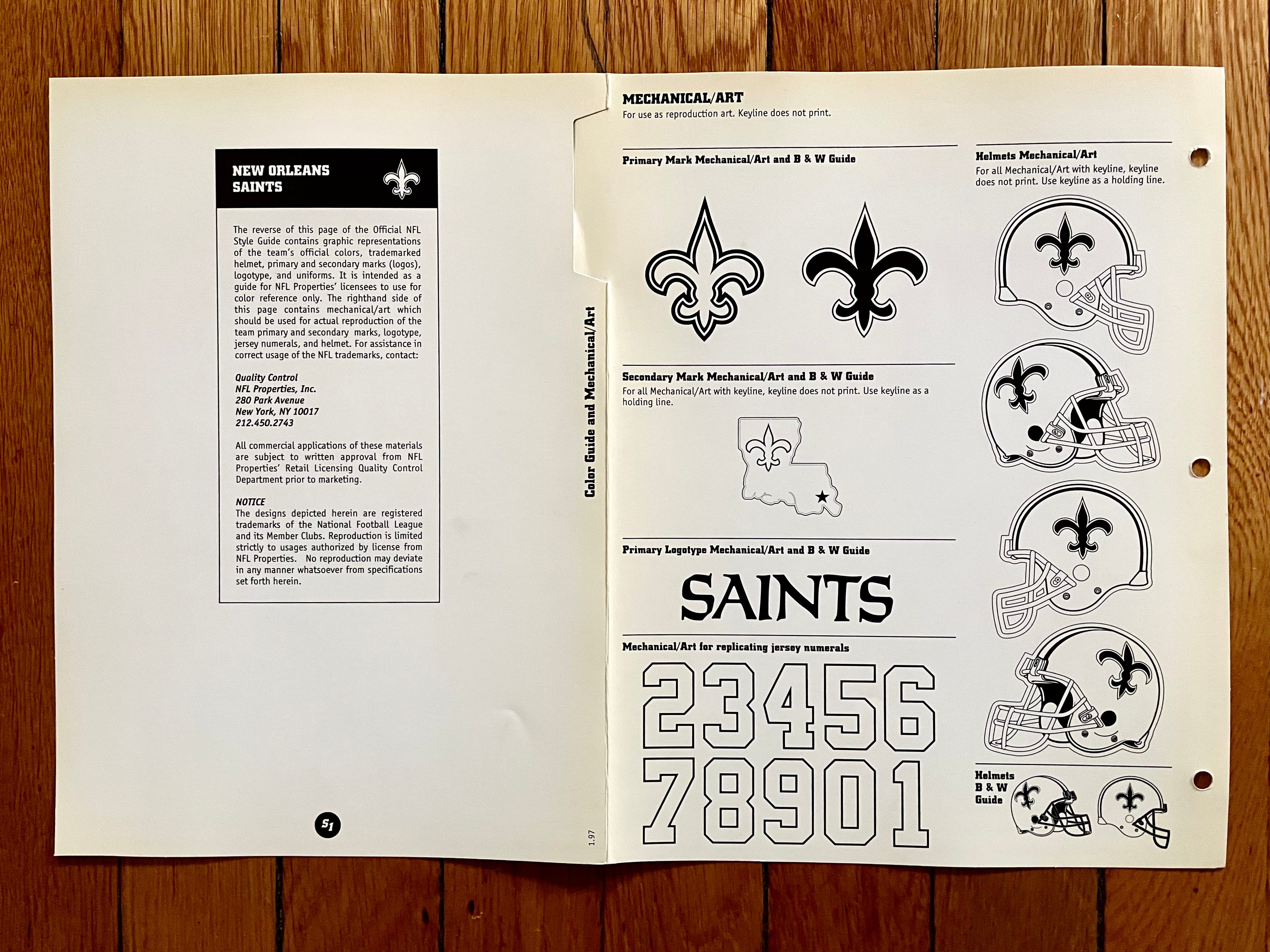
Note that they didn’t yet have black pants. I wish they still didn’t.
———
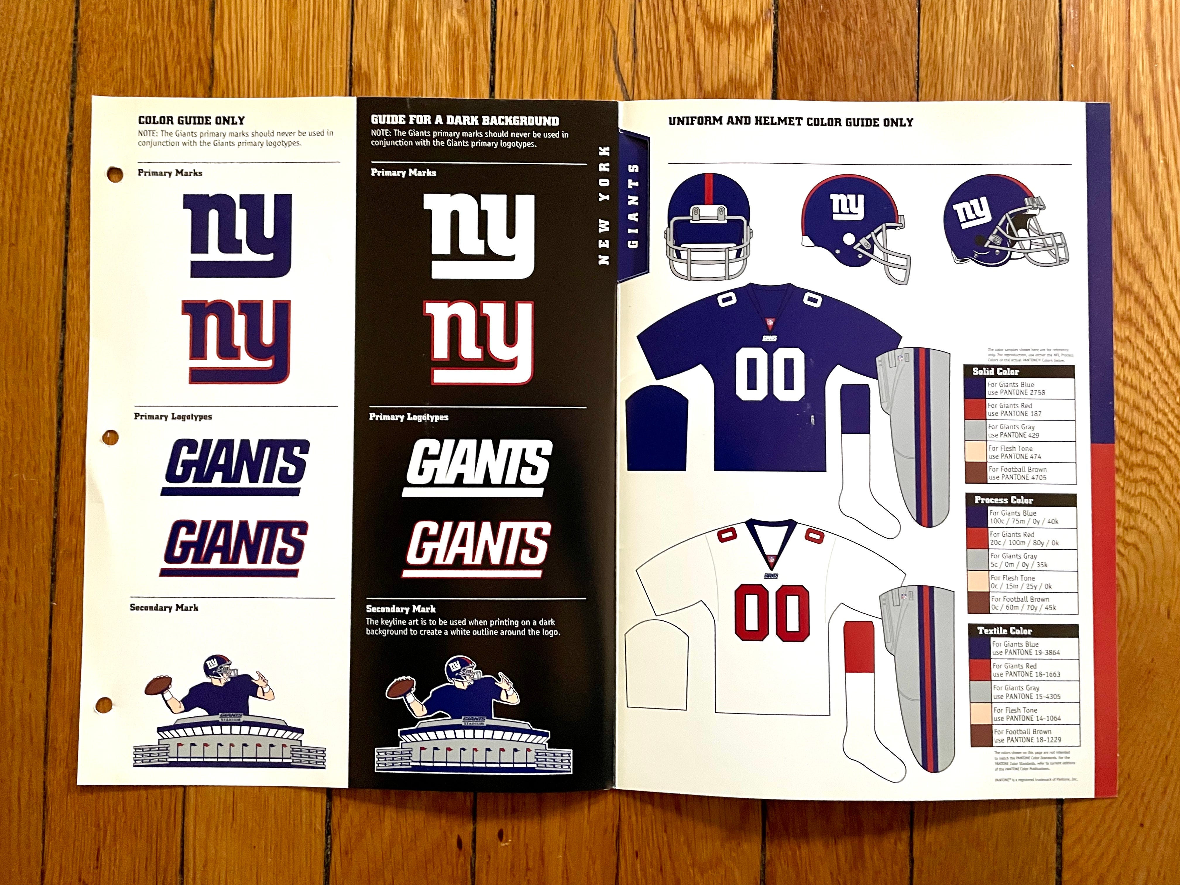
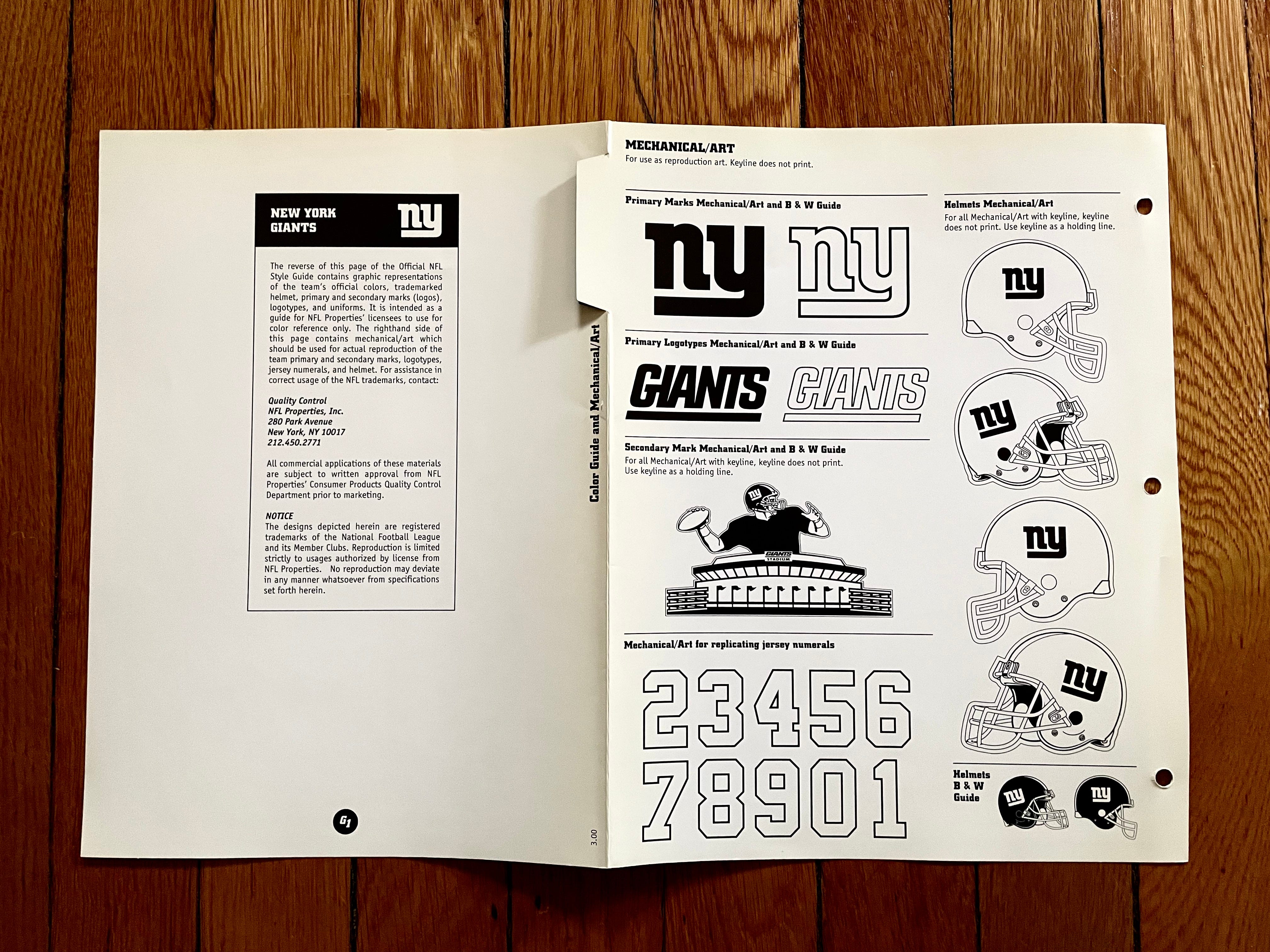
New York Giants
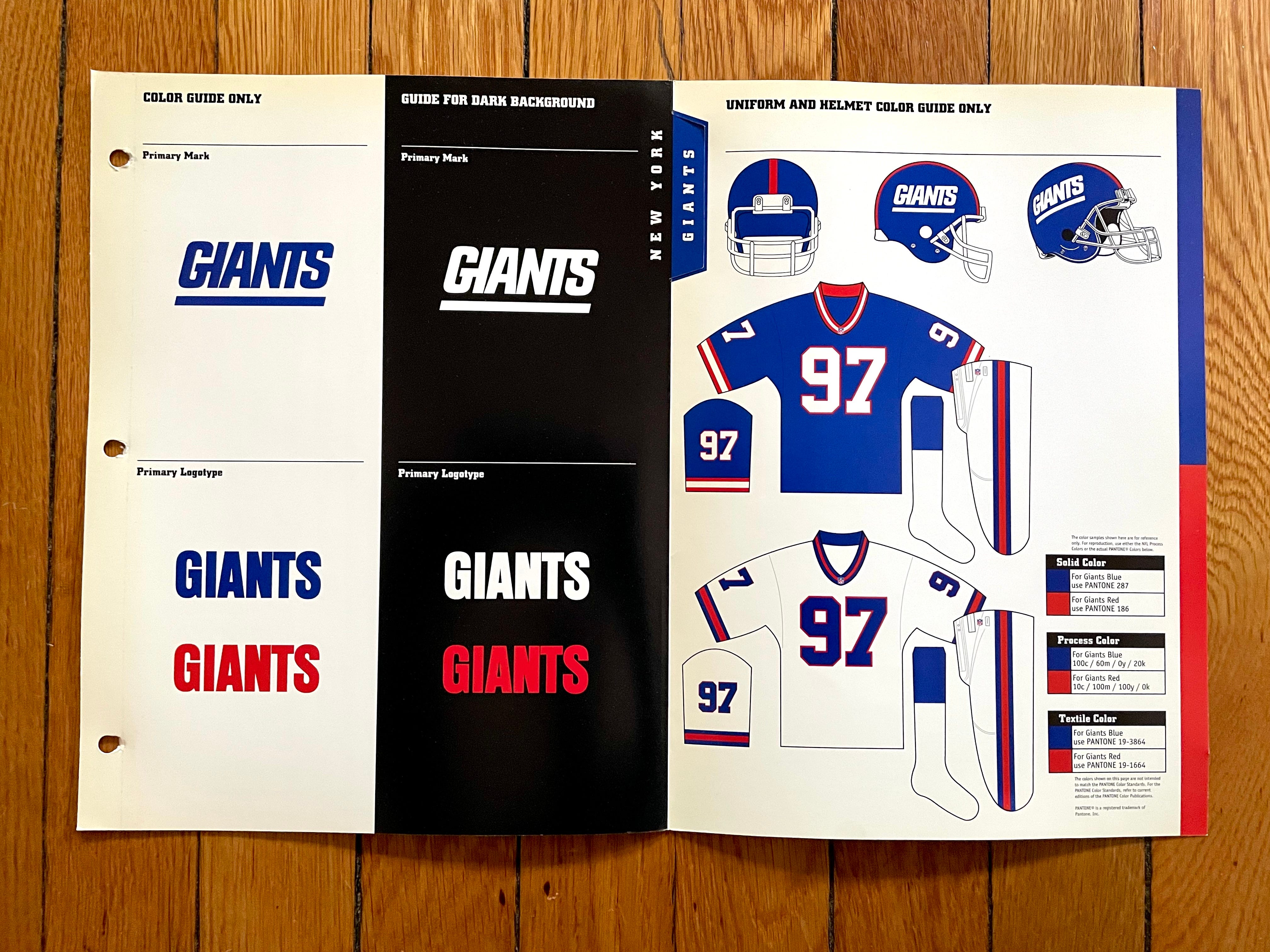
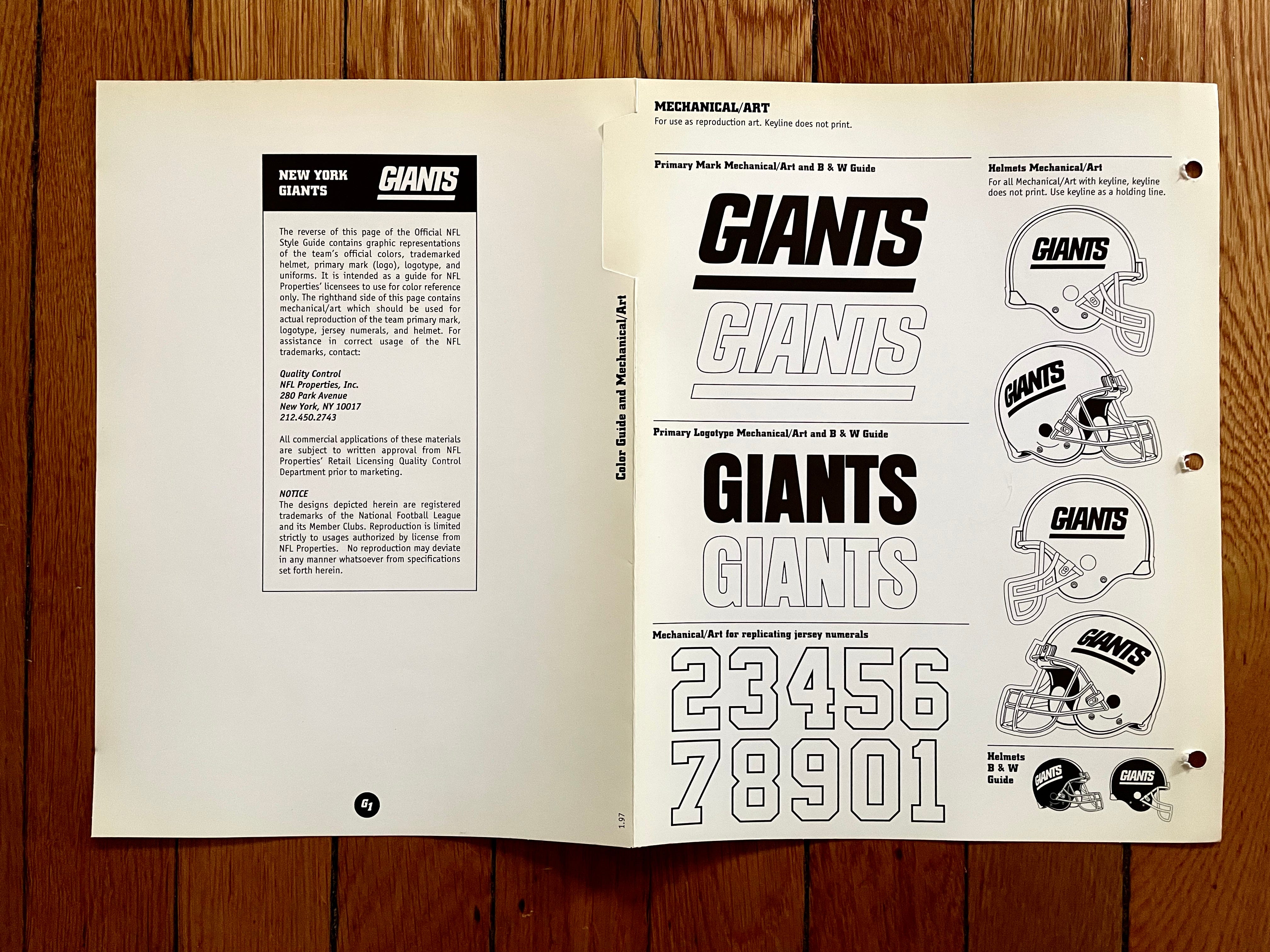
This is the design that the Giants revived last year as a throwback. Interestingly, the style guide indicates that the helmet should be the same shade of blue as the jersey, even though the helmet was clearly darker in real life — both in the original uniform and in last year’s throwback.
/cdn.vox-cdn.com/uploads/chorus_image/image/70336352/688859176.0.jpg)
Also: The Giants, like the Patriots, redesigned their uniforms in 2000, so the league sent me new style sheets for them:
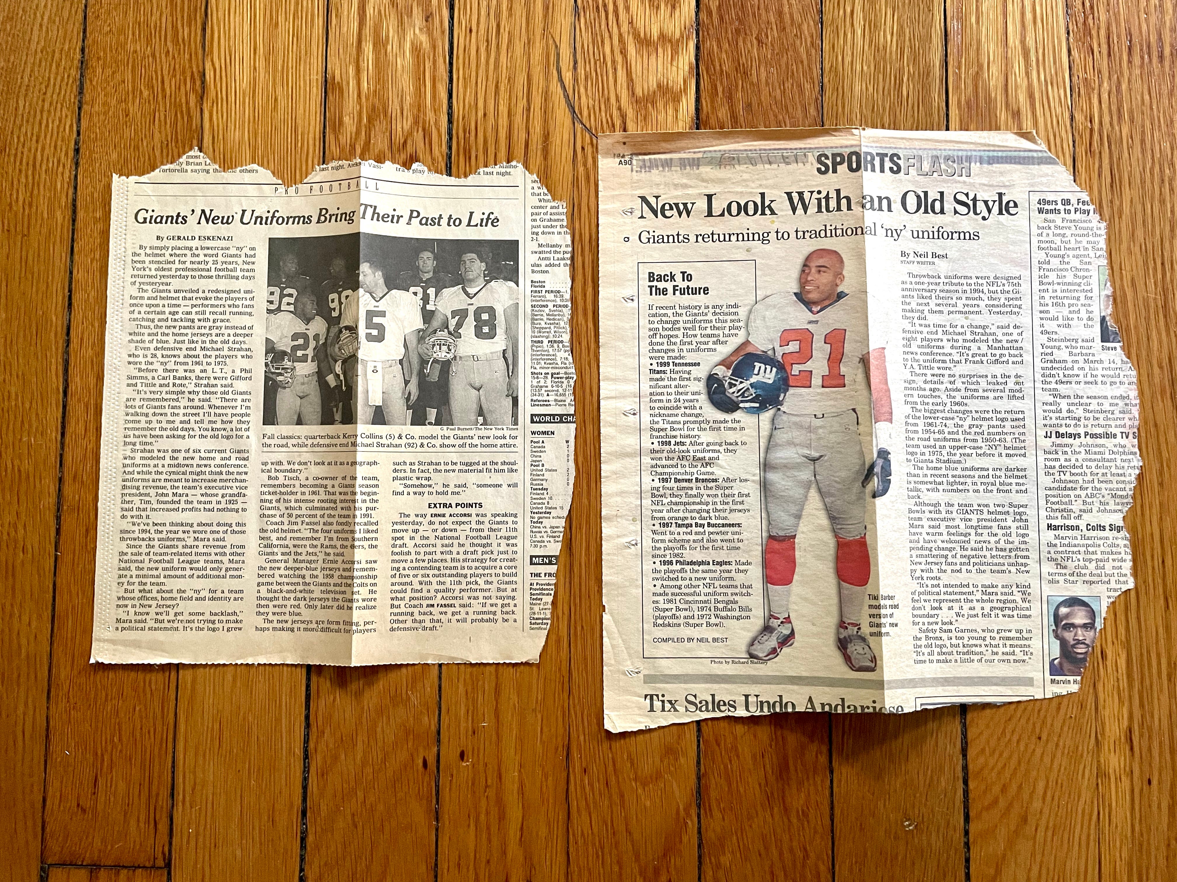
In addition, I tore out the New York Times and Newsday articles about the new uniforms and tucked them inside the fold-out style sheet (which I had completely forgotten about until I photographed all the sheets for this article):
———
New York Jets
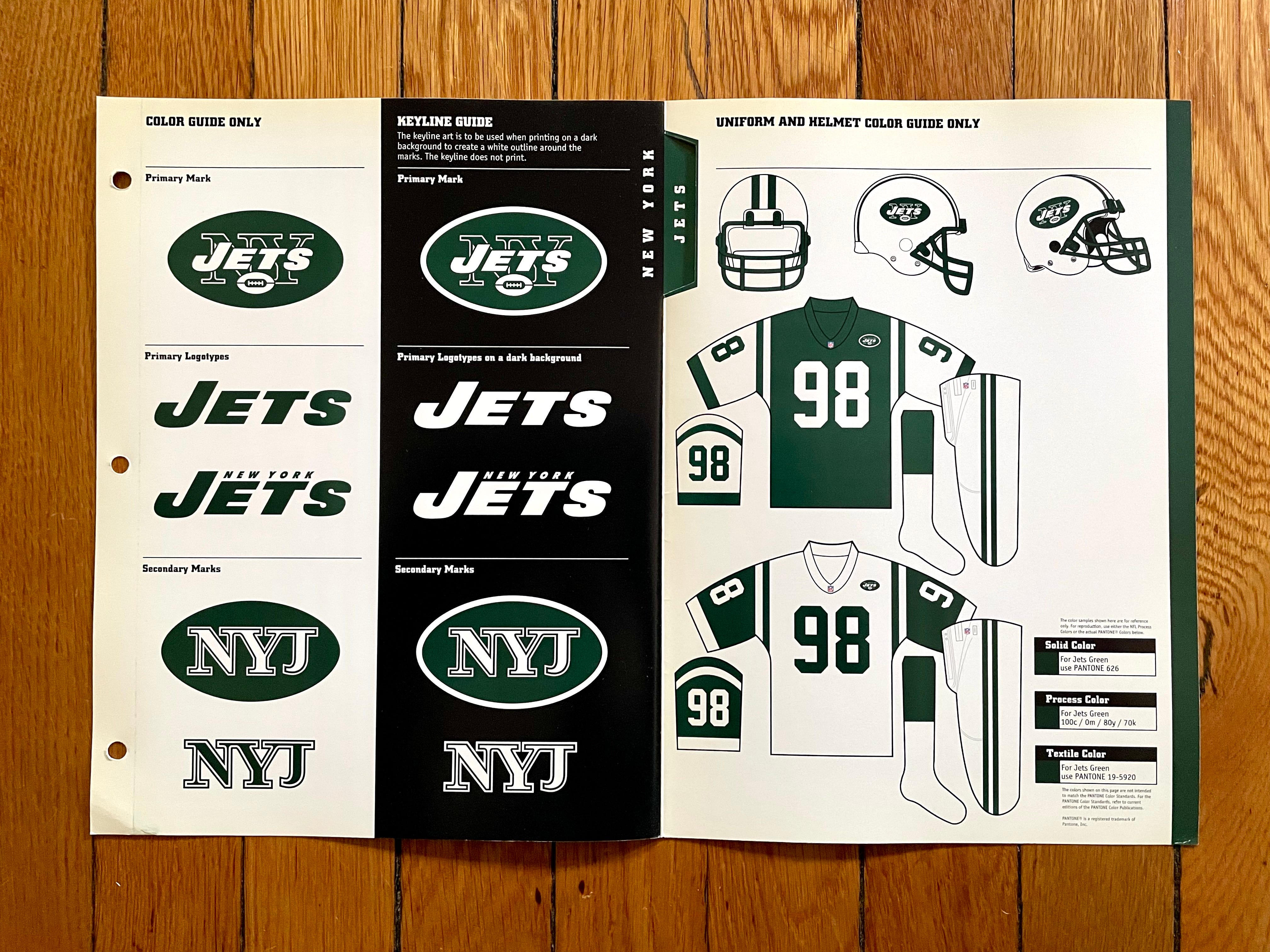

Sigh — remember when the Jets actually looked like an NFL team, and not like some arena league clown show?
———
Oakland Raiders
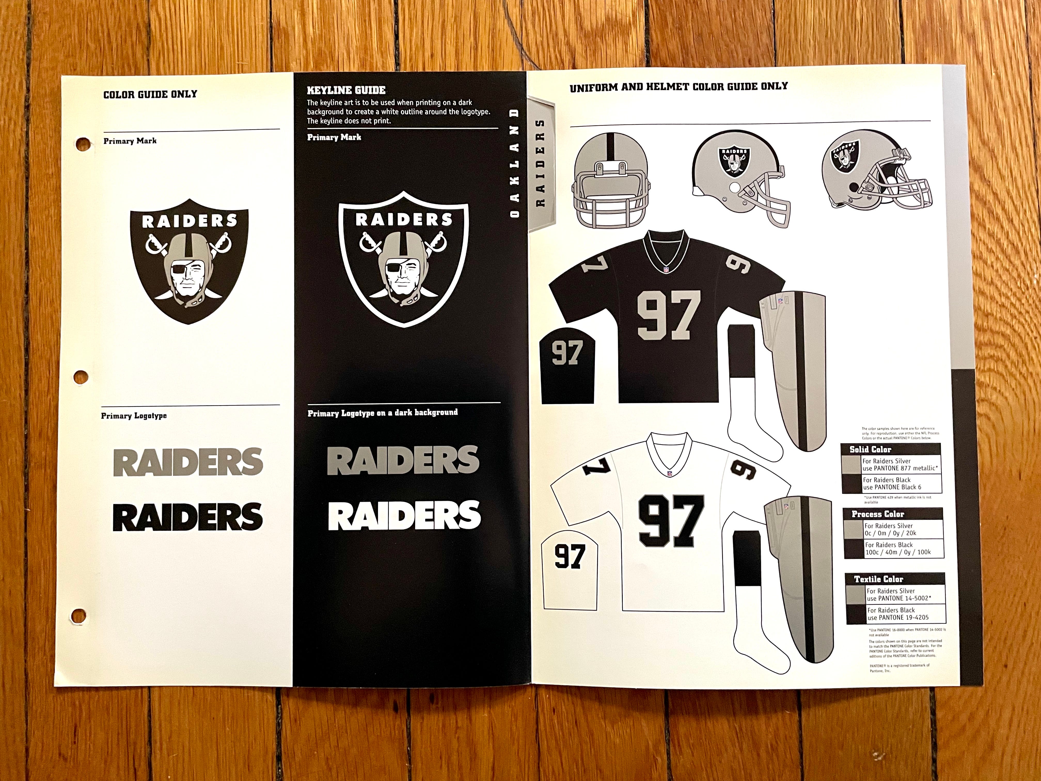
Doesn’t get much simpler than the silver and black. Essentially unchanged since 1971, despite playing in three separate cities during that span.
———
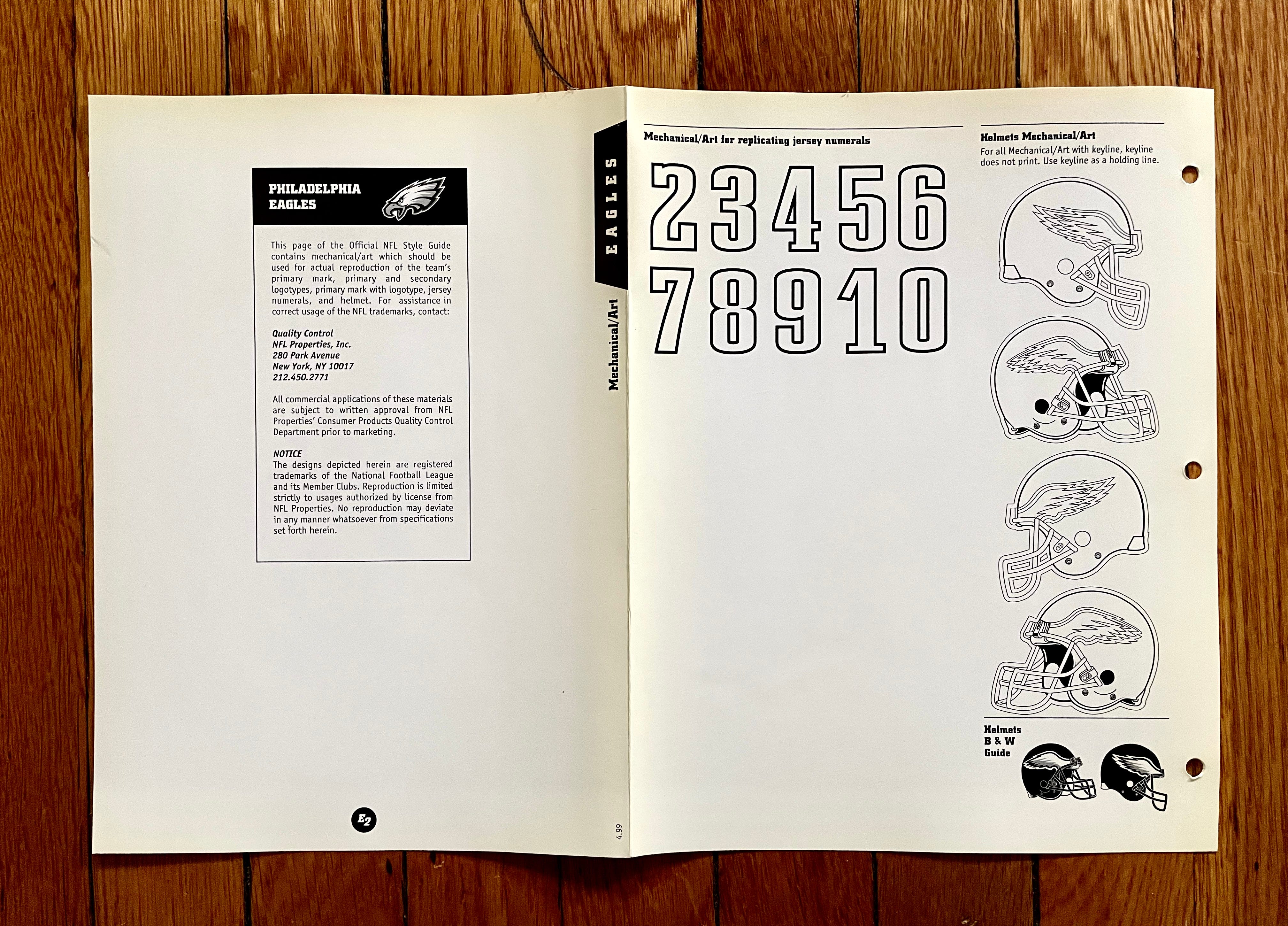
Philadelphia Eagles
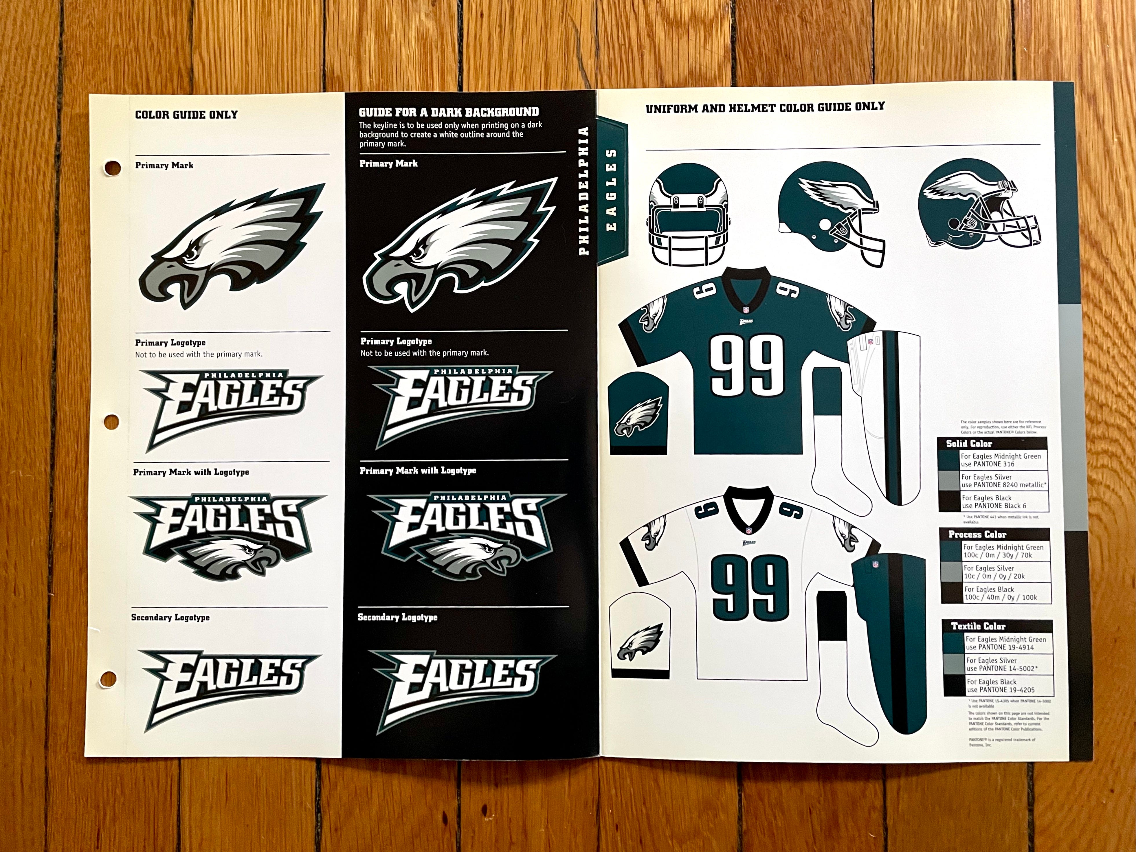
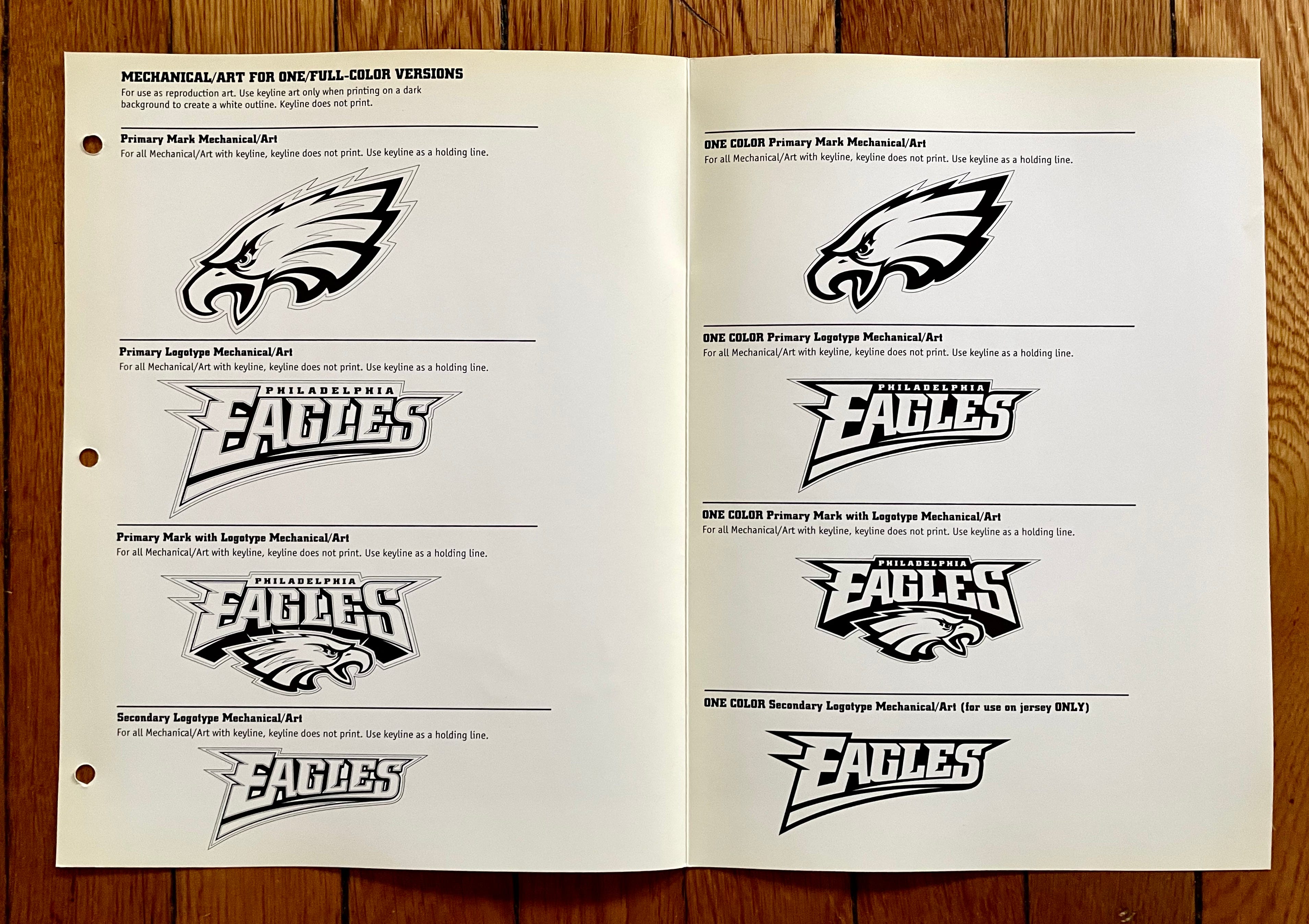
See how the style sheet shows black collars for the Eagles’ jerseys? Those were new for 1999. The original midnight green uni set, introduced in 1996, had non-contrasting collars — and hip logos for the green pants! Check it out:


They got rid of the hip logo in 1997, and then added the black collars in ’99.
———
Pittsburgh Steelers
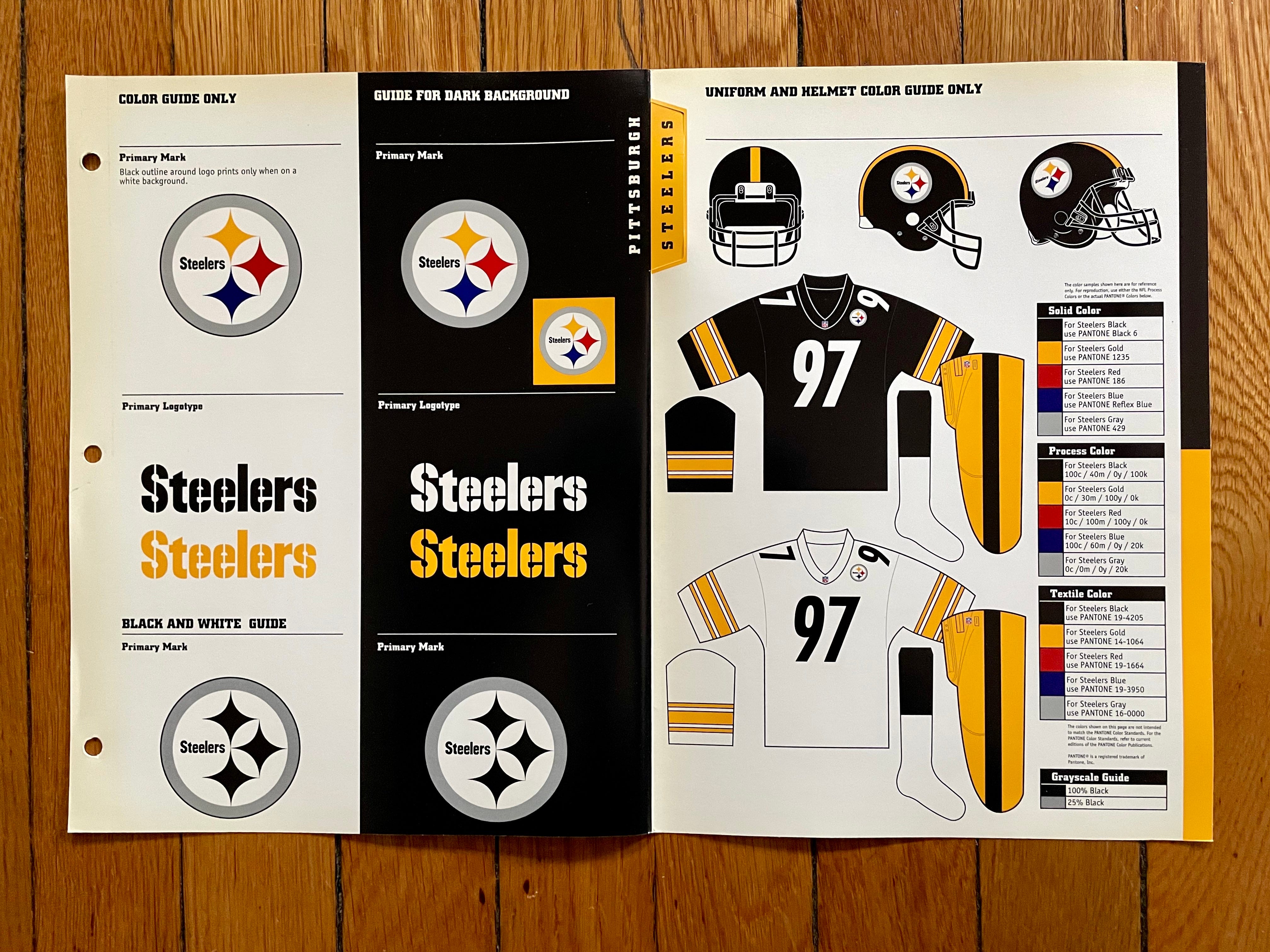
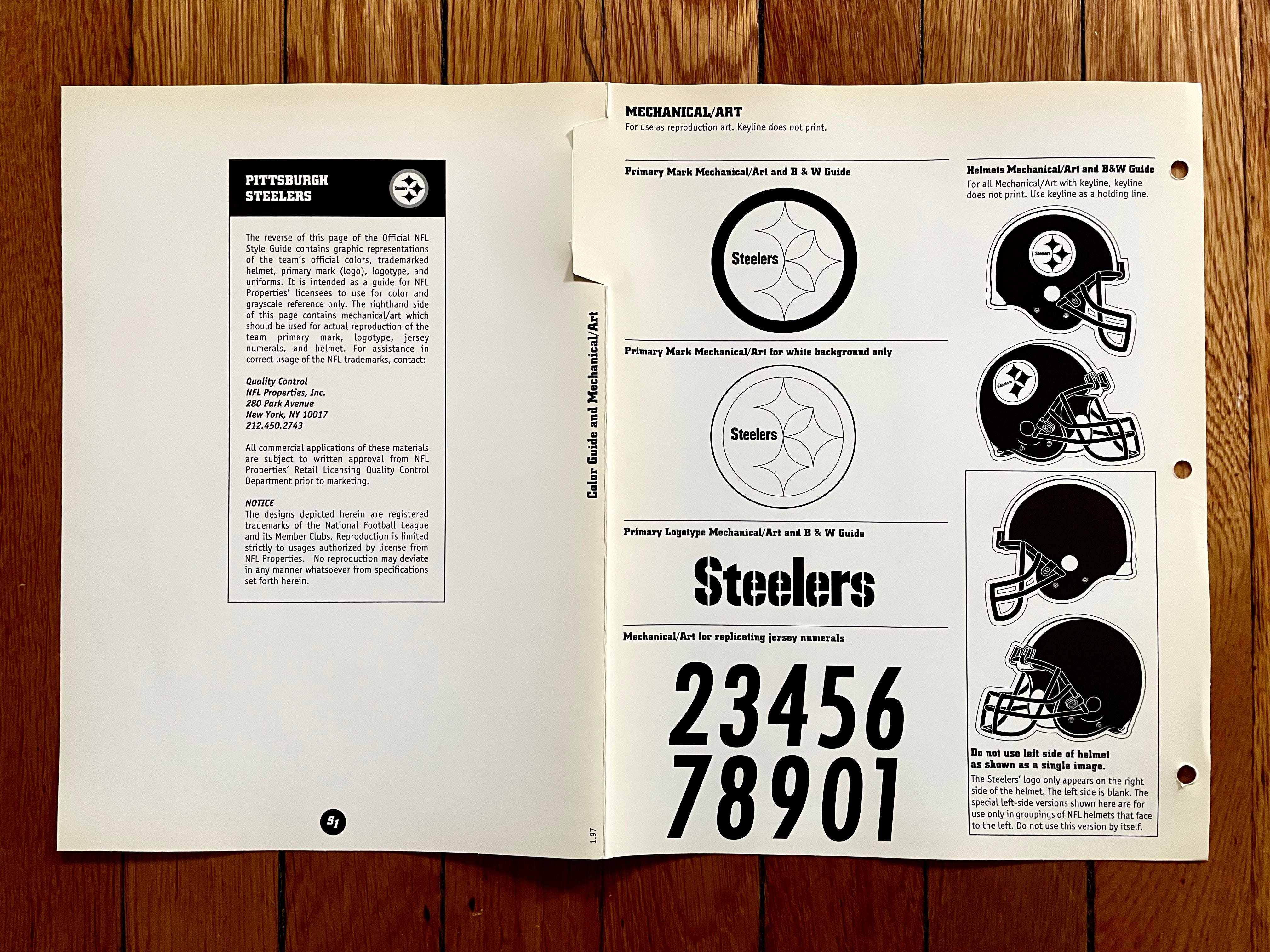
1997 was the year they switched from block numbers to the design that they still wear today. But if the style guide showed the backs of the jerseys, they would have had to issue a new sheet for the Steelers in 1998, because that year they changed their white jersey’s NOB lettering from black to the now-familiar yellow:

Since the NFL Style Guide wasn’t yet showing rear-jersey specs in the late 1990s, this change never became part of the league’s official historical record.
———
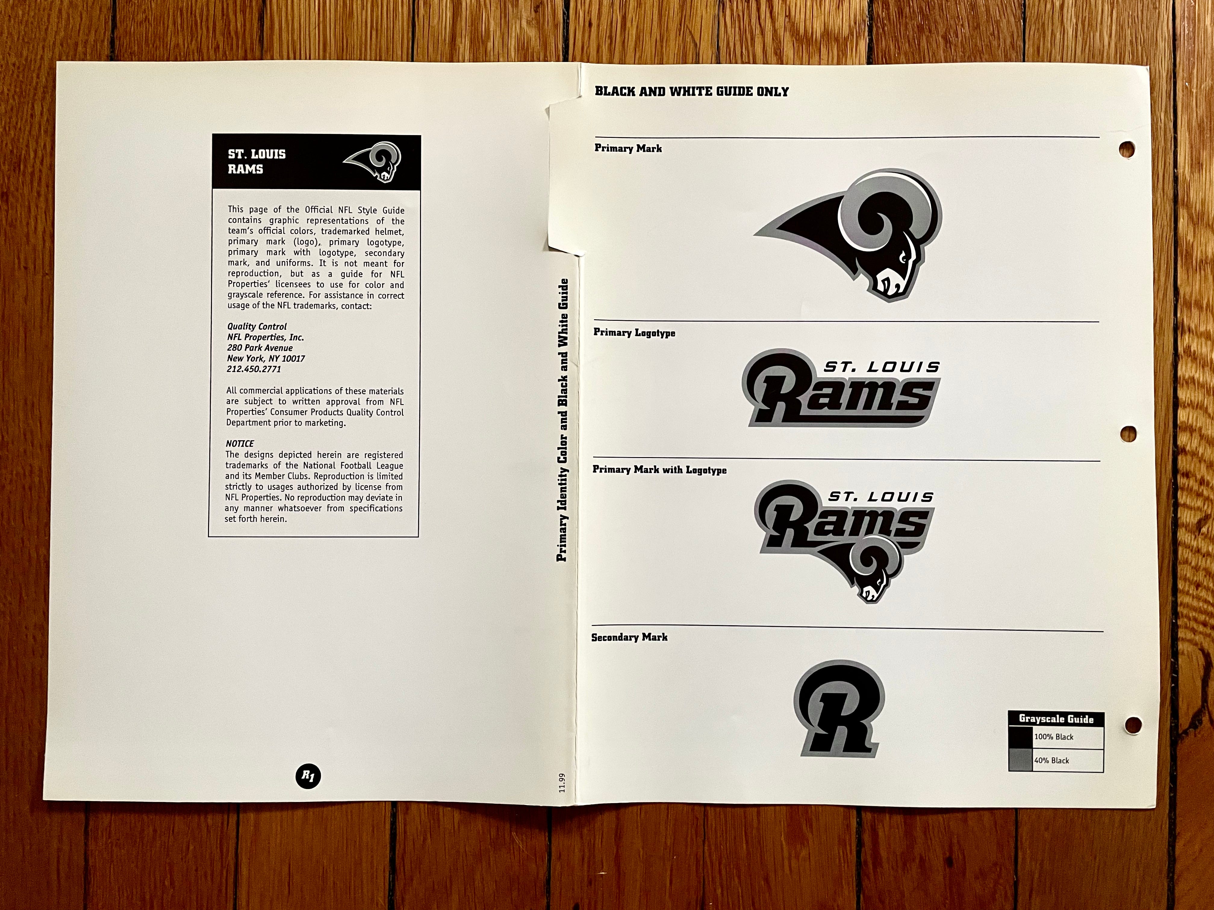
St. Louis Rams
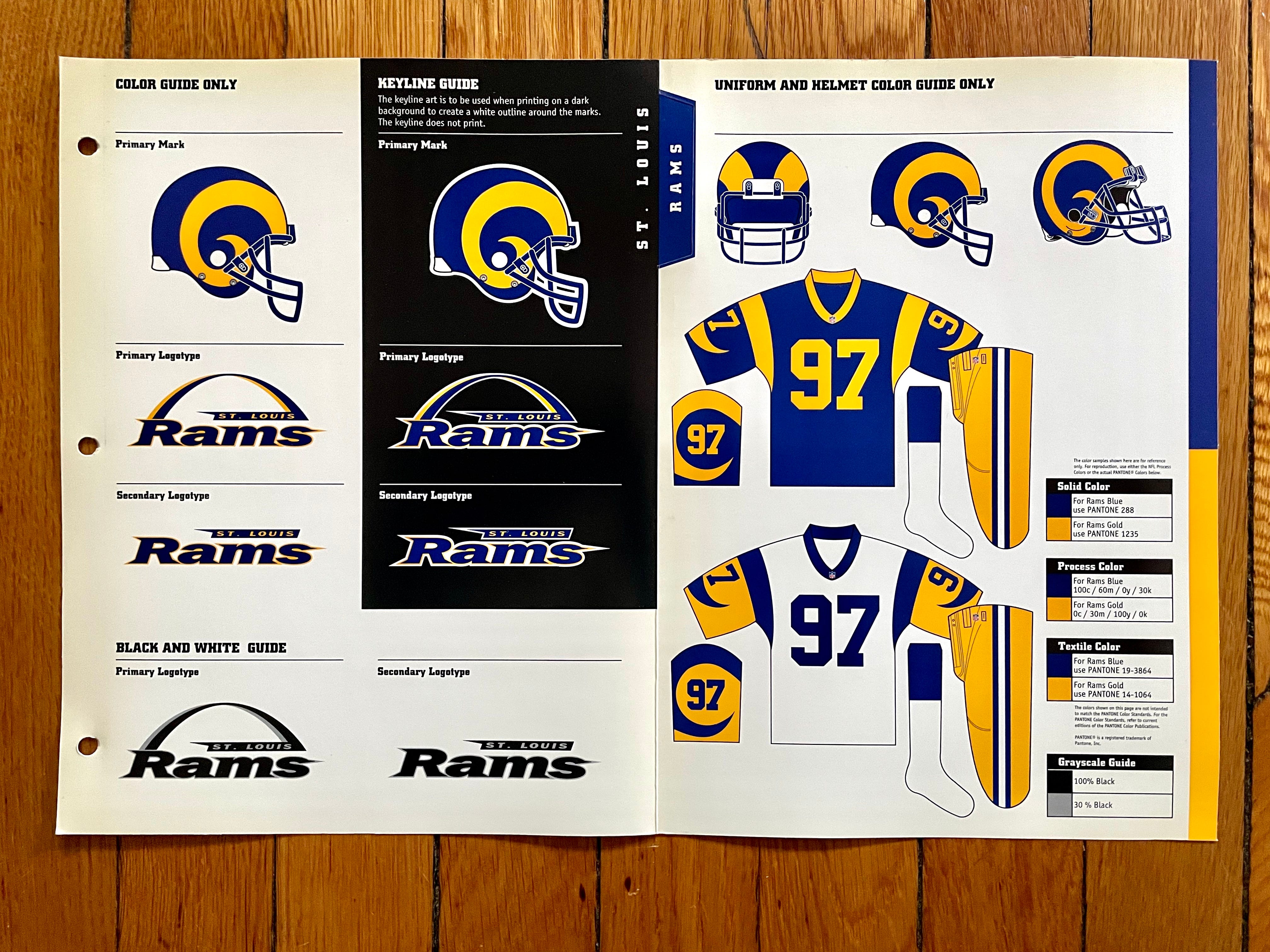

Ah, such a beautiful uni set. All anyone really wants is for them to go back to this — why is that so hard?
Meanwhile, the Rams underwent a full redesign in 2000, so the league sent me a new sheet for them:

Notice anything odd about those uniforms? The white and navy pants (but not the gold) had little horn stripes! If that looks unfamiliar, it’s because the navy pants were never used and the white pants appeared only once, in a 2001 preseason game:
Also: See how the 2000 style sheet shows the Rams using a rounded number font? That is inaccurate, because they actually used block numbers in 2000 before switching to the rounded front in 2001:

Which just goes to show ya: Sometimes the style guides are wrong!
———
San Diego Chargers
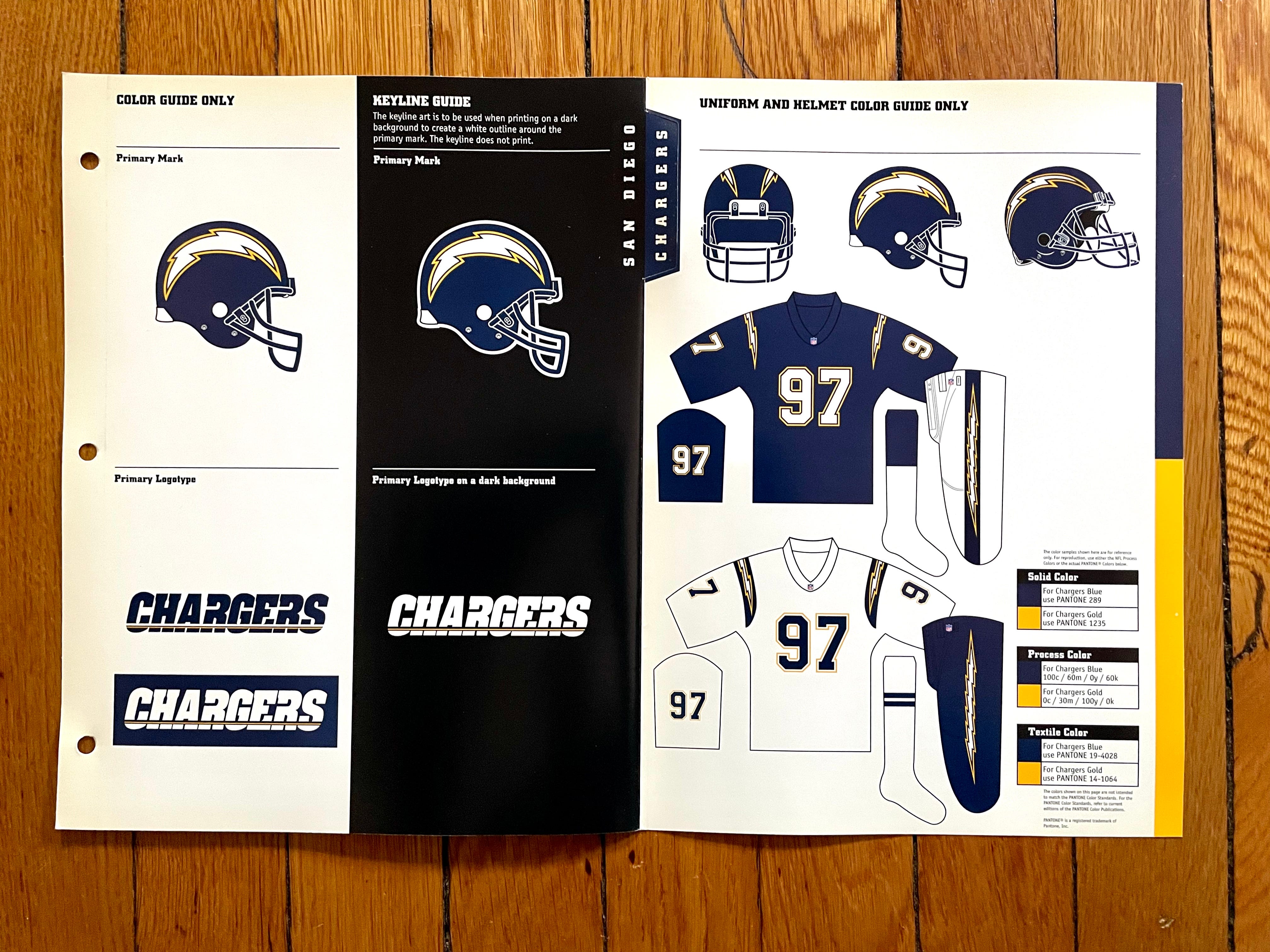
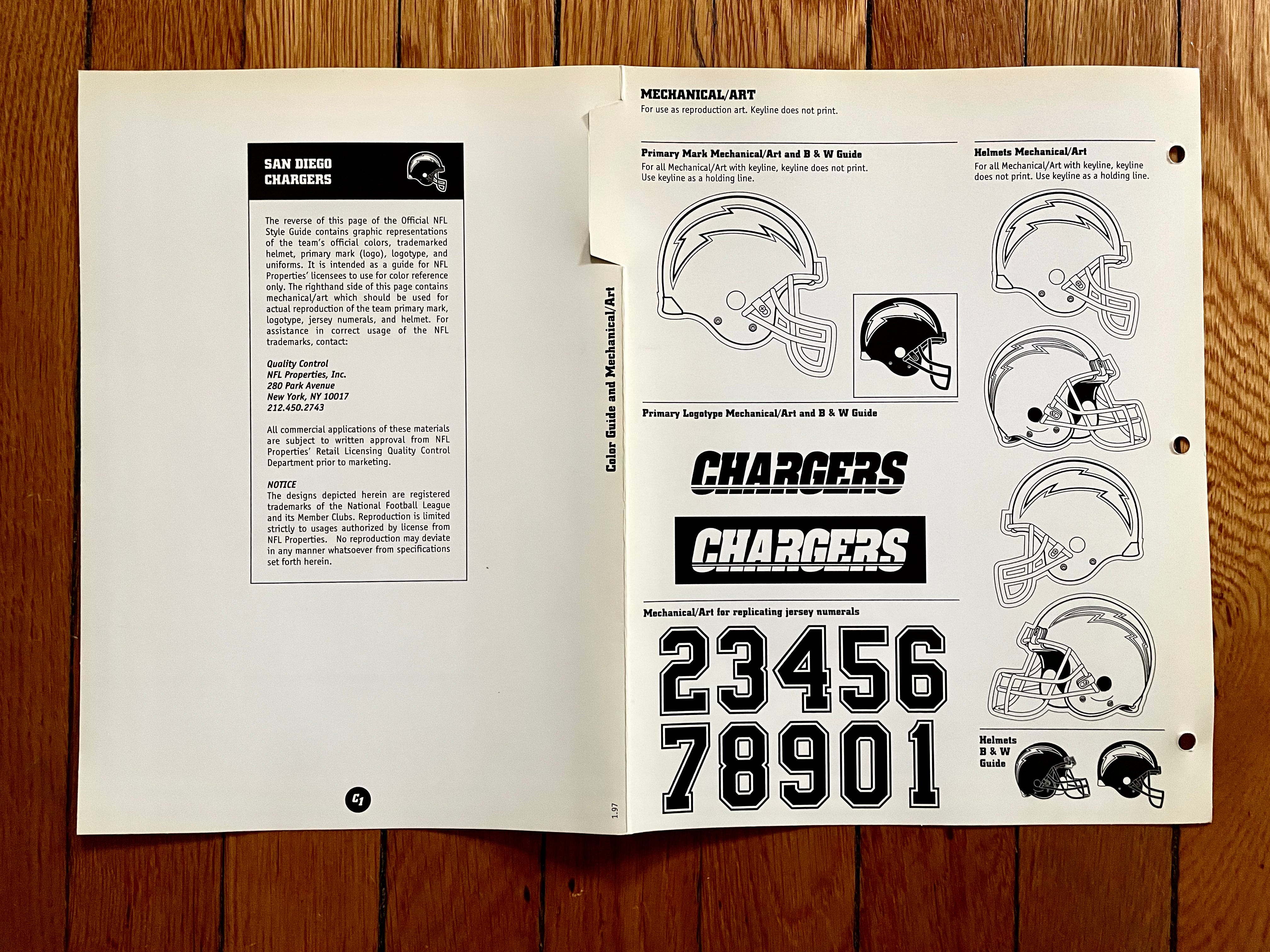
Has this team ever had a bad uniform? I don’t think so! I prefer them in powder blue, but this set is still very nice.
———
San Francisco 49ers
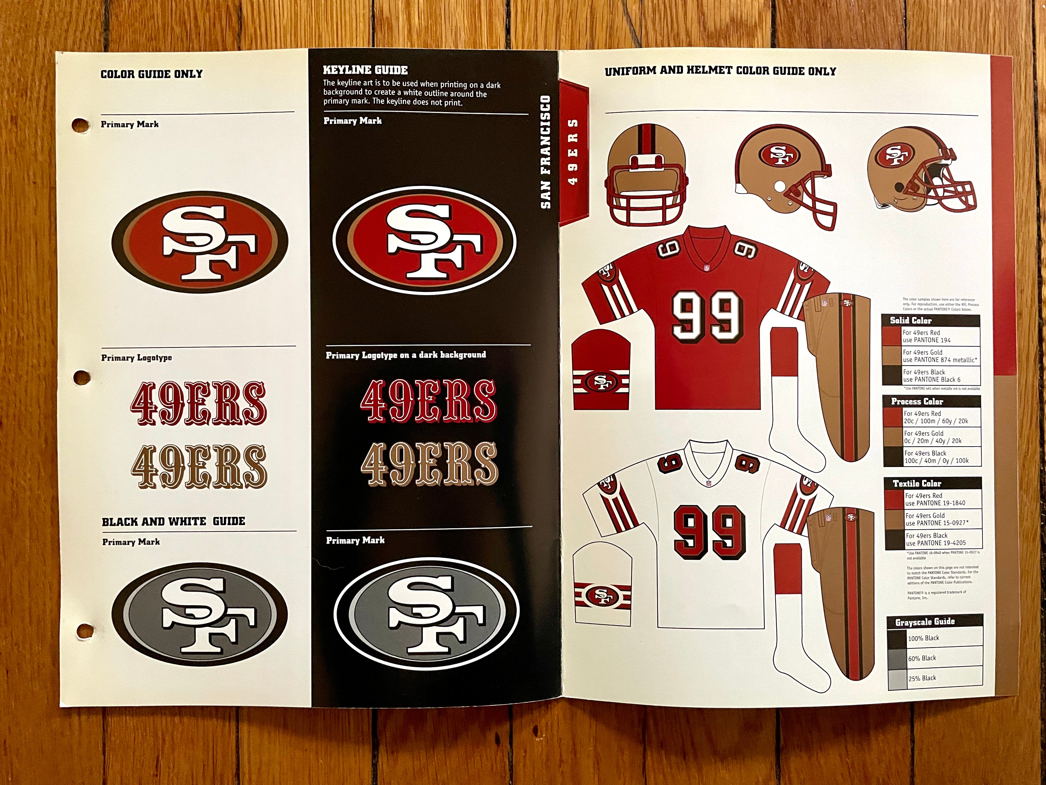
My favorite team, but not my favorite uni set for them. I never liked the block-shadowed numbers or the black trim, and repeating the helmet logo on the sleeves and the hips felt like overkill. Glad they went back to their old-school look.
———
Seattle Seahawks
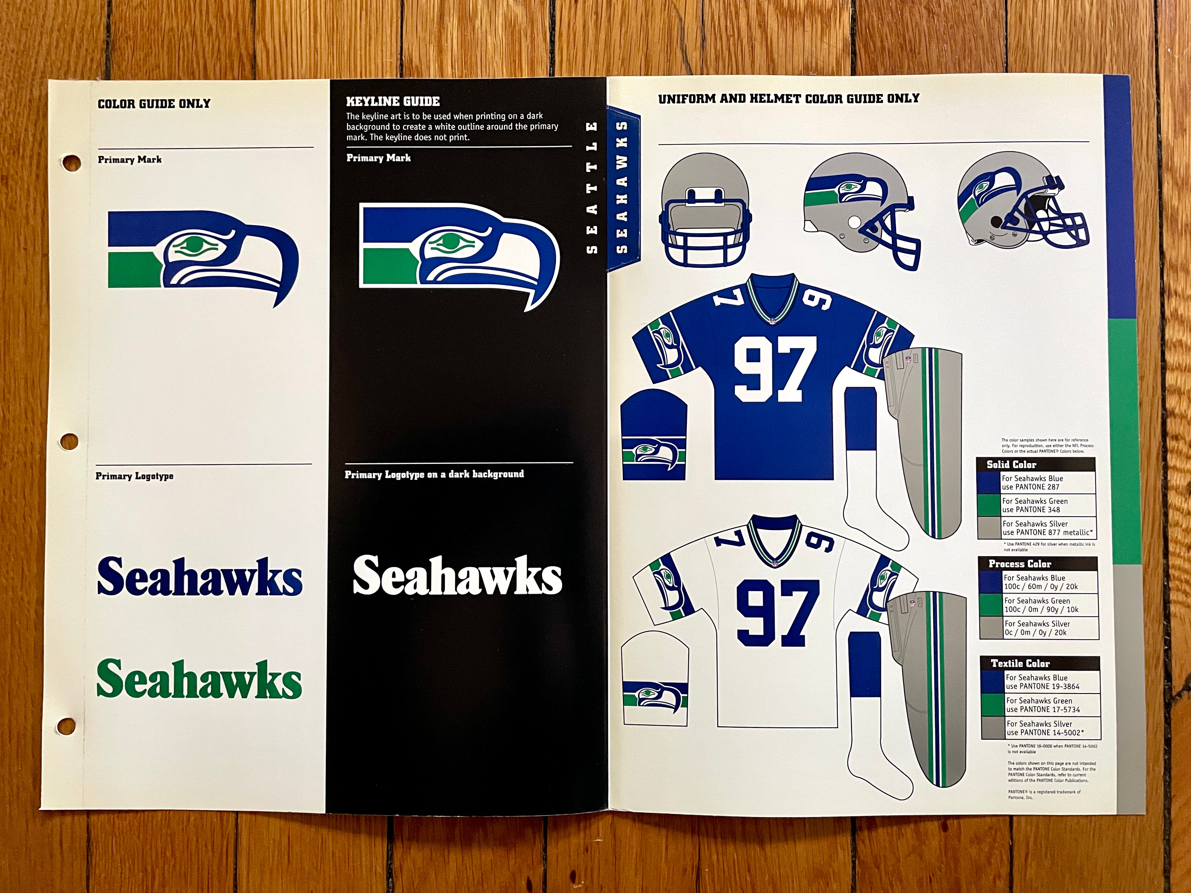
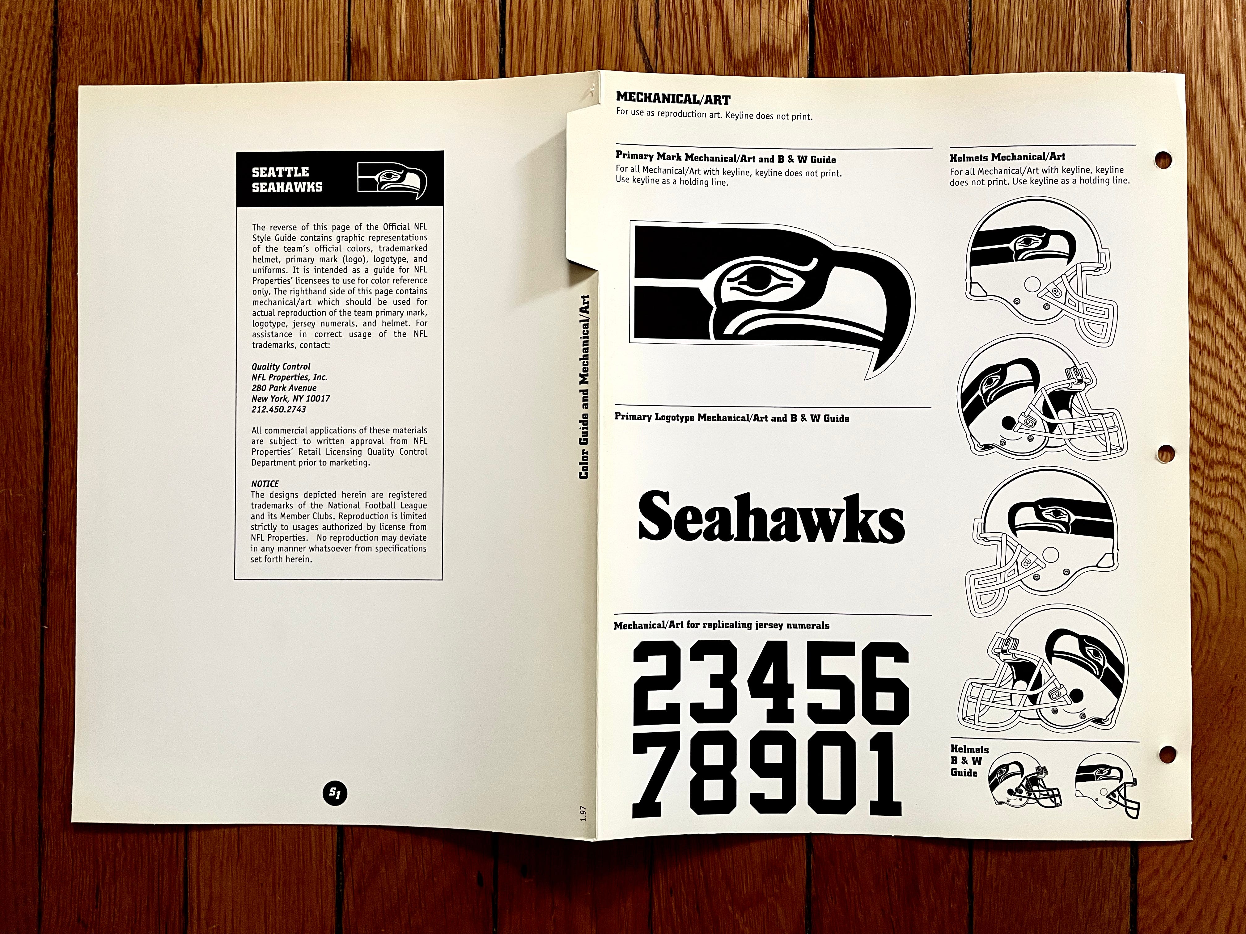
Aw man, I really miss these. Well, at least the team will be bringing them back this year as a throwback.
———
Tampa Bay Buccaneers
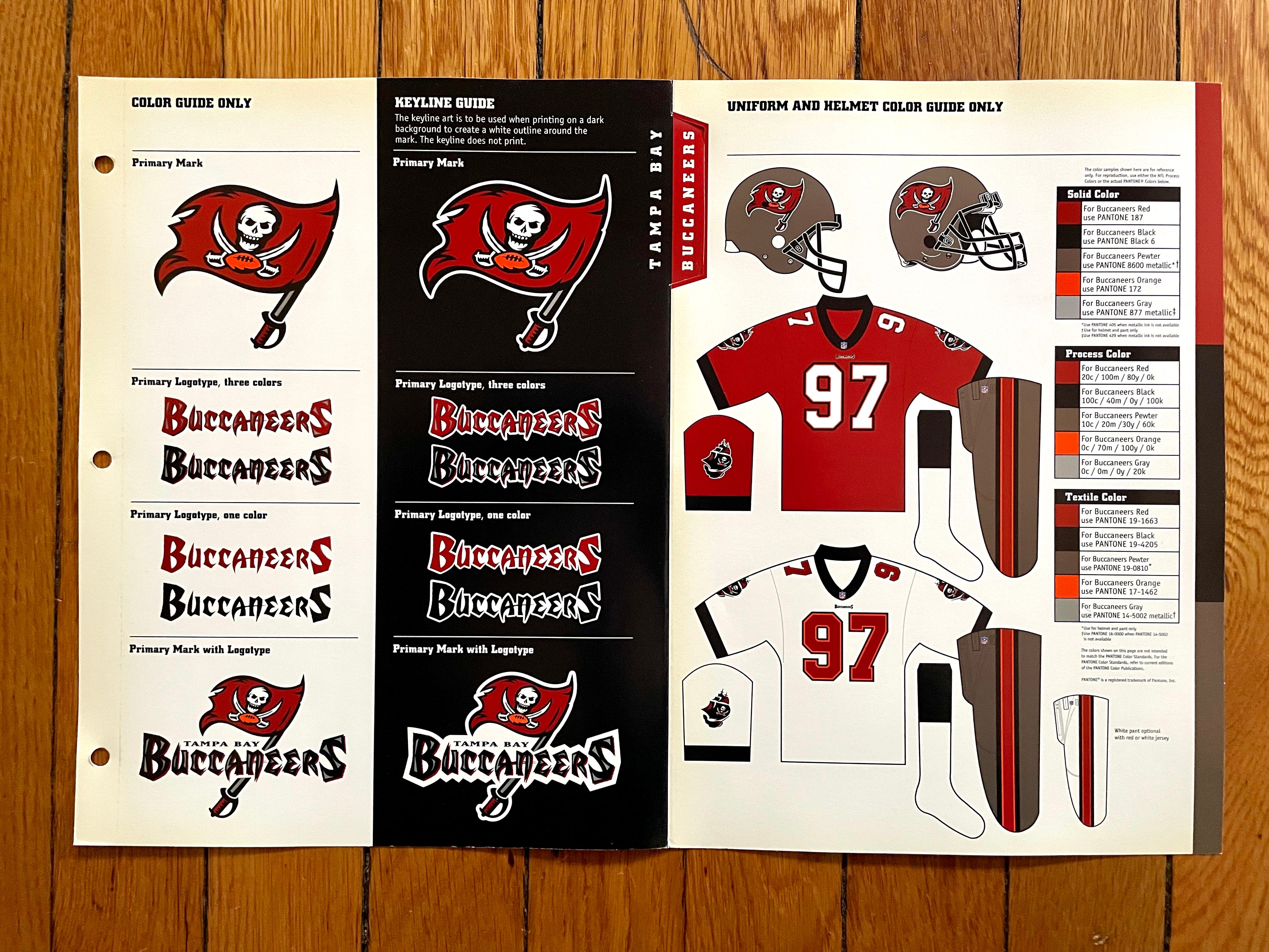
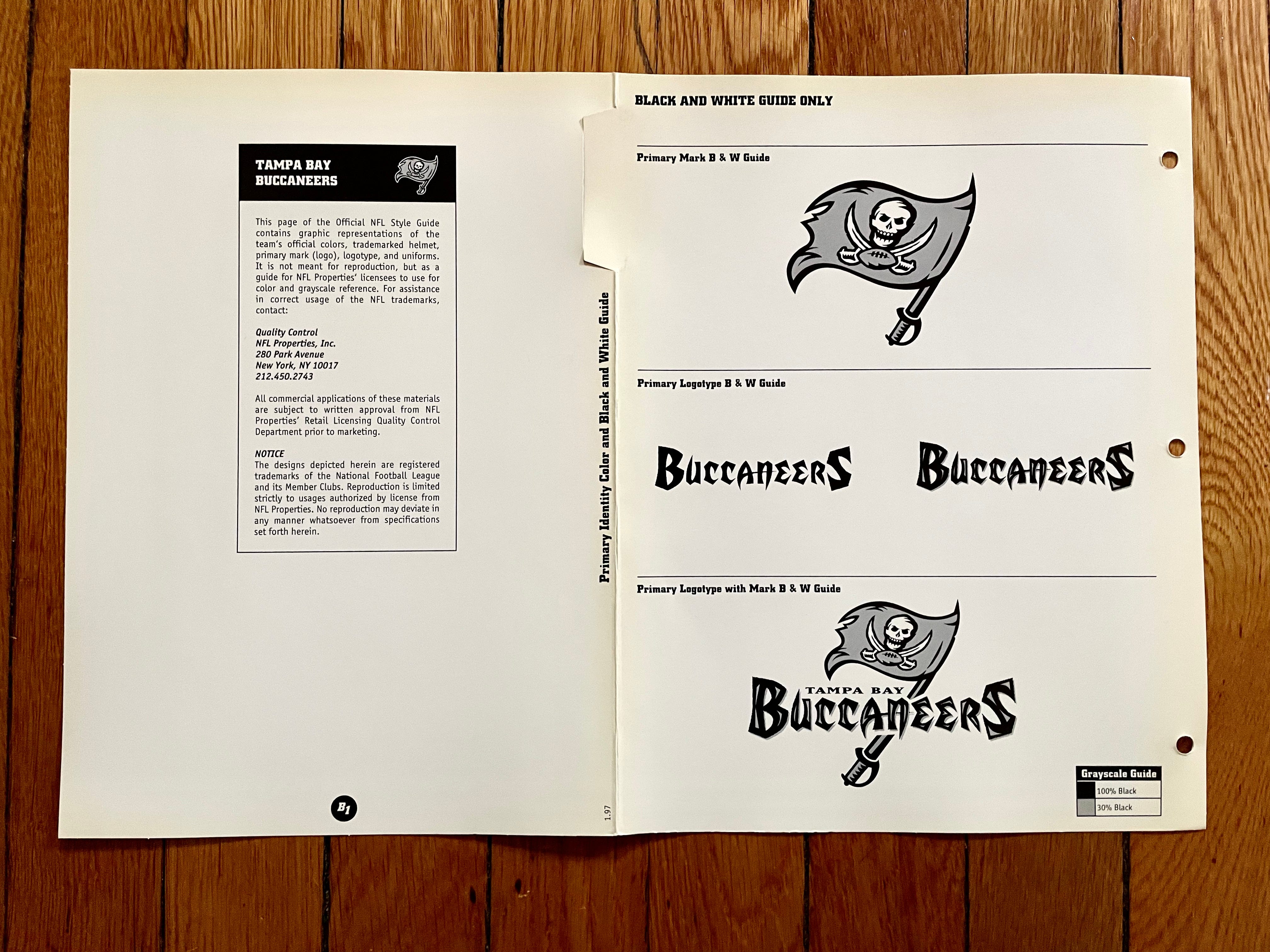
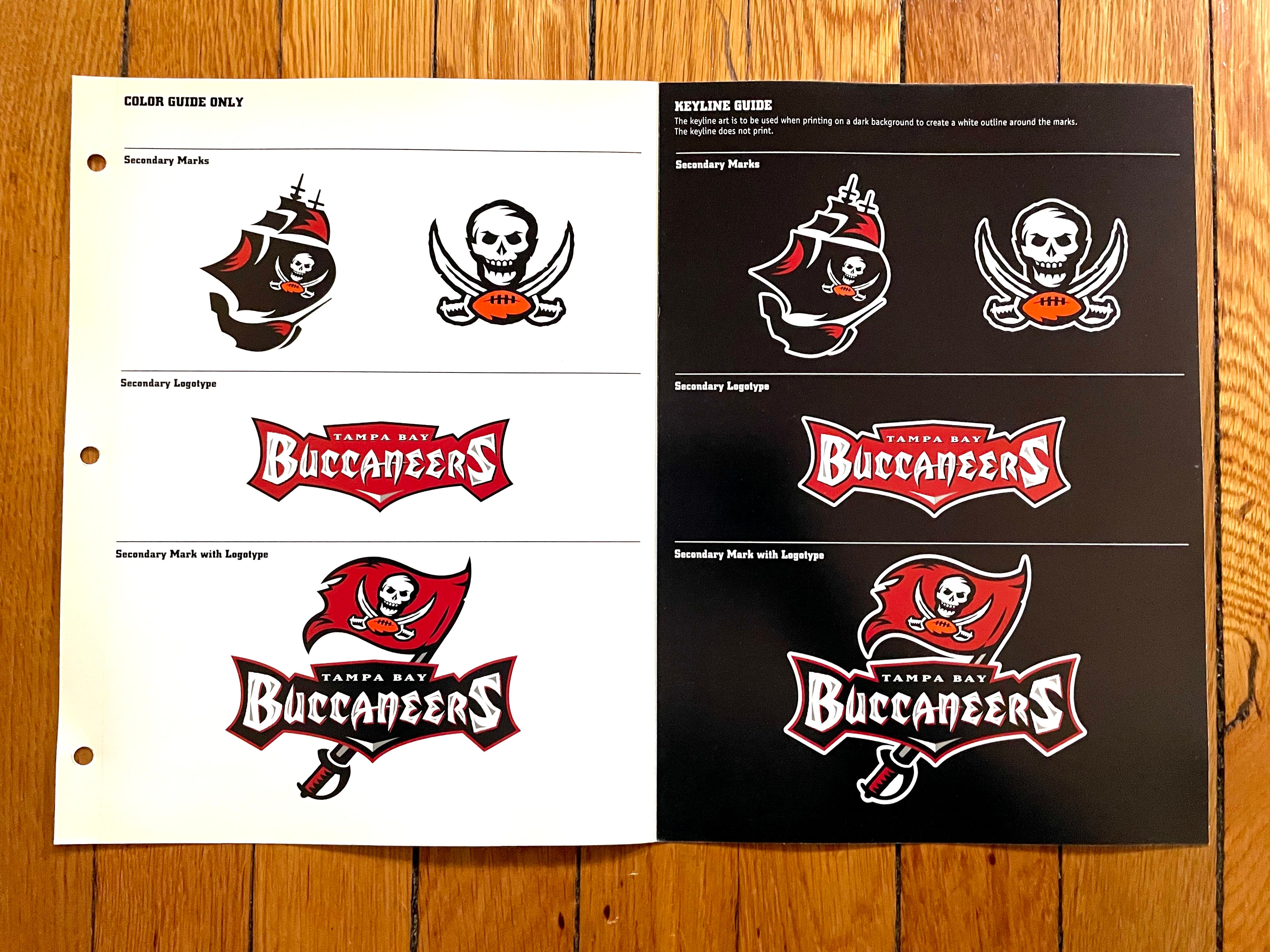
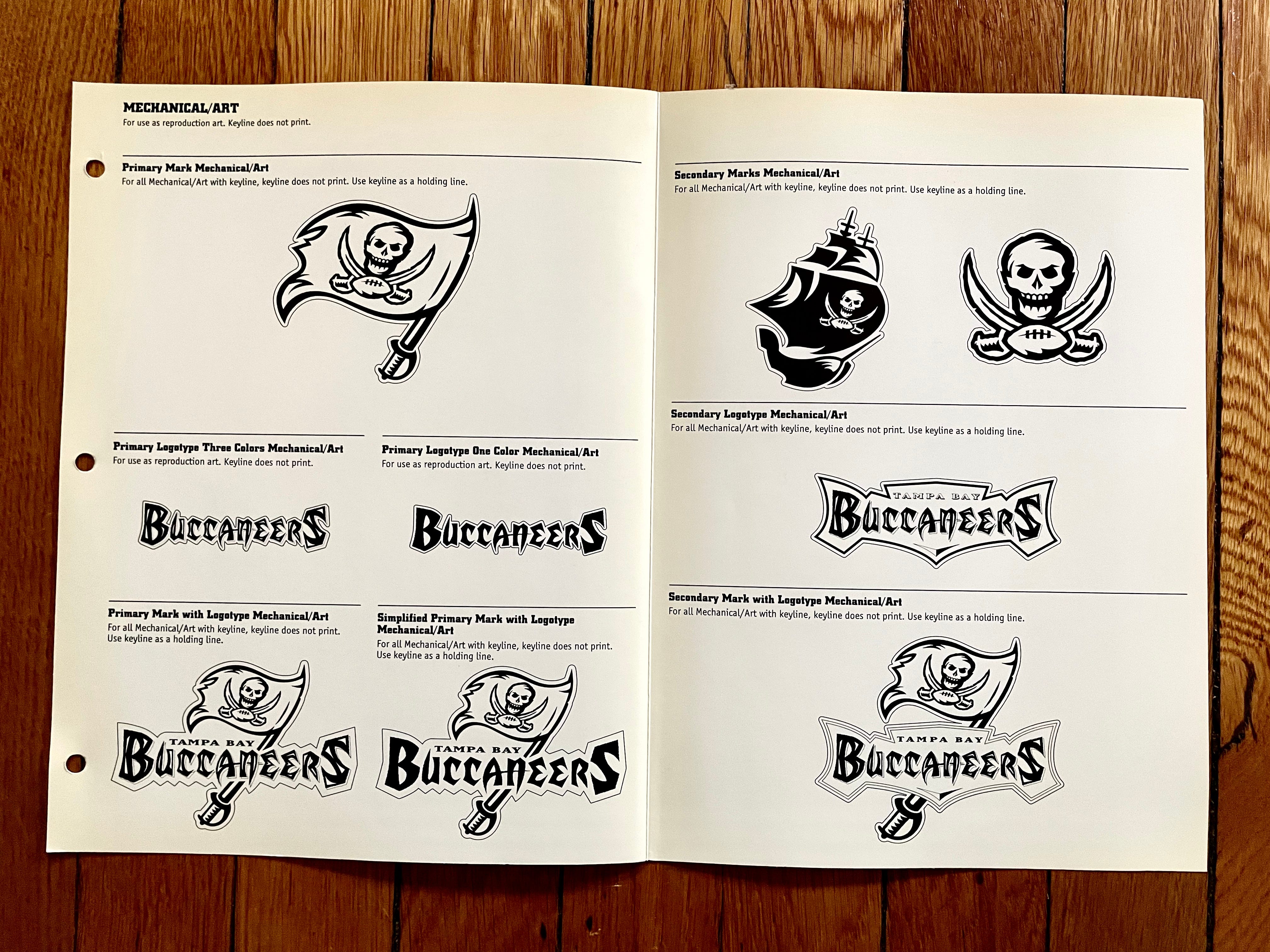
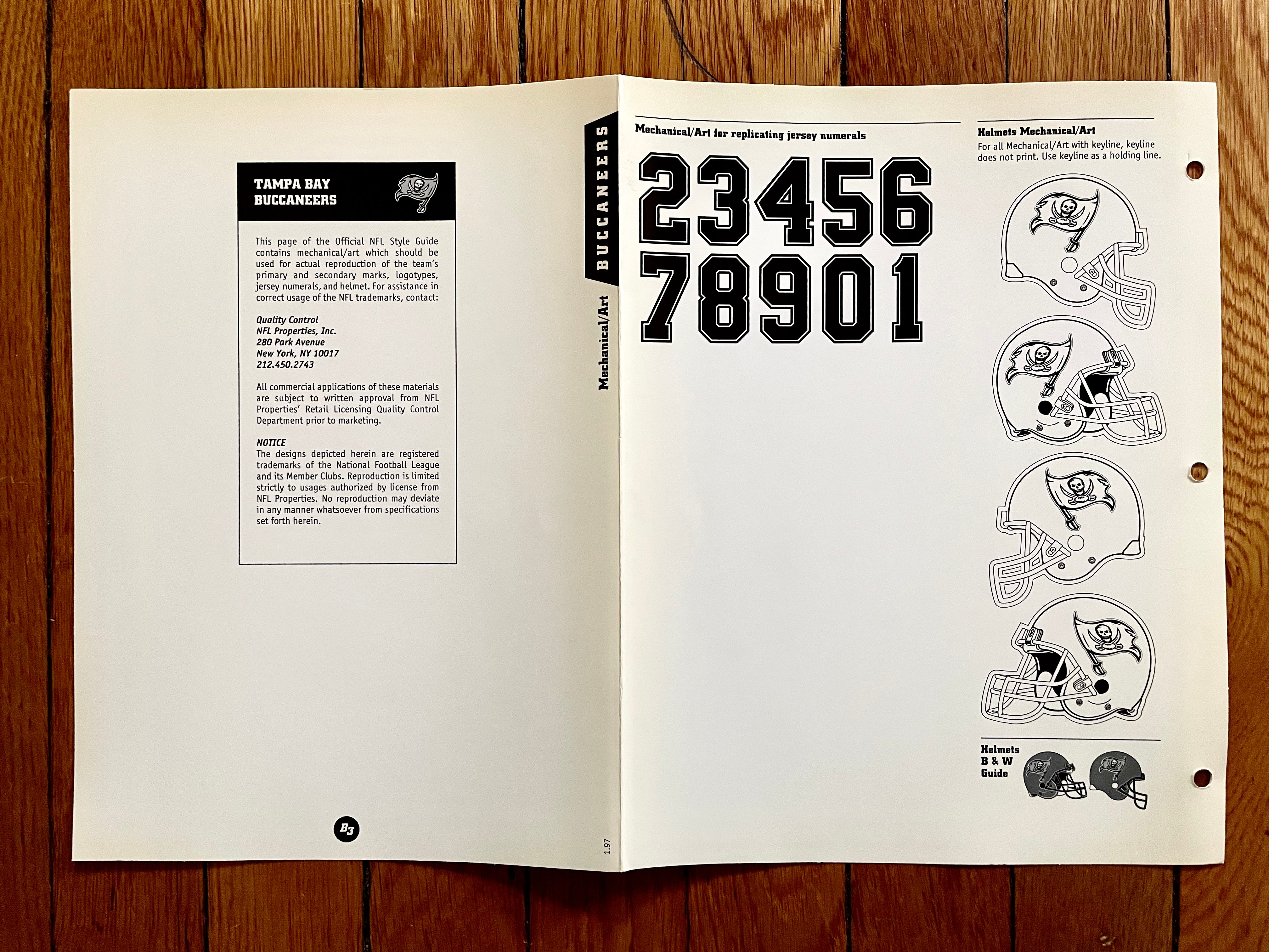
Much like the Browns, the Bucs are wearing pretty much the same thing today that they were wearing in the late 1990s, but only after taking a ruinous stylistic detour. Fortunately, they essentially typed “Command-Z” to undo all of that.
———
Tennessee Titans
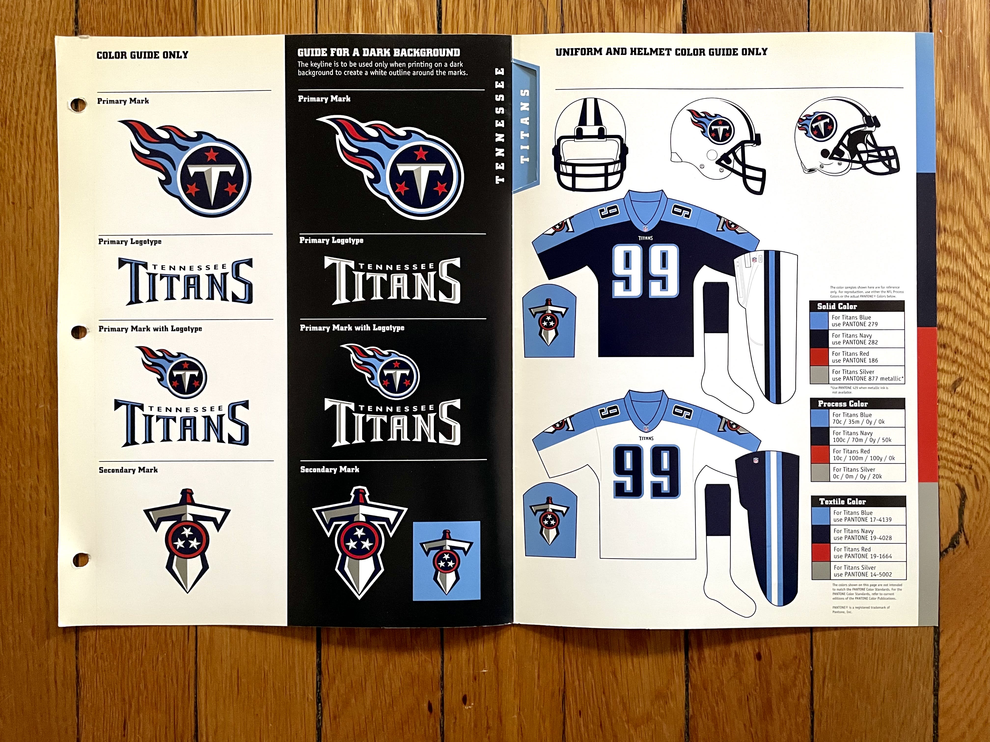
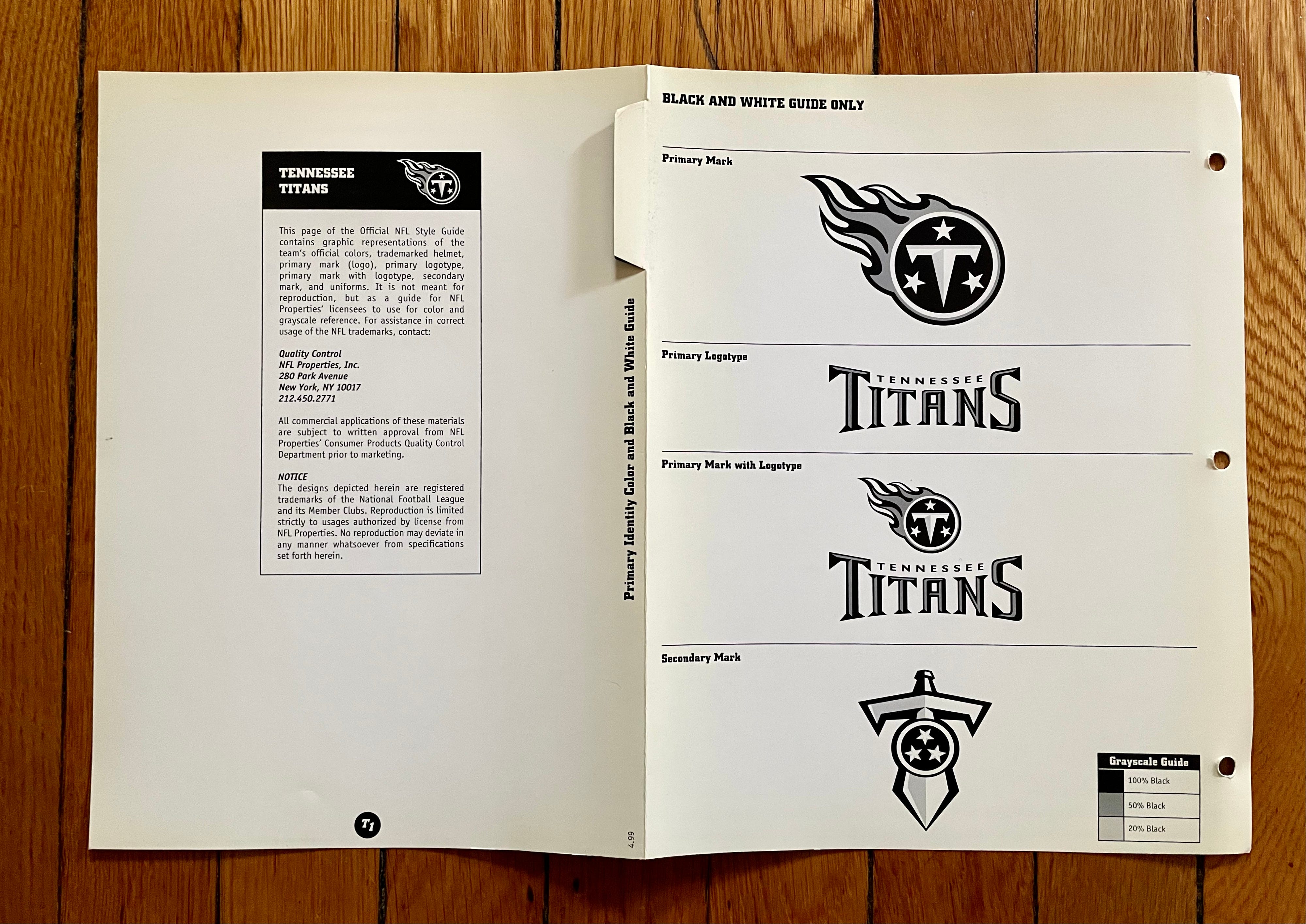
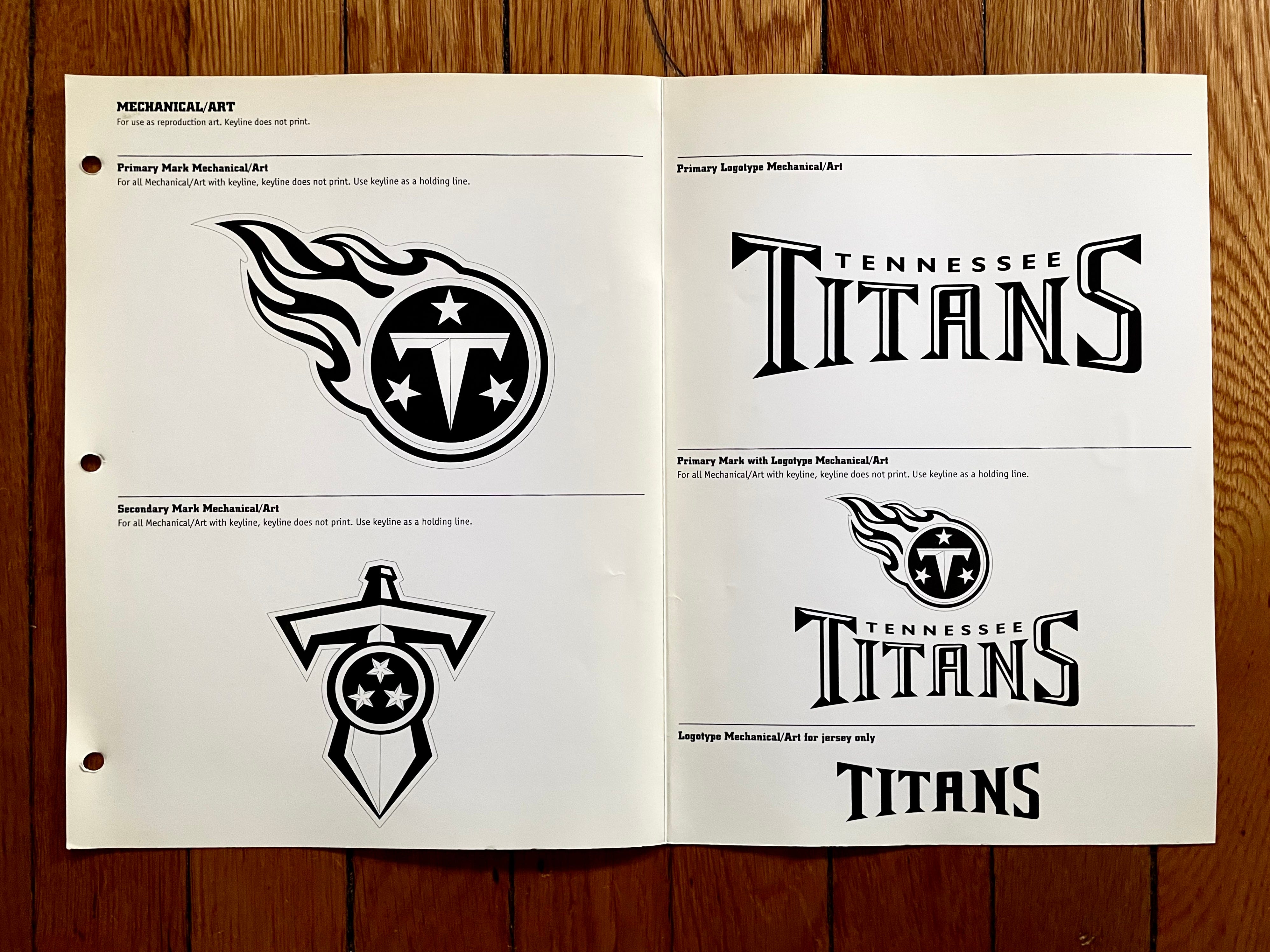
1999 was Tennessee’s first season playing as the Titans (following two years as the Tennessee Oilers), and they promptly went straight to the Super Bowl. I’ll confess a certain fondness for the white-over-navy combo, but the entire Titans identity has always felt misbegotten to me, beginning with the flaming thumbtack, which doesn’t convey the proper gravitas for an NFL team. They’ve tinkered around the edges over the past quarter-century, but I think they really need to blow things up and start over.
———
Washington Redskins
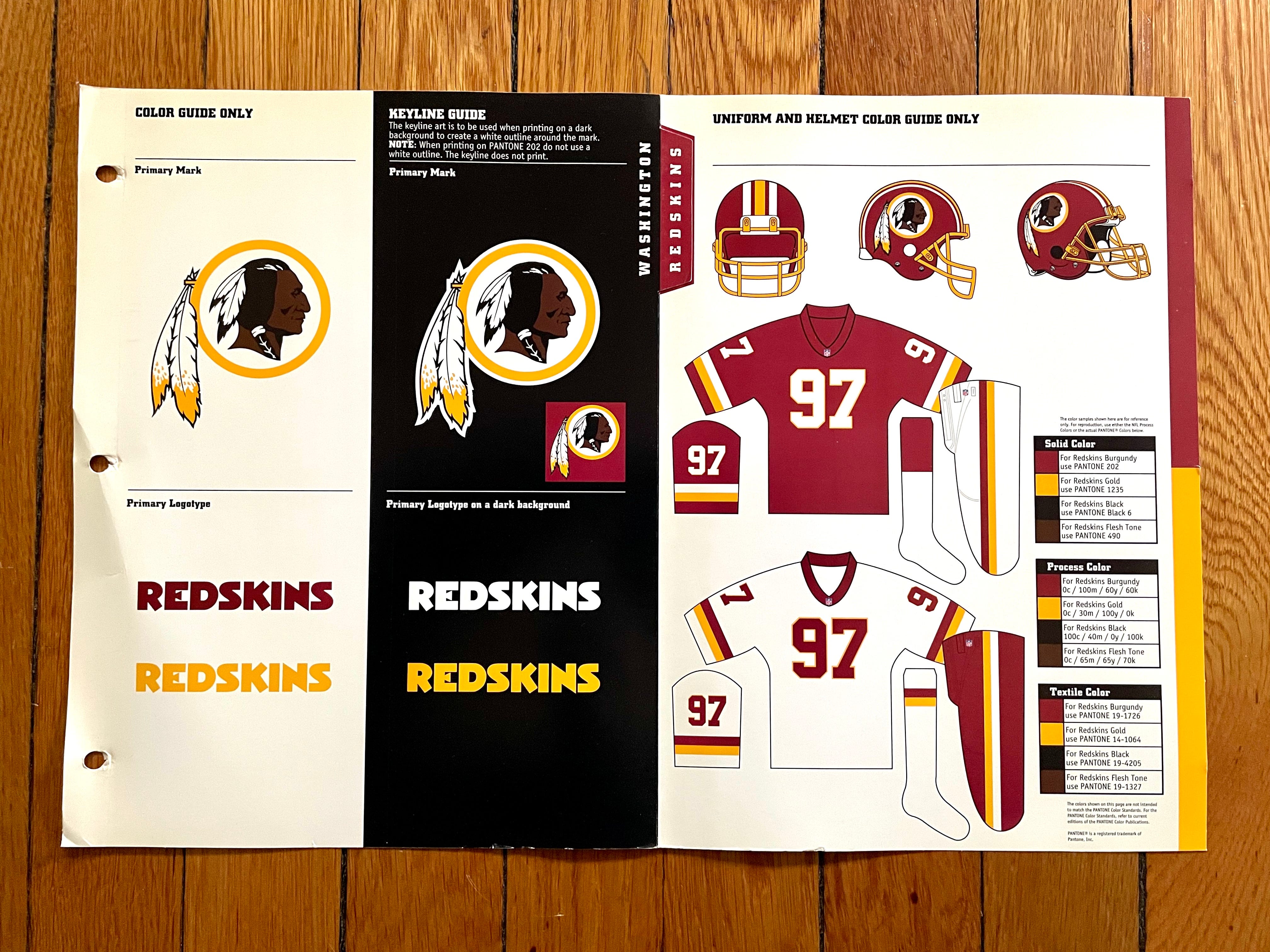
The unfortunate team name and logo notwithstanding, the basic design here (i.e., the colors, number font, striping, etc.) is miles better than what the franchise is wearing now. Too bad they had to throw out the aesthetic baby along with the team-identity bathwater.
——
Cool stuff, right? Style guides are so much fun!
As I mentioned earlier, the guide also includes some frontmatter pages. Here’s a look at those (if you’re reading the web version of this article, click on the first thumbnail to launch the gallery):


And there you have it — the full 1999 NFL Style Guide (plus some 2000 updates). If you folks are enjoying these, maybe I’ll continue to periodically delve into my style guide collection in the months to come. Let me know if you’d like that!
Paul Lukas has been writing about uniforms for over 20 years. If you like his Premium articles, you’ll probably like his daily Uni Watch Blog, plus you can follow him on Twitter and Facebook and check out his Uni Watch merchandise. Have a question for Paul? Contact him here.
"If you folks are enjoying these, maybe I’ll continue to periodically delve into my style guide collection in the months to come. Let me know if you’d like that!"
YES.
YES Tom Krish! That would be wonderful! Thank you Paul - brings back sooo many great uni memories. I especially enjoyed the front-on helmet views, the color information (Steelers and Rams have the same gold!!!) and the numerals. So nice to see the Seahawks in all their original color glory - makes me long for the days of Jim Zorn and Steve Largent. I enjoy being reminded how good the Titans looked before introducing their current emaciated numeral set. Thanks again!