Uni Watch Power Rankings for the NHL’s New Reverse Retro Uniforms
We rank the new designs from worst to first.
I’m a big fan of the NHL’s Reverse Retro uniform program, which bestowed 32 new designs upon the uni-verse last week. Sure, it’s a merch dump (just like all league-wide uni programs these days), and it’s also gimmicky (ditto), but I can overlook those things because the ЯR concept is so much fun. While other pro leagues base their merch-dump gimmicks on strained connections to local culture (the NBA’s City Edition, MLB’s City Connect) or unsightly chromatic experiments (the NFL’s Color Rush), ЯR is based on the things that uniform fans already geek out over: old uniforms, old logos, defunct teams, and so on. At its heart, it’s a uniform program about uniforms, and that’s something I can totally get behind.
But that doesn’t mean every ЯR design is good. Moreover, a good uniform isn’t necessarily a good ЯR uniform. That’s because the whole point of ЯR is to play around with historical design elements and team colors — if you’re not doing that, you’re not really doing it right.
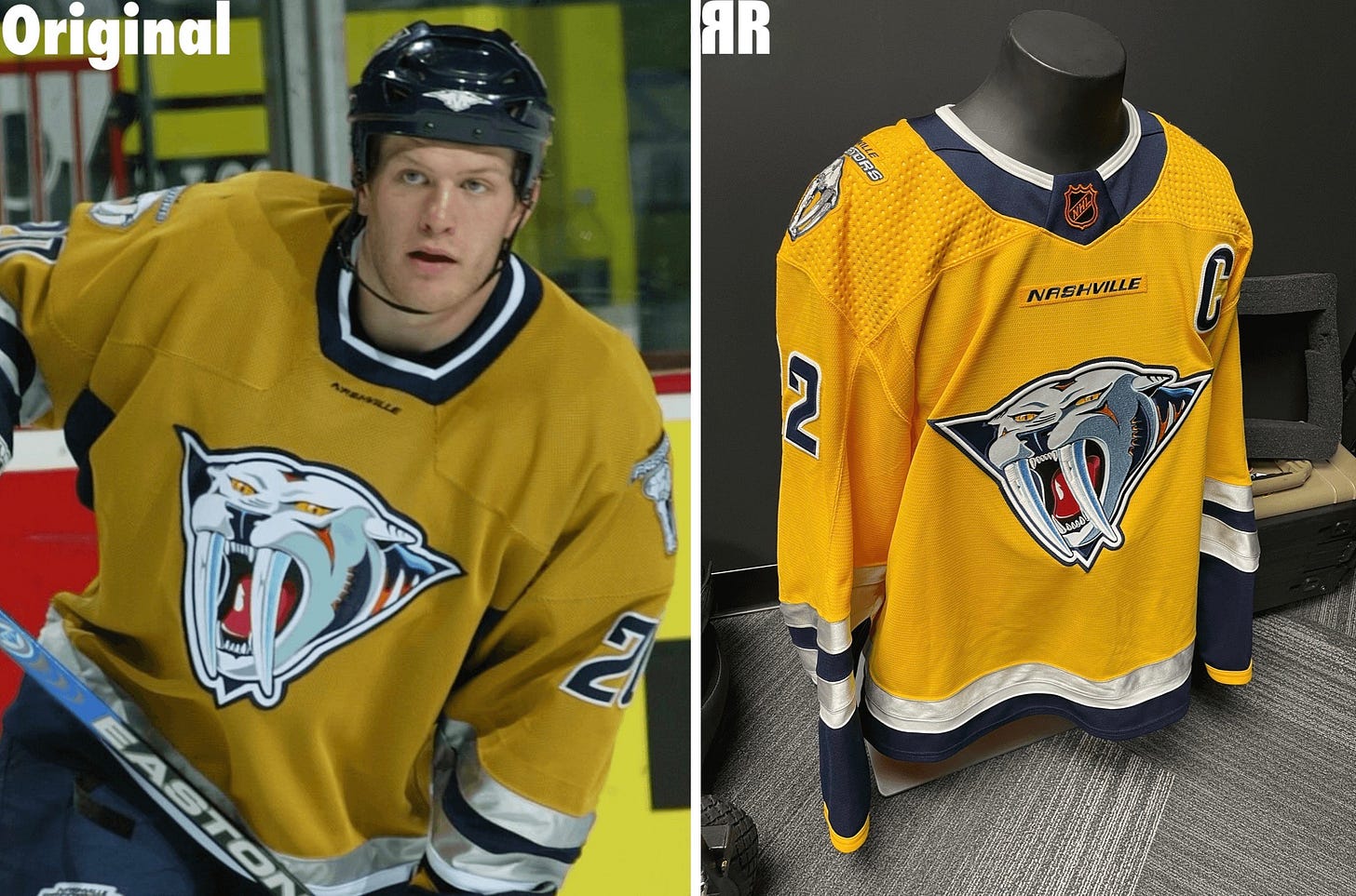
To show you what I mean, let’s look at the Predators’ new ЯR jersey, along with the early-2000s “mustard cat” design it’s based on:
Now, when viewed in a vacuum, the new ЯR design isn’t bad at all. Depending on your tastes, you might even prefer it to the mustard original. But while it’s a nice enough design, I’d say it’s a poor ЯR design, because all they did from a design standpoint was copy/paste the old jersey and brighten up the color a bit. Seems like the very definition of a lazy effort. Why not change the base color to navy, or white, or change the striping, or something? So while the end result isn’t bad, I don’t think it’s so great from an ЯR perspective, and I’ve factored that into my rankings of this season’s new ЯR designs.
Speaking of which: What you’re about to read are the Uni Watch Power Rankings for the new ЯR set. For most of these, we’ve only seen the jerseys, not the full uniforms (such is the nature of merch dumps), so it’s possible that my opinions could shift a bit once we see the full designs on the ice. And of course it’s almost guaranteed that you’ll disagree with some of my assessment (such is the nature of uni rankings), but that’s part of the fun. Ready? Here we go, from worst to first.


