Uni Watch Power Rankings for All 30 MLB Teams
Assessing the current MLB uni-verse, from worst to first.
Before we get started, a quick note: When this article is published, on Aug. 9, I’ll be traveling (my first real vacation since before the pandemic, whoop-whoop!), so I’ll likely be slow to respond to comments and queries. Thanks in advance for your patience and understanding. — Paul
Things have been very NFL-centric around the Uni Watch Substack lately, so I thought this week would be a good time to shift gears and do an MLB piece. And not just any MLB piece, but a full-blown Uni Watch Power Rankings rundown for all 30 big league teams.
Even without our recent NFL focus, this seems like a particularly good moment to do the MLB rankings, for two reasons. First, MLB uniforms will be getting a new Nike template next season, so I wanted to assess everything now while we still have the old template. And second, the 2023 season is now more than two-thirds complete, which means there are no more City Connect designs to be unveiled and, I hope, no more sleeve ads to be announced. (I suppose we could still see more sleeve ads, but it seems unlikely that an advertiser would partner with a team this late in the season.) In short, this seems like a moment of relative calm and stability in the MLB uni-verse, and thus a good juncture for doing the rankings.
Speaking of sleeve ads: Another interesting thing about this particular moment is that we’ve reached a point of uni ad parity — 15 ad-clad teams, 15 ad-free teams. As I’m sure you’re all aware, I’m strongly opposed to uni ads and have hated seeing them infest my favorite sport this year. From my perspective, even the worst ad-free uniform is, by definition, better than the best ad-clad uniform, so these rankings are split into two de facto castes: Spots 1 through 15 are the ad-free teams; 16 through 30 are the ad-clad clubs.
I know some of you will disagree with this approach. You may think, for example, that the Yankees’ uniforms (which have an ad) are obviously better in the big picture than the Rangers’ (which do not), and that the few square inches represented by a sleeve patch can’t outweigh that self-evident truth. Similarly, you may think that some uni ads, such as the Cardinals’, are so innocuous as to be aesthetically irrelevant in the grand scheme of things.
I understand and appreciate these points of view, but I respectfully disagree with them. To me, a uni advertisement is the turd in the punchbowl that ruins the party, even if it’s a very small turd in an otherwise lovely punchbowl. Moreover, a uni ad isn’t just a visual blemish — it also causes collateral damage to the uni-verse by helping to normalize the practice of uni advertising, which in turn helps spread that practice further. Ultimately, I don’t believe in having a hierarchy of acceptability for something that’s inherently unacceptable. Or to put it another way, no uni ad is “better” than another; some are just worse than others.
With that framework in mind, here are the rankings. Each team was assessed primarily on the basis of its home and road uniforms, with alternates, including City Connects, being factored in to a lesser extent. Here we go, from worst to first!
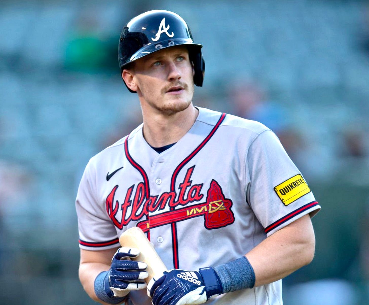
30. Atlanta
It’s long past time for Atlanta to retire the tomahawk, discourage fans from doing the chop, and move on to a new identity. MLB’s most comically minor league-looking sleeve ad doesn’t help.
29. Miami Marlins
Adding throwbacks to the mix, as they’ve done this season, helps a little, but it’ll take more than the occasional retro game to bring this team back to aesthetic respectability. Blow it up and start over.


