

The Untold Story Behind the Jaguars’ 1997 Number Font
Nike took a circuitous path before arriving at the right solution.

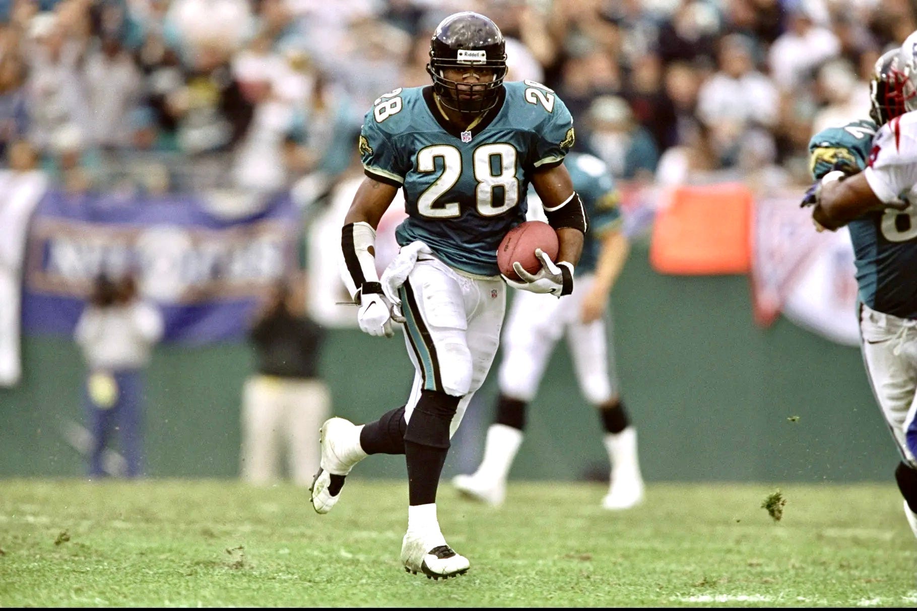
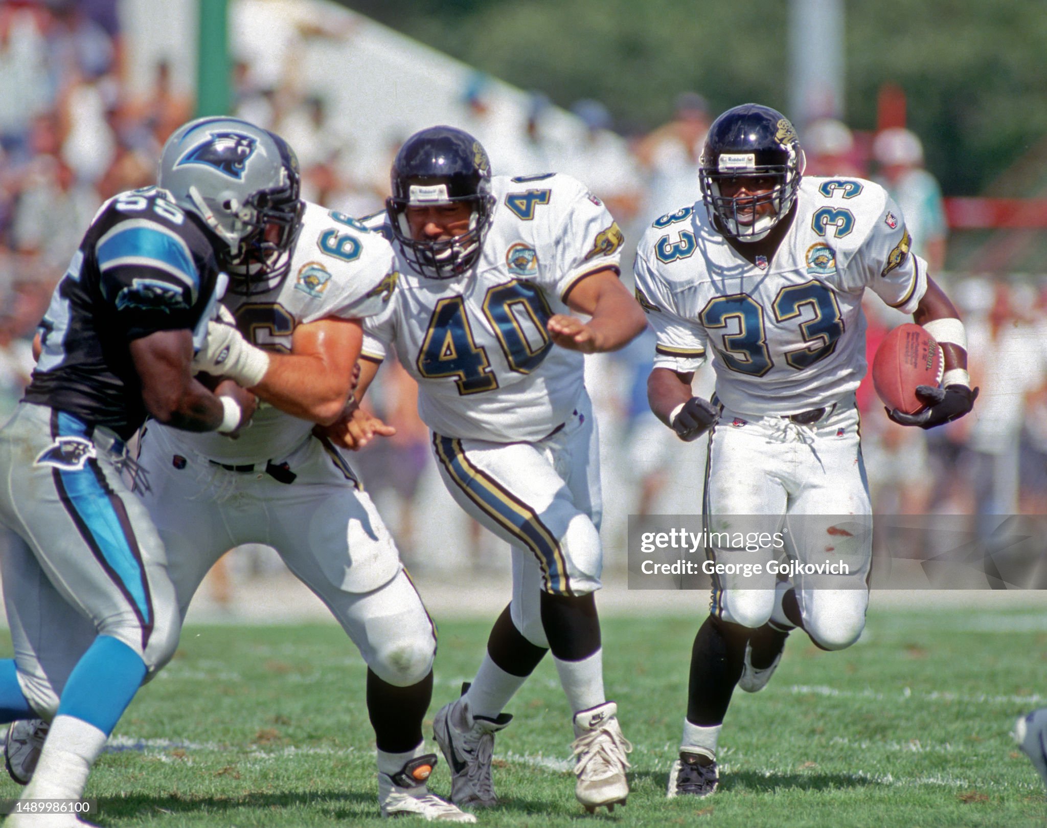
It’s no secret that I’m a big fan of the Jacksonville Jaguars’ late-1990s uniforms. When I recently wrote about 10 NFL throwbacks I’d like to see on the field, the Jags’ late-’90s set was at the top of the list. As I noted in that piece, the team’s original 1995 uniforms had standard block uni numbers, but then in 1997 they switched to “a very nice custom font” (which is shown in the photo above). I loved that font when it was introduced and really wish they’d bring it back.
What I didn’t mention in that piece, however, is that the 1997 custom font has an interesting backstory, which I’m going to share with you today.
Let’s start here: For the first two games of the 1997 preseason, the Jags wore a different font than the one they eventually wore in the regular season.

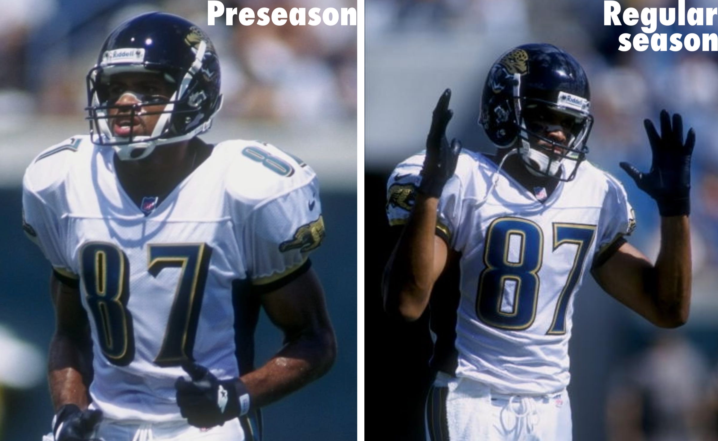
The Jags wore their teal jerseys for their third and fourth preseason games that season. Did those jerseys also have the odd font worn in the first two preseason games? Nope — they had the “regular season font.”

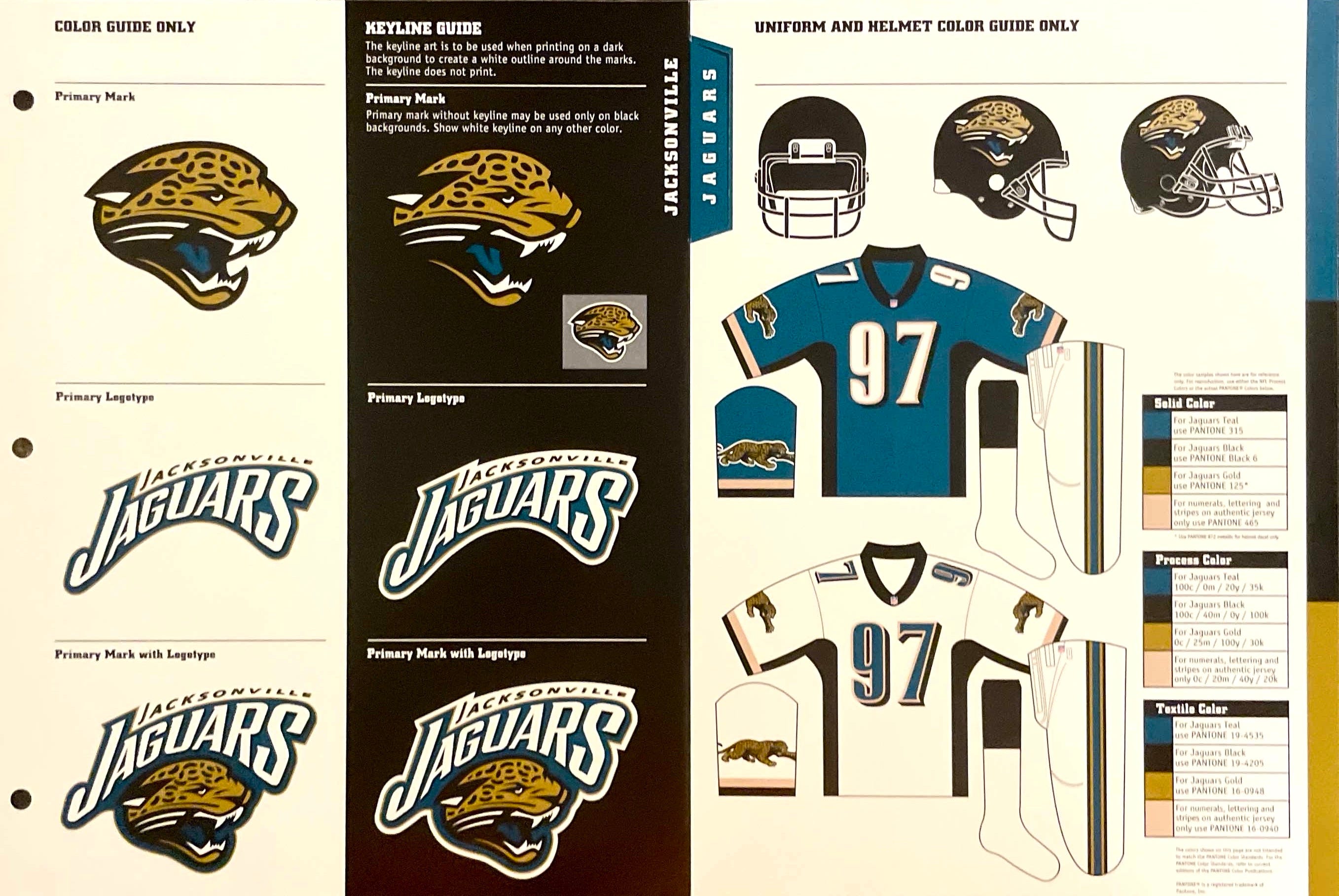
So was the “preseason font” initially intended only for the white jerseys, but not the teal jerseys? Nope — the preseason numbers were shown on both jerseys in that year’s edition of the NFL Style Guide.
Here’s the deal: When the preseason number font debuted during those first two preseason games, there were lots of complaints about its legibility. So Nike, which had the Jags’ uni contract at the time and had designed the font, quickly redesigned it, creating the custom font that the team ended up using for the next decade. Nike was able to get the redesigned font done in time for the last two preseason games (it’s just a coincidence that the team wore white for the first two preseason games and teal for the last two), but it was too late to change the NFL Style Guide, which had already been printed.
I’ve known about the general parameters of this story for many years (maybe you have too), but I recently had the opportunity to interview Eric Bodamer, a designer who was working for Nike at the time. He filled in a lot of interesting details. Here’s a transcript of my recent Zoom call with him, edited for length and clarity: