


Note: Inconspicuous Consumption reader Norb Rozek recently posted on social media about the street signs in his hometown of Green Bay, Wisconsin. His manifesto was so squarely in the IC wheelhouse that I asked him if we could adapt it into a guest-written IC post, and he graciously agreed.
This post is not paywalled. Enjoy! — Paul
By Norb Rozek
Slipshod street signs have long been a source of annoyance for me. I think this might stem from when I was four and we moved to a suburb where a street not far from ours had signs that variously read “Kalb Street,” “Kolb Street,” and “Colb Street.” This street was maybe a mile long. How exactly can one wind up with three different spellings of the same street name? How do the signs get left like that? Does nobody notice? Does nobody care? Seemed weird to me, even as a little kid.
I now live in Green Bay, Wisconsin, which has the most pathetic excuses for street signs of any city I’ve ever been to, and I’ve been to quite a few. There’s no standardization, no quality control, no attempt whatsoever to pretend that anyone really cares — just a bizarre mish-mosh of whatever letters were lying around that day, I guess.
In an attempt to document this sorry phenomenon, I recently walked down a roughly half-mile stretch of Washington St., a major artery that runs through downtown. Here’s a map of the span I traversed:
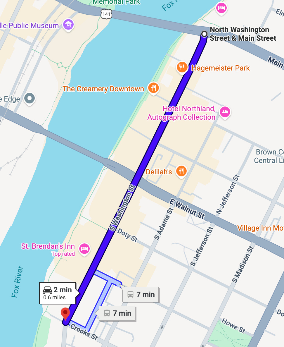
I began at the north end of that route and walked south. As you can see on the map, my path included nine intersections. Here are the street signs I encountered along the way, beginning with…
North Washington St. and Main St.
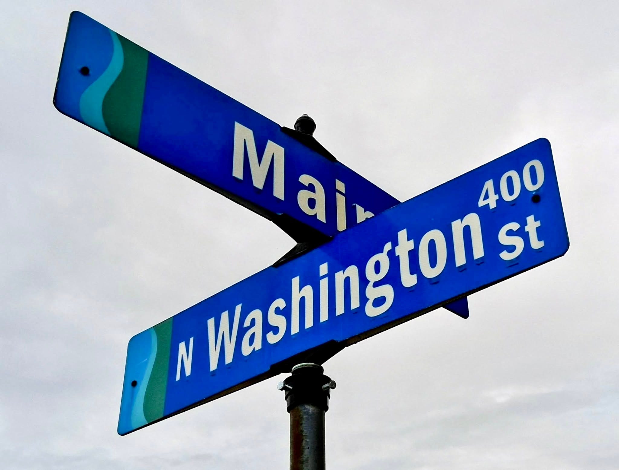
All the text appears to be set in something fairly equivalent to Franklin Gothic Heavy (“Washington” is more like Franklin Gothic Heavy Condensed, because it’s longer, but that’s fine). Well, heck, that doesn’t look too bad. Nice and bold, right?
Now let’s go one block south to…
North Washington St. and City Deck Ct.
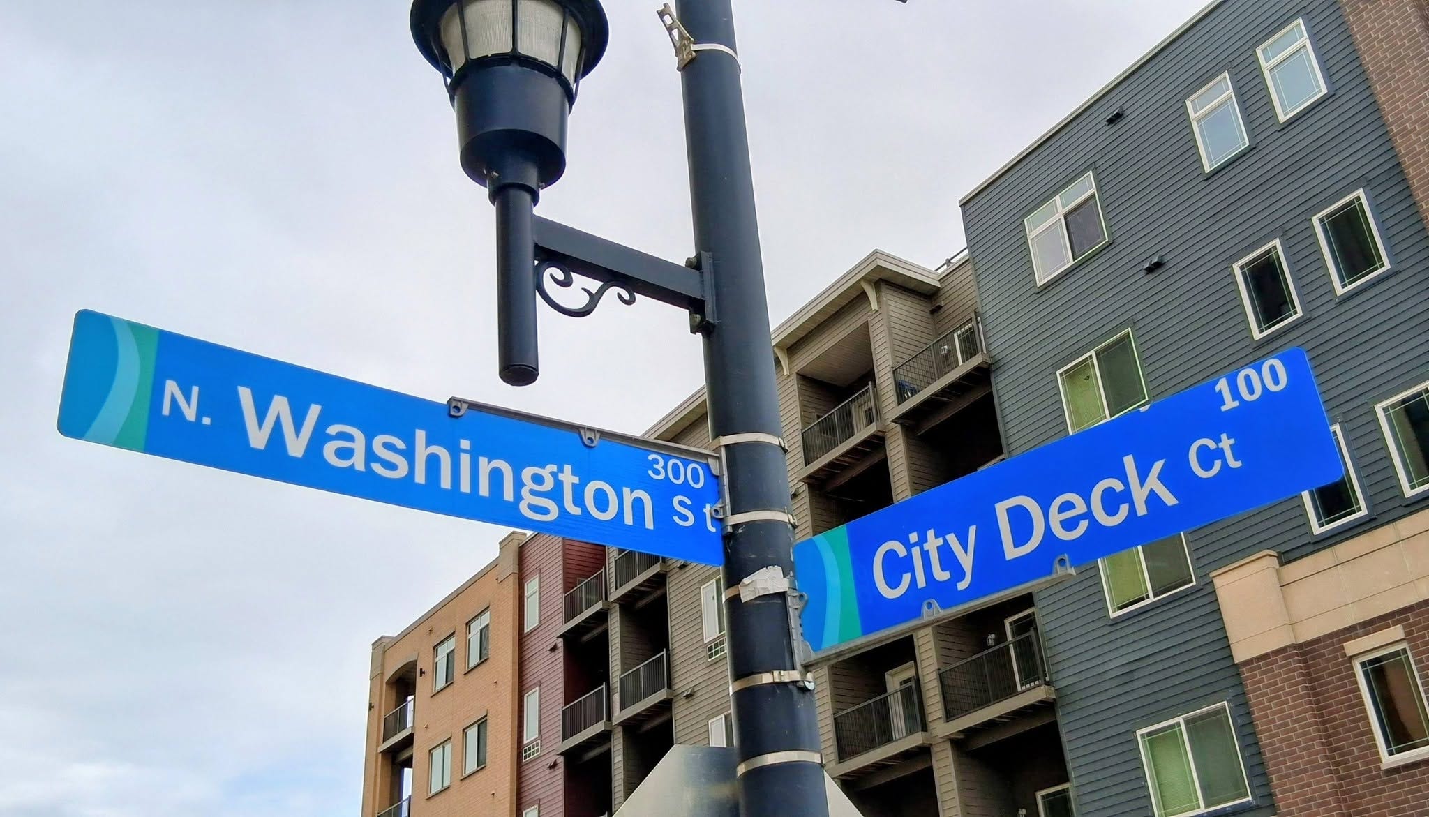
Wait, now the text is in something more akin to Franklin Gothic Demi or Book -- certainly not the same big, chunky letters from the first sign, except for the block number of City Deck Ct., which is still Franklin Gothic Heavy Condensed. Also, there is now a period after the “N” for “North.” Hmm.
Let’s continue down Washington to the next intersection, which is…
North Washington St. and Northland Ave.
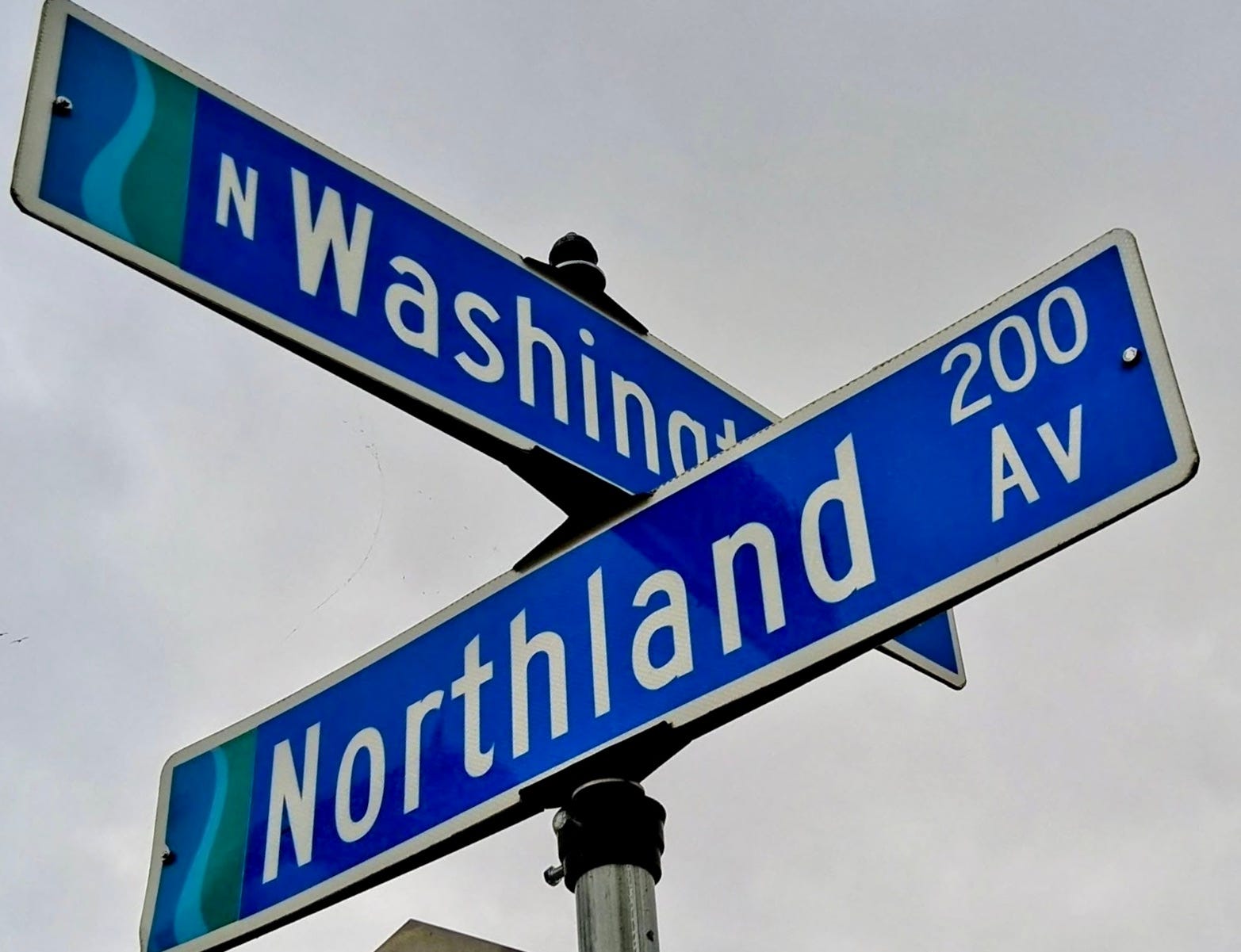
This sign uses a completely different font. I don’t know what it’s called but I think it’s used only on street signs, so I’ll call it “Street Sign font.” In any event, this is a complete departure from the first two signs.
Let’s go down another block to…
North Washington St. and Pine St.
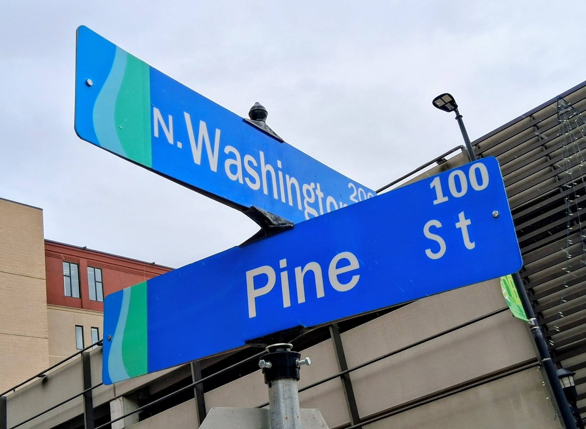
Here we have a sign that almost matches the sign at City Deck Ct., except that the “St” for “Street” looks like it’s in Street Sign font, while most of the rest of the sign is set in Franklin Gothic book/demi/regular (except for the Pine Street block number, which is set in Franklin Gothic Heavy Condensed).
Moving one block down, we come to…
North Washington St. and Cherry St.
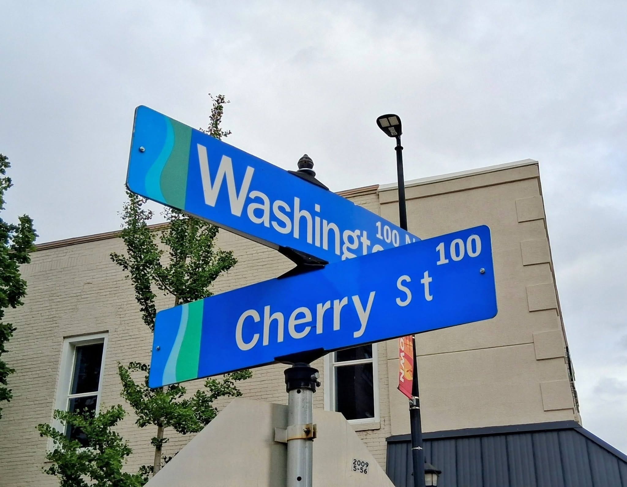
They’ve used such an absurdly oversized “W” that there’s no room for the usual “N” to designate “North.” Also, the Washington Street block number is now Franklin Gothic Heavy Condensed to match the Cherry Street block number, despite the fact that the Washington block number had been Franklin Gothic regular for the previous few signs.
Moving on, in another block we come to…
North Washington St. and Walnut St.
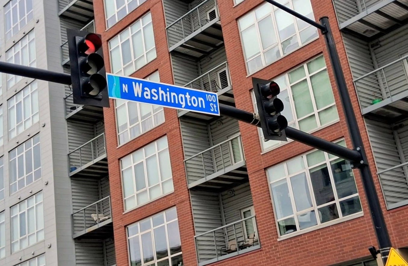
Here the street signs are suspended over the intersection instead of being mounted on poles. In light of the different signage format, I’d be inclined to give them a pass for using Street Sign font, except that the nearby intersection of Broadway and Walnut, which also has the signs suspended over the intersection, use Franklin Gothic Heavy. I didn’t get a photo of that, but you can see it in this Google Street View shot:
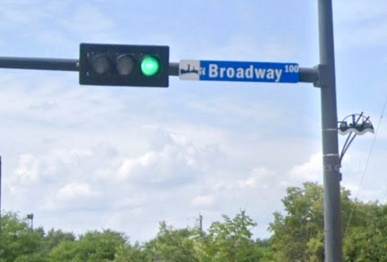
As we cross Walnut St., North Washington becomes South Washington, leading us to…
South Washington St. and Doty St.
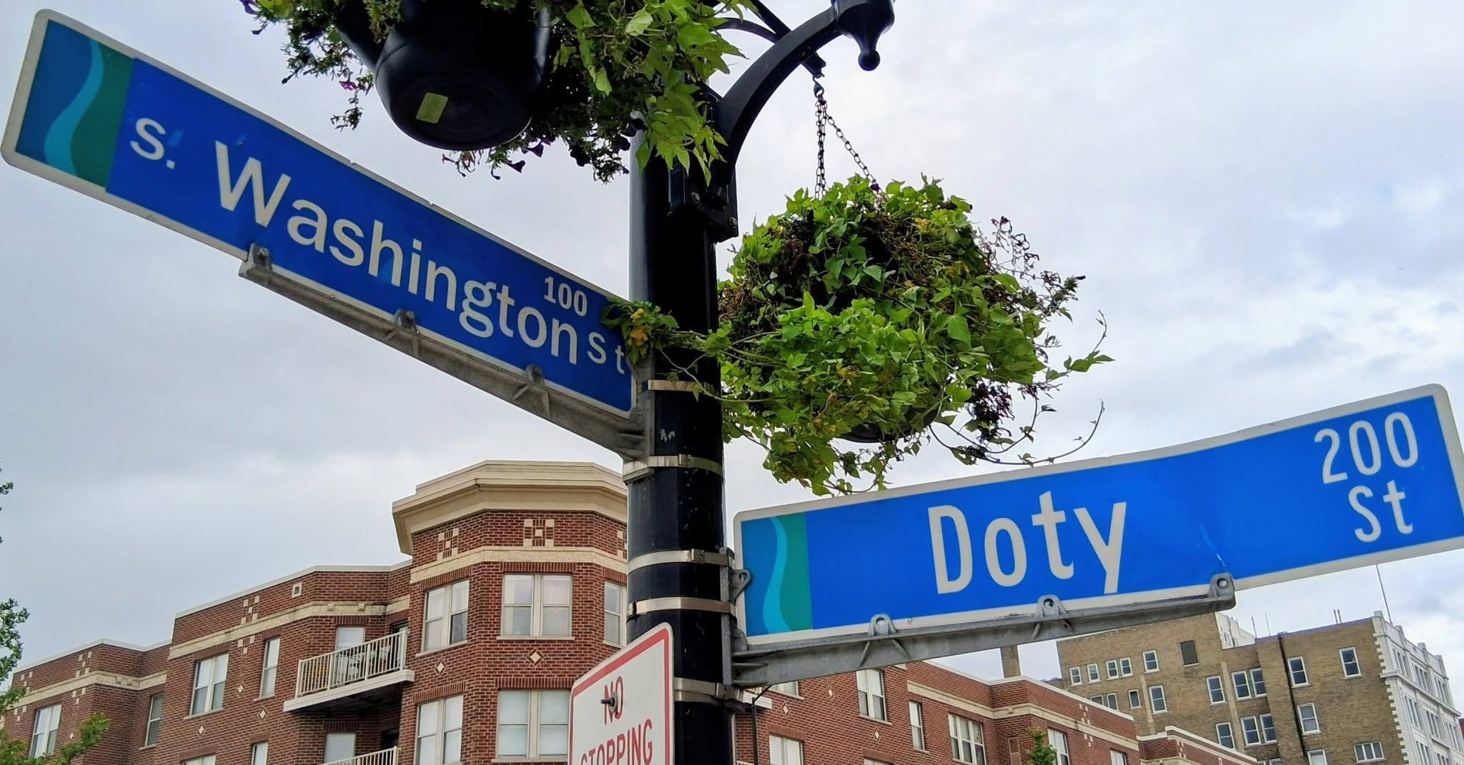
Here we have one sign in Franklin Gothic regular and the other in Street Sign font, which is not a good look for anyone.
Moving on, we arrive at…
South Washington St. and Stuart St.
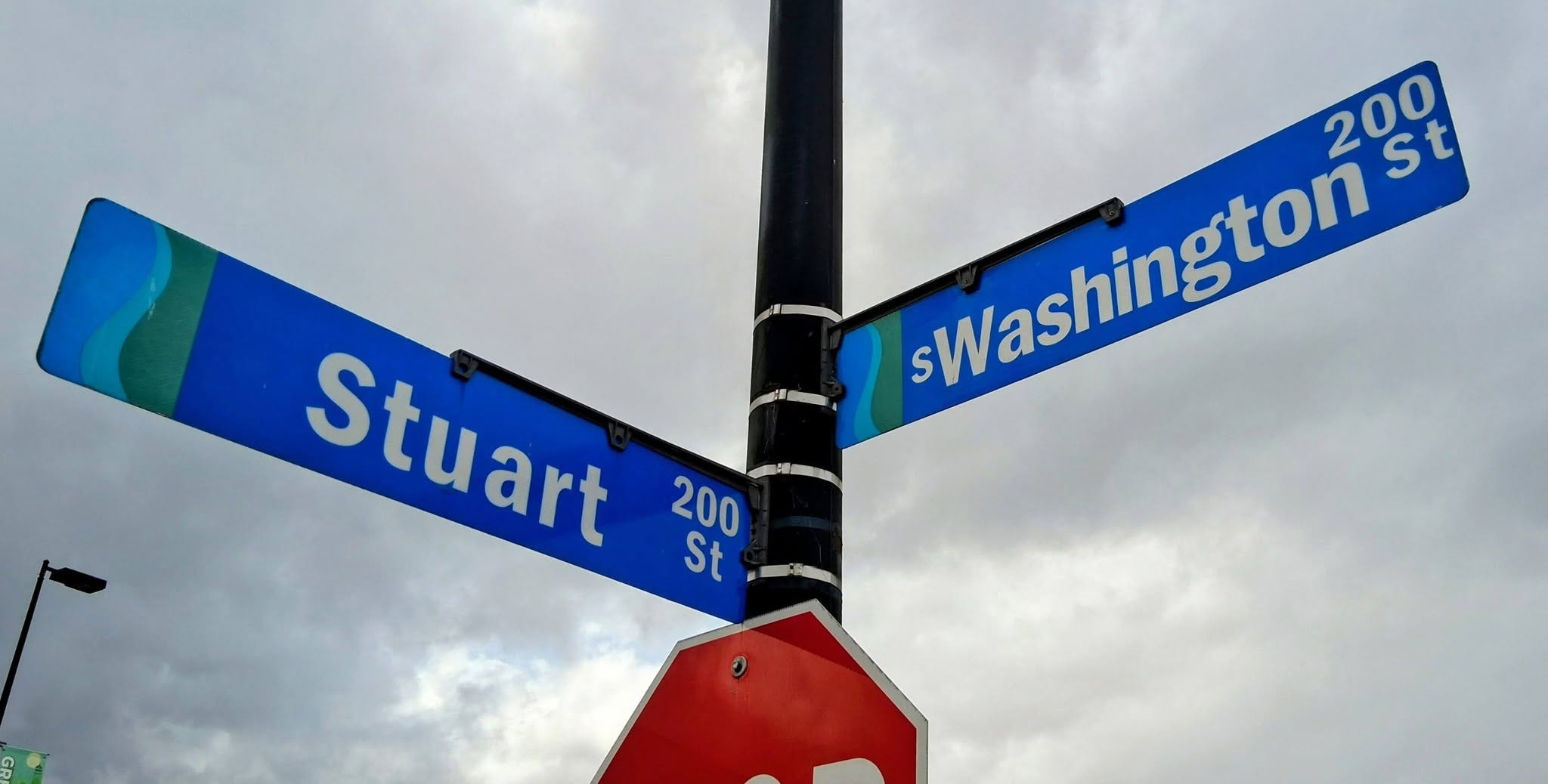
This is almost a match with our first sign at Washington and Main — except that first sign had “Washington” in Franklin Gothic Heavy Condensed, and here it’s just regular Franklin Gothic Heavy. As Maxwell Smart used to say, “Missed it by that much!”
A block down from that, we come to…
South Washington St. and Admiral Flatley Ct.
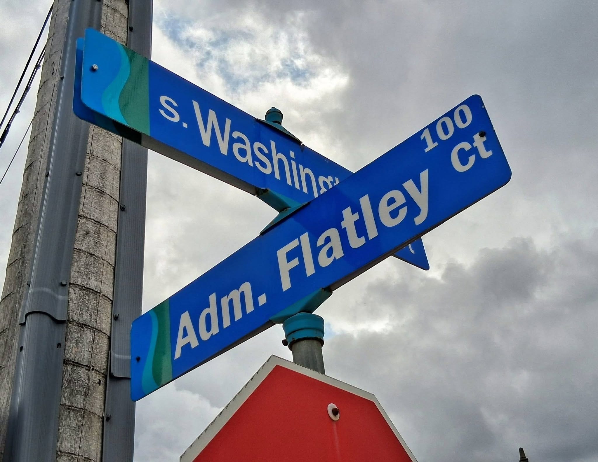
“Washington” has reverted to Franklin Gothic regular, while “Adm. Flatley” is in Franklin Gothic Heavy. I stopped after that because I got bored documenting the carnage.
Just to be clear, I wasn’t combing through all of downtown to find boo-boos or inconsistencies in the street signs. THESE ARE NINE INTERSECTIONS IN A ROW, ON A MAIN THOROUGHFARE, THAT I HAPPENED TO WALK PAST, AND NONE OF THEIR SIGNS MATCH. If I live to be a million, I will never understand how grown adults sign off on such slop. Who okayed this?
Paul here. Big thanks to Norb for his eagle eye and uncompromising typographic rigor. Here’s a gallery of all nine of his sign pics, just so you can see them all at once (you can click on the images to enlarge):


All kidding aside, most municipalities have style guides to cover this sort of thing. And while changing graphics standards occasionally lead to a certain degree of inconsistency (many cities, including mine, have slowly been replacing all-caps signs with title case, for example), Green Bay’s lack of uniformity does seem a bit extreme.
Oh, and I should add that what Norb refers to as “Street Sign font” is actually Highway Gothic. I didn’t change it in his text because I thought his nomenclature was amusing.
An appreciation for the finer points of street signage runs in Norb’s family. As you may recall, his brother, Kurt Rozek, was a longtime employee of the Street Department in the Green Bay suburb of Allouez. He recently retired, but shortly before that he spotted a new street sign that was due to be installed but was missing the dot over an “i” (sometimes referred to as a tittle), so he used some reflective tape to create a DIY dot for the sign. The tape he used was silver while the rest of the sign lettering was white, creating an endearingly inconspicuous anomaly.
Kurt didn’t remain on the job long enough to see his DIY-dotted sign installed on the street, but he recently had a dental appointment in Allouez, so he drove by and saw his silver-dotted sign in the wild:
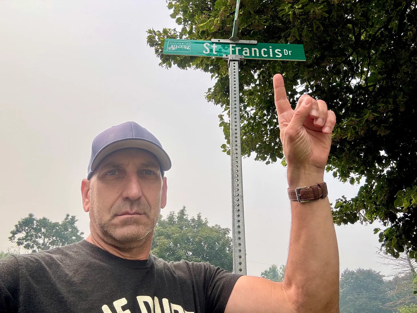
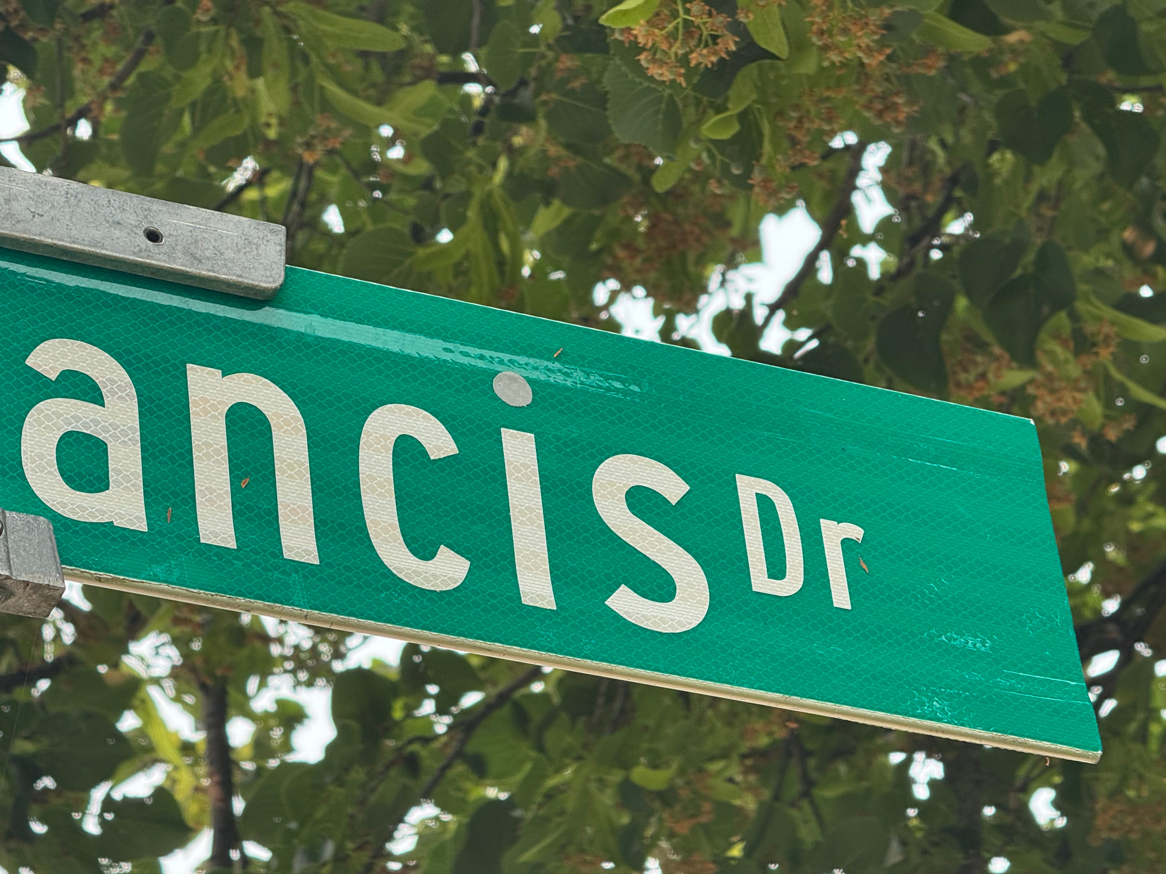
So even though Kurt no longer works in Allouez, he’s left his mark on the town — literally.
Unless anyone can provide evidence to the contrary, I think we can safely say that the Rozek brothers take the prize for being IC’s most sign-obsessed siblings. I mentioned this to Norb, who wrote back:
My one experience similar to my brother’s dotting of the “i” was when I had a janitorial gig at an office complex in the ’80s. My boss had had some signs made up that I was supposed to go around affixing. They read “NO PARKING — VIOLATORS WILL BE TOWED AT OWNER’S EXPENCE.” I was flabbergasted that no one caught “EXPENCE” at any step of the process.
After informing my supervisor of the error, I was told to go put the signs up anyway. My reward for pointing out the spelling mistake was to go back around to all the signs the next day with a bunch of little cover-up “S” stickers that they made to fix the problem. I put one of the stickers upside-down as some manner of statement or protest or something. Needless to say, no one caught it.
I will add one last thought here: I am not a fan of municipalities putting their town logo (or tourism logo, or whatever) on the left side of their street signs, as both Green Bay and Allouez have done. I’m not sure when this trend began, but there’s something about it that makes the sign feel more promotional than informational. How do you people feel about this?
And Speaking of Road Signs…
You may recall that my friend Liz Clayton was visiting family last year in Michigan City, Indiana, and sent us this photo of an unusually growth-stunted Stop sign, using her four-foot-tall daughter for scale:
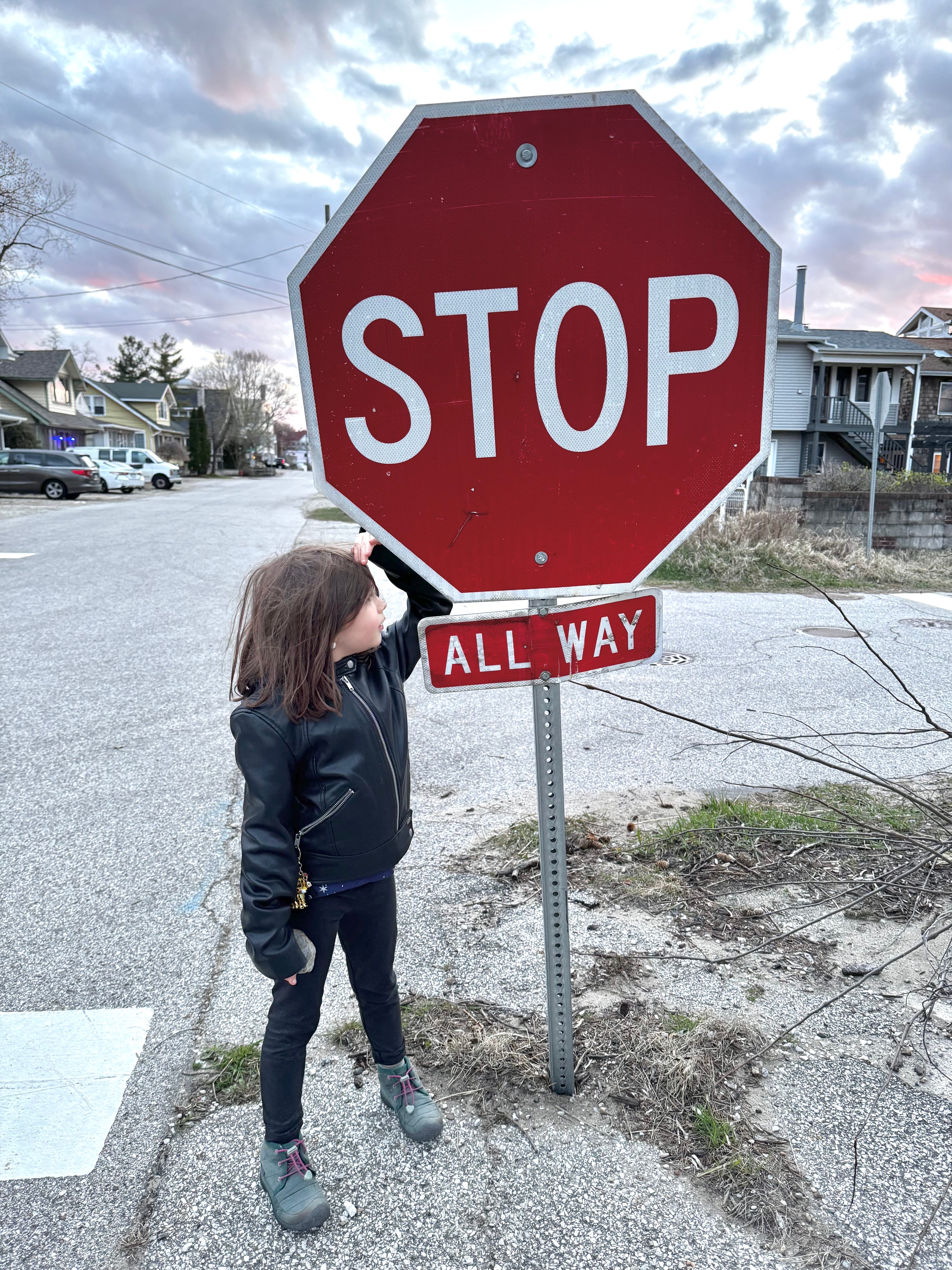
Liz was recently back in Michigan City and saw that the Stop sign is still very short, but with a new twist:
As Liz put it when texting me the new photo, “This stop sign just can’t win!”

Inconspicuous News Roundup

I’ve written before about artists who specialize in miniatures. If you liked those posts, you’ll love this article about photographer David Gilliver, who creates some really clever scenes out of tiny elements.
Really fun development on the stationery front: envelopes made from old U.S. Geological Survey maps! (From Jason Hillyer)
Nice, thoughtful review of a new book featuring photos of abandoned houses in and around Baltimore. (Another one from Jason Hillyer)
Size matters: The famous Oscar Mayer weinermobile got stuck in a tunnel! (From Adriene Zepka)
Here’s a faaaascinating piece on the newest movie craze: collectible popcorn buckets. That article is both informative and very entertainingly written — highly recommended!
It’s been so hot in Japan that they had to come up with a new word for it.

Meanwhile, in Case You Hadn’t Heard…

I think most of you know this by now, but just in case: I recently announced that the Uni Watch blog will go dark at the end of July, but that will not be the end of Uni Watch, because I’m moving the operations over to Substack, where I’ll be posting about uni-related items now and then. You can see my introductory post here. I’ll be publishing a new article early next week; you can make sure that you see it by subscribing. (It’s free for now, but I may be adding a paywall soon-ish.)
Inconspicuous Consumption is still my main priority, but I’m happy to keep Uni Watch going, even if at a much slower pace than in the past. Thanks to everyone who’s already subscribed!
Paul Lukas has been obsessing over the inconspicuous for most of his life, and has been writing about those obsessions for more than 30 years. You can contact him here.
This isn't about fonts, but this brings to mind a 1 mile stretch of ostensibly the same road near my house that has five different names. In the span of that 1 mile, the name changes from Katie Kerr Dr., to Arcadia Ave., to Sams Crossing, to N Arcadia Ave., to Dekalb Industrial Way. And no apostrophe on Sams!
Fun entry today, thanks Norb, and Paul for running it. On the Venn Diagram of my interests and Paul's, street signs is definately in the intersection of the circles, pun defanitely intended. Just yesterday I left my neighborhood the 'back way' due to street repaving and noticed that the streets closer to that end had new street signs. They had some sort of badge or logo, the type you find in historic neighborhoods (which ours is NOT). I need to go back and take a closer look. I hope they extend them throughout the subdivision because the ones near me have been up for 40+ years and need replacing.
Another thing this brought to mind was back a few years we were my mother-in-laws caretakers and went to her place quite often. IHer neightborhood had blue street signs as opposed tot he green ones the rest of the area had. I never needed to know the name of the street that led to her house because it was the first blue street sign and it meant turn right. I made that turns hundreds of times and never knew the name of the street, just that the first blue sign meant 'turn here'.