The 2024 Uni Watch MLB Season Preview
Our annual (and final!) compendium of everything you need to know about this season’s new uniforms, logos, patches, throwbacks, sleeve ads, stadium updates, and more.
Reminder: Uni Watch’s time on Substack will be coming to a close in late May. After that, I’ll be taking a break for at least a month, and then my Substack will return in the summer with a new name and a new subject focus. To learn more about all of this, including what it will mean for those of you with paid subscriptions, look here. — Paul
The annual Uni Watch MLB Season Preview holds a special place in my heart. For starters, baseball is my favorite sport and the one whose visual culture I follow most obsessively, so I love reporting on each season’s new uniforms and try to get as granular as possible. Perhaps because of that, the MLB Preview is almost always the biggest and most popular Uni Watch piece of the year.
In addition, the MLB Preview has a foundational role in Uni Watch history, because the very first Uni Watch column, published in The Village Voice in May of 1999, was a rundown of that season’s MLB uniform changes — sort of a de facto “preview,” even though the season had already started.
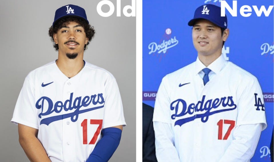
But this year’s MLB Preview resonates even more strongly than usual, for two reasons. First, I plan to stop writing about uniforms on May 26 (which is the 25th anniversary of that first Village Voice column), so this will be my final MLB Preview. Also, unless you’ve been under a very large rock, you’re probably aware that Major League Baseball’s new 2024 uniforms, rendered in Nike’s new tailoring template, have been the source of some serious controversy in recent months. That controversy hangs over this year’s season-opening report like a big, ominous cloud, threatening to overwhelm all the more conventional design changes that are Uni Watch’s bread and butter.
So here’s what I’ve decided to do: First I’m going to run down the important MLB-wide changes brought about by Nike’s new template (let’s call that Part One). Then I’ll do the usual team-by-team rundown of this year’s design changes (Part Two). With one exception, which I’ll get to later, the things I address in Part One will not be repeated in Part Two. In other words, I will discuss Nike’s smaller NOB lettering in Part One, but I will not show every team’s new NOBs in Part Two.
So let’s proceed with Part One, with the caveat that while some of these changes may have implications for retail jerseys, that’s not our concern. As always, what matters here at Uni Watch HQ is how things look on the field when we’re watching a game. With that in mind, here are a dozen MLB uni changes that Nike hath wrought this year, and how they stack up from a Uni Watch standpoint:
1. The New Jersey Fabric
What’s happening: The jerseys (but not the pants) are now being rendered in a new fabric that looks like, well, a paper towel.
Why: Lighter, stretchier, blah-blah-blah.
Annoyance factor: Zero. The new texture isn’t visible except in extreme close-up shots.
2. The New “Sun Collar” Format
What’s happening: Many jerseys now have a seam running around the collar. It’s really two different fabrics — the jersey’s base fabric and then an insert. This format doesn’t appear on pinstriped jerseys, and many teams are using the insert for their collar piping. But for non-pinstriped jerseys with no piping (like the Brewers jersey shown above), the visual effect is sort of like the old-fashioned sun collars.
Why: It appears to be a standardization thing, so collar trim can always be added as a separate attachment, instead of applied as decorative braid.
Annoyance factor: Medium. I don’t like how the seam looks on jerseys without collar trim, but it isn’t visible except in relatively tight camera shots.
3. The New Sleeve Trim
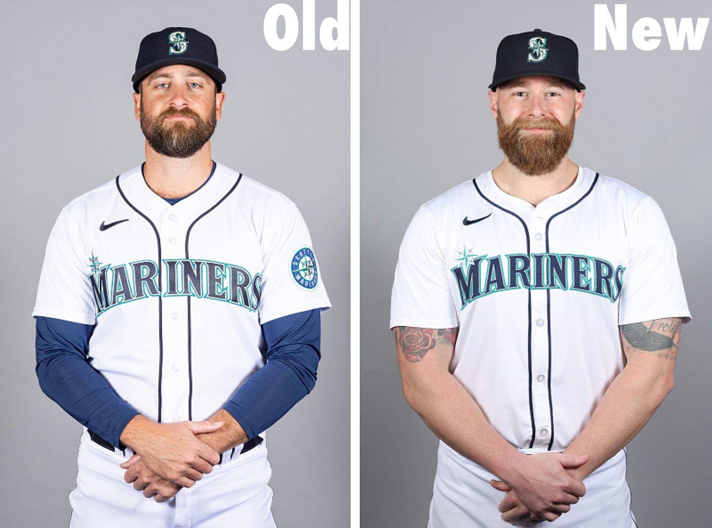
What’s happening: Decorative braid that once appeared on many teams’ jersey sleeves has been banished. Instead, sleeves now have a ribbed insert attached to the cuff (much like the insert on the new collars), and Nike has used this trim to mimic the decorative braid.
The photo above shows how they’re handling teams with multi-colored sleeve trim. For single-color trim, the mimicry effect is a bit better (from a distance, it’s harder to tell the difference):
Why: Standardization. Every sleeve is now constructed the same way.
Annoyance factor: Medium-low. Some people seem very bent out of shape about this one, but I don’t mind it that much.
4. The New Sleeve Patches
What’s happening: Team-logo sleeve patches, which were previously embroidered, are now printed.
Why: Printed patches are lighter, thinner, and more flexible, so they supposedly offer a teeny-tiny performance advantage.
Annoyance factor: On a conceptual level, an embroidered patch has a depth and texture that’s much more satisfying. But from a practical standpoint, it’s impossible to tell the difference unless you’re looking at very close range. The patches will still look fine when you’re watching a game on TV or looking at game photos.
5. The New Home “Whites”
What’s happening: Home uniforms are now slightly off-white instead of white.
Why: Good question! Nobody knows, and Nike has been tight-lipped about most of the new changes, including this one.
Annoyance factor: Zero. I haven’t even noticed the difference during televised spring training games or photo sessions, so this change is easy enough to ignore.
6. The Lower MLB Logo and Smaller NOB Lettering
What’s happening: The MLB logo on the back of the jersey is now lower, and the NOB lettering is smaller.
Why: According to ESPN Sunday Night Baseball analyst Eduardo Pérez, moving the logo down was MLB’s idea, because they wanted to make the logo more visible (perhaps due to the increasing number of players with long hair). And the smaller lettering is supposedly to make the jersey lighter.
Annoyance factor: High. The logo’s new position feels very awkward, and the smaller lettering feels dinky and cheap. (There are two teams that aren’t affected by the smaller lettering, however: the Yankees, because their jerseys don’t have NOBs, and the Royals, because they insisted on keeping the full-size lettering. Too bad no other team thought to do that.)
And speaking of things that have gotten smaller…
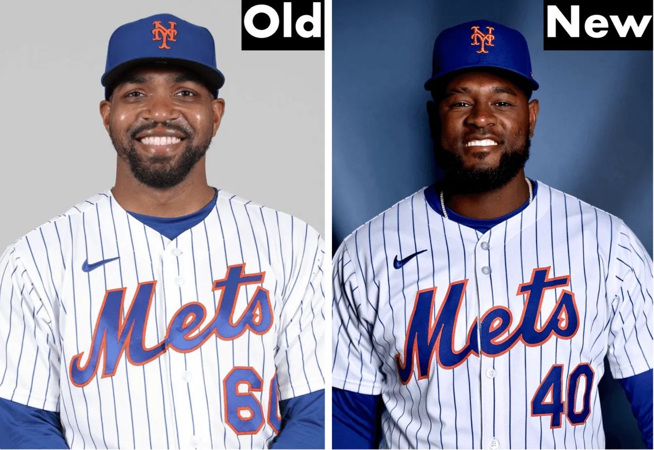
7. The New Front Numbers
What’s happening: For teams that have front jersey numbers, those numbers are now smaller. Back numbers are slightly smaller as well, but the change is more apparent, at least to me, on the front.
Why: Standardization, so all numbers are now the same size.
Annoyance factor: Medium. I don’t like the new number size, but I suspect I’ll get used to it a lot faster than I’ll get used to the new NOB letters.
And speaking of numbers…
8. The Perforated Number Fabric
What’s happening: Front and back uni numbers now have little pinhole perforations — at least for some teams.
Why: To make the jersey lighter, more breathable, blah-blah-blah.
Annoyance factor: Minimal. Much like the new jersey fabric, the pinholes generally aren’t visible except in extreme close-up shots.
9. The Narrower Placket Piping
What’s happening: For teams whose jerseys feature a headspoon — that’s the Uni Watch term for the two lines of decorative trim that run along the button placket and around the collar — the spacing between those two lines has been narrowed.
Why: Unclear. But the narrower placket means that the left side of the jersey (i.e., the buttonhole side) doesn’t extend quite as far as it once did, which means the jersey now uses a bit less fabric, which in turn means it’s another 0.000002% lighter, so that’s probably the reason.
Annoyance factor: High. Much like the smaller NOB lettering, the narrower headspoon looks frustratingly dinky, like something you’d see on a cheap knockoff jersey.
10. The New Lettering Breaks
What’s happening: Some teams’ chest lettering is now intersected by the placket break at a visually awkward spot.
Why: As noted above, the leading edge of the buttonhole side of the jersey doesn’t extend as far as it once did, so these new lettering breaks are a side effect of that change.
Annoyance factor: Off the charts. Many teams had carefully crafted their chest lettering over the years to create clean, smooth placket breaks. All that work has now gone down the drain. It’s unconscionable that Nike didn’t work with teams to adjust the size and/or configuration of their chest marks so that they’d fit snugly into the new template. Grrrrrr.
This is the one new-template item that I will call out in the team-by-team rundown, because (a) it affects some teams but not others, and (b) it reeeeeeaaally annoys me.
11. The New Belt Loops
What’s happening: All pants are now adorned with Nike’s diagonal-cut belt tunnels.
Why: Standardization, presumably.
Annoyance factor: Medium. The new format isn’t so bad per se. But as you’ll see later in this article, a few teams’ signature belt loop elements have been eliminated along the way, which is disappointing.
12. “Limited-Use” Uniforms Get Even More Limited
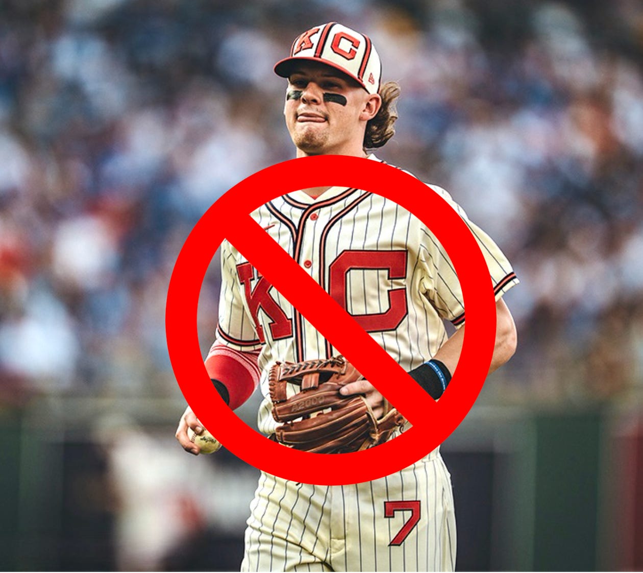
What’s happening: Although nothing has been publicly announced, multiple sources tell Uni Watch that most “limited-use uniforms” (that’s MLB’s term for one-off designs that are worn for just a game or two, like a Negro League throwback or a Spanish-language jersey) are going on hiatus this year. Limited-use caps are okay, but not jerseys or pants.
Why: Nike already has its hands full with the changeover to the new template and is trying to keep things simple this year. The one-offs will presumably return next season.
Annoyance factor: High. One-off throwbacks are almost always enjoyable, and ditto for designs like the Giants’ “Gigantes” jersey and the Brewers’ “Cerveceros” jersey. This seems like just the latest example of Nike not being up to the task that they signed on for.
One of my sources says a few one-off designs have been given reprieves from this prohibition. The Blue Jays, for example, will still be able to wear their red jerseys on Canada Day, and the Giants and Cardinals will wear Negro League throwbacks for their June 20 game at Rickwood Field in Alabama (more on that later in this article). And although my source didn’t mention anything about the Red Sox’s “Boston Strong” jerseys, I’d be stunned if they weren’t permitted to wear those, as usual, on Patriots’ Day in April. Still, the scaling back of other one-off designs is disappointing, and adds yet another dimension to this season’s uni-related mishegoss.
———
You may be thinking, “Wait, what about the see-through pants?” And yeah, it’s true that a lot of photos taken over the past month or so seemed to show the white home pants being rather transparent. However:
It turns out that this same phenomenon was observed in previous years, which isn’t surprising because…
This year’s pants fabric is exactly the same as what’s been used in previous years. And most importantly…
The see-through factor has not been observed at all during spring training games.
So this appears to be something that happens under bright photo studio lights and in some other other non-game situations, but it has no on-field implications, so we can safely ignore it.
Phew! With all of those preliminaries in mind, are you ready for our annual team-by-team rundown of this year’s uni changes? I bet you are! So with most teams opening their 2024 schedules this Thursday, March 28, here’s what you can expect to see on the diamond this season, one team at a time.


