Some Thoughts About Book Spine Design
Including a particularly interesting (and irksome) recent example.

When it comes to books, LPs, and CDs, I’ve always been fascinated by spine design. From an overall graphic design perspective, the spine isn’t as important as the front cover, but the spine is nonetheless what we see when the book or record is stowed on a shelf, so it’s important. When I’m at a record store, I’ll look at multiple copies of the same album to make sure I’m getting one whose spine typography is perfectly centered and legible. And when I worked as a book editor in the 1990s, I encouraged our company’s designers to think of the spine as its own little sub-niche — an opportunity for playfulness and creativity.
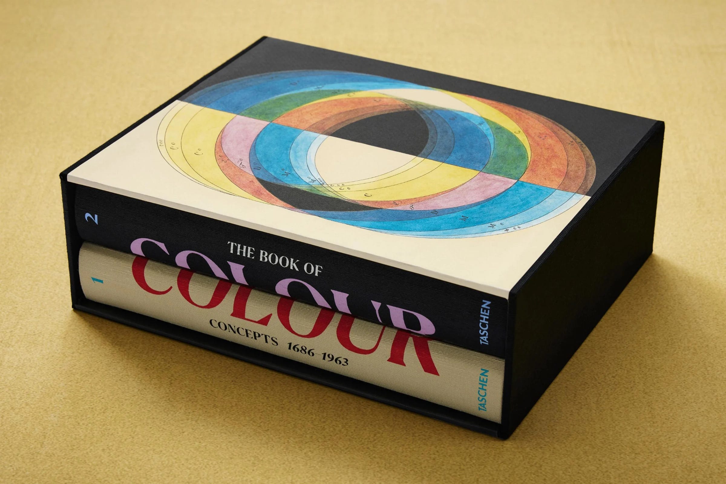
But sometimes you can get too creative. I think that’s what happened with The Book of Colour Concepts, which was published a few months ago by the luxe art imprint Taschen. The book, which traces the history of colo(u)r theory back to the 1600s, is over 800 pages and weighs over 13 pounds, so they’ve broken it up into two separate volumes packaged in a slipcase. Here are two views of it: