

Let’s Geek Out Over This Early-1990s MLB Style Guide!
From uniforms and logos to color swatches and sleeve patches, this guide had the official specs for every MLB team.

Before we get started, a quick note: This article includes lots of fairly detailed graphics that you’ll probably want to see at full size. So if possible, I suggest reading it on a laptop or desktop computer, not on your phone. — Paul
When you write about uniforms for a living, people sometimes approach you with unusual or specialized requests. That recently happened to me when I heard from a guy who said he once worked for a greeting card company that had partnered with Major League Baseball for a line of cards in the early 1990s. While working on that project, he’d been given a copy of the MLB Style Guide, which he had held onto over the ensuing three decades but was now looking to sell. He did a bit of googling, found some of my writing about style guides, and was wondering if I could tell him what his guide might be worth.
You probably know this already, but just in case: Every major sports league has an annual style guide that shows the official design specs for uniforms, logos, team colors, and so on. Manufacturers and licensees use those specs to create on-field uniforms and retail merchandise (including MLB greeting cards in the 1990s, apparently, although I have no memory of that). Nowadays the style guides are all kept on gated websites so the leagues can control access to them, but they used to be printed and mailed out to licensees. These vintage guides occasionally turn up on eBay or at collectibles shows, and they’re fascinating documents of uniform history. Each one is like the Rosetta Stone for a particular moment in a given league’s uniform timeline.
Over the years I’ve amassed a nice collection of old style guides from each of the Big Four pro leagues, but I didn’t have an MLB guide from the early 1990s (I had late-’90s and early-’80s), so I asked the greeting card guy if he’d consider selling his guide to me. We settled on a fair price and he sent me the guide, which is shown above.
As you can see, the guide came in a white binder. When you open the binder, the first thing you see is some frontmatter (I’ll get to that later in this article), and then there’s a series of two-page spreads — one for each of the then-current 26 MLB teams. Each spread consists of a color page and a black-and-white page, like this:
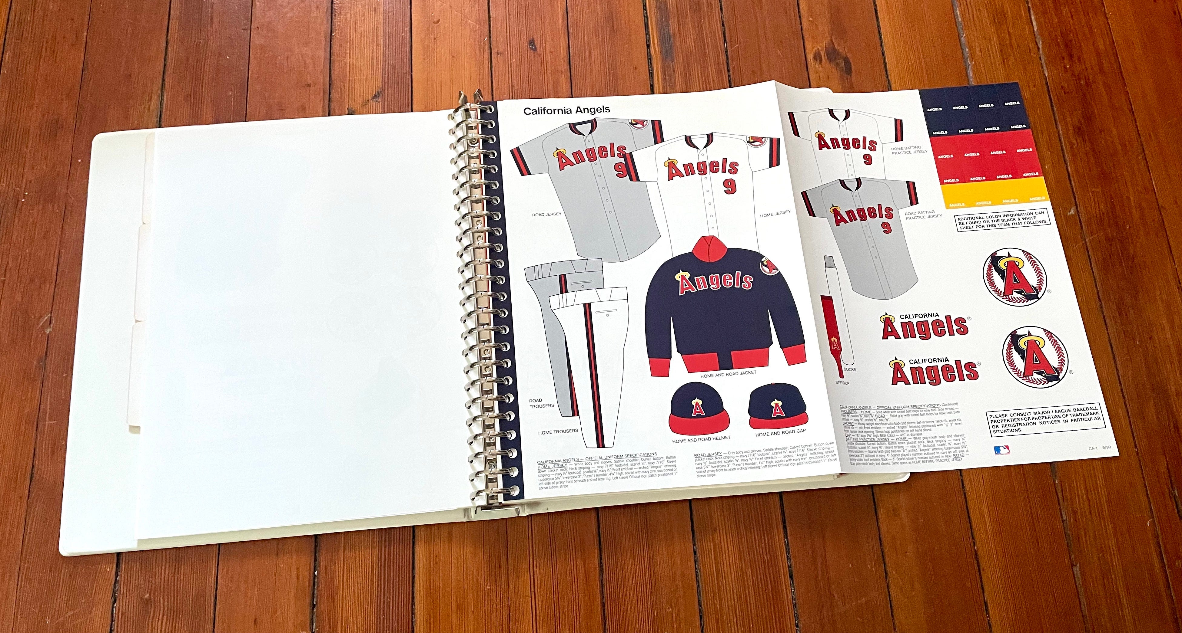
The color page then folds out to show you the team’s full uniform set, including jerseys, BP jerseys, pants, headwear, hosiery, and a dugout jacket:
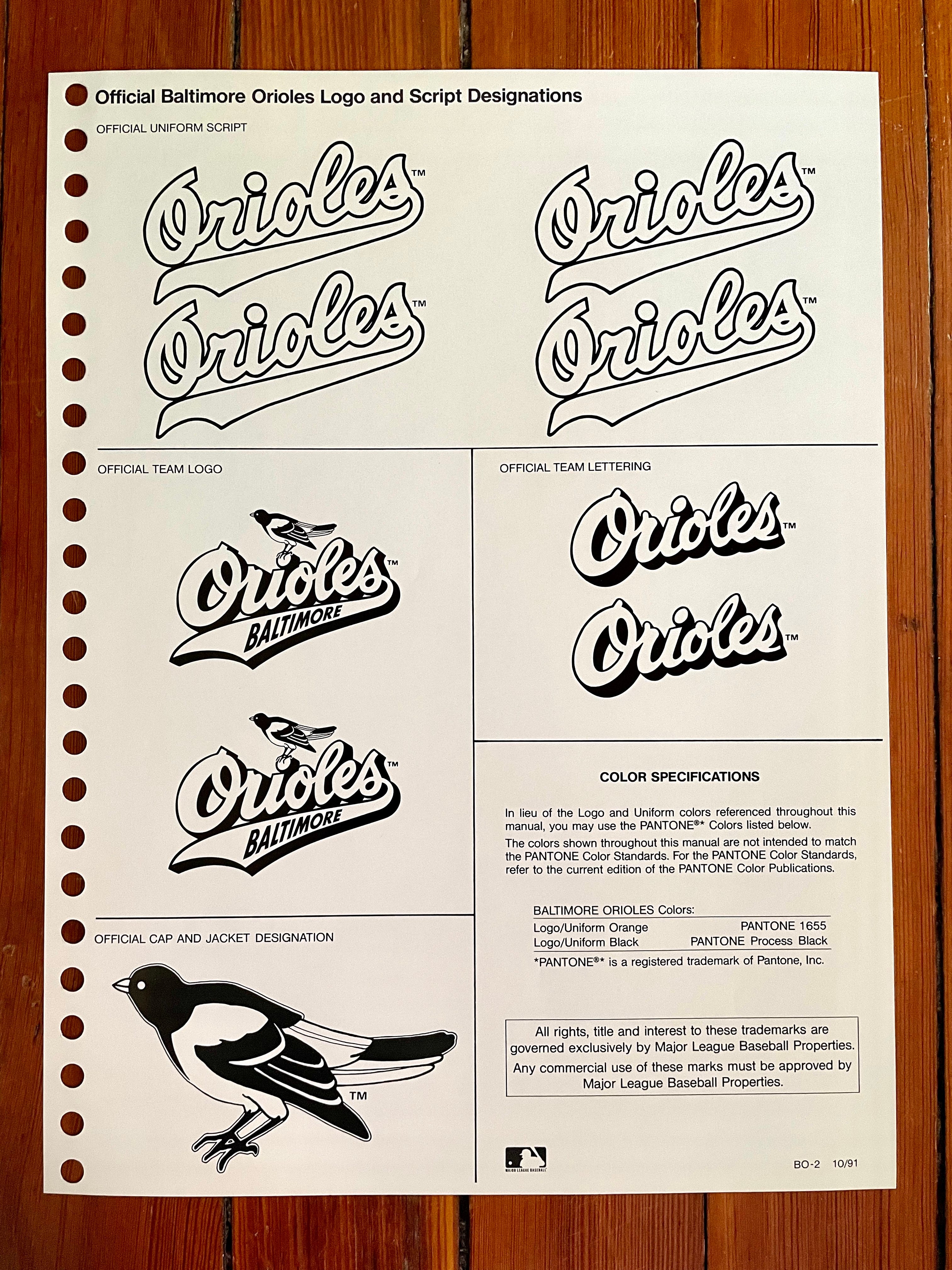
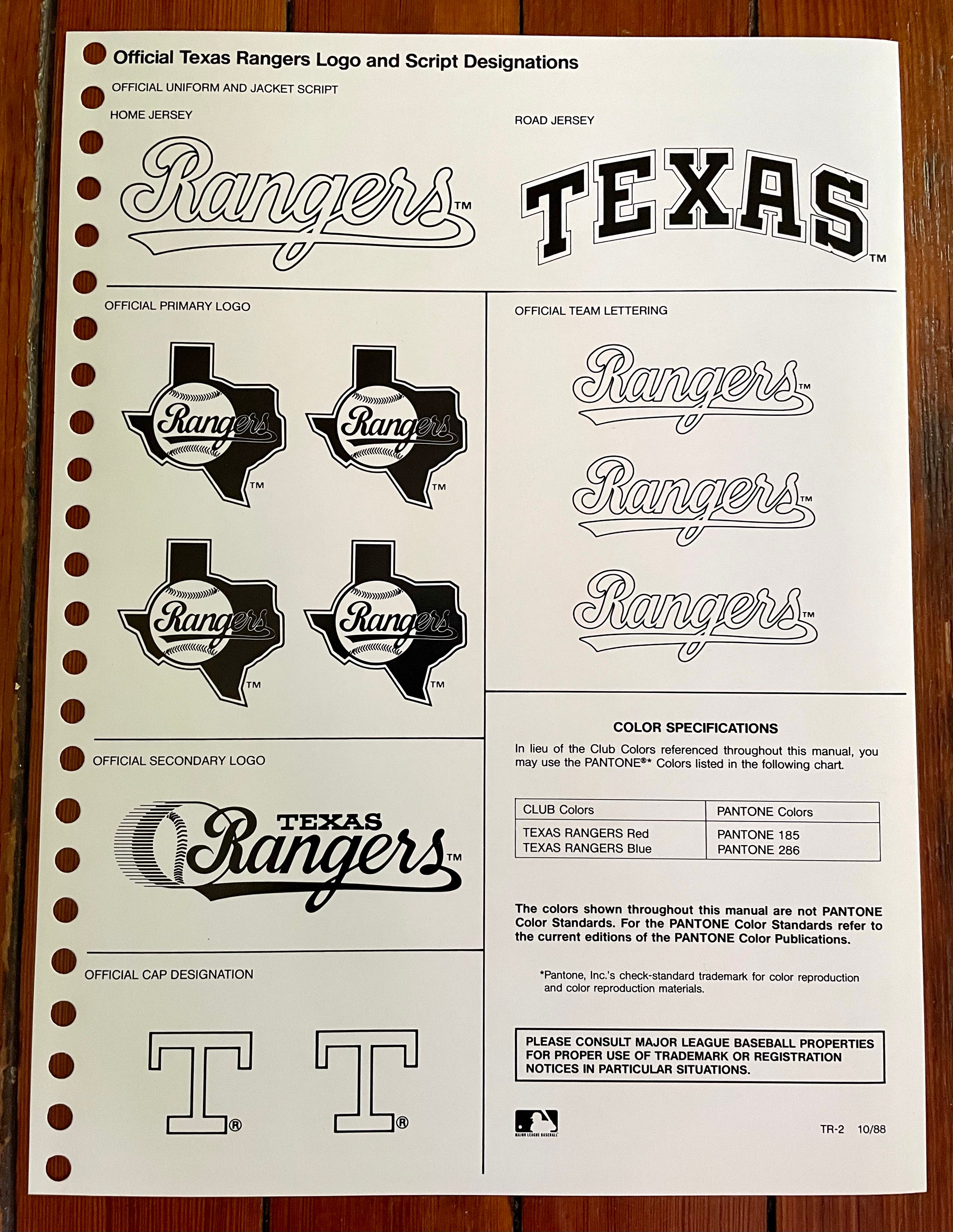
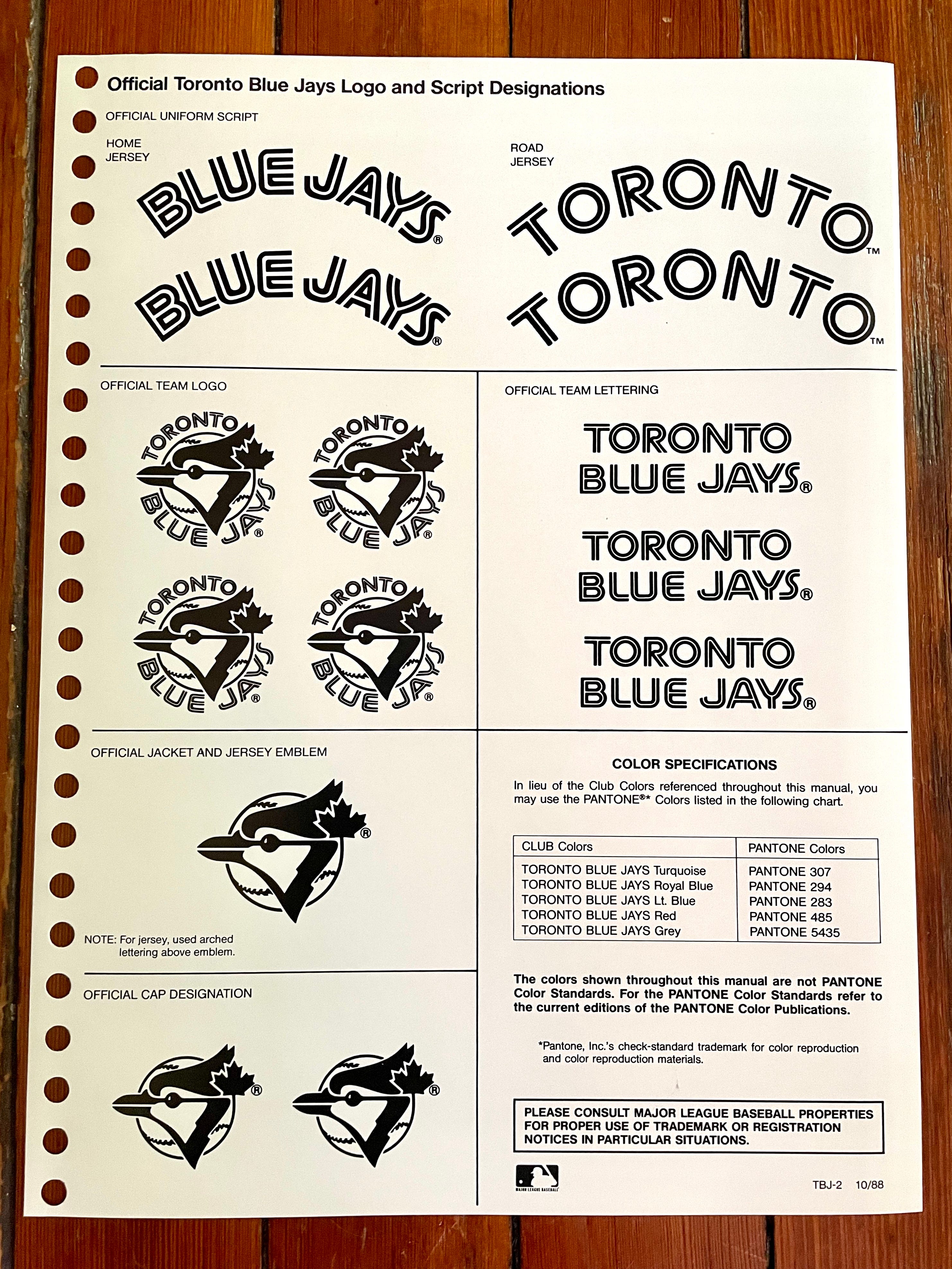
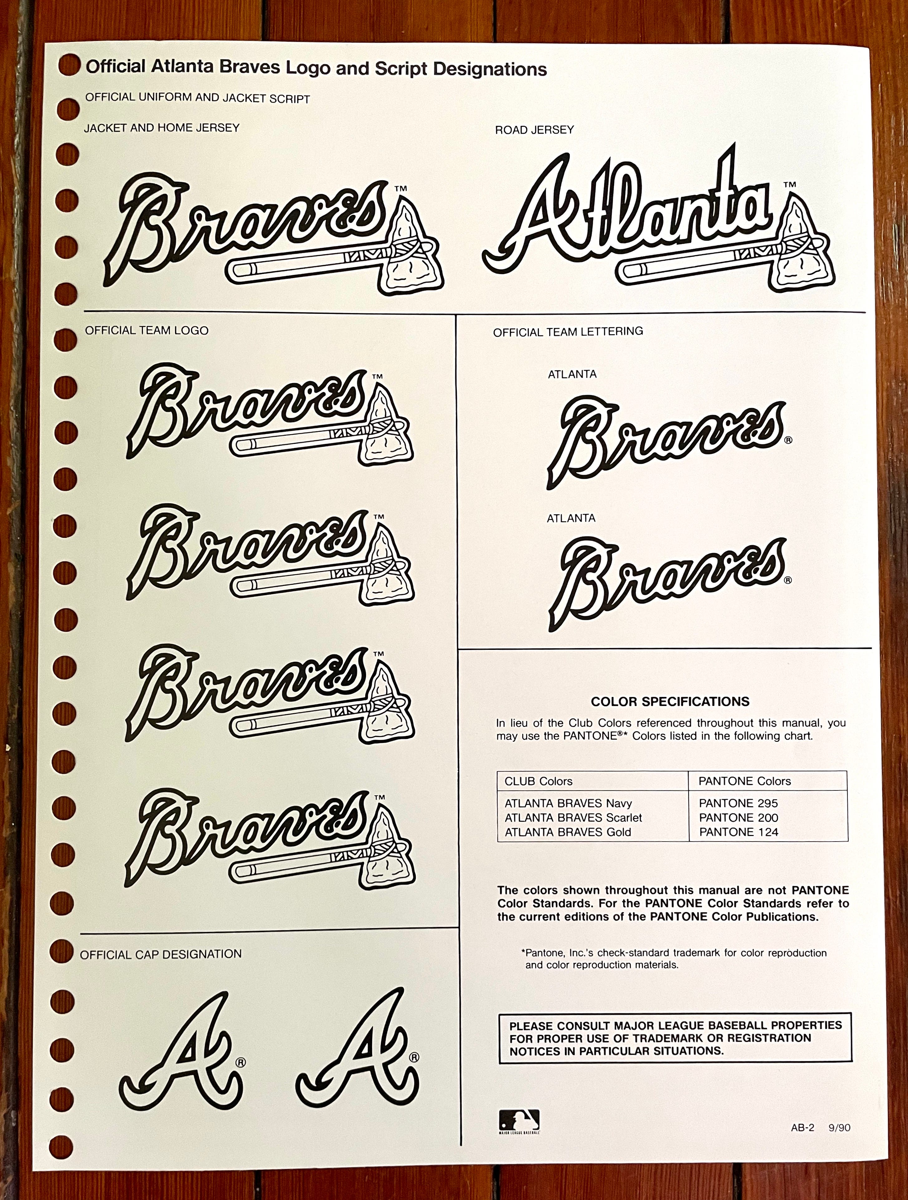
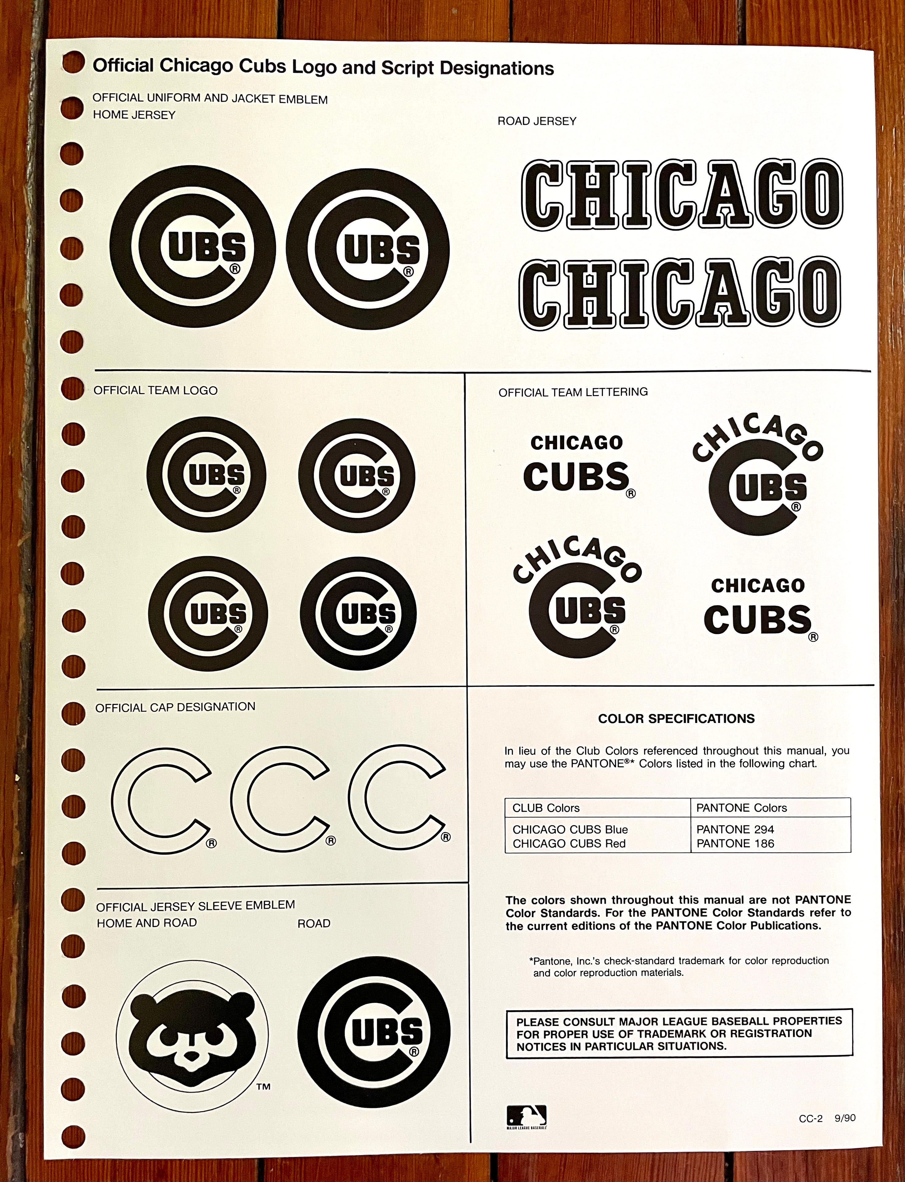
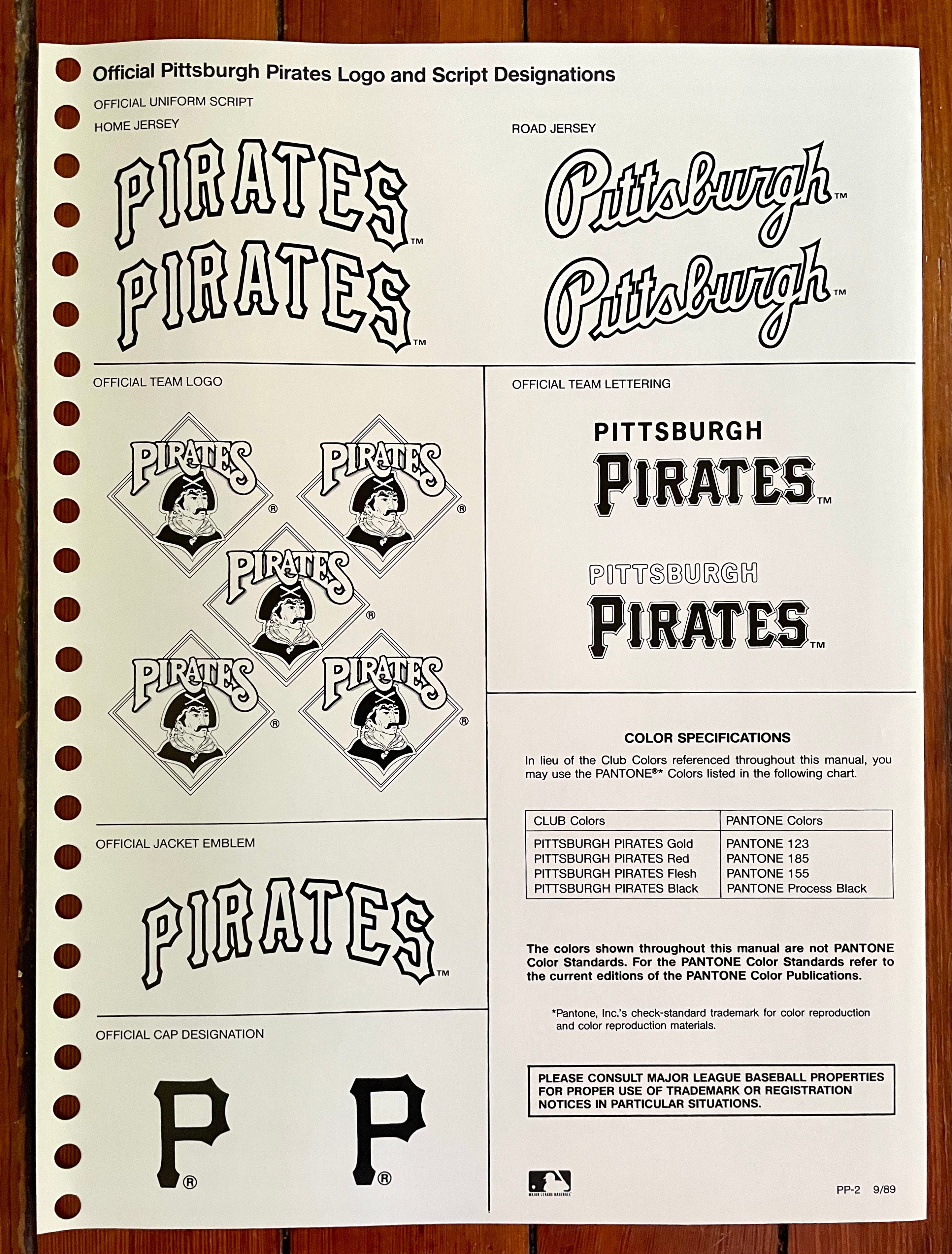
Those color fold-out pages are the main attraction, filled with juicy details to geek out over. The black-and-white pages, which are meant to be used as a printer’s camera copy, are less interesting but still have worthwhile info:
Style guide formats tend to vary across leagues and eras. Each one has its own protocols, rules, and conventions. Here are some of those conventions for this MLB guide (the orange-dot numbers correspond to the numbered list that follows the photo):
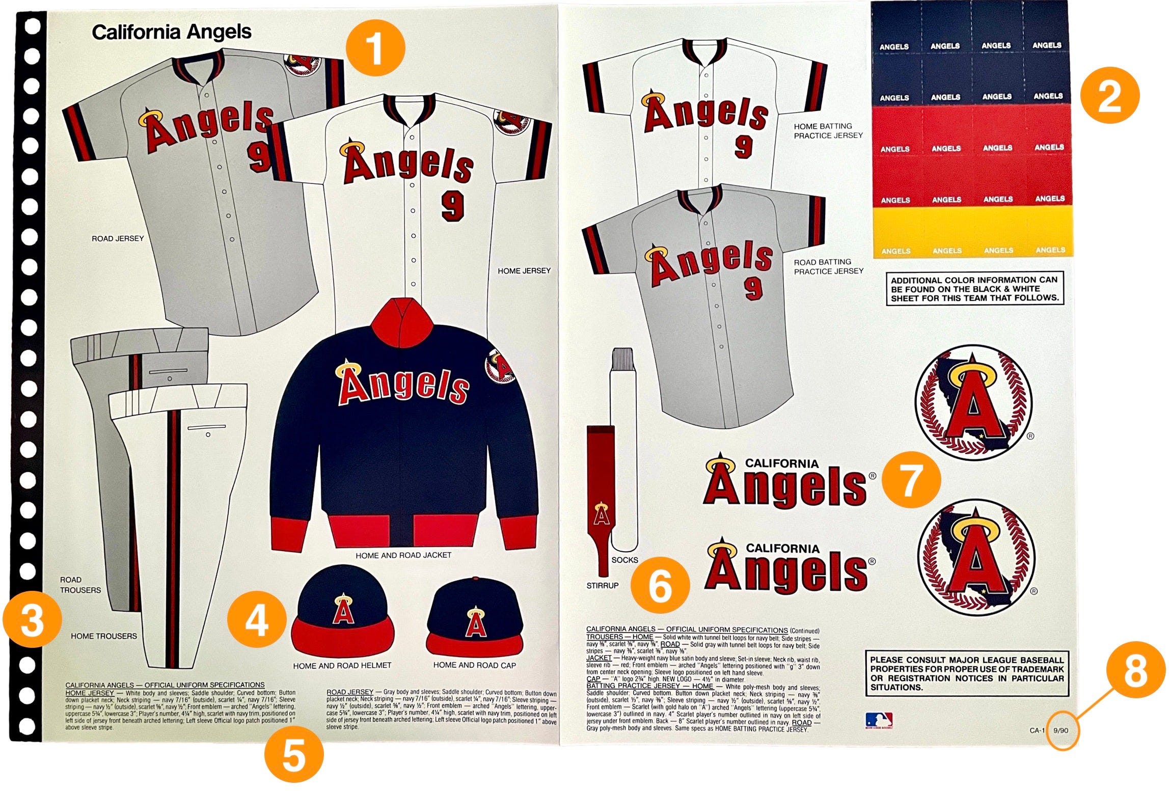
Home and road jerseys are always shown in the upper-left region. Sometimes, as in the case of this Angels sheet, the road jersey is shown first, which seems like an odd way of sequencing things. Unfortunately — and this is probably the guide’s biggest deficiency — we don’t get to see the backs of the jerseys. (MLB began showing rear-view mock-ups in the guide a few years later.)
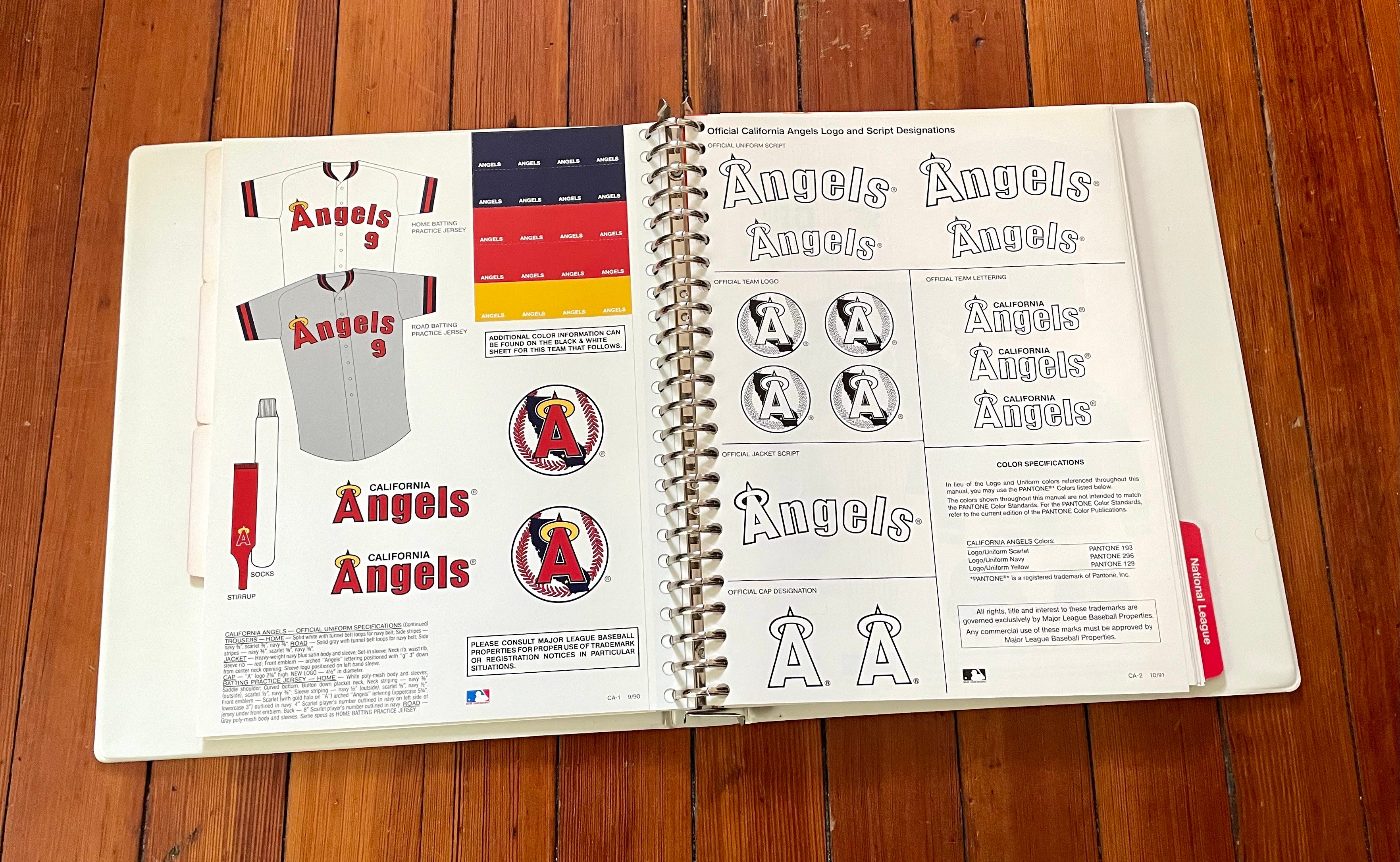
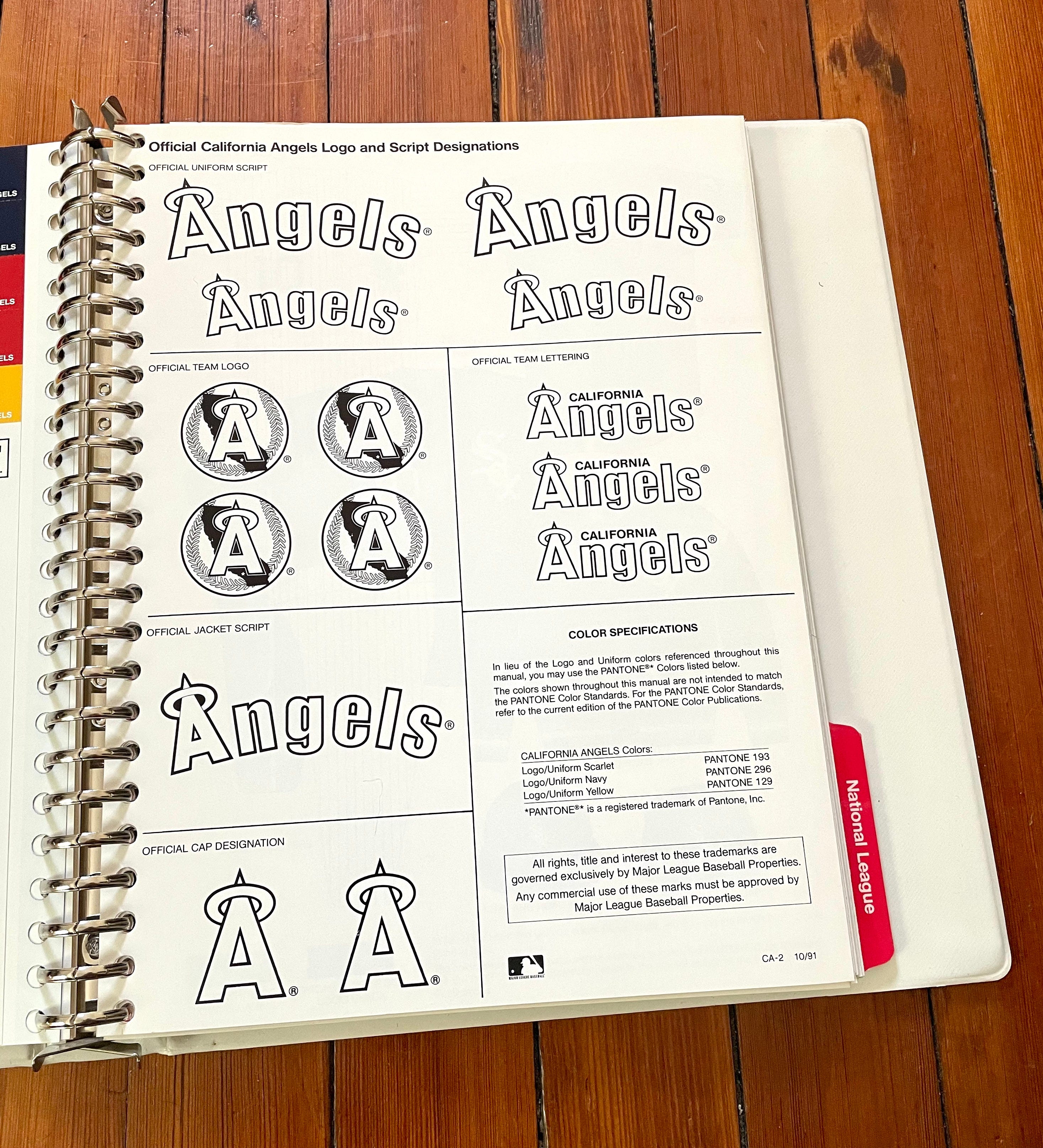
The color chips in the upper-right corner are perforated, so they can be removed for color-matching. In some vintage style guides, some of these chips have been removed, but all of them in this guide are intact.
Uniform pants are consistently referred to throughout the style guide as “trousers,” which seems hopelessly square.
Batting helmets are consistently shown without earflaps, even though most MLB players were wearing flaps by this point.
Most of the sheets include fine print at the bottom that spells out the uniform specs in exacting detail. Sample passage: “HOME JERSEY — White body and sleeves; saddle shoulder; curved bottom; button-down placket neck; neck striping — navy 7/16″ (outside), scarlet 1/4″, navy 7/16″; sleeve striping — navy 1/2″ (outside), scarlet 5/8″, navy 1/2″.”
Each team’s sheet shows one stirrup (labeled as “Stirrup,” singular) and one sanitary sock (“Socks,” plural).
For reasons that aren’t clear to me, most of the sheets show duplicate iterations of the team’s logos in the lower-right area. Including the logos seems like an obvious enough move, but why show them multiple times? It almost seems like they were just looking to fill the space.
A small but crucial detail can be found in the lower-right corner of each sheet, where a month and year are shown in fine print. Here’s a close-up:

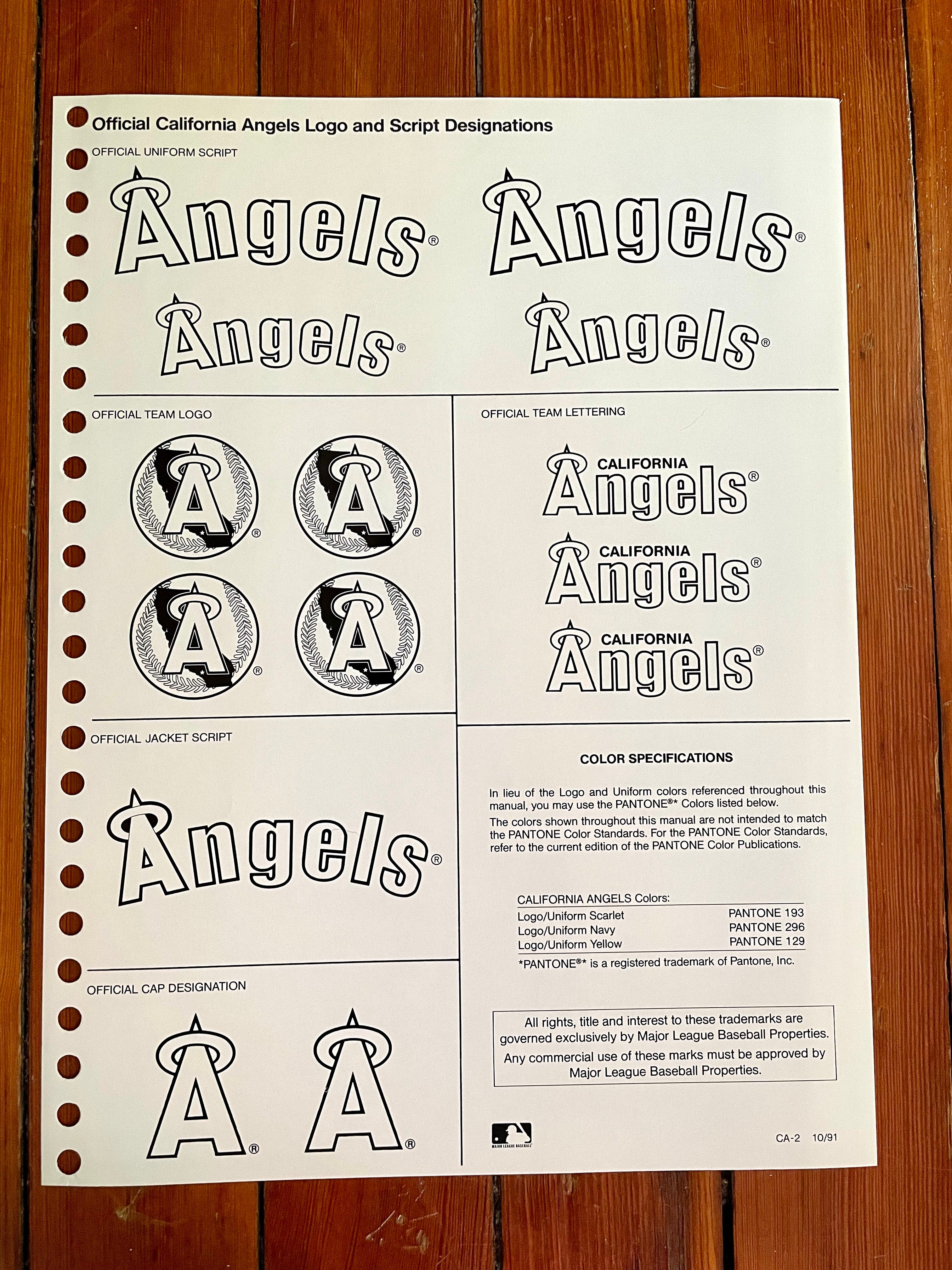
The “CA-1,” of course, tells us that this is the first sheet for the California Angels. (The accompanying black-and-white sheet is “CA-2.”) But the key info is that “9/90” notation, because it tells us that this sheet was issued in September of 1990, meaning it showed the Angels’ specs for the then-upcoming 1991 season. The idea was that new style sheets would be sent to licensees whenever a team changed its uniforms or other specs, and then the licensees could update their binders by swapping out the old sheets and inserting the updated ones. As a result, the sheets in this binder carry a variety of dates, ranging from 10/88 through 10/91. (MLB eventually abandoned this approach and began issuing annual style guides that covered all of the teams, even the ones that hadn’t made any changes since the previous season.)
So that’s the basic format. With that in mind, let’s take a team-by-team look at this style guide. For each club, I’ve photographed the color fold-out page and the accompanying black-and-white page, and I’ve also provided some comments and observations. (One caveat: The Phillies’ color sheet is missing — an annoying omission! The guy who sold the guide to me says he doesn’t know what happened to it. Whaddaya gonna do.)
Okay, ready to dive in? Here we go.
American League
Baltimore Orioles
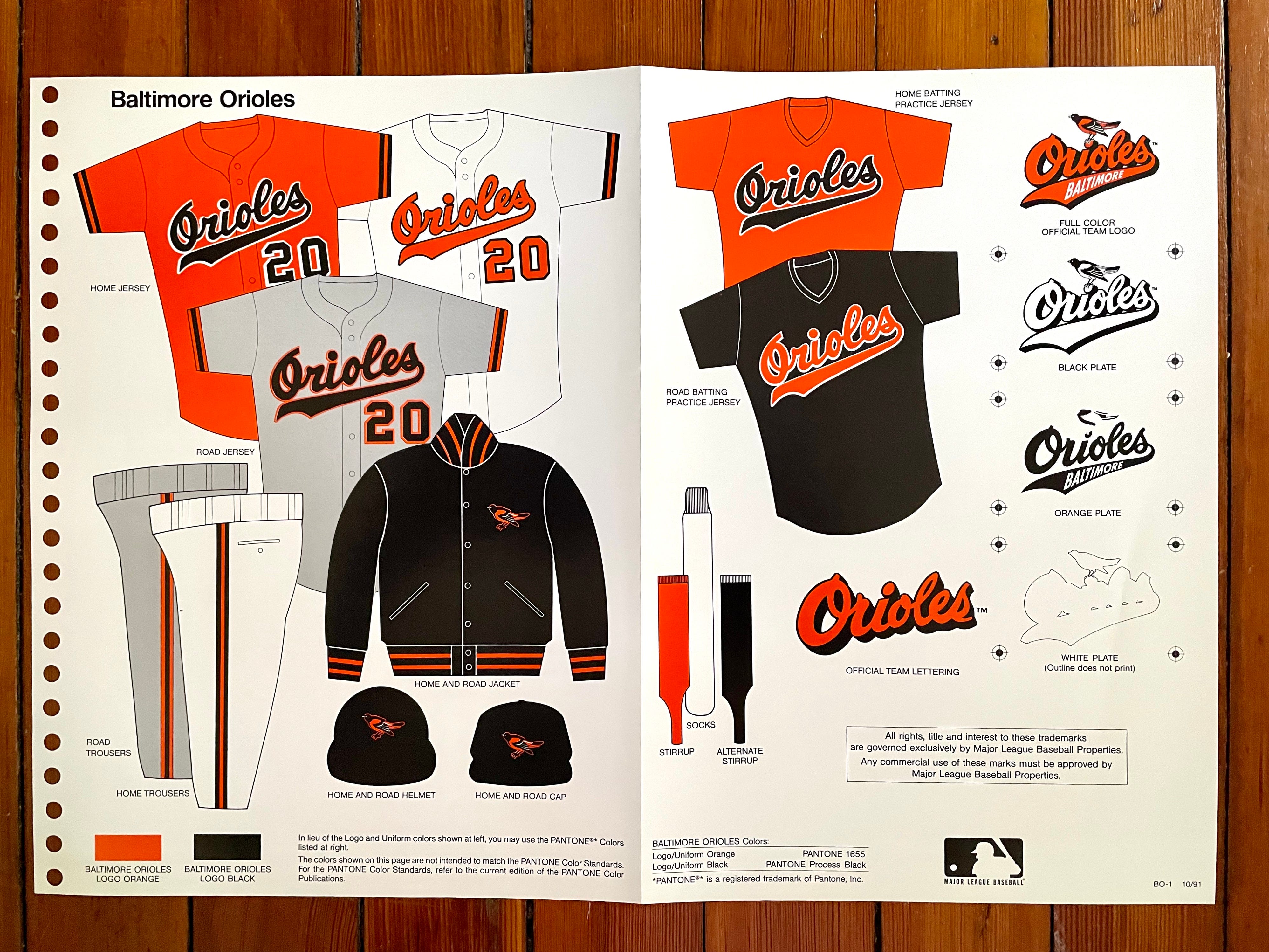
The Orioles are among the relatively few teams in the style guide to have an alternate jersey — and an alternate stirrup color!
Also, note that the trousers pants are depicted with a profusion of belt loops. I didn’t remember the O’s being particularly loop-heavy during this period, but sure enough, they were.
———
Boston Red Sox
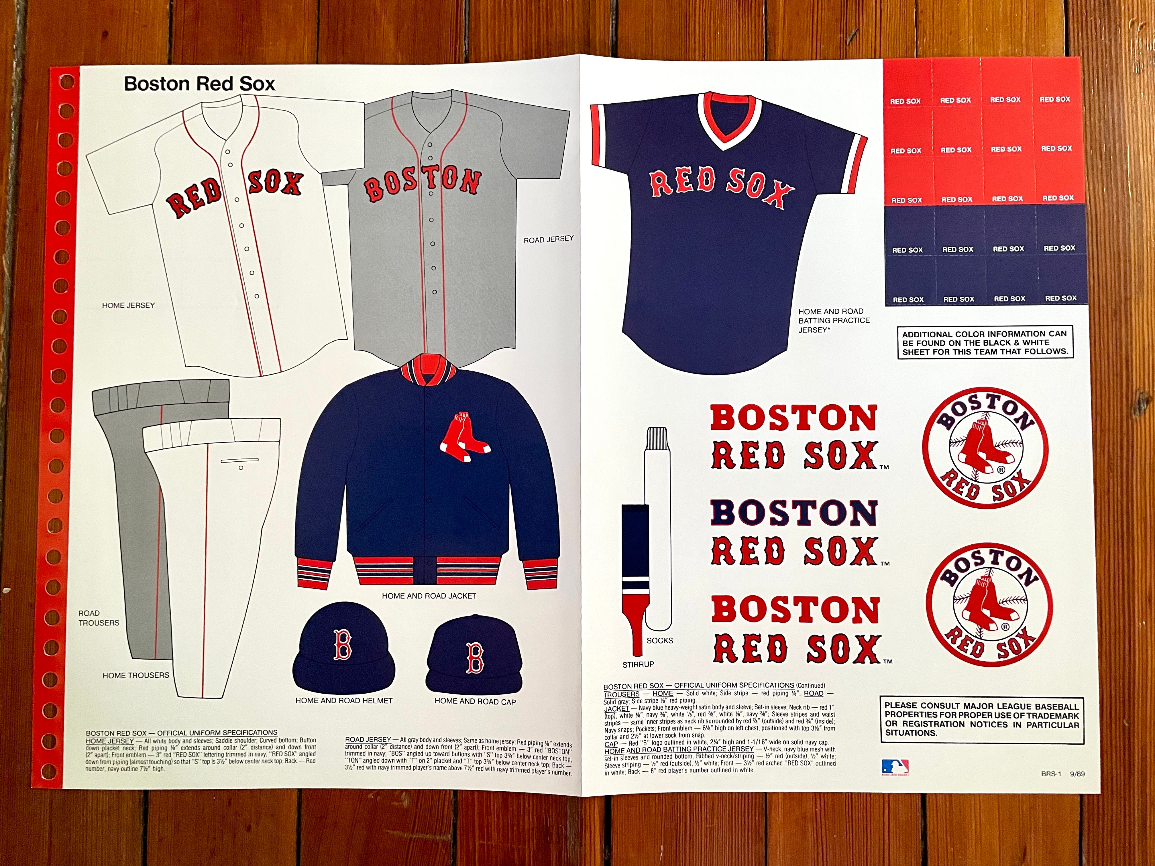
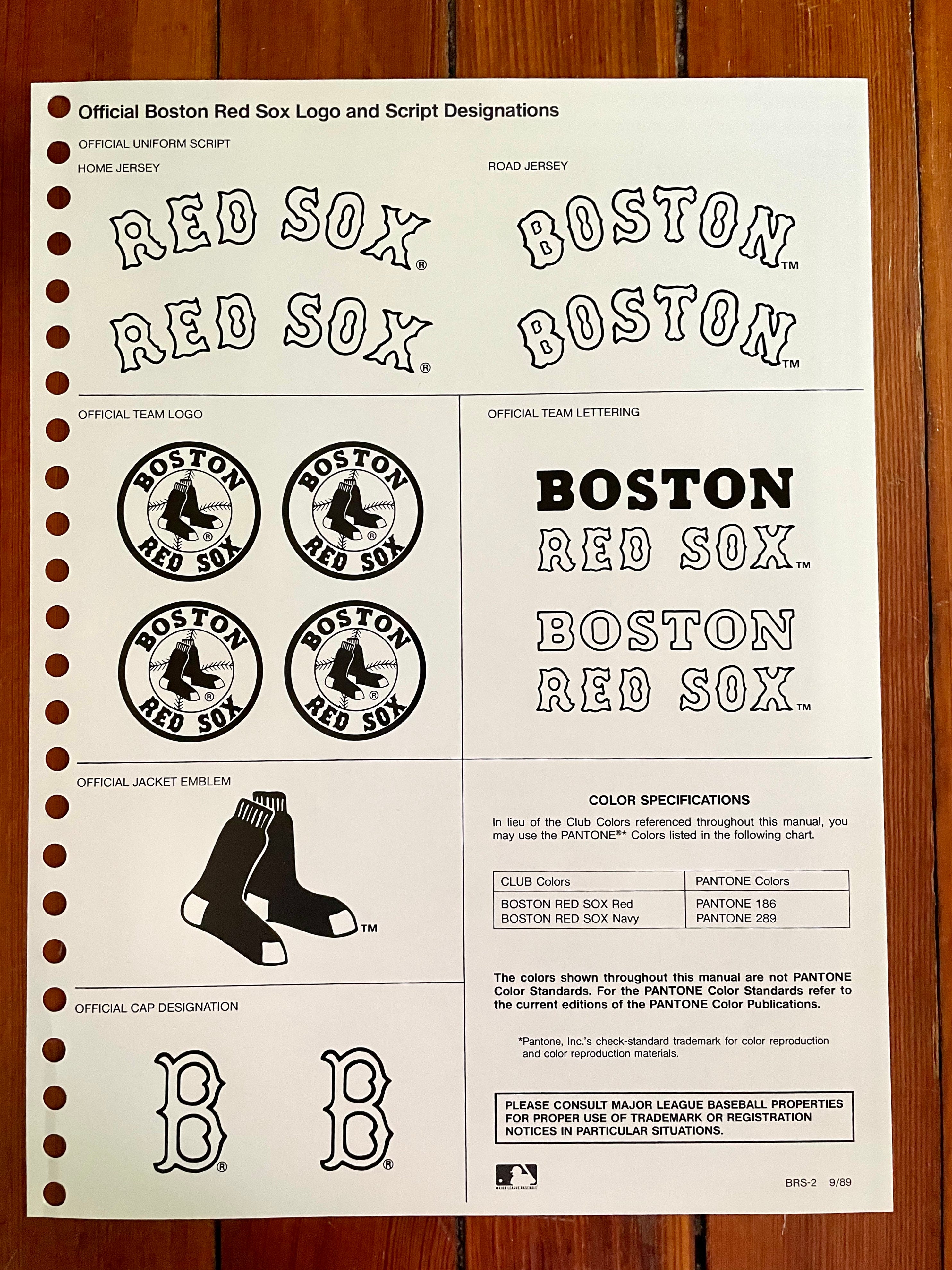
The weird thing here is that the style sheet shows the road jersey with headspoon piping — something the Red Sox have not had on their road greys since 1937! Maybe they initially planned go with the piping but changed their minds.
Also: If you look closely, you can see that the font on the jersey mock-up doesn’t match the “official” jersey lettering, especially on the “R”:

This inconsistency was part of the MLB Style Guide for many years but has since been corrected.
———
California Angels
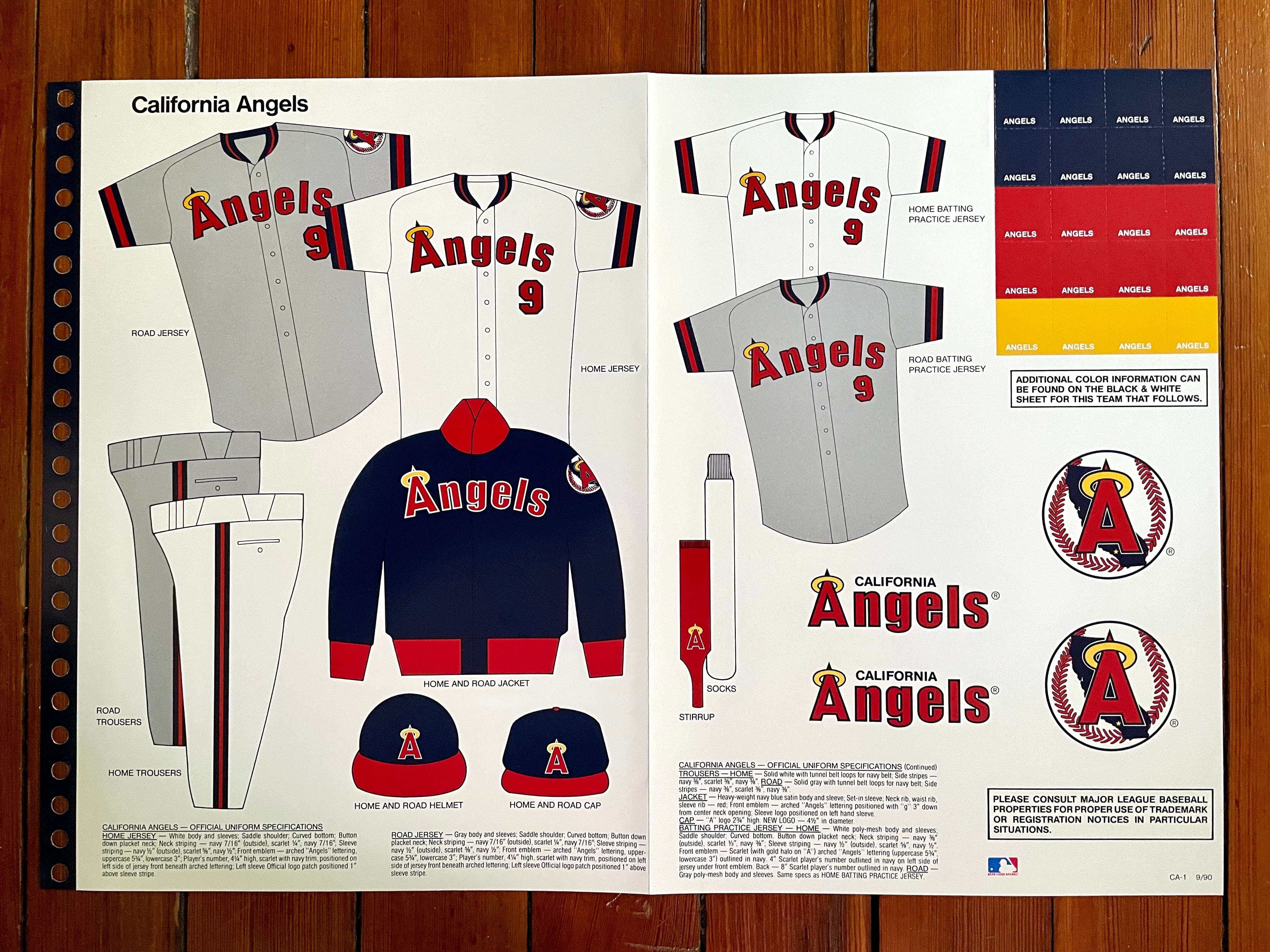
Always fun to see a stirrup design that includes the team’s logo, right? Many of the team’s players just wore plain red stirrups, so the logo wasn’t often seen on the field, but here’s a good view of it on Wally Joyner.
Also: Note that the BP jerseys are basically identical to the game jerseys, except for the sleeve patches. As noted in the fine-print description, however, the BP jerseys were rendered in a mesh fabric.
———
Chicago White Sox
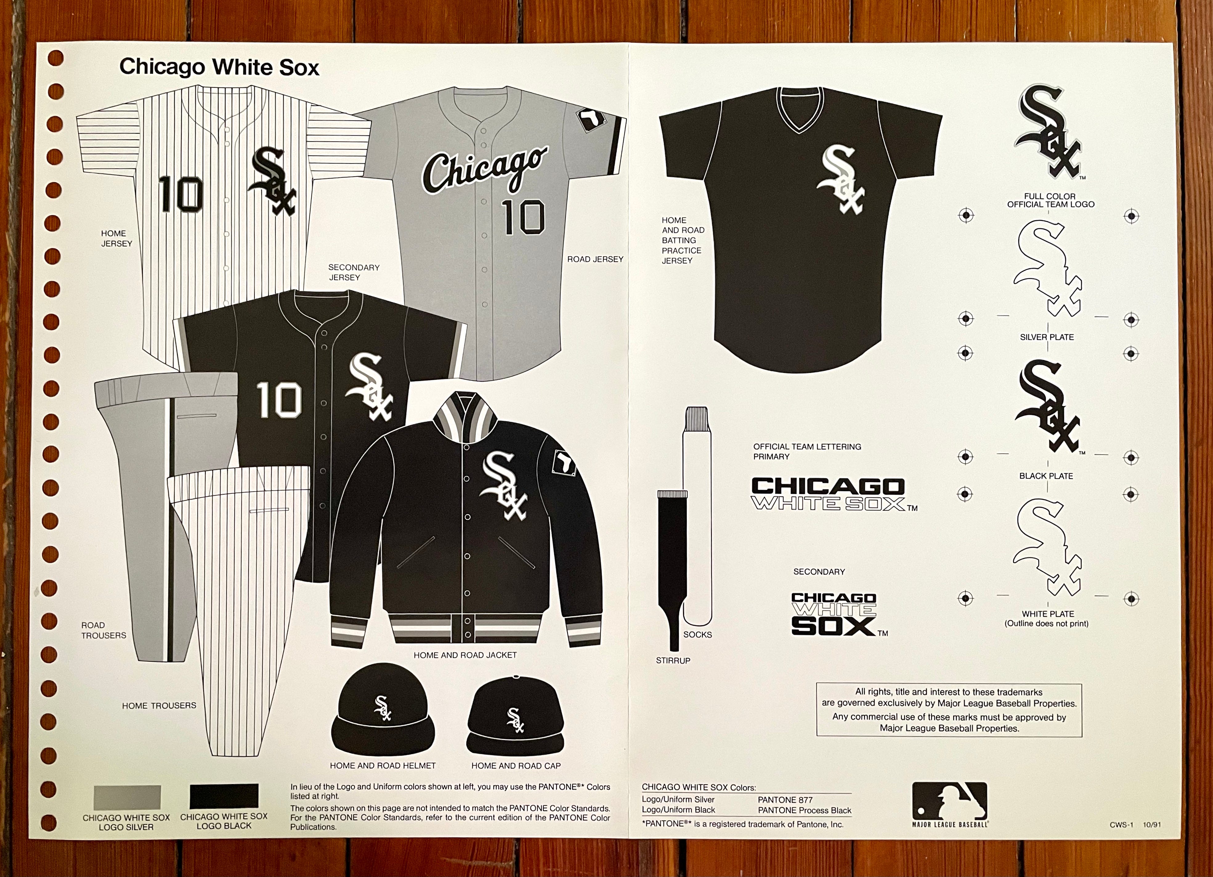
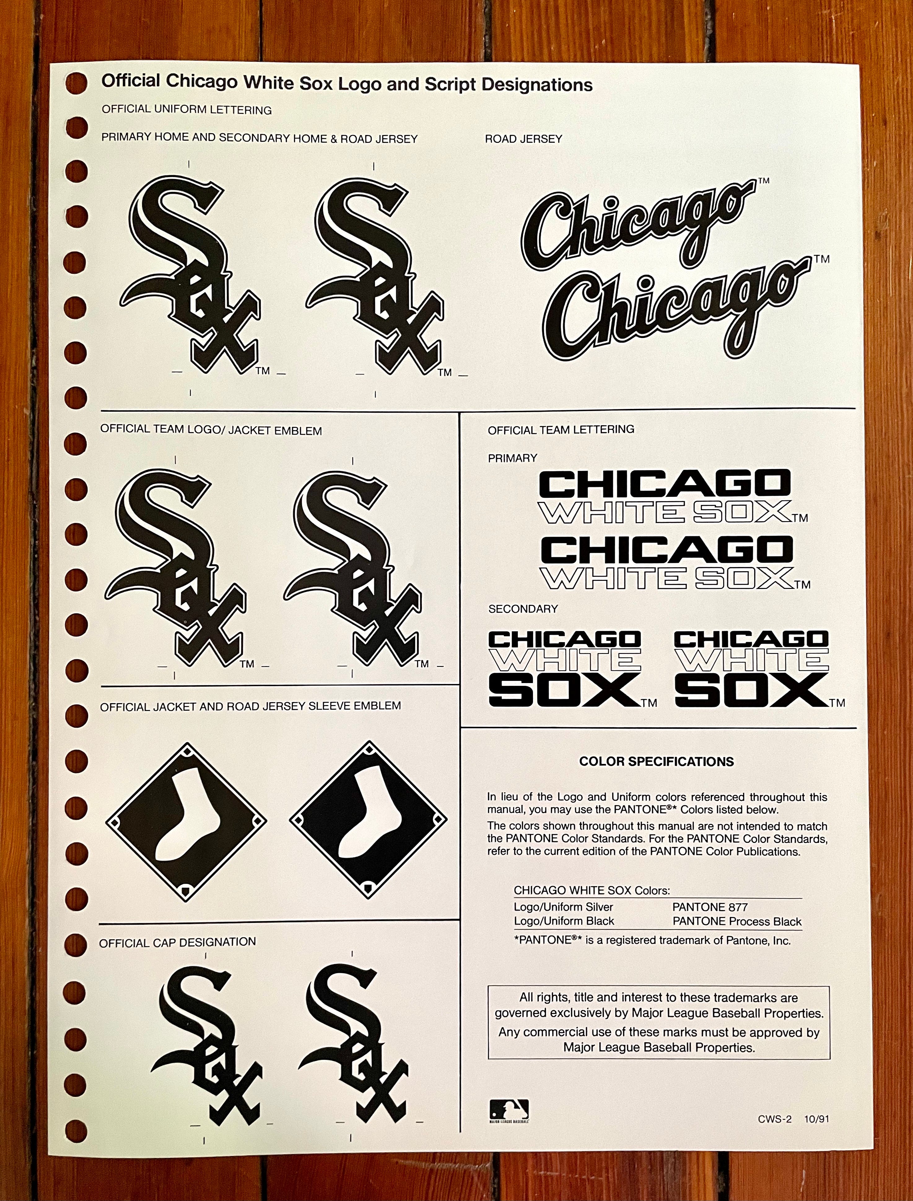
This is essentially the same thing that the Sox wear today. The funny thing is that they had a veritable revolving door of disparate uniform designs during the 25-season period from 1966 through 1990. In the three decades since then, however, they’ve been among baseball’s most visually stable franchises.
———
Cleveland Indians
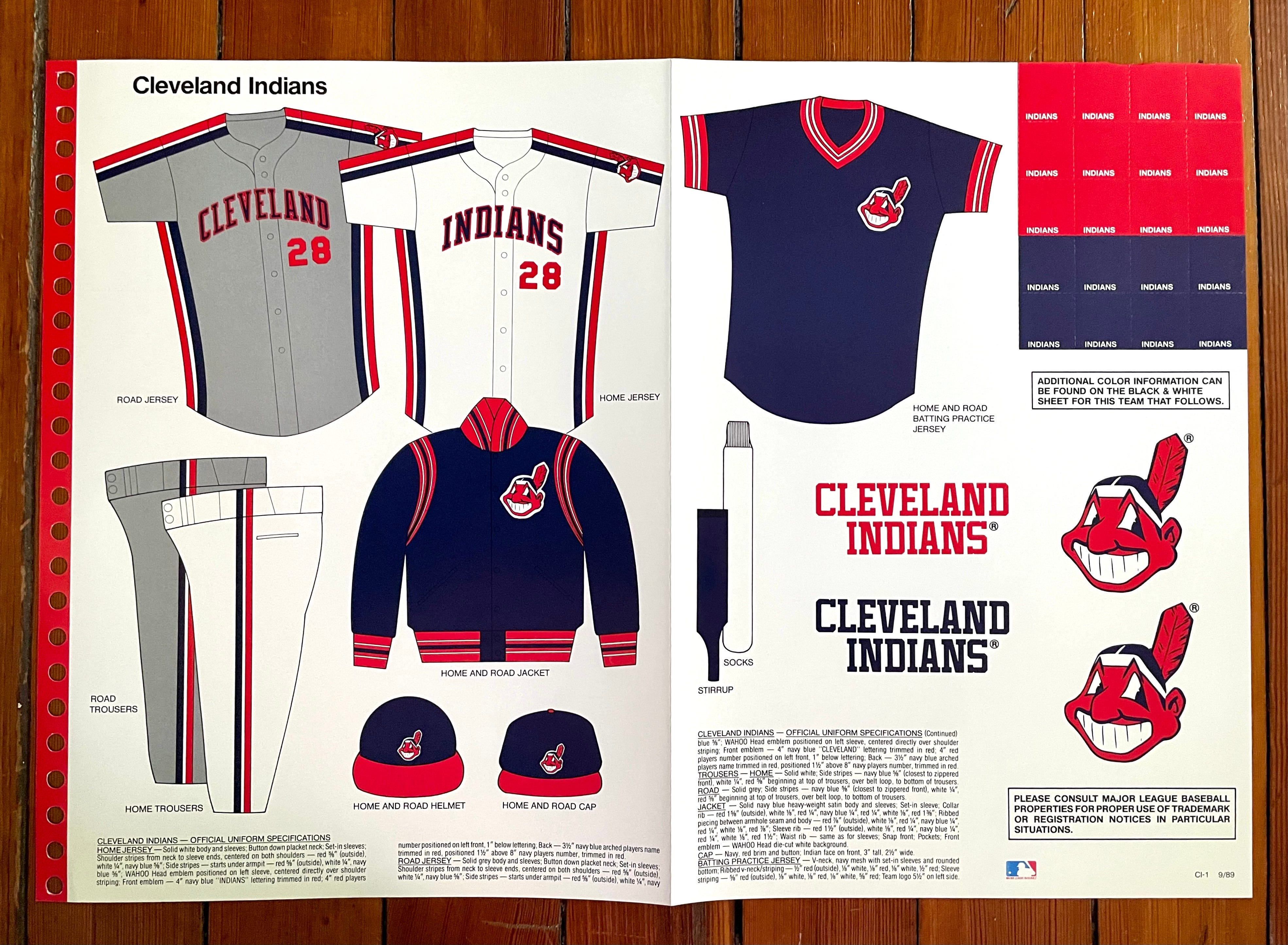
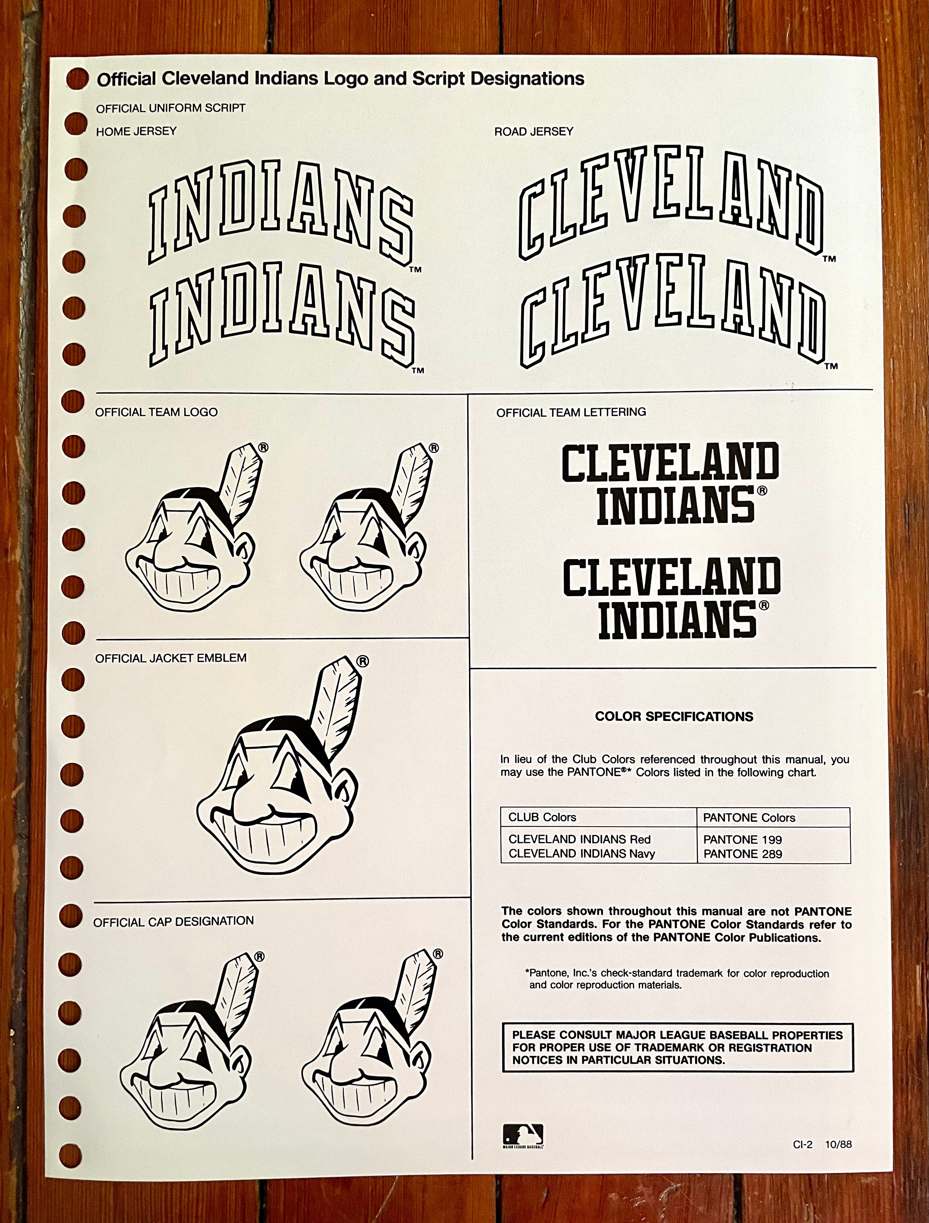
Oh man, that jersey piping looks sooooo dated, doesn’t it? I never liked it, not even at the time.
———
Detroit Tigers
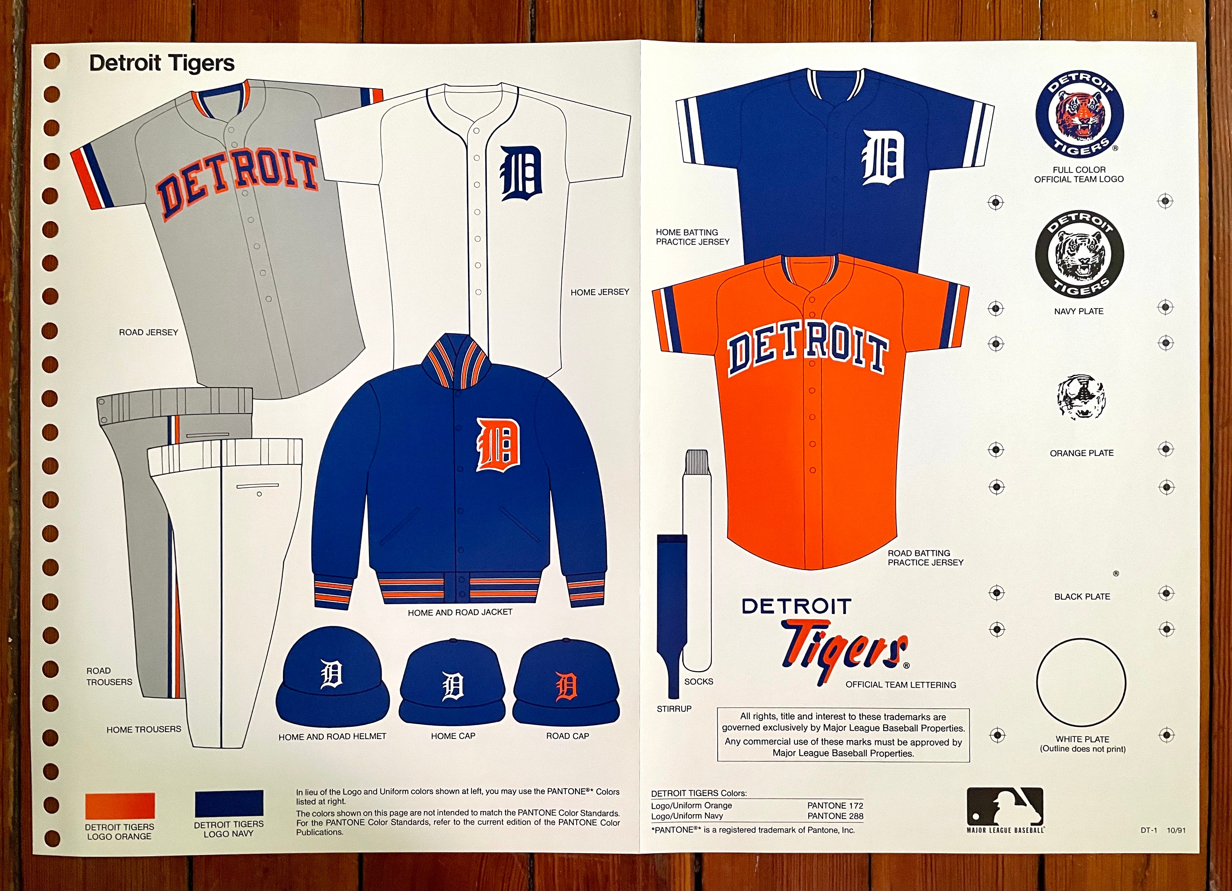
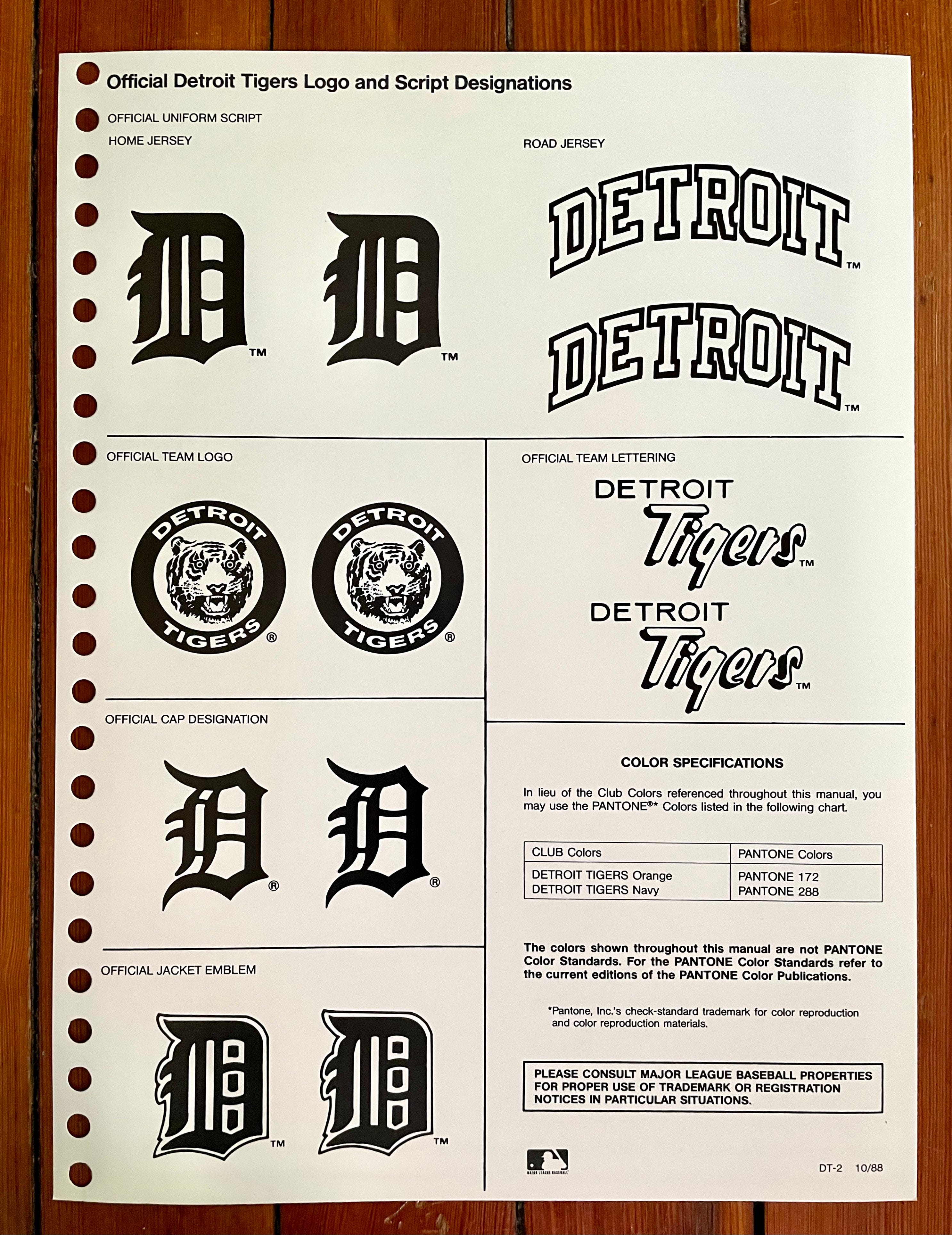
A few notes here:
The style sheet does not show the Tigers having separate home and road batting helmets, even though they did indeed use orange-”D” helmets on the road throughout the 1980s and ’90s (and still do so today).
The Tigers were another team that went heavy on the belt loops, which always felt particularly appropriate on Cecil Fielder.
Fun to see the mismatched cap and jersey versions of the Olde English “D” logo, one of those charming inconsistencies that have since been whitewashed out of existence.
———
Kansas City Royals
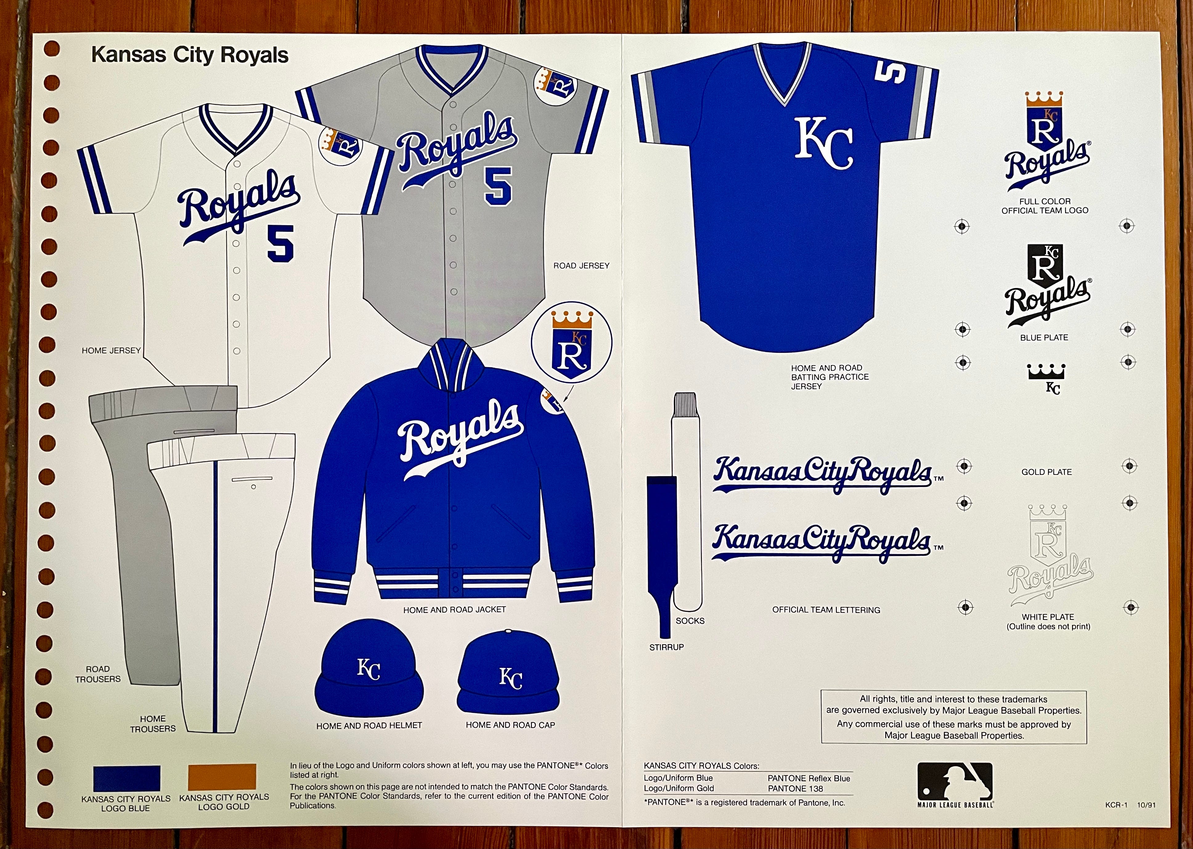
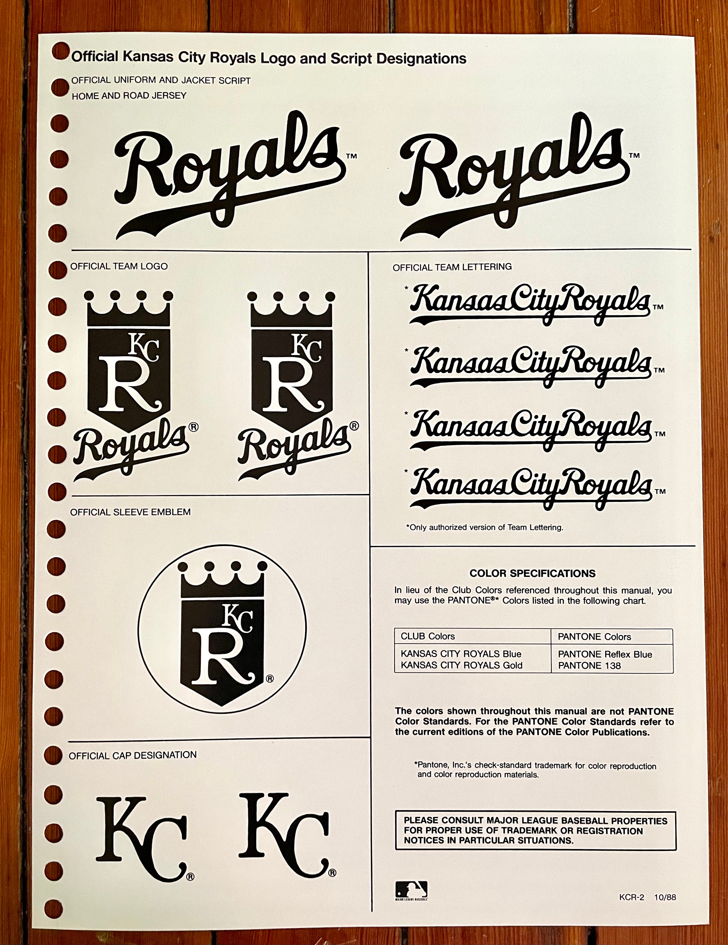
A few notes on this one:
The key elements of the Royals’ basic identity — the cap logo, jersey script, and secondary logo — have held up really well over the years. Classic and timeless.
Back in the early ’90s, their jerseys had raglan sleeves; since 2006, they’ve been wearing set-in sleeves (this comparison also shows the slight tweak that’s been made to the home script):

The style sheet shows a V-neck pullover BP jersey, but Bill Henderson’s jersey guide shows that they also dabbled with a zipper-front version:

———
Milwaukee Brewers
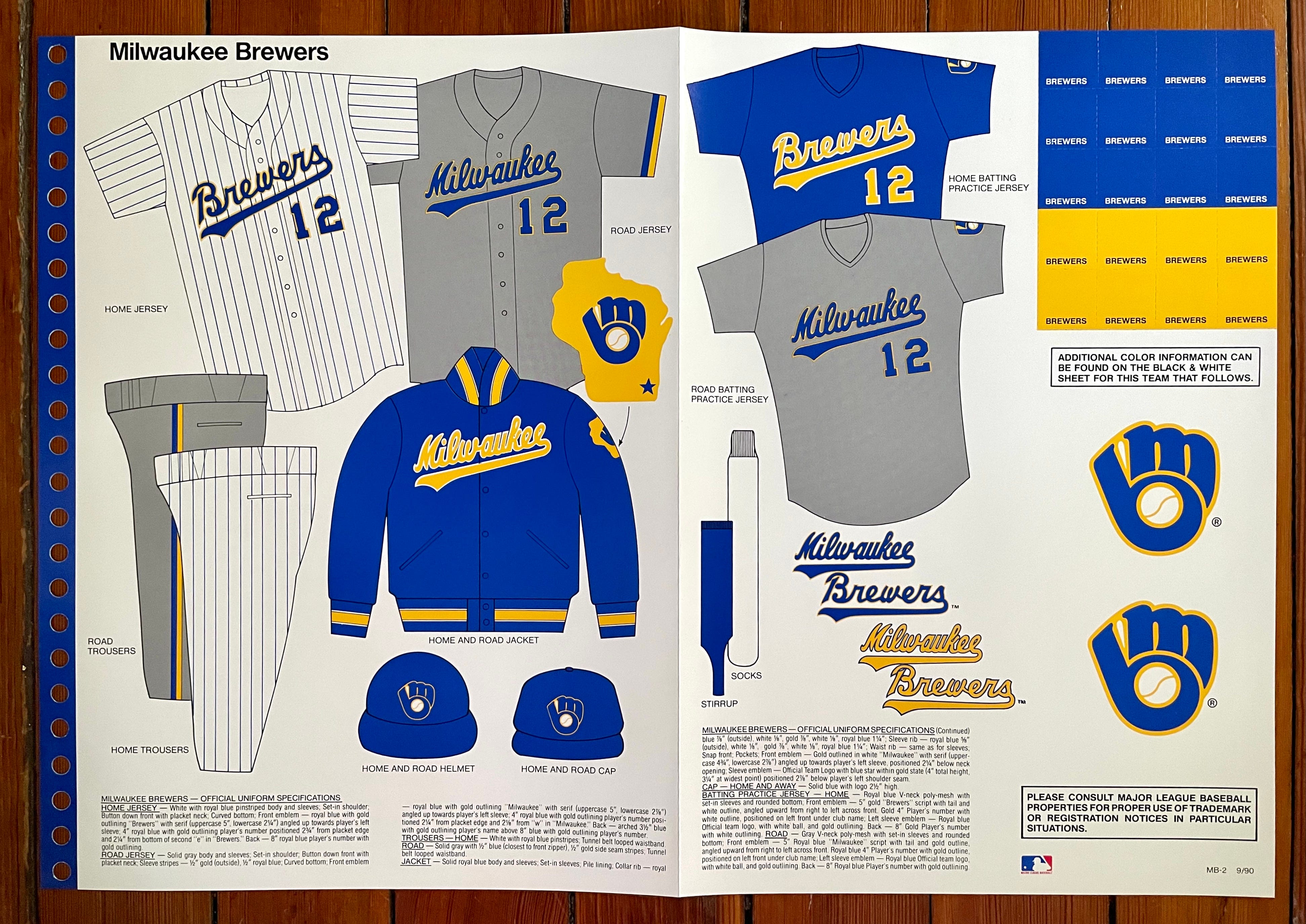
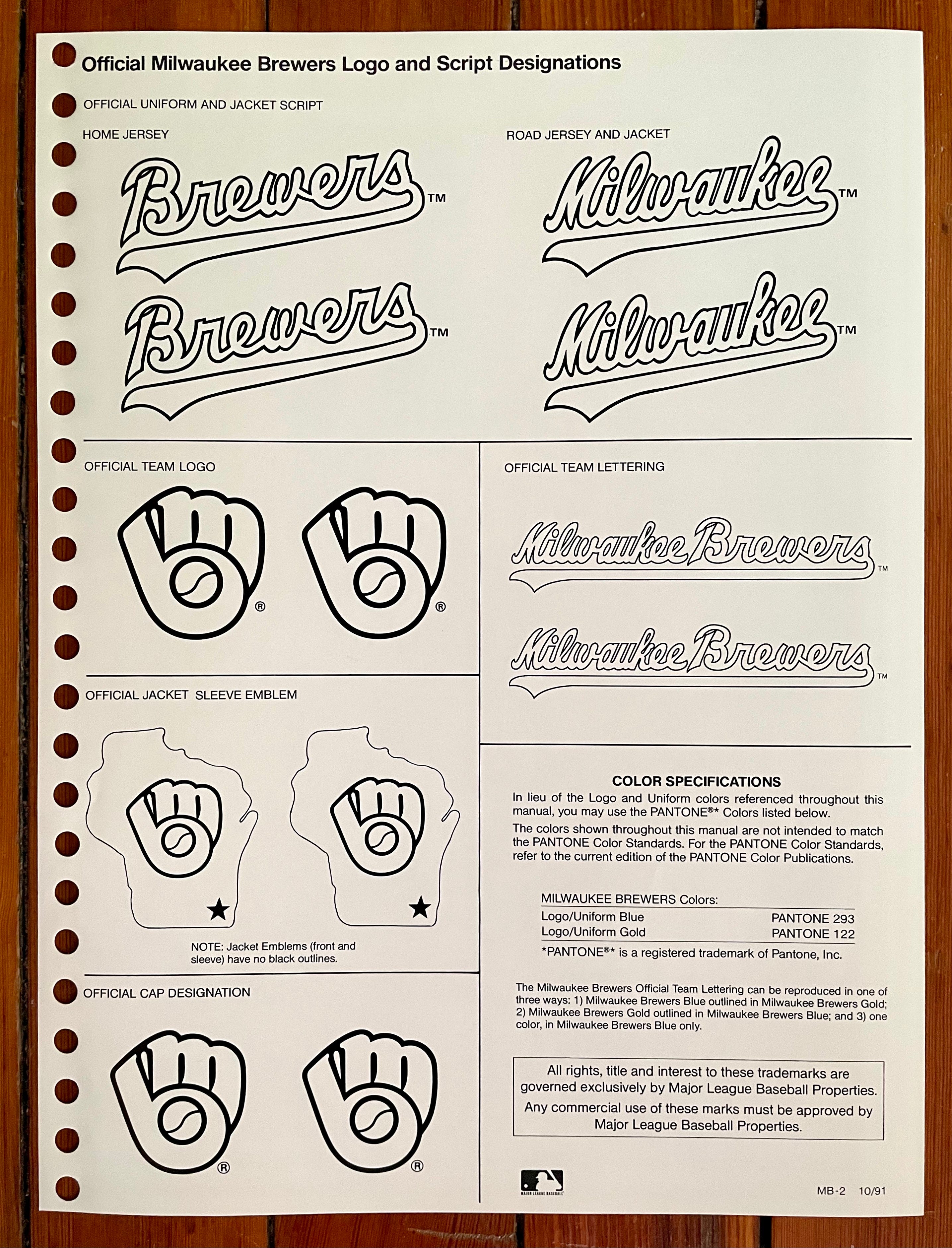
This was back when the Brew Crew were still in the American League. I love that sleeve patch on the jacket and always thought they should include it on the jerseys. Took them a while to get the message, but they did include something similar when switching to their current uni set in 2020.
———
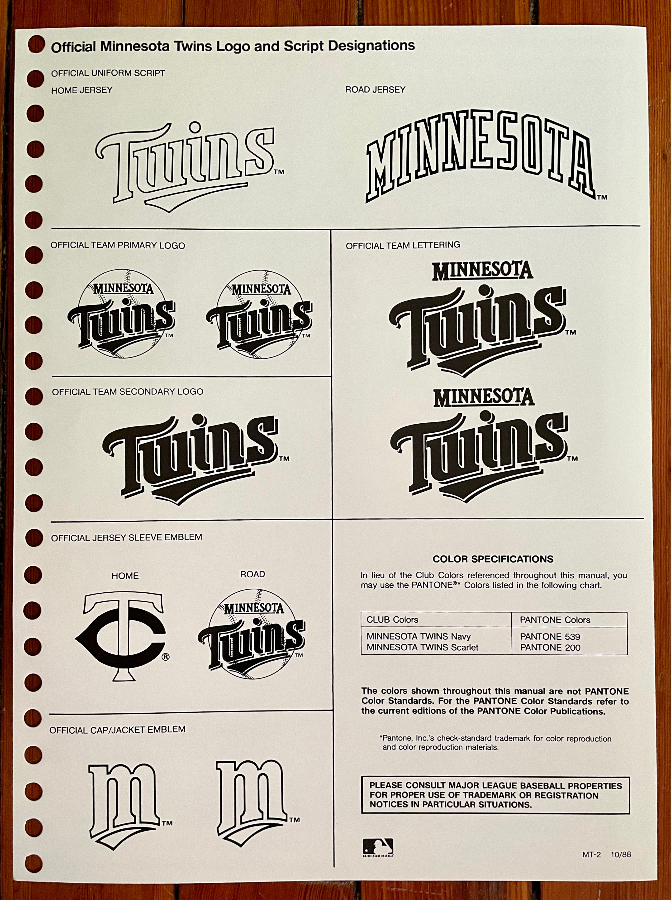
Minnesota Twins
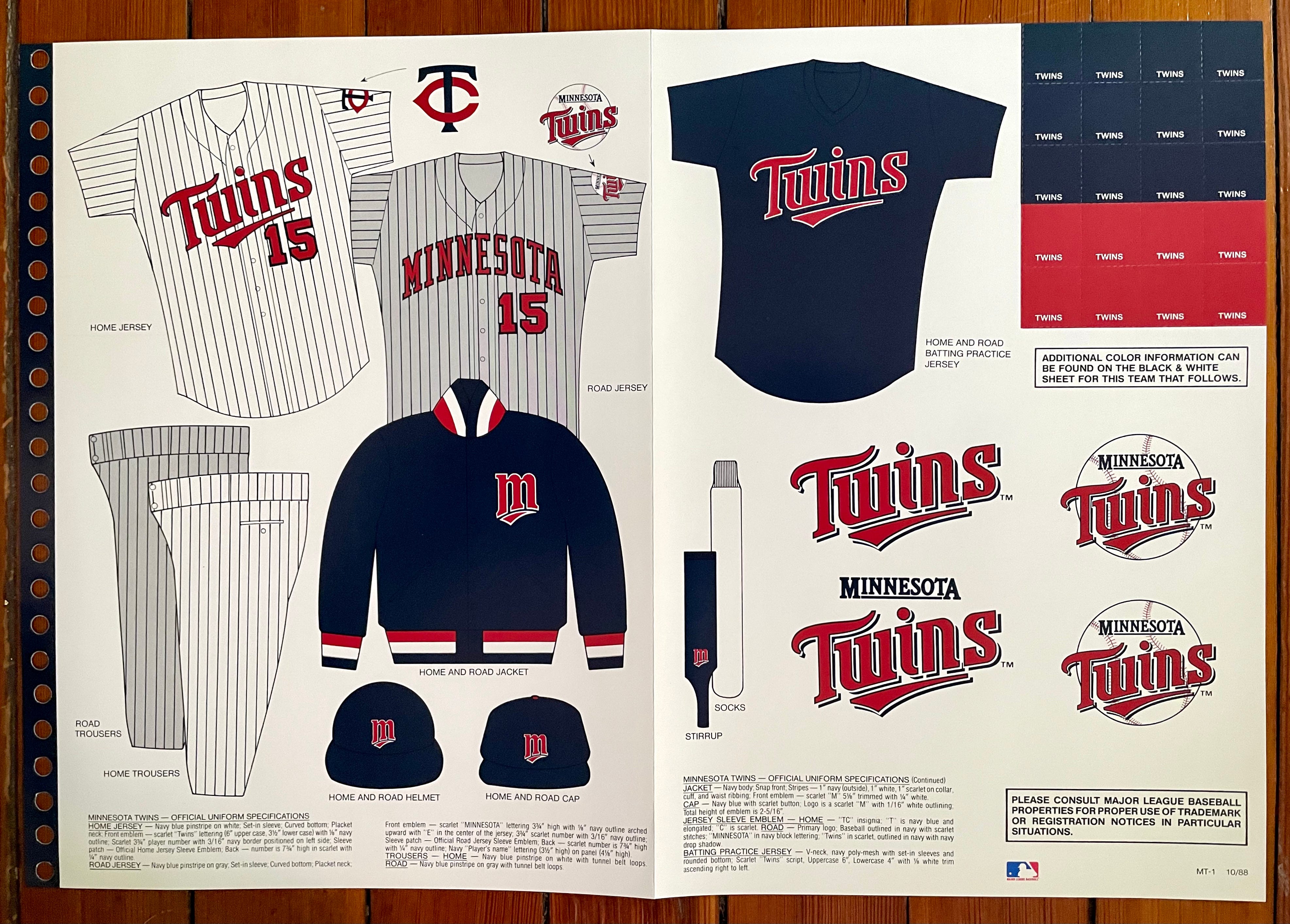
Another team with logo-emblazoned stirrups. Again, the logo didn’t appear very often on-field, but here’s a glimpse of it, courtesy of the late Kirby Puckett.
———
New York Yankees
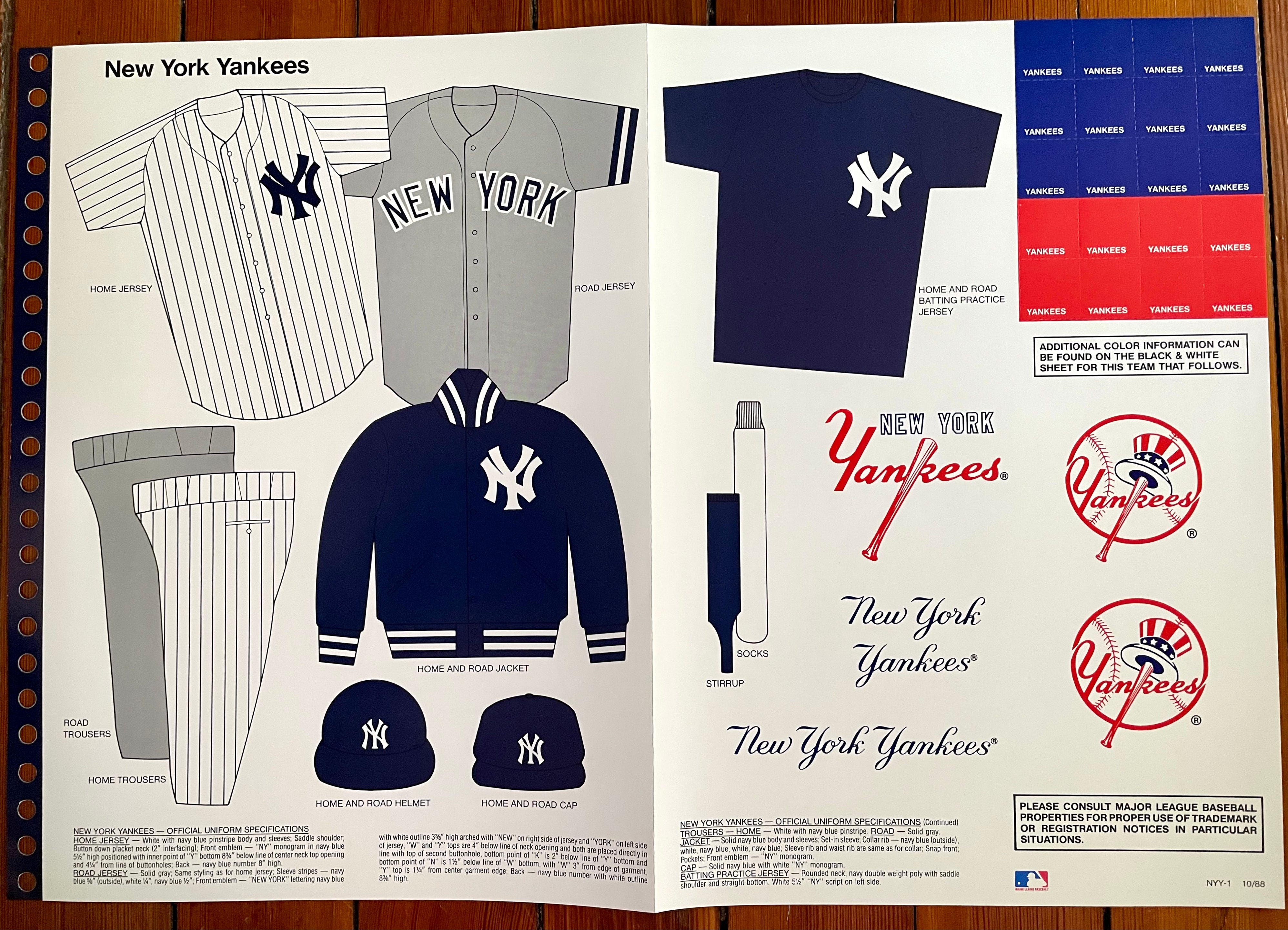
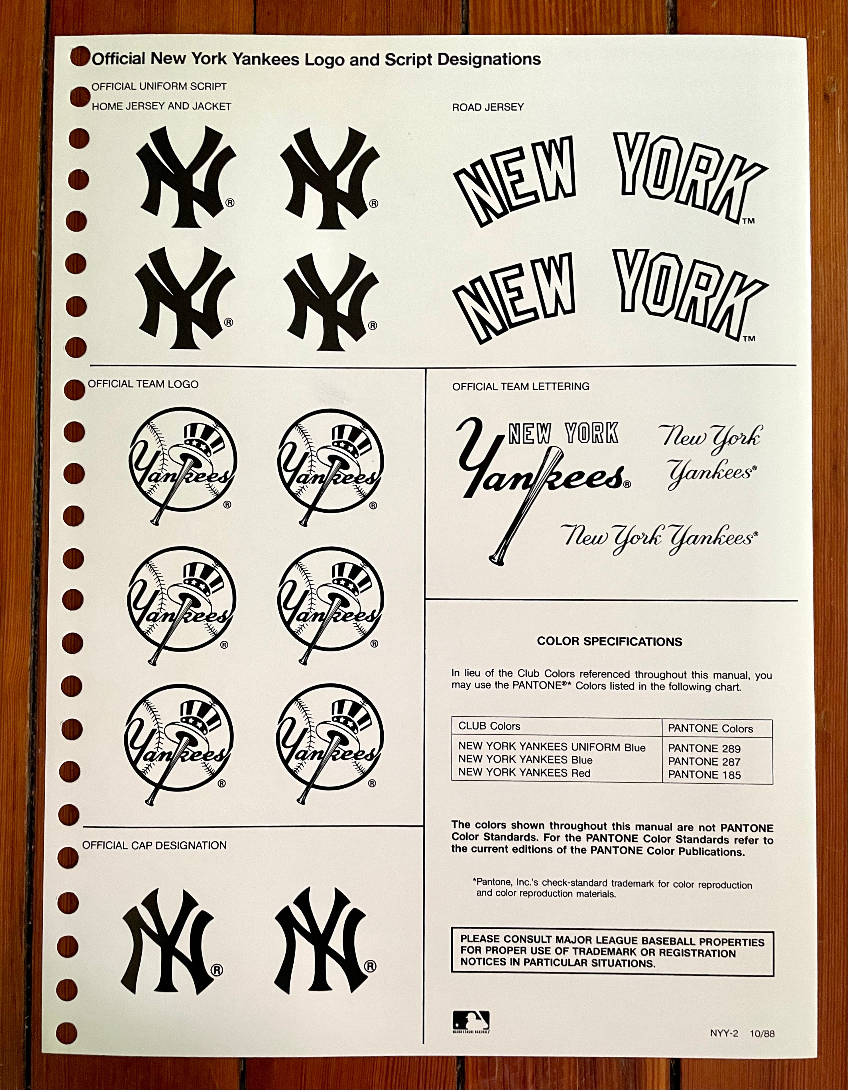
While the style sheets do show the mismatched cap and jersey versions of the Yanks’ “NY” logo (an inconsistency that, unlike the similar situation in Detroit, still persists to this day), they don’t capture the admittedly subtle distinctions between the cap and helmet logos:
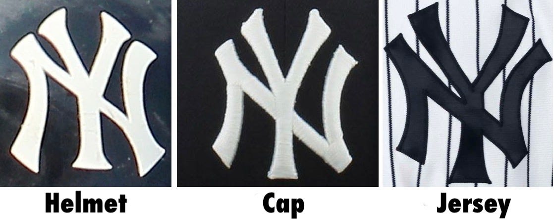
To MLB’s credit, they do show all three versions in the current style guide.

———
Oakland Athletics
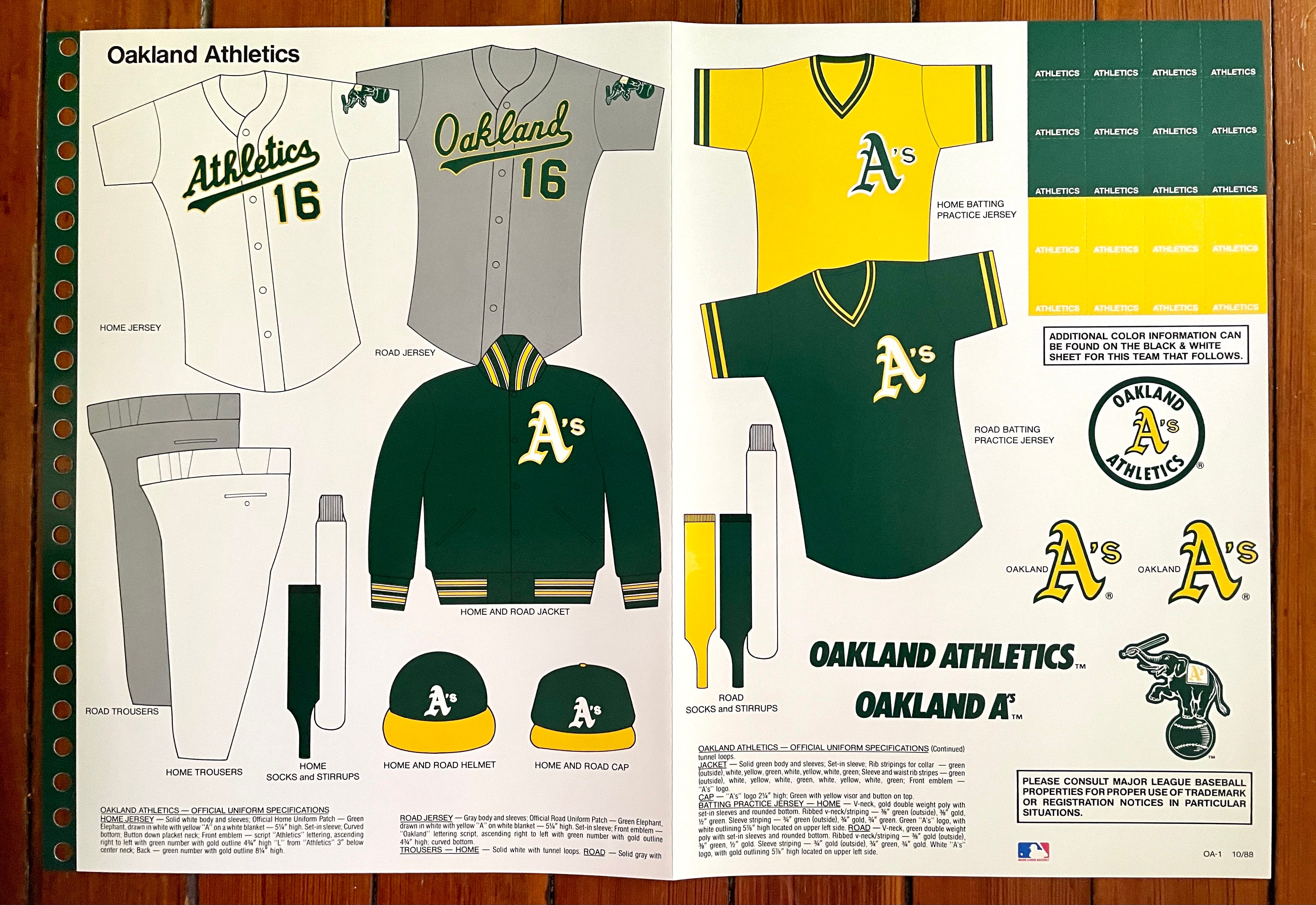
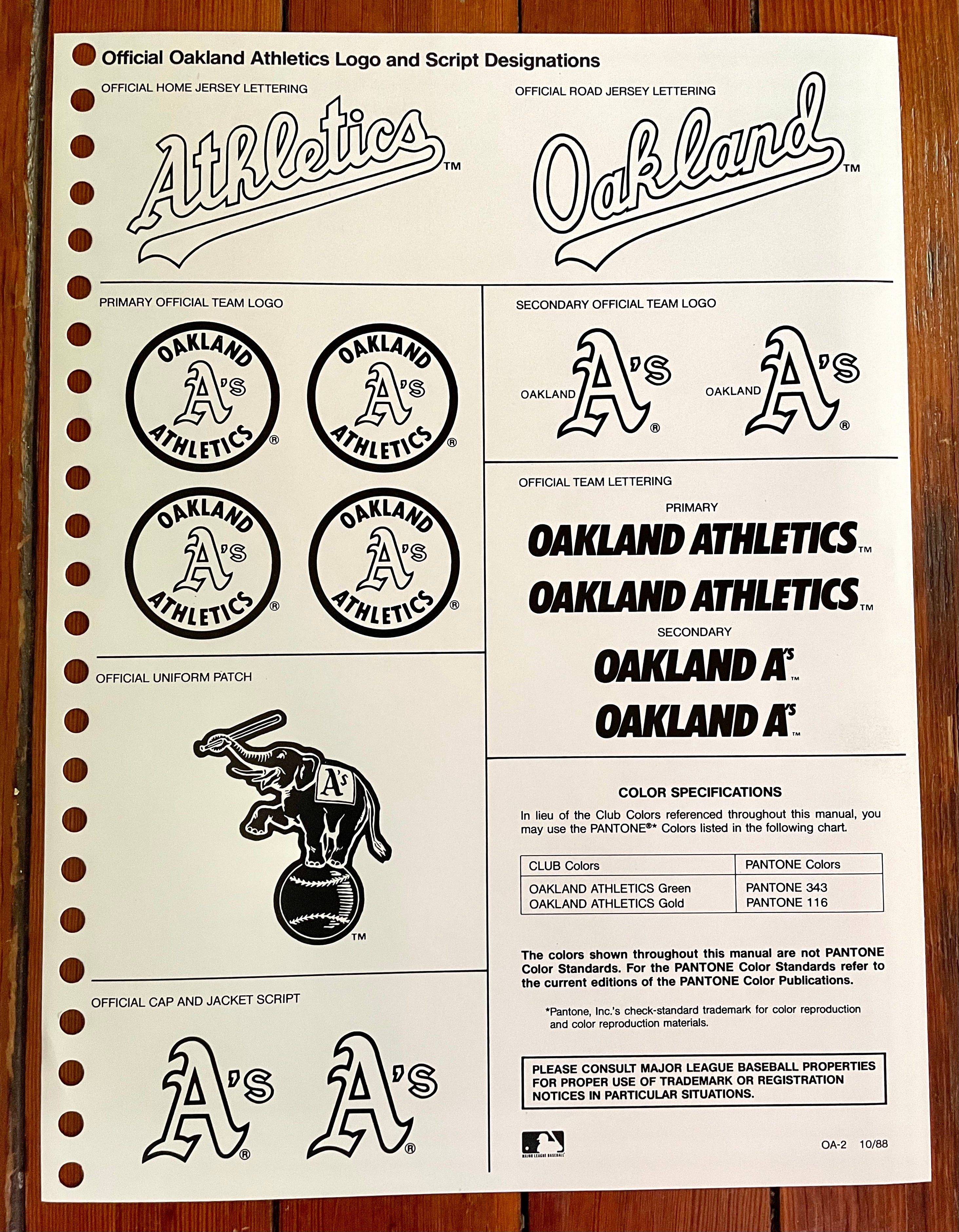
Here we have MLB’s most bee-YOO-tee-ful color scheme. I particularly like how the BP jerseys from this period were essentially a reprise of the game jerseys from the 1970s “Swingin’ A’s” glory days — a nice way to acknowledge the team’s visual past.
———
Seattle Mariners
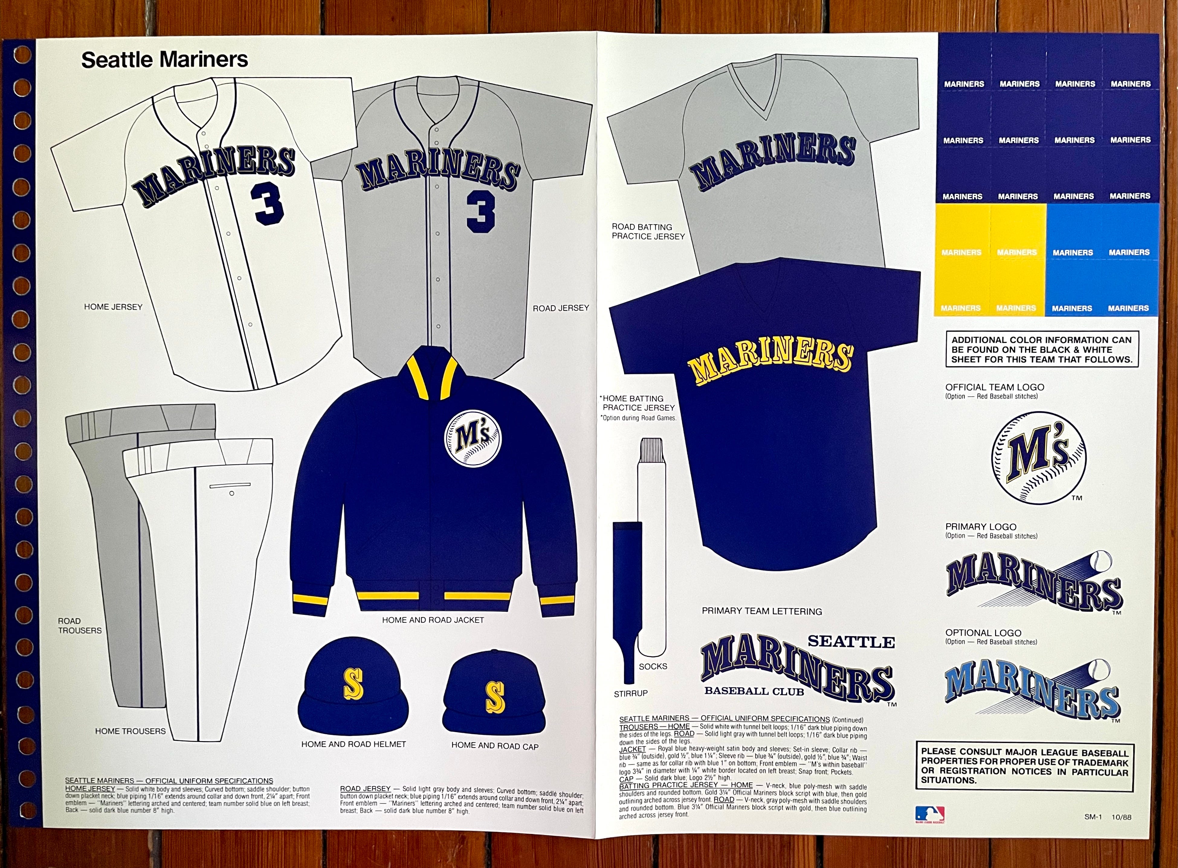
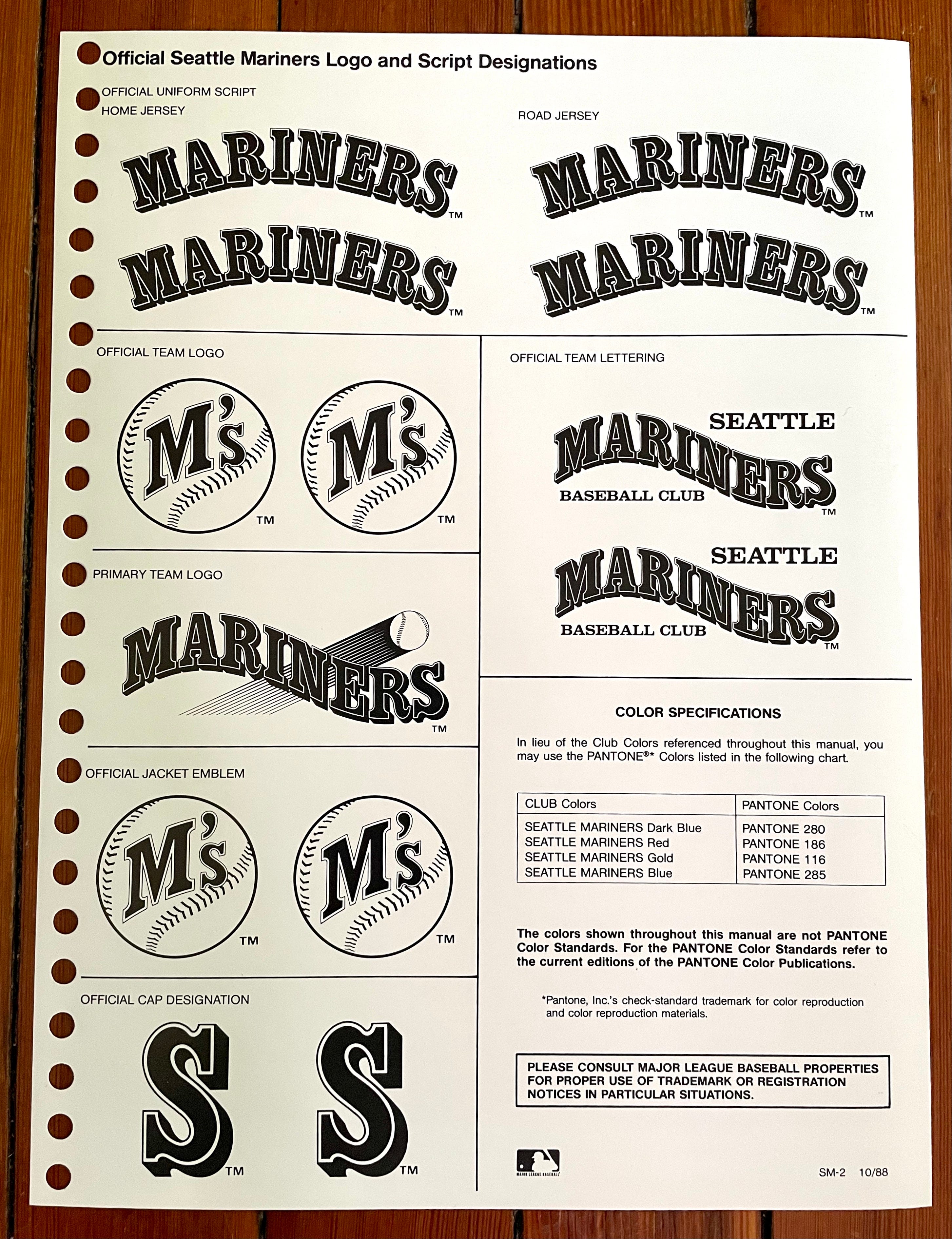
See that wavy “Mariners” wordmark with the baseball shooting through it? It’s listed as the primary logo, but I have no memory of it. Like, zero memory. Looks like a cross between the Colorado Rockies’ and Phoenix Suns’ logos, no? Turns out it was printed on the turf behind home plate at the Kingdome. Have I mentioned that I have no memory of that?
———
Texas Rangers
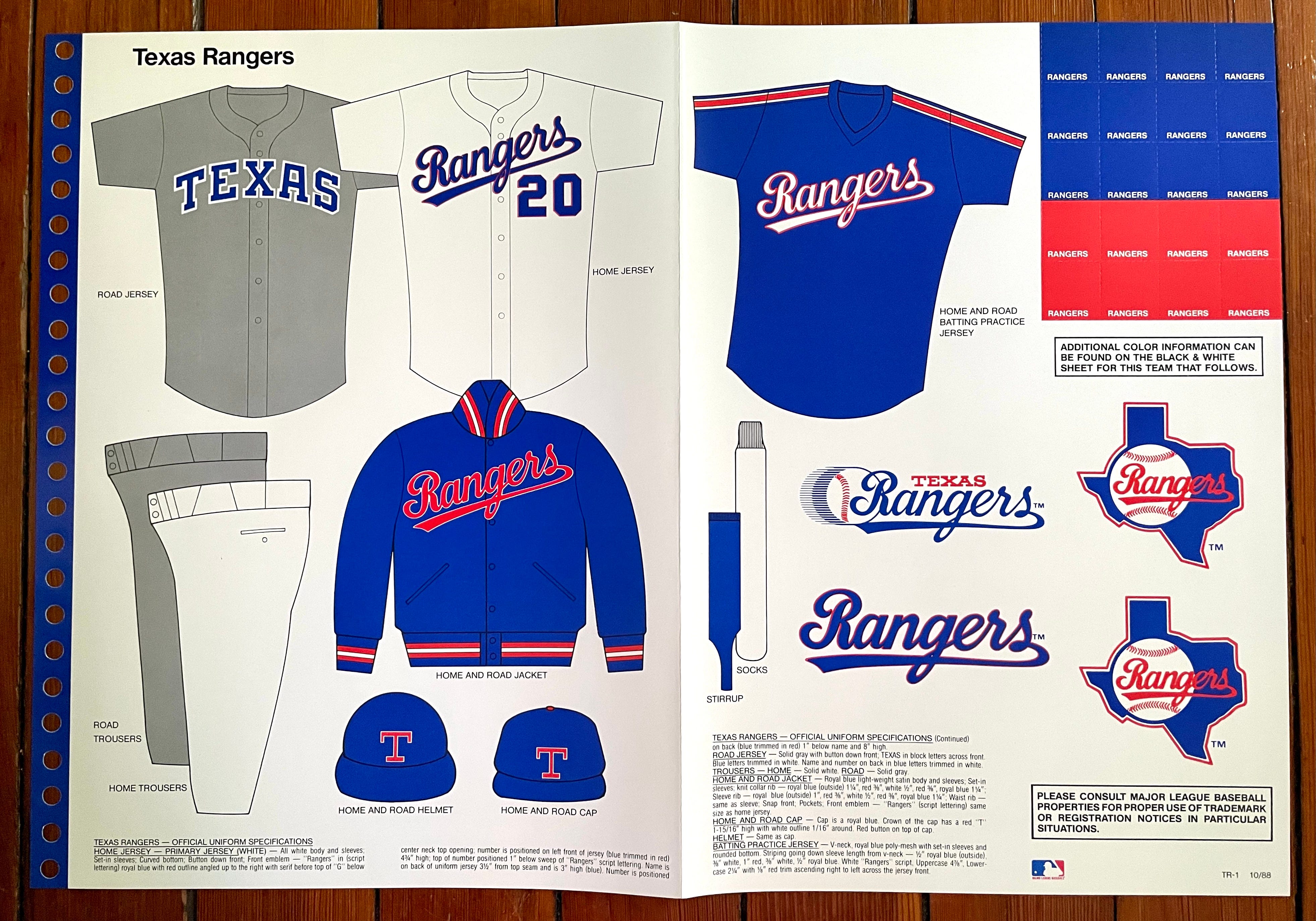
The Rangers have famously flip-flopped between being a blue team and a red team. The uniforms from this period were firmly in the blue category, which is my preferred look for them. The simple but effective road jersey looks particularly sharp.
———
Toronto Blue Jays
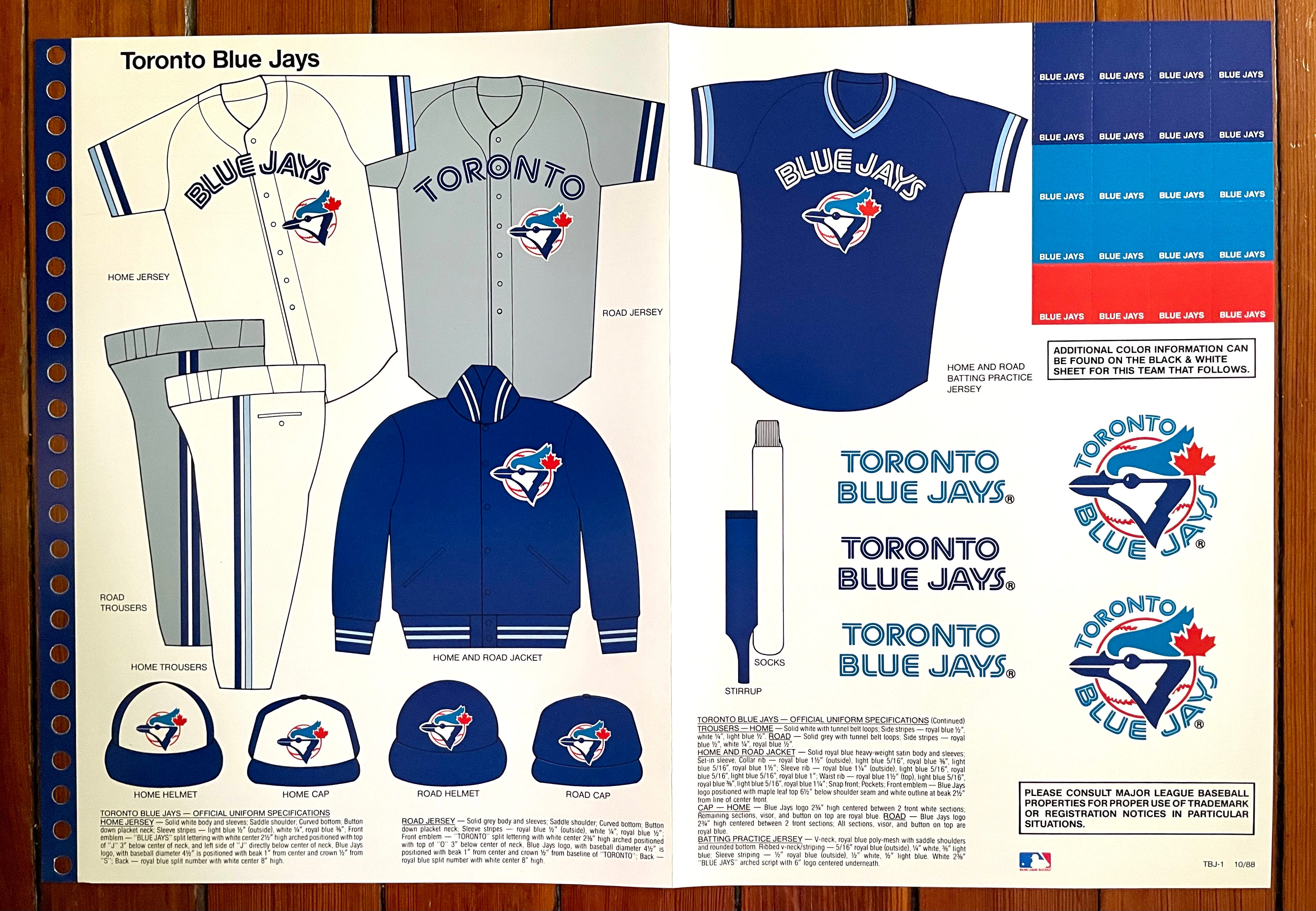
Oh, man — the Jays were a very good-looking team during this period. All the elements worked really well together. First-rate!
———
National League
Atlanta Braves
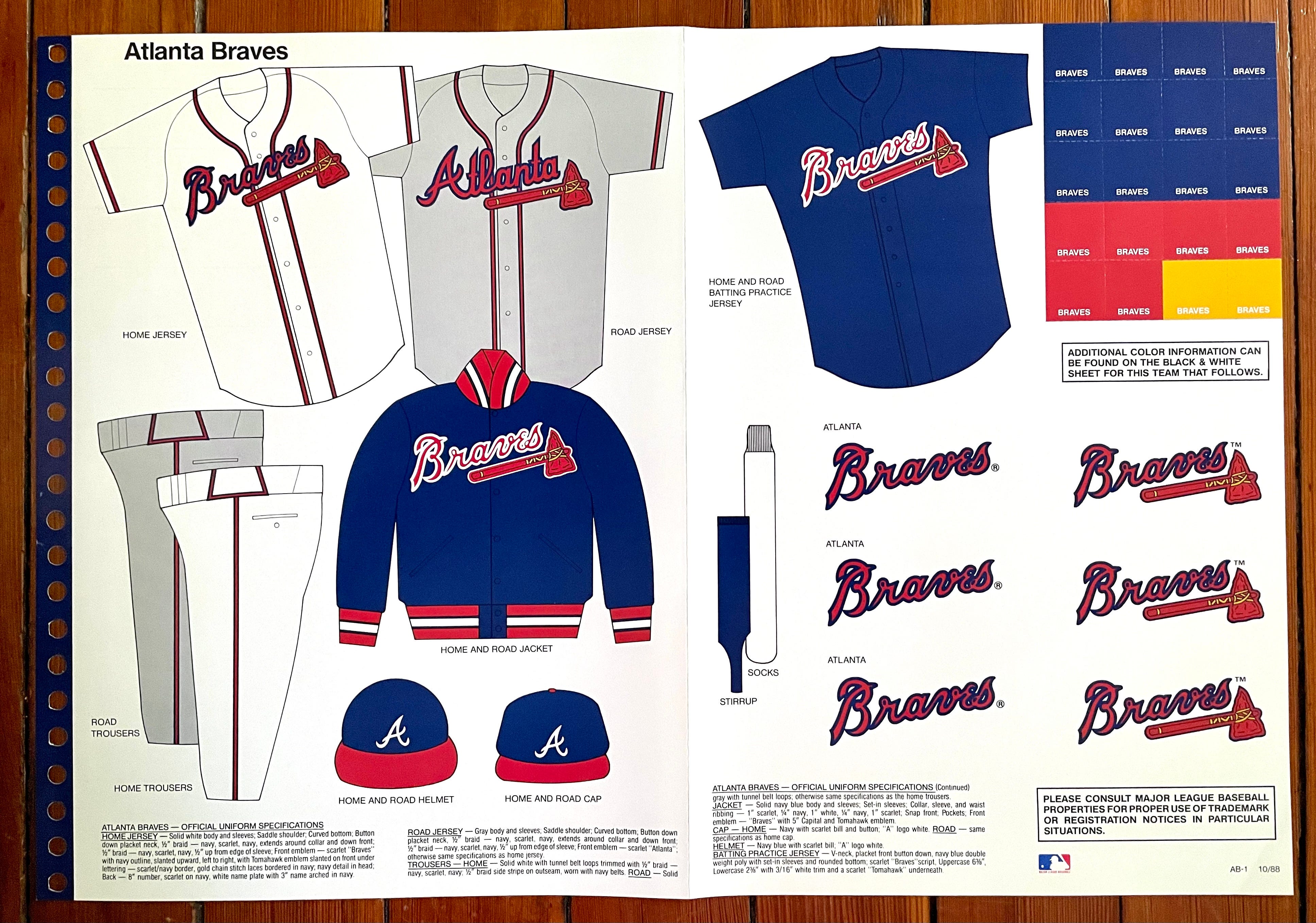
It’s remarkable how little Atlanta’s uniforms have changed over the years, even down to the piping on the belt tunnels. Aside from some teeny adjustments to the jersey scripts, the team’s primary uniform set has essentially remained the same since 1987.
———
Chicago Cubs
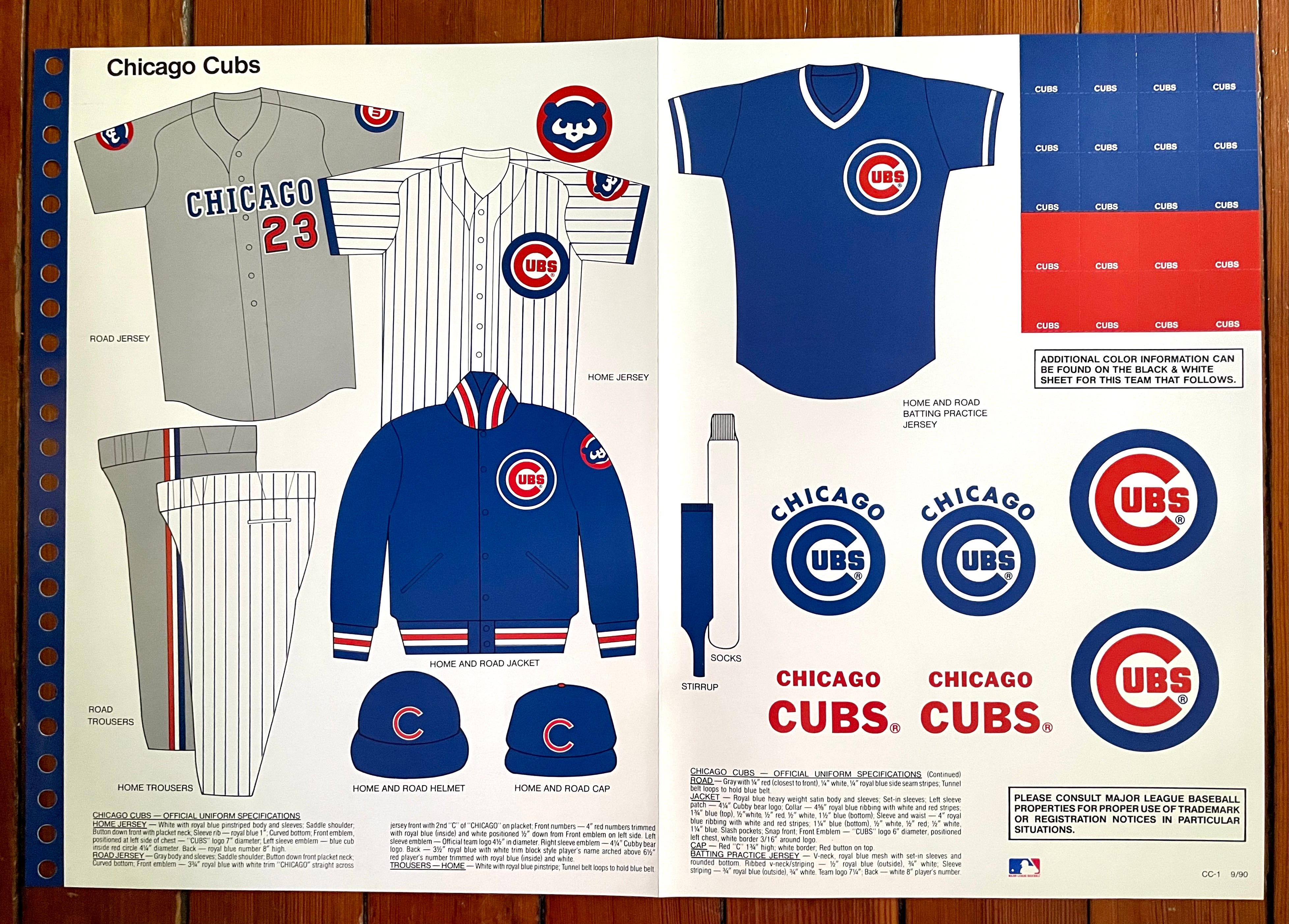
Interesting to see that the Cubbies had patches on both sleeves of their road jersey during this period — an unusual look, especially on the road.
Also: For years now, the Cubs have been the only MLB team with a circle-R trademark symbol right there on their jersey logo. And sure enough, it was shown in the style guide’s jersey mock-up!
———
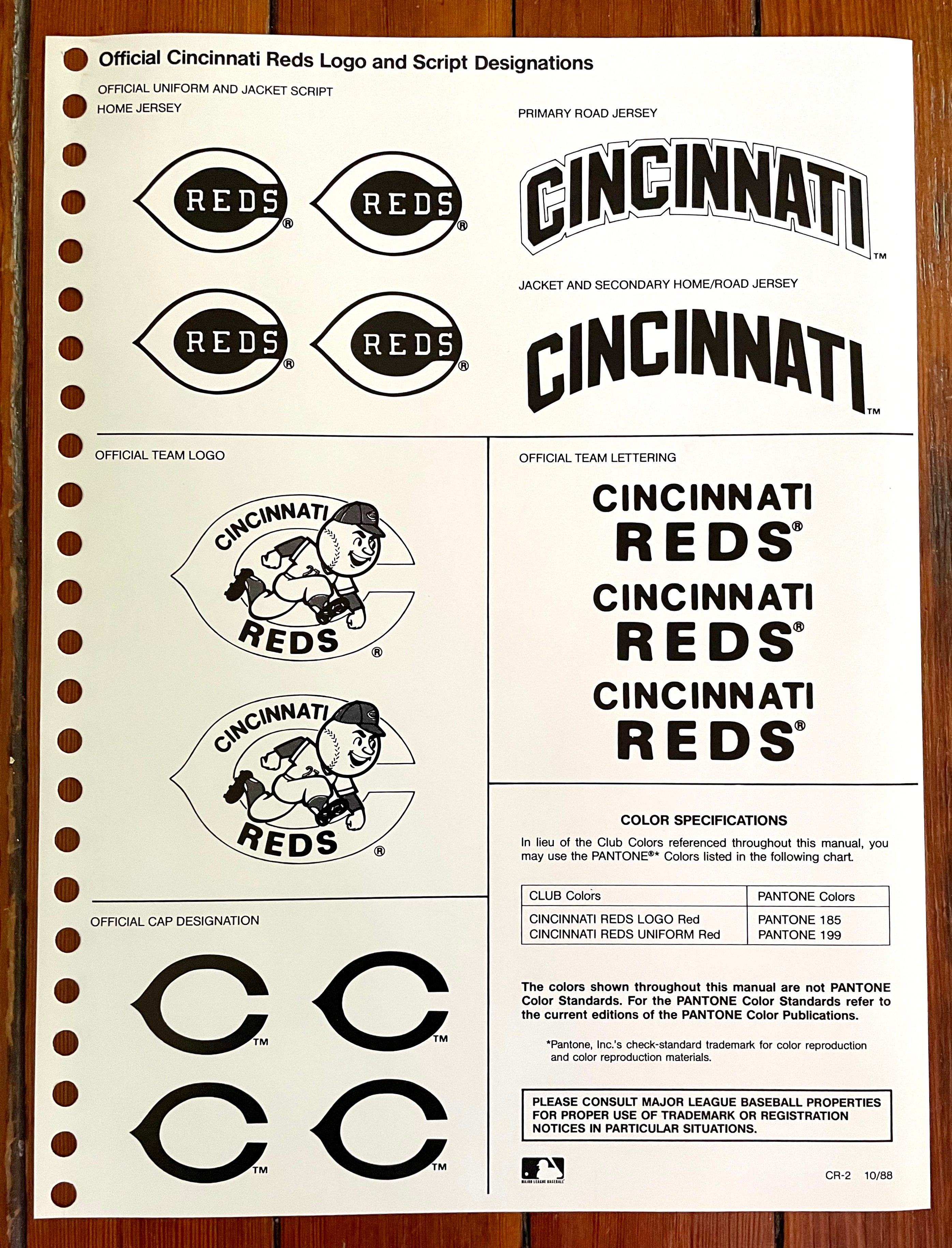
Cincinnati Reds
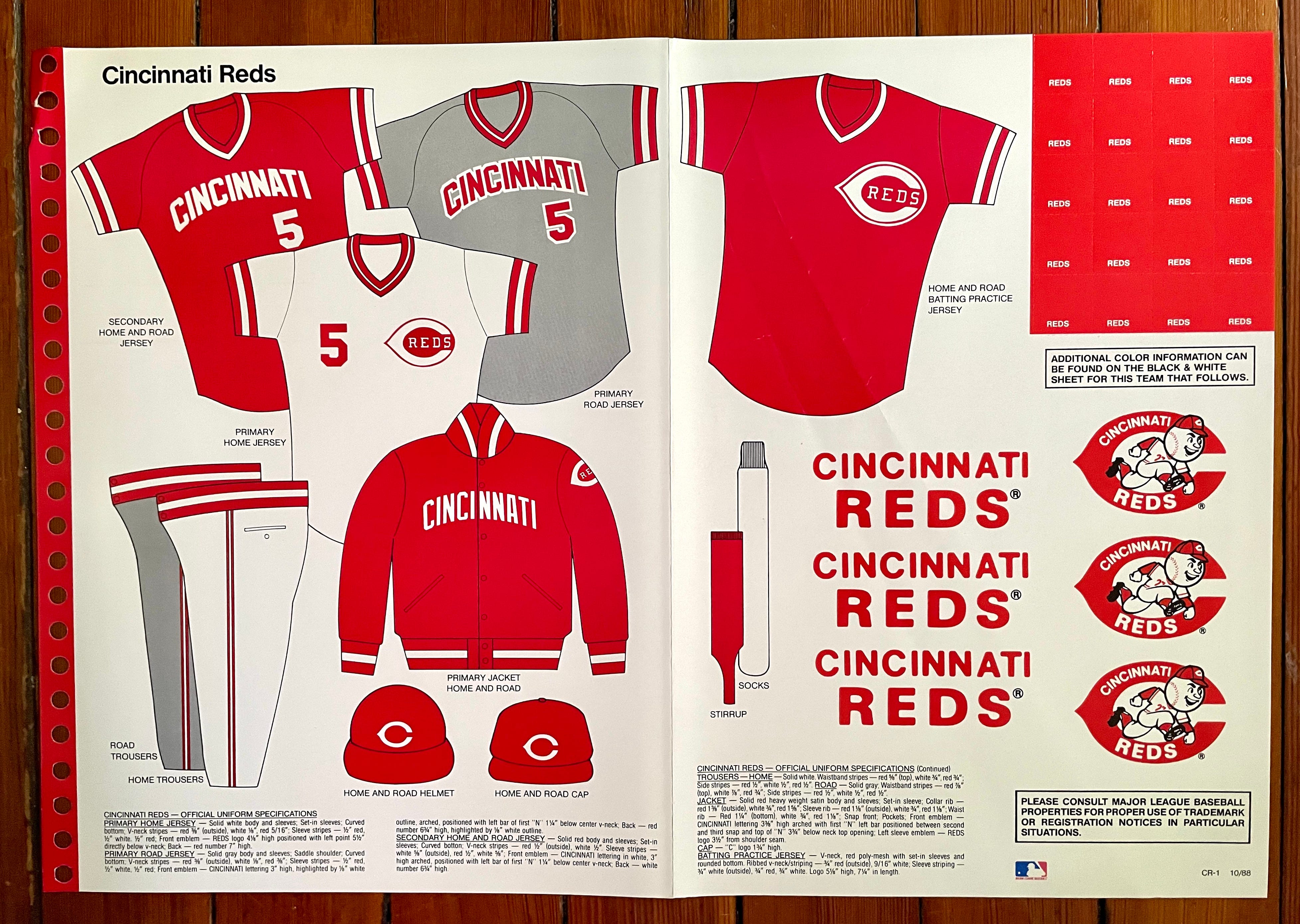
A few Cincy-related notes:
As you can see on the color sheet, the Reds were the last holdouts from the pullover/sansabelt era. They eventually returned to buttoned jerseys and belted pants in 1993.
While the style sheet shows a red alternate jersey, no such jersey ever existed in real life. According to Bill Henderson’s jersey guide, the Reds didn’t add a red alternate design until 2003. Maybe they were planning to do it but changed their minds.
Note that the style sheet shows the home jersey with set-in sleeves but the road greys (and the phantom red alternates) with raglan sleeves. Extensive Uni Watch photo research indicates that the road jerseys actually had set-ins, not raglans.
———
Houston Astros
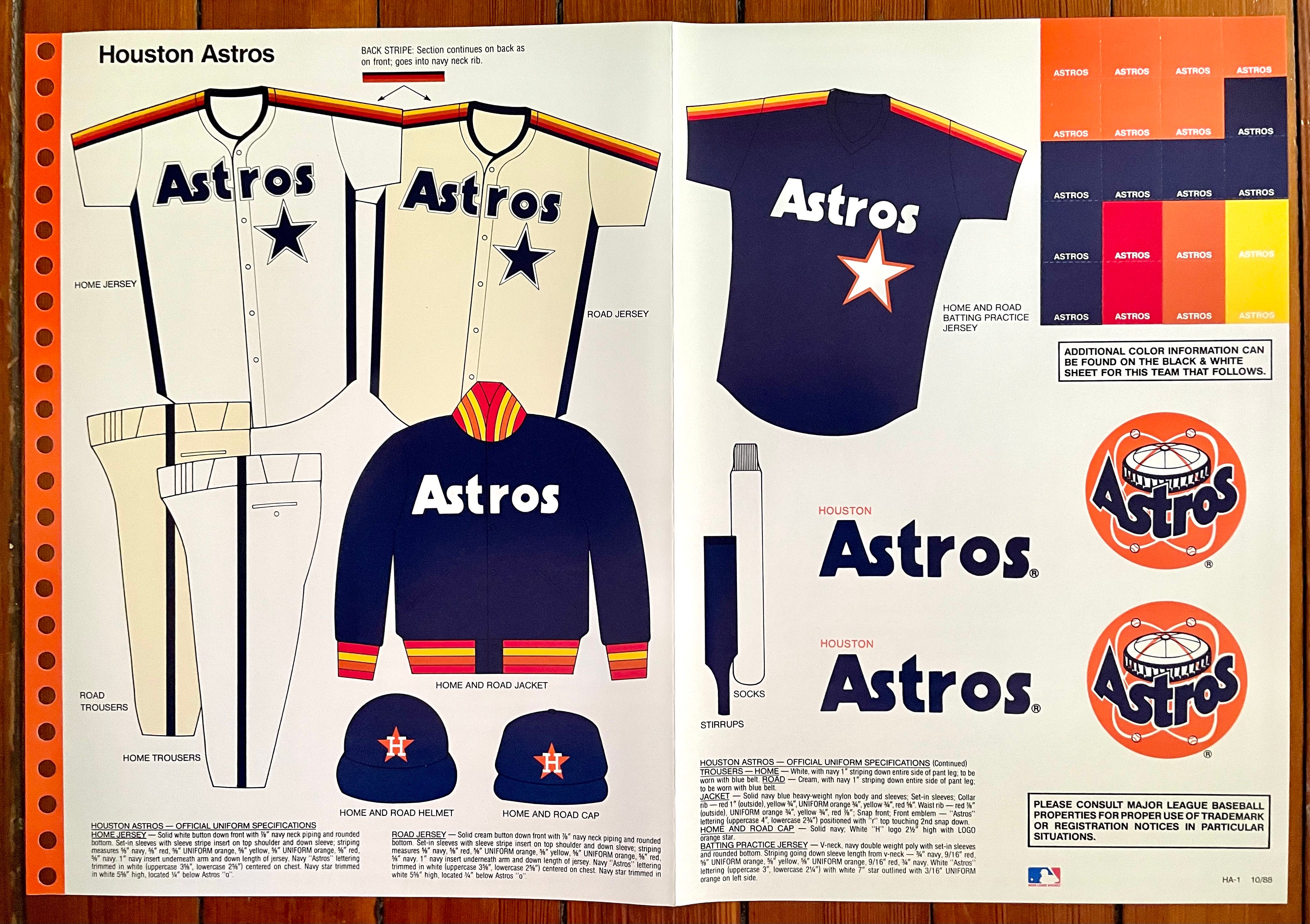
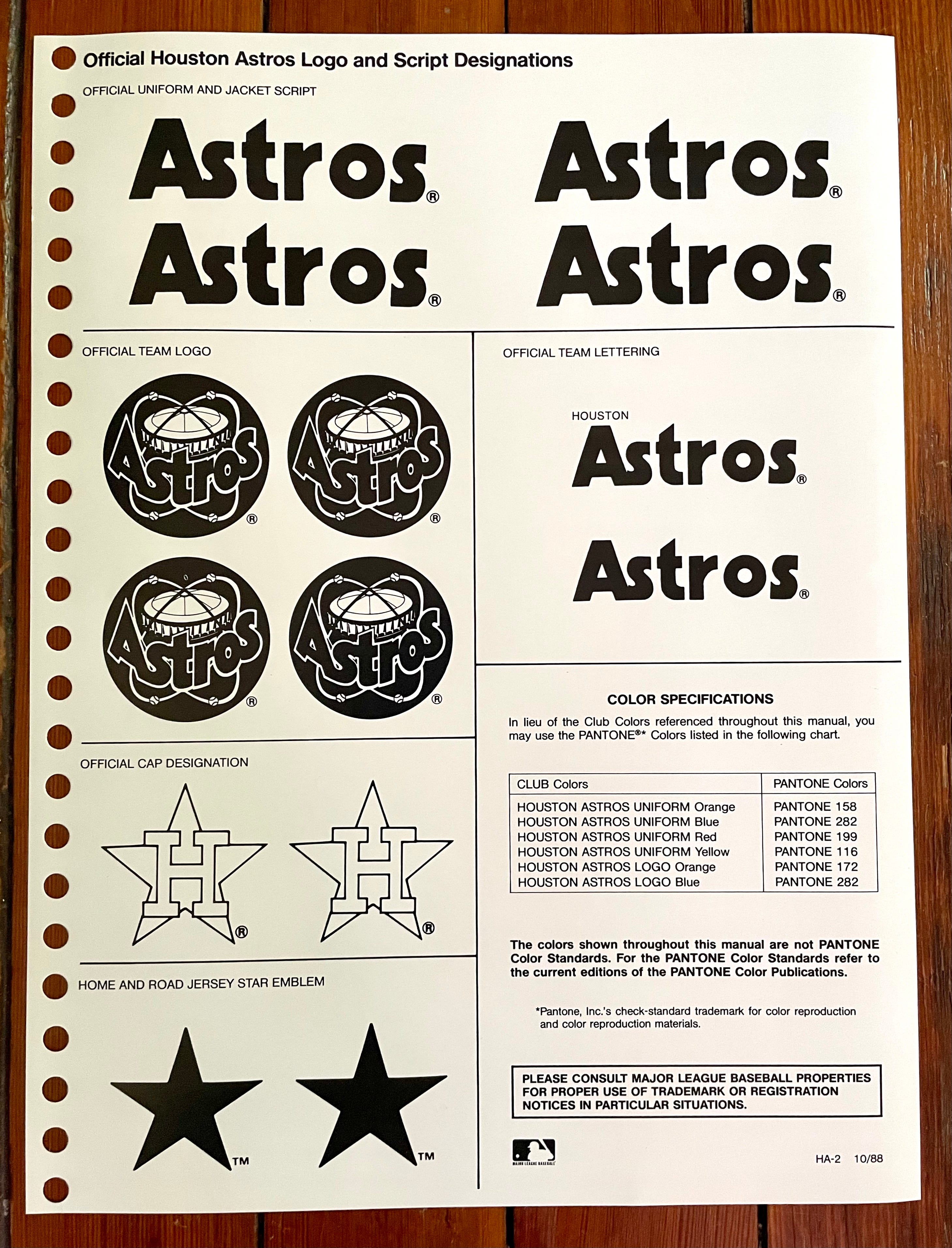
For years there’s been confusion about the Astros’ uniforms from this period. Marc Okkonen showed the home and road designs as essentially identical, while Bill Henderson describes the road design as “cream”-colored but jokes that it’s indistinguishable from the home uni. Watching on TV at the time, I couldn’t tell the difference between the homes and roads and was sure that they were just wearing the same uniforms for every game.
But as the style sheet shows, the road set was indeed cream — or at least it was intended to be, even if the color distinction was too subtle for most of us to discern. I’ve never seen this type of visual documentation before!
And seriously, what kind of thought process led them to opt for home whites and road creams? Those Astros — always innovating!
———
Los Angeles Dodgers
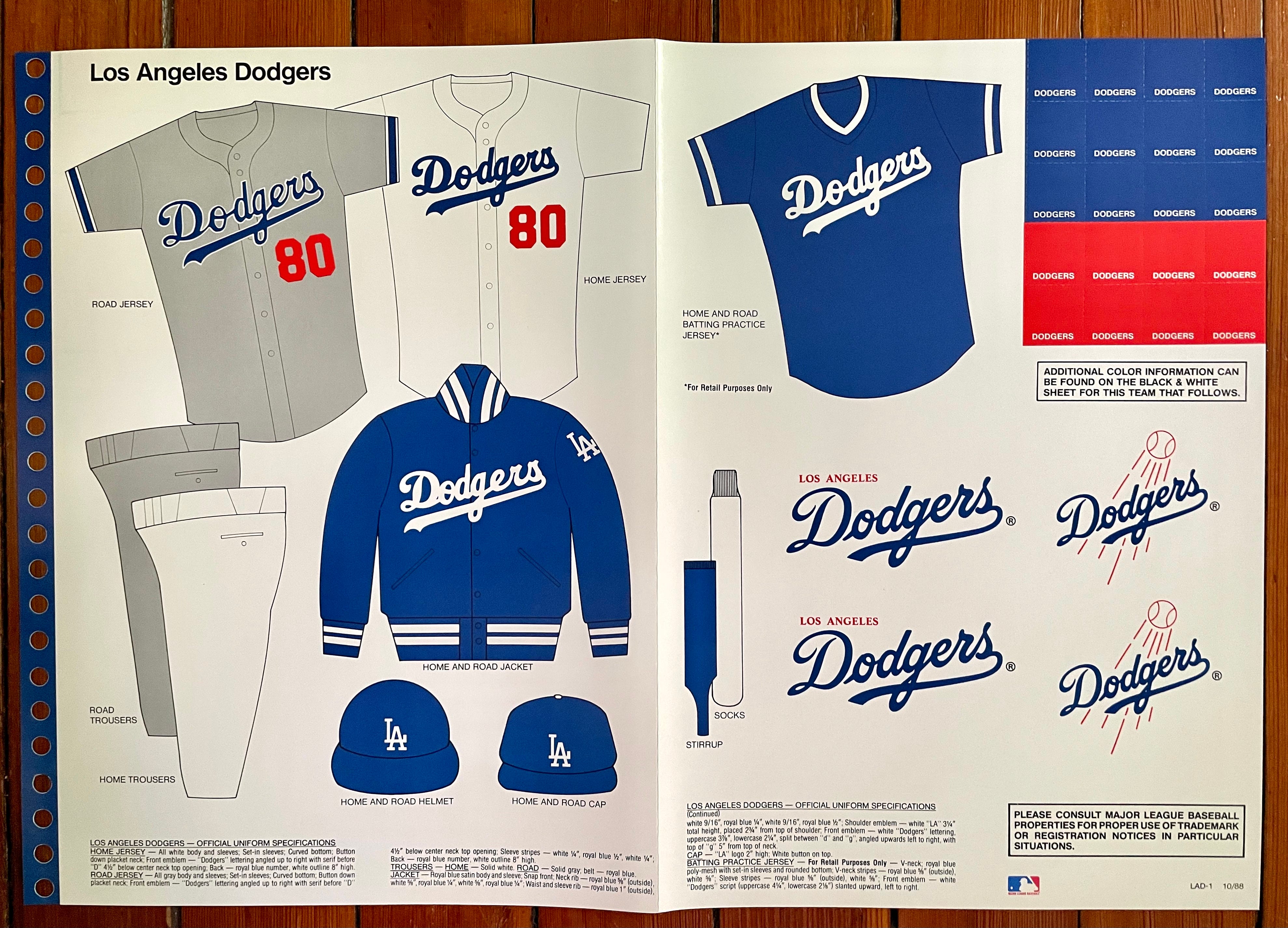
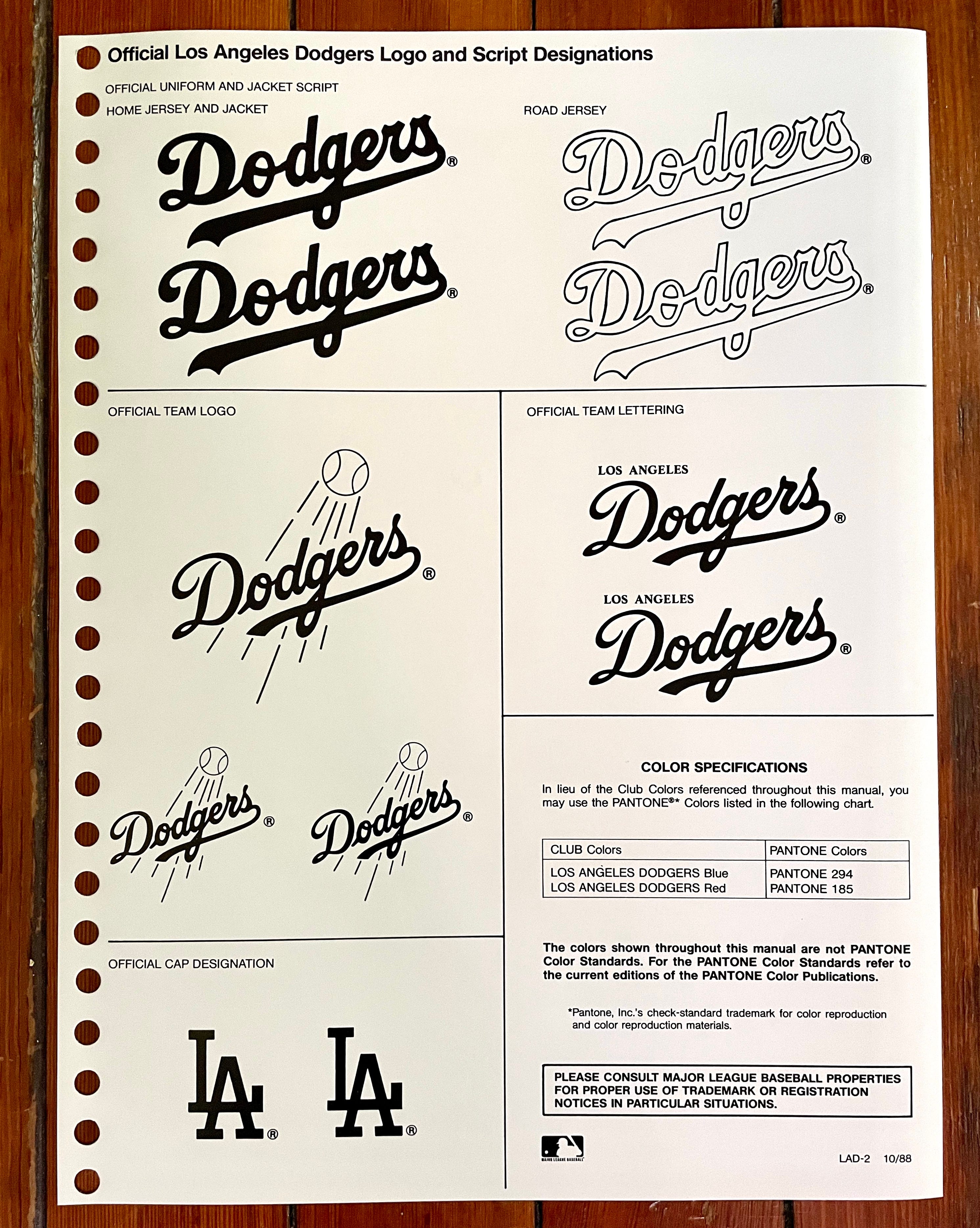
Obviously, the Dodgers don’t make many changes to their uniforms, but it’s interesting to see how they’ve tinkered in the years since this style guide was produced. The sleeve trim and white-outlined script on the road jersey look almost gaudy compared to the current version, for example, and the “LA” sleeve logo should have stayed on the dugout jacket instead of migrating to the game jerseys.
/cdn.vox-cdn.com/uploads/chorus_asset/file/24412169/1414322268.jpg)
———
Montreal Expos
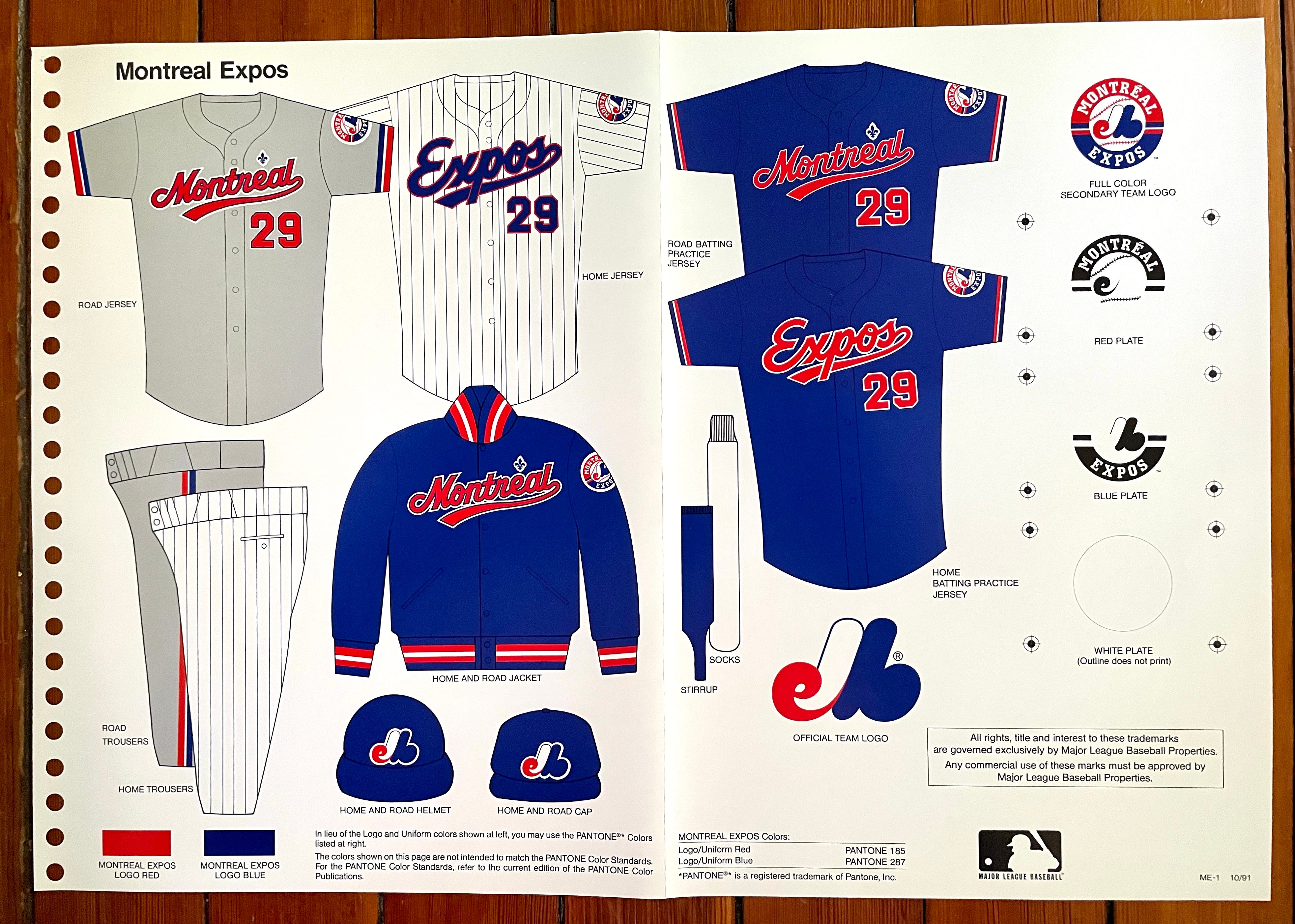

Ah, les Expos de Montréal — I really miss them. This wasn’t my favorite uniform period for them (I preferred their inaugural set), but just the sight of that cap logo makes me smile. Au revoir, mon ami.
———
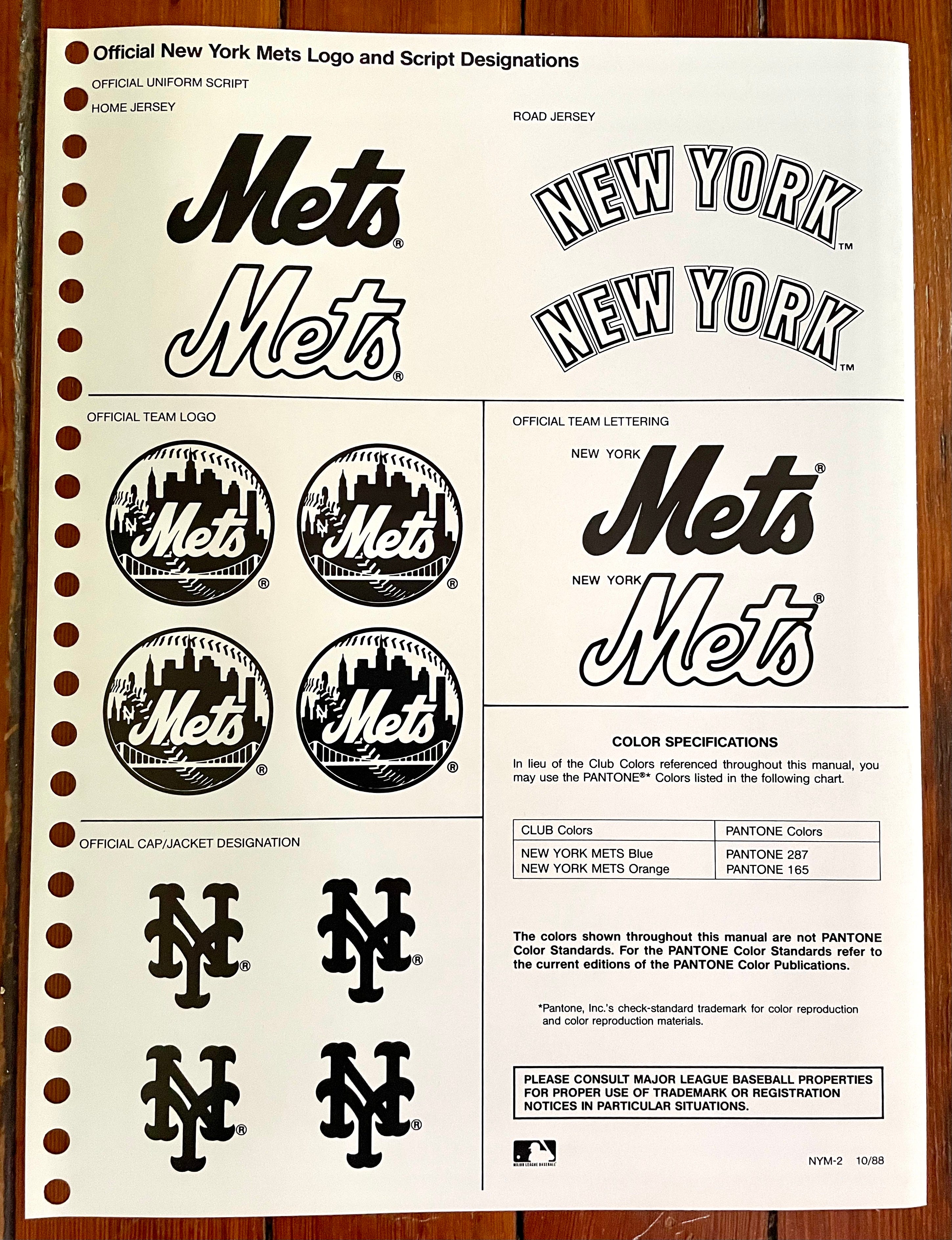
New York Mets
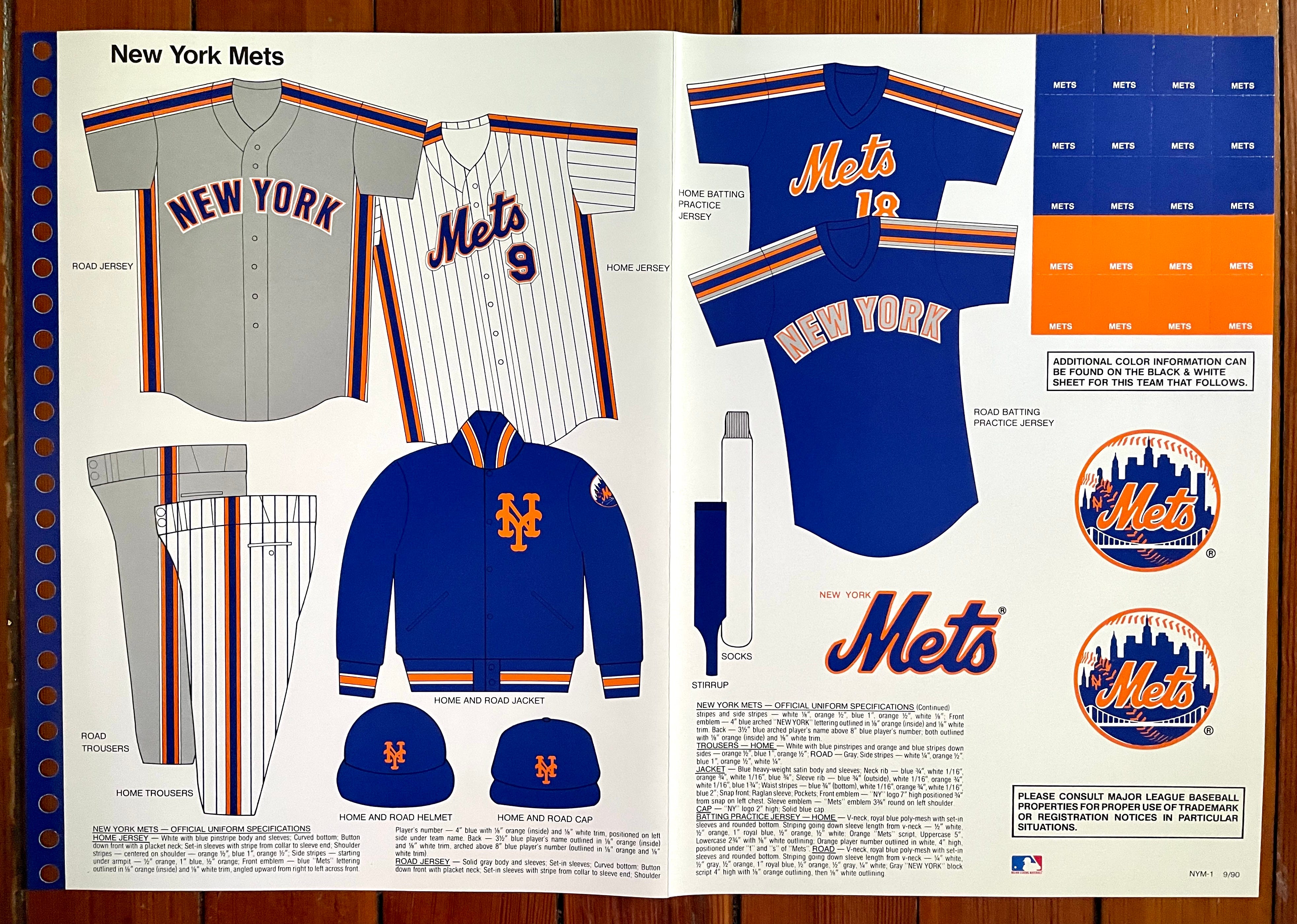
This was a weird hybrid period for the Mets, as they’d traded in their pullover jerseys for button-fronts but still retained the thick racing stripes — not a good look. I never much cared for the characterless road insignia, either.
Also: See that script logo with the little “New York” appended to it? As a lifelong Mets fan, I have no memory of ever seeing that in the wild.
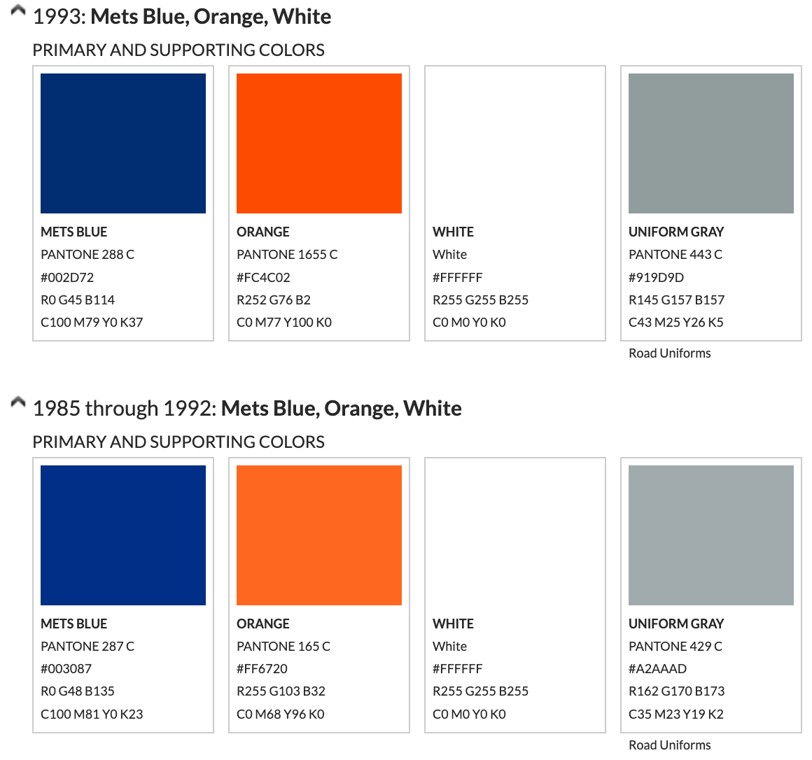
Meanwhile, see how the team’s official colors are listed as Pantone 287 (blue) and 165 (orange)? In 1993 they were ever-so-slightly darkened to 288 and 1655, respectively, and they’ve stayed that way ever since. If you squint, you can see the teeny-tiny differences in this screen shot from color expert Donovan Moore’s indispensable TruColor website:
———
Philadelphia Phillies
The Phillies’ uniform page is missing from the guide, unfortunately. Sorry about that, Philly phans. 😢
———
Pittsburgh Pirates
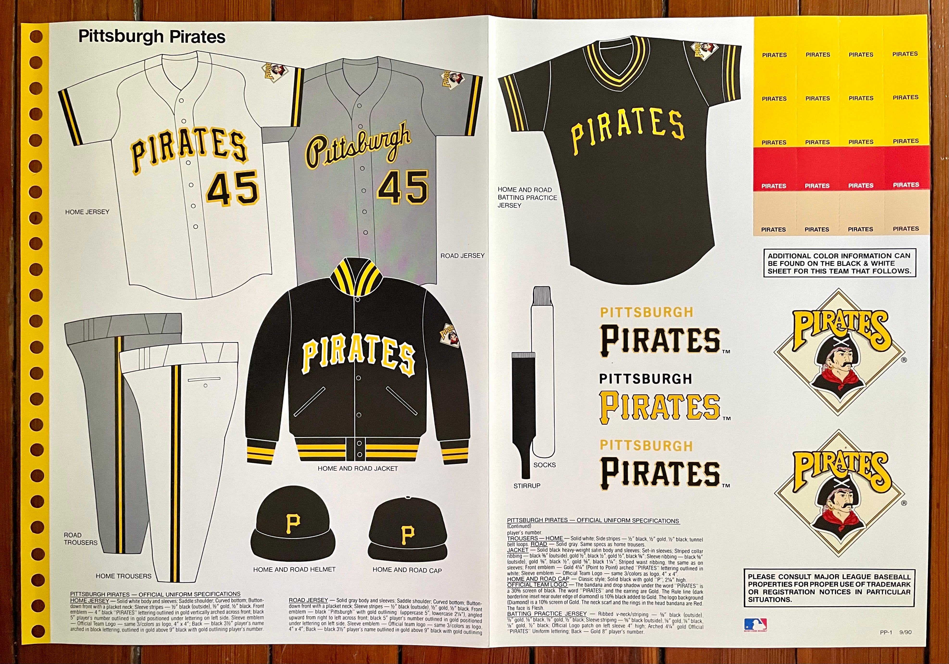
The homes and roads shown here look pretty sharp and are very similar to what the Buccos wear today (although they took several stylistic detours in the intervening years). My one gripe is with the sleeve patch — never liked that logo. Feels more like a minor league mark, or even an unauthorized knock-off, at least to me.
———
St. Louis Cardinals
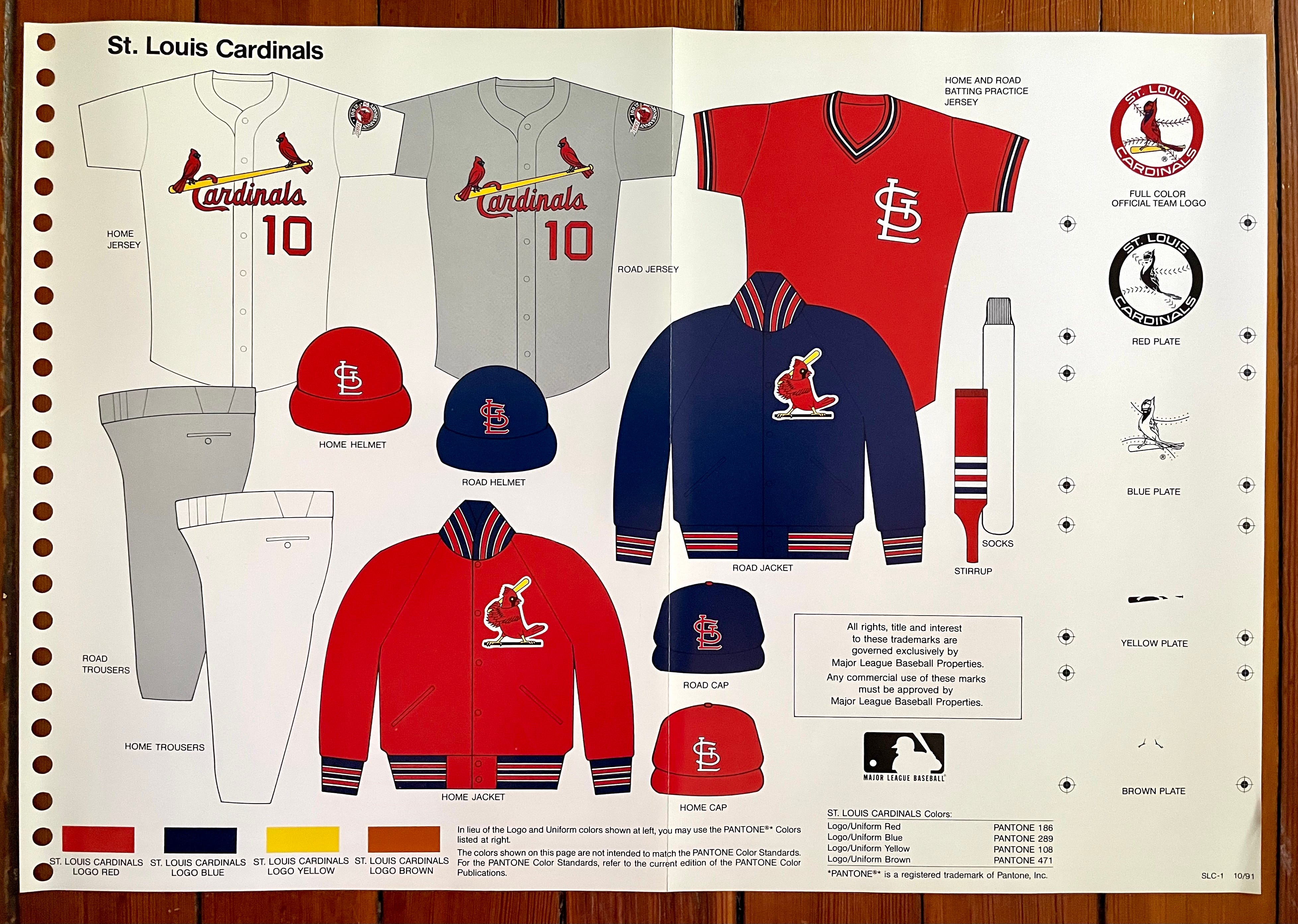

Fun fact: The Cardinals are the only team with separate home and road dugout jackets shown in this style guide.
Also: See that sleeve patch on the jerseys? I’m not sure why they don’t show a stand-alone version of it, but that’s the Cardinals’ 100th-anniversary patch, which they wore in 1992. Here’s a better view.
———
San Diego Padres
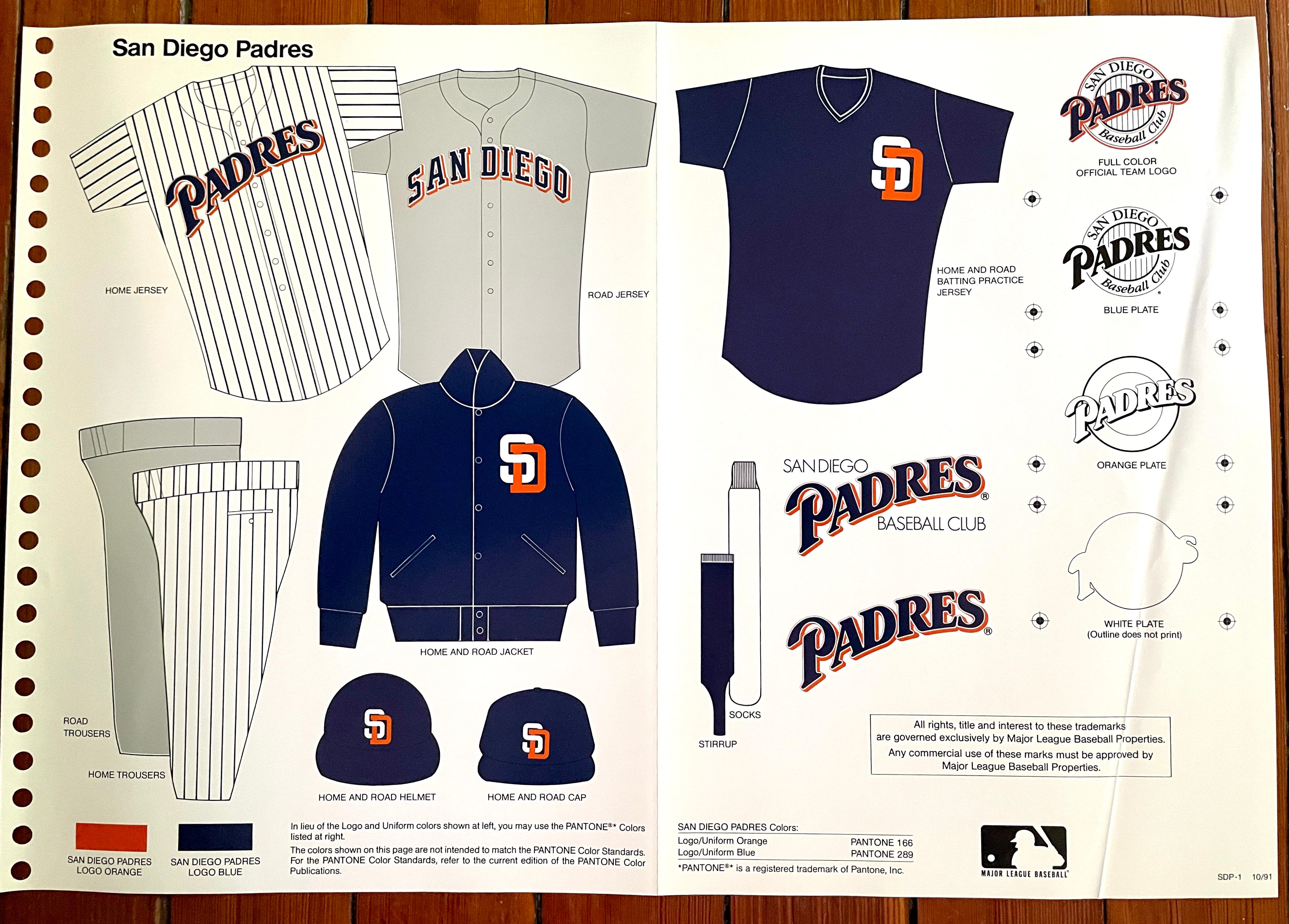
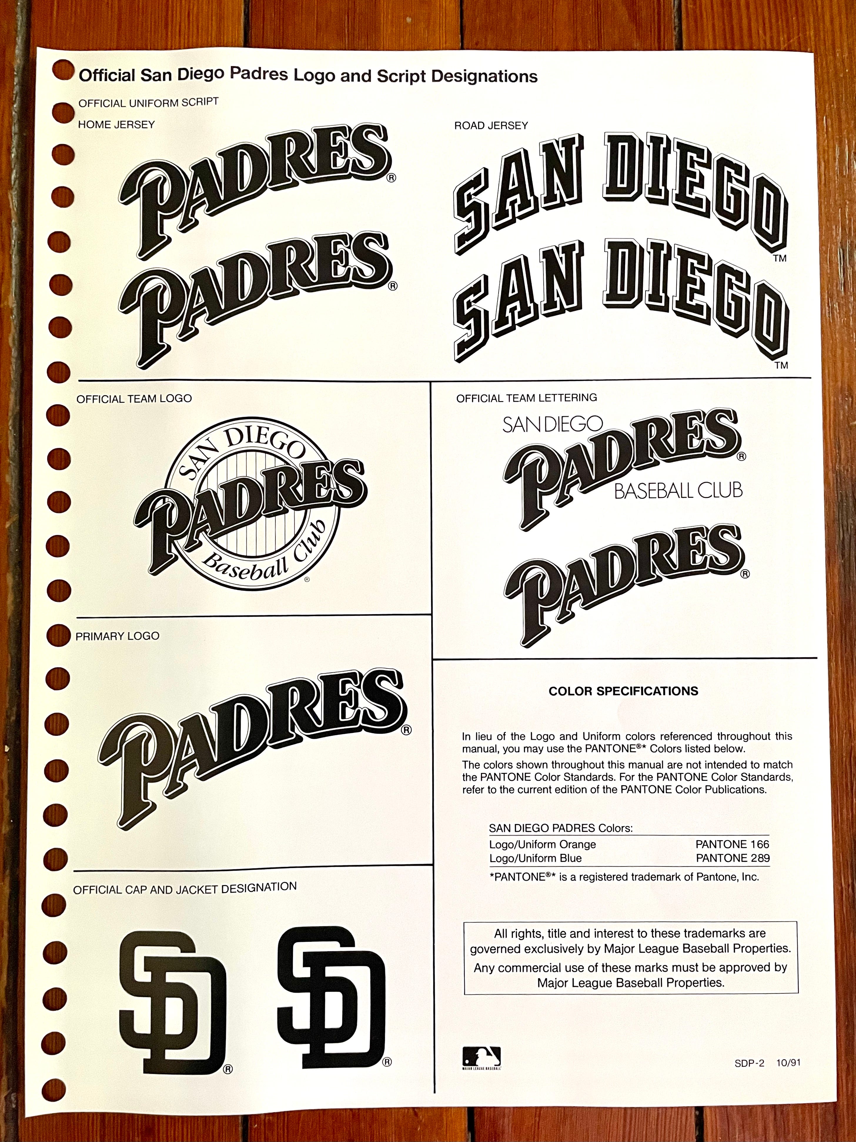
Any Padres uni that doesn’t include the Swinging Friar gets the thumbs-down from me, although I realize fans who grew up with this look probably still feel a fondness for it.
———
San Francisco Giants
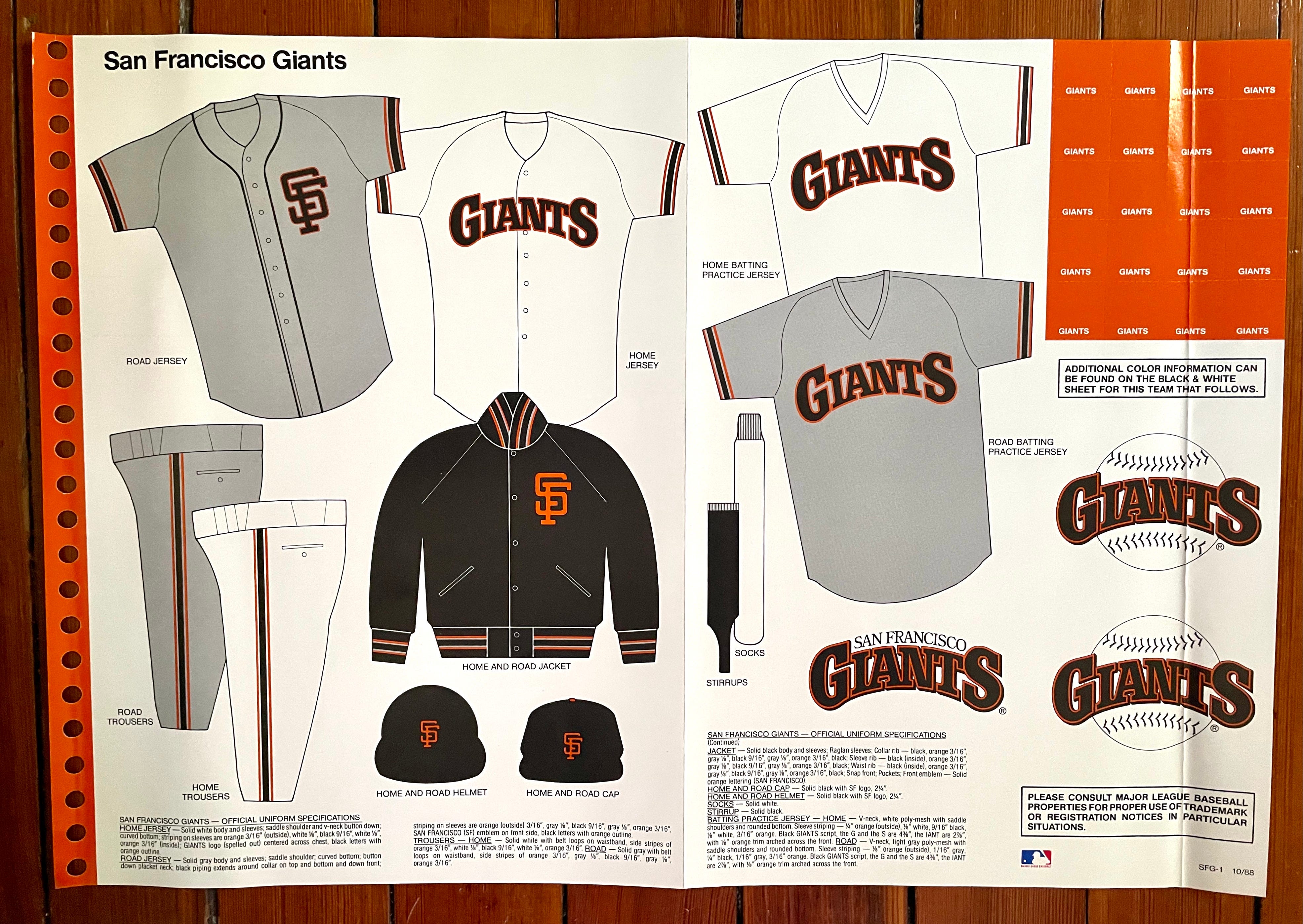
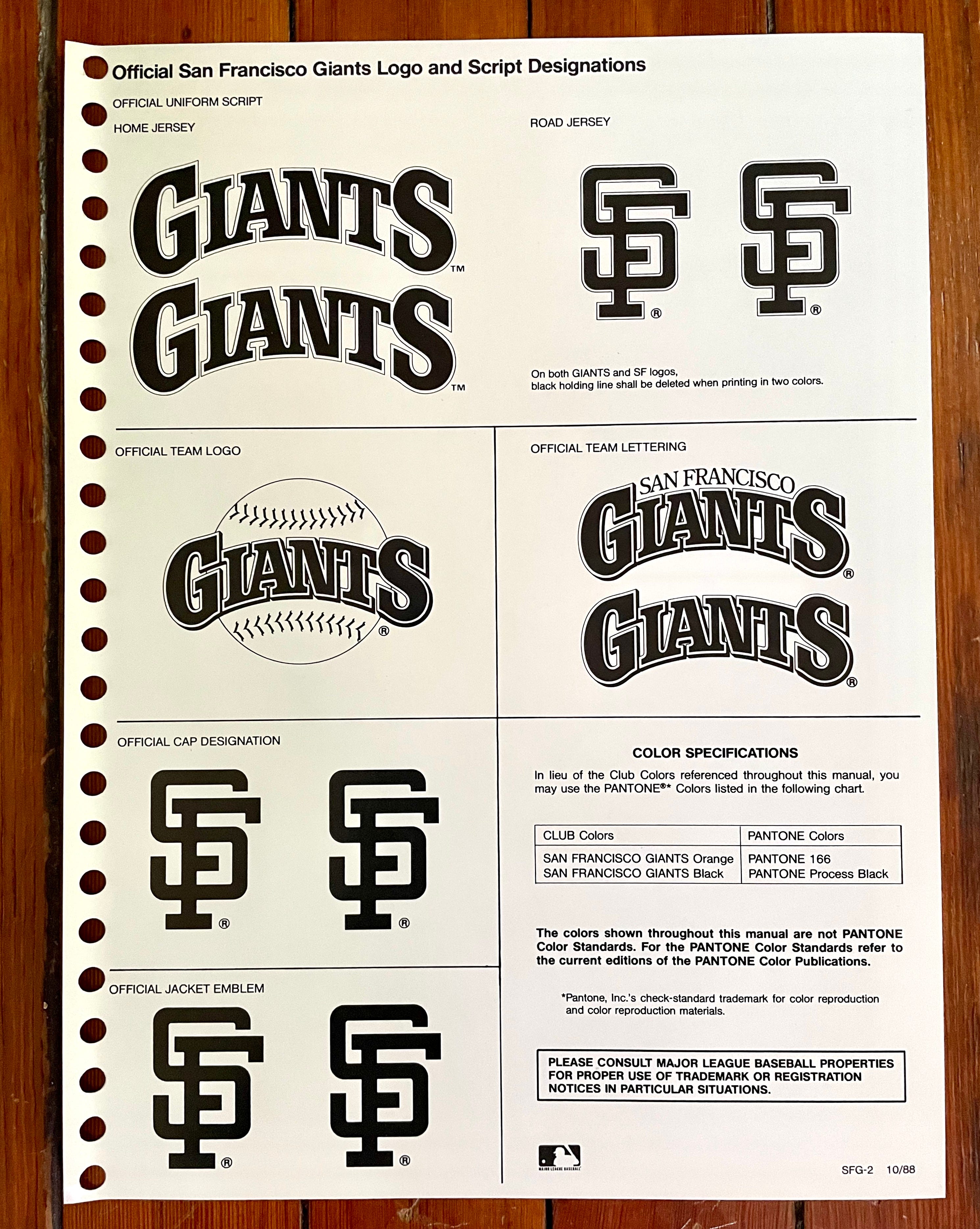
Ugh, I’ve always hated that home insignia. Feels so strip-mall, so TGIBaseball. But it’s worth noting that this uni set had a significant saving grace that isn’t shown in the style guide: vertically arched NOBs.
———
Okay, so that’s the team-by-team rundown. But as I mentioned earlier, the guide also includes some frontmatter pages. Here’s a look at those (if you’re reading the web version of this article, click on the first thumbnail to launch the gallery):


And there you have it — the full style guide. Hope you enjoyed seeing it as much as I enjoyed sharing it with you! If the response is good, maybe I’ll feature some of my other style guides in subsequent articles.
Paul Lukas has been writing about uniforms for over 20 years. If you like his Premium articles, you’ll probably like his daily Uni Watch Blog, plus you can follow him on Twitter and Facebook and check out his Uni Watch merchandise. Have a question for Paul? Contact him here.
Love this - more please!
I don’t hate the current Brewers current ball-in-glove logo, but man do I prefer the original. It has a certain amateurish charm I just love (the loopier “m”, the off center ball, etc). The new one is just too sleek and industrial for my taste.