
Go Figure
A deep dive on the surprisingly wide stylistic range of “Fig.” notations on patent drawings.


Editor’s Note: I don’t mind saying that today’s post is, for lack of a better term, peak Inconspicuous Consumption. If you’re already a paid subscriber, I’m fairly confident that you’ll love this post. If you’re not a paid subscriber, this post is worth splurging on. Trust me. — Paul
I recently visited the excellently named General Society of Mechanics & Tradesmen of the City of New York (motto: “By Hammer and Hand All Arts Do Stand”). I went there to see the architect and design historian Thomas Rinaldi give a presentation about his 2021 book, Patented (shown above), which is a survey of 1,000 notable design patents.
The presentation was really good (you can see a video of it here), and I ended up purchasing a copy of the book. Its format is very straightforward, as you can see from these sample pages:
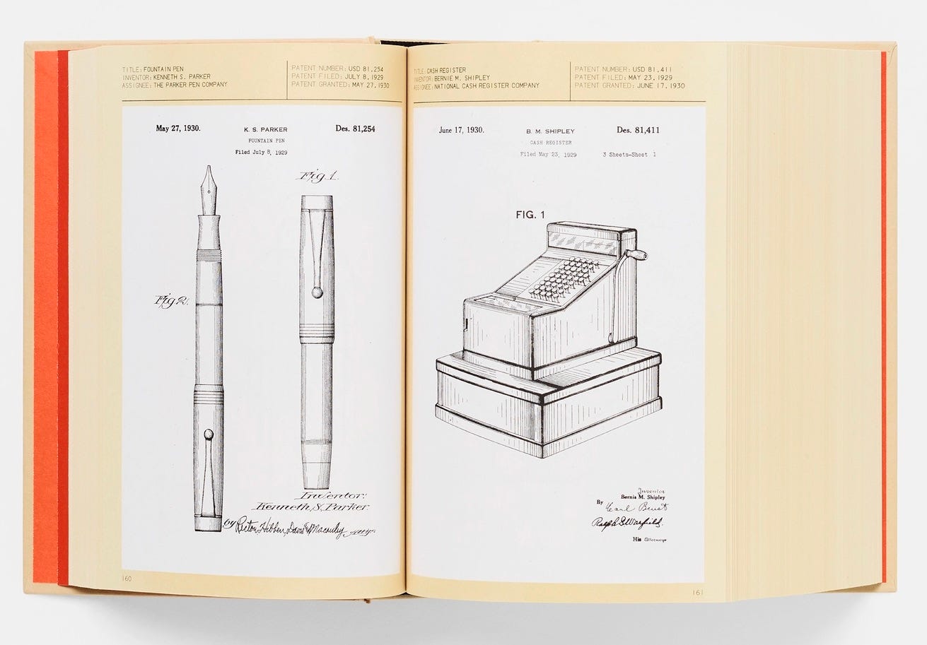
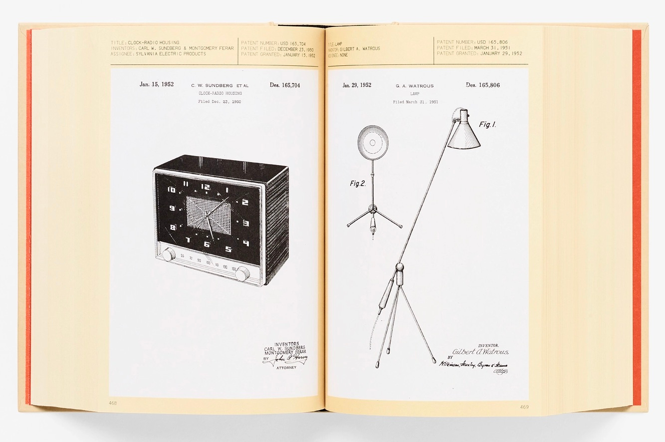
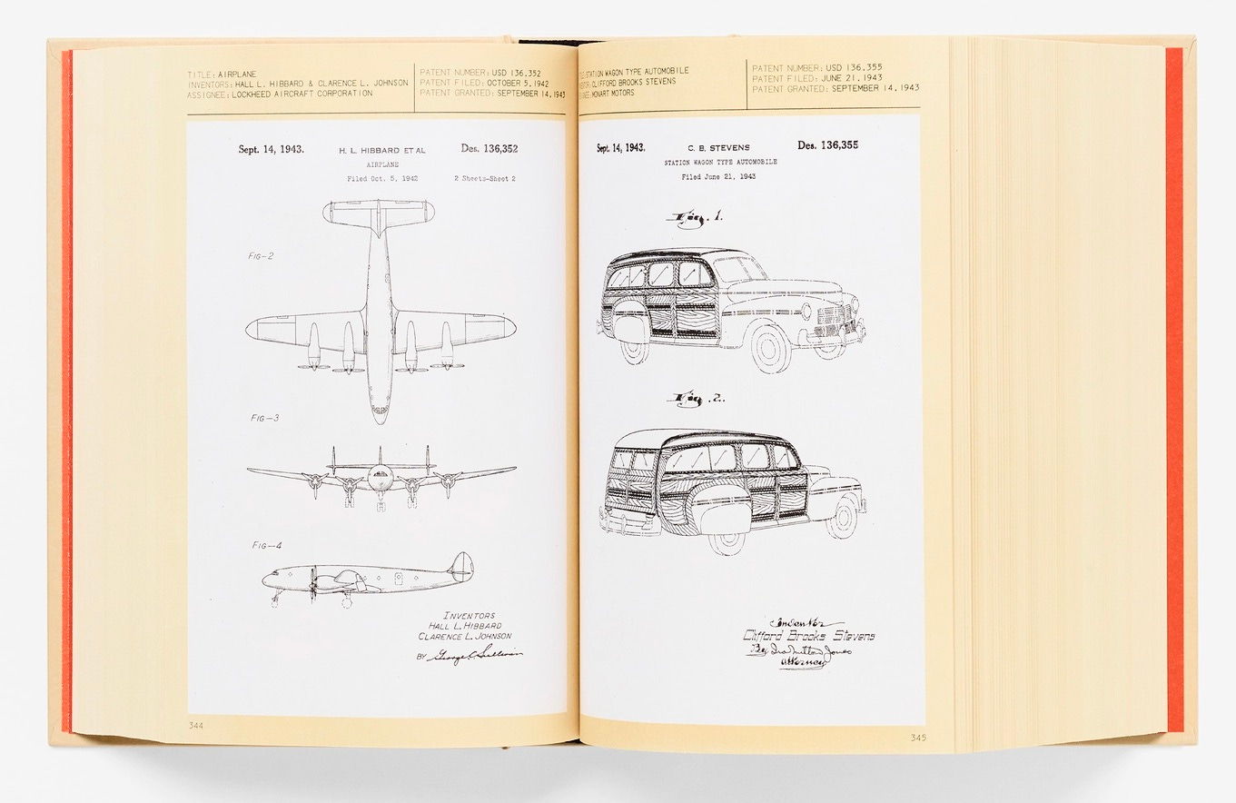
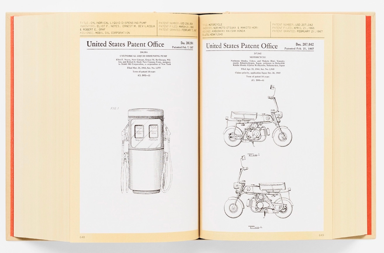
Aren’t those drawings beautiful? When you see so many of them gathered together in the book, you really start to appreciate patent artwork as an aesthetic category unto itself. Sadly, Rinaldi says the illustrators are never named in the patent paperwork, so there’s no way of knowing who created these wonderful images.
But as I paged through the book, I soon found myself fixating on — of course — a more inconspicuous aspect of the drawings. As you can see in the pages shown above, some of the patents have multiple images, labeled “Fig. 1,” “Fig. 2,” and so on. The more drawings I looked at, the more fascinated I became by these little “Fig.” labels, which were rendered in a seemingly endless variety of styles. To see what I mean, let’s take a closer look at the ones just from the pages shown above:


“Fig.” notations on patent drawings have occasionally caught my eye in the past, but seeing so many different versions of them in Rinaldi’s book got me to really think about them for the first time. Given how specific and exacting the patent-application guidelines are in most respects, it’s a bit surprising that there are no apparent rules or protocols for the “Fig.” labels. As demonstrated by the examples shown above, they can be typeset or hand-lettered; all-caps or initial cap; italic or not; serif or sans; a period after “Fig” or not; a period after the numeral or not; and so on. Sometimes the lowercase i isn’t even dotted! About the only consistent thing is that “Figure” is always abbreviated.
Since the book contains 1,000 patents, I can’t show you all of the notable “Fig.” variations here. But to give you an idea of the stylistic range, I’ve chosen a random handful of years — 1950 through 1953 — and have selected 30 of the more interesting “Fig.” labels from that time span. Before I show them to you, here are a few preliminary notes:
I mostly avoided “Fig. 1” labels, because 1 is the least visually interesting numeral. I wanted to show how the illustrators executed the more visually complex numerals.
While some of the labels I chose may look similar to each other, I’m pretty sure no two are alike.
The caption for each illustration includes a link to the full patent.
Ready? Here we go: