EXCLUSIVE: 76ers Considered Black-Light Uniform in Early ’80s
The design was never used, but the designer still has drawings and a sample prototype uni.
Before we get started, here are our usual two reminders: First, if you’re reading the emailed version of this article, you can post a comment by clicking on the headline above, which will bring you to the web version, where any Facebook member can comment. And second, if you’re reading the web version and want to subscribe to receive my Bulletin articles via email, you can do that here. Thanks! — Paul
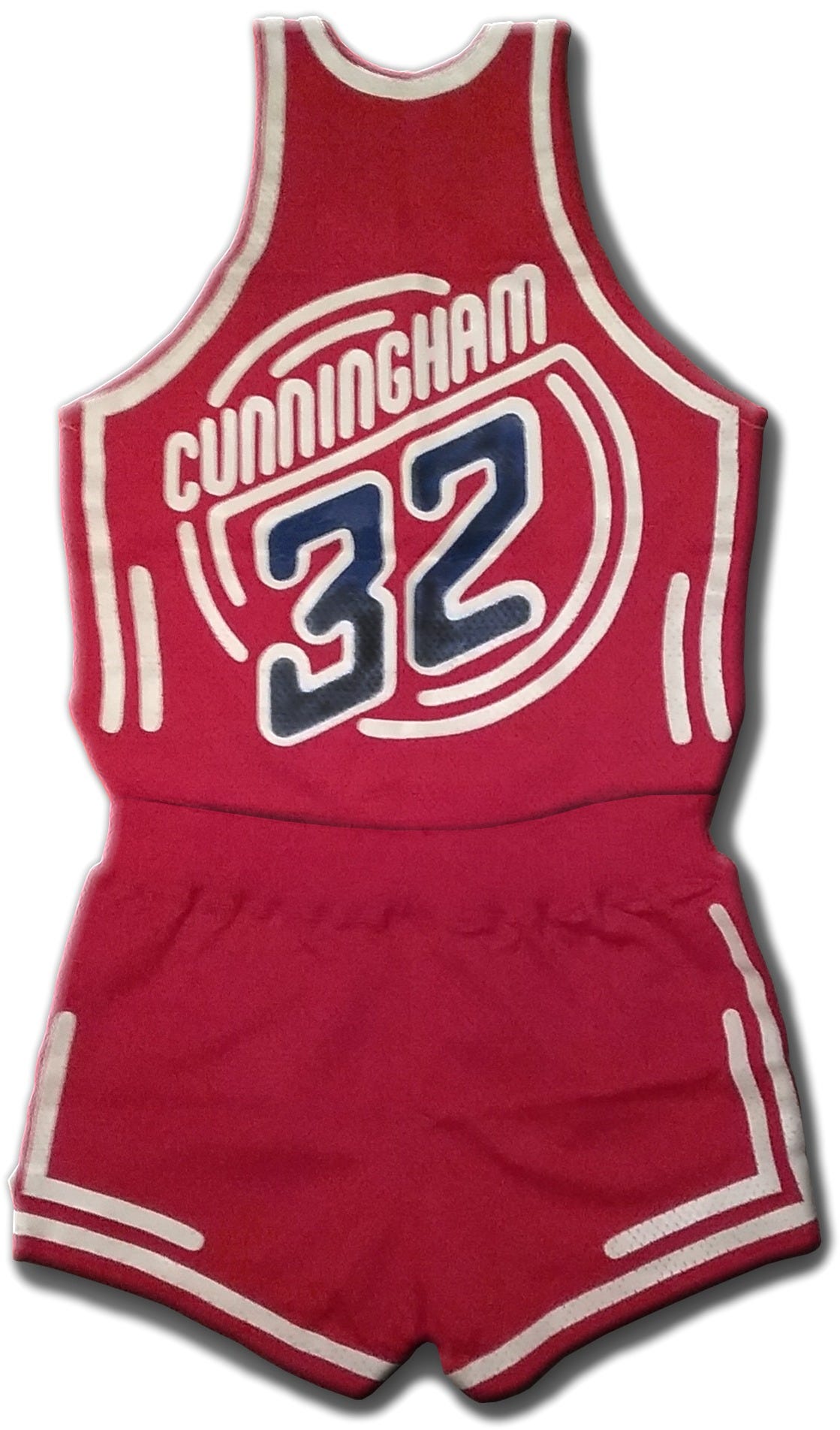
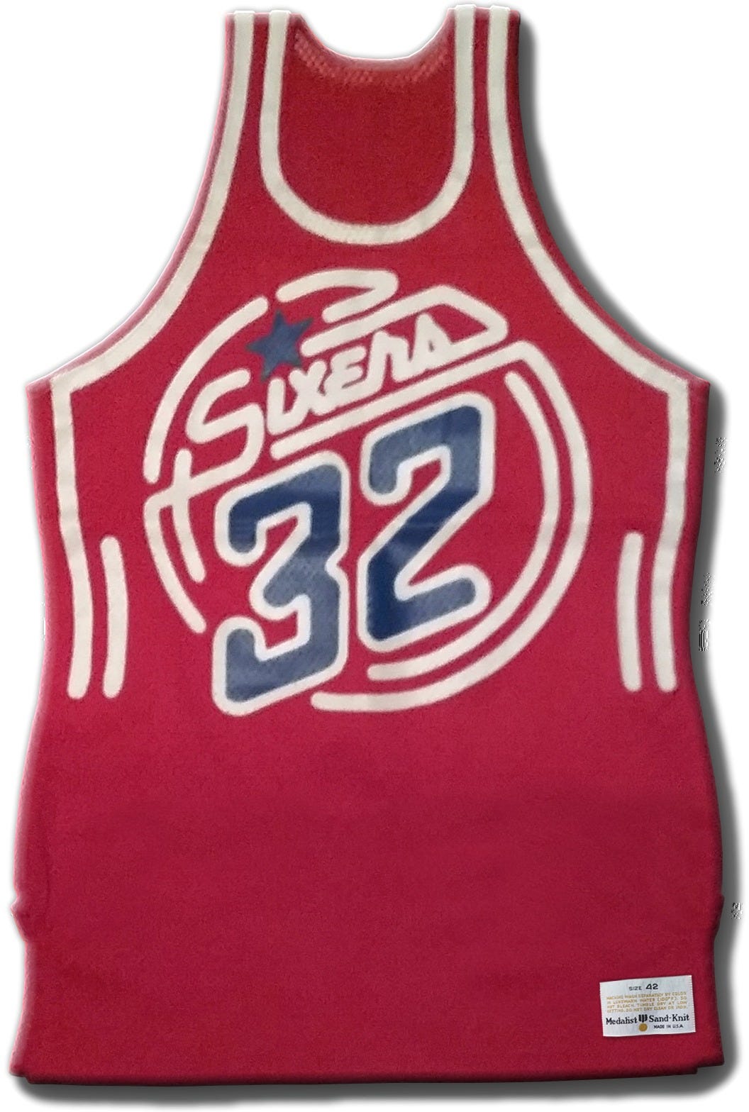
About a month ago, I received an email from a Uni Watch reader named Jonathan Poet. He belongs to a Facebook group about vintage Philadelphia-related stuff, and someone in the group — a guy named Ivan Stiles — had just posted photos of a Philadelphia 76ers prototype uniform that he claimed to have designed in the early 1980s, along with the original concept art.
Naturally, I was interested. Prototype uniforms are always fascinating to see — they provide a window into what might have been, a peek down the road not taken. But what really caught my eye about Stiles’s Facebook post was his description of the uniform concept (boldface emphasis mine):
Back in the early ’80s, I worked for an advertising agency charged with giving the Sixers a new look, which included a new uniform design. I was given the challenge of designing the uniform. The stripes were printed with ultraviolet-sensitive ink designed to glow under black lights. … Unfortunately, for reasons not shared with me, the entire project was scrapped before reaching fruition.
Whoa — a black light uniform? That was a new one on me. Interestingly, the design didn’t look like old black light posters, but it appeared to have a neon sign motif, which I figured was supposed to “pop” once the black light hit it.
I got in touch with Stiles and arranged to speak with him by Zoom. As I prepared for our interview, I learned that he’s no ordinary designer — he’s also a longtime professional musician. Specifically, he's one of the nation's foremost autoharpists, and he's also adept on other old-timey instruments like the mountain dulcimer, the bowed psaltery, and the musical saw.
Stiles turned out to be a completely charming character. Here’s a transcript of our conversation, edited for clarity and length.
Uni Watch: Let’s start with a little background on you. You mentioned in your Facebook post, which is where I first saw the uniform, that you were working for an ad agency in the early 1980s. What agency was that, what was your title or role there, and what sort of graphic design career had you had up to that point?
Ivan Stiles: I was working at the time for Schaefer Advertising, just outside of Philadelphia. I worked there from 1979 until 1985. I was the associate creative director, so I was in charge of the art department.
UW: Where did you work previously? Were you a longtime advertising guy?
IS: Yeah, I started at Strawbridge & Clothier as a messenger in the advertising department. Within two years, I was promoted to illustrator, so I was illustrating a lot of their newspaper ads. Eventually I left them and went to another company. You remember Sunoco Sunny Dollars? I worked for the company that made the scratch-offs for that. And then I quit and started my own advertising agency, which I had for seven years. Then I was with Contemporary Marketing, Inc., as their creative director. And then I went to Schaefer.
UW: Had you gone to art school or design school?
IS: No, I never went to college. I’m self-taught.
UW: Wow. Regarding Schaefer, what was their relationship to the 76ers? Had the team been a Schaefer client for a long time?
IS: No, this was a special project that came into the agency.
UW: You mentioned on Facebook that this took place in the early ’80s.
IS: I’d say ’83 or ’84. Somewhere in there. I don’t think it was ’85. And I think it probably came to the agency through Al Schaefer [the agency’s founder], because he had a son who was big into hockey, so Al was big into sports. The project was essentially a rebranding of the Sixers to give them more excitement. We were charged with planning all of that — you know, what’s their new look, what are they going to do for halftime shows, and all this other kind of stuff. The only portion I was involved in was the design of the uniforms.
UW: How did you end up getting assigned to the uniform component of the project?
IS: Because I was associate creative director in charge of the art department. So I got to say who designed the uniforms, and I said it was me.
UW: Had you ever designed a sports uniform before?
IS: Oh, no.
UW: Were you a 76ers fan and a basketball fan, or even a sports fan?
IS: Not really, no. I knew the name Billy Cunningham [who was the Sixers’ coach at the time].
UW: Then why did you assign this to yourself? Why did you find that challenge so intriguing?
IS: Well, it was something I hadn’t done before, and I just thought it would be a interesting project to work on. So I took it on.
UW: Did you meet with the team?
IS: No, I had no contact with the Sixers. That was all done by Al, I think. The job just came and it was there, so I did it.
UW: Do you recall what the creative brief called for?
IS: No, I have no recollection of that. I don’t even know if there was a brief — it was just “Here, give us a couple of designs for a uniform.”
UW: Do you recall what their existing uniforms looked like at the time?
IS: You know, I have no idea.
UW: Here, let me share my screen with you so you can see.

IS: Oh, right. Yeah, that jogs my memory.
UW: It’s actually not all that different from what they wear today, although they had a lot of other things in between. I think we could agree that this was basically a conservative, classic basketball uniform design, right?
IS: Yeah, it’s fairly conservative as far as design is concerned.
UW: So your your goal was to do something with a little more razzle-dazzle?
IS: Yeah, more excitement. I had the idea of using black lights, so the proposal was that they would embed the black lights into the floor of the court. The idea was that when the Sixers were announced to come onto the court, the lights would be dimmed and the black lights would come on and activate the inks used on the uniform.
UW: The prototype uniform is the road design, so was the idea that the black light would be used at home and on the road?
IS: For the sample, we chose to do the away uniform because it was more dramatic than the white home uniform. But I don’t know if they actually considered taking some sort of portable black lights with them on the road.
UW: And the black light would just be for the pregame introductions, not for the game itself, right?
IS: Right, just for the introduction. It may also have been planned to be used in the halftime shows, but I was never involved in any of that planning.
UW: It looks like the graphics themselves had a neon sign motif. And then the black light would make it pop like a neon sign — was that the idea?
IS: Right, exactly.
UW: Did you go back and forth with a few other ideas before hitting upon that?
IS: No, not really — that was the idea from the start. The boss was happy with it. So you know, if the boss is happy, I was happy.
UW: What did you use for the drawings you prepared — colored markers?
IS: Yeah, yeah, that’s just Magic Markers.
UW: And would you go through several preliminary sketches before coming up with a final like this?
IS: I must have, but I don’t recall offhand, and I don’t have any other sketches saved from that project. When I sit down, I usually get a couple of ideas and they work and I don’t have to take them any farther. Like, I’ve designed over 50 CD packages for musicians all over the country. Most of the time, I work up a design and they accept it and that’s it. I think only once have I had to actually do a redesign because they didn’t like what I did.
UW: Wow, that’s a gift. Judging from the tagging on the prototype, it looks like it was manufactured by Medalist Sand-Knit, which was a big uniform manufacturer at that time. Did you have any interactions with them about the production of the prototype, and especially the black light-sensitive ink?
IS: Yeah, I did have to have a discussion with somebody there about the ink that would respond to the black light. They’d never had a request for that before, but they said they could do it. And we tested it with the black lights, and it worked.
UW: That must have looked very cool. Do you have any photos of that?
IS: No, nothing like that.
UW: Obviously, the team never went ahead with this design. Do you recall why?
IS: I have no idea and it was never discussed.
UW: How did the prototype end up in your possession?
IS: We had two prototypes done. One of them went to Billy Cunningham, and the other one I kept. I wanted it because I designed it.
UW: Have you ever worn it like for a pickup game or anything like that?
IS: Oh, it wouldn’t fit, you know, not in a million years. That thing is gigantic.
UW: Would the graphics still “pop” under black light after all these years, or does the ink’s effectiveness fade over time?
IS: You know, I don’t know if it does or not. That’s not something I asked the manufacturer about. [Stiles later told me he checked and discovered that the black light effect no longer works, unfortunately. — Paul]
UW: When I got in touch with you to arrange this interview, you showed me illustrations for a different design that wasn’t shown in your Facebook post. Did you produce that one at the same time, just as another option for them?
IS: Yeah, it was just a backup, in case they didn’t like the neon look. It wasn’t the one that we preferred, so we didn’t make a sample of that one, because we liked the other one more.
UW: Was there any particular theme or inspiration behind it?
IS: Basically a patriotic theme.
UW: Right, I noticed that you used 13 stars surrounding the number on the chest of the jersey, which I assume was a reference to the 13 original American colonies.
IS: Yes, absolutely.
UW: What about the number of stars on the collar, on the shorts, and around the number on the back? Was there any numerical significance to those?
IS: Not that I remember. Just looking for a place to put stars.
UW: For that design, you put the player’s name below the number on the back, rather than above the number. That wasn’t completely unheard of in the NBA at the time [the Cincinnati Royals, for example, were doing it at least as early as 1970, and they kept doing it when they relocated and became the Kansas City Kings a few years later — Paul], but it was very uncommon. What was your thinking on that?
IS: I have no recollection. I did it because it looked good to me.
UW: Were you disappointed that the team didn’t go ahead with either of your designs?
IS: Absolutely. I mean, I was really down because they canceled it. And I was especially down because I had no idea why. No one was going to discuss it with me. So I don’t know whether it was the money or something else. I just don’t know.
UW: Did you ever design any other sports uniforms?
IS: No, no. That was it and it died.
UW: Do your friends know that you almost had a major role in 76ers history?
IS: No, not really. I don’t talk about it much because it’s one of my failures.
UW: So what led you to share it with that Facebook group?
IS: Well, the Inclusive Vintage Philadelphia group is interested in all kinds of vintage Philadelphia stuff, so it kind of made sense to put it there.
UW: How long did you keep working in advertising?
IS: In 1985, I had three weeks of vacation coming to me. And I had more bookings in my music than I had vacation time. So I quit to pursue my music. I did freelance graphic design, and still do. Basically, I’ve been freelancing ever since 1985 while also playing music professionally.
———
And there you have it. Creating a new uniform was clearly a very different enterprise back then than it is in our current Nike-dominated era!
As for the uniform itself: Obviously, installing black lights in the court might have posed some logistical challenges, and it’s highly doubtful that any other home team would allow the Sixers to do the black light thing on the road, but it’s still a really interesting concept, and a good reminder that the uni-verse is full of fascinating stories waiting to be told.
I showed the photos and drawings to 76ers president Chris Heck, who said he’d never seen or heard anything about them (unsurprising, since they long predate his involvement with the team). Heck said he’d check with Billy Cunningham, who’s now 78 years old, so see if he remembers anything about this. Maybe he still has the other prototype! No word on that yet, though — stay tuned.
Meanwhile, if you’d like to learn more about Ivan Stiles and his music, you can look here and see videos of him performing here.
(Special thanks to Jonathan Poet, without whom this story would not have been possible.)
Paul Lukas has been writing about uniforms for over 20 years. If you like his Bulletin articles, you’ll probably like his daily Uni Watch Blog, plus you can follow him on Twitter and Facebook and check out his Uni Watch merchandise. Have a question for Paul? Contact him here.


