A Sample Catalog for Something You Probably Never Thought About
If you’re giving out a diploma, certificate, or other fancy document, it likely needs a decorative border.

Editor’s Note: This post includes lots of small details and wide-formatted photos. If possible, you’ll be better off reading it on a computer, not on your phone. — Paul
When people ask me why I’m so fascinated by salesman sample catalogs (like the ones featured in that recent Met museum exhibit, or the amazing pencil sample kit I wrote about last week), I’ll usually explain that I like how such catalogs often promote product lines that we rarely if ever think about. In short, these catalogs offer solutions to very specific and obscure problems.
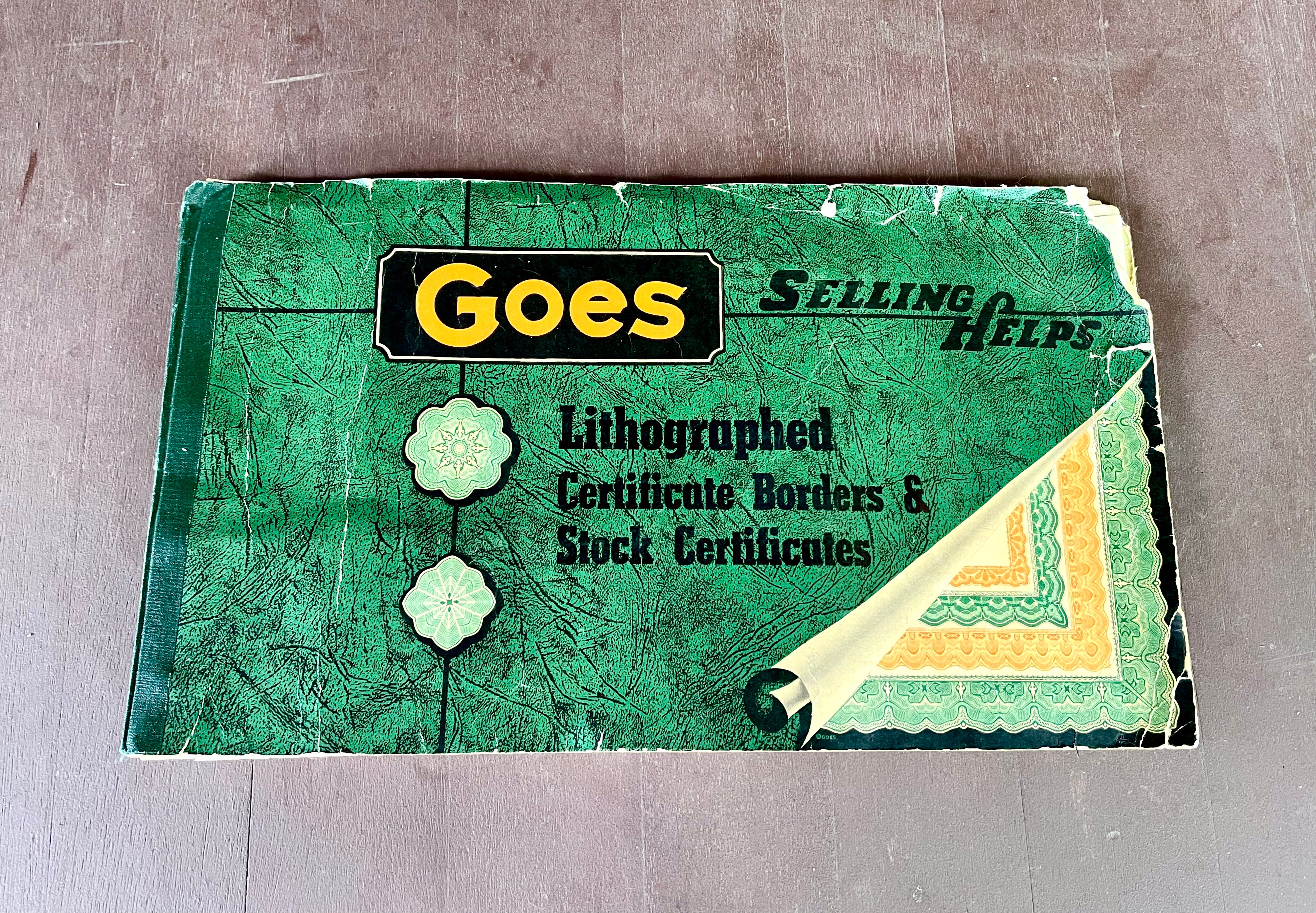
A great example of this is the vintage catalog shown above, which is for the Goes Lithographing Company’s line of decorative certificate borders — an appealingly hyper-specific niche.
I recently acquired this catalog on eBay for $32 and have been completely fascinated by it. Let’s start with the cover, which is gorgeous despite being a bit nicked up. Among the noteworthy details:
Naturally, I love the color scheme, which pushes all of my green-centric buttons.
I’m intrigued by the phrase “Selling Helps,” which seems very old-timey compared to, say, “Selling Aids” or “Sales Aids.” (Or are they trying to say, “Selling helps you”?)
With a company name like Goes, how did they resist coming up with a corny slogan? Come on — “There It Goes,” or “Your Business Goes Up with Goes,” “What Goes Around Comes Around … to Profits!”
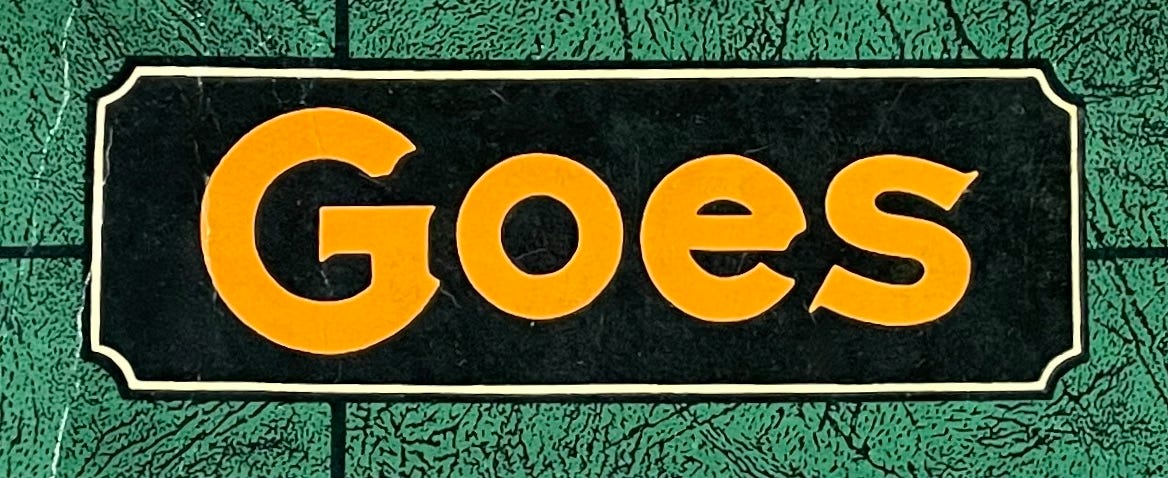
The typography on the company name is unusual. Check out the little notch at the top of the “G,” and the similar notch on the right side of the “e” — it’s like they both had a bite taken out of them:
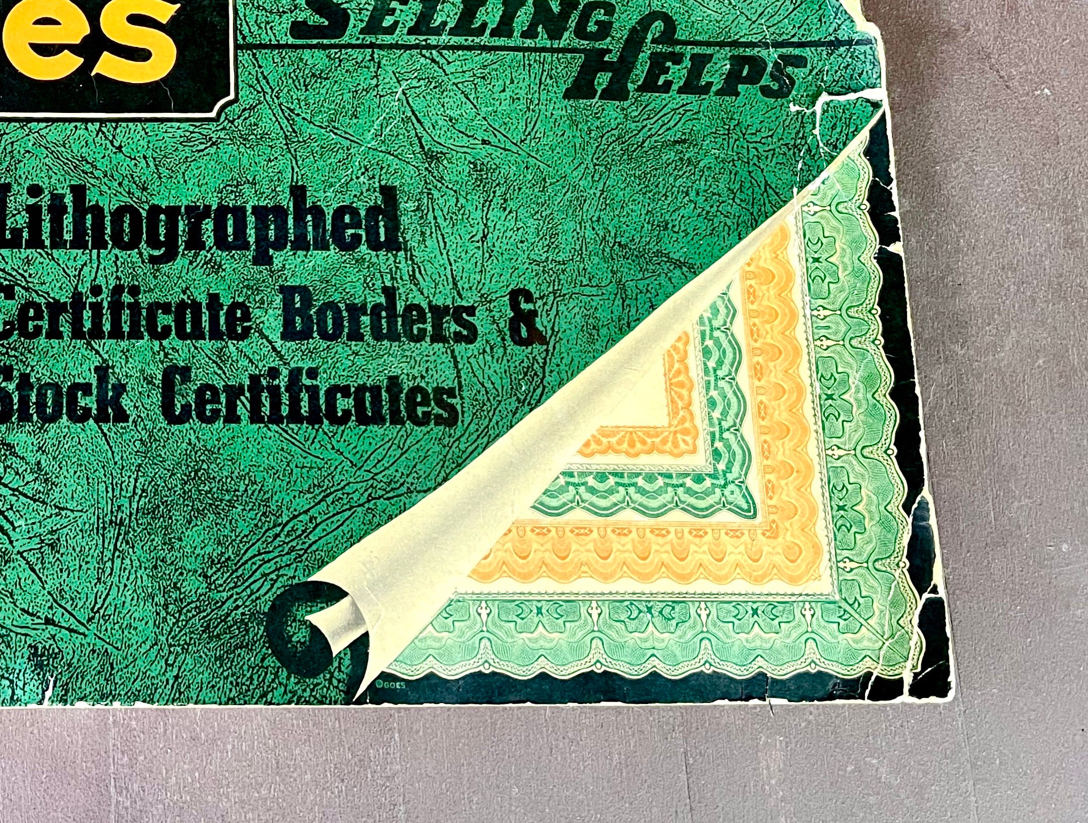
But the most interesting thing about the cover design is the faux-rollback design in the lower-right corner, which gives a hint of what’s inside. It’s a clever design trick that you don’t often see, especially on salesman sample catalogs:
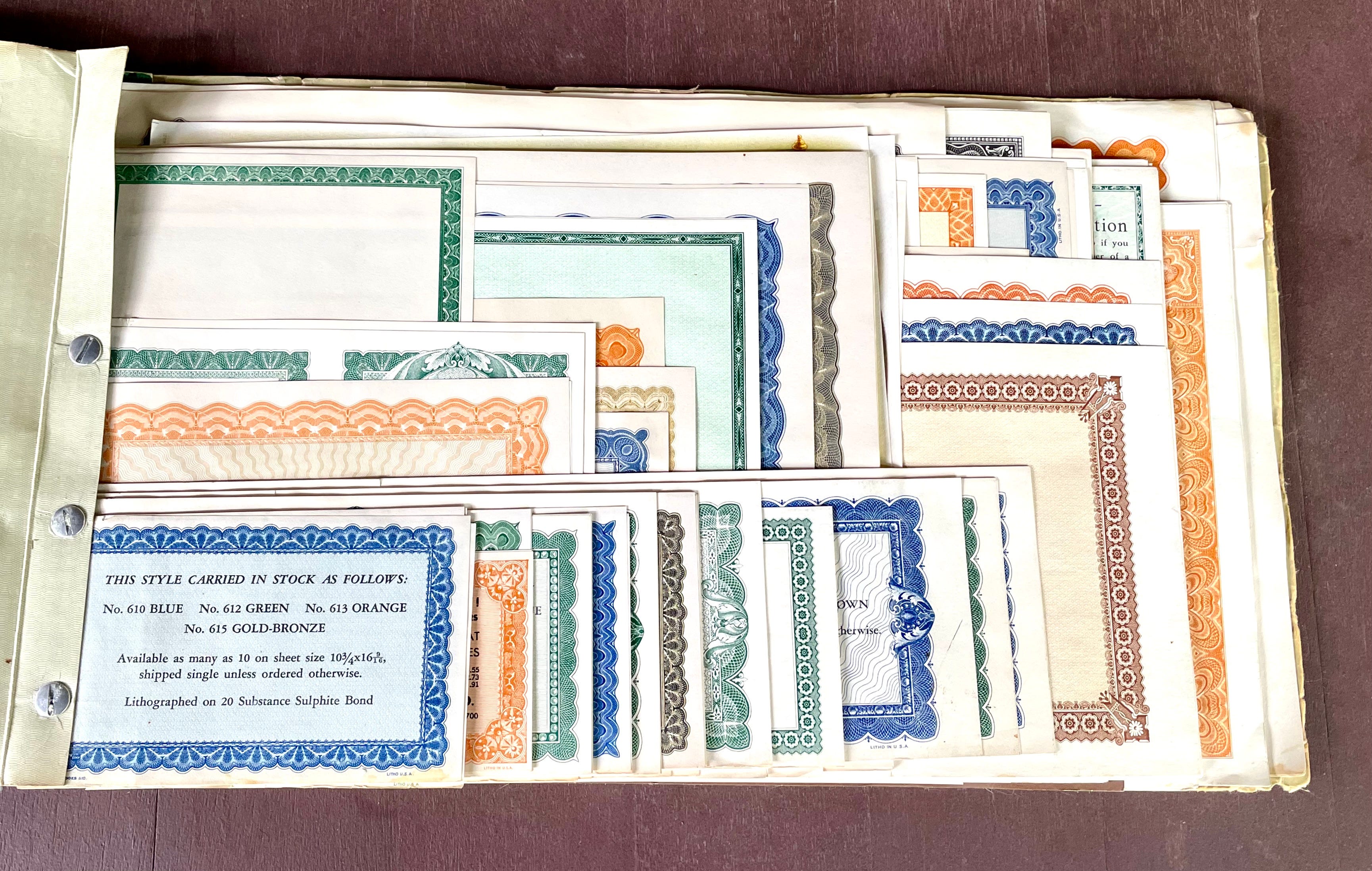
And here’s the thing: That little tease doesn’t even come close to capturing what awaits us within this catalog. In fact, I don’t think I’ve ever seen a trade catalog that delivers such an eye-popping punch simply by having its front cover opened. Check this out: