

Broncos-Redesign Contest Results
We challenged Uni Watch readers to give the team a much-needed makeover. Here's how they did.

It is a truth uni-versally acknowledged that the Denver Broncos are in desperate need of a design makeover. Their current uniform set looked fairly ridiculous when it was introduced in 1997 and has aged poorly since then.
With the Broncos apparently starting the process for a long-overdue visual overhaul, I recently challenged Uni Watch readers to submit their best Broncos-redesign concepts. As usual, you folks did not disappoint. Here are the best and most interesting submissions that were sent our way.
Best Mix of Old and New (tie): Bill Raddatz and Chris Diamond
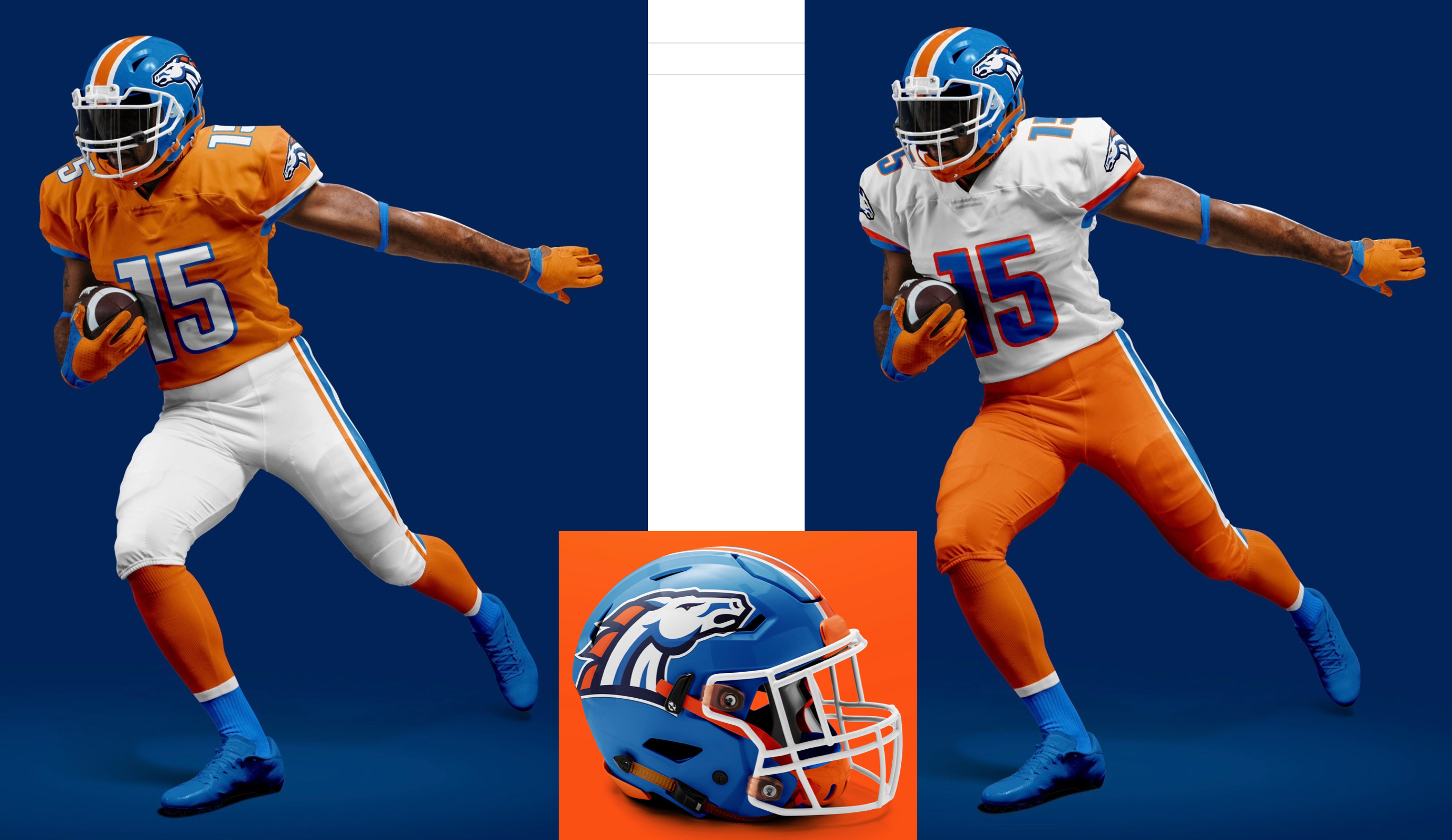
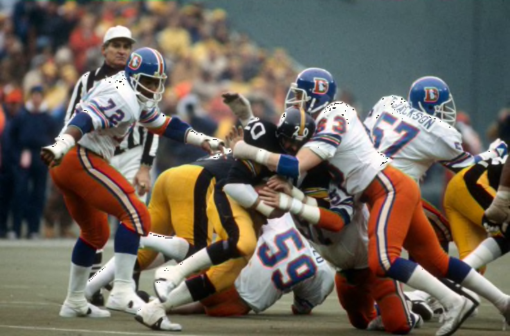
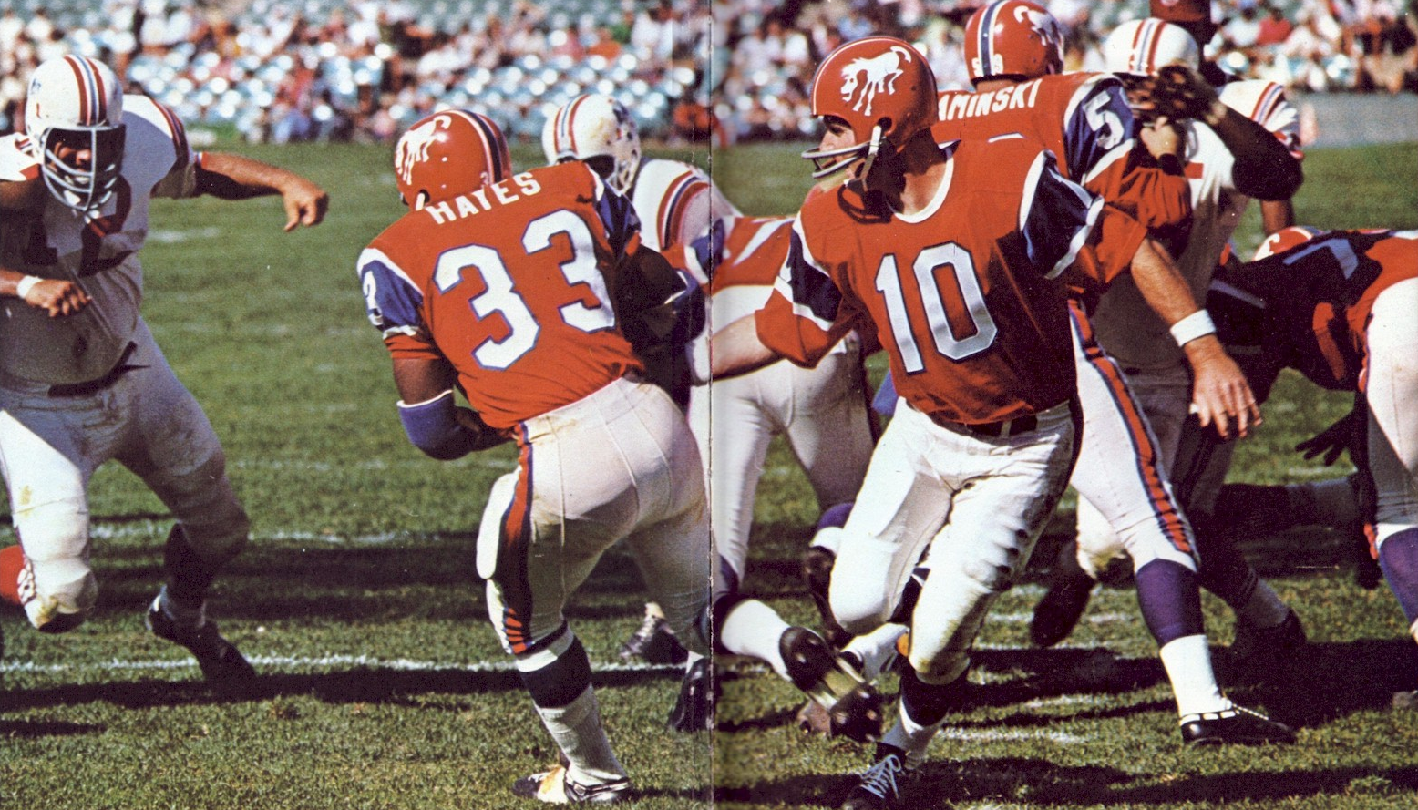
Many of the concepts we received attempted to mix and match various design elements from the Broncos’ visual history. Nobody did that better than Bill Raddatz, whose primary home and road designs are shown above. As you can see, he restored the team’s pre-Nike color scheme (including the sorely missed orange pants, originally worn in the late 1960s and again in the late 1970s), made some minor tweaks to the Nike-era helmet logo, and added a number font that feels like a good happy medium between standard block numerals and the team’s longstanding Nike font. Nicely done.
Chris Diamond took a similar approach and got excellent results by combining the Broncos’ current helmet logo and number font, the old royal blue helmet, and the mid-1960s jersey template: