

☞ Bonus Post: A Deep Dive on Non-Postal Pointing Hands ☜
This symbol already had a long, rich history well before the advent of rubber-stamped “Return to Sender” graphics.
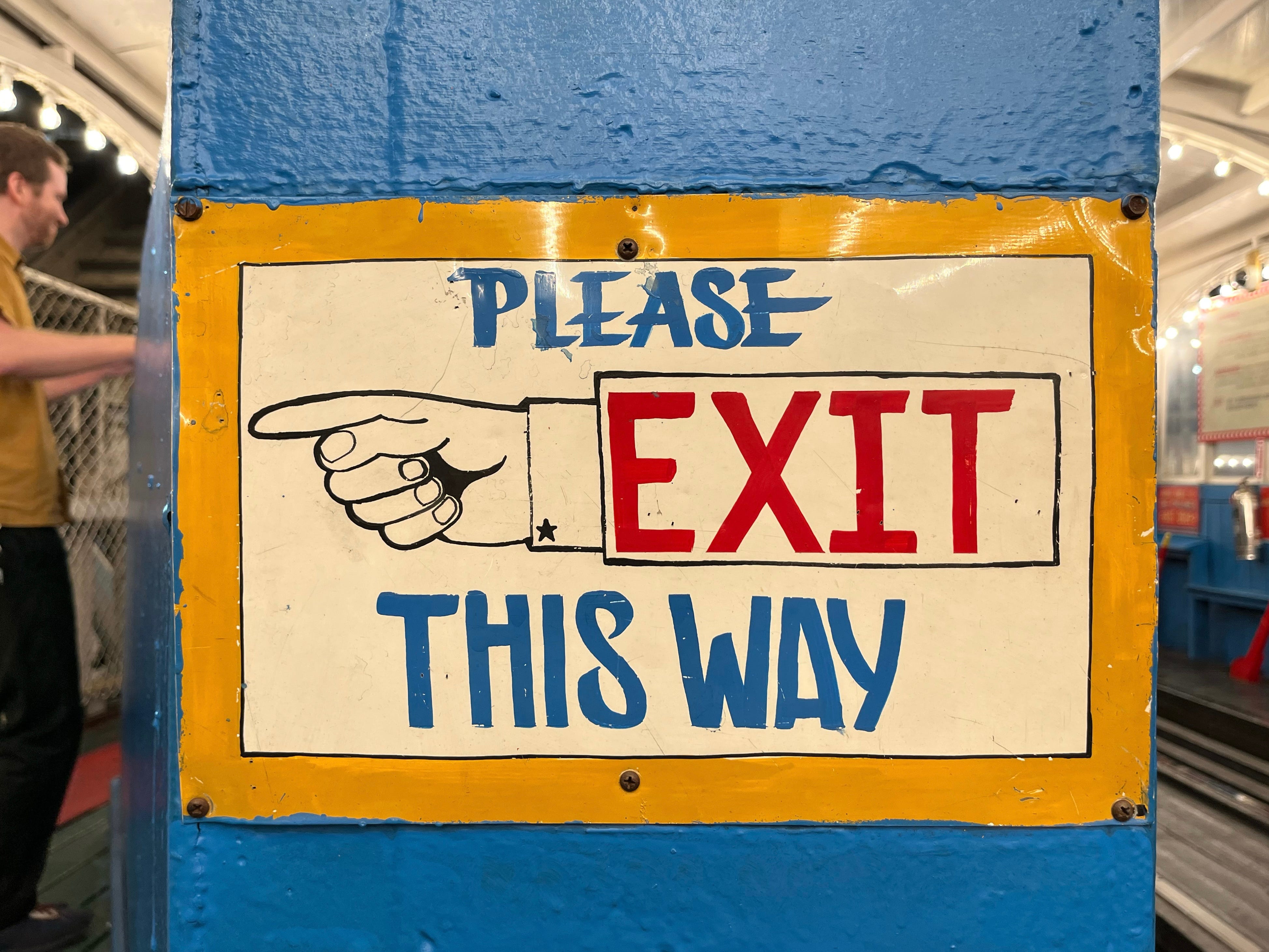
Yesterday we examined the postal system’s use of rubber-stamped “Return to Sender” symbols shaped like pointing hands. But as you’re probably aware, pointing hand graphics are also used in lots of non-postal settings (like on the sign shown above). These symbols, which date back nearly a millennium (!), laid the groundwork for the familiar postal mark, so it seems appropriate to delve into a bit of that history.
Let’s start with some nomenclature: The non-postal pointing hand has been known by many names over the years, but the preferred term appears to be manicule (from the Latin root manicula, meaning “little hand”). This term is used pretty routinely by graphic design people but has not caught on with philatelists, who consistently use pointing hand.
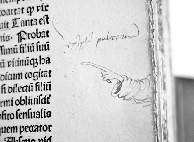
According to Wikipedia, the earliest manicules date back to the 11th century and had nothing to do with undeliverable mail. Instead, they were hand-rendered notations in the margins of books, indicating important passages.
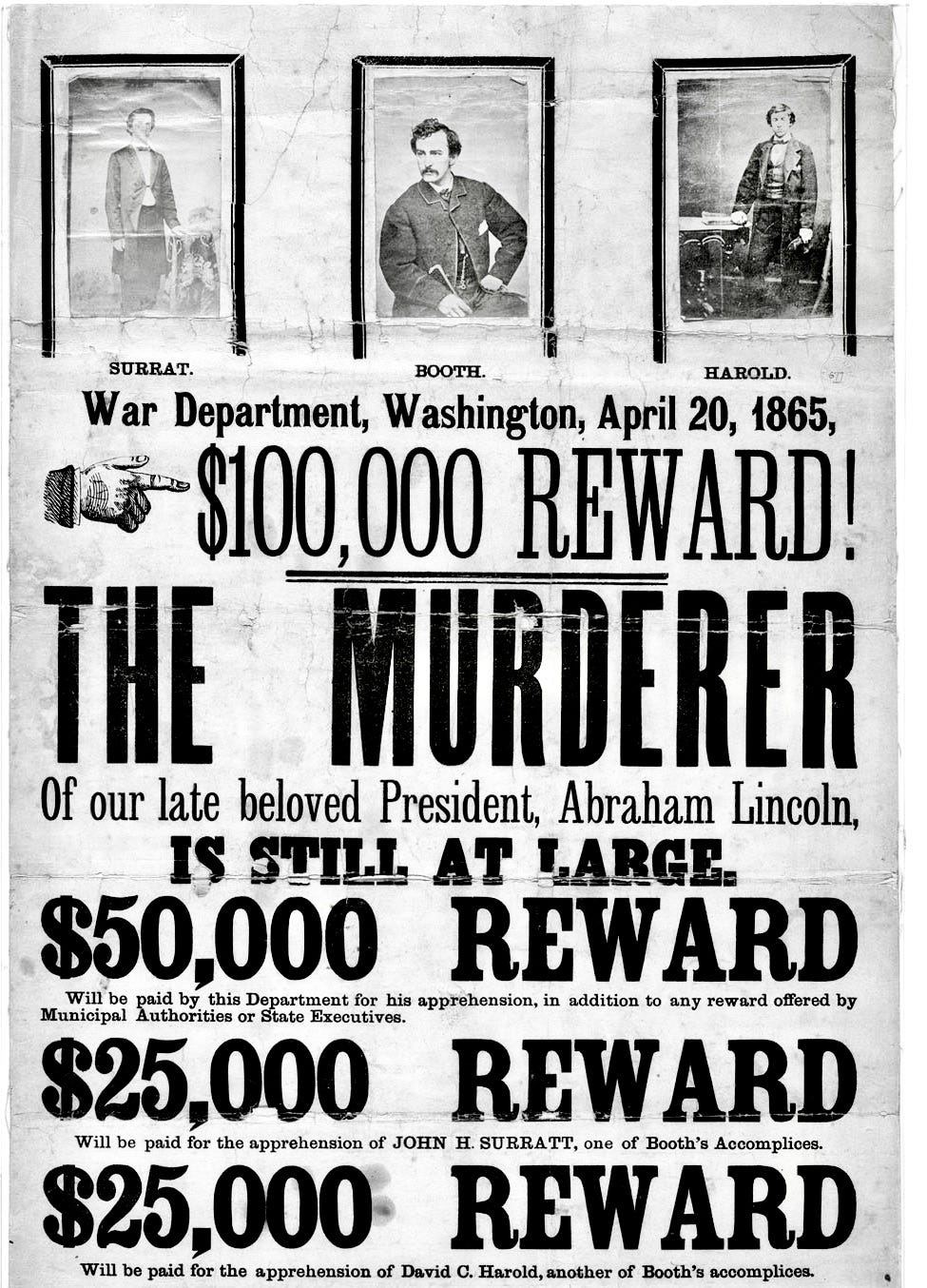
After the invention of the printing press in 1440, printed manicules began appearing in books (sometimes to mark the start of a new paragraph) and on other printed matter. Over the next several hundred years, they became common ornaments on various types of printed matter, drawing attention to important lines of text.
But there was never any standardization of the manicule symbol across the printing trade. Just as there were many different typefaces, there were likewise many different manicules. A new book called Graphic Classics has a page that shows 88 different examples, and one gets the sense that this may well be just the tip of the manicular iceberg. Check it out: