Ask Me Anything
The latest installment in an occasional Uni Watch series.
Hello! It’s time for the latest quarterly edition of “Ask Me Anything,” where Uni Watch readers submit questions and I do my best to respond to them.
If you want to catch up on previous AMA installments, look here. There are 11 additional editions, dating back several years (when I was calling it “Question Time” instead of AMA), here.
Without further ado, here we go:
Why do the uniform numbers on soccer jerseys so often have the league logo (or team logo, or manufacturer’s logo) at the base of the numerals?

I’ve always thought of this as a prime example of branding run amok. I asked Uni Watch Ticker assistant Jamie Rathjen, who knows much more about soccer history than I do, about the origins of this phenomenon. Here’s his response:
The first to do anything in soccer can be hard to pin down, but I think this started in the 1980s and was pretty common by the ’90s. It definitely started with a manufacturer’s logo, not a team or league logo. I was thinking either Umbro or Adidas would have started it, but I have a book called The Spurs Shirt, about Tottenham Hotspur, and it shows them wearing Le Coq Sportif's logo in the numbers as early as 1980 (although not consistently all the time).
As far as league logos, the Premier League has the earliest league-wide font that I know of, which debuted in the 1997-98 season and included their logo in the bottom of the numbers, so I would say that would be a good candidate for the first league example.
My favorite example of a musician wearing a sports jersey during a performance is Christopher Cross in an Earl Campbell Oilers jersey. What’s yours?
I’ve always been a sucker for Elton John’s two Dodger Stadium appearances in 1975, when he wore a full bejeweled Dodgers uniform! I realize that’s not quite what you were asking, because it’s really more of a costume, but I loved it when I was a kid (I was 11 years old at the time) and still appreciate it now.
You sometimes talk about the logos on football teams’ nose bumpers (or the occasional blank bumpers). But what is the practical purpose of the helmet bumper? Is it so the facemask has some cushion if it gets compressed against the helmet shell?

Strictly speaking, the little white billboard that many people (myself included) refer to as a “nose bumper” should more properly be called a nose bumper panel.
The nose bumper itself is a bit of cushioning that extends beneath the lower-front edge of the helmet shell. Its purpose, as its name implies, is to protect the bridge of the nose in case the helmet gets yanked down on the player’s head (if an opposing player pulls down on the facemask, for example). If not for the bumper, the edge of the shell could gouge the player’s nose in such situations. Padding along the helmet shell’s back edge is called the neck bumper, for similar reasons.
Early leatherhead helmets didn’t need nose bumpers because the leather shell was soft. The first generation of plastic helmets didn’t have bumpers either, but everyone soon realized that some cushioning was needed between the hard edge of the plastic shell and the player’s nose. That led Riddell to create the first type of nose bumper — a piece of rubber that attached to the inner lip of the helmet and curled under the edge of the shell. It became known as the rubber snubber. You can occasionally still find old ones available online.
After a few incremental revisions to the snubber, the next major nose bumper innovation came in 1973, when the Northwestern University equipment staff came up with a strip of white padding that wrapped under the edge of the shell. It was wider than the snubber, so it offered more protection, and it also fastened to both the inner and outer sides of the shell, so it was sturdier. Because of its Northwestern pedigree and wider shape, this type of bumper became known as the Wildcat sweatband, or just a sweatband. Again, some vintage examples are still available.
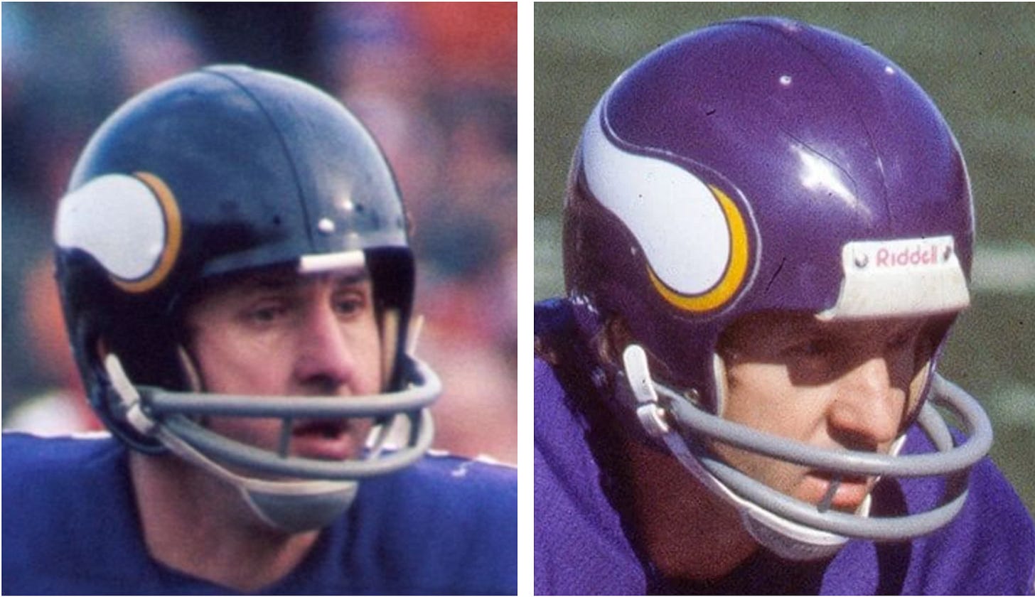
Helmet manufacturers quickly noticed something else about the sweatband’s wider shape: It functioned nicely as a billboard for the manufacturer’s logo. Soon all the helmet brands were putting their logos in that spot.
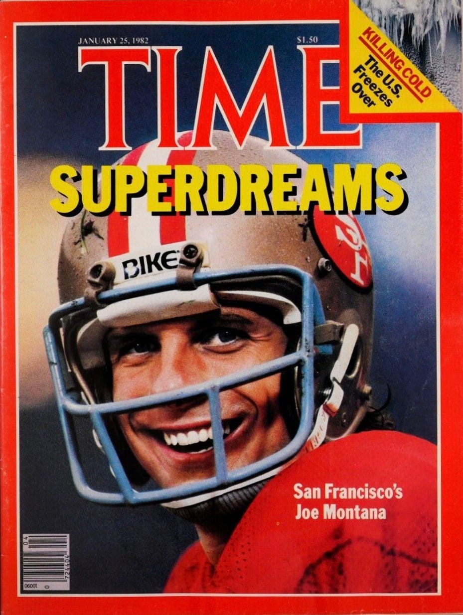
The NFL eventually adopted rules regarding makers’ marks on nose bumpers. In 1989, Riddell became the league’s official helmet partner, so only the Riddell logo could appear in that spot; bumpers on helmets from other brands had to be either blank or team-branded. After the 2013 season, the league terminated the Riddell deal and announced that all manufacturers’ logos were henceforth verboten on NFL helmets (which was widely viewed as a move to distance the league from the then-raging concussion controversy, which had resulted in a slew of litigation directed at helmet brands).
With makers’ marks no longer appearing on bumper panels, team logos quickly filled the void. As of this writing, all NFL teams except the Eagles and KC have team logos on the bumpers of their primary helmets (although a few use blank bumpers for their throwback helmets). But modern helmets have so much padding that you’d have a hard time getting the edge of the shell to hit the player’s nose even if you wanted it to, so the panel is basically a skeuomorph — a vestigial design element that’s now strictly ornamental, not functional, but lives on because it’s become visually entrenched.
Have you ever tried your hand at things like fiction, poetry, or scriptwriting, which presumably require a different skill set than the one you use for journalism?
First, let me say that poetry has always felt like a foreign language to me (except maybe for verses that begin with a man from Nantucket). I can’t even tell good poetry from bad, much less create any myself. I find the whole genre mystifying.
As for fiction, scripts, etc.: Back in the 1990s, I got very hung up on the idea that I should be able to write fiction. I felt like the type of work that I was doing wasn’t truly creative because I was reacting to things around me, whereas fiction was creating something from scratch, which seemed more genuinely creative. Not writing fiction, I thought, reflected some sort of failure of imagination on my part. So I made a few half-hearted attempts at writing short stories, but they didn’t go anywhere. Looking back, I realize that those efforts failed for the same reason that most bad writing fails: I had nothing to say, nothing I really wanted to express.
A few decades later, do I still wish I could write fiction? Yes — just like I also wish I could draw, play the piano, build furniture, sing well, and tons of other stuff. I haven’t given up on learning new skills or growing as a creative person, but I’ve gotten better at accepting the skills I have and at not beating myself up for the ones I lack.
Have you ever experienced imposter syndrome?
Yes, definitely — on a couple of different levels, in fact. When I began writing for magazines and newspapers in the 1990s, I sometimes felt like a bit of a fraud, or like I was getting away with something, because I didn’t have a journalism degree, was essentially self-trained, and had previously been “just” a zine writer. At this point, I think it’s fair to say that I’ve had a successful career, but sometimes I still feel like I’ve gotten away with something.
Later, when I began writing for ESPN, I often felt like I wasn’t a “real” sportswriter like the other ESPN writers. That feeling never entirely went away, even though I stayed with the company for nearly 15 years.
To be clear, nobody I worked with ever made me feel “less than” at any point of my career. These feelings I had were all based on my own insecurities — no more, no less.
You’ve sometimes taken up various causes in your uniform writing: opposing Native American-themed team identities, criticizing teams that sell advertising on uniforms, and so on. Do you consider yourself an activist?
To my mind, activists are people who are participating in live protests and sit-ins, doing door-to-door canvassing and community organizing, walking picket lines in solidarity with strikers — stuff like that. None of my writing falls into that category.
Instead of being an activist, I’d say I’m more of an advocate. There’s a long tradition of advocacy journalism, and I’m proud to be a part of it.
What are your top three favorite sports movies?
Honestly, I usually don’t like sports movies, because the game action never looks real or convincing to me. Like, you can tell that these are actors, not real athletes, and I find that very distracting.
That said, a few sports flicks I’ve enjoyed over the years are Eight Men Out (about the 1919 Black Sox scandal), The Bingo Long Traveling All-Stars & Motor Kings (about a barnstorming Negro Leagues ballclub), and, of course, Rocky.
I was going to embed the Bingo Long trailer here, but then I found that the entire movie is available for free on YouTube! Well worth watching (in part for the awesome uniforms!).
I am sure you’ve been asked this before, but I’ve never seen a response, so here goes: In the 1994 kids’ movie Little Giants, the Cowboys team coached by Ed O’Neill (aka Al Bundy) wore those double-star jerseys, which the real Dallas Cowboys also wore that year. But in the movie, the kids wore blue pants with stars on the sides, which I kind of liked. Were the real Cowboys also supposed to wear blue pants with that jersey, and then Jerry Jones decided he didn’t want to use them? Or were the blue pants only for the movie?
You know, the funny thing about this question is that the subject line on the questioner’s email was “Cowboys blue pants,” and I thought to myself, “Here we go again, another question about the sea-foam pants.” I definitely did not expect a question about a 1994 movie whose existence I barely even remember! (And despite the questioner’s assumption, I’ve never been asked this before.)
Anyway: You can see the blue pants in the movie poster shown above, and also in this video clip:
I had no memory of the blue pants. And in nearly 25 years of writing about uniforms, I’ve never heard any rumors about Dallas planning to use blue pants in the NFL. Has anyone else ever heard anything about that?
I have to say, though, blue pants with the double-star jersey wouldn’t be a bad look! Maybe those kids and Al Bundy were onto something.
You have talked about sights, tastes, and aromas that you like and appreciate, but what about sounds? And I'm not talking about a great concert or the roar of a crowd at a baseball game. Is there a sound in nature that you especially like?
You already put a ballgame crowd off-limits, so I don’t know if you’ll do the same for what I’m about to say, but I do really like the sound of a bat hitting a baseball Just Right.
A few other sounds that I find compelling:
The c-r-r-a-a-a-c-c-k of a tree just as it starts to fall. (The opening moments of a really big thunderclap can evoke a similar reaction.)
Popcorn popping.
The pop of a cork coming out of a bottle.
A cat’s purr. Truly an amazing thing.
Also, I always liked the old dial-up modem connection/“handshake” sound, except for the last few seconds. Can’t explain why. Still get a nostalgic kick out of it.
Since the Texas Rangers won the World Series, can we expect them to get gold-trimmed jerseys and caps, and if so, when should they be available for purchase?
I am about 99.99999% certain that the Rangers will have a gold-trimmed uniform to open the 2024 season. That type of thing is usually announced fairly late in spring training, less than a week before the start of the regular season.
Your recent piece about Sports Illustrated’s use of AI prompted this question: Would you ever use AI to aid you in writing?
I can’t imagine using AI to write something, no. But hey, there are all sorts of things we initially can’t imagine that eventually end up happening. So maybe at some point AI will become just another tool in a reporter’s toolkit. For now, though, I can’t conceive of using it to write something.
I should note, however, that whenever I record an interview with someone, I have that interview transcribed by Otter, an AI-driven transcription service. It’s sooooo much faster and better than having to do the transcription myself, which I did for many years. This new development, which only came about in the past four or five years, has completely transformed my work. So yeah, I do use AI — just not for writing, at least for now.
What Sports Illustrated did with AI was clearly wrong. As a writer and journalist, do you think there's a right way to use AI in creating content? For better or worse, it looks like AI is not going away, so the existential questions going forward may be about how to use it, rather than whether to use it at all.
Just as media outlets are ethically obligated to label paid content as paid content, it’s essential that any AI-created content appearing in journalism settings is clearly and prominently labeled as such.
Also: AI was a big issue in the recent Hollywood writers’ strike, and the eventual settlement provided strong guardrails that restrict AI’s use in creating TV and movie scripts. With more newsrooms unionizing, I suspect we’ll see journalists’ unions demanding similar restrictions. The use of AI may therefore become a marker of unionized vs. non-unionized media outlets.
Also: Literally two hours after I wrote that last paragraph, I learned that The New York Times has just hired its first Editorial Director of AI Initiatives. That doesn’t mean the Times is suddenly going to have articles written by AI (indeed, that press release I just linked to specifically says they won’t do that), but it means AI is likely to have a role in journalism’s future. There’s a good assessment of what that might entail here.
What do you think about the notion that one day, perhaps sooner than we think, we will have explored every option for every team’s uniform and thus reached a saturation point, especially with increased use of AI?
I don’t think it’s possible to reach a saturation point in terms of visual design. What would that even mean? Like, you can always tweak something, adjust something, change a font or a color — boom, there’s your next design.
But we may indeed reach a saturation point in terms of good design. When it comes to pro sports uniforms, in fact, I’d argue that we already hit that point a while ago. You can see this in the endless churn of NBA City and Statement uniforms, most of which are pointless at best, miserable at worst. Also, look how many teams experiment with “innovative” uni approaches and then end up going back to their classic looks, which they never should have deviated from to begin with.
Uni Watch is only on Facebook and Twitter. Do you plan on expanding to Threads, Instagram, or any other social media platforms?
I decided many years ago that when it comes to social media, Facebook and Twitter are enough for me. I had to draw the line somewhere, and that’s where I drew it. I have nothing against Instagram, but I just don’t want to add more social media into my life. Sorry about that.
As for Threads: Like many people, I’ve recently considered leaving Twitter and switching to Threads. But I have almost 140K Twitter followers and don’t really feel like trying to rebuild that following from scratch on a new platform, at least for now. I’m continuing to assess that situation and may come to a different conclusion at some point. We’ll see.
Aren’t you annoyed that the lower white stripe on the Steelers' sleeves basically disappeared? This really bothers me each time I watch a Steelers game, and I’m surprised I haven't seen you talk about it.

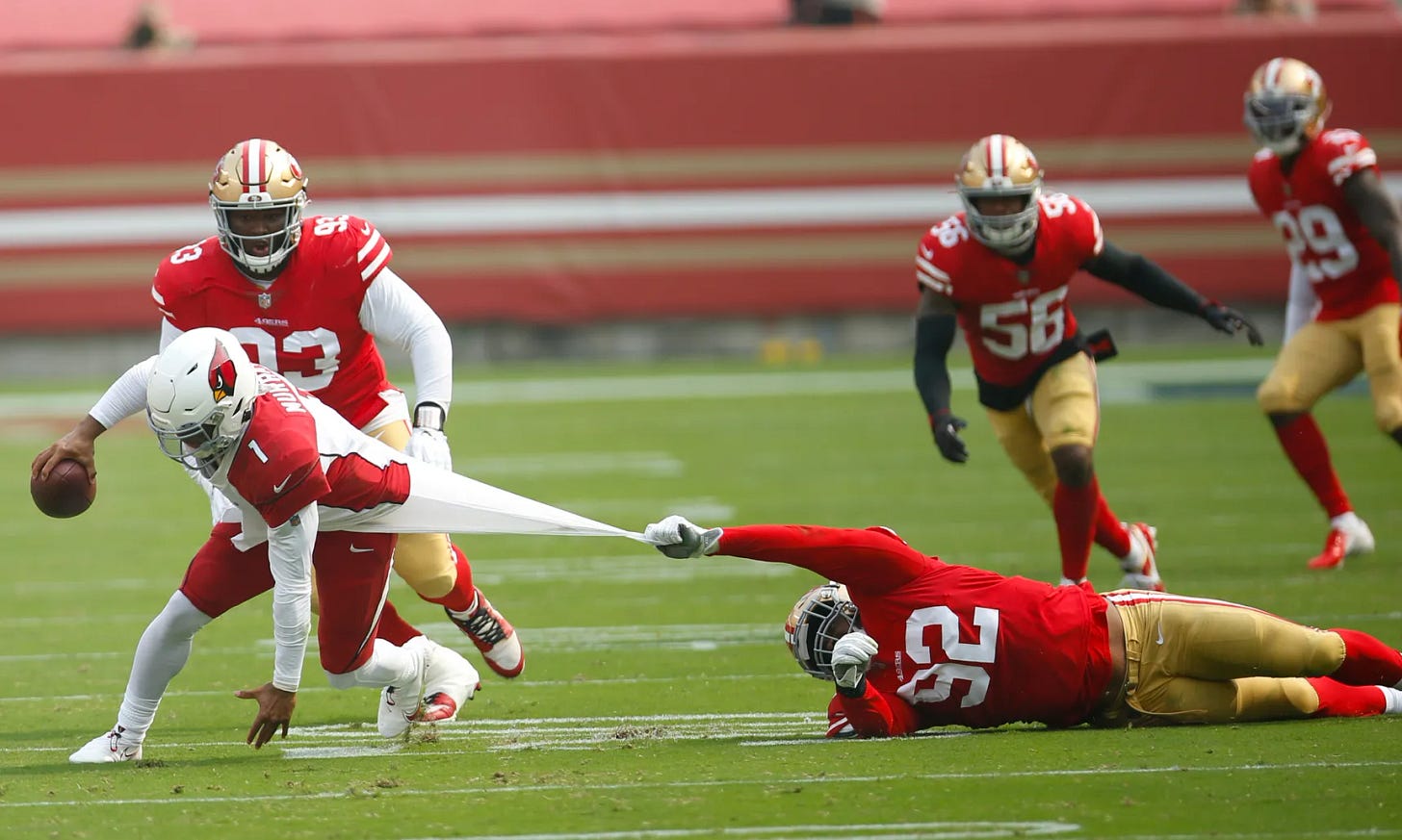
I’ve been decrying the disappearance of NFL jersey sleeves (which is driven by players wanting to minimize chances for an opponent to grab them) almost from the very start of Uni Watch. The Steelers aren’t the only team whose sleeve graphics have been affected — the 49ers, for example, had major problems with truncated sleeve stripes from 2009 through 2016. Shorter sleeves have also driven most teams’ TV numbers from the sleeves to the shoulders — or, in some cases, resulted in the TV numbers being scrapped altogether.
I agree that it’s a shame regarding the Steelers, because their sleeve striping was so distinctive. I suppose they could reduce the center yellow band’s thickness, so that the whole pattern would have a better chance of fitting onto the sleeve. But as long as NFL players remain obsessed with eliminating opponents’ handholds, I don’t see any other options. Form follows function and all that.
But on the other hand…
What’s with all the billowing, untucked undershirts in the NFL these days? Does the NFL have any uniform rules concerning this trend?
Like so many other things in the uni-verse these days, the prevalence of untucked undershirts is just a generational style thing. I don’t like it or relate to it, but my parents didn’t like it when I wore torn jeans, so there you go. (Yes, I realize a uniform is not the same thing as the clothing I was wearing around the house, but you get the idea.) In any case, the league seems to have given up on policing it.
The funny thing is, if players are really so obsessed with eliminating an opponent’s handhold (as we just discussed regarding sleeve lengths), you’d think they’d want to ditch the untucked undershirt, especially players who handle the ball, because they’re often tackled by their undershirts.
Is it time to move the Nike logo from the sleeves of NFL jerseys to the chest, so the sleeve stripes and TV numbers can have a fighting chance?
No! I reeaaaaally don’t want that maker’s mark on the front of NFL jerseys (it looks so awful on NBA and MLB jerseys), and I don’t think it would make much of a difference in terms of sleeve graphics. Leave bad enough alone, I say.
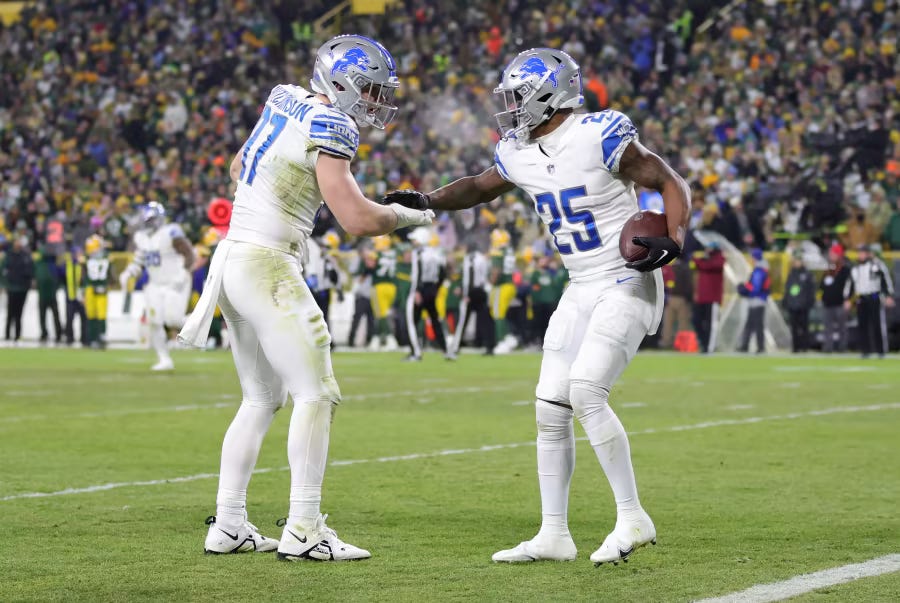
I am a huge Detroit Lions fan, and I’ve noticed that they’ve worn the all-white away uniforms more often this season than in the past. Do you think their all-white unis have become their official away uni?
First, some numbers: According to the Gridiron Uniform Database, the Lions have gone white over white for four road games so far this season. They wore that combo twice in 2022 and three times in 2021. So you’re correct when you say that they’re wearing that combo a bit more often this year.
But does that mean anything going forward? Nah, I wouldn’t read too much into it. Teams sometimes go through uni phases like this, based on a trend, or preferences among the current players, or superstition, but those phases tend to come and go. Last year, for example, the Jets wore their green jerseys just once for the entire season. This year, by contrast, they’ve worn them four times so far, and are slated to wear them at least one additional time before the season ends.
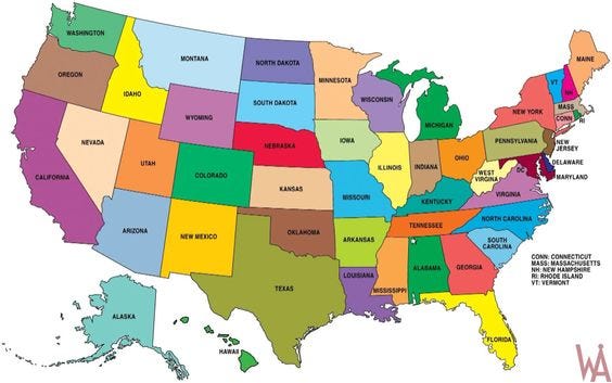
Which U.S. state has the best/coolest-looking border outline?
Oooh, now that’s a fun question! I don’t think I can pick just one, but here are some thoughts:
Texas feels big and beefy, which seems appropriate.
I like panhandles (and also the word “panhandle”), so I’ve always liked the shapes of Oklahoma, Florida, and Idaho.
I’ve always liked how Tennessee is essentially a parallelogram.
As a kid, I was fascinated by how Mississippi and Alabama are almost mirror images of each other.
And of course Michigan is interesting because it comes in two separate pieces.
But here’s the thing: As nice as some individual state shapes are, what I really like is how they fit together, sometimes in surprising and pleasing ways. I love how that little notch at the bottom of Nevada fits into Arizona, for example, and how the eastern section of West Virginia flows into Maryland. From a shape perspective, I’d say America is definitely greater than the sum of its parts!
Would ad patches be more tolerable if they were always for a charity, like the Jazz’s “5 for the Fight” patch?
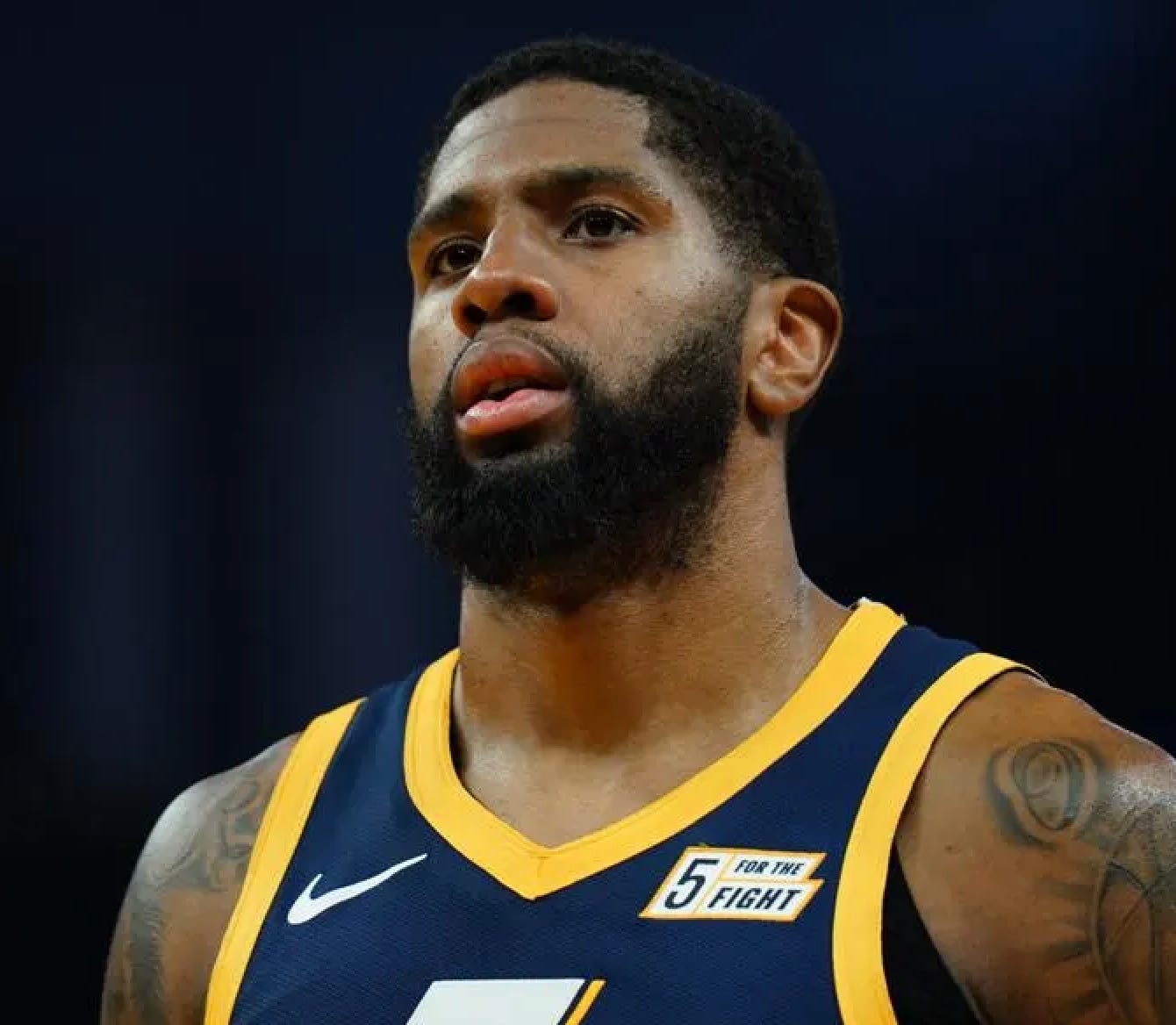
The thing about charity is that it should be, you know, charitable. So if a team wants to give space on its jersey to a charity or nonprofit, I’m all in favor of that. But if a team is selling the jersey space, it’s still just another way of whoring out your uniform to raise revenue, no matter who you’re selling the space to. Or at least that’s my perspective.
I know you hate the Commanders uniforms, but I do actually think they deserve a little credit for keeping their traditional burgundy color, which I think is underutilized in the pros (although it’s more common in college). Are there any colors that you think are underrepresented in the uni-verse? Is the answer green, since that is your favorite color?
I agree that we could do with more teams wearing burgundy (or maroon, or whatever you want to call it). And yes, I’d also like to see more green. Also more orange (especially as an accent color) and brown.
As it happens, I’ve done rankings of uniforms in those three colors — green, orange, and brown.
We know green is your favorite color, but what's your favorite shade of green?
I like a wide range of greens, but my favorite is a deep, rich, saturated hunter. Mmmmm.
When I start expounding on uniforms to my family or friends, their eyes usually glaze over. Do you think those of us who are into uniforms are a little strange to be obsessing over them? If so, what would you say is your weirdest uniform obsession?
As implied by Uni Watch’s slogan — For People Who Get It™ — obsessing over uniforms isn’t for everyone. It’s almost as if some of us are wired for it, like we have a special gene (or maybe a gene mutation) that other people don’t have.
Speaking only for myself, I’d say that my interest in uniforms definitely overlaps with my penchant for collecting, my fascination with catalogs, my interest in grammar and punctuation, and a few other personal quirks, all of which, I’ve come to realize, are related to a desire to create order out of chaos. Or to put it another way, I find programmatic classification systems to be satisfying because they help me make sense of the world and thereby help me feel safe and in control. I suspect that many Uni Watch readers feel similarly on some intrinsic level, whether they realize it or not. Similarly, I think people who Don’t Get It™ probably have a higher tolerance for chaos and disorder than I do.
As for my weirdest uni obsession, there have been so many over the years! (Remember when I couldn’t stop writing about MLB managers with little watch pockets sewn into the front of their pants? Or when Uni Watch briefly became Ump Watch?) But when I read your question, the first thing I thought of was my longtime obsession with MLB catchers who wear their catching helmets with the brim facing forward. How’s that for an obscure detail to geek out over?

What is the most “way out there” really non-traditional jersey/uniform that you like a lot?
I guess the Astros’ tequila sunrise design, although one could argue that that’s achieved a near-traditional status over the years, especially as so many college and high school teams have mimicked it.
I’ve always enjoyed your travelogues. If you could go anywhere in the world on a month-long road trip, where would you go, and why?
Glad you like the travelogues! As the excellent song embedded above suggests, I would very much like to spend a month road-tripping around Europe.
Why is there no maximum size for a baseball field? It seems that every field has different dimensions, which is quirky and fun, but I never read or hear about a maximum size when a new stadium is being built.
One of the many fun things about baseball is that there’s no standardized set of outfield dimensions, so ballparks can be wedged into crowded urban neighborhoods, or farmland, or wherever. There’s no real “why” for this — just one of those eccentric things that took hold during the game’s early days and has remained in place.
(The graphic of the oddly shaped Utah high school field shown above is from my fun interview with a guy who’s trying to document every high school field in America.)
Since you’ve been primarily a freelancer for most of your working career, has it been challenging to plan and save for retirement?
I was raised by Depression-era Jews (the double-whammy of thriftiness) who taught me to be responsible with money, so I’ve always tried to take the long view when it comes to retirement. I began contributing to a 401(k) when I was 24 (I was making only $18,000 at the time, so deferring some of it for later was pretty rough, even though I knew it was the right thing to do!), and then I rolled that into an IRA when I went freelance eight years later. That was also when I hired a financial advisor, who I still work with today. We’ve had a plan and, with minor adjustments, stuck to it, which has worked out well. Living this way — sticking to a budget, living unextravagantly, putting any unexpected windfalls in the bank instead of going on a splurge — isn’t as sexy or exciting as, say, zipping off to Paris on a whim, but it suits my temperament and has, I hope, put me in a decent spot regarding my financial future. Fingers crossed!
What uni opinion of yours has most drastically changed over the years? What style, trend, or fashion that you used to hate do you now love or accept? Or the opposite?
For many years, I thought more leagues should allow color-vs.-color games. The whole notion of going color vs. white was rooted in the days of black-and-white TVs, so why not allow color/color games (as long as the two sides contrast sufficiently) now that everyone has a color TV? The NBA apparently agreed, because they began allowing color/color games in 2017, which I viewed as a very positive development.
Six years later, I’ve changed my mind. While some color/color games look good — and some even look exceptional — I often find myself missing the white uniforms. Having some white on the court (or the ice, or the field) brightens everything up in a way I find appealing. I don’t think color/color should necessarily be banned, but I’d rather reserve it for special occasions, like the USC/UCLA college football game.
Do Division I university sports programs with apparel deals have to buy their own uniforms or do the apparel brands supply them for free?
The apparel brands submit bids to get contracts with the universities, so they pay the schools to be their official outfitter. But the contract will usually stipulate that the school must purchase a certain amount of uniforms from the brand, usually at a discounted or favorable price.
For public universities, these contracts are usually public documents that anyone can access, so you can how much money and product is involved. For example, here’s Nike’s 2020-2023 contract with the University of New Mexico. It makes for fascinating reading!
Ultimately, of course, the value of these deals for the apparel brands isn’t about the uniforms that they sell to the schools. It’s about all the mass-produced retail merchandise they get to sell, all the exposure they get when the teams appear on TV, and so on.
How is the Guardian Cap not a thing yet in NCAA and NFL games? If you’re going to commit to player safety during practice and training camp, why not during games?
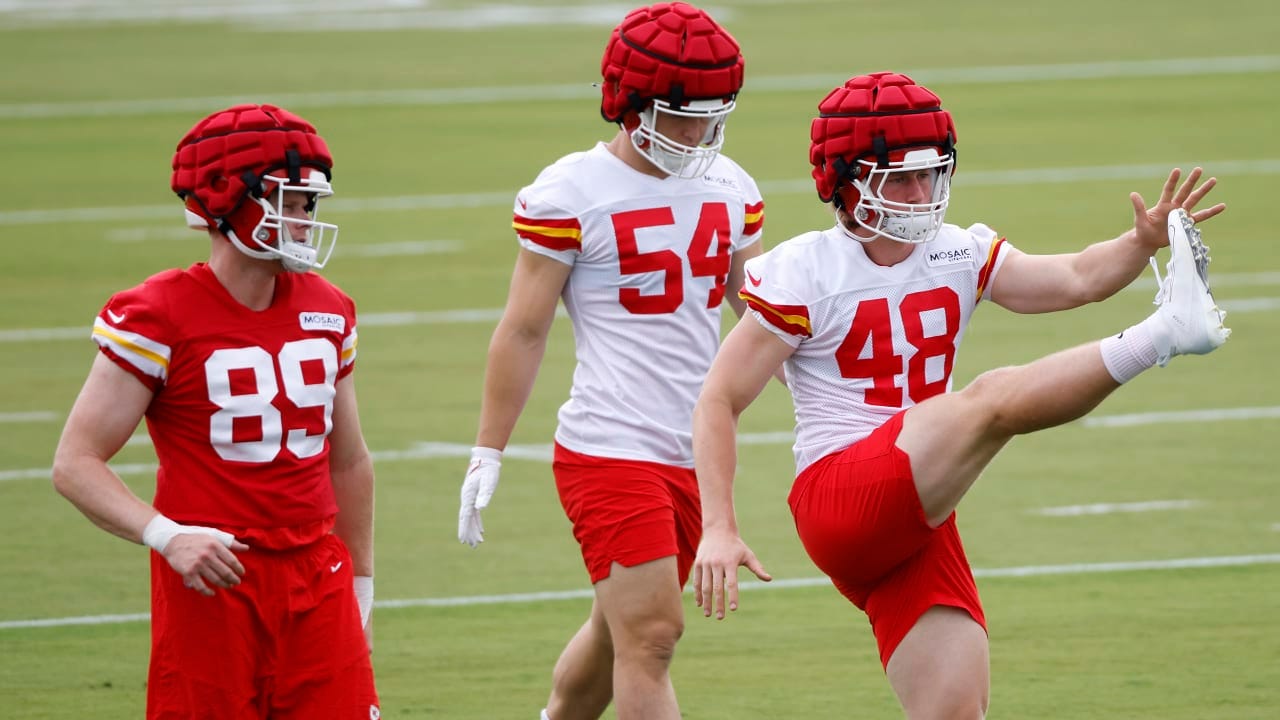
The NFL, to its credit, expanded the mandatory use of Guardian Caps this year to all full-contact practices throughout the season. They were previously required only in preseason training camp. As for wearing them in games, an NFL exec has hinted that that day could be coming, although there’s no apparent timetable for it. (I’ll believe it when I see it.)
Football isn’t the only sport in which certain protective gear is worn during practices but not during the actual event. Boxers, for example, typically wear headgear when sparring but not on fight night. In both cases, I think it’s fair to say that one reason for this is that fans prefer the danger and violence that comes with the lower level of protection.
So while it may seem odd to mandate a certain type of protection for practices but not on game day, I think the underlying rationale can be summed up something like this: “We want to keep you as healthy as possible during the week so that you’re in tip-top shape for bashing your brains in on Sunday. That’s what everyone’s paying to see, after all.”
Phil recently predicted that the NFL will continue to loosen helmet restrictions (as they did with the Bengals’ white helmet) to allow for more combinations. While I imagine none of us want the NFL to become like the NBA, are there unusual combos out there that you’d like to see?
There are several alternate helmets that might work well with non-alternate uniforms. For example, I’d love to see how the Lions’ blue alternate helmet looks with their primary set (blue helmet, white jersey, and blue pants would probably look particularly good). Ditto for the Panthers’ black helmet, the Broncos’ white helmet, and maybe the Texans’ red helmet.
It seems like I can only find durene in vintage jerseys. Is it still being produced? If not, why isn’t it used for retail athletic clothing? I love the way it feels!
For the uninitiated, durene (sometimes capitalized, as Durene) is a cotton/rayon blend that was often used for football and basketball uniforms in the 1950s and ’60s. It has a nice sheen and a fantastic drape, and it reacts extremely well with dyes, resulting in very saturated-looking colors. I’m a big fan of this fabric and own a bunch of vintage durene T-shirts and jerseys.
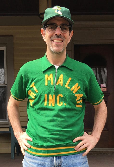


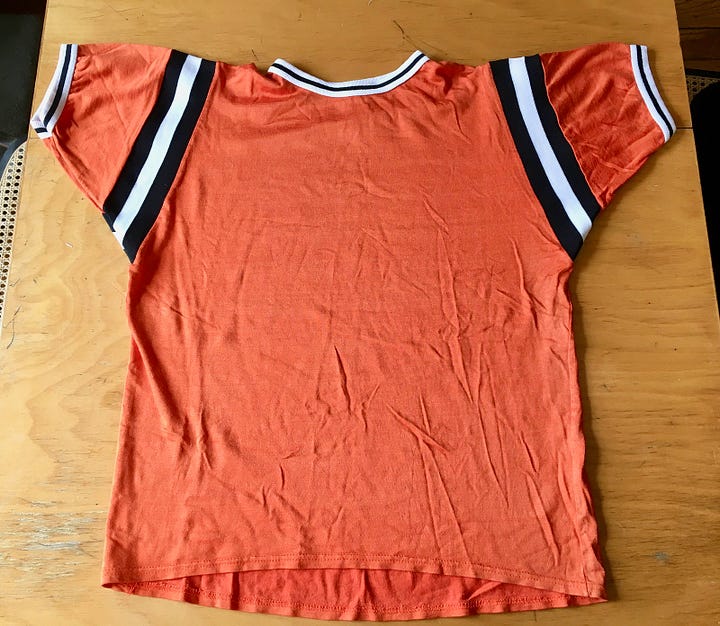
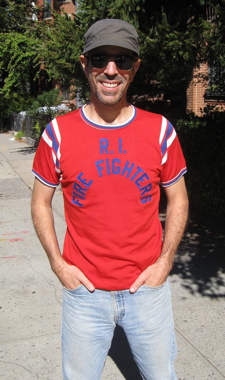
As much as I love durene, it has its limitations. It’s heavy, it doesn’t breathe, it tears and runs fairly easily, and it can easily get stretched out of shape. So I can understand why it fell out of favor for sportswear. To my knowledge, nobody’s still making it, unfortunately.
What’s the best band you’ve seen live in 2023 that no one else knows about but should get more attention?
It was late last year, so not technically in 2023, but I went to see a friend’s band and there was this other group on the bill, called Drunken Prayer. I’d never heard of them before, but they completely blew me away. I’m now officially a fan.
Is there one uni-related topic or article you have written that would be the prime example of Getting It™?
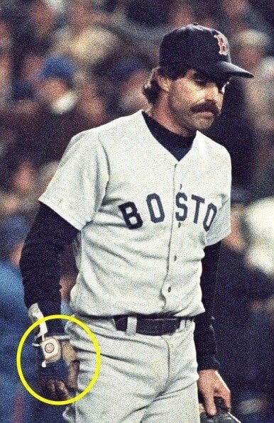
I’ll pick two. First, in 2006, I did a piece about how Bill Buckner was wearing an old Cubs batting glove on his glove/mitt hand — thereby commingling two star-crossed franchise curses — when he made the fateful error in Game 6 of the 1986 World Series.
A few years later, I tackled the enjoyably absurd task of trying to figure out which Yankee had worn the most pinstripes on his uniform.
Both of those articles were really fun and also really good litmus tests. Some people loved them, and others said, “Why would you write about that?” I guess that’s the essence of Uni Watch.
———
That’ll do it for this round of Ask Me Anything. Big thanks to everyone who submitted questions, and apologies to people whose queries I wasn’t able to get to.
Our next round of AMA will be in March. If you’d like to submit a question, feel free to email it here. One question per person, please. I look forward to seeing your queries!
Paul Lukas has been writing about uniforms for over 20 years. If you like his Premium articles, you’ll probably like his daily Uni Watch Blog, plus you can follow him on Twitter and Facebook and check out his Uni Watch merchandise. Have a question for Paul? Contact him here.



Helmet design has always been an interest for me. Actually the Riddell Wildcat Sweatbands show up about 5-6 years earlier than 1973 - they show up on the early Riddell Micro-Fit helmets as an option since the Micro-Fit had an odd-shaped inflated forehead pad/cell. The original Micro-Fits have a design where some cells have foam inside them and can be inflated to customize the fit while other cells are pre-filled with an anti-freeze liquid. I've seen photos from 1969 with players having the sweatband added; by 1972 you'll see several players for both Miami and Washington with them in Super Bowl VII. But it seems like my memory as an 11-year-old was that 1973 was the "tipping point" where it becomes much more common. Riddell introduced a new helmet design called the PAC-3 which had strips of non-inflatable padded cells attached to the helmet - essentially circling the head with 2 more strips at the crown and an additional strip for the lower part of the back; they were not really sold with the rubber snubber, just the Wildcat. They also modified the Micro-Fit so the standard design had the PAC-3 style forehead padding but the rest of it was unchanged from the earlier models. Also I belived 1973 is the first year for the rounded Riddell logo still in use. It seems like Wildcat Sweatband became the "factory standard" and the rubber snubber became the "factory option" on the suspension/partial suspension helmets in 1973 as well; in prior years the snubber was "standard" and the Wildcat was the "option" on them.
Bike was the next manufacturer to use a padded snubber; it was part of their design (done by neurologists at the University of Michigan) when they came out in 1976 or 1977, and Rawlings adds them as well in 1977. By 1978 the two clear-shell manufacturers had been sold and their new owners decided to get in on the action by adding logo decals even though they didn't use the Wildcat-style bumper - Marietta was purchased and renamed MaxPro; they added the decals right in-between the 2 screws for the facemasks (and color-coded them - white with blue letters for the Cowboys, white with green letters for the Eagles, black with white letters for the Steelers, etc.) even though their design had no nose bumper at all. And MacGregor got out of the helmet business; their biggest sales rep - Bill Kelley, who really had the old Southwest and Big 8 conferences covered - purchased the tooling and kept making their helmet. They have the rubber snubber, but Kelley added a "Kelley" decal again positioned in-between the screws for the facemask, but his logos were always white with red lettering.
Riddell phases out the original Wildcat sweatbands for anything but the remaining suspension helmets (not sure when the suspension helmets were offically banned and went out of production) when they re-design their helmets in 1982 - the non-suspension helmets now have a solid foam forehead pad that is made in several sizes to help with the fit of the helmet. The sweatband/bumper now has a pocket for this pad. Riddell will continue to use this forehead pad design on all their various models through their Revolution helmets from the early 2000s.. They don't break from that forehead pad design until the first Speed helmets show up.
Man. You're never too old to learn something new. I had absolutely no idea that that's what nose bumpers were for. I, like the reader, assumed it was a form of shock absorber for the facemask and helmet and never thought twice about it. When you look at the old helmets it's more obvious that it was needed, but having grown up seeing and wearing newer-style helmets and facemasks I guess I just never saw the need to protect the nose in that manner. Fascinating!