
An Unusual Speed Limit Sign
And a municipality that’s in no hurry to talk about it.

I was recently driving with my mom on a Long Island highway called Nicolls Road when I pulled over to the shoulder and put my hazard lights on. “What’s wrong?” my mom asked.
“Nothing,” I said, as I unbuckled my seat belt. “Wait here — this will only take a minute.”
“Oh,” she said, “you’ve seen something that’s going to be a story, right?”
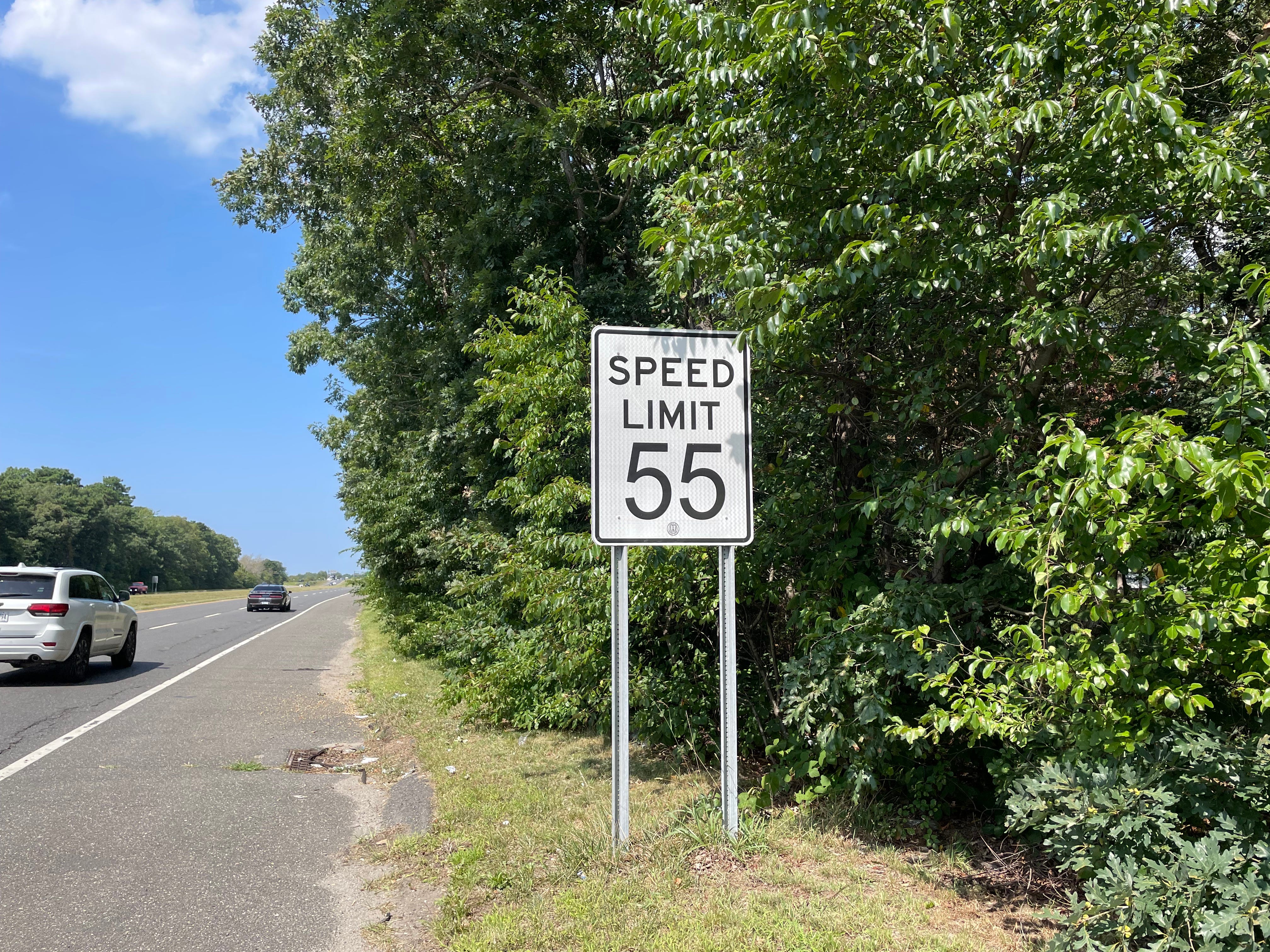
Indeed I had. I walked up to the speed limit sign shown above and took a few photos of it. As most of you have probably figured out already, I took the photos because the “55” on the sign — and on several other speed limit signs along that same stretch of Nicolls Road — isn’t rendered in the usual typeface. Here’s a comparison:
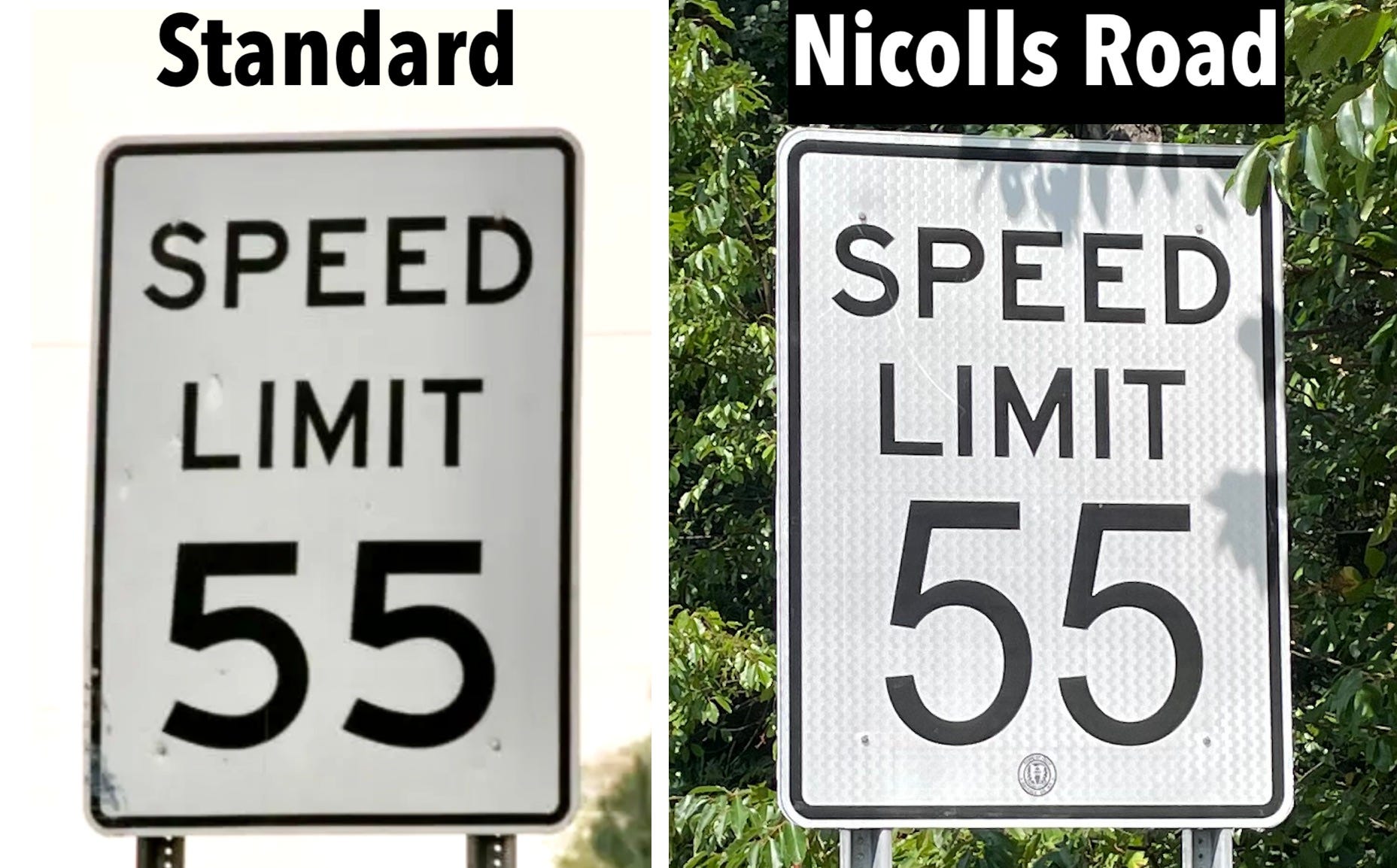
The standard font for the “55” (and for all U.S. speed limit signs, for that matter) is Highway Gothic. I’m not 100% sure about the Nicolls Road sign, but I think the numerals are rendered in a font called Polli Sans.
The Nicolls Road sign is perfectly legible and communicative, but I find the different number font to be really jarring. It looks so strange, so wrong, almost like a cheap knockoff instead of the real deal. It’s a powerful example of the power of standardized design, especially when used in an official capacity.
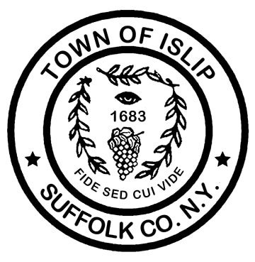
That might have been the end of this post — “Hey look, the wrong font, is that weird or what?” — but then I noticed the little circular logo at the base of the Nicolls Road sign. That’s the Town of Islip seal:

Frankly, I’m not nuts about road signs having any fine print or extraneous logos (perhaps a topic for a future IC post), but in this case it was helpful because it let me know who was responsible for the sign — not the county (which is what I would have guessed), but the township.
A bit of research revealed that Islip’s roads are administered by the township’s Department of Public Works, so I sent an email to that department’s commissioner, Thomas Owens, as follows: