An Open Letter to My Friends at Major League Baseball
Last week I offered some advice to Nike. This week it’s MLB’s turn.
Dear MLB,
Hello! I owe a lot to you, because you folks run my favorite sport. It’s the sport that, in many ways, gave birth to Uni Watch, because my childhood obsession with players’ stirrups and other uniform details were the first stirrings of what eventually became my career path. Thank you for that!
There’s no denying that we’ve had our ups and downs over the years, which has certainly kept things interesting. Remember when I called you out for being ignorant of basic U.S. history? To your credit, you fixed that, which I’m sure was a big hassle. But hey, you got some revenge by putting the kibosh on my Topps trading card — touché! And then there was that time you hired an “investigator” to see if any of your employees were leaking info to me. They weren’t, but your paranoia added an entertaining “Spy vs. Spy” element to our relationship. So much fun!
But enough nostalgic reminiscing — there’s serious business at hand in the here and now, because I’m extremely concerned about the utterly disastrous rollout of your new uniforms. Each time I think you and Nike have hit bottom, the situation gets even worse! Since I offered some free advice to Nike last week, it seems only fair that I do likewise for you this week.
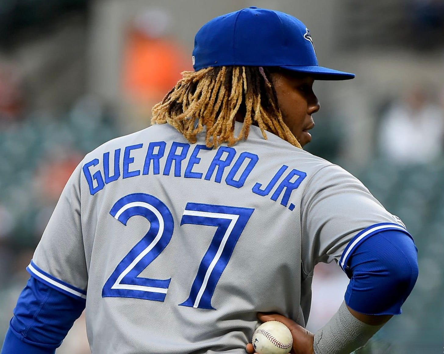
Amidst all the chatter about the new fabric, the smaller NOB lettering, the see-through pants, the mismatched greys, the off-white home uniforms, and more, the most puzzling thing about the new uniforms, at least to me, is the lower positioning of the MLB logo on the back of the jersey. Unlike all the other changes, the lower logo has no conceivable performance-based rationale. It’s strictly an aesthetic move.

At first I thought Nike decided to reposition the logo. But then ESPN Sunday Night Baseball analyst Eduardo Pérez spilled the beans by saying it was actually your idea. His quote, given during a podcast interview, was a bit muddled, but it still tells us a lot:
[The decision to lower the logo] wasn’t made by Nike or the players or the teams. It was made by Major League Baseball. And that’s the part that we have to understand. Look, you want to get that brand out there, you want to be able to showcase it, you want it a little bit bigger, these are the sacrifices that are having, that have to be made.
So it was you, not Nike, who decided to lower the logo, in order to “get that brand out there” more prominently. After I wrote about Pérez’s quote, I heard from a source (don’t worry, it wasn’t one of your employees) who told me that you moved the logo down because you were concerned about it being obscured by players with long hair, or getting bunched up when players run and slide.

I should say here that I love the MLB logo, which debuted in 1969 and endures as a classic, timeless piece of graphic design. Back when I was with ESPN, I wrote several times about the logo’s history and its creator, the great Jerry Dior (who, I’m proud to say, attended a Uni Watch party in Brooklyn in 2009). The logo is a pleasure to behold, so I can understand how irksome it must be for you when you’re watching a game and can’t see the logo on the back of a jersey because of a player’s hair. I can just picture you in front of your TV, looking for the logo and then feeling all sad and lost when you can’t find it. Poor you!
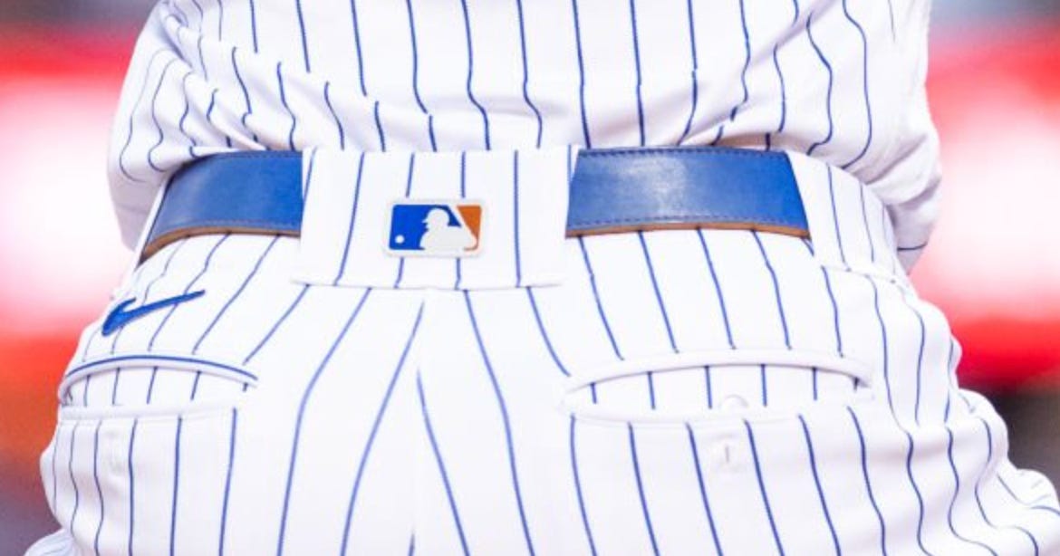
Fortunately, I’m here to remind you that the logo also appears in lots of other spots on the players’ uniforms, and elsewhere on the field to boot. In case you’ve forgotten, here’s a handy guide for you to consult the next time you can’t find the logo on the back of a jersey:
1. It appears on the back of the cap:
2. It appears on the back of the batting helmet:
3. It appears on the back belt loop of the pants:


