

Go This Way — No, Wait, Go That Way!
Some confusing signs could easily send you off in the wrong direction at one of America’s busiest airports. Plus possibly the last batch of stick figures in peril.

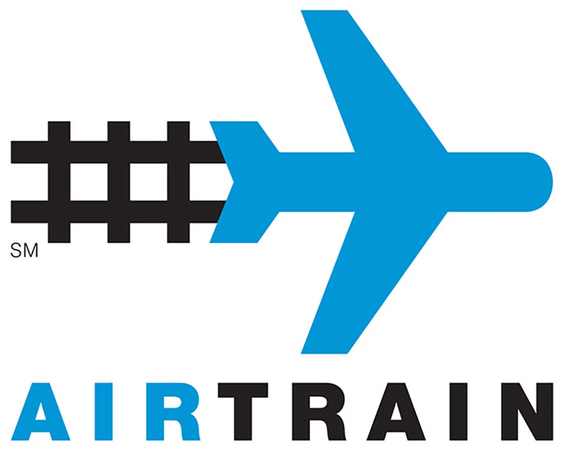
John F. Kennedy International Airport in New York City is the nation’s sixth-busiest airport. Like many airports, JFK has an automated train, called the AirTrain, that connects the facility’s terminals, plus it also connects to the local subway system. Its logo is shown above.
The logo design, with its combination of a jet and train track imagery, seems straightforward enough. But my friend Carrie has a major issue with it: She notes that the jet icon looks a lot like an arrow, especially when it’s used on an overhead sign, and that the jet is often pointing the opposite direction of where passengers are actually being directed. Here’s an example:
“It’s TERRIBLE for travelers who are glancing quickly at signs, because the plane in the logo looks like it’s telling you which way to go,” says Carrie. “Traveling is so stressful anyway and this does not help!”
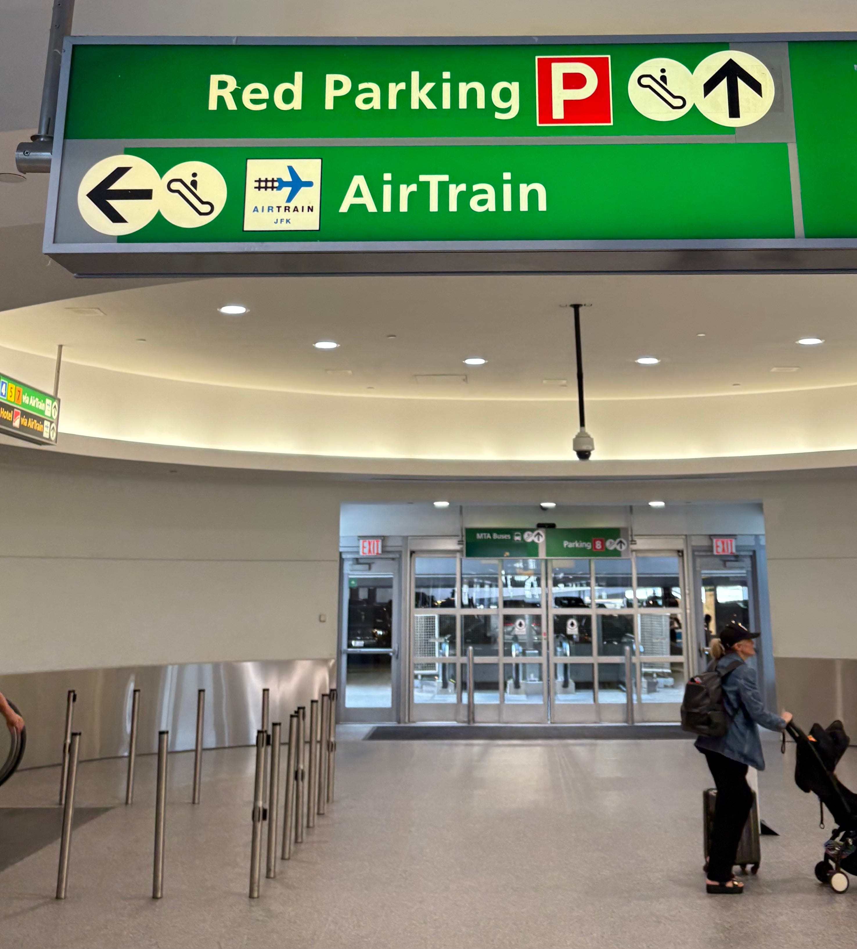
Interestingly, the logo doesn’t always face rightward. Sometimes the jet is pointing to the left — but even then, that’s often the opposite of where travelers are supposed to go, as you can see in two separate instances on this sign: