A Very Entertaining Way to Visualize Sports Data
Paul interviews a data guru who specializes in highly dynamic animation style.
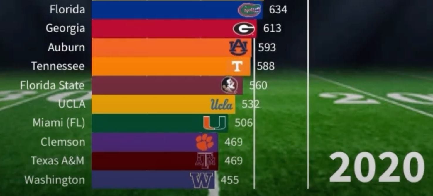
In my annual Uni Watch College Football Season Preview, I included a video timeline charting the number of AP poll appearances by all schools, dating back to 1936. It had nothing to do with uniforms but was a fun, visually dynamic look at college football history, so I decided it fit under the category of “athletics aesthetics”:
You’ve probably seen this type of video before. It’s called a bar chart race. They’re good for tracking all sorts of data over time (the most populous U.S. states, the world’s largest armies, the internet’s most-trafficked websites, and so on), but I think they’re particularly good for sports data because they essentially present as competitions. As the various bars jockey for position, you can almost hear the racetrack announcer saying, “And here he comes on the outside, making a late push for the finish line!"
But no matter what the topic is, I find bar chart races compelling. Even for those three non-sports examples I just linked to, I watched them all the way through because I couldn’t tear myself away from them. They’re so mesmerizing!
The college football video was made by a guy named Greg Harvey, who’s been posting all sorts of very engaging sports-related bar chart races on his Twitter feed over the past two years or so. One of his ongoing projects is to track each MLB team’s all-time leaders in WAR (that’s “wins above replacement,” for those who don’t speak baseball analytics). Here, for example, is his WAR chart for the Cubs:
Of course, the Cubs are a very old team, so Harvey’s video for them takes longer, and features more old-timey players, than his chart for a newer franchise, like the Diamondbacks:
I’ve been retweeting Harvey’s bar chart races for a while now, and I recently decided I wanted to learn more about how he developed this niche, so I recently interviewed him via Zoom. Here’s a transcript of our talk, edited for length and clarity.
Uni Watch: Tell me a little bit about yourself.
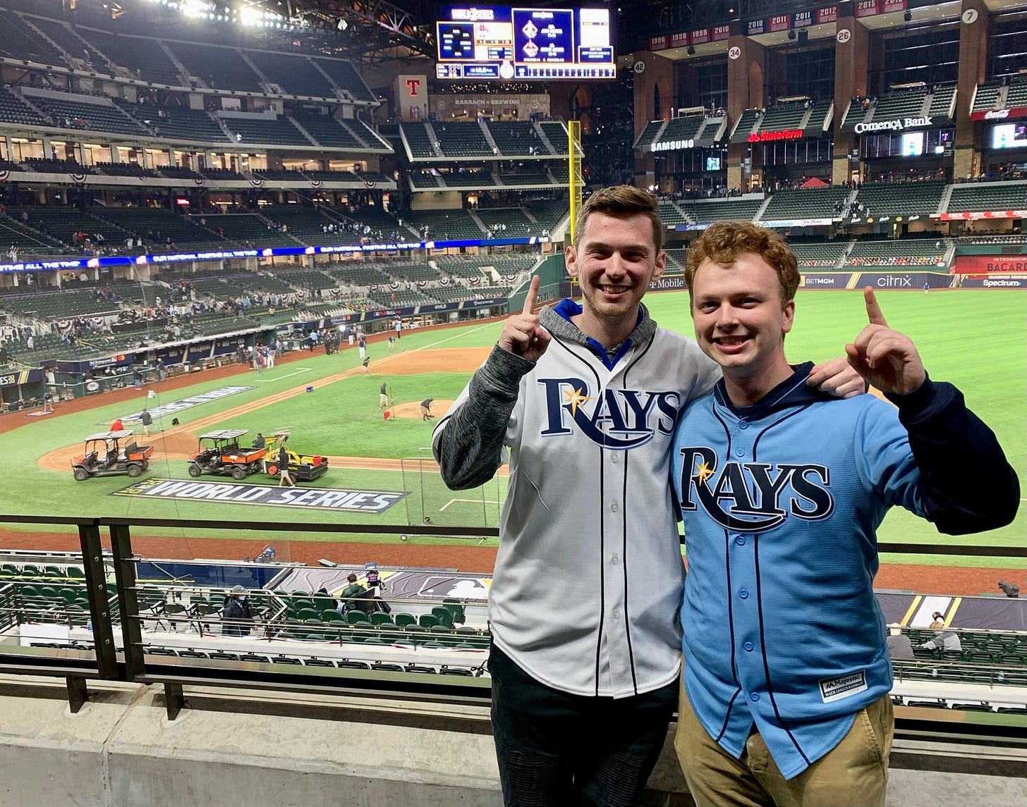
Greg Harvey: I’m 21 years old and am currently a senior at the University of South Florida in Tampa. I’m studying business analytics and information systems. I was born in Stuart, Fla., so college is close to home.
UW: Do you have a post-college plan or goal for what you want to do with your degree?
GH: I think a goal of mine is to work in the sports industry as an analyst, whether at a place like ESPN or with a sports organization or team. I have a lot of different avenues I can take, so I’m just excited for whatever happens.
UW: Obviously, you’re very into data, and you’re also into data visualization and animation. Would you say you’re more of a data guy or an animation guy?
GH: I guess a little bit of both. I definitely lean more toward the visualization. There’s just something very satisfying about creating a visually appealing graphic. But again, that starts with data, right? I like making the data easier to understand so even if people don’t necessarily understand the data, they can still get something out of it. That’s the end goal.
UW: How did you get into this particular niche interest? Like, does it go back to your early childhood, or what?
GH: When I was growing up, I always had a passion for sports. And then I also really had a passion for math and statistics and numbers. Once I started making these bar charts, it’s just been, like, almost obsessive. It’s just so much fun being able to visualize history in a way that people can appreciate.
UW: When did you start creating the bar chart races, and what inspired you to use that particular format?
GH: It must have been about two years ago now. I saw one on Twitter — it was made by this guy named Kyle Umlang, who’s a very popular college football stats guy. So I reached out to him to see how he did it, how he created it. Once I found out about the platform that I use to create them, I made my first one. This was right before Covid started, and I was just looking for a way into the sports world, so it was a good outlet during Covid. Then I made a few more, and they were very successful, so I was, like, okay, I’m gonna keep doing this.
UW: When you say the first few were “successful,” do you mean that they got good responses online?
GH: Yeah, yeah.
UW: Do you ever use other data-visualization formats, aside from the bar chart race?
GH: When it comes to Twitter content, I’ve just found that that’s what does well for me, so that’s my main focus there. But career-wise, there are all sorts of other approaches I could take.
UW: You mentioned that there’s a platform you use to create them..?
GH: Yeah, it’s a data-visualization software called Flourish. It’s super-easy to use — a lot easier than trying to code it all yourself. I think some people assume that I do all the coding, but I don’t. The time-consuming part is scraping the data and making it in a way that, you know, goes through history.
UW: I realize this is probably a gross oversimplification, but do you essentially scrape data from a particular data set and then you essentially dump it into this template? Is that how it works?
GH: Essentially, yeah. There’s more to it than that, but that’s basically it, yeah.
UW: Baseball is your main sport, right?
GH: Yeah, but I try to do other sports, too. I try to keep them relevant and topical. Like when Carmelo Anthony reached a certain place on the all-time points list, I tried doing something for that. Because I think people really engage with content when it’s relevant.
UW: Right, and I saw that you also did recently one for the Olympics, to coincide with the closing ceremonies.
GH: Right, that seemed like a good time to do that one.
UW: Have you learned anything from the level of engagement you’ve gotten from certain graphics? In other words, do certain types of data get a better response, and then other things aren’t as popular?
GH: Some teams have a really good fan base on social media and some don’t. So when I post something for, like, the Yankees, everyone’s gonna be all over it. But if I post something for the Rays, not nearly as many people will respond. That’s something out of my control, but it doesn’t stop me from doing something about the Rays, or any other team.
I think the best thing coming from the graphics, at least for me, is that I’m learning more, because the graphics sort of travel through history. So I feel like I’ve learned more names, more players. I’ll go, “Oh, I didn’t know that,” and then look into it a bit more. And I think the same thing applies to people who view the graphics online.
UW: Personally, I love bar chart races — I find them completely mesmerizing, and I know that many other people feel the same way. Why do you think that is? What is it about this particular format that people like so much?
GH: I think the biggest thing is that for for a majority of them, you’re always looking to see what comes next, and sometimes you get surprised. That’s visually appealing, and you just get sucked into it.
UW: Do you ever plug the data into the platform and then it turns out that there just isn’t that much jockeying for position Like, it sort of stays the same the whole way, so it isn’t as visually dynamic compared to some of the others?
GH: Yeah, for sure. The one that tracks all-time home runs is like that — there's a period where it’s just stagnant over a course of 10 to 15 years. So sometimes that’s just the way it happens. But that’s interesting in its own way, to see that some things don’t change a lot over a certain period of time. I think there’s still something to get out of it.
UW: I’ve read that bar chart races are controversial among some data visualization people. What do you think of that?
GH: I haven’t heard about that.
UW: Apparently, so many people were doing bar chart races that some folks in the data visualization world decided it was too much already. But I guess that that hasn't filtered down to you..?
GH: Not necessarily, but I think it’s a good point. I think all data has a certain place to be visualized, but a bar chart race doesn’t necessarily apply to all of that data, even though some people may try. So I can understand the frustration of some professionals being, like, “I know it looks fun, but this is not how you should visualize this particular data.”
UW: Right, right. This format isn’t always the best solution to every problem.
GH: Right. I think bar chart races are more of an informative kind of visualization, not business practice, if that makes sense.
UW: What are some of the favorite ones you’ve done?
GH: Definitely the all-time home run one. That was the original one I did that got shared by a couple of big names, like [longtime MLB writer] Jon Heyman. And actually, the next day someone at the MLB Network emailed me to ask me if they could use my graphic on there, which was extremely cool. I don’t even know if they used it, but just to know that they were interested, that was very heartwarming for me.
And then I’m slowly but surely doing the all-time WAR graphics for each MLB team. But now that now that school has started, I don’t have as much time as I used to. I have a part-time job with a baseball software company called BaseballCloud. And then I’m also working with the USF baseball team — I’m doing data tracking for them, and then I’m gonna start doing some analytics once the spring season starts.
UW: Sounds like you’re right on track for that career path that you mentioned earlier.
GH: Yeah, I have good experience lined up, which I’m excited about.
And there you have it. Interesting stuff! My thanks to Greg Harvey for sharing his story, and here’s hoping he lands a gig in his chosen field.
• • • • •
Attention football fans: My annual Uni Watch NFL Season Preview, which has all the news about new uniforms, logos, and related issues for the coming season, is now available for your reading pleasure. Enjoy.
———
Paul Lukas has been writing about uniforms for over 20 years. If you like his Bulletin articles, you’ll probably like his daily Uni Watch Blog, plus you can follow him on Twitter and Facebook. Want to learn about his Uni Watch Membership Program, check out his Uni Watch merchandise, or just ask him a question? Contact him here.


