

A Very Dairy Mystery: The Colors of Butter
An epic deep-dive investigation into the confusing color-coded package designs of this familiar grocery staple.

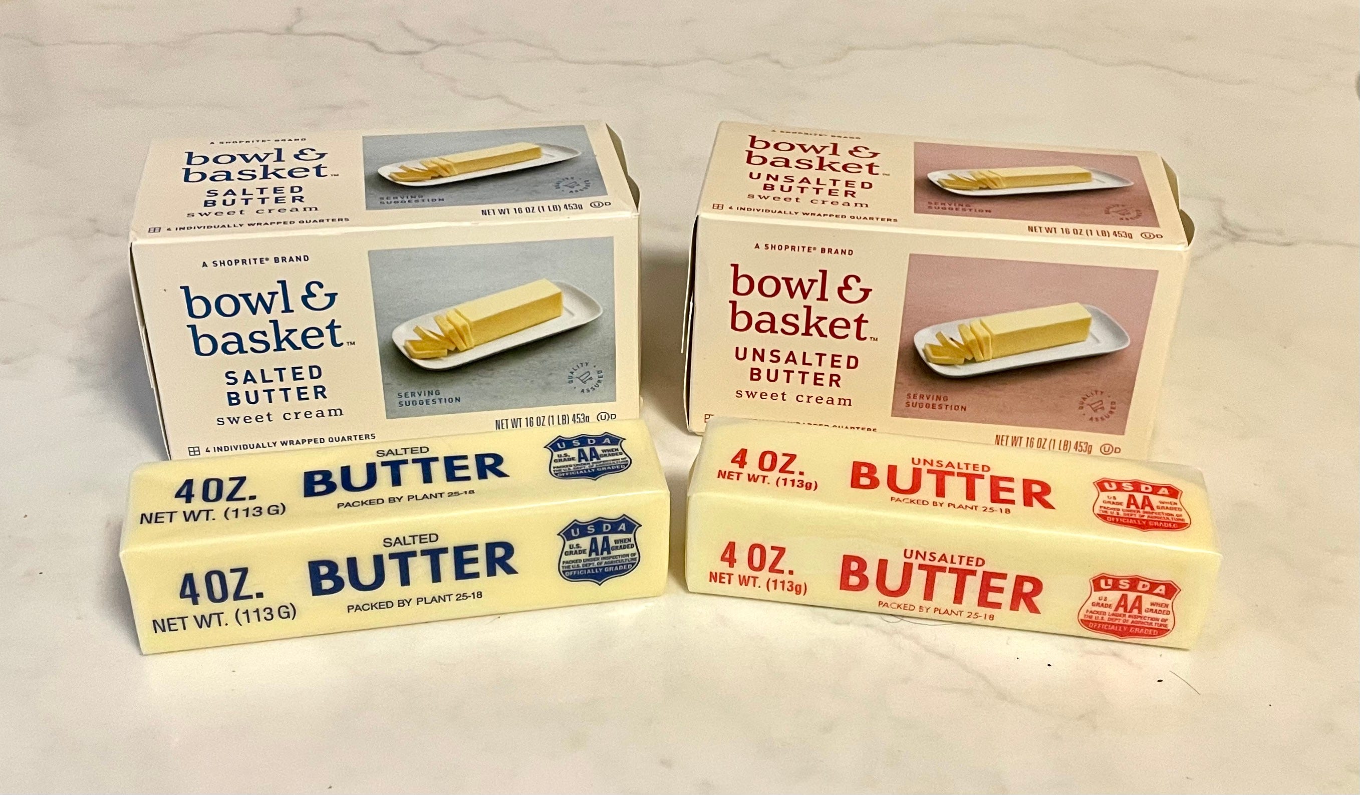
Like many people, I routinely purchase one-pound boxes of salted and unsalted butter. I know there are lots of fancy-shmancy butters out there — premium, organic, cultured, grass-fed, sea-salted, boutique, imported, and more — but I’m fine with standard American supermarket butter, and I usually get whichever brand is least expensive. That means I often buy the store brand, which at my local ShopRite supermarket is called Bowl & Basket.
As you can see in the photo above, there’s a pleasing chromatic consistency to Bowl & Basket’s butter packaging. The salted variety, on the left, comes in a blue-lettered box and the individual sticks are in blue-lettered wrappers, while the box and wrapper graphics for the unsalted variety are red. As a result, I’ve come to associate blue with salted butter and red with unsalted, which is handy when I’m reaching for some butter in the midst of a cooking project.
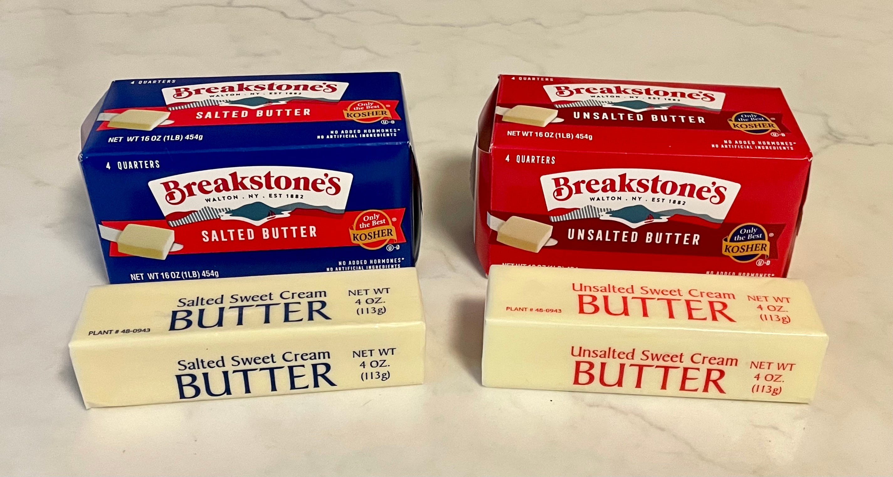
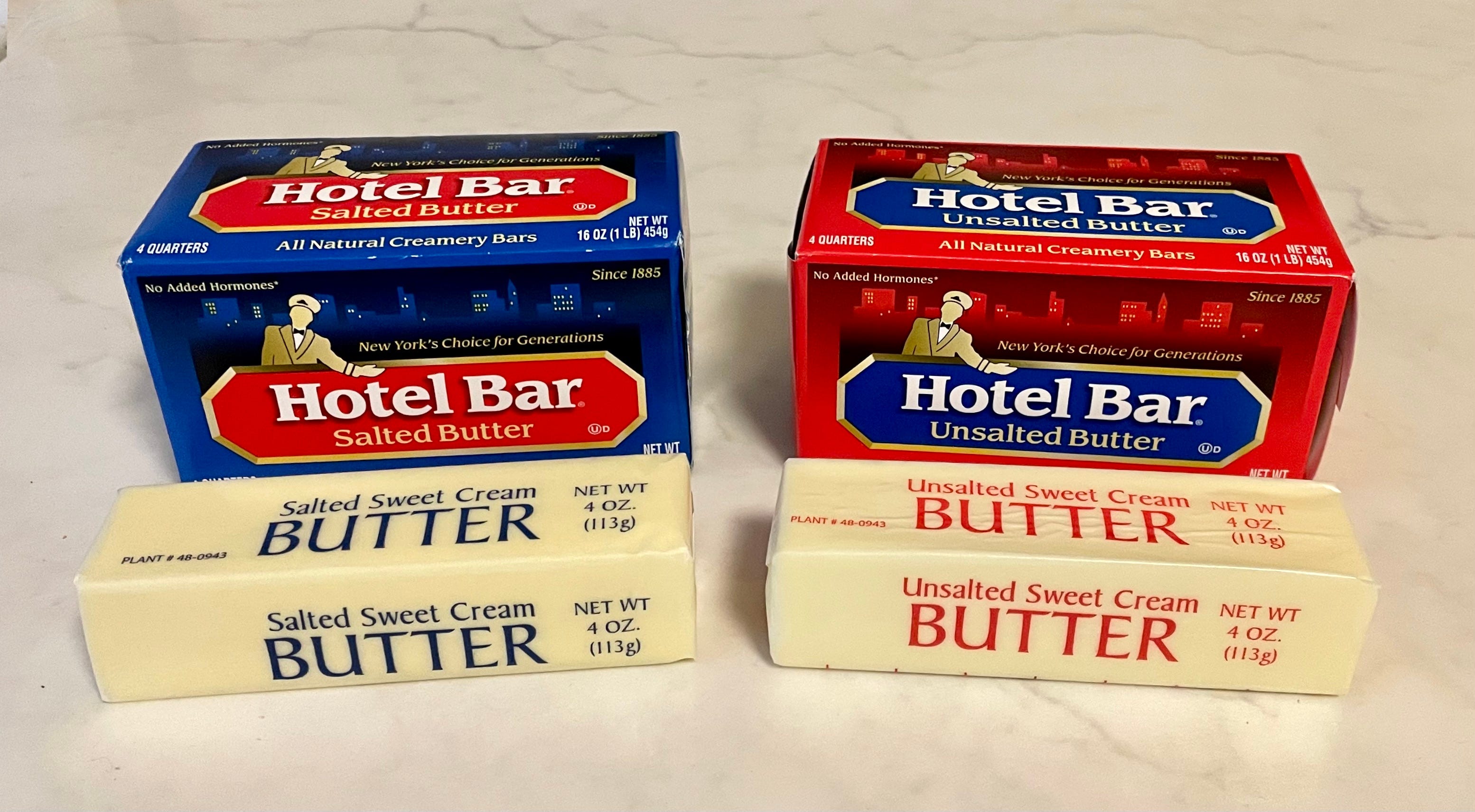
Sometimes, however, ShopRite has Breakstone’s or Hotel Bar butter on sale at a lower price point than Bowl & Basket. Conveniently, Breakstone’s and Hotel Bar use that same color-coding system for their boxes and wrappers — blue for salted, red for unsalted:
But the other day I went shopping and saw that Keller’s butter was on sale. And that’s where the system began to break down:
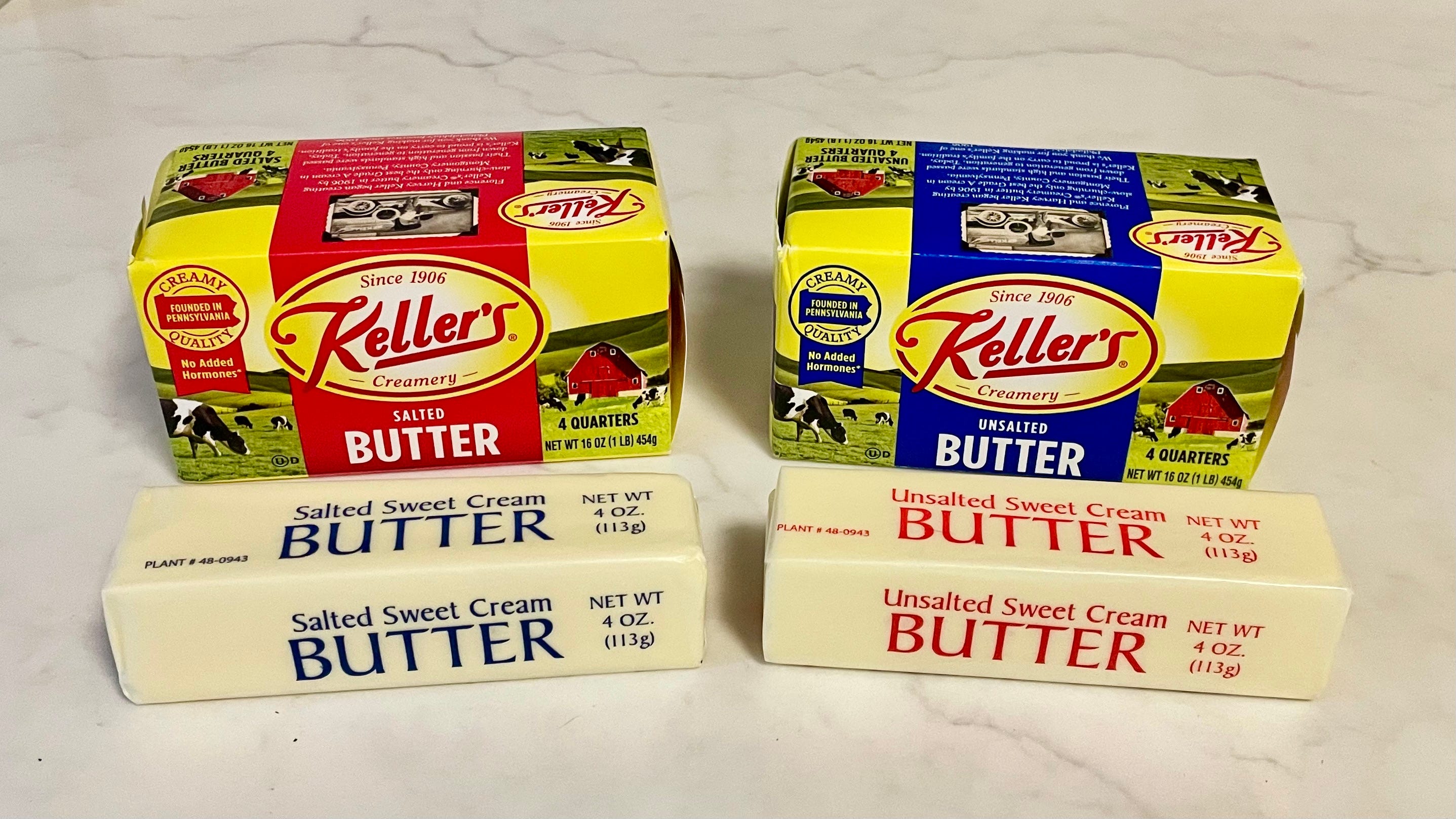
There are several things to process here. First, Keller’s has chosen to reverse the usual color protocol on its boxes, using red for salted and blue for unsalted. Even more confounding, the wrappers have the usual blue for salted and red for unsalted, which is (a) somewhat comforting, since it matches what we’ve seen with all the other brands, but is also (b) completely unacceptable because the wrapper colors don’t match the box colors.
Also of note: The three brand-name butters — Breakstone’s, Hotel Bar, and Keller’s — are using identical generic wrappers, which seems surprising. In a world where practically everything is now branded, wouldn’t you expect a dairy company to plaster its logo on the butter stick wrappers? Moreover, if you look closely at the fine print, you can see that the wrappers for those three brands all say, “Plant #48-0943,” suggesting that these three butters were all processed and packed at the same manufacturing facility. Some quick Googling reveals that plant 48-0943 is a Keller’s Creamery facility in Winnsboro, Texas, which makes the Keller’s box/wrapper color mismatch all the more surprising. Hmmmm.
Land O’Lakes butter, the industry leader, is almost never on sale, so I rarely buy it, but I wanted to see how they handle all of this, so I splurged on a couple of boxes. Here’s what I found:
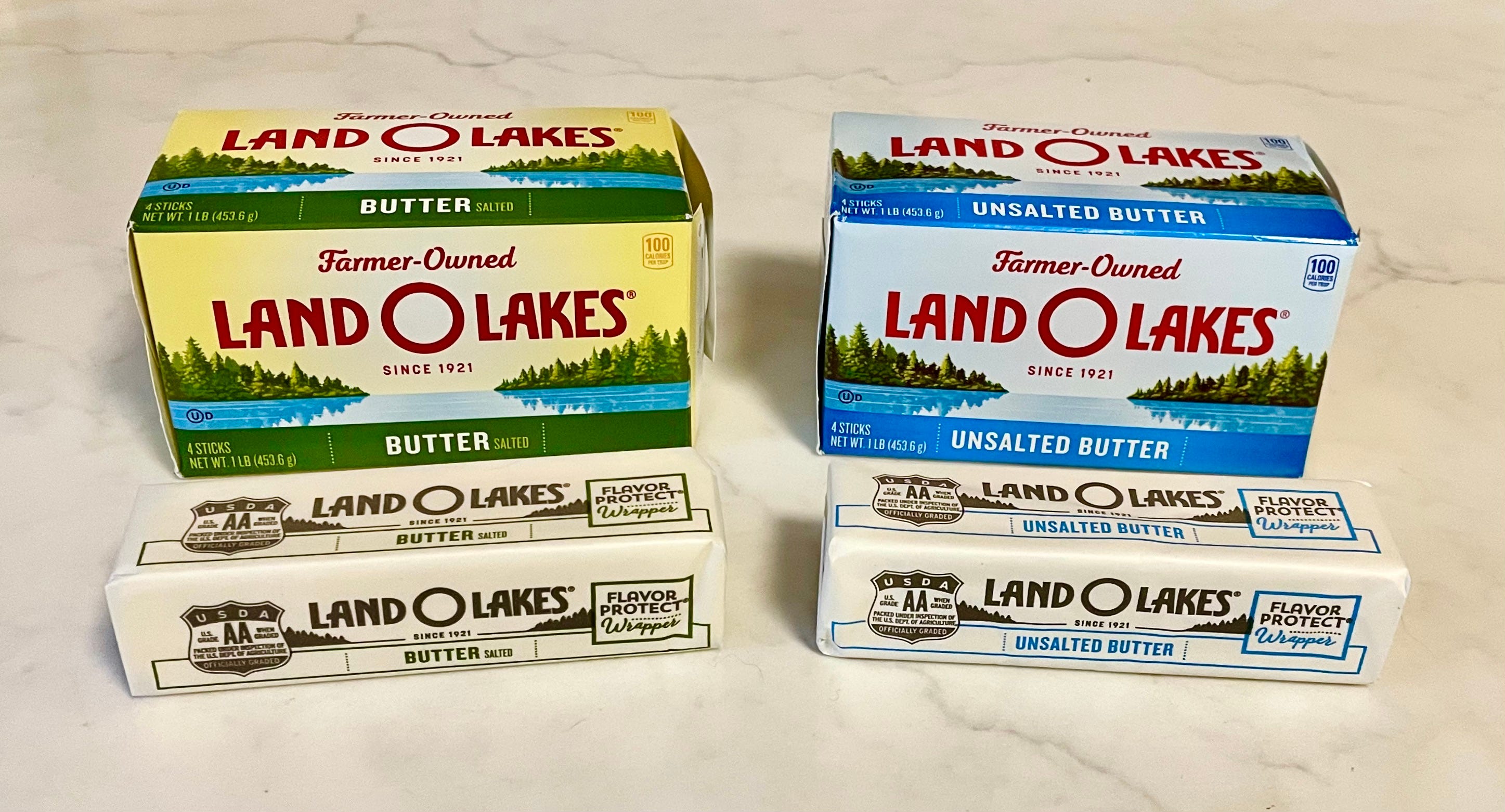
Whoa! Land O’Lakes has charted its own color course — green for salted, blue for unsalted. But maybe the most surprising thing is the sudden appearance of branded wrappers, emblazoned not only with the Land O’Lakes logo but also with the trademarked term “Flavor Protect® Wrapper.” (According to this article, the company’s wrapper really is coated with a “special wax blend” to preserve the product’s freshness.)
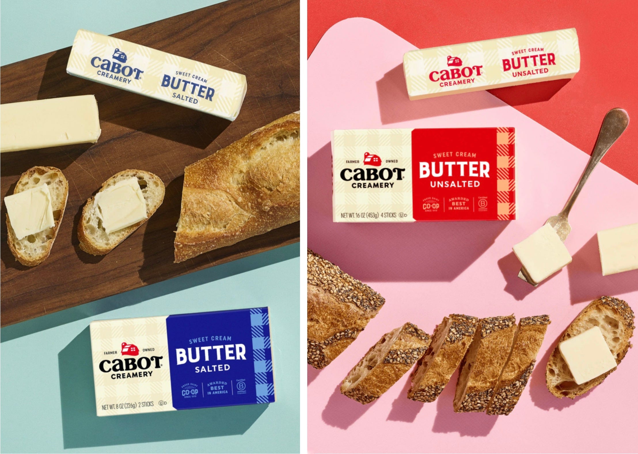
My supermarket has sometimes carried butter from the Vermont-based Cabot Creamery brand. It wasn’t available during my recent visits, but photos from the Cabot website indicate that they adhere to the standard blue/red color coding, with branded wrappers to boot:
There’s another supermarket in my neighborhood — a CTown (a regional chain). They carry the same name-brand butters as my ShopRite, but their store brand, which is called Krasdale (a local grocery wholesaler), turned out to have the weirdest system of all: The boxes follow the standard blue/red color coding, but the wrappers are blue for both the salted and unsalted varieties! Check this out:
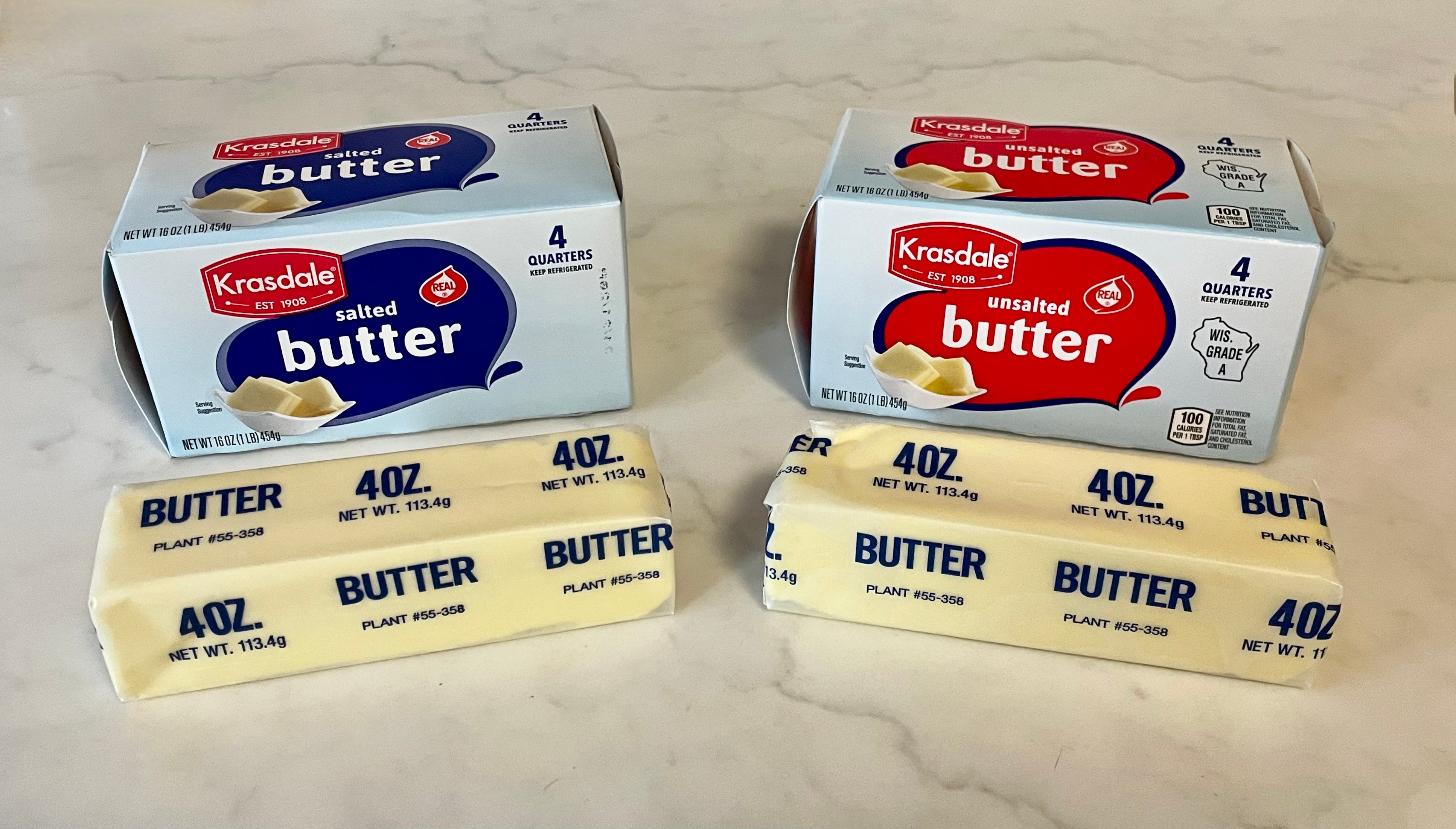
This one is highly problematic. For starters, it’s upsetting to have the box and label colors match for one variety and not match for the other. Moreover, these wrappers don’t even say “Salted” and “Unsalted,” so there’s no way to know which is which once the sticks are removed from their boxes. Note to self: Never buy this butter again!
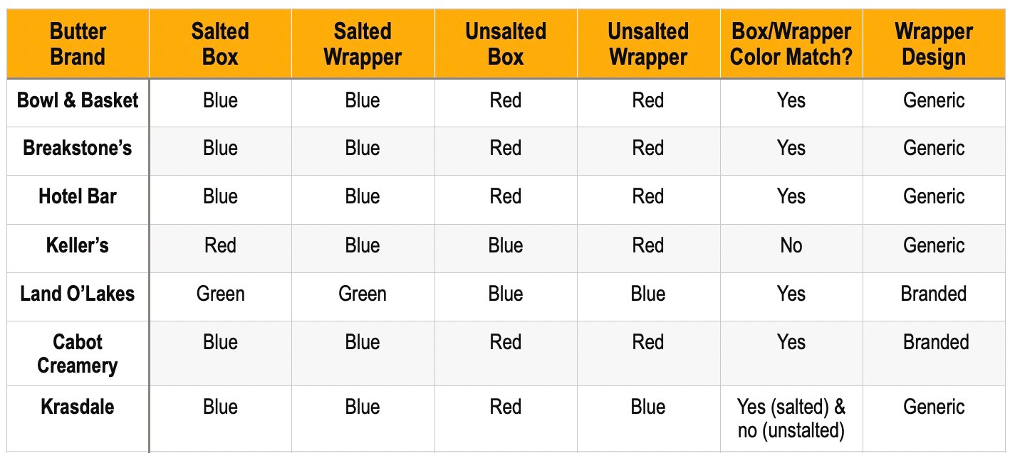
So that covers the basic supermarket butters available in my neighborhood. Here’s a table that summarizes the situation:
That’s a fair amount of information to process, but trust me — we’re just getting started. What I’ve shown you so far is just the tip of the smooth, creamy iceberg.