
A Spectacular Matchbook Catalog, in a Very Satisfying Format
Why weren’t all salesman sample catalogs made this way?

As most of you are probably aware by now, I’m very fond of midcentury salesman sample catalogs. In addition to enjoying the catalogs themselves, I also like thinking about how they were used. I usually picture a suit-clad salesman marching into a retail shop, briefcase in hand, and then pulling his company’s latest catalog out of the briefcase and going over the new product line with the shop owner.
Ah, but what if the briefcase is the catalog?
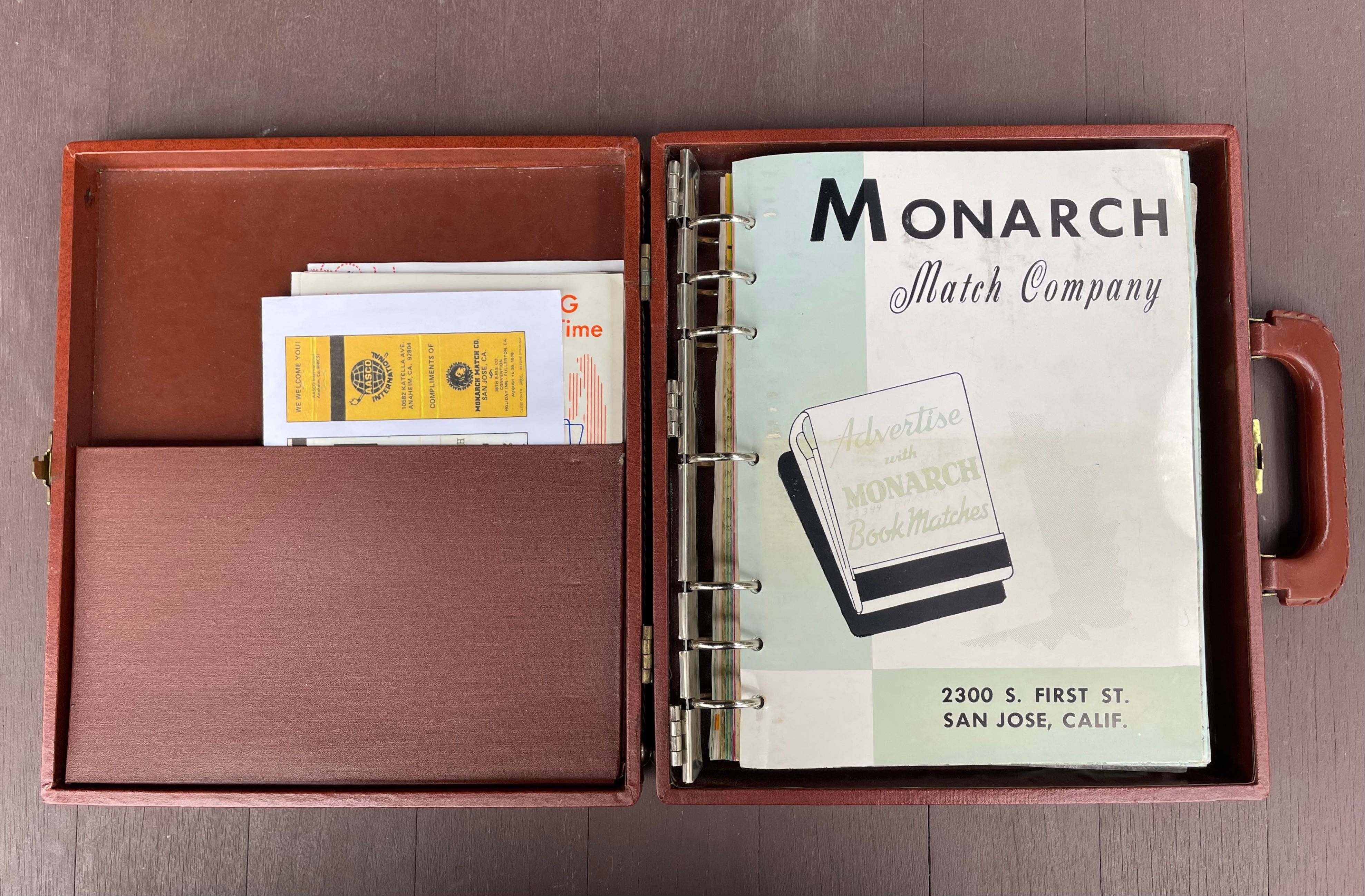
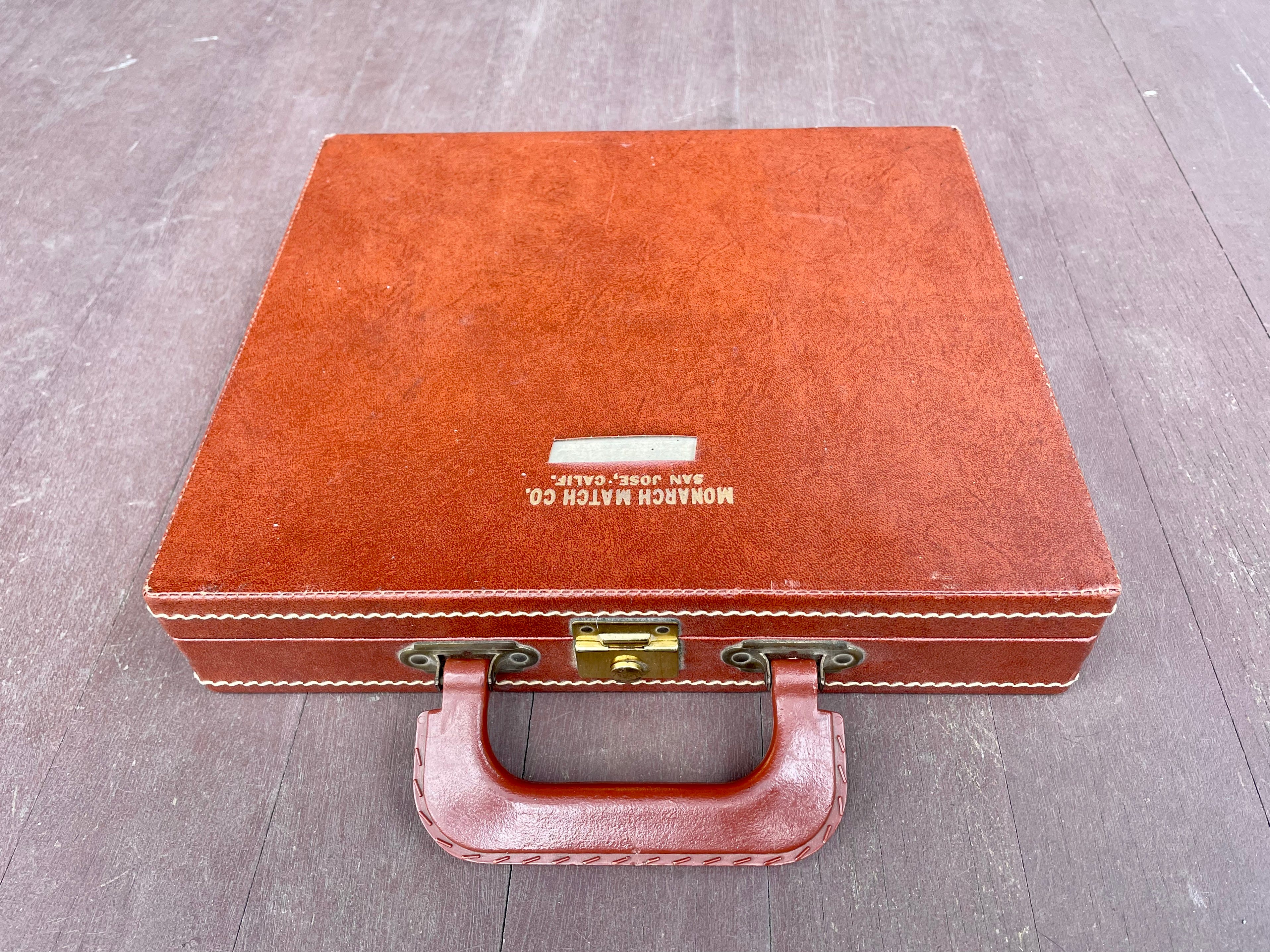
That’s the situation with a remarkable artifact that was recently given to me by a longtime reader. It’s a salesman sample catalog for the Monarch Match Company, which made matchbooks (or, as they say in the industry, “book matches”). But instead of being housed in a conventional loose-leaf binder, the catalog pages are in a briefcase with a seven-ring binder mechanism built into the interior of the case itself!
As you can see on that first page, the Monarch Match Company was headquartered in San Jose. The company operated for a relatively short period, from 1946 through 1966. This catalog appears to be from 1956, with a few updates from 1957 through the early 1960s.
That was a peak time for matches in America — pre-Surgeon General’s Report, pre-disposable lighters (those would come in 1964 and 1973, respectively). The matchbook, which had been patented in 1892, had emerged in the 20th century as an inexpensive vehicle for advertising, with all sorts of businesses giving away freebie matchbooks emblazoned with their name, logo, phone number, and so on. So match manufacturers like Monarch weren’t really in the match biz; they were in the advertising biz. As a result, the Monarch catalog has almost nothing to say about the quality of the company’s matches and instead has lots of chatter about how a well-designed matchbook can be “your silent salesman” and serve as “your own ad right in the customer’s pocket.” The catalog’s introductory text actually goes so far as to say, “The matches themselves are incidental, being merely the MEDIUM whereby you make certain the message you wish to convey is read by the folks you want to reach.”
So let’s imagine a Monarch salesman striding into a store in his sales territory while carrying this briefcase. The case is truly brief, measuring 10½ inches high by 12 inches wide — smaller than the standard 12-by-18-inch attaché size — and has the company name and location printed on the cover in gold lettering. It appears that the salesman’s name was also printed, but that line of type, sadly, has been removed.
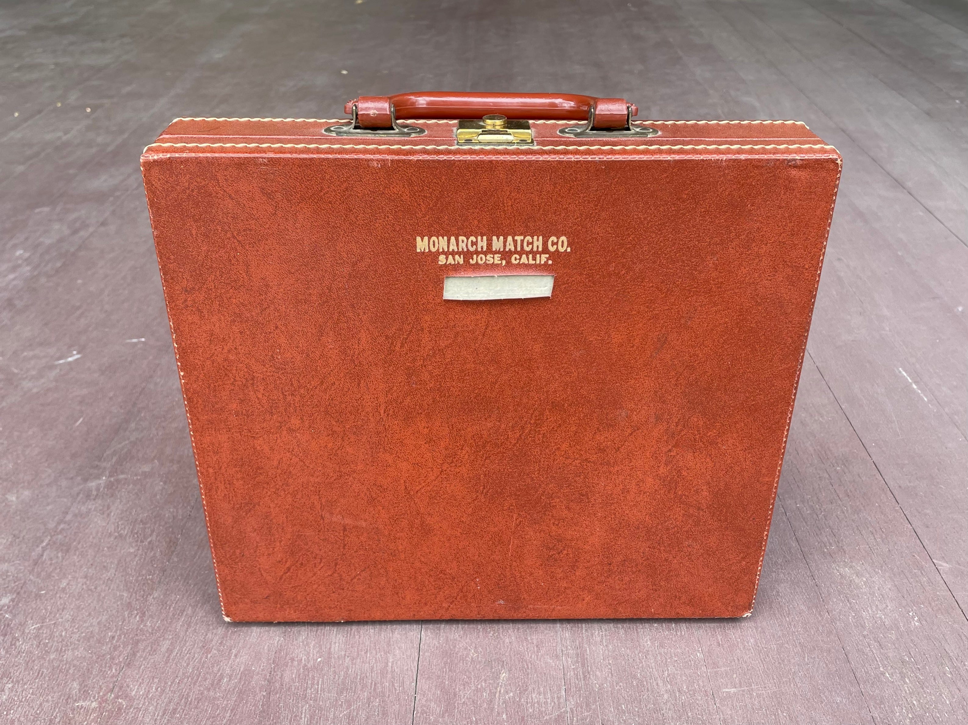
Also of note: The briefcase’s plastic handle is imprinted with faux stitching, to simulate the look of a leather handle — a design trend I wrote about last year. Interesting to see that this phenomenon dates back at least to the mid-1950s.
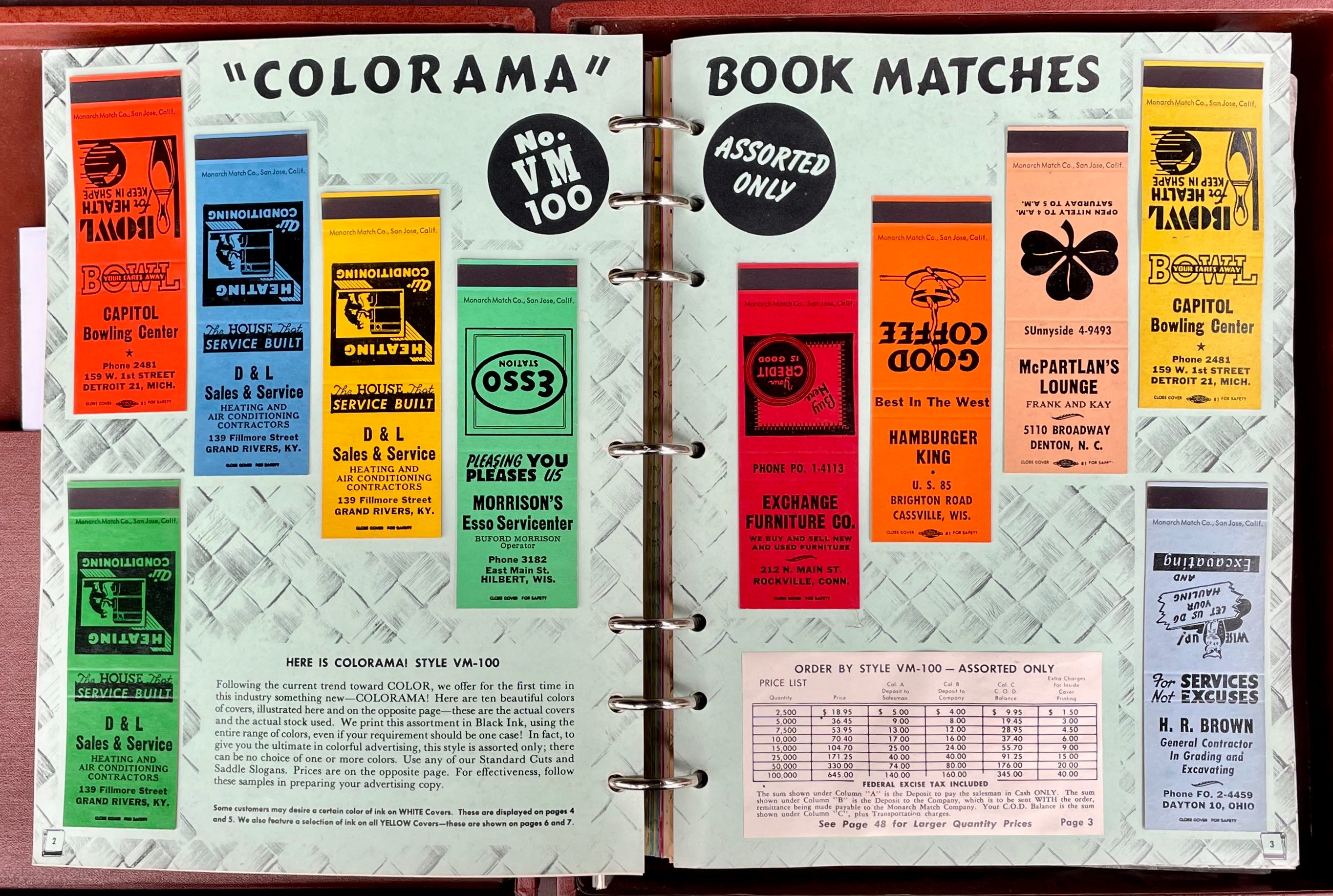
But enough about the case — let’s talk about the catalog, which is spectacular. It features dozens of real matchbook covers, complete with striking surfaces, glued onto the catalog pages. Here are some typical two-page spreads, showing various designs on white, yellow, and “Colorama” backgrounds (note also that the catalog page numbers are shown in little matchbook icons at the lower-outside corner of each page):
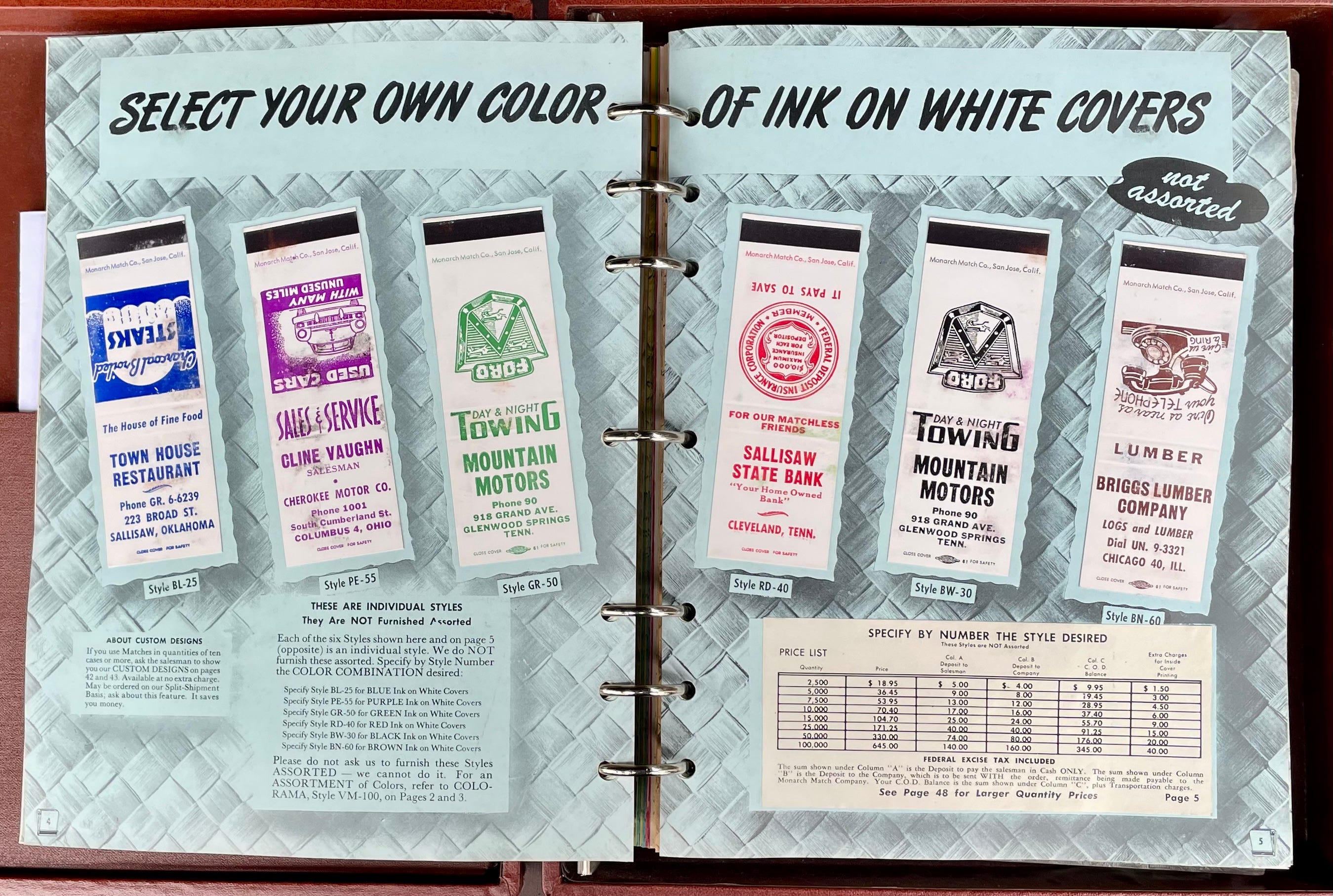
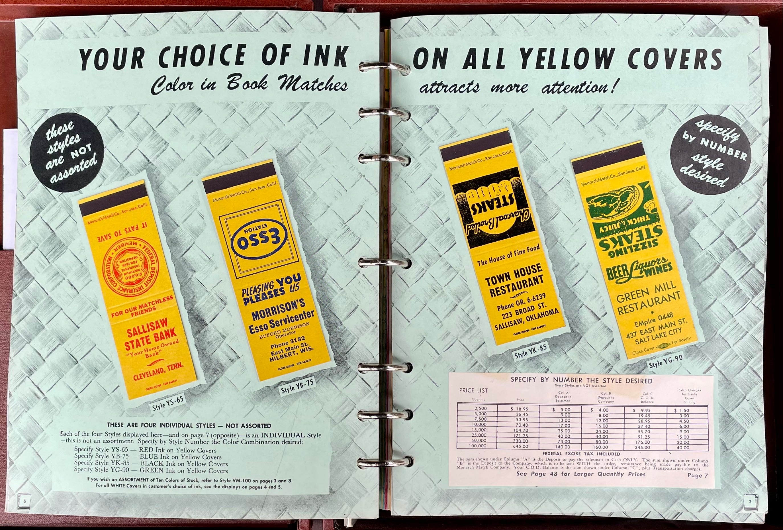

These are the most basic options offered in the catalog. Here are some other specialty design elements that Monarch’s customers could choose from:
Metallic Colors
You say you want something flashier than the standard colors? Try putting your ad on a metallic background, or have it printed in metallic ink: