

A New (and Improved!) Inconspicuous Consumption Shirt Design
Duh, I should have come up with this idea to begin with.


Last week I announced the launch of Inconspicuous Consumption T-shirts. As you may recall, there were two basic designs — one with typography and one with the Brannock device and a circle. For the circle design, we used a black circle for light-colored shirts and a white circle for dark-colored shirts.
But yesterday I realized that the dark shirts would look even better if we used a black circle with a white outline, as shown above. Here’s how it looks on some additional shirt colors:
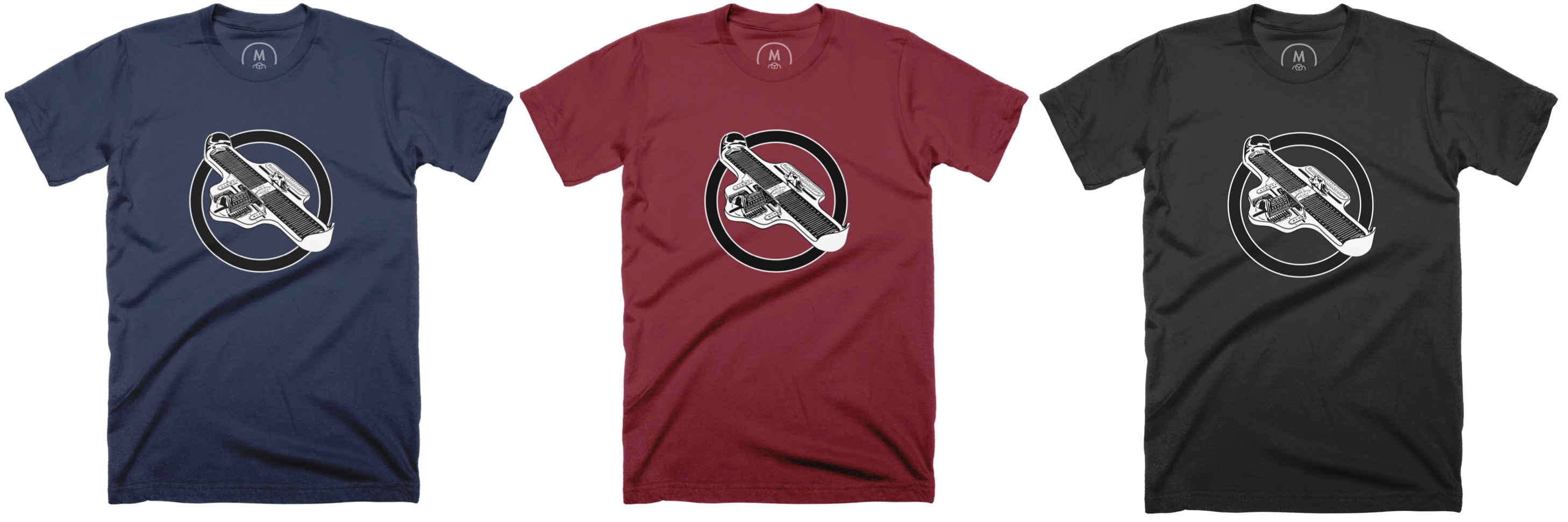

Looks really sharp, right? I have to say, I like this design much better than the solid white circle, and I feel silly for not having thought of it sooner. These shirts featuring the black circle with the light outline can be found here, and the rest of the shirts we’re offering — including the ones with text instead of the circle — are available here.
(My continued thanks to Steve Shanabruch for his design assistance.)
Paul Lukas has been obsessing over the inconspicuous for most of his life, and has been writing about those obsessions for more than 30 years. You can contact him here.