A Look at All the New 2021-22 NBA City Uniforms
The league's 75th-anniversary alternate-uniform program is a doozy.
Before we get started, two quick reminders: First, if you’re reading the emailed version of this article, you can post a comment by clicking on the headline above, which will bring you to the web version, where any Facebook member can comment. And second, if you want to subscribe to receive my Bulletin articles via email, you can do that here.
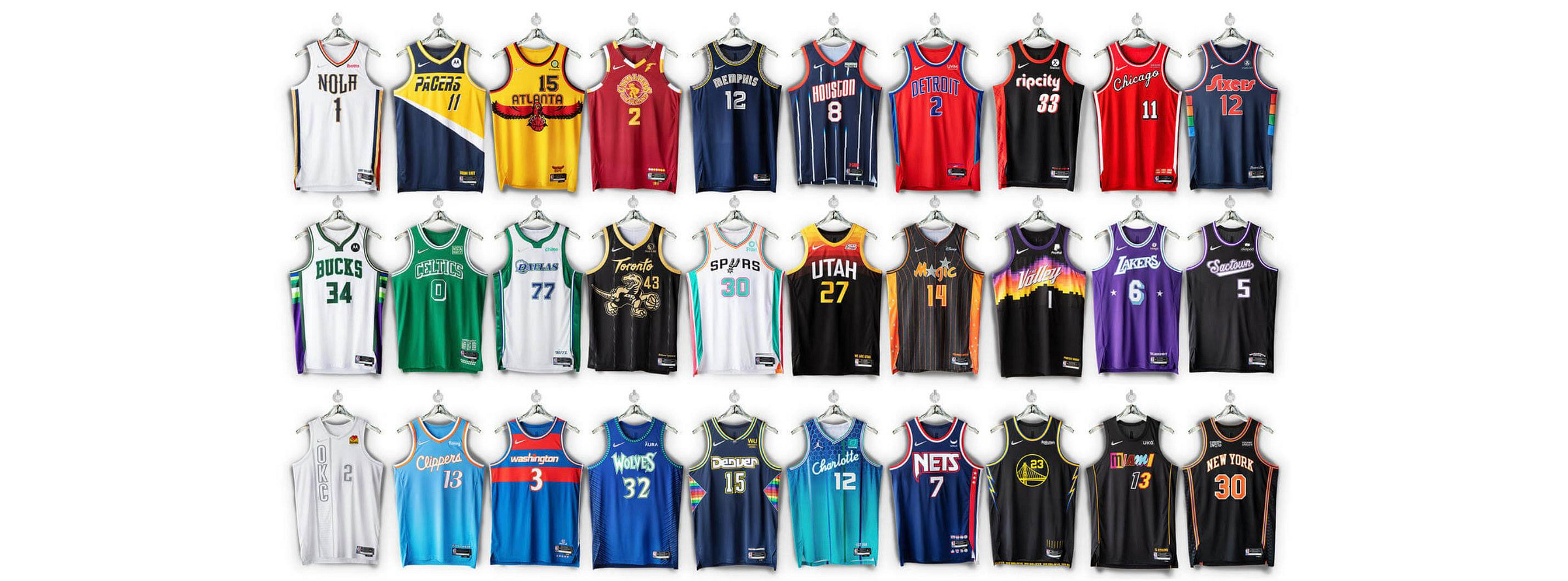
I usually post new Bulletin articles on Friday, but I’m changing the schedule this week because the NBA revealed 28 new uniforms yesterday — by far the biggest day for uni unveilings since I began writing for Bulletin back in July — so I thought I’d cover that here, instead of on my blog.
The new uniforms are the widely anticipated City Edition designs for the current season. As has been previously reported, most of these designs combine elements from each team’s visual history, as a nod to the league’s 75th anniversary. (The two exceptions are the Jazz and the Suns, who are reprising their popular City designs from last season.) In some cases, the new designs have incorporated certain elements very cleverly, and it can be tempting to say, “That’s a good uniform!” simply on that basis alone. But it’s important to remember that a clever concept for a uni element is not the same thing as a good-looking element. Or, as I’ve been saying for years, good “storytelling” is not necessarily the same thing as good design or good aesthetics.
With that in mind, here’s a team-by-team breakdown (except for the Jazz and Suns, since their designs aren’t new). For each team, I’ve provided three things:
First, there’s the official thinking behind the design, as taken from this Nike web page. (Much of the marketingspeak language is somewhere between silly and cringe-inducing, but whaddaya gonna do).
Second, I’ve added some thoughts of my own and, when possible, included a link to the team’s website for additional info and, when applicable, a link to the new court design that will be used with the new uniform.
And third, since one of the biggest complaints about NBA alternates is that fans can’t tell who’s playing when they turn on the game, I’ve provided my assessment of whether the average NBA fan — someone who isn’t already a fan of the team in question — will be able to tell who’s playing if the team is wearing the new City alternate.
Ready? Here we go.
Atlanta Hawks
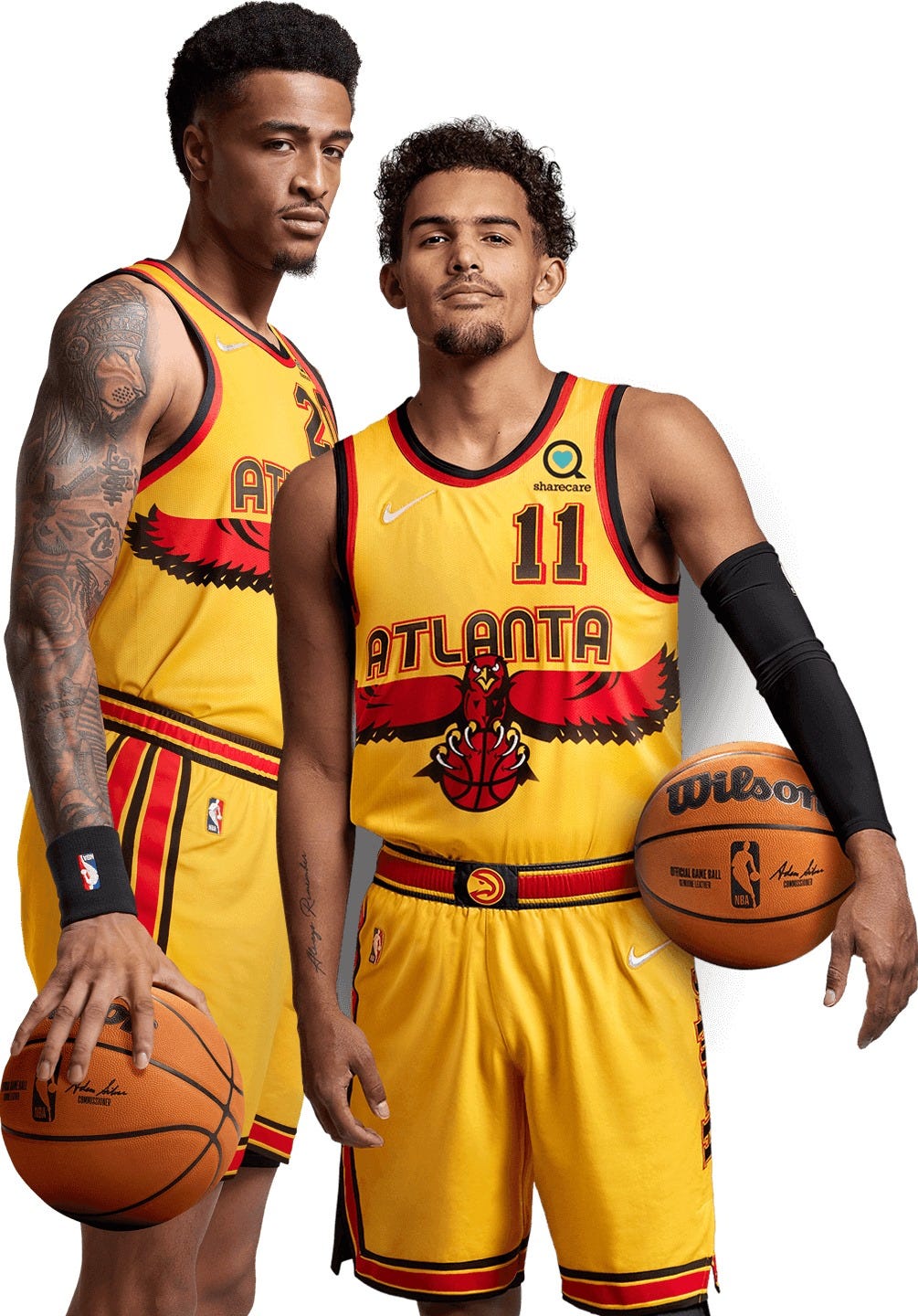
Nike says: “The front numbers and the stripe configuration on the shorts pay tribute to the first uniforms debuted in 1968, while the back numbers hearken to the highlight era of the ’80s. The wingspan logo of the ’90s makes a bold return across the front, while the beloved Primary Icon logo goes front and center on the belt. And the jersey anthem [i.e., the slogan printed above the jock tag — PL] calls out the city’s iconic ‘404’ with the razor-talon Hawk.”
Paul says: Basically a yellow version of the team’s late-1990s uni, with typography and trim drawn from other periods of the team’s history. Additional info here. Also: Like many of the new City uniforms, this one comes with its own dedicated court design.
Can you tell who’s playing when you turn on the TV? Yeah, probably. You might do a double-take, but you’ll know it’s the Hawks.
———
Boston Celtics
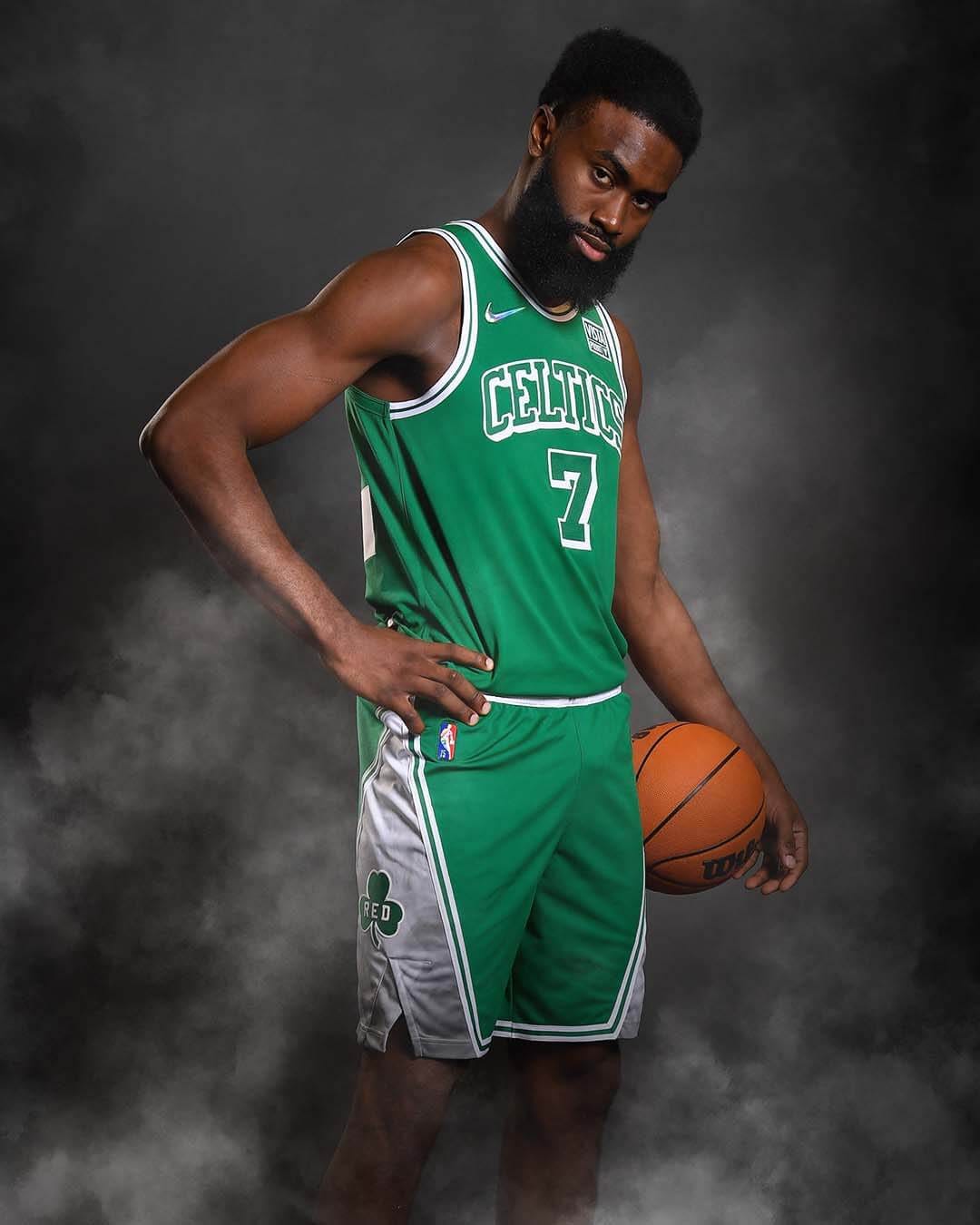
Nike says: “It’s a tall task to pick a collection of greatest moments for your franchise when 17 championship banners hang from the rafters. The Nike NBA City Edition uniforms focus on lettering and striping details from the ’46 and ’49 Celtic teams, as well as some signature details (Lucky the Leprechaun returns) from the franchise’s untouched run in the ’60s.”
Paul says: Just as the Celtics’ throwback is a perfectly nice uniform that has no compelling reason to exist because it’s so close to the team’s primary white uni, this new alternate is perfectly nice but has no compelling reason to exist because it’s so similar to the primary green uni. Additional photos here. Meanwhile: This uniform does not have its own dedicated court design.
Can you tell who’s playing when you turn on the TV? Duh, of course.
———
Brooklyn Nets
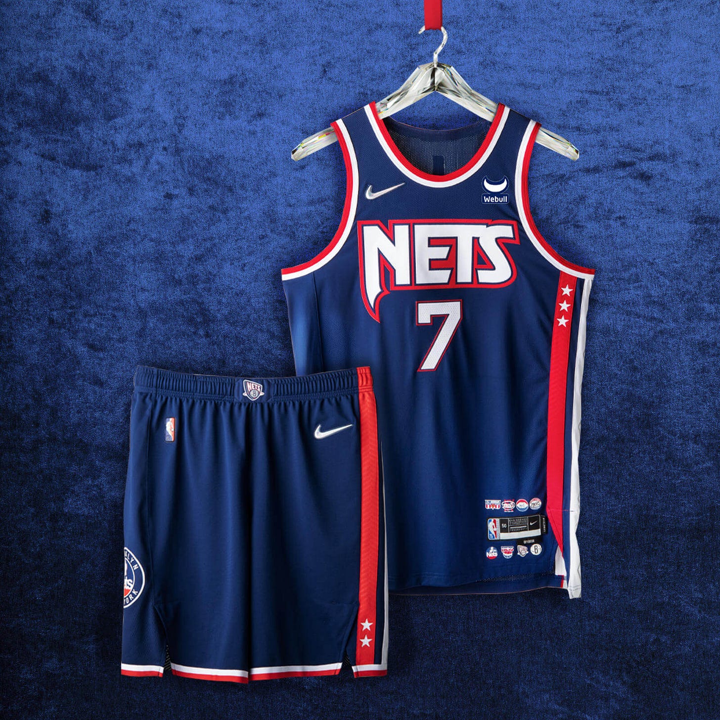
Nike says: “Marking the team’s path from New York to New Jersey and back again, the argyle side panel is a tribute to the repeat Eastern Conference championships from the ’01-’02 and ’02-’03 seasons. The patch on the shorts is a throwback to the ’80s, while the red, white, and blue color blocking reaches back to the franchise’s ABA roots. On top of the navy body color, the black space symbolizes a team on the rise, poised to leave a new mark on the league.”
Paul says: An interesting mix of elements from the team’s New Jersey period. The Dr. J era, surprisingly, is soft-pedaled, but maybe they’re trying to move past that. Additional info here, and here’s the corresponding court design.
Can you tell who’s playing when you turn on the TV? Definitely.
———
Charlotte Hornets
Nike says: “The ‘Charlotte’ script wordmark has never been used on a Hornets uniform, a detail calling to mind the unveiling of the team’s original uniforms in 1988. On the front of the jersey, the numbers are styled in the way of the current Hornets font, right-justified on the front as a throwback to the Bobcats jerseys from ’04-’09 and ’12-’14, and the player name on the back honors the classic Hornets font. The iconic pinstripes return in purple, green, and blue, commemorating the first team in league history to wear them on a jersey. The shorts bring back the original Hugo design from the team’s founding year in 1988.”
Paul says: Well, that’s a lot to digest. They even managed to reference the Bobcats! Way too busy for my tastes, but I’m not the target market. This uniform will also have its own court. Lots of additional info here.
Can you tell who’s playing when you turn on the TV? Probably, but you might have the impulse to watch something else.
———
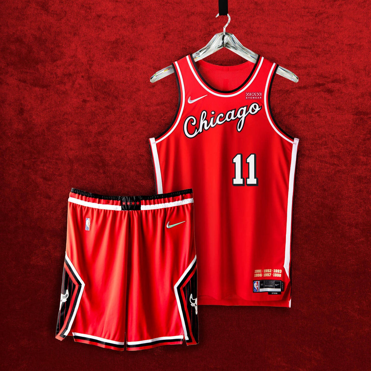
Chicago Bulls
Nike says: “The unforgettable script from the Bulls’ debut ’66 season graces the jersey chest. Two callouts to the team’s three-peats cover the area above the jock tag. The four stars of the city’s flag stud the belt buckle, while on the diamond cutout of the shorts, a black pinstripe pattern hearkens back to the team’s second three-peat.”
Paul says: I realize the Bulls have a very conservative uniform history, but this still feels really underwhelming, no? At least there’s a bit more visual interest on the shorts. Additional info here. No separate court for this one.
Can you tell who’s playing when you turn on the TV? Definitely.
———
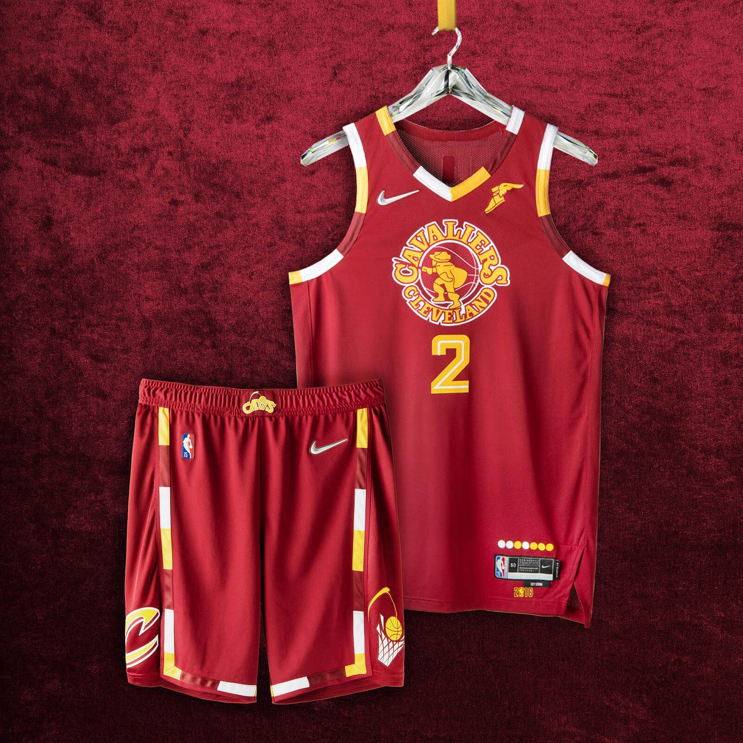
Cleveland Cavaliers
Nike says: “The uniforms are styled in the franchise’s classic crimson and gold, a pattern that honors the return of the team’s swashbuckling swordsman from the ’70s and the Miracle at Richfield. The jersey pays tribute to the ’16 championship season, and the legendary comeback that brought the city its first title in generations. The shorts rep the Cavs logo from the ’80s and ’90s playoff runs on one leg, and the logo from the historic ’16 season on the other.”
Paul says: The NBA’s mashup approach to these 75th-anniversary alternates was actually pioneered years ago by the Cavs with their “CavFanatic” uni series. Unfortunately, they already used up a lot of good ideas for that program, leaving them with few options for this season’s alternate. I give them credit for resurrecting a logo that most people don’t even remember, but not for much else. Here’s the matching court design.
Can you tell who’s playing when you turn on the TV? Nope.
———
Dallas Mavericks
Nike says: “Although the City Edition uniform brings back the green accents and western-style typography of the franchise’s early years, this season is the first time that a cowboy hat is set on top of the Dallas wordmark. The shorts include the style of cowboy hat featured graphically from the team’s first 20 years, the horse from its second 20, and a belt buckle with a giant Texas skyline.”
Paul says: This one had already leaked, so no surprises here. Off-center number looks particularly weird here, no? Additional photos here, and here’s the matching court design.
Can you tell who’s playing when you turn on the TV? Yes.
———
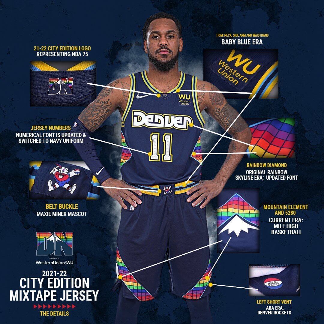
Denver Nuggets
Nike says: “Uniform details from the team’s fast-breaking game play of the ’80s and its shocking postseason run in ’94 make their way into this year’s City Edition jersey. A shimmering rainbow tetris pattern returns on the side paneling, the shorts and the neckline. Maxie the Miner, the team’s original mascot, appears on the belt buckle. The number set stretches back to the ’93-’94 to ’02-’03 uniforms. The diamond insert is a tribute to the identity of the ’75–’76 ABA team.”
Paul says: Well, that’s, uh, something. I thought they had run out of ways to repurpose the old rainbow pattern, but it turns out they just ran out of good ways to do it. Additional info here, and here’s the matching court design.
Can you tell who’s playing when you turn on the TV? The big “Denver” wordmark is a strong enough identifier, but you might wonder if you’re watching an exhibition game instead of a real game.
———
Detroit Pistons
Nike says: “The jersey proudly displays ‘Detroit’ across the chest set against accented teal, royal and white arm taping. The side paneling is a nod to the Pistons squads of the mid- to late ’90s. Both the Pistons’ former and current patches are featured on opposite sides of the shorts and are set against lightning bolt strikes, reminiscent of the team’s late-’70s aesthetics. The color-block waistband is a remix of the classic flaming horse logo and the ’90s-era graphics.”
Paul says: Sort of vertical mullet — all business on the jersey, a party on the shorts. But not necessarily the kind of party I’d want to attend. Here’s the matching court design.
Can you tell who’s playing when you turn on the TV? Yes.
———
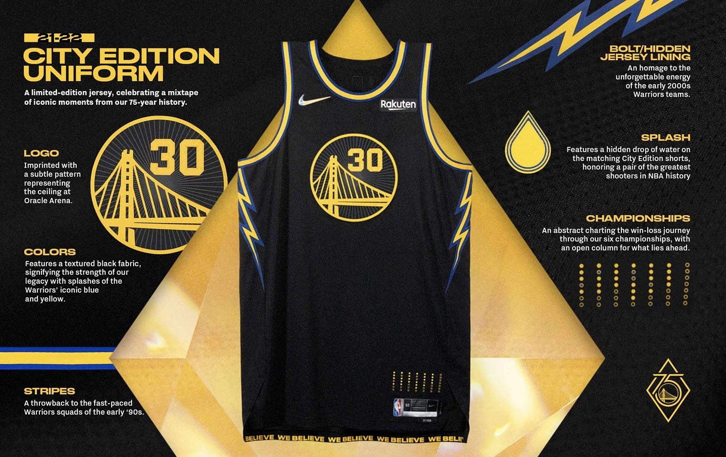
Golden State Warriors
Nike says: “The uniform’s inspiration began with Oakland, the team’s home for nearly 50 years. Based in black, the Bay Bridge logo is surrounded by a design representing the roof of the team’s former arena. As a tribute to the ‘We Believe’ Warriors of the late 2000s, lightning bolts line the uniform’s side panels. The shorts are embellished with a golden trim and feature two logos: one from the We Believe era, and the other marking the Warriors’ 75th anniversary.”
Paul says: Hmmm, two teams in a row featuring lightning bolts in their designs. Can we just pass a law that says nobody but the Chargers can wear those? Additional info here, and here’s the court design.
Can you tell who’s playing when you turn on the TV? Yes.
———
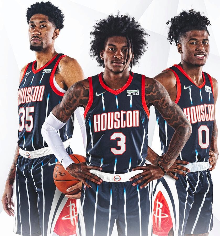
Houston Rockets
Nike says: “The uniform’s style is inspired by the mid-’90s jerseys, with white pinstripes fading into navy continuing to the shorts. The belt buckle features the team logo from the Clutch City championship years of ’94 and ’95. The two logos, pulled from the 2000s, mark two moments: one for Houston’s No. 1 draft pick, and the other from the team’s memorable 22-game winning streak.”
Paul says: Garish pinstripes plus garish shorts graphics equals a serious eyesore. Additional info here, and here’s the court design.
Can you tell who’s playing when you turn on the TV? Yes.
———
Indiana Pacers
Nike says: “Front and center is the Pacers jersey wordmark from 1987, surrounded by the famous yellow color-blocking. More details on the lining and the side paneling pay tribute to the team’s legacy, such as the three ABA championships in the early ’70s and its 2000 Eastern Conference Championship. The shorts include the team’s current logo remixed with the classic look from 1971.”
Paul says: Interesting riff on the FloJo design, but it really has too much going on. Additional info here. No separate court design.
Can you tell who’s playing when you turn on the TV? Probably, but you might think that their luggage got lost and they had to wear their practice gear.
———
Los Angeles Clippers
Nike says: “The uniform has a Pacific blue base color that was inspired by the team’s past incarnations as the Buffalo Braves and the San Diego Clippers. The jersey numbers and taping on the neck, arms and shorts are a tribute to the 1984 uniform design, marking the team’s first season in Los Angeles. The memorable Clippers script wordmark is from the 2015-16 season, linked to its high-flying roster. The uniform’s shorts feature the three white sails that were part of the original Clippers logo design, and part of the team’s first Nike NBA City Edition uniform in 2017-18.”
Paul says: As someone who cares about history, I think it’s cool that they included the old Buffalo Braves logo on the waistband. But as someone who knows that feathers are sacred to Native Americans, I don’t think we should be reviving that design today. (I feel the same way about the Atlanta Braves’ 1970s “feather” throwbacks.) Additional info here and here. No separate court design.
Can you tell who’s playing when you turn on the TV? Yes.
———
Los Angeles Lakers
Nike says: “While the shorts incorporate the baby blue from the original championship team in Minneapolis, the primary head-to-toe color is the Lakers purple that emerged in the late ’60s. The belt buckle includes the ‘L’ logo from the three-peat era of the 2000s.”
Paul says: Can’t say I love the purple/light-blue color combo, but the stars are a nice touch. Additional info here. No separate court design.
Can you tell who’s playing when you turn on the TV? Definitely.
———
Memphis Grizzlies
Nike says: “The uniform brings in details from throughout the team’s far-reaching background, from British Columbia to Tennessee. The uniform’s main colors are the midnight blue and yellow that have represented the Grizzlies style since 2004. A stylized ‘Mem’ wordmark from 2018 patterns through the neck, arms and shorts in a design similar to both the original Vancouver uniform and the current Statement Edition uniforms. The waistband has the ‘claw ball’ logo drawing from the original design from Vancouver and those early Memphis years. The shorts have the iconic bear logo from 2002 updated with the current blue colorway.”
Paul says: This is another one that had previously leaked. Overall, one of the nicer designs — unspectacular but gets the job done. Bonus points for not having a jersey ad. Additional info here. No separate court design.
Can you tell who’s playing when you turn on the TV? Definitely.
———
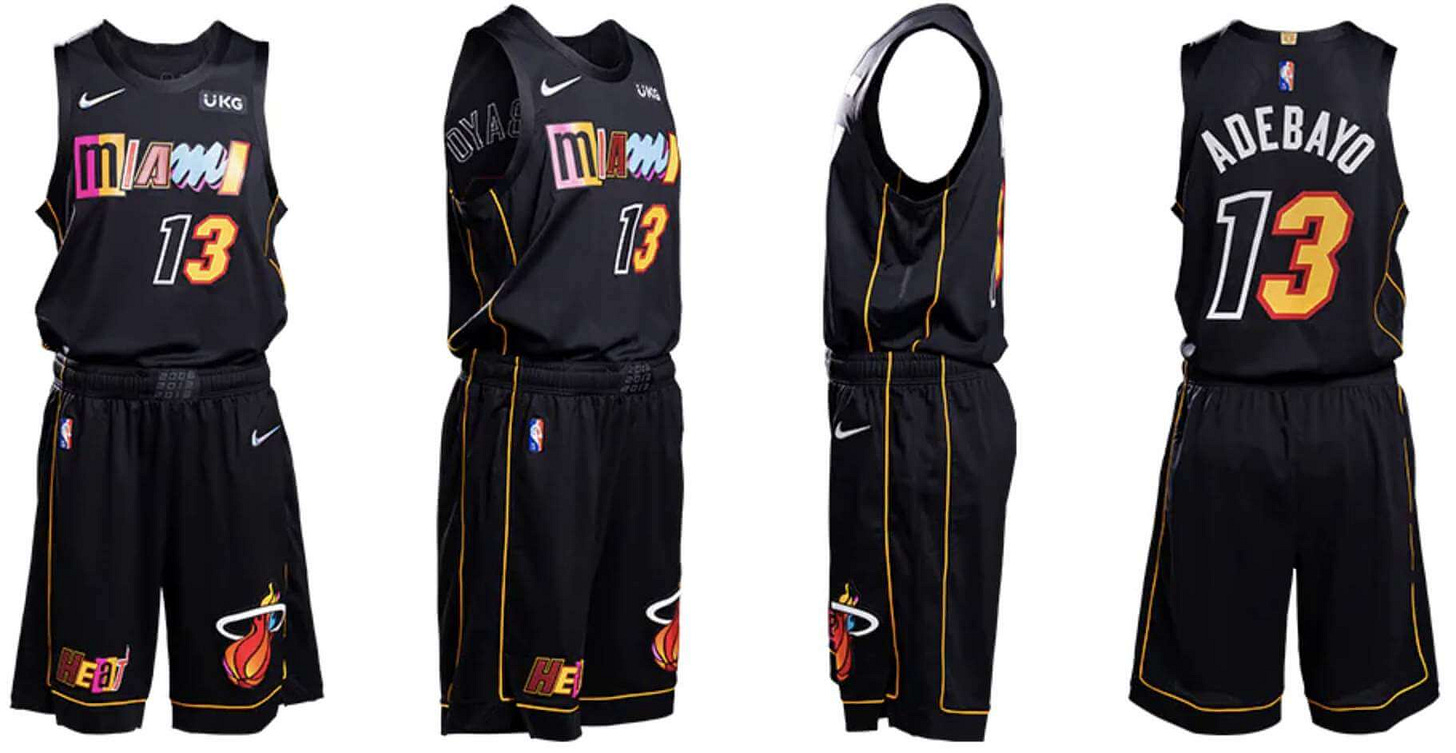
Miami Heat
Nike says: “This is a mashup in the truest sense of the word, comprised of a collage of letters and numbers from the franchise’s most iconic jerseys. The black base is a neutral foundation for the letters pulled from uniform sets like the technicolor Vice Nights jersey, the Miami Floridians jersey and others. Just above the jock tag appears ’15 Strong,’ referring to the team’s 2006 championship run. Rounding out the uniform is a thin golden stripe that symbolizes the security ropes brought out by arena staff seconds before the thrilling Game 6 shot in 2014.”
Paul says: The “Miami Mashup,” as it’s being called, is likely to be the most talked-about of all the City designs. In addition to the ransom-note chest mark, players can use a variety of number fonts to mix and match for the numerals of their uni numbers (here’s what the players have chosen). I have to say, I really like all of this. The chest lettering is clearly identifiable as part of the Heat’s design program, and the mishmash makes sense for a team that’s had more alternate unis than any other NBA team. This approach wouldn’t work for every team, but it works for this one. Additional info here and here, and here’s the court design.
Can you tell who’s playing when you turn on the TV? Maybe, maybe not. But that’s already been the case with this team for quite a few years now.
———
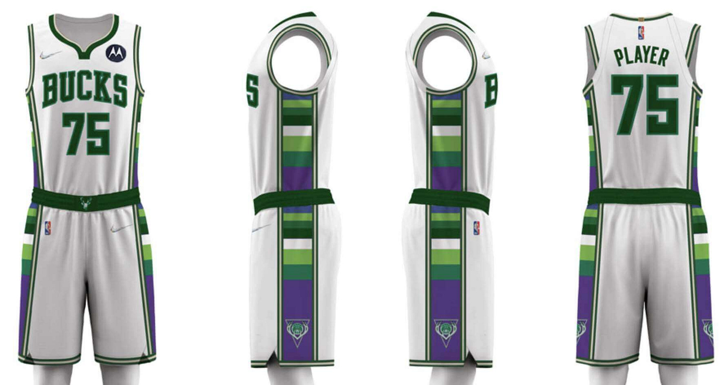
Milwaukee Bucks
Nike says: “The uniform features green and Lake Michigan blue from the team’s current uniform sets, side panel blocking from 2001, the neckline from the 2010s, and the number set worn by the team during its second championship in 2021. A remixed waistband logo from 1971 is a callback to skyhooks and triple-double averages.”
Paul says: Well, at least they didn’t bring back this. But mixing my favorite and least-favorite colors is a pretty sneaky trick, Milwaukee. And ugh, that collar. Additional info here. No separate court design.
Can you tell who’s playing when you turn on the TV? Yes.
———
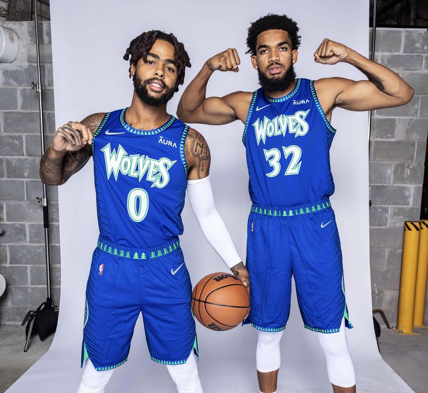
Minnesota Timberwolves
Nike says: “The blue, green, and white color palette of the uniform returns from the team’s inaugural 1989 season. The wolf logo reflects the origins of the team, while the wordmark and forest images are inspired by the MVP-era early 2000s. Each side of the short is equipped with guard hair patterns to capture the essence of the wolf as well as resurface themes from the inaugural 2017-18 Nike NBA City Edition uniform.”
Paul says: Seriously, has this team ever had a good uniform? Like, ever? Also, note that this is a City alternate that, according to Nike, is actually referencing a previous City alternate, which is pretty much the definition of creative bankruptcy. Additional info here. No separate court design.
Can you tell who’s playing when you turn on the TV? Yes, unfortunately.
———
New Orleans Pelicans
Nike says: “Inspired by the resilience of the city, the uniform combines a white base with typography reminiscent of wrought iron. It also boasts red, gold and navy stripes, as well as the signature ‘NOLA’ emblem, iconic fleurs-de-lis on the belt buckle in Mardi Gras gold, and an anthem that defines the team and its city: ‘Won’t Bow Down.’”
Paul says: Obviously, they don’t have much history to draw upon, so their design options were limited. Maybe that was for the best, because it kept them from getting too ridiculous. Net result: a perfectly nice uniform. No separate court design.
Can you tell who’s playing when you turn on the TV? Yes.
———
New York Knicks
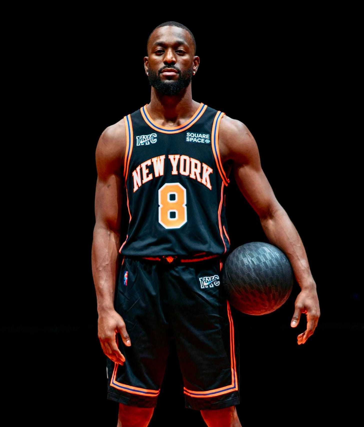
Nike says: “The black uniform features orange and blue piping and checkered side panels. A graphic treatment of the team’s world-famous arena is shown on each leg, while the belt buckle boasts the logo that defined the team in the 2000s. The shorts carry retired Knicks numbers along the waistband.”
Paul says: An original NBA franchise going full-on BFBS. As a New Yorker and a Knicks fan, I find this embarrassing. On the plus side, the jersey features the more deeply arched “New York” lettering that they should never have gone away from — so much better than the version on their current primaries. Here’s the absolutely brutal court design.
Can you tell who’s playing when you turn on the TV? No, at least not initially. Then you’ll see the “New York” lettering and be confused.
———
Oklahoma City Thunder
Nike says: “Atop a white base, the uniform brings back the vertical lettering from the Thunder’s first alternate uniform, worn from 2012 to 2016. Also returning is the team’s belt buckle graphic from its first practice uniforms. Additionally, the sash detail on the shorts from the 2018-2019 Nike NBA City Edition uniform honors Oklahoma’s indigenous culture.”
Paul says: This is another one that had leaked. Still can’t believe they’re actually wearing it. Like, really? Additional info here and here. The court design — the first alternate floor in Thunder history — is as bad as the uni would lead you to expect.
Can you tell who’s playing when you turn on the TV? No.
———
Orlando Magic
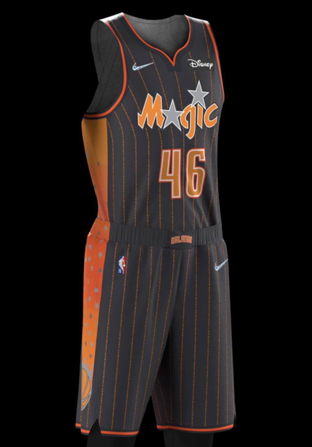
Nike says: “The uniform includes orange and anthracite detailing to recognize the orange groves that helped build the city’s economy, while the neck and arm taping are throwbacks to the team’s original jerseys, with the side insert featuring the first Orlando Magic logo. Two questions that typified the ’90s-era teams — “Why Not Us?” and “Why Not Now?” — are printed up and down the jersey in the form of pinstripes.”
Paul says: Like I always say, orange is a very underrated accent color. Not bad at all. Additional info here. This uniform will have its own court, but it’s not a new floor design — it’s the same court the Magic used for an earlier City uniform.
Can you tell who’s playing when you turn on the TV? Yeah, although the colors will probably make you do a double-take.
———
Philadelphia 76ers
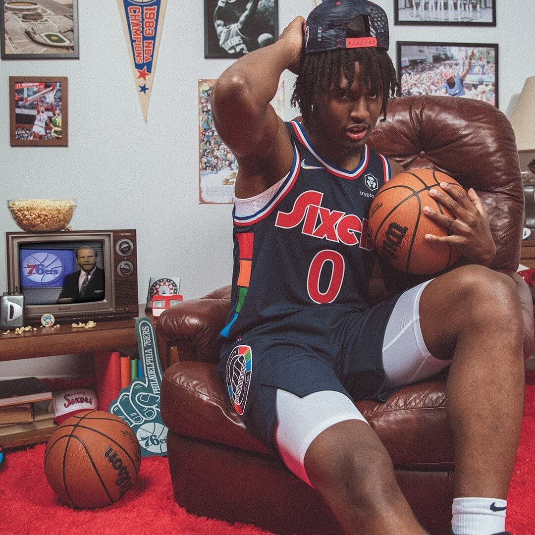
Nike says: “The team’s 40-year relationship to its home arena is celebrated by the arena’s logos on the shorts and the belt buckle. The arena’s signature multicolor pattern runs up the sides of the jersey. The deep-blue body color is a deeper version of the team’s royal blue, while the wordmark, numbers, and player names are inspired by the team’s graphic identity from the late ’70s.”
Paul says: Probably my favorite of the whole batch. There were plenty of leaks for this one, and the real thing is just as good as the sneak peeks suggested. Additional info here, and here’s the court design.
Can you tell who’s playing when you turn on the TV? Maybe, maybe not. I don’t care — I love this uniform!
———
Portland Trail Blazers
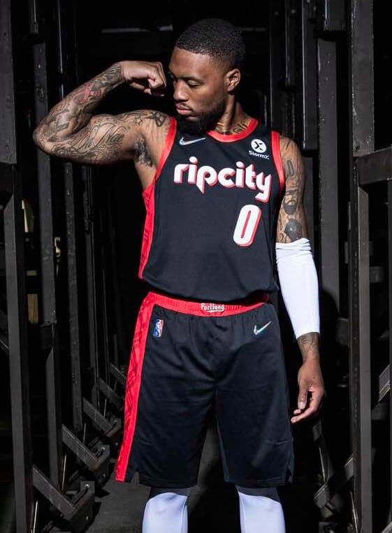
Nike says : “‘Rip City’ appears in the retro ’90s-style font with drop shadow. The belt buckle features ‘Portland’ in the ’70s-style font from the original Blazers teams. A signature plaid pattern is a nod to a memorable feature of the city’s culture and also honors an all-time coach. A ‘City of Roses’ anthem is a tribute to the city that supports its team.”
Paul says: Not a terrible uniform, but any Trail Blazers uni that doesn’t include either vertical lettering or diagonal stripes feels like a mistake to me, plus the whole “Rip City” thing feels way too played out at this point. Additional photos here. No separate court design.
Can you tell who’s playing when you turn on the TV? Yes.
———
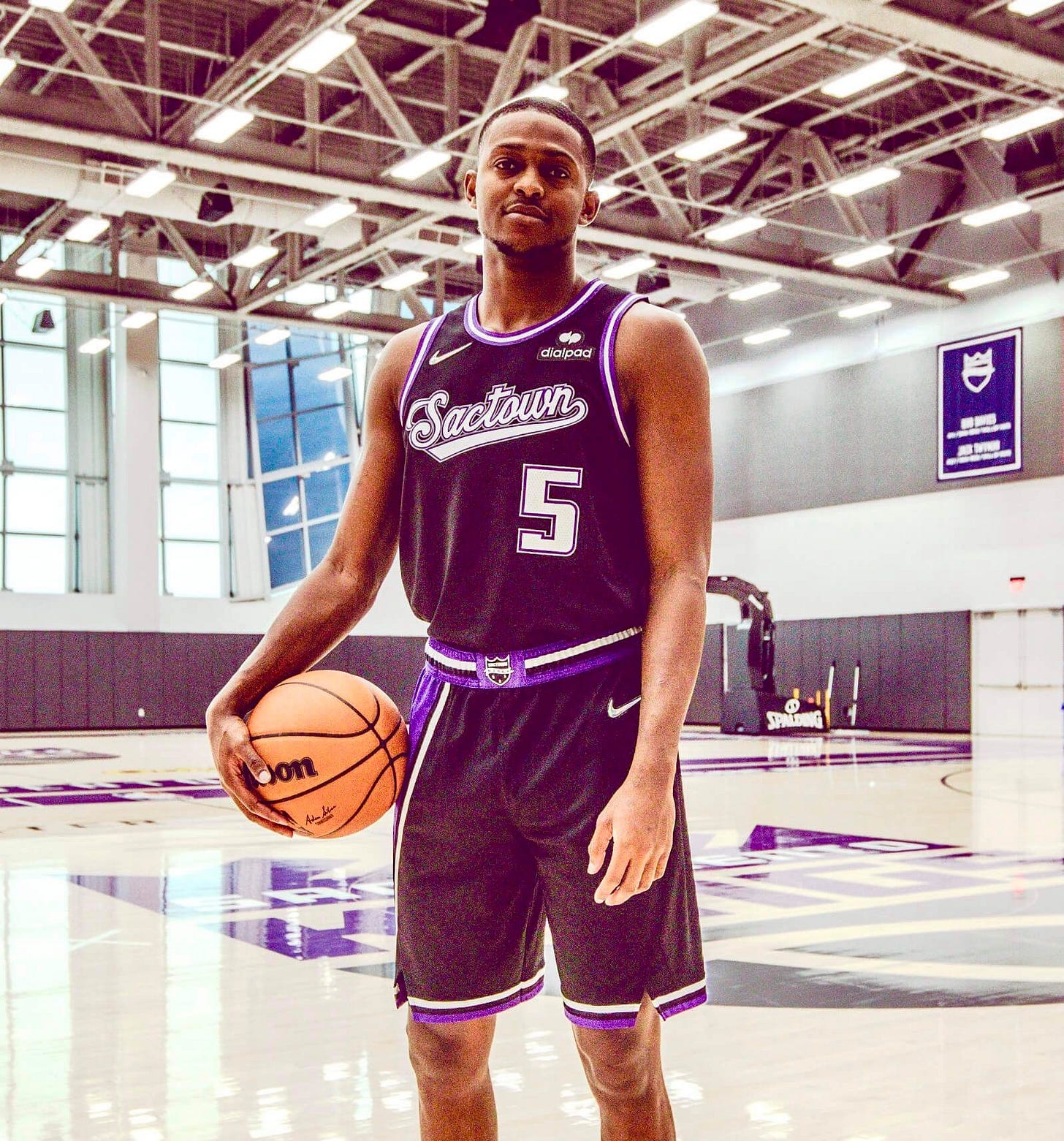
Sacramento Kings
Nike says: “An asymmetrical stripe over the black base is an ode to the ‘Greatest Show on Court’ teams of the early 2000s. The script wordmark is a staple of the team’s design, as it’s been part of the team’s history from Kansas City to its permanent home in Sacramento. The waistband features a remixed version of the Rochester Royals logo set in purple and black.”
Paul says: Not bad at all. The script is really nice (although the uni number, rendered in the team’s current font, isn’t a good match for it), and the purple trim is restrained enough to work quite well. Additional info here. There will reportedly be a new court design, but it hasn’t yet been revealed.
Can you tell who’s playing when you turn on the TV? Yes.
———
San Antonio Spurs
Nike says: “Lining the entire uniform are the franchise’s fiesta stripes, which first appeared on the team’s warm-up jerseys in the mid-’90s. Classic silver and black stripes appear above the jock tag. The shorts feature the boot-spur logo and the angular design of the jerseys worn by the team in the late ’70s and early ’80s, while also bringing back the roadrunner logo of the Dallas Chaparrals, the franchise’s original ABA name.”
Paul says: Everyone’s a fan of the Spurs’ Fiesta motif, so everyone’s gonna love this. That includes me. Additional info here. This uni has its own court, but the floor design is a repeat from last season’s City uniform.
Can you tell who’s playing when you turn on the TV? Yes.
———
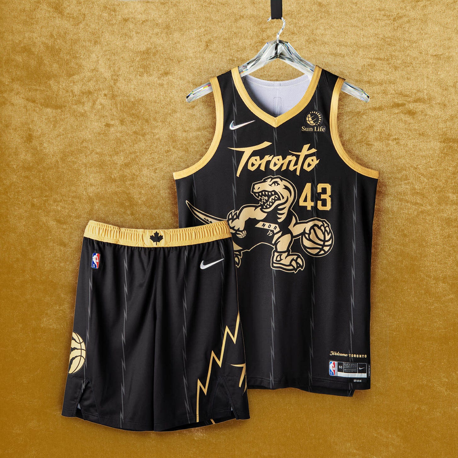
Toronto Raptors
Nike says: “The popular black base and gold trim return, with the iconic dino logo, scrawled across the chest, donning the look from the 2019 title-winners and flipping the Raptor’s direction from the Nike NBA Hardwood Classic uniform. The jagged pinstriping and short design echo the team’s inaugural uniforms from a quarter-century ago. Today’s claw-scratch logo appears on the shorts, with a Canadian maple leaf on the waistband reminding fans of the team’s roots.”
Paul says: This one leaked last week. Putting Barney in the chevron uni is really clever, but I hate this color combo. This uniform has its own court, but the floor design is very similar to one of the team’s previous City courts. (I think the only difference is that the lane for the new design is gold instead of black.)
Can you tell who’s playing when you turn on the TV? Yes.
———
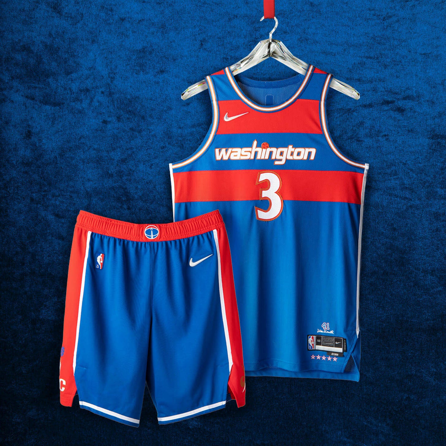
Washington Wizards
Nike says: “The red stripes on the blue base are a tribute to the classic Bullets uniforms from the ’60s and ’70s, especially from center Wes Unseld’s exceptional ’68 season, when he won both league MVP and Rookie of the Year honors. Below the red belt, the shorts feature a wide red panel on each side, a detail also brought back from the late ’60s. The ‘Washington’ wordmark across the chest is a remixed take on the jerseys that highlighted the team’s inspiring playoff run during the 2016-17 season.”
Paul says: Anything with this stripe pattern is jake with me. I like the gold/orange trim, too. Bonus points for not having a jersey ad. No separate court design. Additional info here.
Can you tell who’s playing when you turn on the TV? Yes.
———
Phew! That’s a lot to process, right?
But wait — there’s more. You can see all of the new City designs on the NBA’s LockerVision site. If you click on any individual uniform, you’ll get a page with still more info on that uniform. That page will also show all the warm-up gear that goes with that uni.
Paul Lukas has been writing about uniforms for over 20 years. If you like his Bulletin articles, you’ll probably like his daily Uni Watch Blog, plus you can follow him on Twitter and Facebook. Want to learn about his Uni Watch Membership Program, check out his Uni Watch merchandise, or just ask him a question? Contact him here.


