A Deep Dive on the Seahawks’ Silver-and-Blue Uniforms
With throwbacks planned for this season, here are some things you might not know about Seattle’s early uni set.

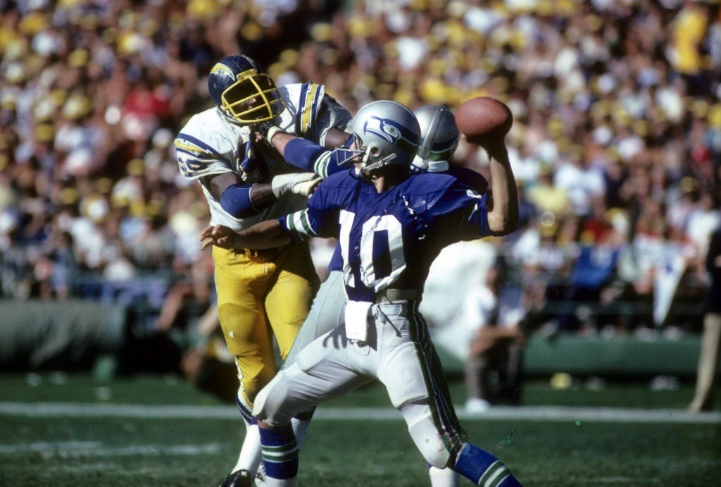
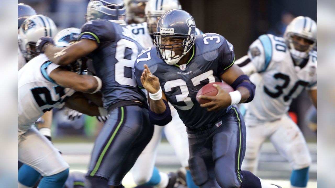
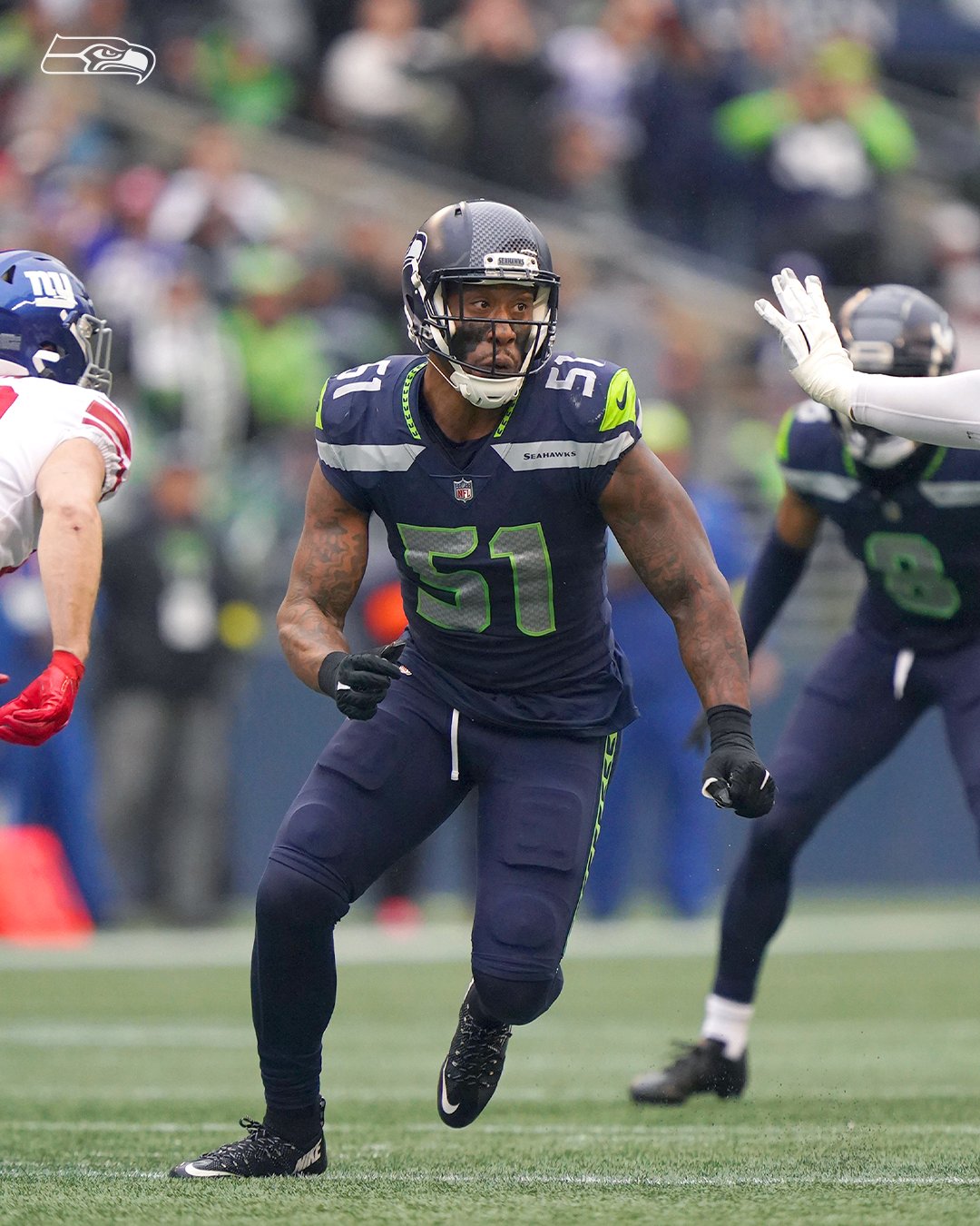
The Seattle Seahawks have had three primary uniform epochs. The first one, which ran from the team’s 1976 inception through 2001, featured the club’s original silver/blue color scheme. The second one, which ran from 2002 through 2011, saw the team abandon its original colors and adopt its now-familiar mono-navy “scuba suit” look for home games. And the third one, which began in 2012 and is still ongoing, has seen the team go full Nike.
That first era — the one with the silver helmets and the royal blue home jerseys — has never gotten the throwback treatment (in part because of the NFL’s one-shell rule, which made such a throwback impossible from 2013 through 2021). But that will change later this year, as the Seahawks plan to wear silver/blue throwbacks on Oct. 29 against the Browns.
Personally, I’ve always loved this uniform set and am excited to see it back on the field. And since I wrote last week about the Buccaneers’ creamsicle uniforms, which are also being revived this season as a throwback, it seems only fair that I do the same for Seattle’s silver/blue design. As is the case with so many uniform sets, this one includes lots of nuances, details, and sub-eras that you might not be aware of, so buckle up for another one of our deep dives. Ready? Here we go.
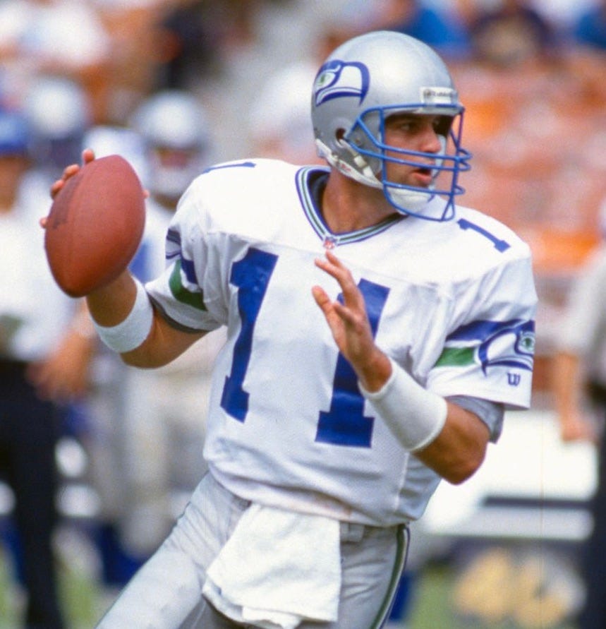
1. Bigger is better and biggest is best.
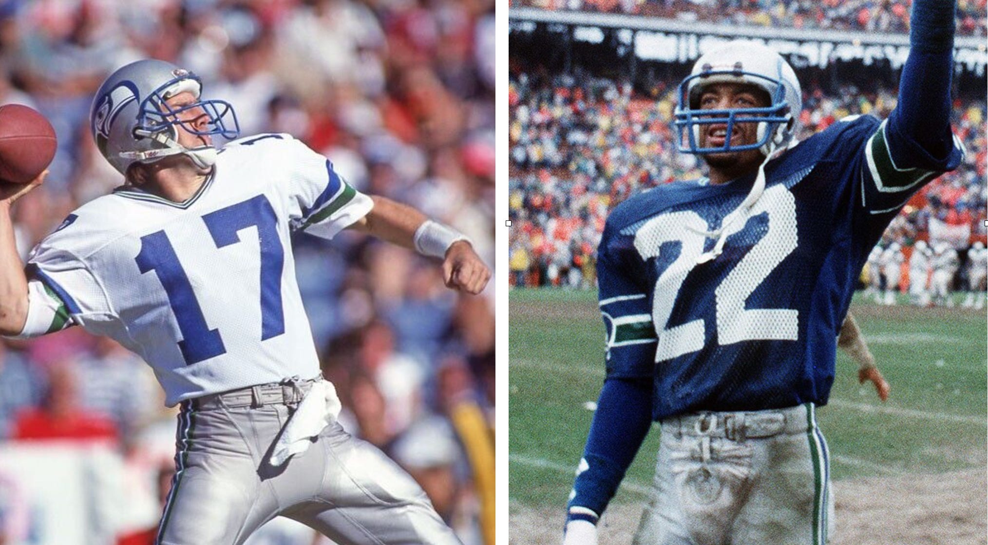
When I think of the Seahawks’ early uniforms, the first thing that comes to mind is that their front jersey numbers were enormous. They seemed to occupy much more acreage than the numbers on other teams’ jerseys. In addition, if the uni number included a “1,” there was often an unusually large space between the numerals, especially for quarterback Kelly Stoufer: