

A Deep Dive on the Most Radical Uniform in NFL History
After 26 years, the Denver Broncos’ 1997 makeover still stands alone among groundbreaking NFL uniform designs.

In recent weeks we’ve taken close looks at an early-1990s MLB Style Guide and a 1999 NFL Style Guide. As I was looking through my library for other items to possibly write about, I came across something I’d forgotten about: a brand guide for the Denver Broncos’ 1997 uniform redesign. It’s sort of like the league-wide style guides we previously examined, but just for the Broncos:
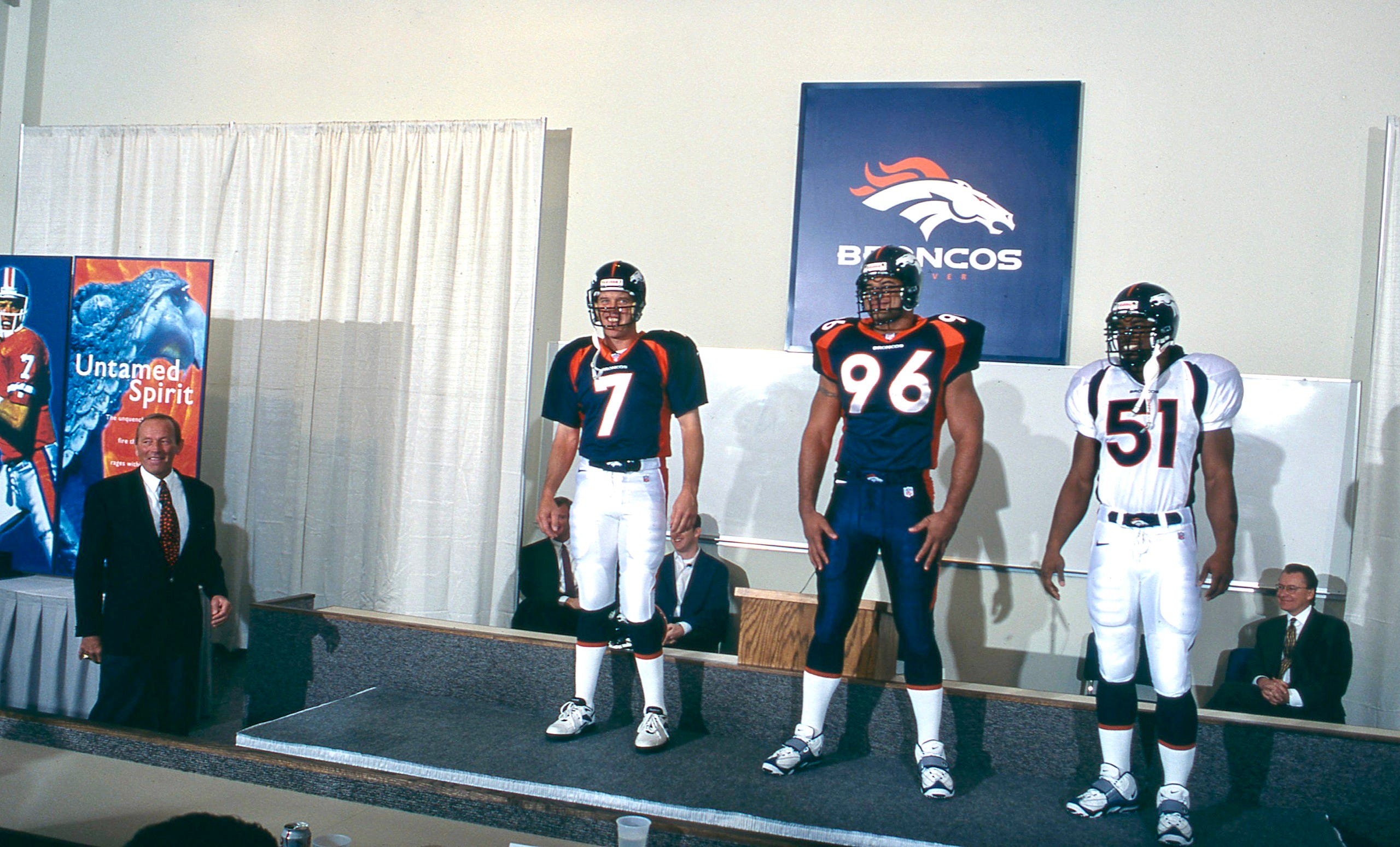
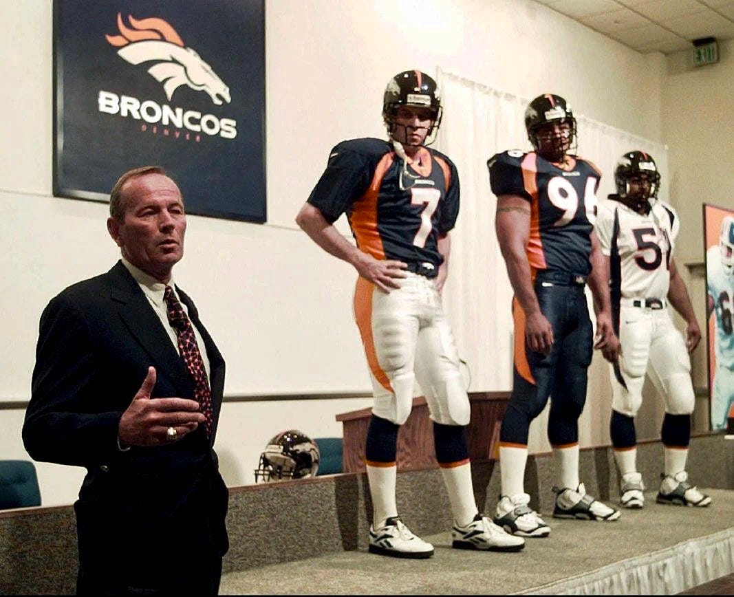
Rediscovering the guide got me thinking about the Broncos’ 1997 uniforms. Uni Watch didn’t yet exist in 1997, but I was definitely a uniform aficionado at the time, and it’s hard to overstate how much commotion this uni set caused back then. 1997 was a big year for NFL uniforms — it was the year that the Buccaneers changed from orange to pewter, and the Steelers moved away from block numbers — but all of that was overshadowed by the Broncos’ new set. It clearly represented a quantum leap for NFL uniform design (although people disagreed on whether that leap was forward or backward). I didn’t like it when it was unveiled and still don’t like it today, but I can’t deny what a game-changer it was.
As the years have gone by since then, I’ve been struck by two unexpected developments. First, although Denver ’97 was clearly an “of the moment” design that looked very much like a product of its times, it has had unusual staying power. A quarter-century after its launch, it’s largely unchanged and is now one of the NFL’s longest-serving uni designs, which is about the last thing I would have expected in 1997. Granted, the Broncos won the Super Bowl after the 1997 and ’98 seasons, which certainly accounts for some of this uni set’s longevity. Still, it’s pretty amazing that the radical design has become a legacy design.
But then there’s this paradox: While the 1997 set definitely changed people’s perceptions about what a football uniform could be and thereby loosened up some of the old design rules, and while it definitely sent design ripples through the world of college football, it hasn’t really been that influential on the NFL level. Look around the league today: Are there any uniforms that seem like direct aesthetic descendants of Denver ’97? In many ways, the Denver design is as much of an outlier today as it was when it was released.
Now the legacy outlier’s days could be numbered. While nothing is official yet, there are signs that the Broncos may be getting new uniforms in 2024, which means the 1997 set might be entering its final season. With that in mind, let’s take a closer look at this design. We’ll start with 10 deep-dive details that you may not have known about, and then we’ll circle back to the branding guide.
Ready? Here we go!
1. This was the first Big Four uniform designed by the manufacturer…
Nowadays, we’re used to companies like Nike, Adidas, and Under Armour designing uniforms, but that’s a relatively recent phenomenon. Prior to Denver ’97, uniform outfitters were essentially just vendors providing products to their clients. They didn’t design those products — they just made them according to the team’s specs. Denver ’97, however, was a Nike design from start to finish (although with the team’s input and approval, of course), and thus marked the beginning of the modern uni-verse where lifestyle brands drive much of what we see on the field, court, and ice.
2. …which led to lots of conspiracy theories.

Almost immediately upon the uniform set’s unveiling, sharp-eyed observers noticed something interesting about the nostril in the team’s new helmet logo: It looked a lot like the Nike swoosh. Once the uniform appeared on the field, people further noticed that the pants piping looked very swoosh-like when a player crouched down in a three-point stance (or punted!)
For many people, this was clearly subliminal (or maybe even explicit) branding on Nike’s part. Writing in The Denver Post, columnist Woody Paige said the team had become “Trojan horses for Nike” (Broncos, horses, get it?) and added:
Nike has played us for fools — and won. ... Nike graphic artists knew exactly what they were doing and they must believe Denver and the Broncos were too stupid to understand the secret of the design until it was too late. ... [Team owner Pat] Bowlen doesn't own the Broncos; Nike does.
For what it’s worth, over the years I’ve spoken with two people who were on the Denver ’97 design team, and they both maintain that the so-called subliminal swooshes were coincidental, not intentional. This 2018 article in The Athletic adds that Nike has always considered the conspiracy theories to be laughable because “Nike had strict rules about how the swoosh could appear” and the uniform elements “didn’t come close to meeting those standards.”
I’m not here to tell you whether you should or shouldn’t believe Nike. Either way, the subliminal swooshes have become part of the Denver ’97 lore.
3. There were two different sets of white pants.

Because the navy and white jerseys could both be paired with white pants but had different-colored side panels, and because the pants piping had to match the side panels, Denver ’97 required two different sets of white pants: one with orange piping and one with navy. At the time, this was viewed as a measure of the set’s absurdity — who needs two different sets of white pants? To this day, I think it’s still the only example of an NFL team having two different primary pairs of white pants (i.e., not counting Color Rush, throwbacks, or other non-primaries).
Update: Reader/commenter George Myers points out that the Falcons’ mid-2000s set also had two separate pairs of white pants. Thanks for the fact-check, George!
4. And speaking of the pants…

When Nike took over the NFL’s uniform contract in 2012, one little-noted change was that the tip of the Broncos’ pants piping was extended by several inches, so it looped farther around onto the front of the pant leg. (The same thing happened to the Bengals’ pants.) It’s stayed that way ever since.
To me, this just made a silly-looking uni element even sillier, “because we can.”
5. One more thing about the pants.

I mentioned this in the recent article about the NFL Style Guide, but it bears repeating: Denver ’97 was the first (and, I’m pretty sure, is still the only) NFL uniform set to feature a team-logo sleeve to be worn over the belt buckle. Innovative! Or maybe just overkill! Either way, sometimes the logo was worn askew, or obscured by a towel, or the players just didn’t bother with it. It was quietly abandoned after a few seasons.
I have never seen a game-used Broncos buckle sleeve available for sale. Now that would be a satisfyingly obscure piece of memorabilia.
Update: Reader Kevin Mericle points out that the 2009 NFL Style Guide (which I do not have a copy of) shows similar belt overlays for the Jets and the Titans. And sure enough, here’s a 2009 photo of the Jets wearing the belt logo, and a similar photo for the Titans. And get this: Kevin says he once bought a pair of game-used Titans pants, which included the belt accessory!
6. Moving up to the collar…

The NFL logo was added to the base of all teams’ jersey collars in 1991. But Denver ’97 added a new wrinkle to this uni element by positioning the league logo on a little contrast-colored triangular fabric panel nested within the collar.
This feature turned out to be somewhat influential. At least three other NFL teams — the Giants, Jags, and Bills — eventually adopted the contrasting collar panel:

And another three teams — the Cowboys, Dolphins, and Falcons — used the triangular panel but didn’t add the contrasting color, allowing the panel to blend in more with surrounding collar:

I feel like there was an industry term for this triangular fabric panel, but I can’t recall what it was. Does anyone know?
7. Orange you glad?
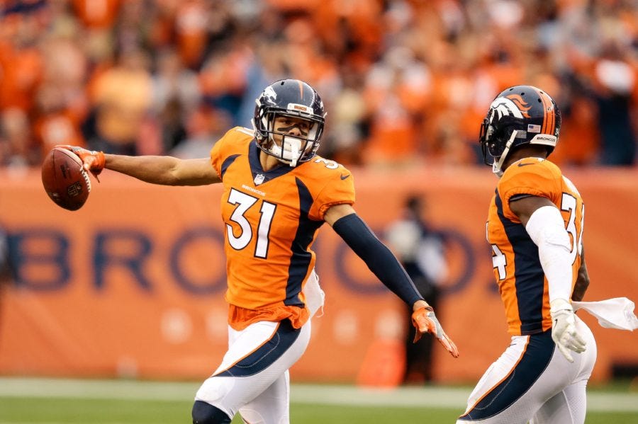
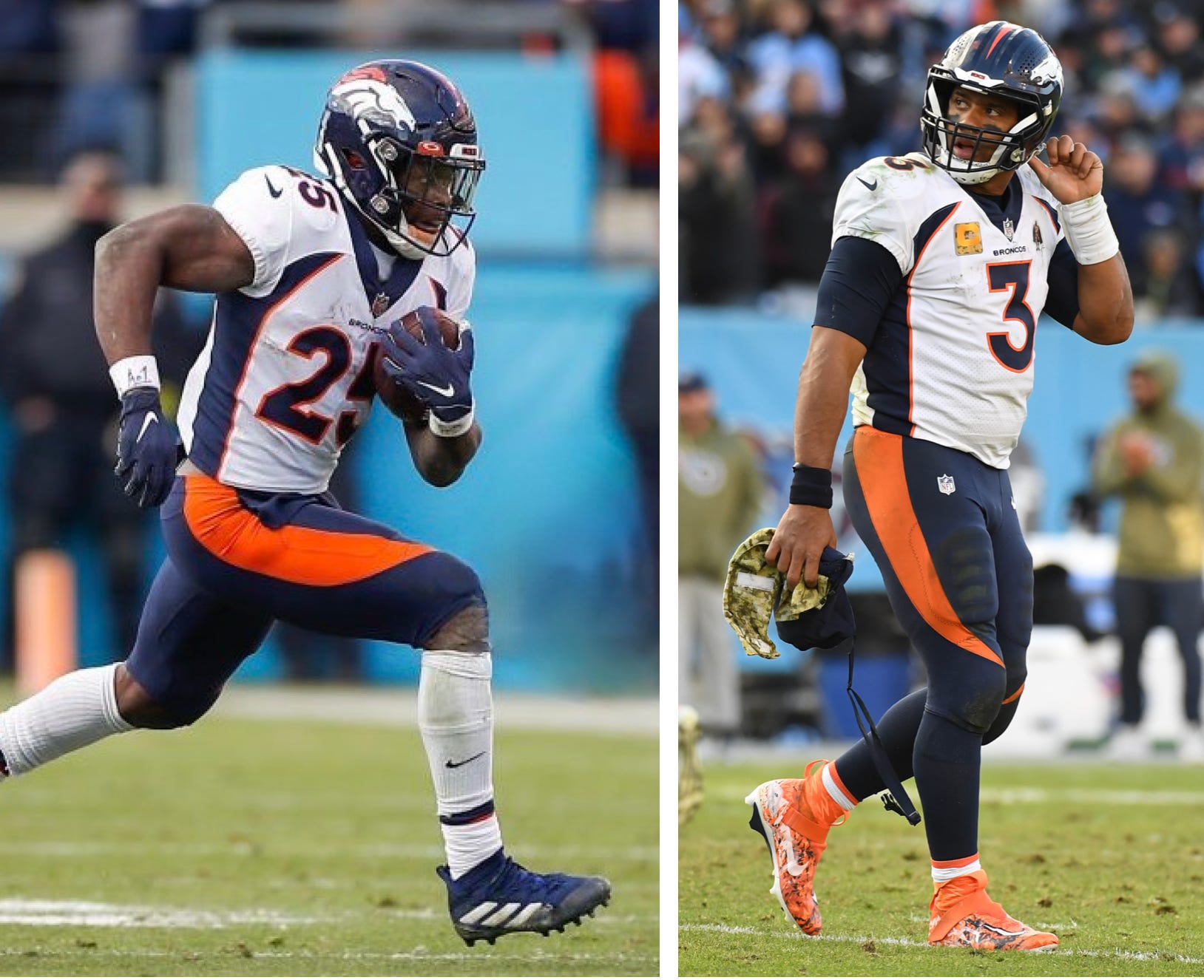
One of the most audacious aspects of Denver ’97 was that it changed the team’s primary color from orange to blue. But that didn’t last — an orange alternate jersey was added to the set in 2002, and in 2012 it was redesignated as the team’s primary jersey, with the navy design relegated to alternate status. At the time, the team said the switch back to orange was done in response to requests from the fan base.
I understand that impulse — I too prefer to see the Broncos in orange jerseys. But not these orange jerseys. For me, the garish Denver ’97 template looks even worse when rendered in a flashy color, and I find that the colors vibrate a bit more in the orange-centric format. So when they break out the slightly more subdued navy originals-but-now-alternates once or twice a year, I actually breathe a sigh of relief. Never thought I’d be happy to see that jersey!
8. And speaking of colors…
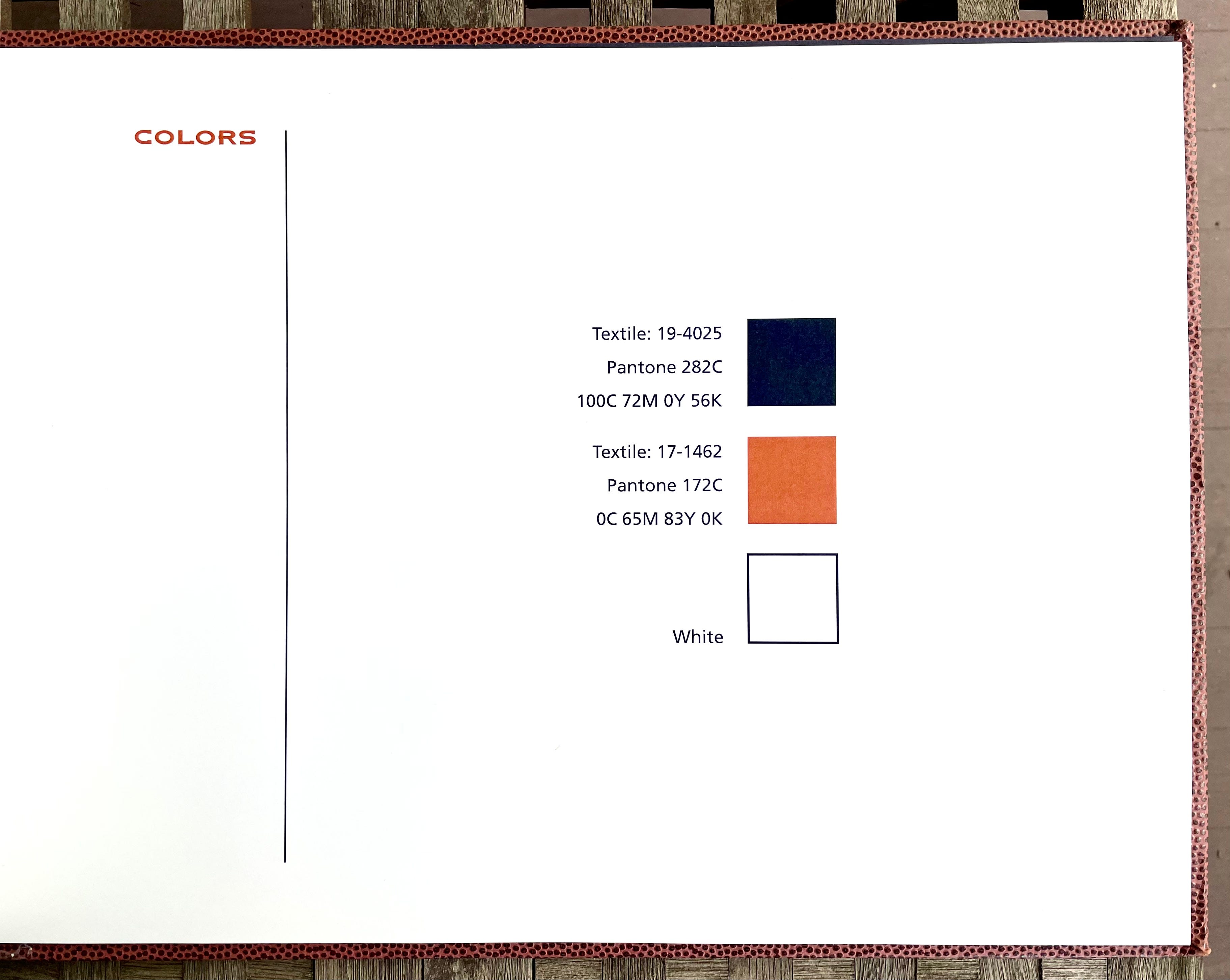
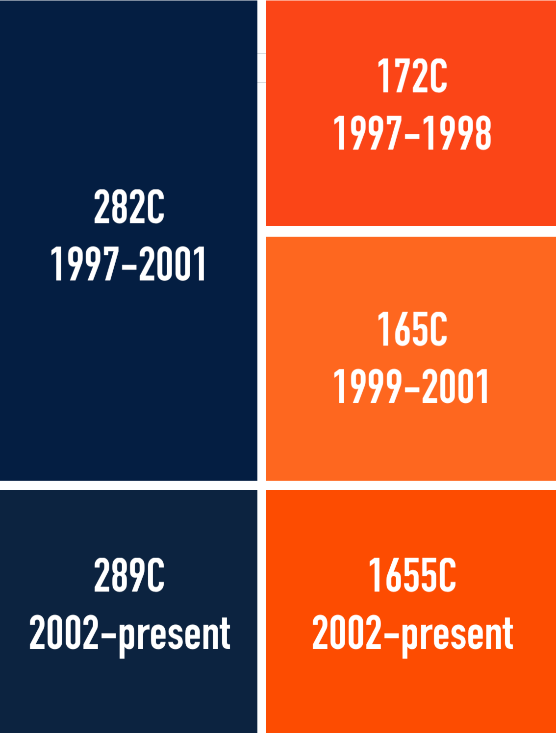
The photo above shows the Broncos’ official color specs in the 1997 brand guide. But you might not realize that those colors have changed slightly over the years. Here’s a breakdown of the team’s official Pantone color values since 1997, as outlined on the definitive TruColor.net site:
9. A case of mono.

If you scroll back up to the photo at the top of this article, you can see that the Denver ’97 unveiling included one player wearing mono-navy — a particularly boundary-pushing look, because monochromatic NFL uni combos were unheard of at the time. They did wear the mono combo for two 1997 preseason games — one against the Patriots and one against the 49ers — but then apparently got cold feet, because they didn’t go mono in the regular season until 2003, six years after the unveiling.
10. And speaking of unusual uni combos…
Remember how I was saying earlier that the side panels on the jersey and pants were supposed to be the same color? That’s why the Broncos went 25 seasons without ever pairing their white jerseys and navy pants — those two wardrobe components were never meant to be worn with each other. Last year, however, they basically said, “Ah, what the hell” and wore that uni combo for the first time. They won that game, so they wore the same combo again the following week.
You know how lots of players nowadays like to wear their undershirts untucked? I’m not a fan of that trend, but in this case it actually improves the overall look of the uniform because it breaks up the mismatched side panels.
Honorable Mention: What the hell is that horse doing?
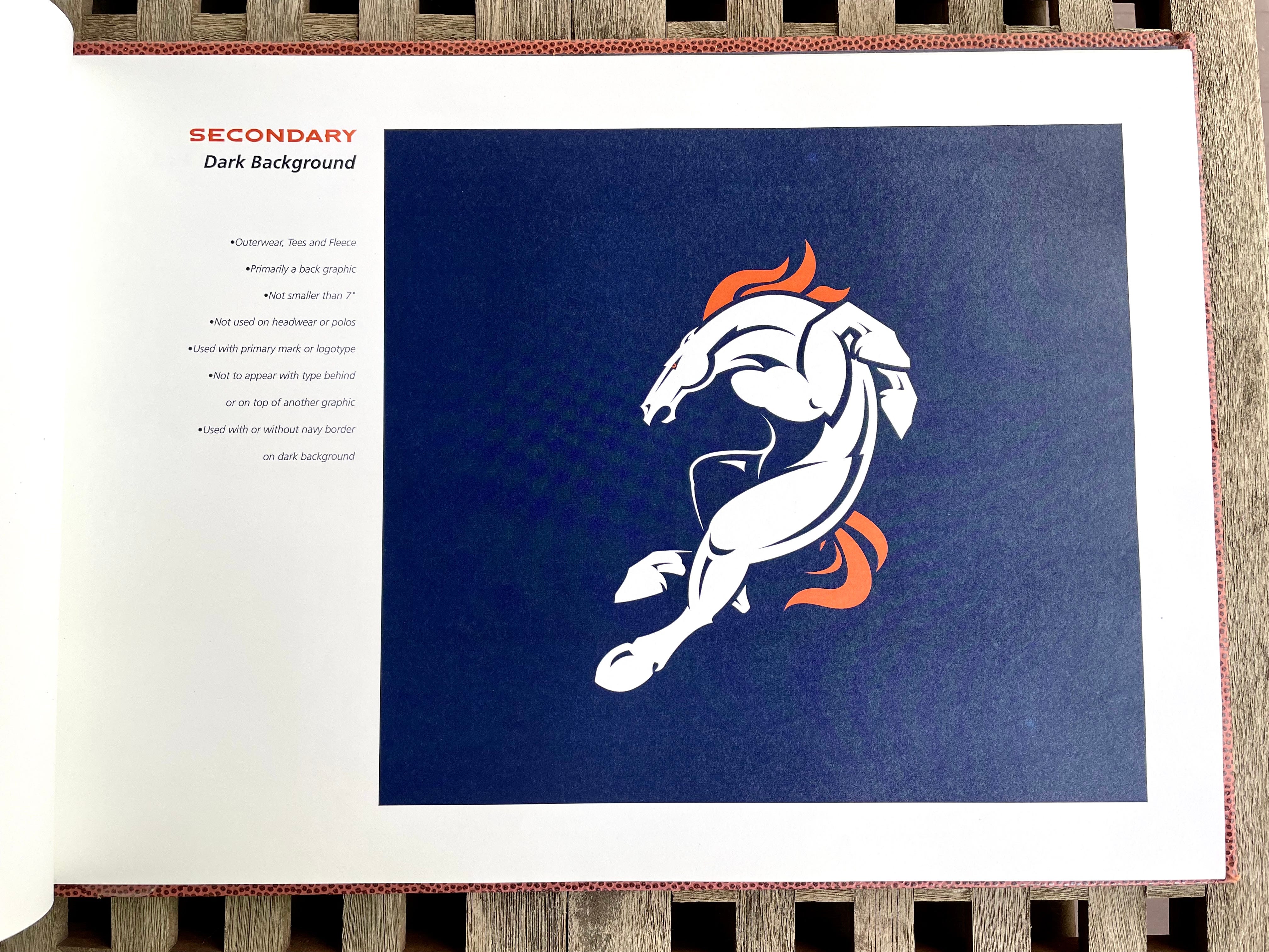
The Denver ’97 identity included a secondary logo featuring a full-body version of the team’s equine mascot. It never really caught on and has rarely been used by the team in any capacity, yet it remains in the Broncos’ official visual portfolio to this day.
Maybe it’s just me, but I’ve never understood what the horse is supposed to be doing in this pose. I’ve always thought it looks more like he’s retreating, not charging ahead, which is an odd posture for a sports mascot. Maybe he’s moving back to pass-block? Dropping back into a zone defense? Skittishly jumping back after hearing a loud noise? Feel free to post your own interpretations in the comments.
———
And there you have it. Hope you enjoyed that rundown as much as I enjoyed creating it.
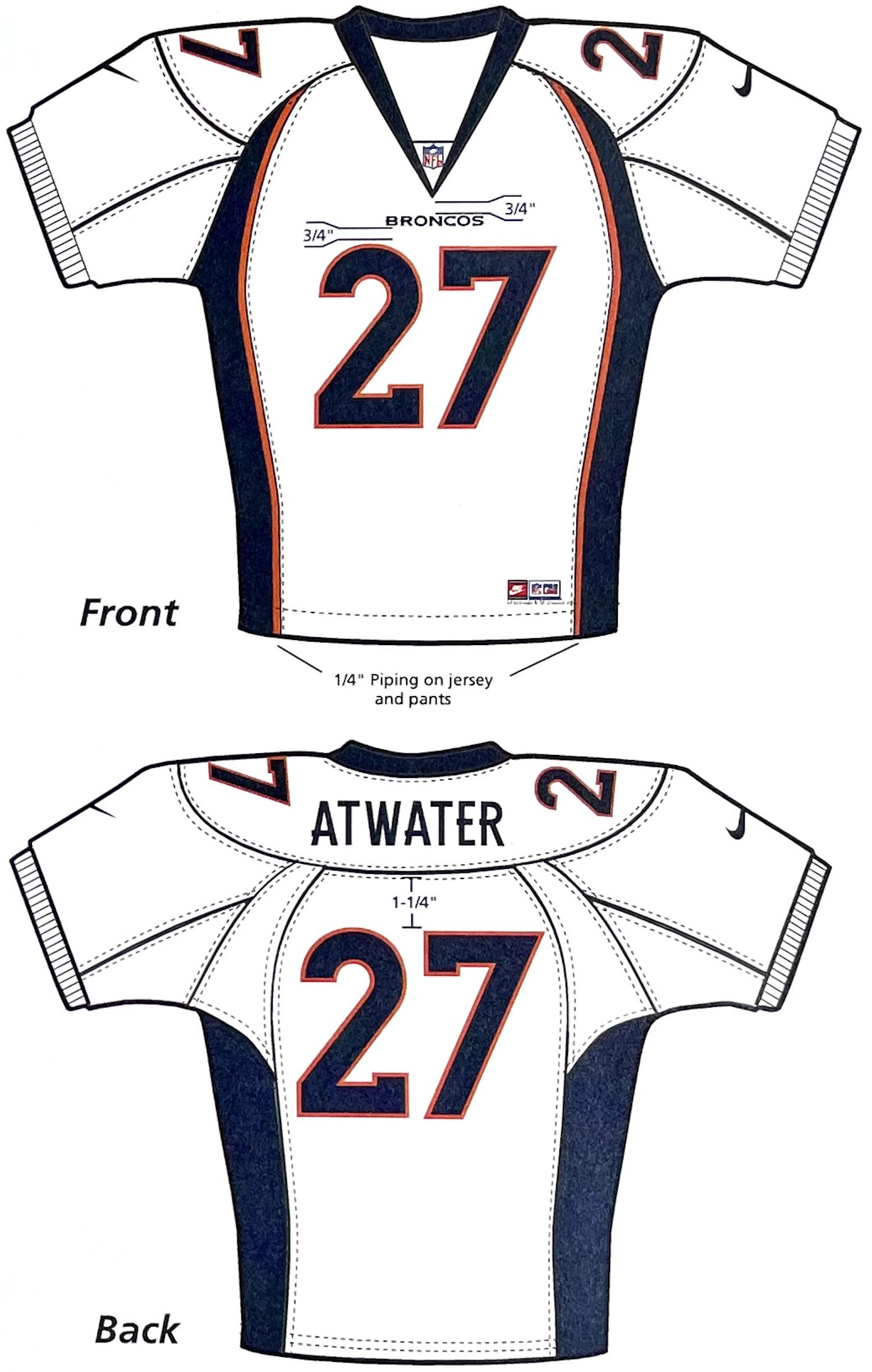
Now, let’s get back to the branding guide. One of the interesting things about these team-specific guides is that they sometimes use mock-up templates that you won’t see anywhere else. Here, for example, is the page in the guide showcasing the Denver ’97 uniforms:

The brand guide also includes some details that aren’t found in the regular NFL Style Guide. For example, the Denver guide spells out spacing measurements for various design elements on the jerseys and helmets:

Cool, right? If you want to see more, the entire brand guide is available as a slideshow on this page, and you can also see the individual page images in this Flickr set. Enjoy!
Also: Rick Bakas was a junior designer on the Nike team that created Denver ’97. You can see a bunch of preliminary sketches and prototype logos from the project on his website. Really interesting stuff!
Paul Lukas has been writing about uniforms for over 20 years. If you like his Premium articles, you’ll probably like his daily Uni Watch Blog, plus you can follow him on Twitter and Facebook and check out his Uni Watch merchandise. Have a question for Paul? Contact him here.
The secondary logo strikes me as a horse that has just seen a snake. I can’t think of another sports mascot logo that reads so clearly as “recoiling in fear.”
Does anyone else see the secondary logo as a big Nike swoosh?