

A Deep Dive on Air Mail Envelope Design
We all know what an air mail envelope looks like — or do we?

A few weeks ago I did a deep dive on “Return to Sender” symbols used by the Postal Service. One of the comments on that article came from IC reader Brendan Jang, who wrote, “Hoping for a similar piece on air mail envelope design!”
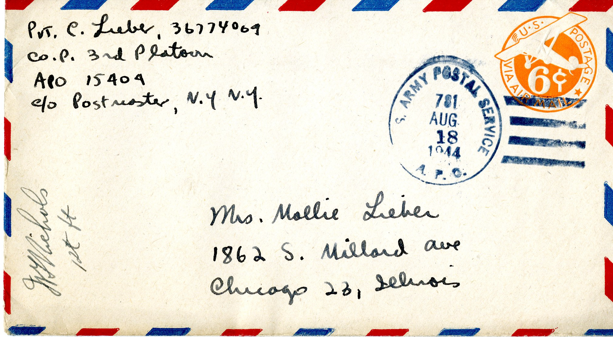
Of course, I was already familiar with the basic air mail envelope, with its border pattern of red and blue parallelograms (like the 1944 example shown above). But just as it hadn’t occurred to me that there might be myriad variations on the “Return to Sender” pointing hand, it likewise hadn’t dawned on me that air mail envelopes might be a deep well of design diversity. I had intuitively assumed — very incorrectly, as it turns out — that they were all the same.
So at Brendan’s suggestion, I started a journey down this new rabbit hole. One thing I quickly learned is that the classic air mail envelope design is actually patented! The design was created by a Buffalo stationer named Benjamin Dahlke, who applied for a patent in 1927. It was granted to him in 1929.
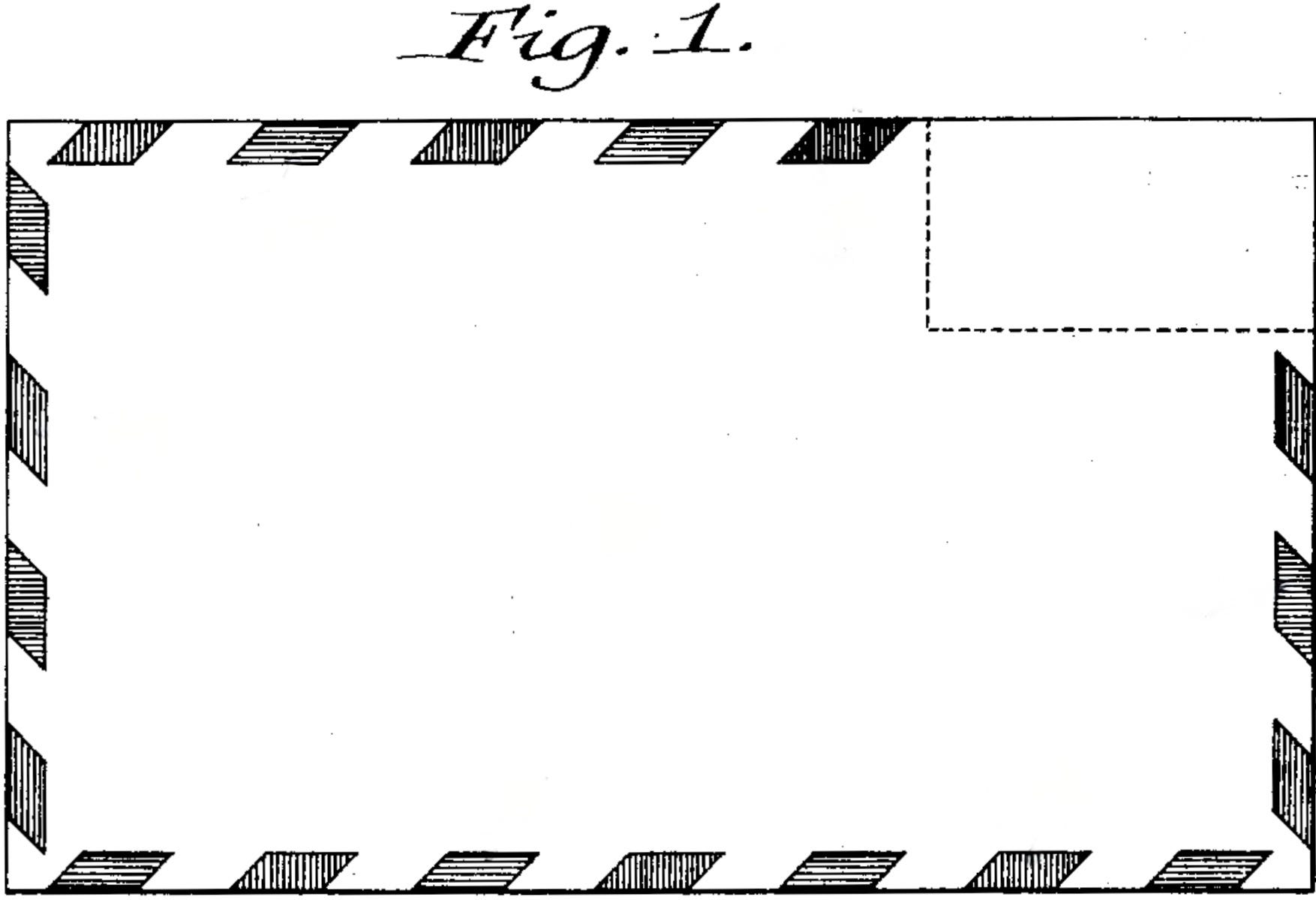
According to Dahlke’s patent application:
[The parallelogram pattern] immediately attracts the eye and serves as a flash or signal, facilitating the duty of giving such mail the special attention required of mail clerks and ensuring the quick and prompt delivery to which such mail is entitled. Furthermore, by carrying this characteristic border around the edges of the envelope, it can be readily detected in a pile, bundle, or stack of miscellaneous envelopes, thereby materially aiding in the quick assortment of air mail, or other special mail.
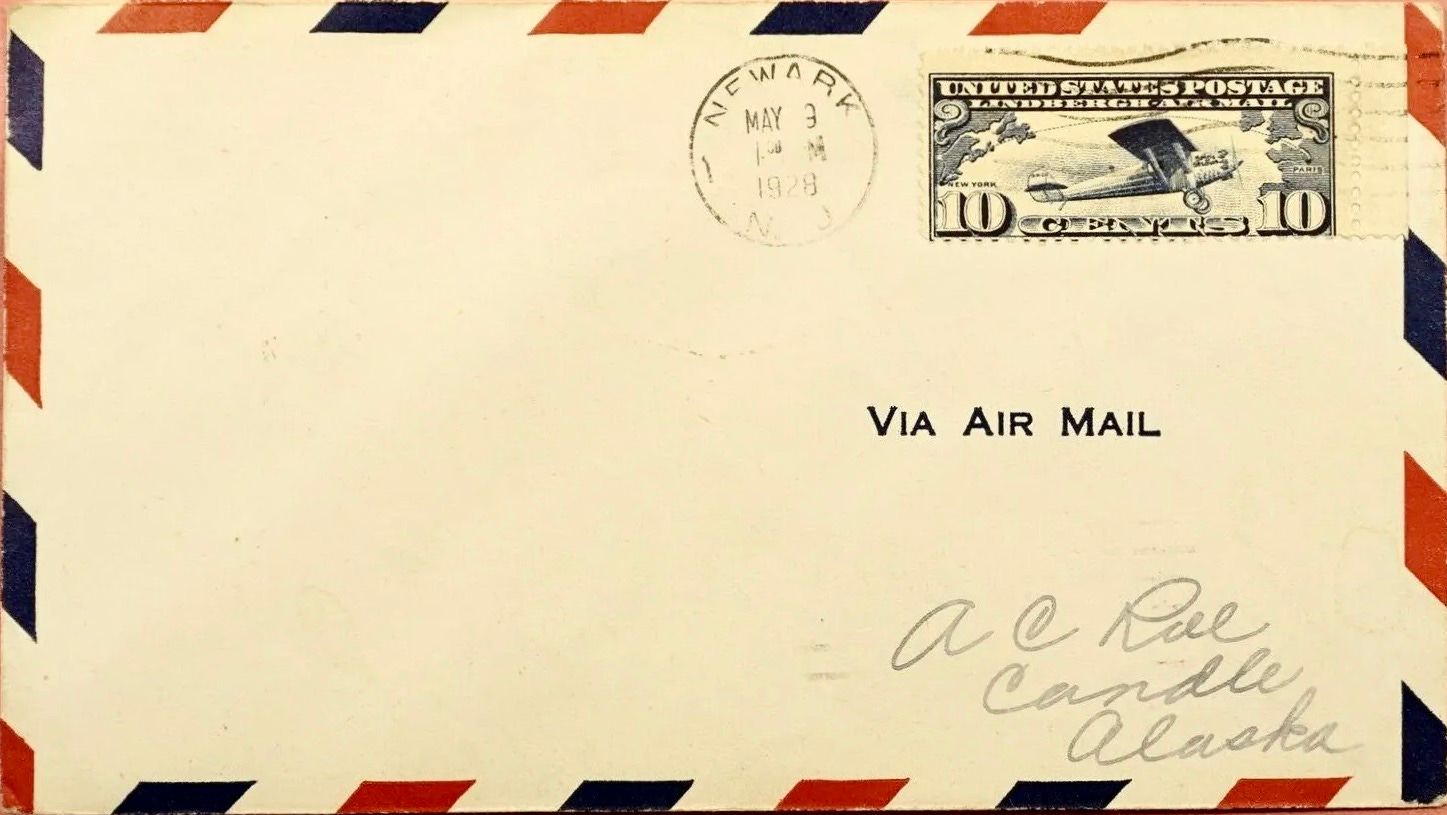
This design has become informally known as the Dahlke envelope. Although Dahlke’s patent wasn’t granted until 1929, the U.S. Post Office Department approved the use of his design in the spring of 1928. As a result, the earliest known examples of the Dahlke envelope are from 1928. Some of them were manufactured by Dahlke himself and sold at his stationery shop; others were made and sold by other stationers.

Almost immediately, there were design inconsistencies. For example, some envelopes didn’t have the border pattern along the top edge (similar to Dahlke’s patent drawing), while others had an uninterrupted pattern going all the way around the envelope.
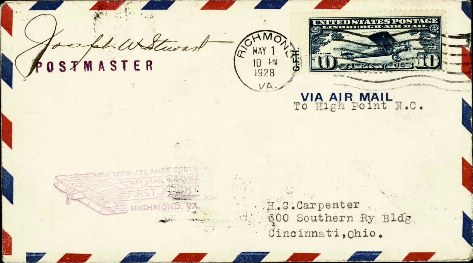

The relative size and spacing of the parallelograms also varied widely. Some border patterns included a lot of white space, while others were more densely packed.
Most surprisingly, at least to me, some of these 1928 covers had the parallelograms leaning in the “wrong” direction!


Although Dahlke’s patent was granted in 1929, he apparently wasn’t able to capitalize on it. In a 1958 article published shortly before his death, he said he had to give up the patent due to antitrust regulations.

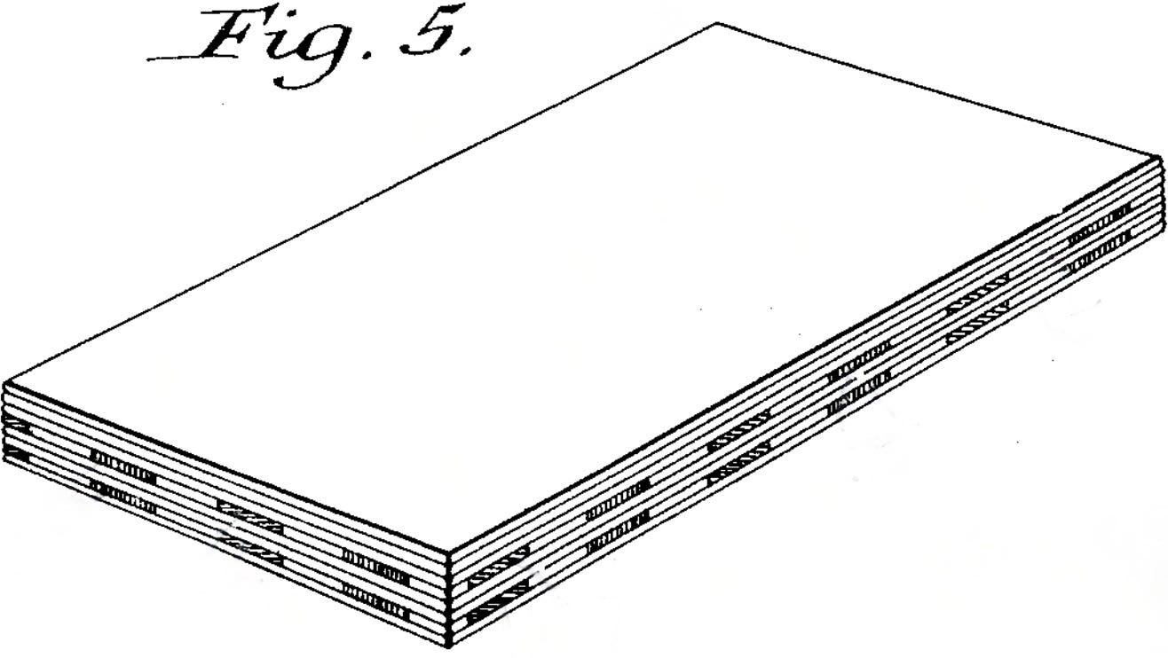
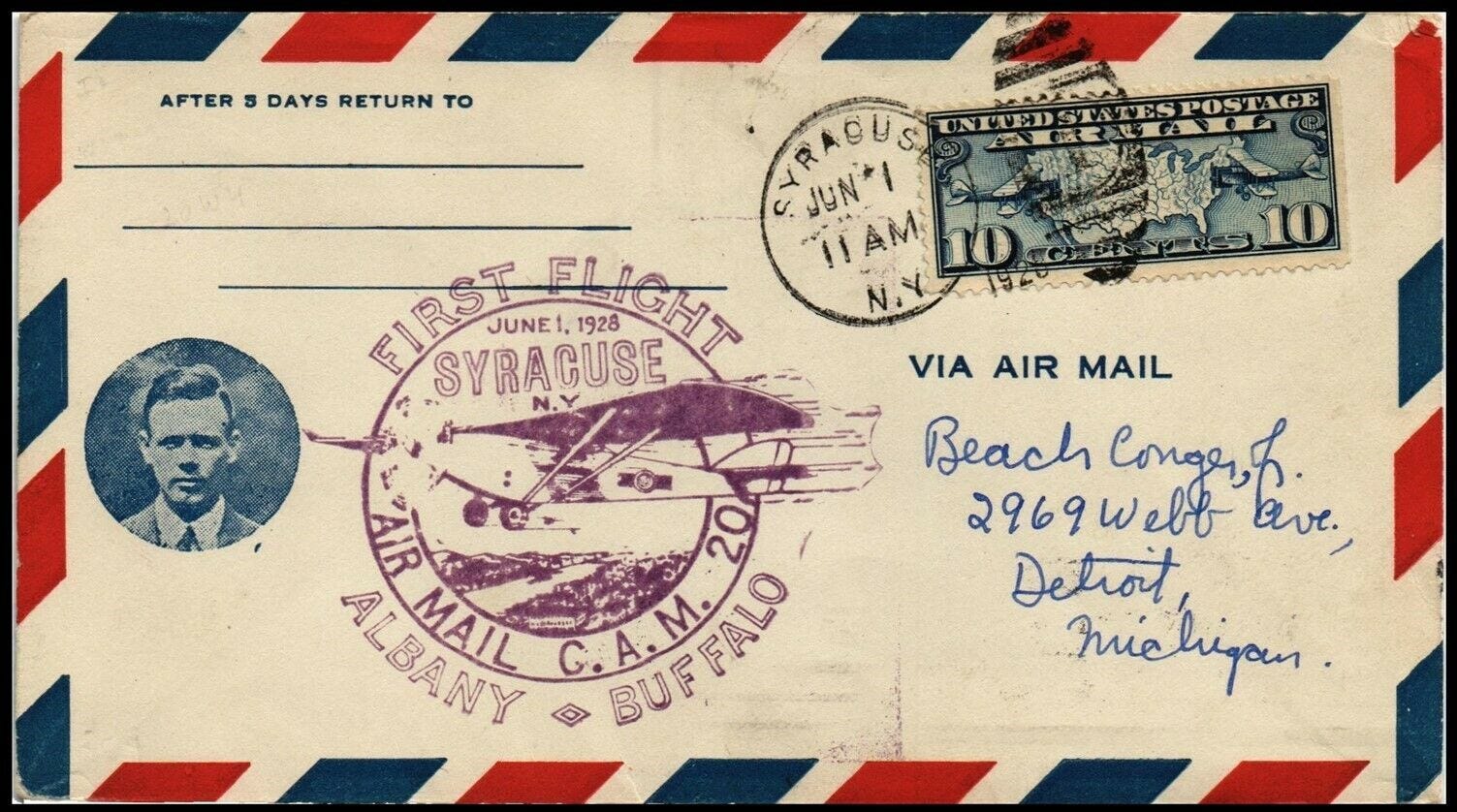
With the patent essentially rendered moot, the result was a design free-for-all, with various stationers coming up with their own variations on the Dahlke envelope in the 1930s, ’40s, and ’50s. Here’s a sampling of notable versions that turned up during my research — some very close to Dahlke’s original design, others a bit more adventurous, but all clearly part of the same extended family:


There was also a whole subset of designs that were recognizably Dahlke-derived but featured airplane-themed border patterns instead of just geometric shapes:


For good measure, here’s one that features zeppelins and balloons (both of which were involved in early air mail delivery) in addition to airplanes:

I could go on, but you get the idea. There have been lots of Dahlke-esque envelope designs over the years.
Many other countries adopted the Dahlke envelope concept. Some kept the red/blue color scheme, while others adjusted the colors to match their national flag. Here are some examples of that:


So that’s the Dahlke envelope. But when the Post Office Department approved the use of Dahlke’s design in 1928, they also approved another air mail envelope design. It’s not clear who created this one, but it featured horizontal stripes running across the center of the envelope.

This design never caught on to the same extent as Dahlke’s, but it too inspired its share of variations. Here are some of those:


In addition, there were other design motifs that didn’t necessarily have official Post Office Department approval but were nonetheless popular, at least for a while. One such design involved crossed horizontal and vertical lines, and once again there were lots of variations on that central theme:


There was also a design motif featuring stripes emanating from the opposing corners of the envelope. Here are some examples of that:


Phew! While the assortment of envelope designs I’ve presented here is extensive, it is far from exhaustive. There have been many, many other air mail envelope designs over the years. Plus we haven’t even talked about the backs of the envelopes, or air mail postcards, or any of several other adjacent topics. But those will have to wait for another day.
If you want to go deeper on all of this, air mail has its own branch of philately, called aerophilately (of course). American aerophilatelists have their own research organization, the American Air Mail Society, which is a member of the International Federation of Aero- and Astrophilatelic Societies.
Credit where it’s due: I owe a huge debt of gratitude to the aerophilatelist R. Howard Courtney, whose website was an invaluable resource in compiling many of the photos shown in this post. I came upon Courtney’s site via a link from this message board thread about Benjamin Dahlke, which appears on the website StampCommunity.com. Jeff Mills’s survey of early air mail envelopes was also very helpful.
Most of all, big thanks to IC reader Brendan Jang for suggesting this very interesting topic. Hope you all enjoyed reading about it as much as I enjoyed investigating it. And as a bonus, I think we’ve just set a near-unbreakable record for the most occurrences of the word parallelogram in an IC post!
Paul Lukas has been obsessing over the inconspicuous for most of his life, and has been writing about those obsessions for more than 30 years. You can contact him here.
Thanks for not "mailing it in"!!
Come for the envelopes, stay for all those incredible local post office air mail stamps! Incredible “post”. One of my favorite parts about shopping on eBay is often the packages I receive when I buy something from say, Poland, is that it arrives with that country’s air mail stamps and design (though sadly not always the envelope).