A Close Look at Auxiliary Prescription Labels
The ubiquitous little stickers are classically inconspicuous.
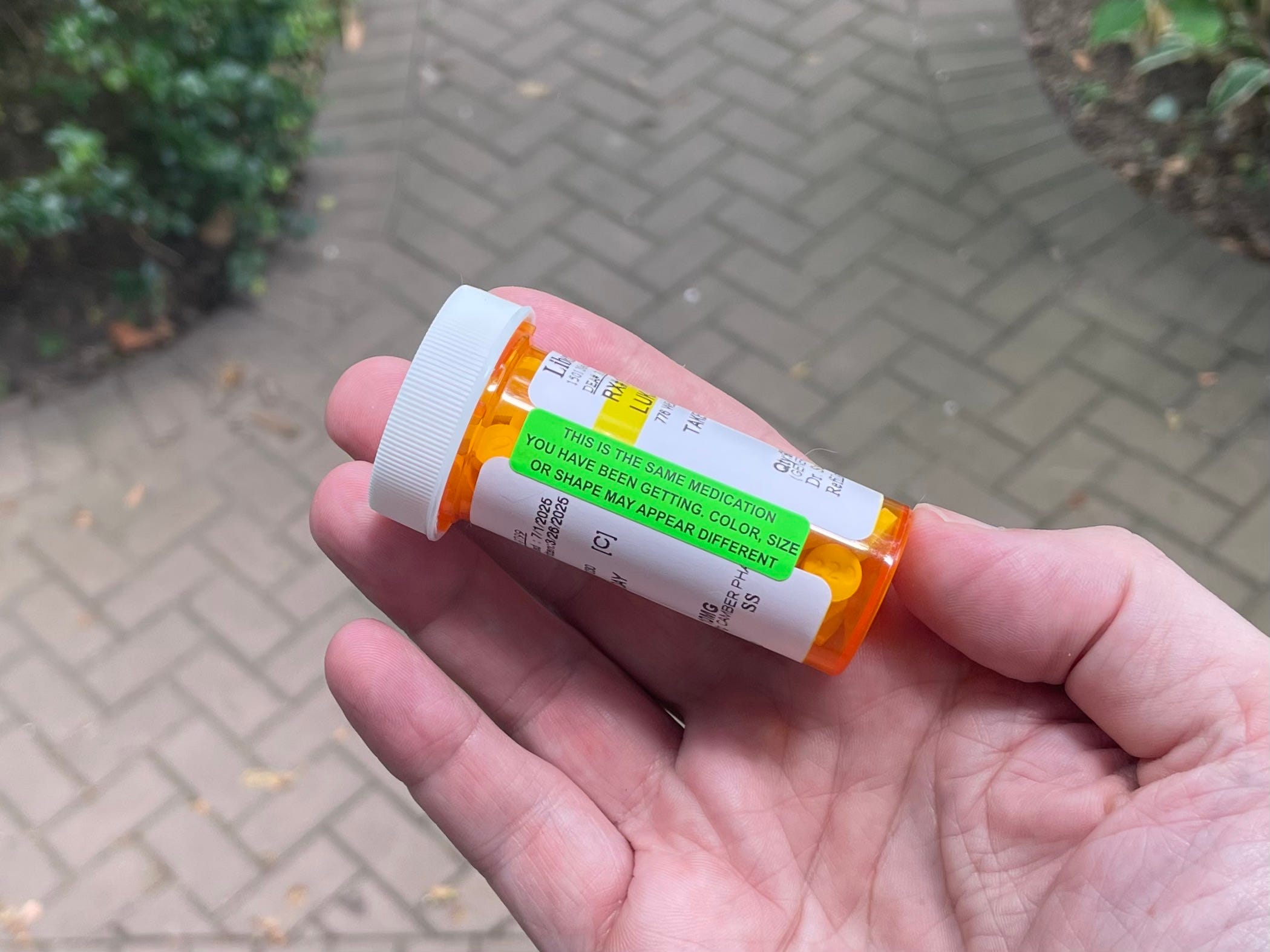
I picked up a prescription refill at my local pharmacy the other day. When I opened the bottle later that night, I was surprised by the look of the pills, which were round, instead of the square-ish pills I was used to seeing for this medication. Had the pharmacy given me the wrong drug?
That’s when I noticed a little green sticker on the pill bottle. As you can see in the photo shown above, it reads, “This is the same medication you have been getting. Color, size or shape may appear different.” I felt reassured, and was also happy that my pharmacist had been thoughtful enough to anticipate my concern.
The sticker on my pill bottle is part of a larger family of brightly colored labels that we’ve all seen on our prescription medications. Usually they’re amplifying a doctor’s instructions (“Take with Food”) or warning of possible side effects (“May Cause Drowsiness”). I’d never devoted much thought to them before, but this latest one got me thinking: Who makes and sells these little stickers? How many different messages do they carry? Is someone credited with “inventing” them, or did they emerge sort of organically?
And that’s how I started down the rabbit hole of what the pharmacy industry calls auxiliary prescription labels. They’re standard inventory, usually in rolls of 500 or 1,000, at pharmacy- and medical-supply outlets like Apothecary Products, Distinctive Medical, and many others. But you don’t need to be a medical professional to purchase them — they’re also readily available on Amazon, and some of the more risqué ones are even sold as gag items on Etsy. There’s something vaguely pop-cultural about them, which presumably explains why they’ve shown up on T-shirts and notebook covers, and why there are also parody versions.
Auxiliary labels have a fairly consistent look: They usually measure an inch and a half wide by three-eighths of an inch high, come in a familiar ranges of reds, blues, yellows, oranges, and greens, and often include very simple illustrations. Although this fairly uniform formatting may provide a veneer of formal standardization, the reality is that the labels are not issued or approved by any industry group and are not subject to any state or federal regulation, so there is no “official” version of any auxiliary sticker. Depending on the vendor, the same basic message may appear with slightly different wording, on a different-colored background, or accompanied by a different (or no) illustration. Here, for example, are some of the options — but by no means all of them — for the common “May Cause Drowsiness” message:
This lack of official standards may explain why I’ve found it surprisingly difficult to ascertain when the current generation of brightly colored auxiliary labels began appearing. I inquired with several pharmacy-centric professional associations, academic organizations, and research journals, none of which could answer this seemingly simple question. But Greg Higby, former director of the American Institute of the History of Pharmacy (I love that such an organization exists), said that while he didn’t know the backstory of the current label style, the basic concept of auxiliary labels dates back more than 150 years. Higby pointed me toward a book called History of Drug Containers and Their Labels (I love that such a book exists), which includes the following passage:
Auxiliary labels also became popular during the second half of the 19th century. … [One] widely used auxiliary label read, “To Be Shaken Well Before Taken.” Alfred B. Taylor of Philadelphia reported that he was faced by questions from patients asking whether they should shake the bottle or shake themselves before taking the medicine, so Taylor labeled his prescriptions, “Shake the Vial Well Before Using.”
[…]
Other auxiliary labels seen in label collections of the late 19th century include: “Keep Tightly Corked,” “For External Application Only,” and “Use With Caution.” One auxiliary label that seems to have appeared long before it became popular was employed by Pharmacist W. Clarke of Wisconsin in 1896; it read, “Caution: Be Careful to Keep This Medicine Out of the Way of Children.”
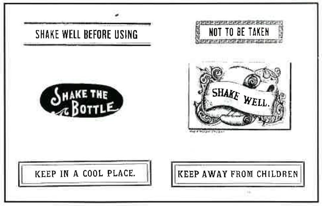
The best part of this is definitely the revelation that some prescriptions were once labeled “Keep Tightly Corked.” If I were a pharmacist, it would be tempting to dispense medications in cork-topped bottles just so I’d have an excuse to use such a label.
Speaking of which, let’s consider the following situation: If you’ve decided to open up a neighborhood pharmacy, how many different auxiliary labels, each with its own message, should you have on hand? Or, if you happen to be a somewhat obsessive sort with a collector’s mindset, completist tendencies, and the occasional inclination to get a bit carried away with things (um…), how many could you have on hand?
In an attempt to answer that question, I’ve spent a fair amount of time scouring the internet and assembling an auxiliary label database. As we’ve already seen with “May Cause Drowsiness,” it’s easy to stack the deck with multiple iterations of the same message, so I established a few ground rules to keep things from spiraling too far out of control:
If I found multiple labels with the same message but different graphics (as in the “May Cause Drowsiness” example), I included only one of them.
If I found multiple labels with essentially the same message expressed in slightly different wordings, I included only one of them. (Since “essentially the same message” is an inherently subjective notion, this occasionally required a judgment call.)
It turns out that there’s a subset of auxiliary labels whose messaging appears to be intended for hospital staffers, not for pharmacy customers — “Dosage Changed, Refer to Chart,” for example, or “Patient Is Allergic to Penicillin,” or “Infuse Entire Contents of Bag.” While it was tempting to include these labels, they’re not typically part of the retail pharmacy experience, so I didn’t include them. (Frankly, it seems to me that these hospital stickers should be a whole separate sales category, but online vendors tend to intermix them with the pharmacy stickers, all under the “Auxiliary Labels” heading.)
Despite these restrictions, I’ve come up with 120 distinct labels, which I will now share with you. I’ve organized them into what I hope will be a logical-seeming sequence, with fairly obvious groupings that will become apparent as you scroll through the list. In a few instances, I’ve used captions to make small observations. Despite the lamentable absence of “Keep Tightly Corked,” I think you’ll agree that it’s a pretty impressive aggregation. Ready? Here we go:


Yowza — that’s a lot of labels! And I’m sure there are more of them out there that I missed. Taken together, they comprise a fascinating little design niche, much like the ticket-punch dies that we recently examined. (Insert my usual lament here about how it’s a shame that we’ll never know the identities of these graphic artists.)
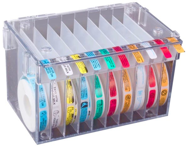
Returning to our hypothetical notion of opening a new pharmacy, the completist approach would clearly necessitate a lot of auxiliary label inventory! How will we possibly keep all of those labels organized in our shop?
With one of these handy-dandy label-dispenser thingies, of course:
While the dispenser in that photo can handle only 10 rolls of labels, a 20-roll model is also available, and the dispensers are connectible and stackable, so we could assemble a big bank of them to accommodate all 120 label designs at our new pharmacy. Granted, that would probably have a pretty big footprint, so we might need to make room by cutting back on a few superfluous items (pill counters, mortars and pestles, life-saving drugs, etc.), but that seems like a reasonable trade-off. Priorities, right?
And hey, although nobody offers “Keep Tightly Corked” these days, I note with a raised eyebrow that most of the label vendors have an option to create your own custom auxiliary label, and cork stoppers are still readily available. Just sayin’.
Inconspicuous News Roundup
The photo shown above is part of a series of very pleasing overhead photos of Ohio highway interchanges. You can see the full set of them here. (From Jason Hillyer)
Speaking of Ohio: I’m not sure how I wasn’t previously aware of this, but reader Shirley Tobias reports that there’s a pencil sharpener museum about a 45-minute drive southeast of Columbus. It purportedly has nearly 3,500 sharpeners, with no duplicates!
If you’re into tech design, or just a longtime Mac computer user, this history of Mac control-panel interface designs is an absolute must-read. The article itself is a design masterpiece — check it out and you’ll see what I mean. (From Mark Hurst and his Creative Good newsletter)
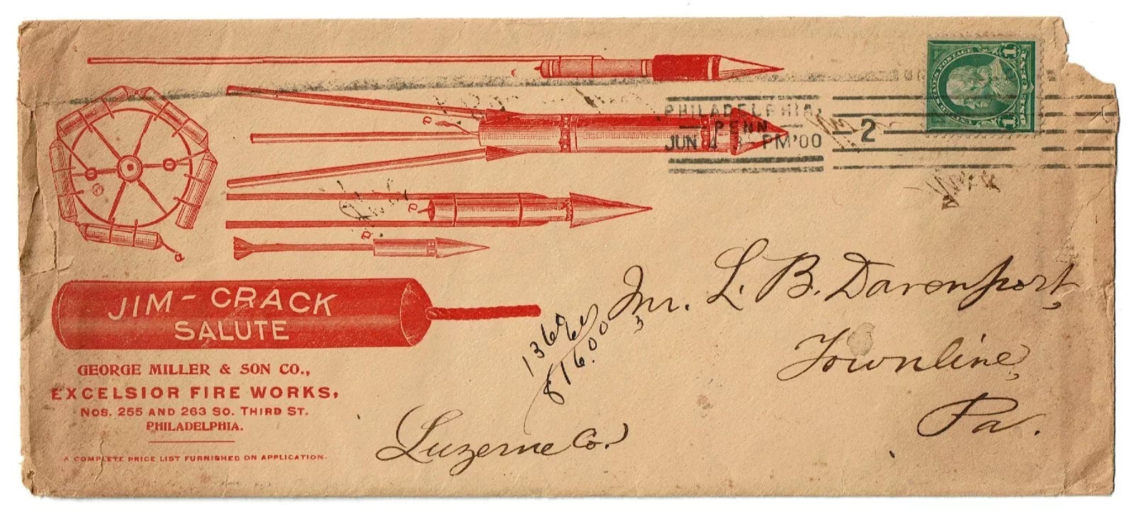
Although July 4th is now behind us, I keep finding cool fireworks-related items to share with you, including this completely amazing vintage envelope from a Philadelphia-based pyrotechnics company:
Also, note that the addressee on that envelope lived in Townline, Pennsylvania, which recalls our recent discussion of towns named “Stateline”!
Paul Lukas has been obsessing over the inconspicuous for most of his life, and has been writing about those obsessions for more than 30 years. You can contact him here.









The “Please Don’t Drop Me” label cracks me up. The medication is pleading for its safety.
Every time I look at my various Substacks and wonder “Do I need to keep this one?” a post like this shows up, uncovering a little world I’d never normally think about and remembering just why I subscribed in the first place.